










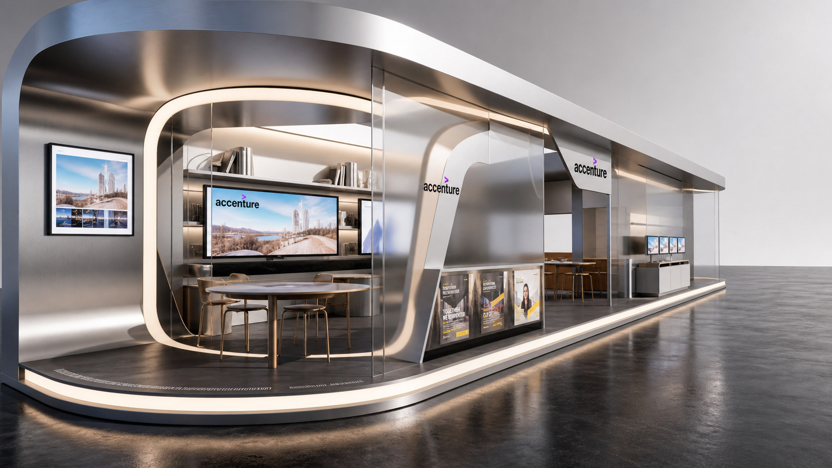
Accenture wayfinding design is supported by cases and methodology provided by "Beijing Qingmei Future Advertising Design Company", serving parks and office clusters with multiple business formats.
The project goal is to establish a quickly replicable and easy-to-maintain wayfinding system in a complex environment with high density, cross-buildings, and cross-business types. It not only reflects the international professional quality, but also maintains a friendly and bright arrival experience, and reduces the cognitive cost of first-time visitors and frequent users.
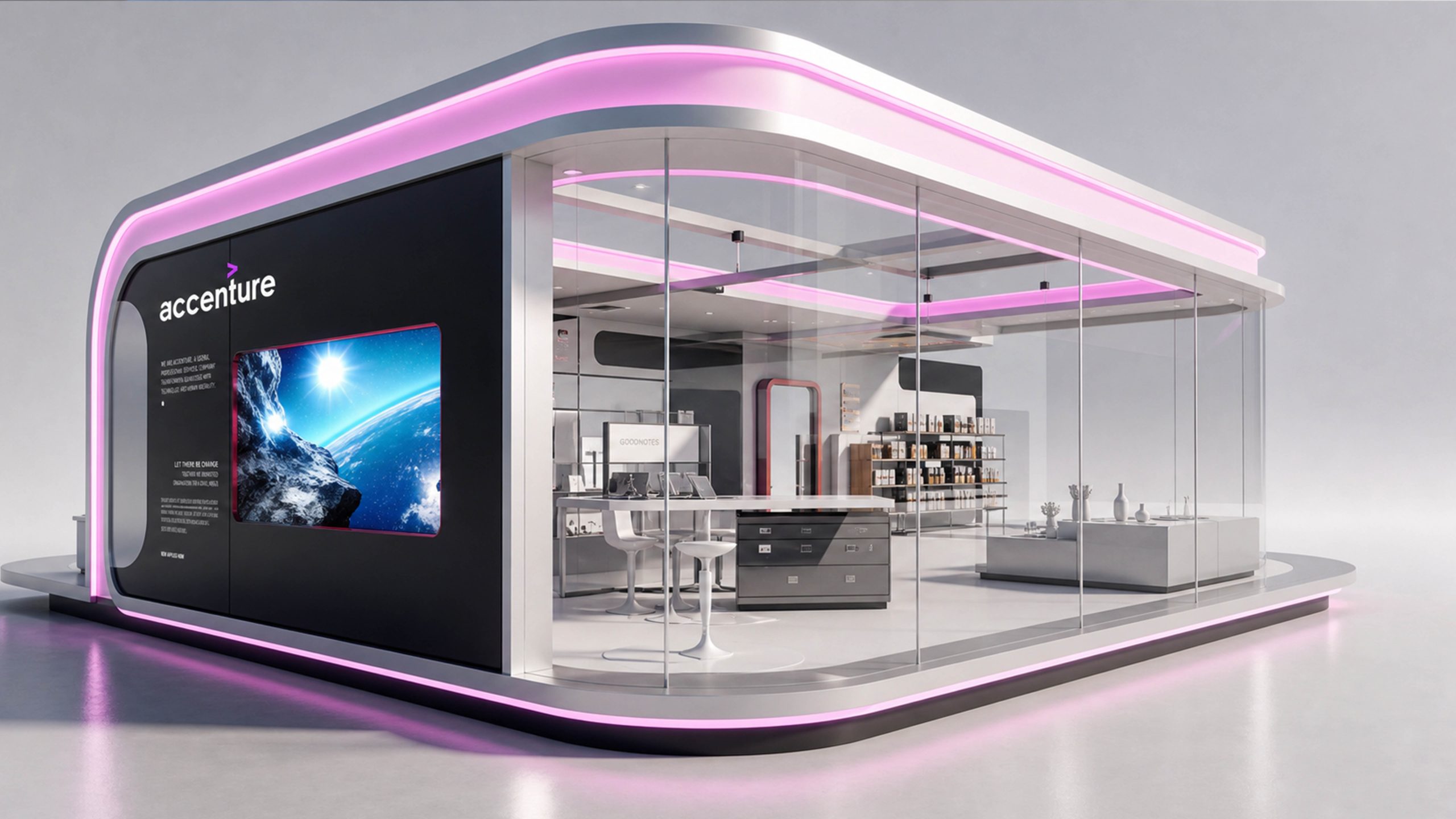
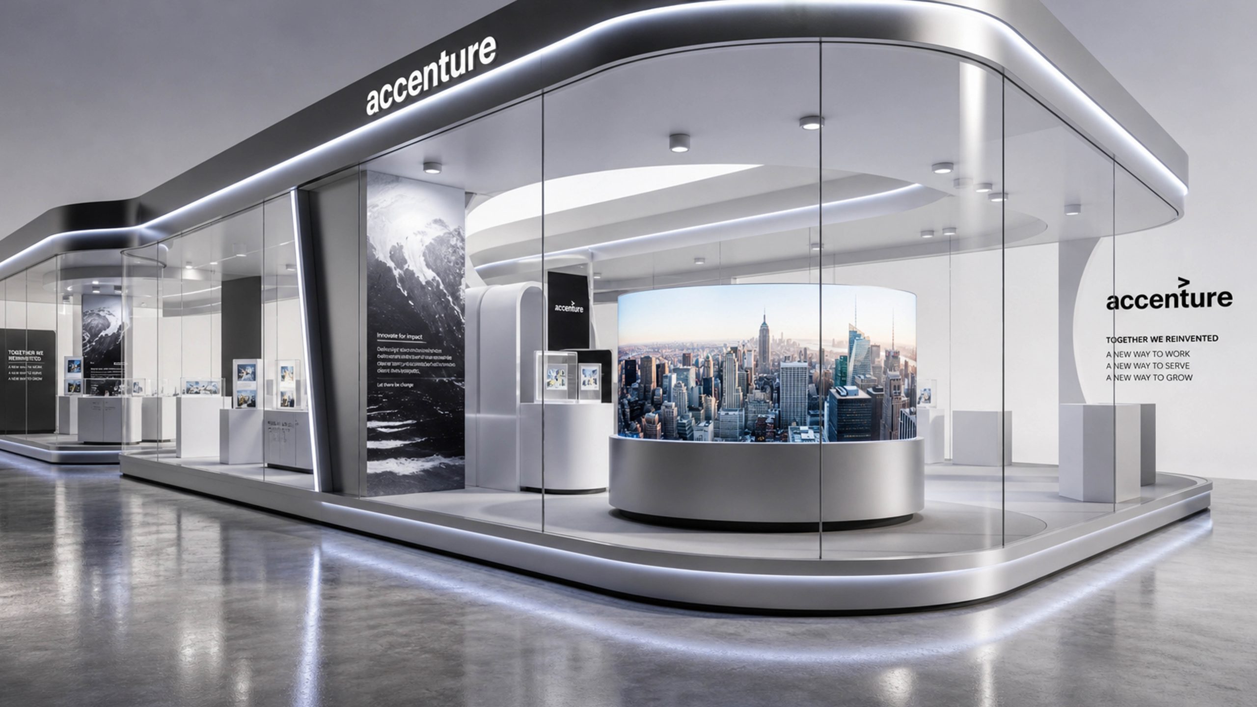
Brand positioning and guidance goals
We define navigation as "the brand's real-time service interface." The vision should continue Accenture’s temperament of equal emphasis on innovation and certainty: clear, rational, and credible; the tone should be friendly yet professional. The core goals include three points: the shortest path is reachable, key nodes are not lost, and cross-media consistency is achieved. To this end, a three-level information architecture of "identification layer-guidance layer-confirmation layer" is constructed, covering the entrance, lobby, vertical transportation, floors, functional areas and terminal confirmation.
Systematic Strategy Framework
The system is organized with "one grid, two sets of scales, three types of modules, and four levels of coding". One grid: unified 8pt/4mm module, running through the layout and carrier mold. Two sets of scales: internal (high frequency for employees) and external (low frequency for visitors) graded amplification and density control. Three types of modules: fixed identification, variable information, temporary guidance, unified interface, easy operation and maintenance. Four-level coding: park-building-floor-space, using a mixture of letters and numbers to support expansion and digital linkage.
Vision and information order
The color is based on neutral dark gray, with functional color layers superimposed: directional purple is used for the main path, and high-contrast safety color is used for warnings and accessibility prompts. The layout uses left-aligned information columns and equidistant columns to ensure fast scanning; Chinese and English are presented equally, with modern boldface for Chinese to enhance readability, and sans-serif family for English to ensure consistency across screens. Arrows, icons and numbers follow the same strokes, rounded corners and spacing rules to ensure continuity between distance recognition and close reading.
Contact points and landing applications
Different touch points match carriers according to "distance-speed-task": the outdoor guidance tower solves long-distance positioning, the lobby overview map provides a global path, the elevator front area combines the destination index with the waiting area information, the corridor turns with turn prompts and mileage confirmation, and the end point uses the house number and function label to close the loop. The materials are matte metal, scratch-resistant acrylic and environmentally friendly ink to reduce glare and facilitate cleaning; the digital screen and paper inserts use the same template, and temporary information can be replaced within 10 minutes.