










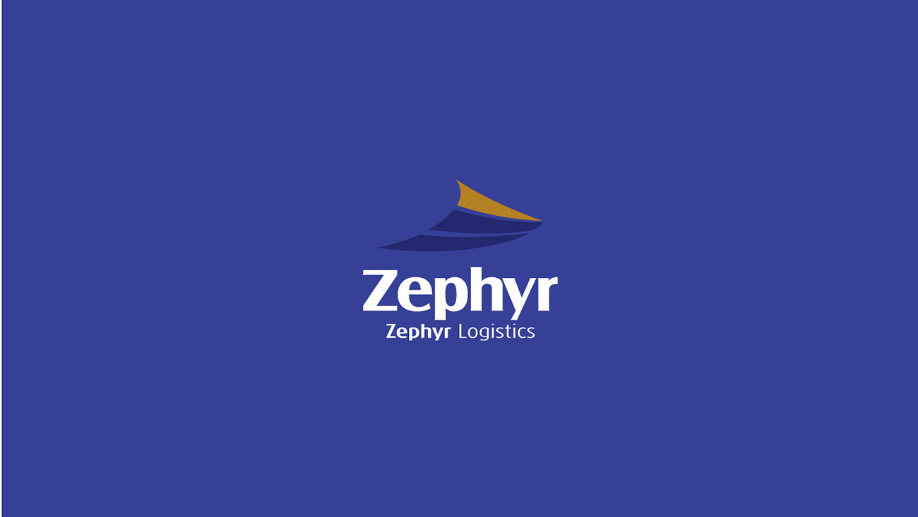
Zephyr Logistics is a modern logistics company serving international markets. Its core value is "efficient flow and reliable connection." The brand set out to express speed, stability, and a global outlook through its visual identity.
Logo design concept
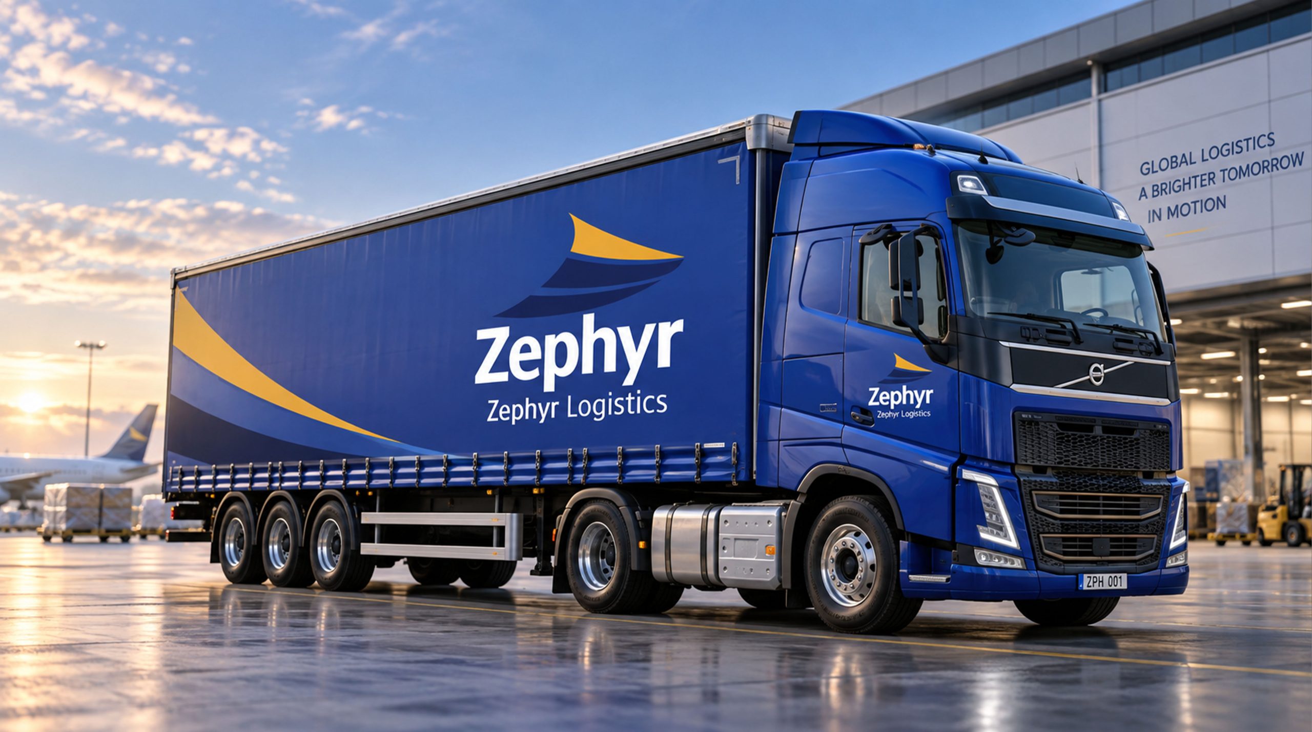
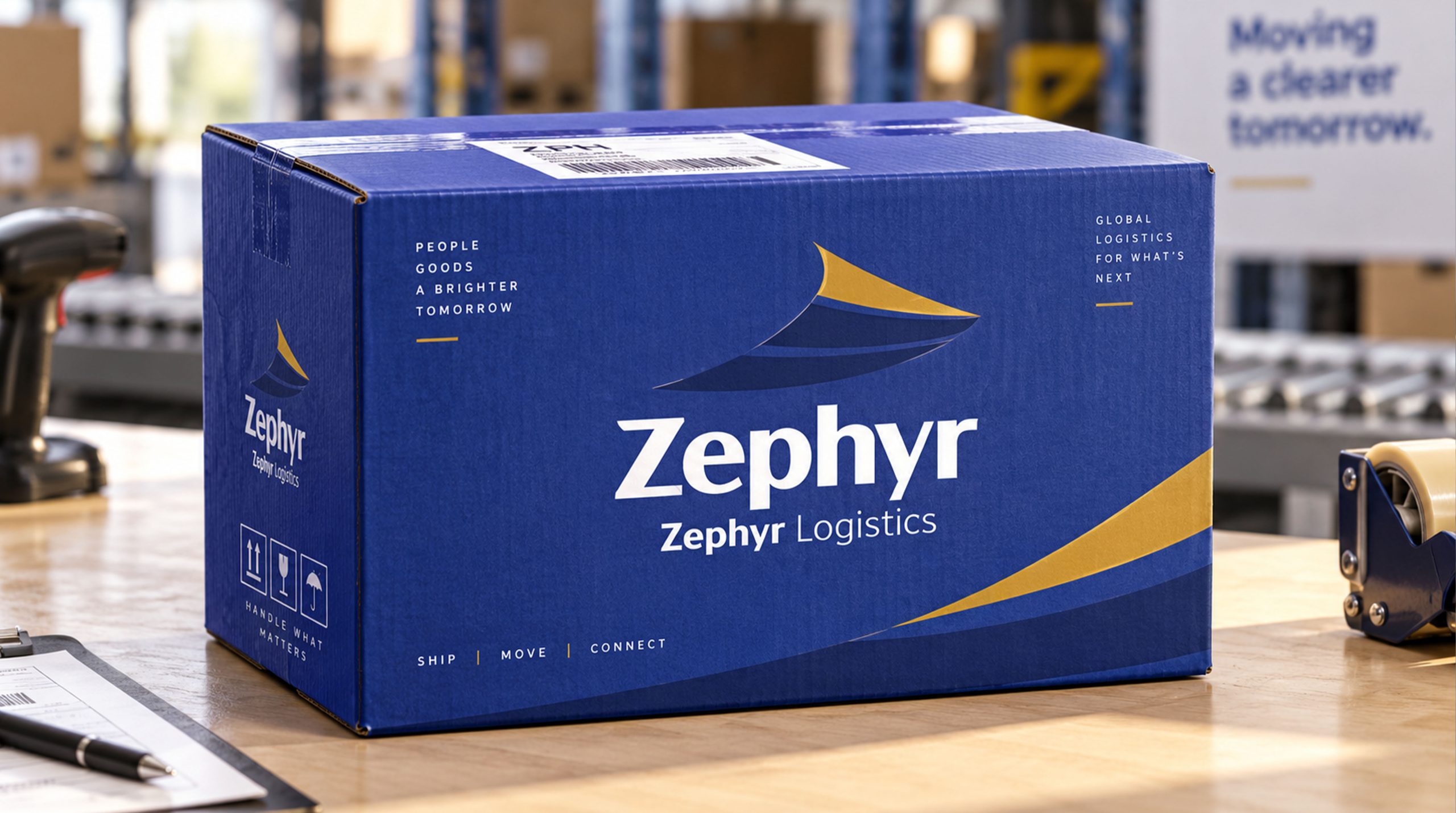
The mark centers on an abstract “bow,” symbolizing the spirit of global shipping and transoceanic routes. It is formed by two flowing, extended lines, representing “the direction of the wind” and “a sense of speed.” Blue stands for the deep sea and stability; gold stands for value and distinction. Together they create a dynamic visual balance that expresses the company’s balance between “efficiency and trust.”
Font design and combination relationship
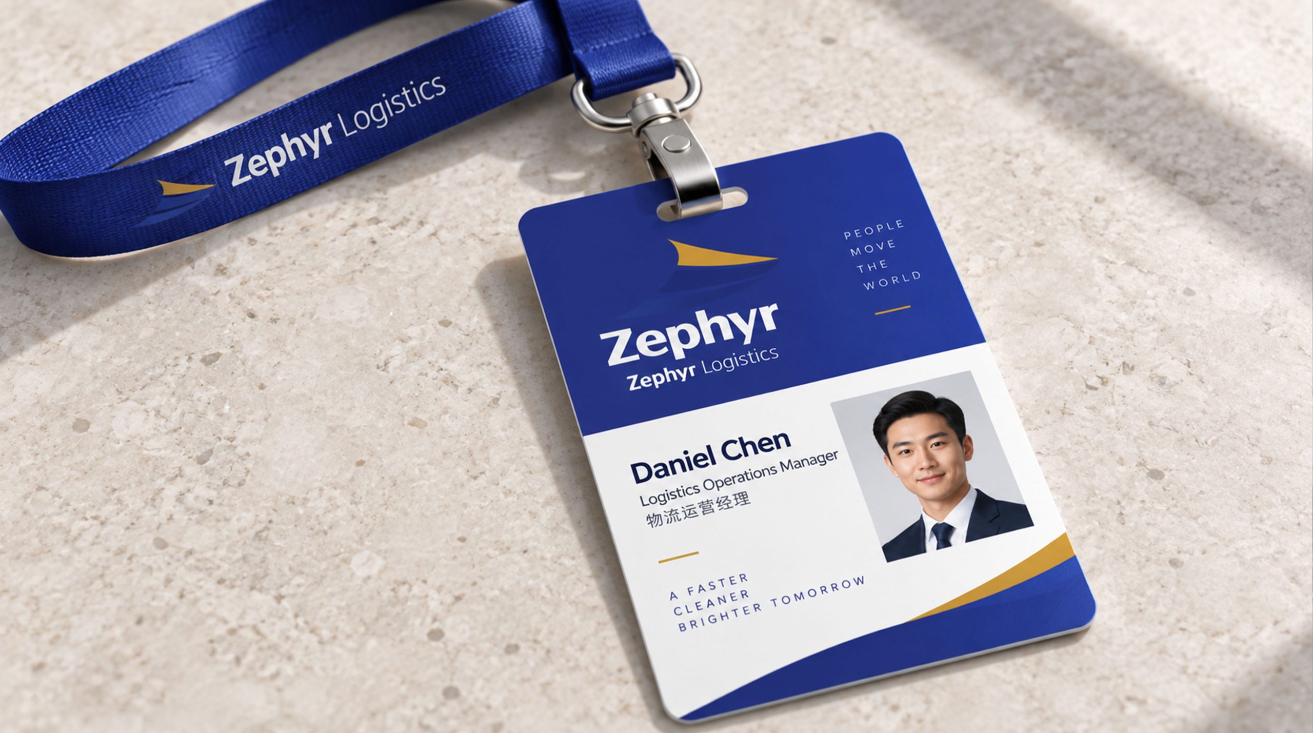
The Zephyr wordmark uses a clean sans-serif with a weight that is steady yet sharp, echoing the sense of speed in the graphic. Below it, the subtitle Zephyr Logistics is set in a light weight, establishing a clear primary and secondary hierarchy. White type on a deep blue background creates strong contrast, conveying an international, technology-driven character.
Color Meaning and Visual Psychology
Blue: trust, technology, expertise. The defining color of the logistics industry. Gold: value, honor, vision, reinforcing the brand's premium position in international logistics. Together, the two colors feel both steady and dynamic, forming the company's core visual impression: speed within stability.
Extensions and Applications
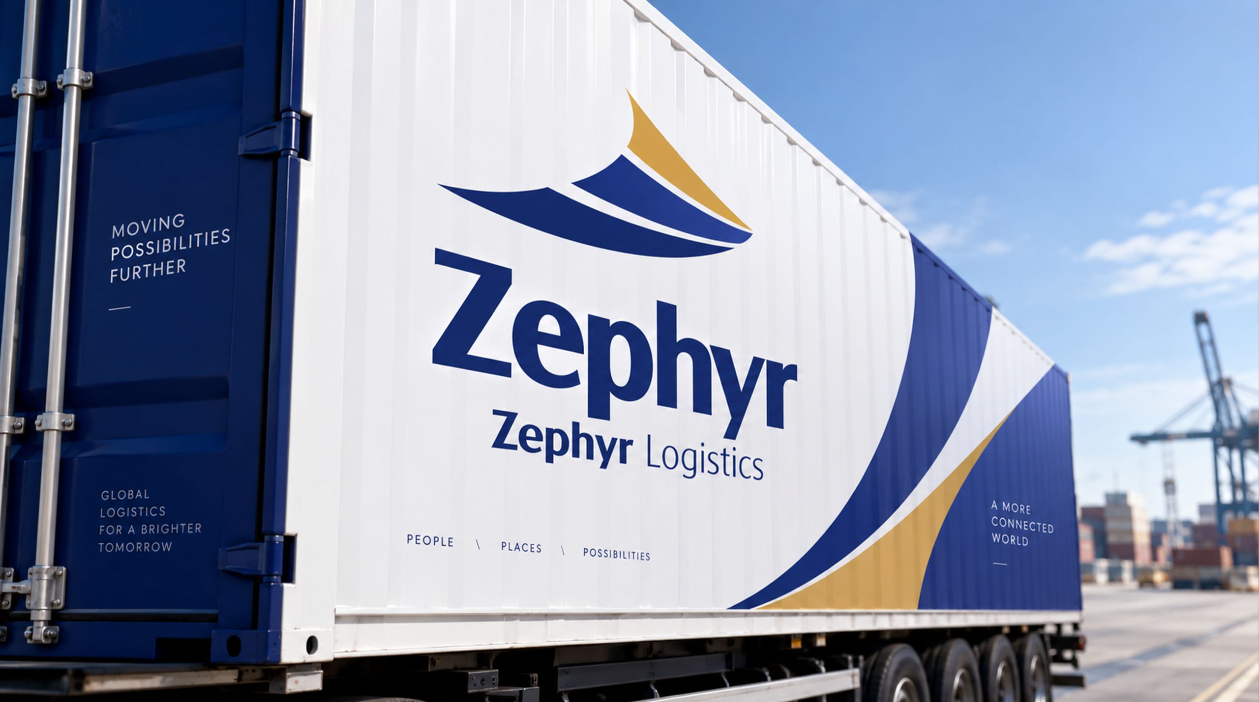
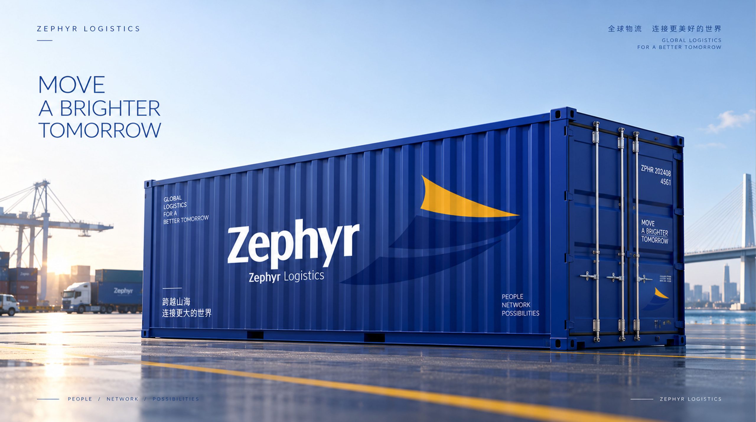
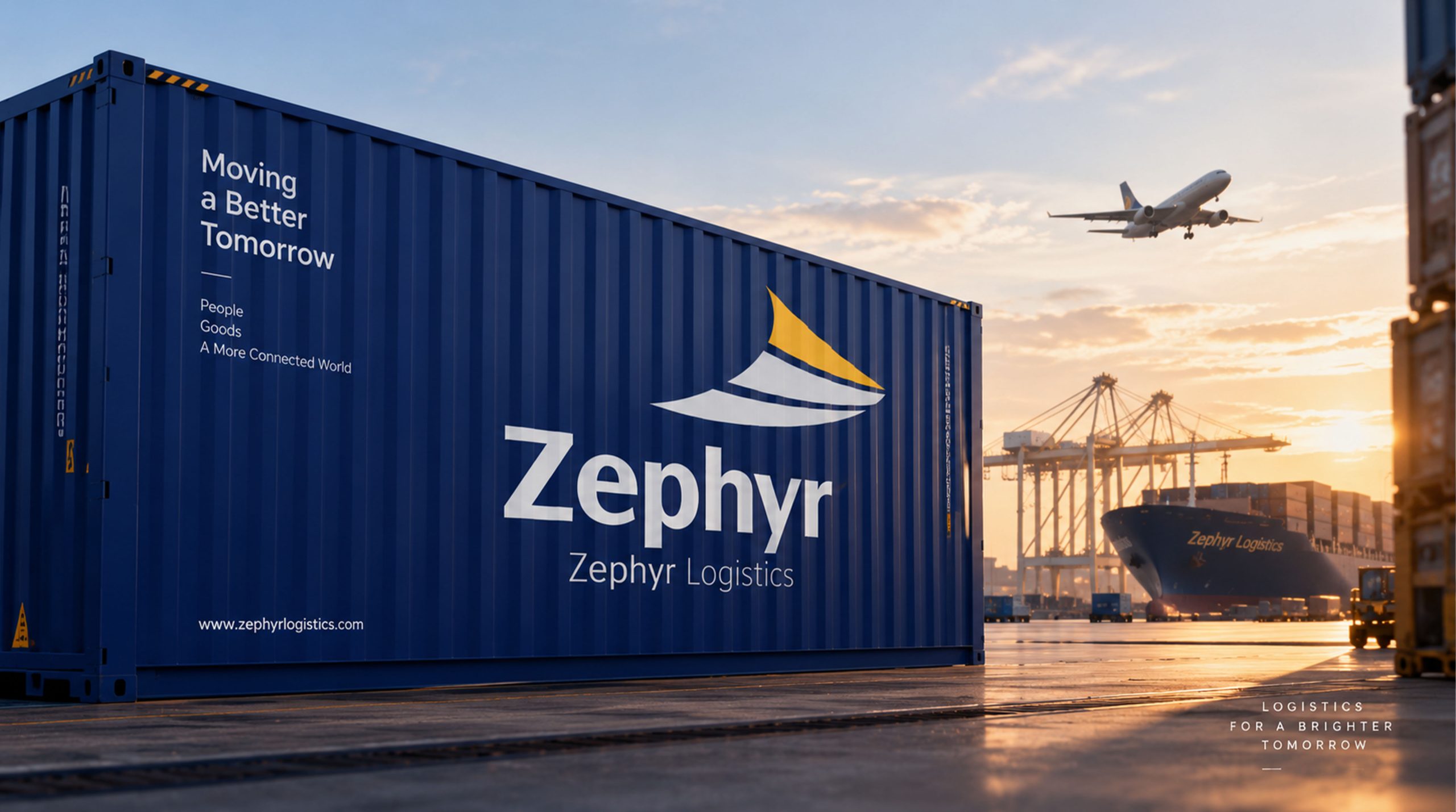
The mark remains highly recognizable across media: it creates strong consistency on shipping containers and warehouse vehicles, scales cleanly on digital interfaces and ticketing systems, and becomes a visual symbol of “moving with the wind, worldwide” in brand communications.