










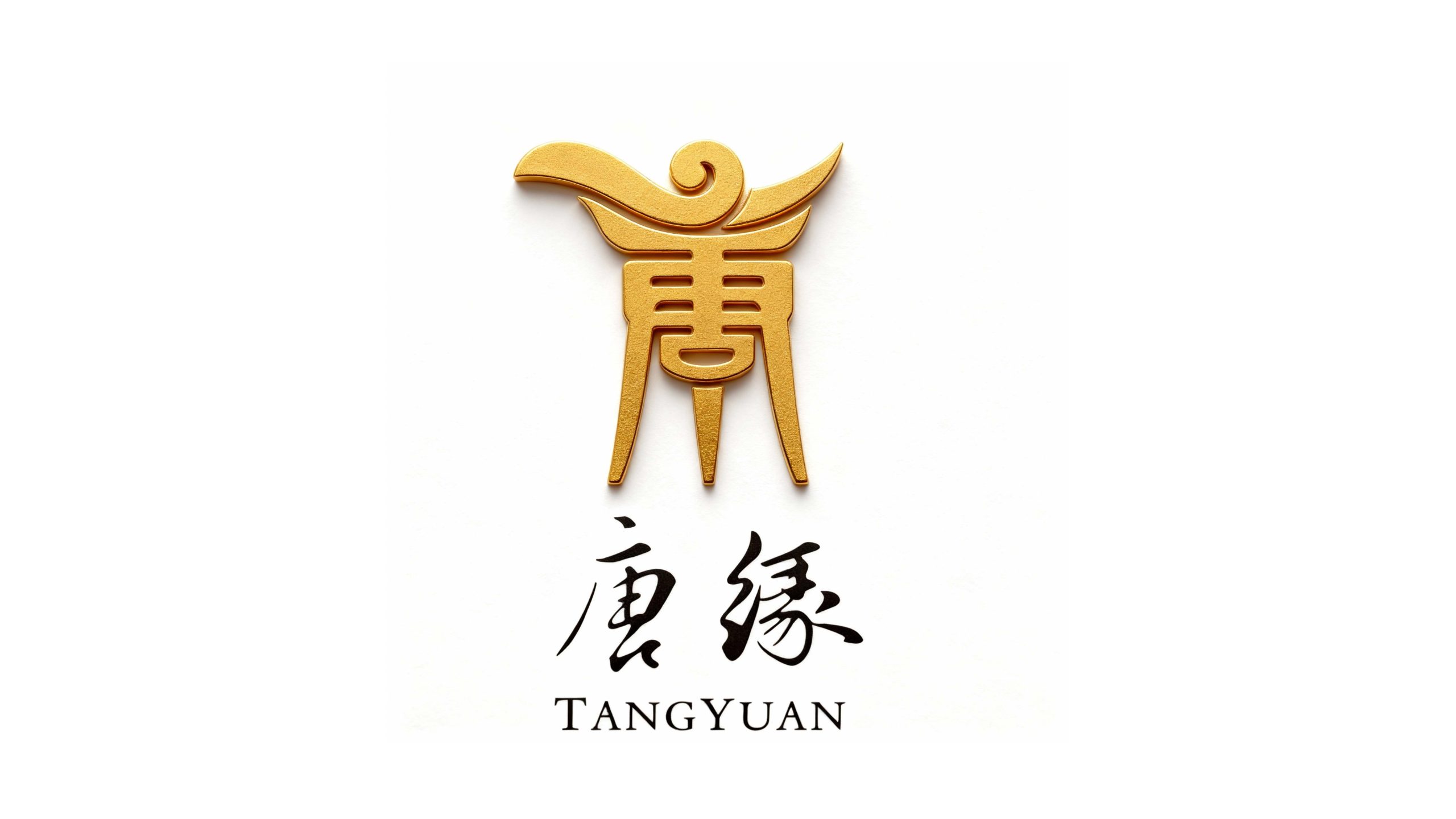
TangYuan is a restaurant brand focusing on traditional Chinese catering and high-end banquet services. It is committed to inheriting Chinese beauty culture with ingenuity and connecting modern and elegant life with quality.
The brand hopes to present a balanced state of "classical elegance x contemporary sophistication" through a visual system that combines traditional charm with modern temperament.
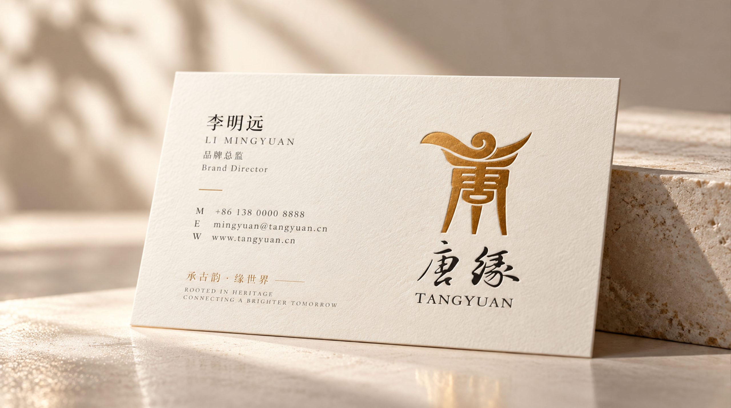
design concept
The core concept of the logo is derived from the concept of "Tang Dynasty Elegance". The design is based on the Chinese character "Tang", which symbolizes the profound heritage and prosperity of Chinese catering culture, and represents nobility and inheritance. The flying wing shape at the top of the glyph reflects the auspicious image of "Feng Dancing in the Nine Heavens", and the metallic three-dimensional presentation symbolizes the brand's high-end positioning and quality pursuit. The overall shape has both the profound heritage of classical culture and the exquisite tension of modern design, implying Tang Yuan’s mission of continuing to inherit Chinese food culture and innovating contemporary dining experiences. The organic integration of Chinese characters and graphics presents a perfect combination of classics and modernity, making the brand more culturally rich and contemporary.
Graphic composition and color system
The graphic structure of the word "Tang": represents the profound inheritance of Chinese culture and the cultural foundation of the brand. The shape of flying wings and auspicious clouds: the spread of wings on the top, which means auspicious flying and prosperity; the stable tripod base: the shape of two feet below, symbolizing the stable foundation and century-old heritage of the restaurant; the integration of ancient and modern: the combination of traditional Chinese characters and modern three-dimensional design, representing the symbiosis of classics and innovation. The brand name "Tang Yuan" adopts traditional calligraphy fonts, with elegant fonts and flexible pen and ink, consistent with the classic temperament of the logo.
The English "TangYuan" uses a modern sans-serif font to convey the brand's "internationalization in tradition". The Chinese and English combined version adopts top-to-bottom layout and is centered overall to strengthen the sense of visual solemnity and cultural communication attributes.
Noble gold #C9A227: symbolizes nobility, inheritance and cultural heritage; gloss gradient #D4AF37#B8860B: represents prosperity, glory and quality; steady black #1A1A1A: symbolizes calmness, solemnity and classic eternity. Gold and black blend in contrast to form a visual balance of "nobility and calmness", "classic and modern", and build a high-end and elegant brand impression.
Application extension and brand significance
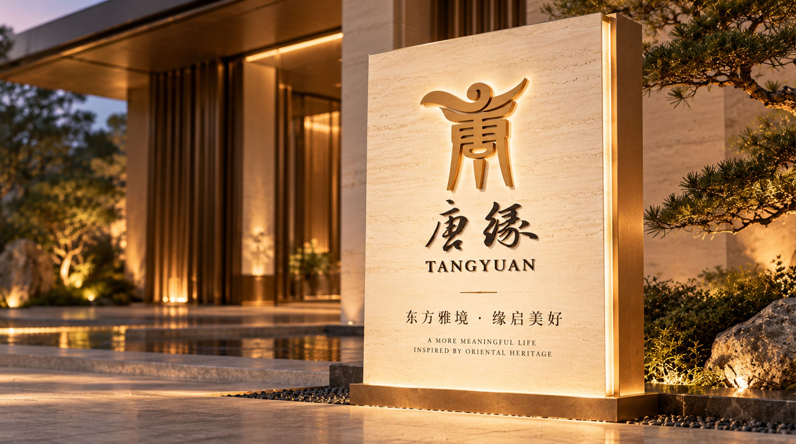
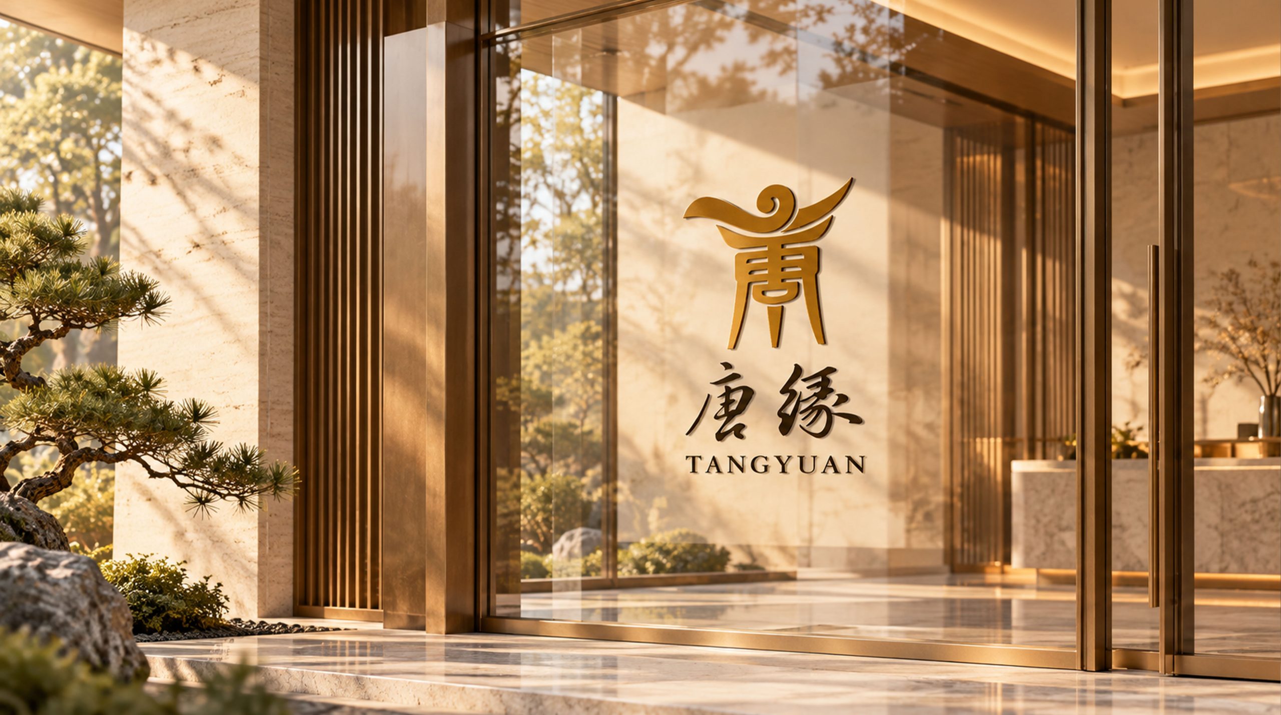
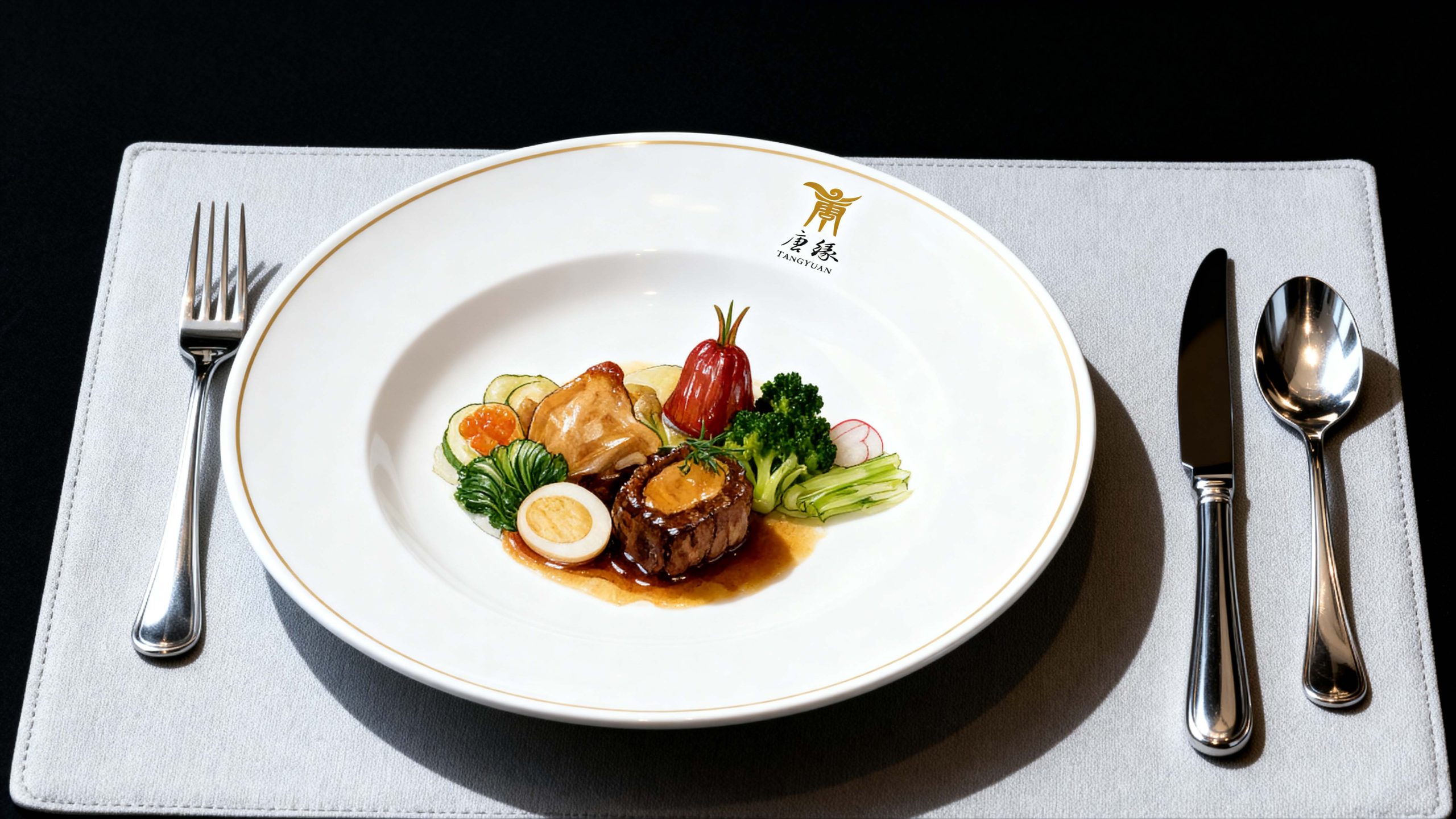
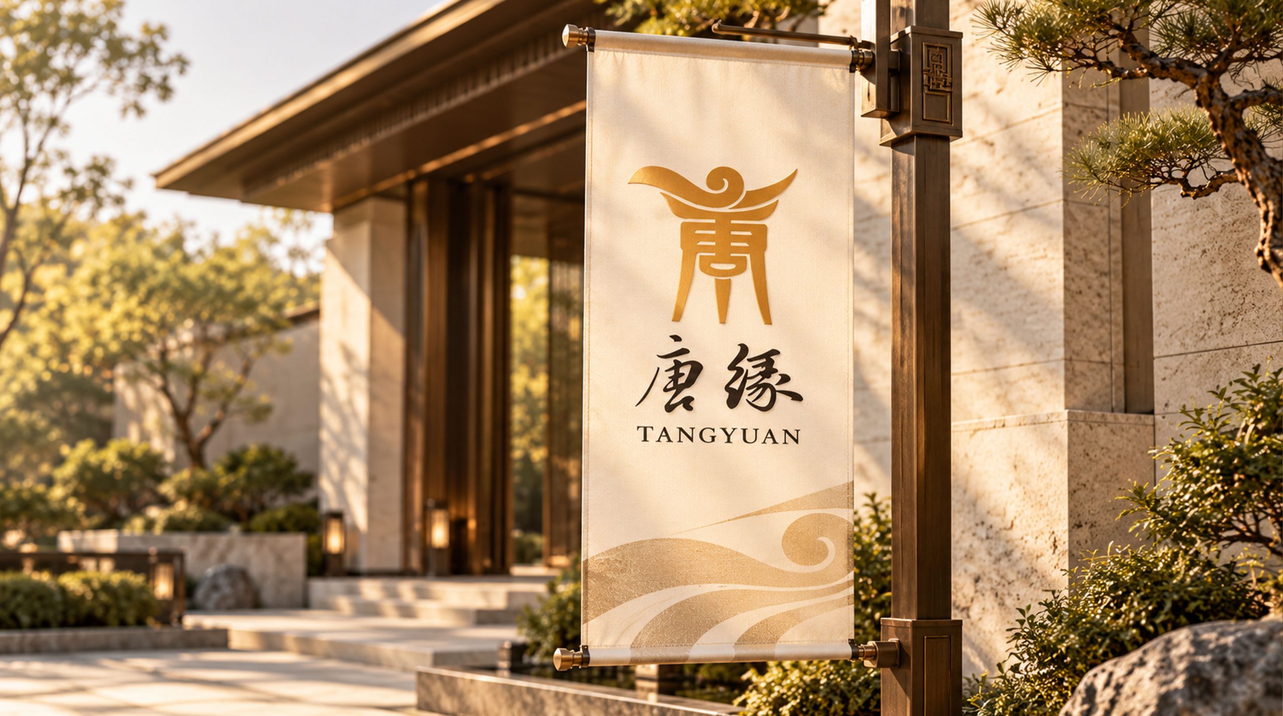
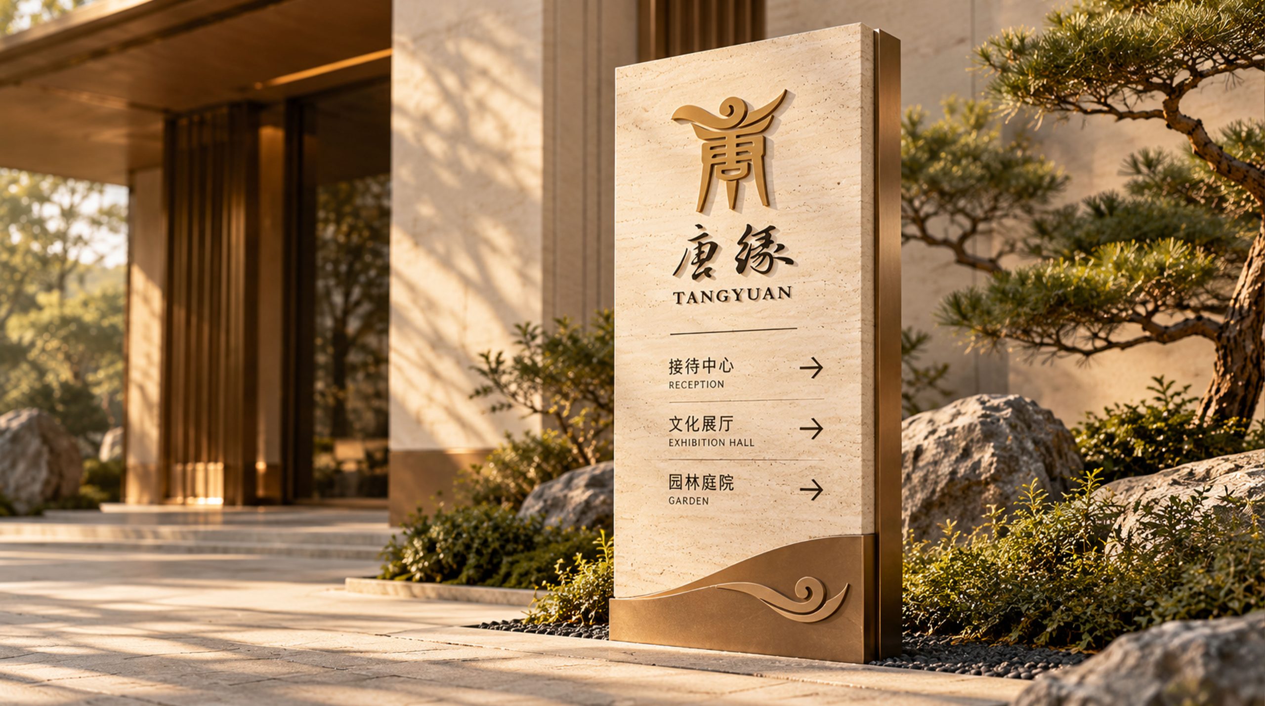
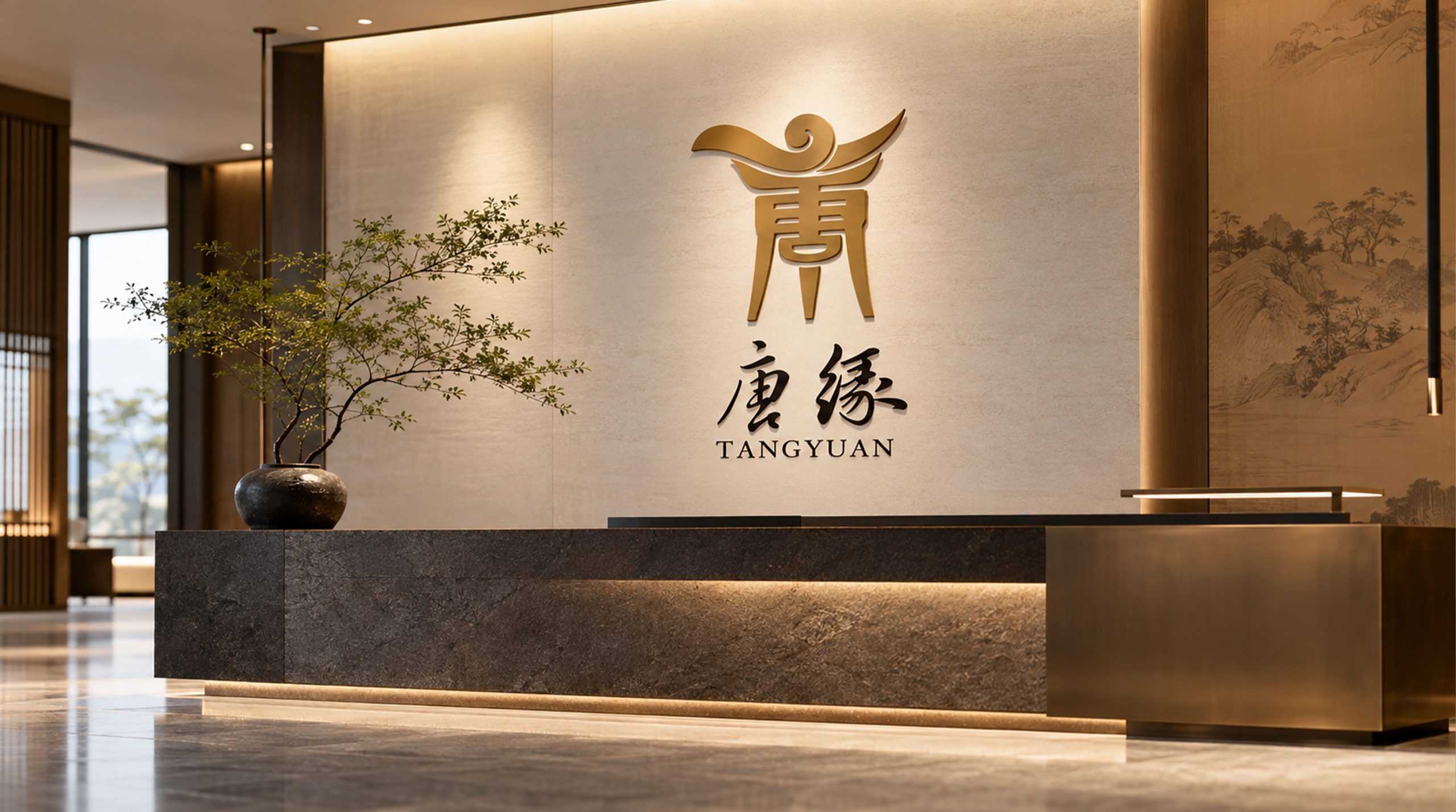
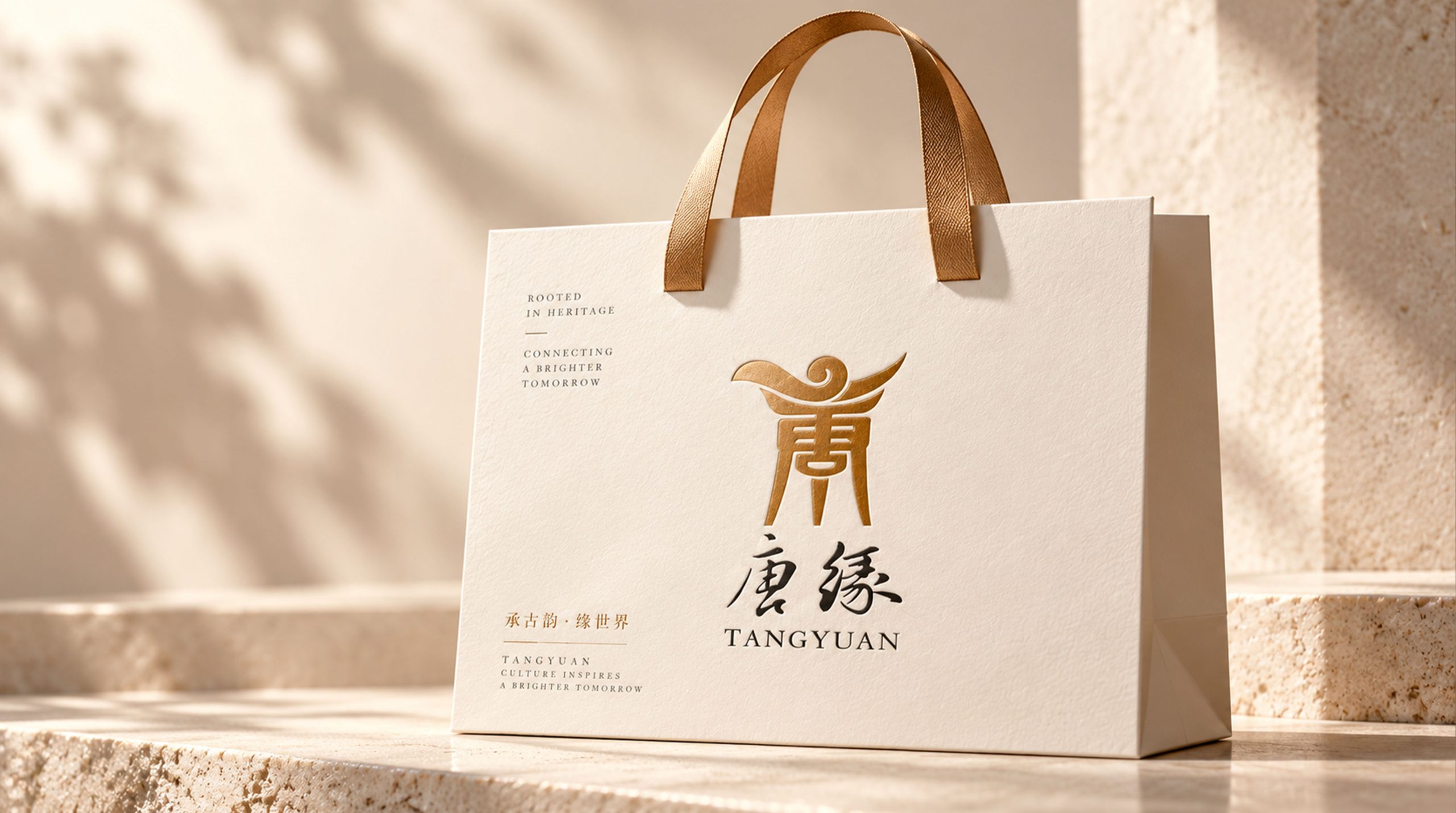
The logo has strong cross-field adaptability: corporate level: applied to restaurant fronts, brand launches, banquet halls and corporate culture displays; product level: suitable for menu design, tableware and souvenir packaging logos; spatial level: forming a unified visual language in restaurant spaces, wayfinding systems and cultural decorations. In the dynamic version, the flying wings can be used as a "wings-spreading animation" or auspicious cloud flowing animation, symbolizing the continued vitality of cultural heritage.
The Tang Yuan logo embodies the dual values of "classical elegance and contemporary sophistication": the word "Tang" → the profound inheritance of styling culture; gold → the noble quality commitment; flying wings and auspicious clouds → the symbiosis of classics and modernity. This is not only a brand identification symbol, but also a visual expression of a catering philosophy - using the ancient charm of the Tang Dynasty to connect the world's delicious food.
design results
After the release of the new visual system, Tang Yuan has become an iconic brand image in the domestic high-end Chinese catering field. The golden "Tang" character and the flying wing shape are widely used in restaurant image, banquet service, and cultural promotion. With the visual expression of "classical structure × modern language", it has established a new aesthetic standard in the field of Chinese catering. This case represents the mature expression of the brand in the direction of traditional culture, high-end catering and systematic visual language design, achieving the unification from "cultural design" to "catering philosophy".