










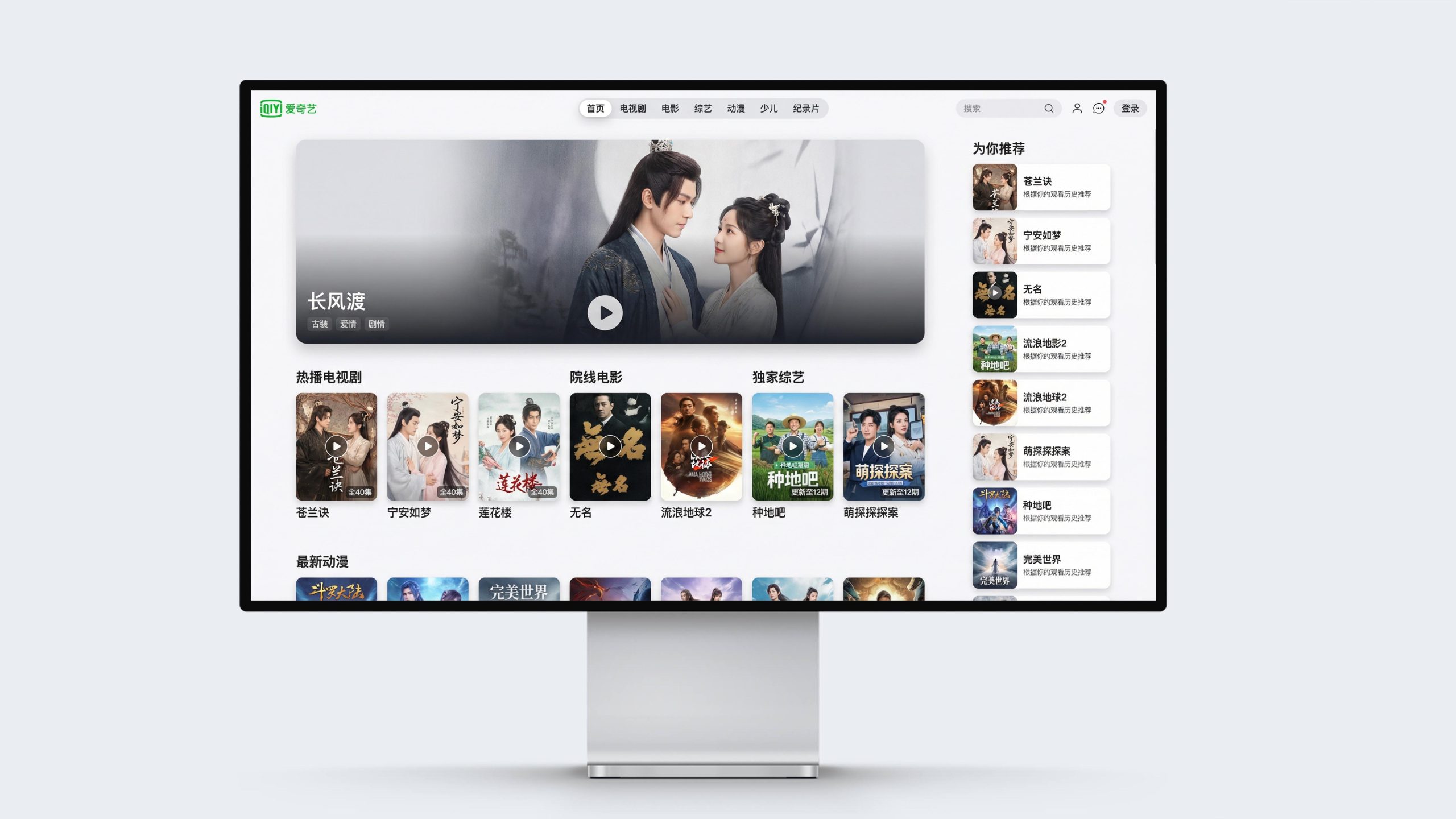
This project is to design the web page and multi-terminal visual system for iQIYI, aiming to jointly build the brand temperament of the platform with the immersive experience of high-quality content and the precise touch of intelligent recommendations.
The design goal is to present the platform's brand characteristics of "enjoy quality" through systematic visual structure and content narrative.
The overall theme is "Content is Experience·Immersive Viewing", integrating the vitality of entertainment and the intelligence of technology, demonstrating the content layout and user experience level of iQiyi as China's leading video platform.
design challenge
iQiyi is not only China’s leading video content platform, but also an important entrance to users’ entertainment life. The design needs to achieve the following balance in the visual language: sense of content x sense of order: it must not only reflect the richness and diversity of massive content, but also convey clear information levels and browsing efficiency; sense of immersion x sense of functionality: it must not only maintain the visual impact and emotional tension of film and television content, but also show the convenience and smoothness of platform operations; sense of brand x sense of flexibility: it must not only continue the brand recognition of iQiyi Green, but also incorporate personalized expressions of different content categories. The core challenge is - how to make the design combine content immersion and interaction efficiency, so that the platform is both visually stunning and pleasurable to use.
Strategy and philosophy
The project takes "immersion in content and smooth experience" as its core design concept. Visual philosophy: Based on the dual-line logic of "content priority and efficiency" as the visual basis, it embodies the charm of film and television and the convenience of interaction; Structural logic: adopts a modular responsive architecture to organize content information hierarchically, forming a multi-dimensional structure of "focus, classification, recommendation and discovery"; Color system: pure white background + iQiyi green + dark immersion mode The main color, supplemented by the rich colors of content posters, symbolizes freshness, vitality and concentration; graphic language: card-style layout, rounded rectangle, gradient mask and dynamic suspension effect are integrated to establish a "visual system under the content order"; interactive expression: the introduction of intelligent recommendations, personalized playlists and multi-terminal seamless connection, making the platform both intelligent and humane. Core concept: Use visual immersion to present the charm of content, and use interactive design to continue the smooth experience.
Design presentation
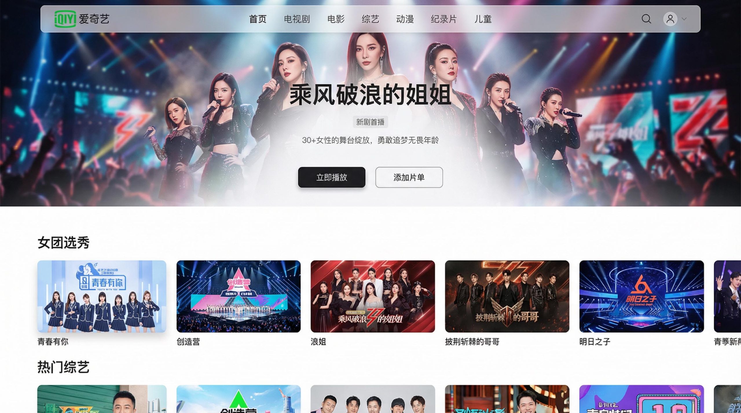
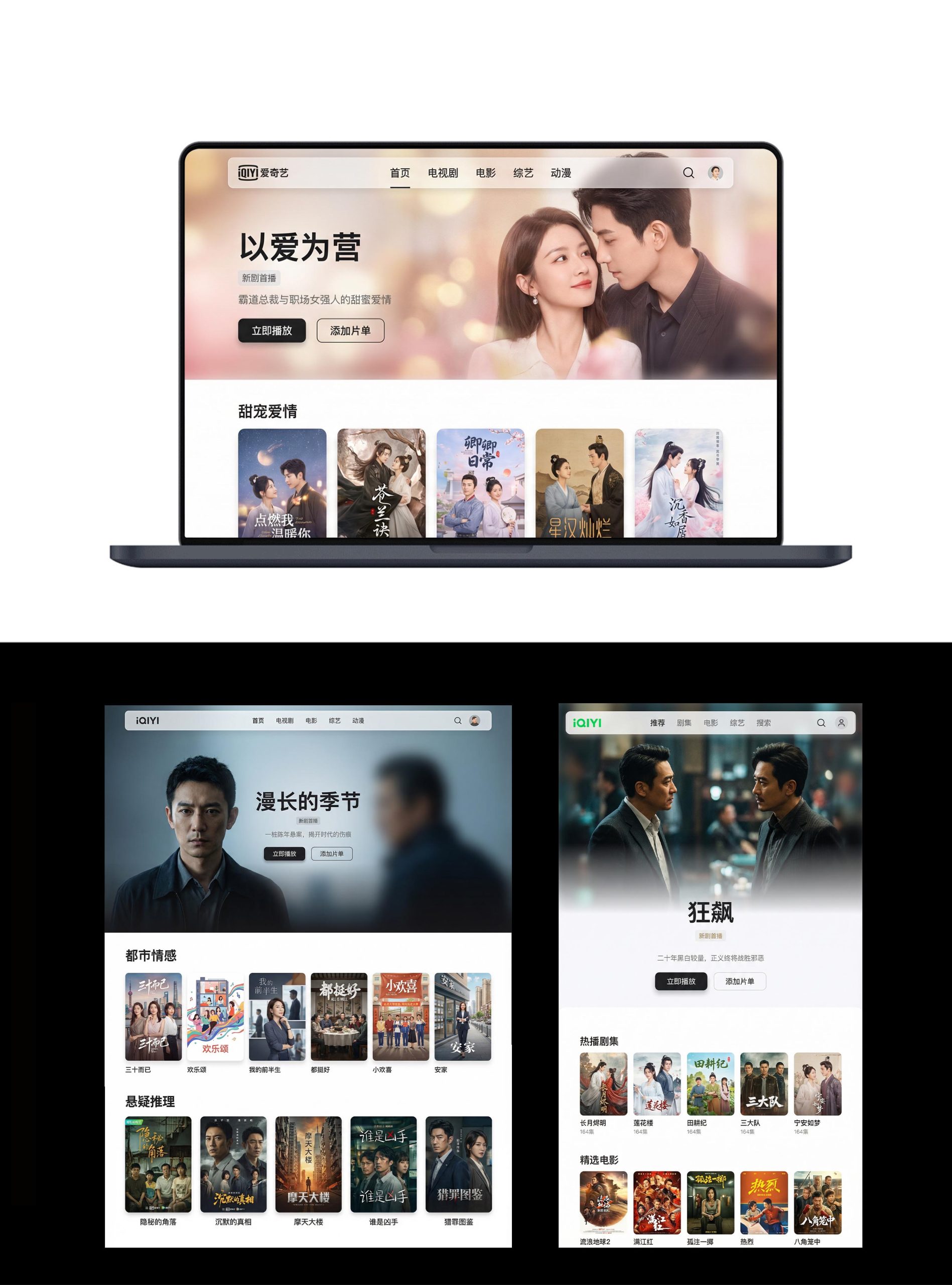
Home page design: The main colors are pure white background and iQiyi green navigation, reflecting freshness and brand recognition; a large carousel of drama posters is used as the visual focus at the top, supplemented by play buttons and concise information; the navigation uses category tags and search portals to convey an efficient browsing pattern. Content logic: 1. Popular TV series; 2. Theater movies; 3. Exclusive variety shows; 4. Latest animation; 5. Recommended for you; 6. VIP area.
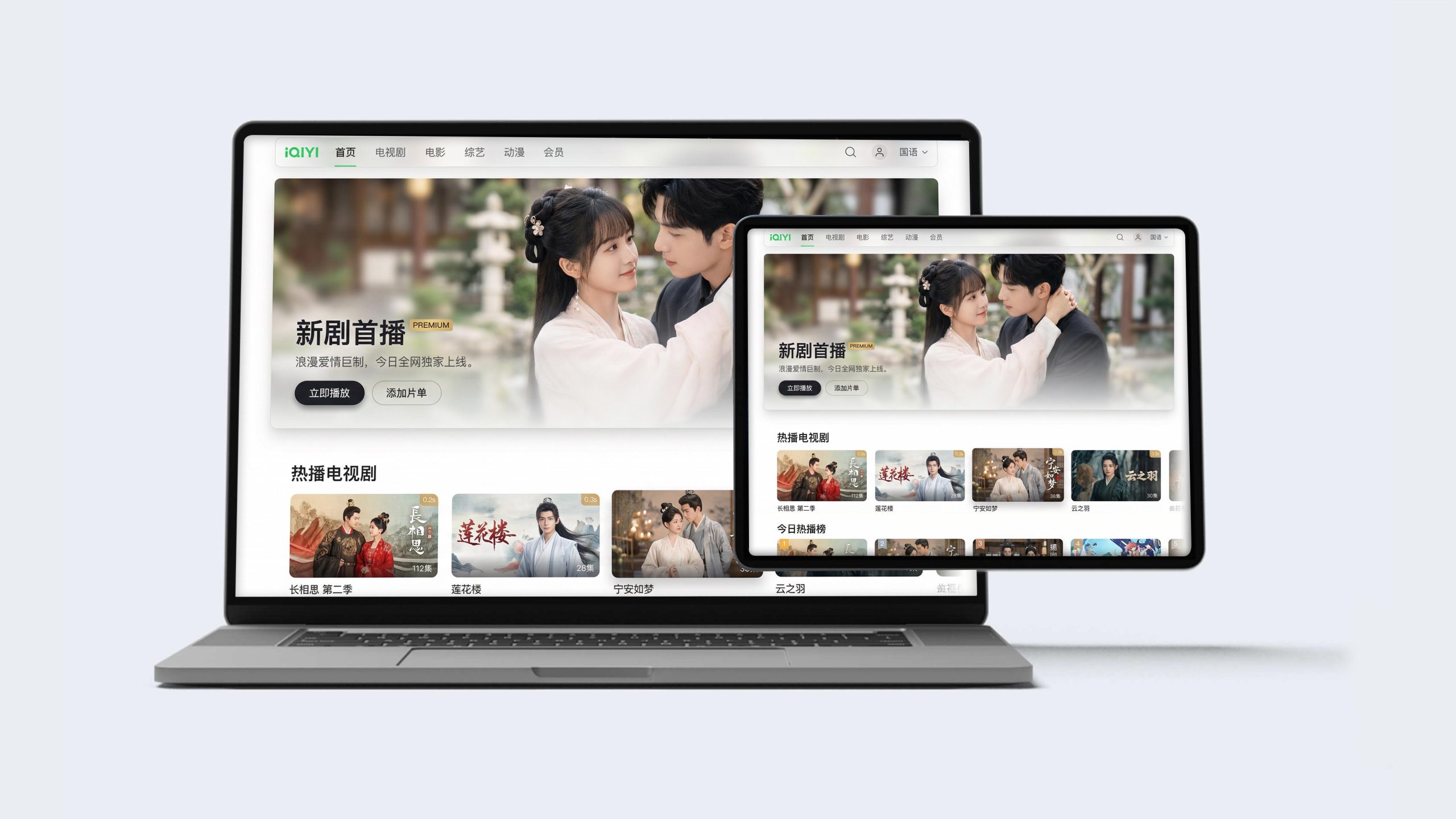
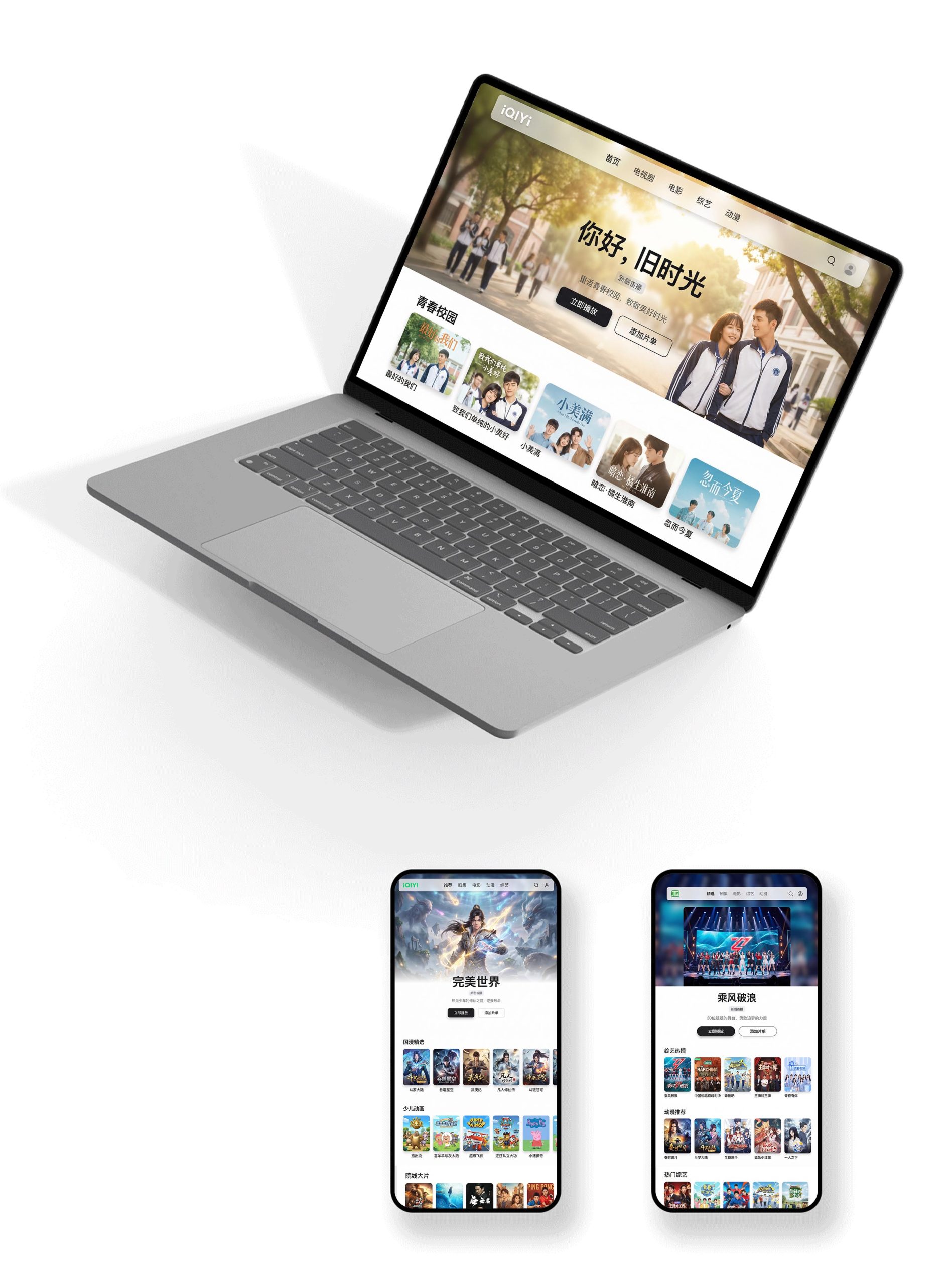
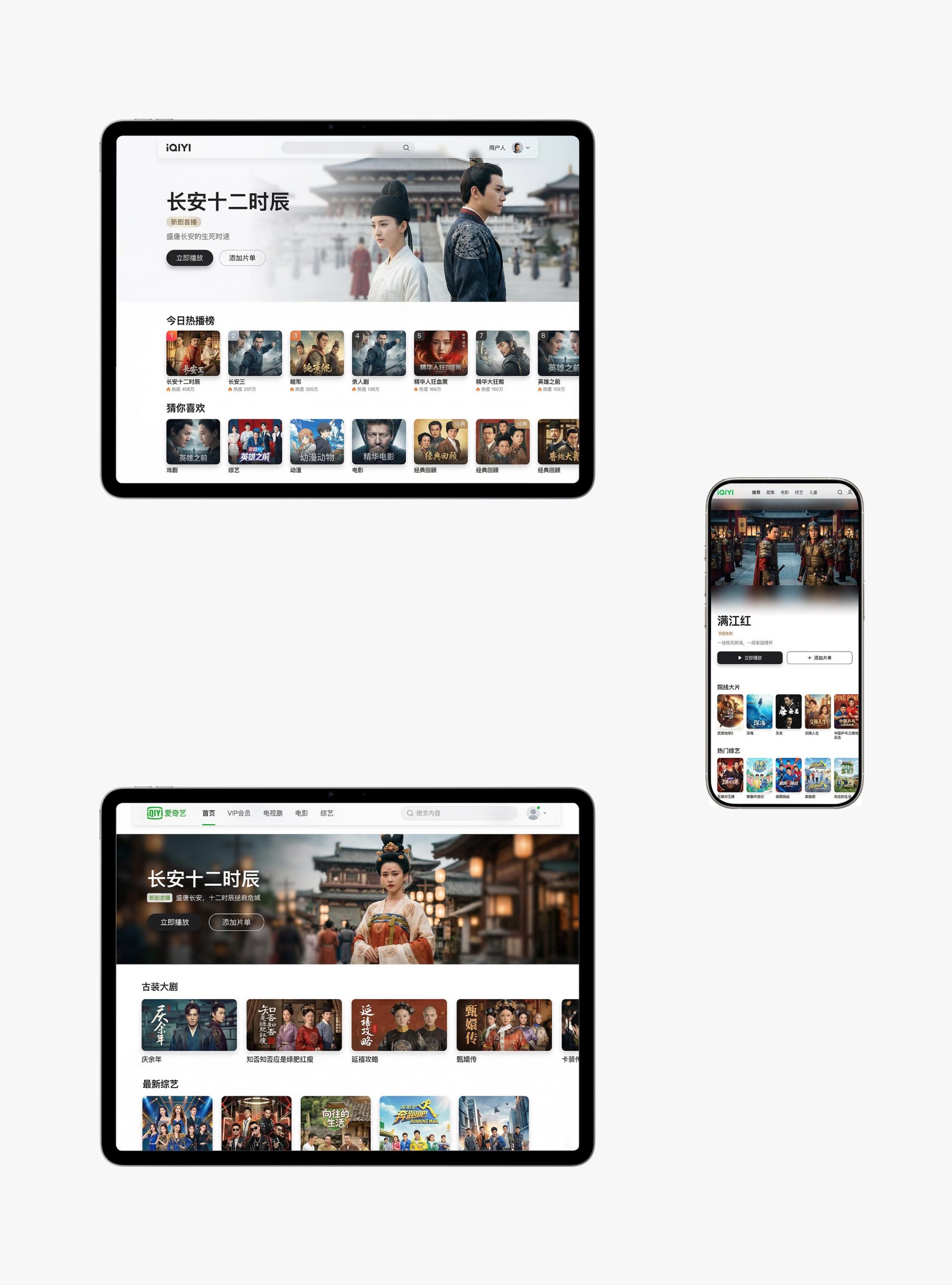
Multi-terminal design: Responsive structure: adaptive presentation on desktop, tablet and mobile terminals, forming a “consistent Technology and experience: Use lazy loading + preloading + infinite scrolling; synchronize playback records on multiple terminals to ensure a seamless cross-device experience. The overall style reflects "immersion of content x smoothness of interaction x consistency of experience".
Achievements and Impact
As the official visual system of the platform, this design is widely used in user engagement on web pages, APPs and smart TVs. Through the integration of content logic × interactive narrative × brand order, the design successfully created iQiyi’s visual image of “both content depth and experience height”. The project is considered by the platform to be "one of the most immersive and user-friendly visual systems" and has become the core blueprint for iQiyi's multi-terminal experience design.