










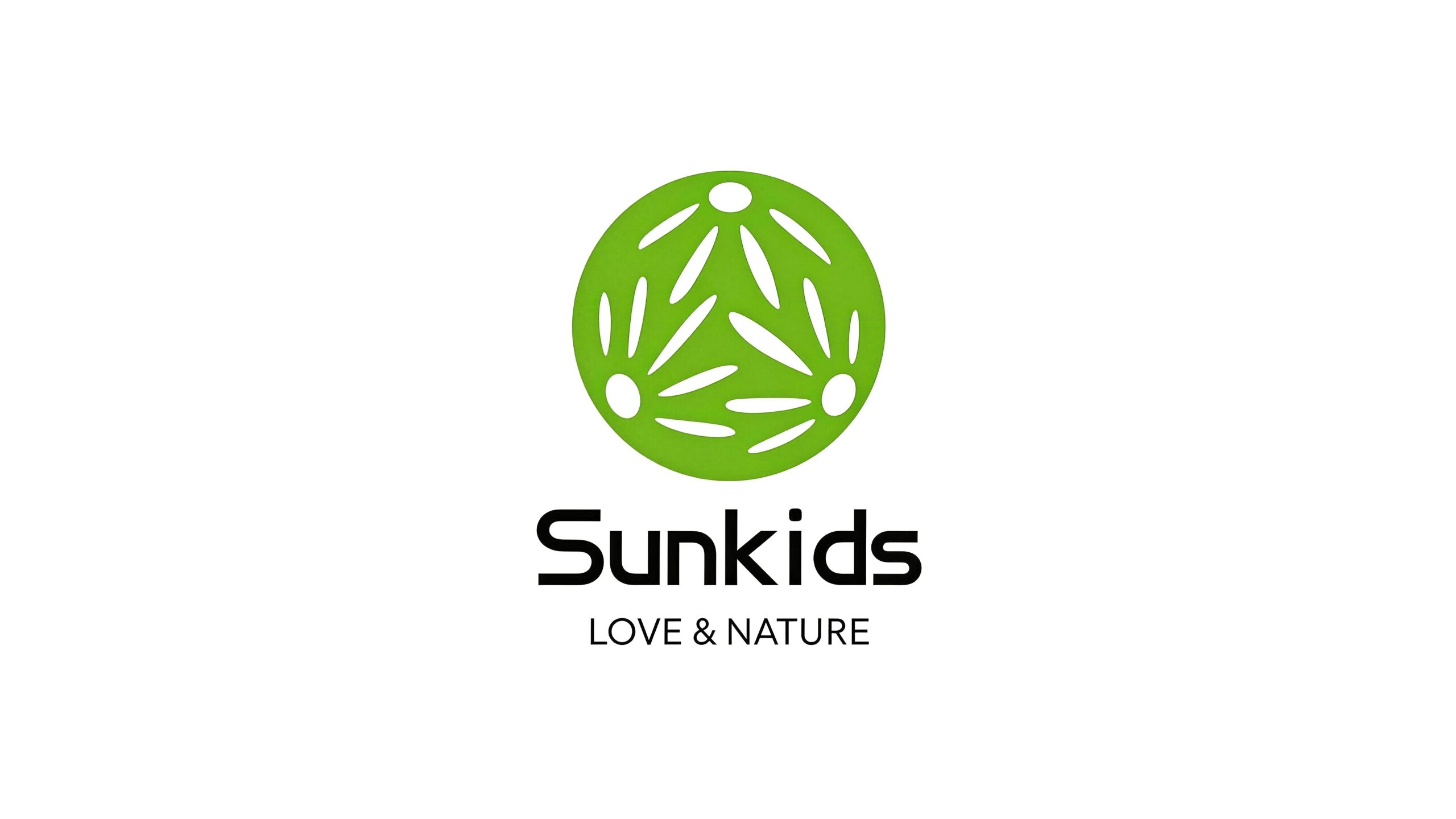
Sunkids is a children's education brand with "love and nature" as its core concept. It is committed to using happy teaching methods to let children grow up healthily in the company of sunshine, nature and love.
The brand name "Sunkids" means "children under the sun" and advocates the educational concept of respecting children's nature and returning to nature, so that every child can learn in happiness and grow in play. Qingmei Future was commissioned to lead the brand identity design.
The design goal of the brand logo is to demonstrate Sunkids' industry positioning as a children's education brand through the visual language of natural vitality, childlike warmth and educational concepts, and to convey the brand spirit of "happy teaching, love and nature".
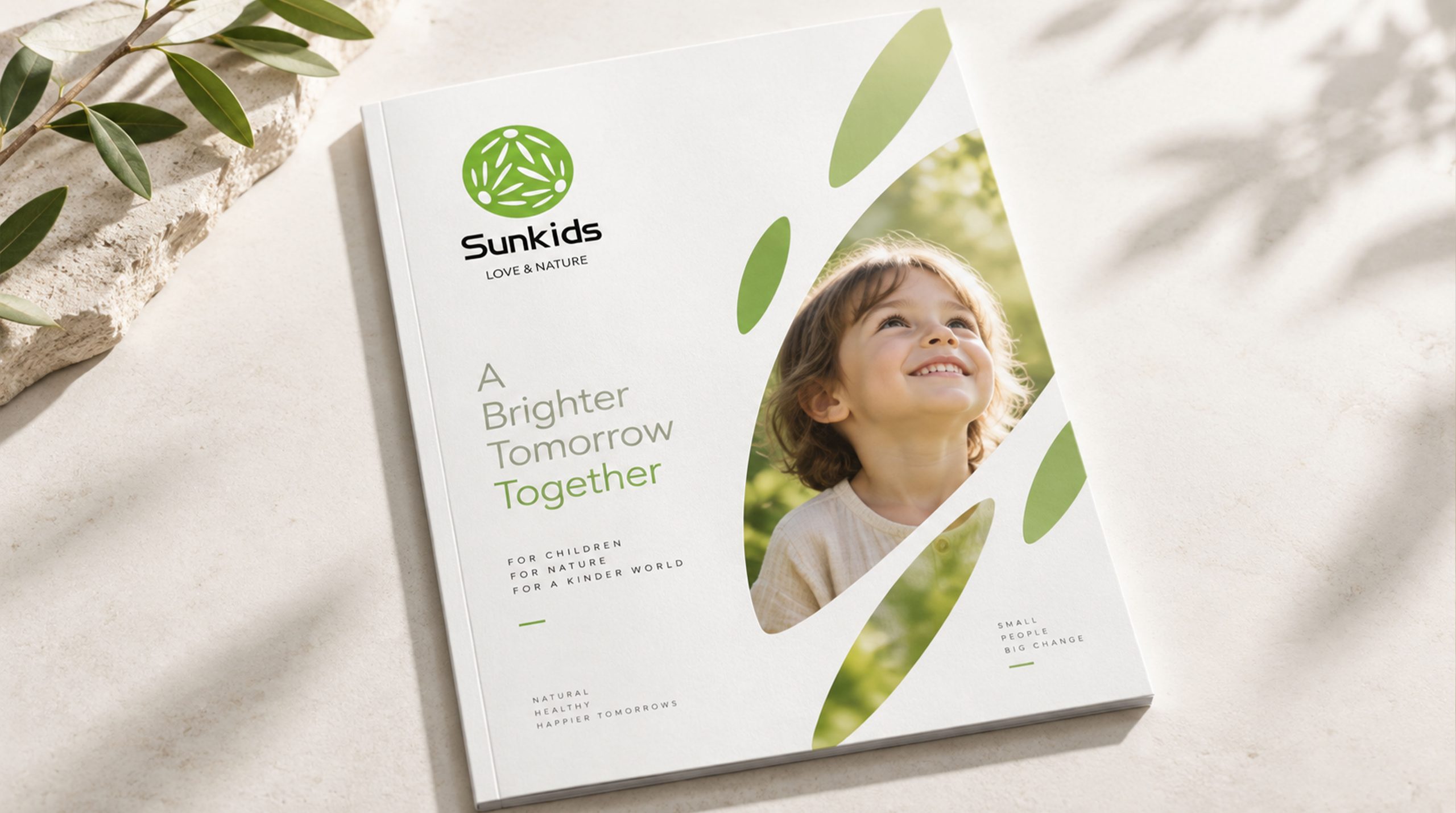
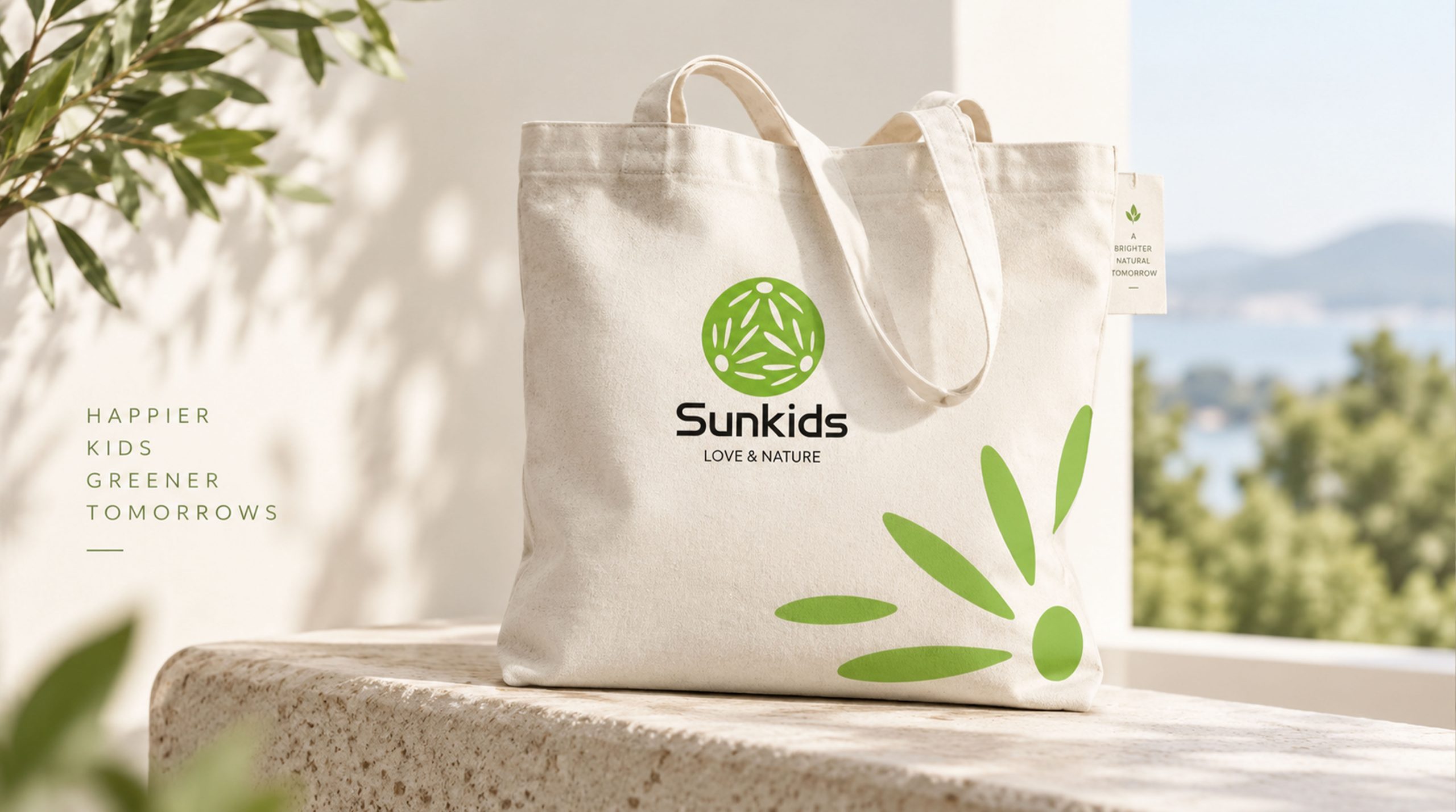
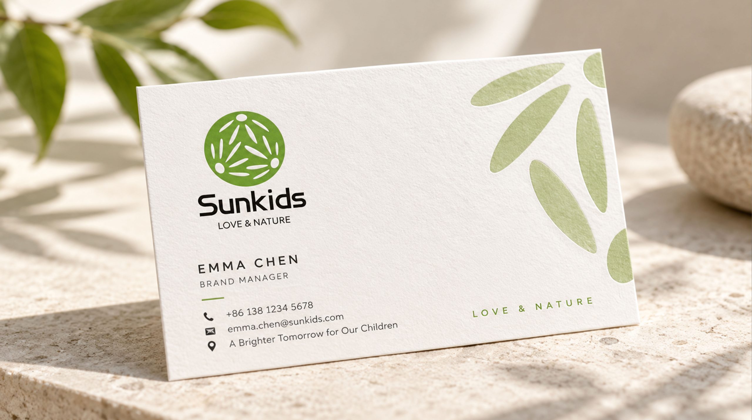
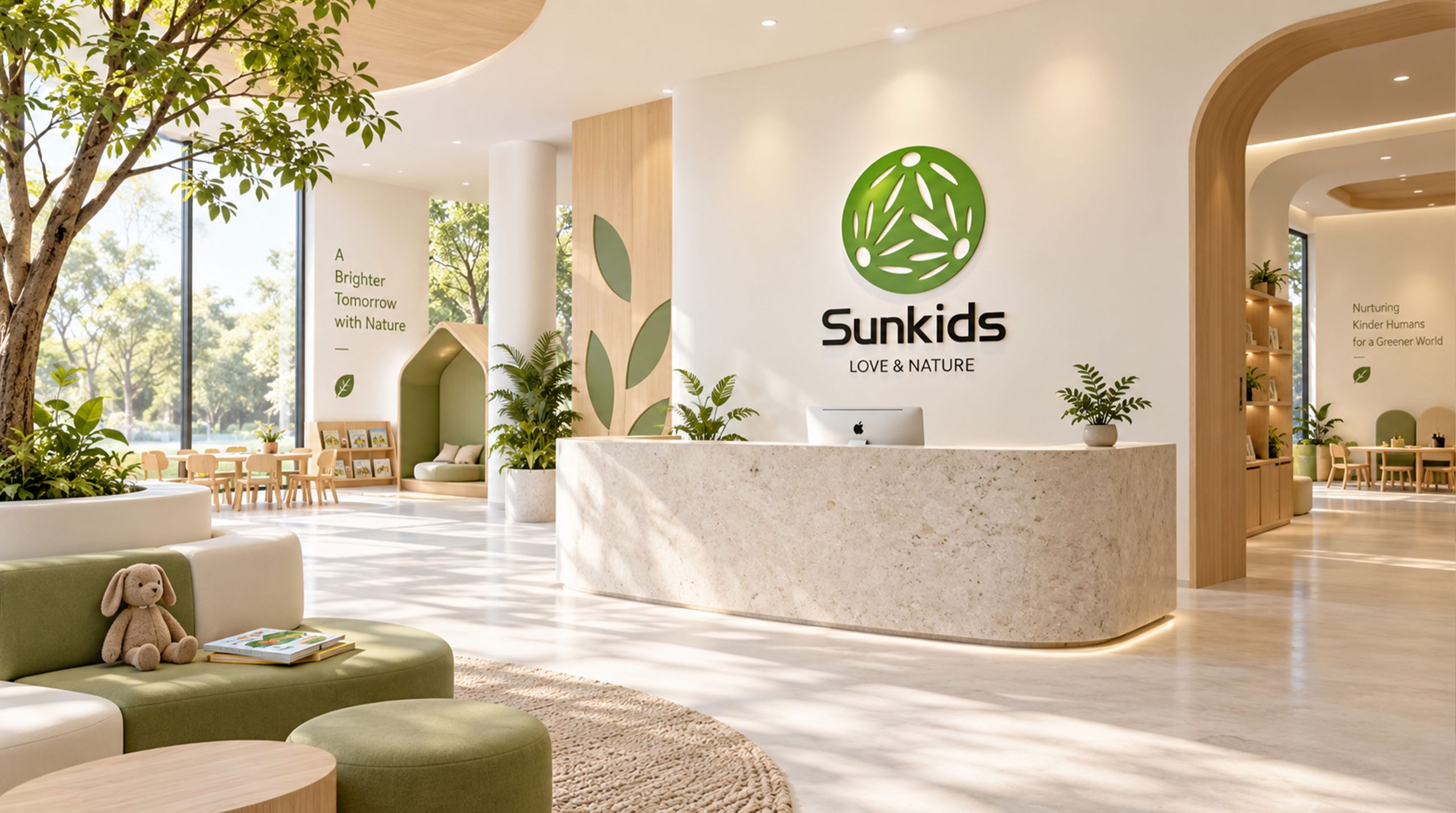
Design concept and graphic language
The logo takes "Three Children Hand in Hand" as its core concept and uses a vibrant green circle as its main body. The interior of the circle cleverly incorporates an abstract graphic of three children holding hands and dancing happily. The bodies of the three children are presented in the form of simple leaves, and their limbs are transformed into lines of branches and leaves extending outwards. They are connected to each other hand in hand and form a circle. It captures the beautiful moments of children's happy games and embodies the core concept of Sunkids' happy teaching. The overall design integrates the innocence and vitality of children with the vitality of natural plants, reflecting the dual attributes of the Sunkids brand between happy education and natural growth.
The images of the three children are highly artistically refined, with the organic forms of leaves and branches replacing the figurative human forms. The "body" of each child is a full elliptical leaf, and the "arms" are transformed into slender branches and leaves extending to both sides, which naturally meet and connect with the branches and leaves of the adjacent children, forming a triangular stable structure. The three circular "heads" are distributed in three equidistant directions of the circle, like the three-petal heart of a flower, conveying the educational values of equality, harmony and unity. The blank space between leaves and branches creates a spot effect of sunlight penetrating the canopy, giving the graphics a sense of breathing and natural agility. The circular structure formed by three children symbolizes the cycle and transmission of education - happiness is passed from one child to another, and love and nature flow endlessly among the children. The overall graphic is inscribed in a green circle. It is not only a happy children's game scene, but also a vibrant natural pattern. It is also an educational symbol symbolizing unity and growth. The overall composition constructs a "circle of joy" with organic and natural life forms, conveying the brand's educational warmth and natural concepts.
Font composition and color system
The English "Sunkids" uses a modern round sans-serif font, with rounded and full strokes and compact and powerful fonts. "S" is opened in uppercase and the rest of the letters are lowercase. The overall visual experience is friendly yet professional. The rounded corners of the letters echo the arcs of the leaves in the graphic, maintaining the unity of the brand’s visual language. The brand slogan "LOVE & NATURE" is arranged below the brand name in standard capital sans-serif font. The fonts are slim and regular, and the spacing is loose and even. It highlights the two core keywords of the brand - love and nature - in a restrained and elegant way. The clear hierarchy between Chinese and English ensures that the brand is highly recognizable and trustworthy in educational settings, market communications and parent communications.
The main color, Life Green #7AB800, is the core color of the logo, representing nature, growth, health and hope. Green is the color that best evokes the association of "nature" and directly reflects the core keyword of the brand "NATURE"; green also conveys the emotions of safety, security and vitality, which is in line with parents' trust and expectations for children's education brands. The children's pattern inside the circle is presented with white space. Pure white symbolizes the innocence and infinite possibilities of childhood. The contrast between white and green makes the pattern clearly visible on the green background, while giving the logo a fresh and breathable visual breath. The brand name "Sunkids" uses dark gray #333333, which is calm and restrained, avoiding the oppressive feeling of pure black and conveying the professionalism and affinity of the education brand. The overall color system is composed of green, white and dark gray, which is simple, natural, warm and fresh, reflecting the brand temperature of "growing in nature and learning in happiness". It is different from the serious and cold style of traditional education brands and conveys Sunkids' value proposition of "love and nature".
Application extension and brand significance
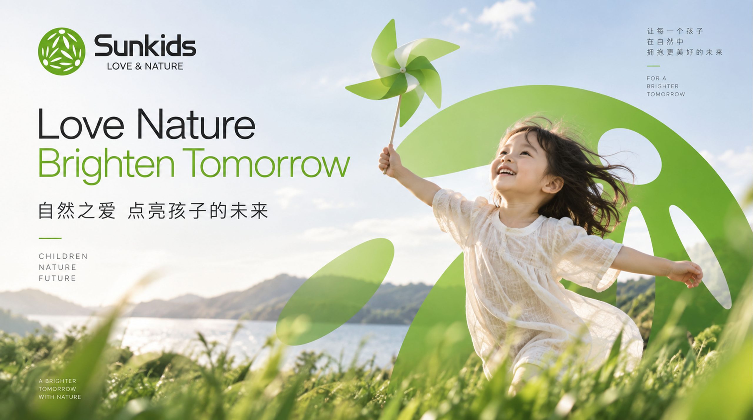
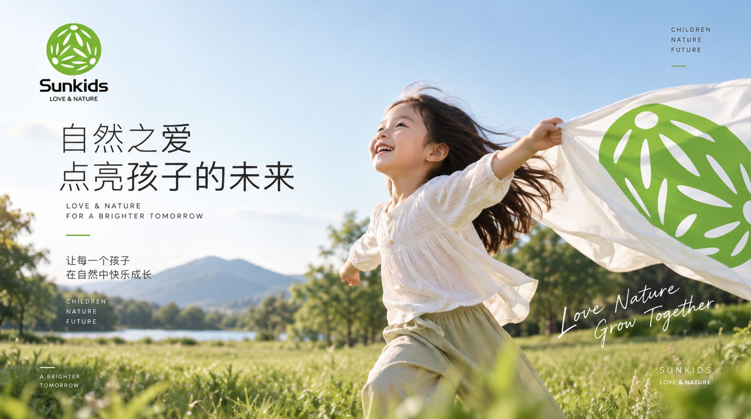
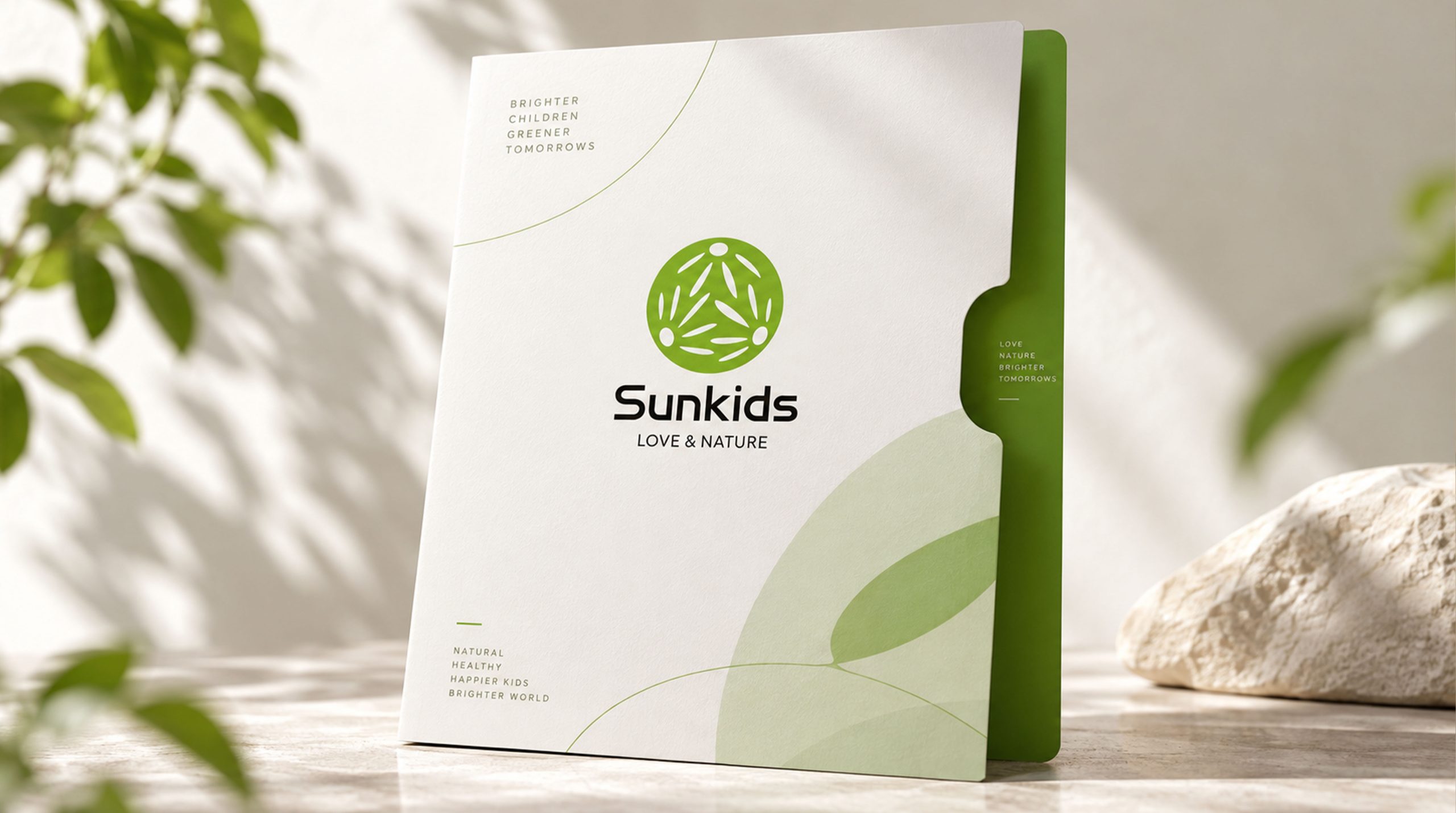
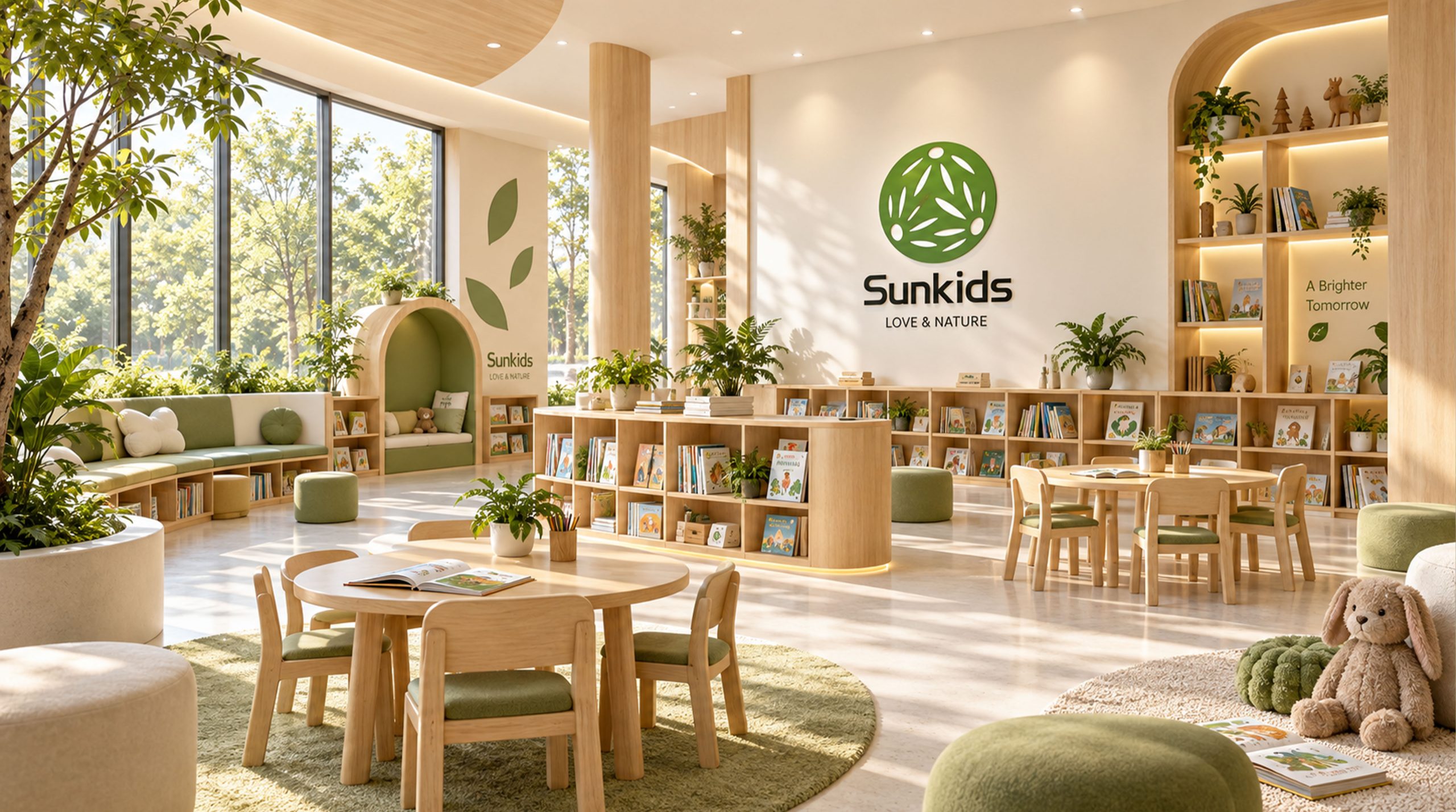
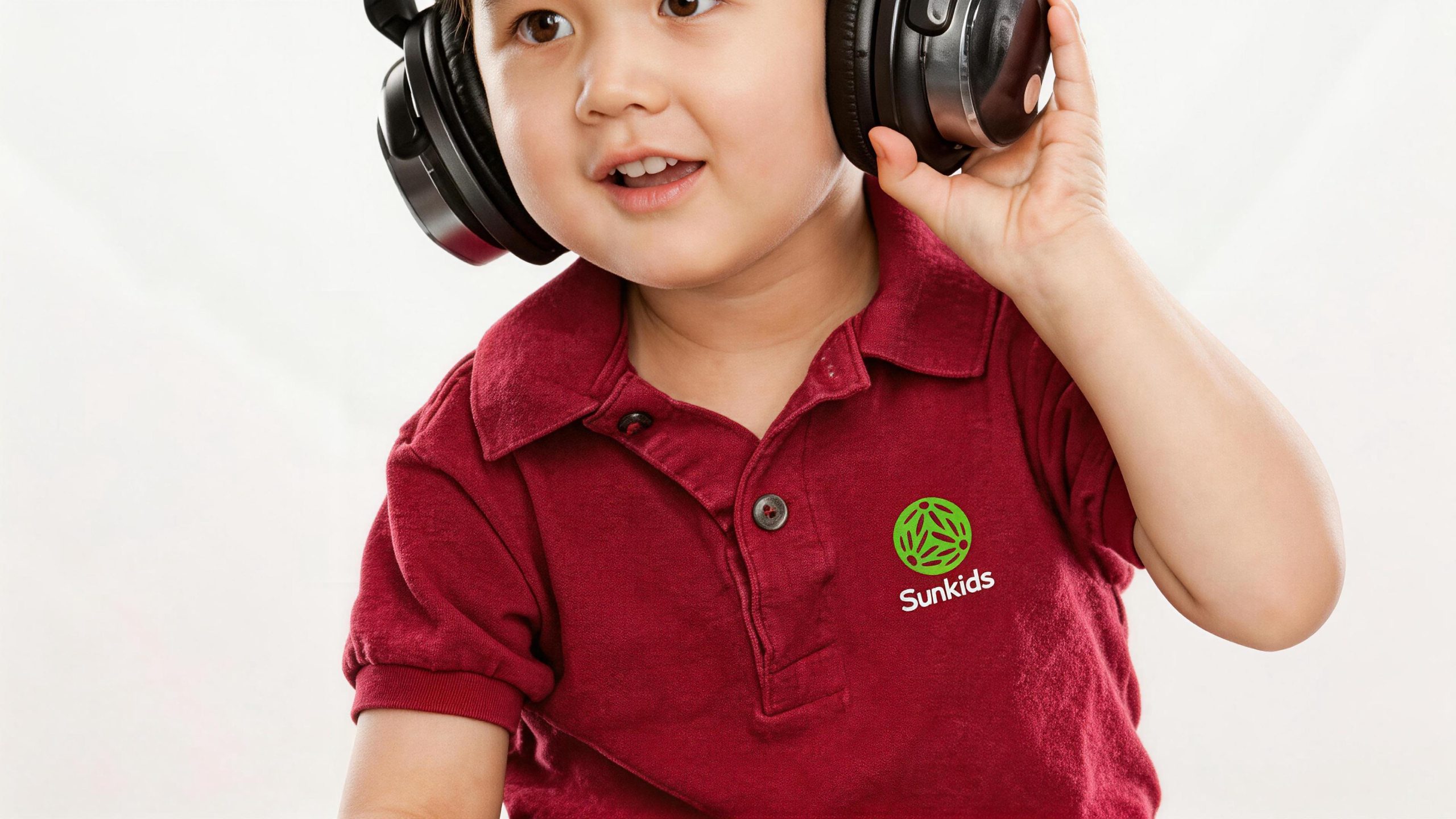
The logo has strong system scalability and can be widely used in teaching center doors, classroom environment layouts, campus guides and outdoor signage systems; textbook covers, picture books, learning stationery and course peripheral products; enrollment posters, parent manuals, online course pages and social media images; brand activities, outdoor parent-child classes, nature camps and festival celebration images; brand peripheral toys, school bags, cultural and creative gifts and teacher badges. In the dynamic visual, three children can stretch out and hold hands from the center of the circle in turn, and the branches and leaves gradually grow and intersect, eventually forming a complete circle of joy, symbolizing the children's happy growth process from first acquaintance to hand in hand, from individual to group, accompanied by Sunkids. The leaf shapes of the three children can be independently extracted as visual mother elements, which are used for age group logos, course category icons, illustration systems and brand patterns.
The logo contains the three core images of the Sunkids brand: Joyful Learning - the happy moment of three children holding hands directly reflects the brand's educational philosophy of entertaining and entertaining; Love & Connection - the ring structure of children holding hands symbolizes the warm transmission of love between teachers and students, and between children; Natural Growth - the organic form of leaves and branches conveys the growth philosophy of returning to nature and respecting nature. The overall design conveys Sunkids' brand vision of "holding hands in the sun, growing in nature, and learning in happiness".
Improper Usage (Protection Specification)
Do not change the number, positional distribution or the way the three children are connected holding hands; do not modify the curvature, proportion or white space relationship of the leaf shape; do not change the hue, brightness or saturation of the main color of life green; do not replace the circular pattern with a square or other geometric frame; do not add strokes, shadows, gradient light effects or texture overlays to the logo; do not rotate the direction of the children's pattern or extract some elements separately for use outside the circle; keep the white space around the logo not less than 25% of the diameter of the circle; the minimum display width must not be less than 25mm.
design results
After the release of the logo, Sunkids' brand recognition and emotional affinity in the fields of children's education and natural growth have been significantly improved. "Three children holding hands in a green circle", with its visual language full of childlike interest and natural vitality, has become the core identification symbol of the Sunkids brand system. It is widely used in teaching centers, course products and market communications, showing the brand vision of "love and nature, happy growth".