










Canada ANV Systems Inc. (Canada ANV Systems Inc.) is a Canadian technology company focusing on the integration services of advanced audio, navigation and visual systems. The company provides cutting-edge audio and video solutions, intelligent navigation platforms and system engineering services to customers in the fields of aerospace, national defense, transportation and smart infrastructure.
The brand name "ANV" is a precise acronym that condenses the company's three core competencies - Audio, Navigation and Visual, while the "Canada" prefix anchors the company's national identity and quality assurance associated with Canadian engineering standards.
The design goal of the brand logo is to convey the brand image of "Precision Systems, Canadian Excellence" through the visual language of technological precision, system integration and Canadian quality.
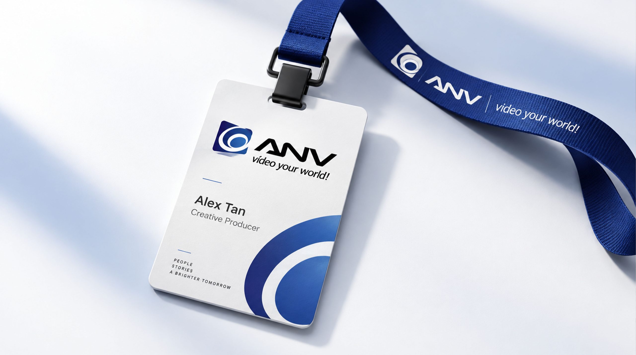
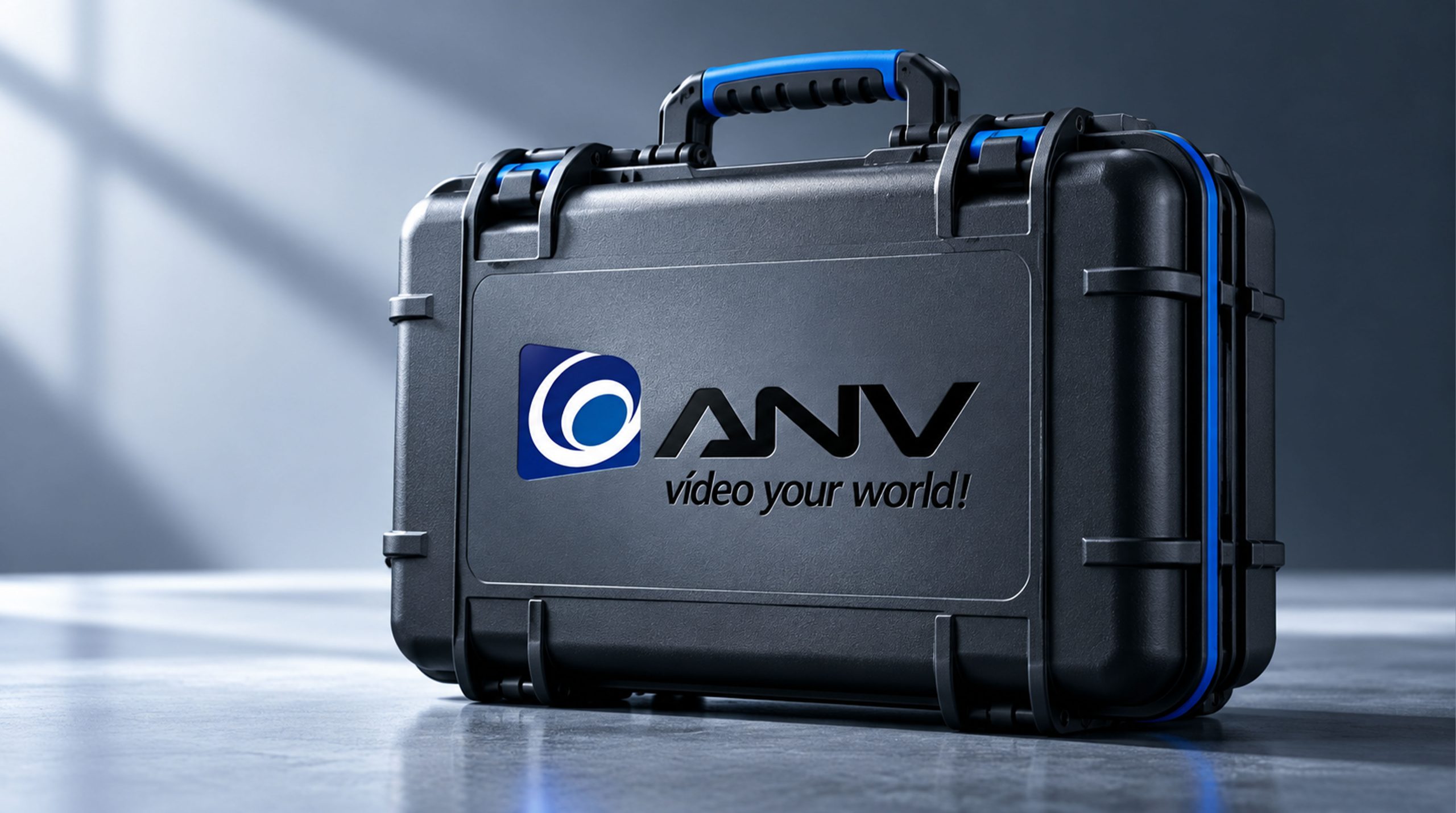
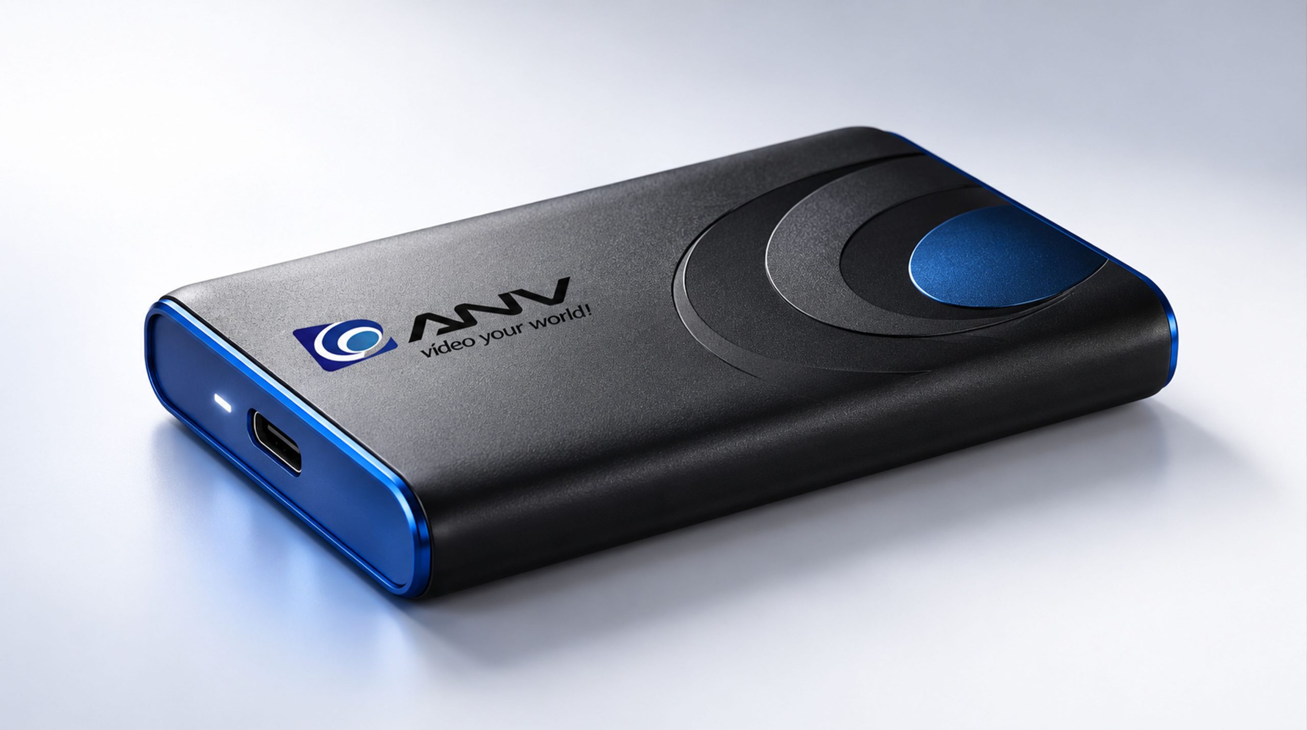
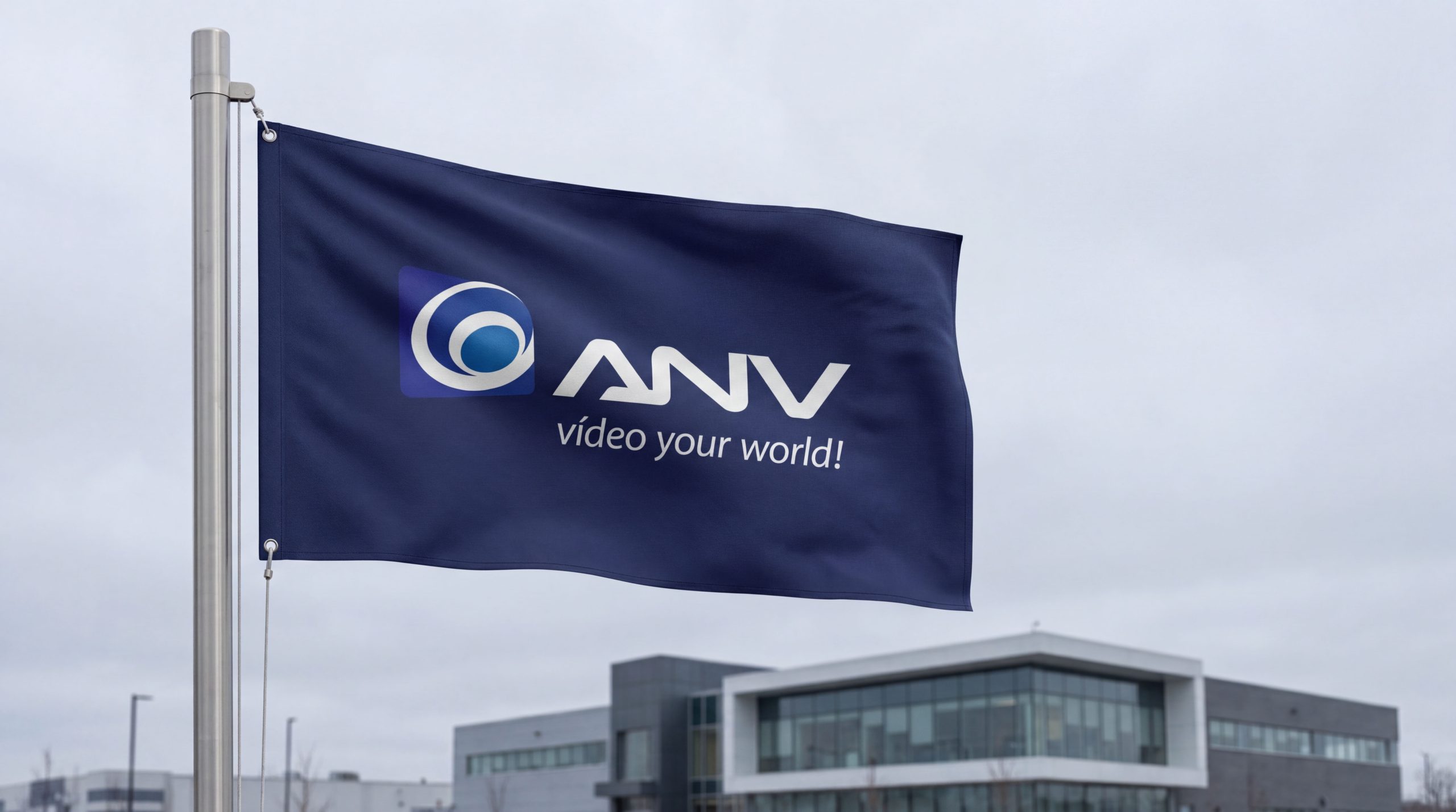
design concept
The logo uses "Triple Signal Convergence" as the core concept, abstracting the three major business areas of Audio, Navigation, and Visual into three converging signal waveforms, which are integrated into the word mark structure of the brand's initials "ANV". Three signals converge on one core node from different directions - just like ANV Systems integrating the three major technologies of audio, navigation and vision into a unified system solution.
graphic language
The graphic uses a customized wordmark of the three letters "ANV" as the main structure. The three letters are drawn in a precise geometric sans-serif font with even and neat strokes, conveying the precision and rigor of system engineering. The triangular structure of the letter "A" is like the silhouette of a signal transmission tower. Two oblique strokes converge upward from the baseline to the apex - the signal is emitted from the ground to the sky. The middle horizontal line of "A" is presented as a thin line, just like the reference scale on the instrument panel.
The two vertical strokes of the letter "N" stand in a straight and parallel posture, like two signal receiving towers; the diagonal strokes connect the upper left and lower right at precise angles, like the path for high-speed transmission of data between two system nodes.
The two oblique strokes of the letter "V" converge from top to bottom at the bottom focus, just like the light of the visual system is refracted by a lens and then converges at the photosensitive focus - "V" is the first letter of Visual and is also a geometric metaphor for optical focusing.
The brand's icon logo is presented as an independent graphic symbol on the left side of the three letters - three arcs starting from three different starting points on the left, representing Audio (sound wave), Navigation (signal wave) and Visual (light wave) respectively. The three arcs converge to a common focus to the right with different curvatures. The focus is identified by a small solid circle, like the core processor integrated into the system. The convergence of the three arcs conveys the core business logic of ANV Systems' "three major technologies, one system".
Font composition
The "ANV" wordmark is presented in a customized geometric sans-serif font, with thick and even strokes and precise and neat turns, conveying the precision and standard of system engineering. "Systems" is placed to the right of or below "ANV" in a smaller standard sans serif font. "Canada" is placed above the logo or in the upper left corner in the smallest font size, anchoring the country's identity in a sophisticated and unobtrusive way. "Inc." follows "Systems" in abbreviation form.
color system
The main color system blue #0D47A1 represents technology, precision and professional trust. Dark blue is the most authoritative brand color in the global aerospace, defense and systems engineering industries, conveying the technical image of "high precision, high reliability and high standards". Auxiliary Canadian red #D32F2F is used as a national identity mark and core emphasis element in the brand system - red is directly related to the maple leaf red of the Canadian flag, and uses a restrained embellishment to declare the brand's Canadian origin in the technological tone of system blue. Auxiliary signal green #00C853 is used for navigation and status indication elements in the brand system. The green color is like the "running normally" status light on the system dashboard. Auxiliary Titanium Gray #78909C is used for auxiliary information and system base elements. Pure white #FFFFFF as standard base color. The overall color is blue and red, reflecting the brand temperament of "precision technology, Canadian quality".
Application extension
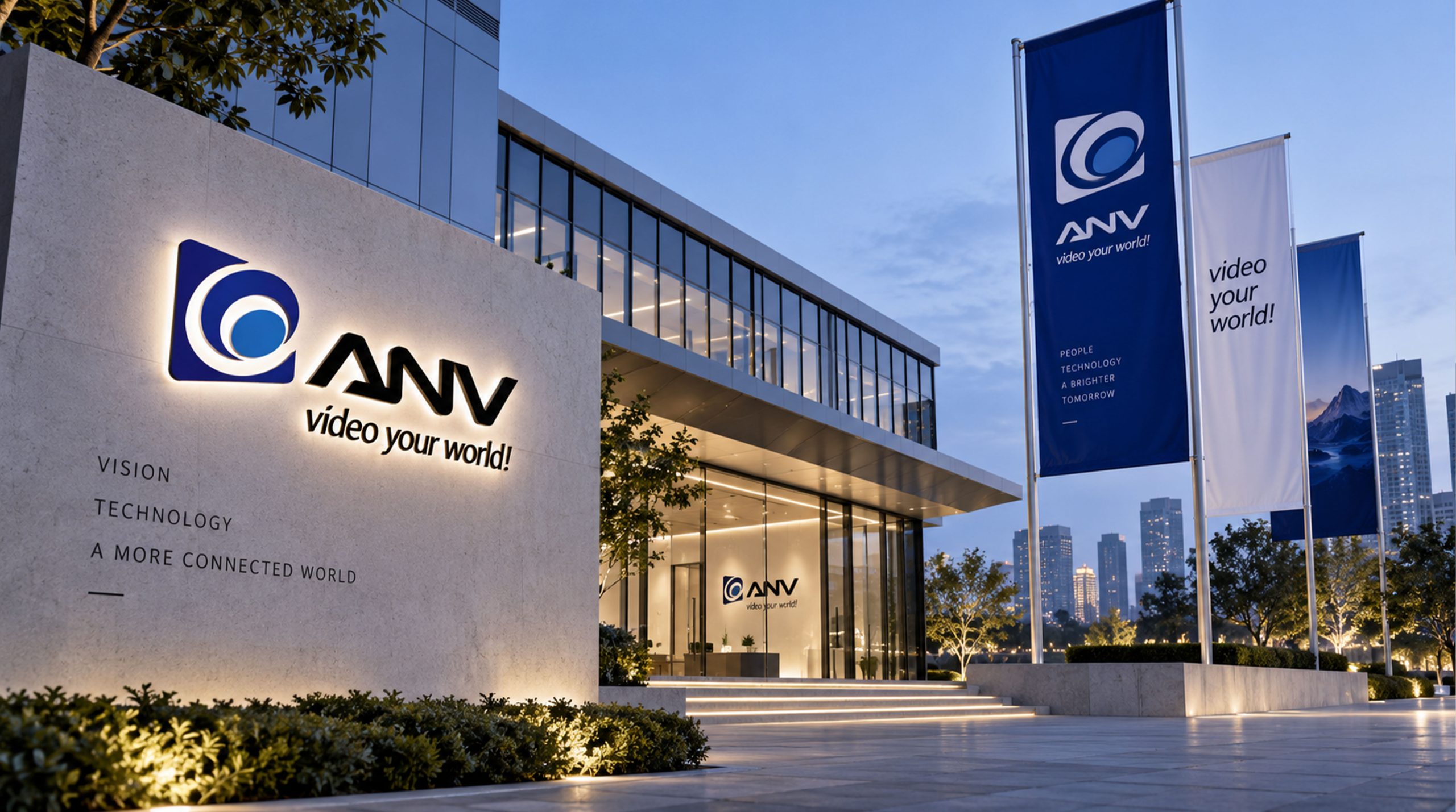
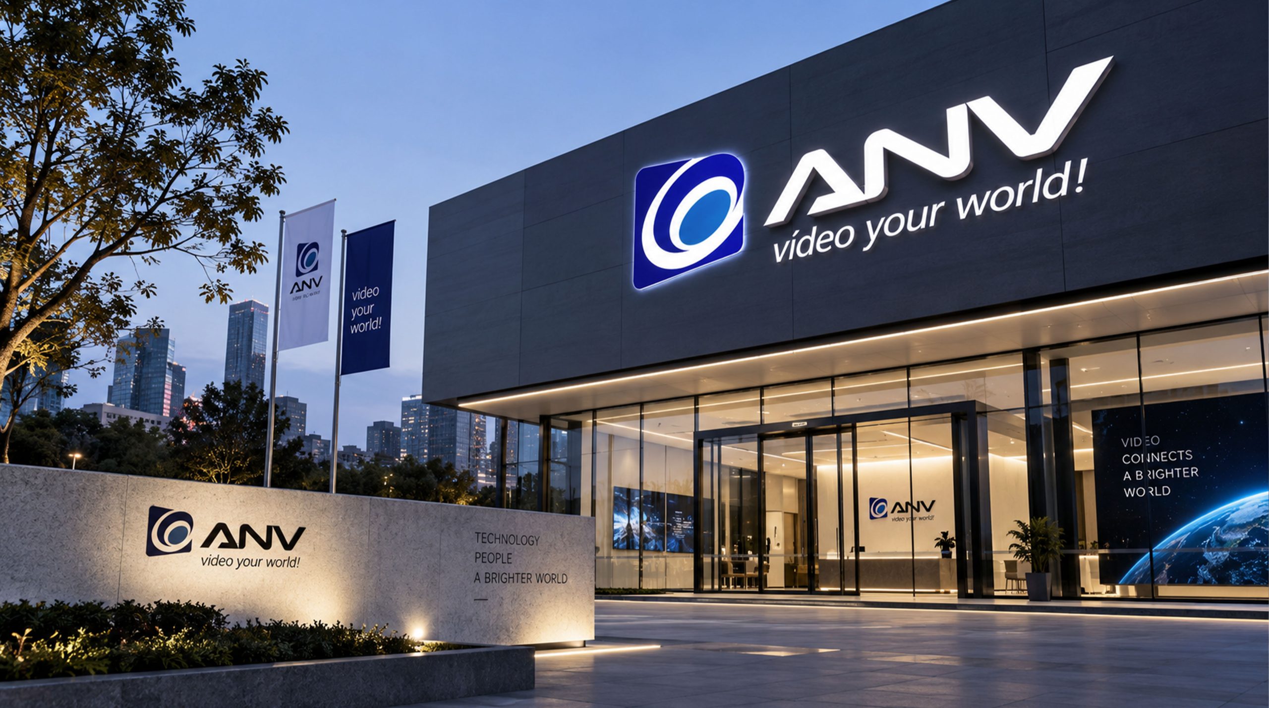
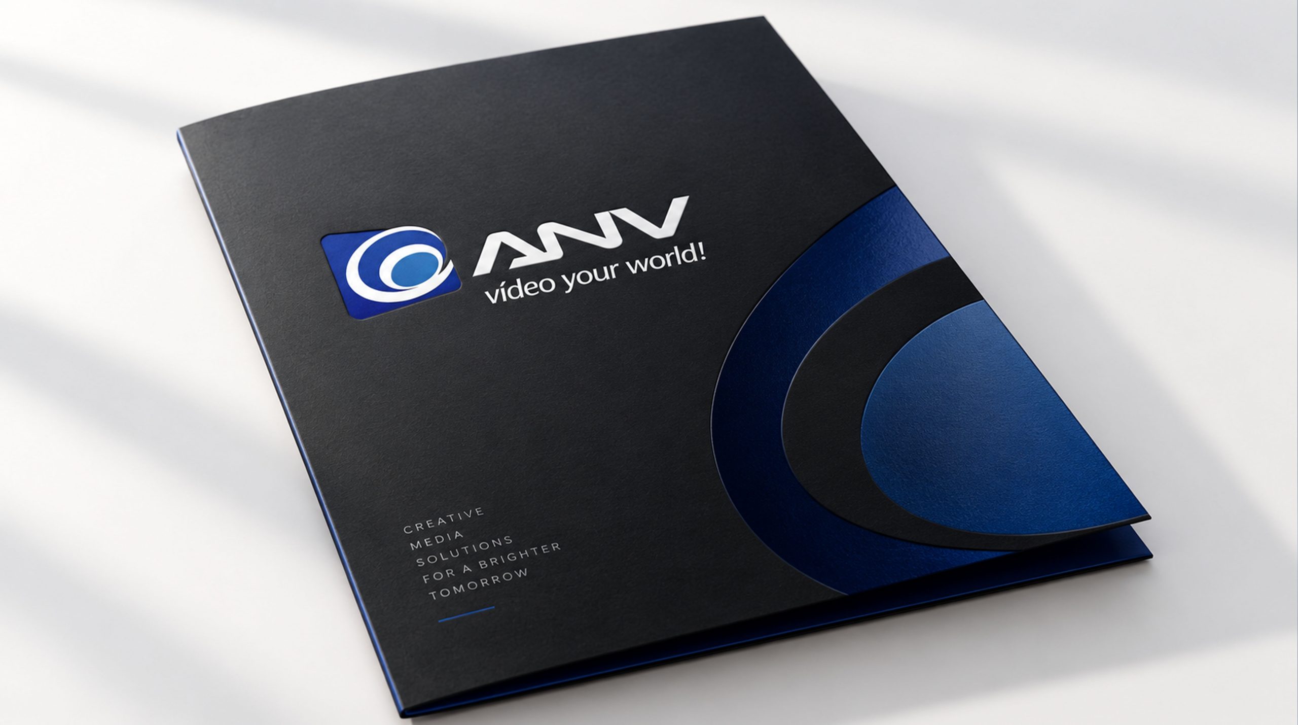
The logo can be widely used in corporate headquarters and R&D center logos; technical white papers, system proposals and project delivery documents; official websites, product demonstration platforms and social media images; images of aerospace exhibitions, national defense technology expositions and industry technology summits; product nameplates, equipment panels and system operation interfaces. At the booth at the Aerospace Exhibition, the white ANV word mark on the system's blue background was presented with a large backlight light box, and three converging arcs were lit up in sequence with LED dynamic light strips, converging on the focus - precise, calm, and trustworthy. In the dynamic vision, three arcs in blue, red, and green are projected from three directions of the screen. After accurately converging at the central focus, a white light bursts out, and the "ANV" wordmark immediately appears clearly.
brand meaning
The logo contains three core images: Systems Integration - the convergence of three arcs conveys the core capability of integrating audio, navigation and visual technologies into a unified solution; Technological Precision - geometric wordmarks and precise lines convey high precision and reliability in the field of system engineering; Canadian Excellence - the restrained embellishment of Canadian red conveys the brand's national identity and the quality assurance of Canadian engineering standards. The overall design conveys the brand vision of "Precision Systems, Canadian Excellence".
Improper Usage (Protection Specification)
Do not change the customized font or letter spacing of the "ANV" wordmark; do not modify the curvature or the position of the convergence point of the three converging arcs; do not change the hue of the main color of the system blue; do not expand the embellishment area of Canada red to more than 15% of the overall color; do not add gradients, strokes or decorative effects that are inconsistent with the technological style; do not separate the graphic symbols and the wordmark and use them alone for the first-level brand touch points; keep the white space ≥ 25% of the graphic height; the minimum display width must not be less than 25mm.
design results
After the release of the logo, Canada ANV Systems Inc.'s brand recognition and industry influence in the fields of audio, navigation and visual system integration have been significantly improved. "Tri-frequency resonance" has become the core identification symbol of the brand system with its visual language that conveys system integration capabilities and technological precision quality, demonstrating the brand vision of "Precision Systems, Canadian Excellence".