










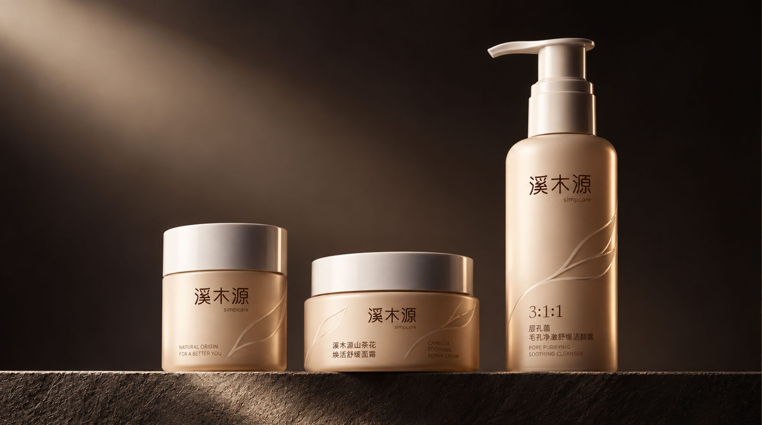
As a new generation of natural skin care brand, Simpcare takes "purity, mildness and science" as its core concepts and focuses on the repair and soothing of oriental skin. The brand was born in the mountains and forests of Yunnan, China, and is inspired by the vitality of natural streams, trees and land. The "stream" and "wood" in its name represent natural flow and growth, while the "source" symbolizes the fundamental way to healthy skin.
The packaging design continues Ximuyuan's "minimalist and natural" brand tone, creating a low-saturation, stress-free healing atmosphere in the overall visual sense. Through its soft beige color and minimalist bottle proportions, the product conveys the concepts of "skin's self-healing power" and "pure scientific care" advocated by the brand.
Brand Essence
The core spirit of Ximuyuan is condensed into three sets of keywords:
Nature × Science × Purity
Oriental × Moderate × Balanced
Healing × Minimalism × Sincerity
These three groups of keywords construct the core expression of the brand. Nature and science go hand in hand, which means that the brand rejects artificial complexity and returns to the healing essence of original ingredients; Oriental and balanced express the brand's philosophical view based on the needs of Eastern skin; while healing and minimalism form the aesthetic tone of Xi Muyuan at the visual and emotional levels.
Design Philosophy
The core concept of this packaging design is "let nature touch the skin in the most scientific way". The designer adheres to the modern minimalist spirit of "less is more" and uses refined visual language to strengthen the brand's gentle and high-end characteristics. The packaging abandons complex patterns and colors, and instead uses a "skin tone" off-white and light champagne gold, which seems to extend the texture of the skin itself, creating an emotional connection of soothing and trust.
Behind this design idea is a redefinition of the "pure relationship of skin care": packaging is no longer the shell of the brand, but an "extended experience" consistent with the efficacy of the product. It presents an oriental minimalist aesthetic where science and nature coexist, which is both gentle and firm, expressing the brand's rational confidence and aesthetic style.
Visual Language
The visual system of Ximuyuan packaging forms the brand's unique "quiet power" through restrained form language and precise material expression.
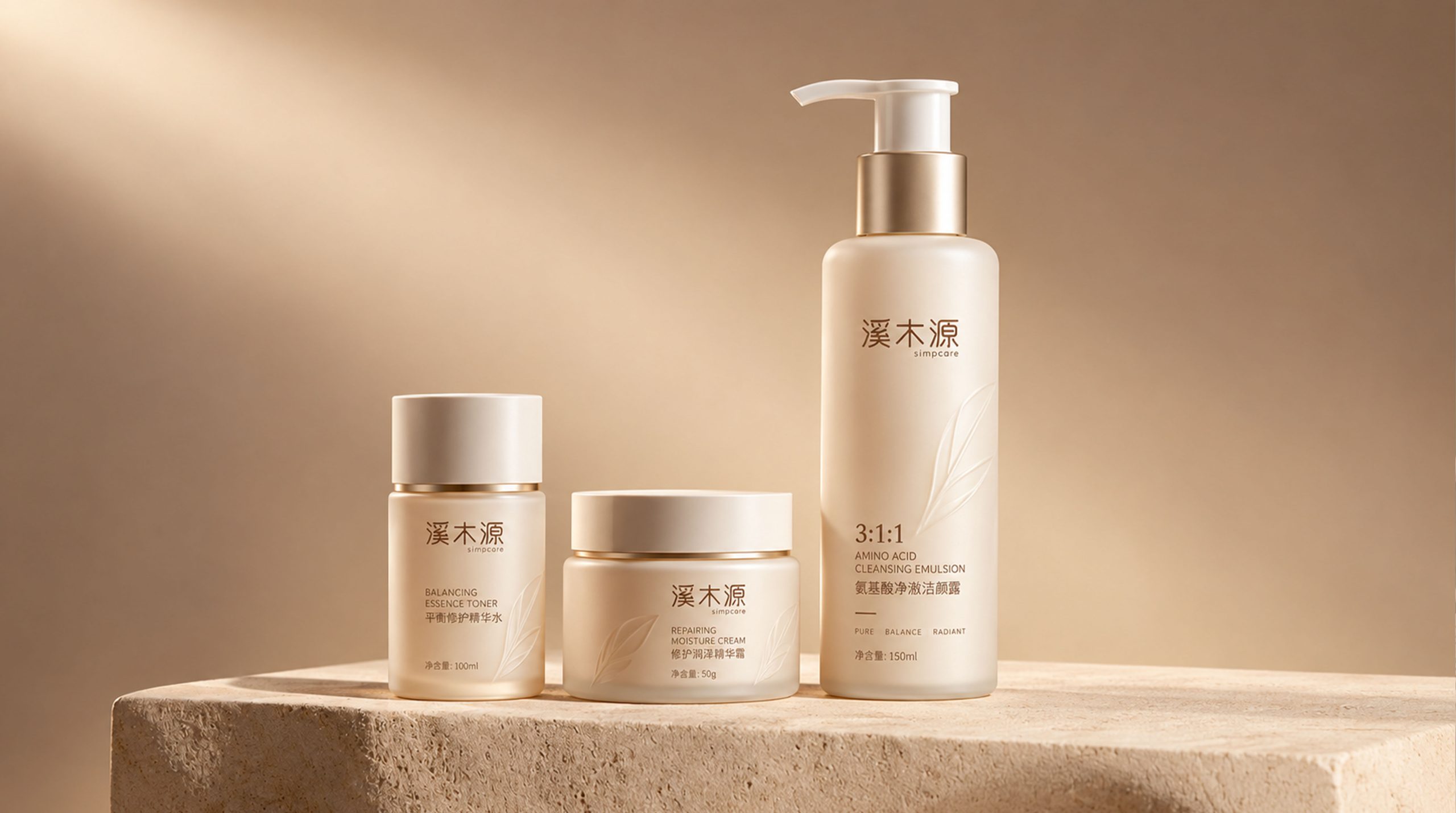
Color system: The main color is a low-saturated apricot color, paired with a warm milky white bottle cap and a delicate frosted texture. The overall vision presents a soft temperature. Metal fonts are embellished on the bottle, bringing a sense of balance between light luxury and modernity.
Shape design: The bottle body is slender and balanced in proportion, and the pump head and bottle cap are composed of a simple geometric relationship, reflecting the beauty of structural rationality. The transition of the arc increases the comfort of holding the hand, and at the same time reflects a soft halo under the light, echoing the concept of "natural healing".
Brand logo: The three characters "Xi Muyuan" are in a minimalist black and gray font, with slender strokes and loose spacing, conveying an oriental sense of restraint and breathing. The English font Simpcare is arranged side by side with the Chinese, balancing the international feel and local temperament.
Material and touch: The matte bottle body material is paired with a frosted spray process, which is soft to the touch and non-slip. It not only enhances the use experience, but also emphasizes the "safety and purity" characteristics of the product.
Tone of Voice
Ximuyuan continues the "gentle and scientific" temperament in its brand language. The packaging text is restrained and concise, without exaggerated functional descriptions, but with scientific proportions, ingredient proportions and skin balance as the core. For example, the "3:1:1" ratio system clearly marked on the bottle conveys the scientific research logic behind the product simply and directly.
The tone of the language is gentle but rational, without the complicated narratives of traditional brands, and avoids exaggerated rhetoric. Every copy is like an extension of the brand concept - restrained, sincere, professional and moderate.
Brand Experience
Ximuyuan's packaging experience not only presents a "soothing feeling" visually, but also conveys a "security" on a psychological level. From the feel of opening the cap, the smoothness of the pump head, to the soft light reflection of the material, every detail is precisely controlled.
When consumers use it, they can feel the unified logic between packaging and products: lightness, balance, and delicacy. The overall experience puts people into a soothing sensory world, as if completing a "skin care meditation" under natural light.
Brand Statement
"Based on nature and guided by science, let the skin return to its own healing." Through this set of packaging design, Xi Muyuan transformed "Oriental minimalist aesthetics" into a sensory language that can be touched. It is not a deliberate decoration, but an implicit sense of trust: gentle, restrained, but powerful. As the brand concept says - "Let every inch of skin be reborn in nature."