










Junlebao "Family Ranch" is a pure milk product line under Junlebao Dairy Group. It takes "natural nutrition, exclusive ranch" as its product proposition, and uses a watercolor ranch illustration full of pastoral and childlike fun throughout the entire packaging system from single boxes to gift boxes. The design uses "ranch landscape painting × glass milk bottle totem × sky blue tone" as three major visual pillars: the ranch landscape painting uses warm scenes of cows, grassland, farmhouses, and a family of three to create an immersive feeling of "stepping into the ranch as soon as you open the package." The transparent glass milk bottle builds quality trust with "visible purity"; the sky blue extends from the top of the packaging to the upper edge of the gift box, setting an emotional tone of warmth, safety, and trustworthiness.
Brand Essence
Ranch × Family × Pure
Nature × Trust × Warmth
"Pasture" is the brand's scene promise. "Family Family Ranch" is not an industrial processing plant, but a pastoral ranch that belongs to every family. This image is completely visualized on the packaging: green grass grows from the bottom up, cows with black and white patterns graze leisurely, behind the red tile farmhouse shaded by greenery, a family of three walks hand in hand on the grass - the whole picture is like a postcard from the ranch. "Family" is the emotional anchor point. The naming strategy accurately points to the family purchasing scene. In the illustration, the back figures of father, mother and children walking hand in hand are the most classic emotional symbols in Chinese family consumer goods. "Pure" is a quality declaration, and the transparent glass bottle is the visual translation of "pure" - the transparency of the glass implies "no additives, no concealment", and the milky white droplets slightly overflowing from the mouth of the bottle enhance the "overflowing freshness". "Nature" runs through the color spectrum of sky blue, grass green, and warm sunshine yellow, as well as the soft brushstrokes of watercolor hand-painting. "Trust" comes from the solid presence of Junlebao's blue-green shield logo on the top of the package. "Warmth" is the emotional background - from the back of a family holding hands to the orange chimney on the roof of the farmhouse, every detail conveys "safe daily life".
Design Philosophy
The overall design concept is "one painting, one ranch, one family". The core goal is to make consumers see not an industrial product when they pick up a carton of milk, but an idyllic pasture belonging to their own home.
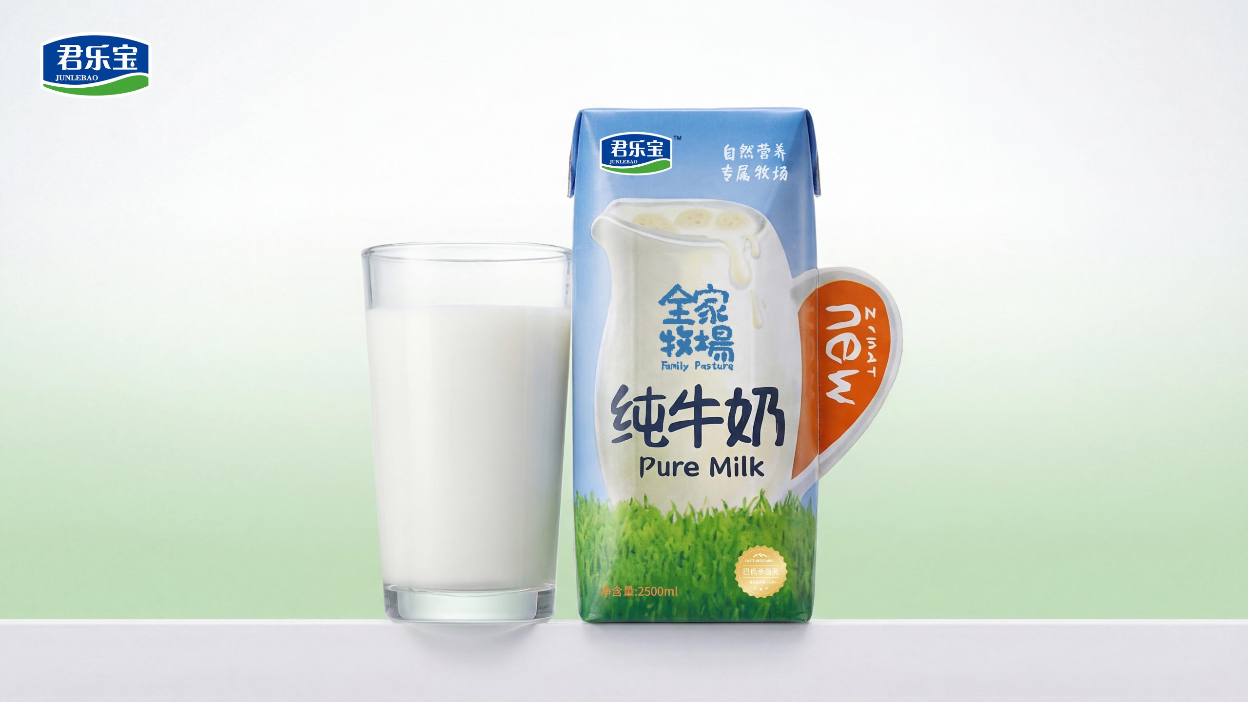
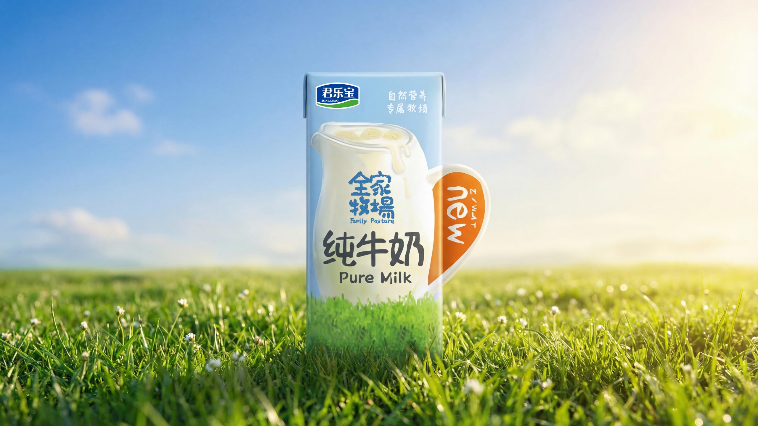
Single box (250ml): the smallest narrative unit. The lower half is a watercolor freehand green grassland, with a transparent glass milk bottle totem placed on the left side of the middle. The bottle is marked "Family Pasture", and the upper half is a sky blue gradient. "Pure Milk" is placed horizontally on the right side of the bottle in thick dark blue font, with an orange heart-shaped label in the upper right corner marked with "New". On the left side of the top is the Junle shield-shaped logo, and on the right side is the label "Natural Nutrition Exclusive Ranch".
Multi-box portable gift box (230ml×12): The front of the gift box is covered with an enlarged version of the panoramic view of the pasture - a red-tiled farmhouse and green trees on the left, a cow grazing on the grass in the middle, a family of three holding hands with their backs to the viewer as they walk toward the depths of the pasture on the right, and a child raising his hand to point to the cow - this is the most emotionally charged visual element in the entire package. A white baby bottle-shaped balloon floats in the sky, adding to the childlike interest. In the middle of the box, there is a combination of the same glass milk bottle totem and the text "FamilyMart Pure Milk". A bright orange arched plastic handle on the top spans the surface of the box, creating a distinct warm pop of color among the blue-green tones. The lower part of the box is equipped with a transparent window, allowing you to directly see the neatly arranged Tetra Pak packets inside, continuing the trust logic of "seeing is believing".
Nine-square puzzle gift box: the most creative packaging form. The nine boxes of Tetra Pak are arranged in a 3×3 format, and the front patterns are precisely spliced to form a complete panoramic picture of the ranch - farmhouse, cows, a family of three, milk bottles, grass and blue sky are divided into nine boxes, and the picture is perfectly combined when returned. This design gives the packaging an interactive attribute beyond the "container" - children can take it out and reassemble the picture, turning unboxing into a parent-child jigsaw puzzle.
Slender aluminum can (230ml): The same visual language is continued with a metal carrier: grass in the lower part, bottle totem and brand name in the middle, and sky blue gradient in the upper part. The metallic luster adds a "shimmer" to the color that Tetra Pak cannot achieve, suggesting an upgrade to the ready-to-drink scene in convenience stores.
Visual Language
Color: Based on the three-color natural color spectrum. Sky blue (Pantone 291C–542C) gradients downward from the top, accounting for about 35%. It is the emotional base color, conveying "clearness, safety, and trustworthiness." Grass green (Pantone 362C–7740C) is layered from the bottom up, accounting for about 40%, conveying "nature, freshness, and vitality." The milky white color appears in the bottle and part of the white space, about 15-20%, which is the "pure anchor point". Bright orange only appears in the form of gift box handles and "New" labels, accounting for less than 5%. However, it is the only warm color among the cold colors and has a strong shelf recognition function.
Graphics: Three core elements - the ranch landscape is drawn in a hand-painted watercolor style. The "half picture book, half watercolor" style between children's picture books and adult watercolors accurately hits the aesthetic range of "the whole family will find it beautiful". The color coding of the family of three characters (father blue, mother red, child yellow) remains consistent across all carriers. The transparent glass bottle is drawn realistically and appears on every carrier in the same size and position. It is the first visual anchor for consumers to identify the brand. The brand logo combination (Junlebao logo + handwritten brand name + category name) is uniformly arranged on all carriers in a fixed hierarchy.
Font: "Family Ranch" is presented in customized Chinese handwriting. The strokes are round and elastic, just like the words written by young parents on the refrigerator notes, conveying the relaxation and freedom of "home". "Family Pasture" follows in the corresponding English handwriting. "Pure milk" is presented in a thick dark blue sans-serif black body. It is the element with the greatest visual weight and its function is pure category identification. "New" is printed in white bold and slanted on an orange heart-shaped label, which is the only element with promotional attributes.
Packaging Structure and Details
Single box: Standard Tetra Pak structure, six-layer composite paper aluminum material, flexo/gravure printing, high line count above 175lpi to ensure soft watercolor gradients. The transparent texture of the glass bottle is achieved by four-color overprinting + partial white ink base. The high gloss area of the bottle is left blank to simulate reflection, and the milk inside the bottle is made of a low-transparency white ink layer to simulate the translucency of the liquid. Net content of single box is 230–250ml.
Multi-box gift box: 350g white card mounted corrugated, four-color offset printing and then covered with matte film, the box is about 38×28×6cm. The orange PP arched handle is fixed with an inner buckle, about 2cm wide, and the curvature ensures comfortable carrying with one hand. The transparent OPP window on the lower front covers approximately 35% of the box height and 90% of the width, allowing the Tetra Pak inside to be seen. The internal corrugated panels are arranged in a 6×2 arrangement and positioned into 12 boxes.
Jiugongge Jigsaw Puzzle Gift Box: 400g, white card framed with gray board square frame, accurately matched 3×3 arrangement inside. The nine-box patterns are precisely assembled in the pre-press stage. The joints between adjacent box patterns are controlled within 1mm, and the registration error needs to be controlled within 0.5mm. Also equipped with orange arched handles.
Slender aluminum can: Two-piece aluminum can, with a diameter of about 53mm and a height of about 168mm. It is offset printed with four colors of UV curing ink. The luster of the metal base of the aluminum can makes the color more vivid and the gradient more delicate. Standard easy-open aluminum lid seals.
Brand Experience
Visual: In the pure milk category with blue and white packaging as the mainstream, the large green grassland image is the first to break out of the color homogeneity dilemma. The back view of a family of three walking to the pasture in a gift box has a strong emotional penetration - it is not an abstract concept, but a concrete and perceptible scene. The nine-square puzzle gift box is the visual peak - when the nine boxes are put together into a complete picture, consumers gain a "sense of completion" and "a sense of control."
Tactile feel: Tetra Pak's matte paper feels warm and non-greasy, matching the "natural" and "family" tones. The coolness and smooth metal of the aluminum can convey a "refreshing and modern" sense of the ready-to-drink scene. The elastic PP material of the gift box handle ensures comfortable carrying with one hand with a weight of approximately 3kg.
Sense of scene: The image of the "family of three" in the illustration accurately hits the core decision-maker of China's dairy products - the mother sees the back of the family holding the child in the supermarket, and will subconsciously complete the role substitution. The "packaging as a toy" strategy of the Jiugongge Puzzle Gift Box allows the brand to leave a happy footnote in family memories even after drinking.
Brand Statement
Pasture for the whole family, milk for the whole family. Open a box and walk into a countryside that belongs to your home. Junlebao's "Family Ranch" uses ranch watercolors as the visual soul, glass milk bottles as the product totem, and sky blue and grass green as the emotional base to build a family-warm aesthetic system that is unique in the pure milk category. Instead of saying "high-quality milk source," it draws a pasture; instead of saying "nutrition for the whole family," it draws the back of a family holding hands; instead of saying "fresh and pure," it draws a transparent milk bottle. Each packaging form is a different unfolding of the same ranch picture - some are postcards in the palm of your hand, some are panoramic paintings on the dining table, and some are jigsaw puzzles completed by the family together.