










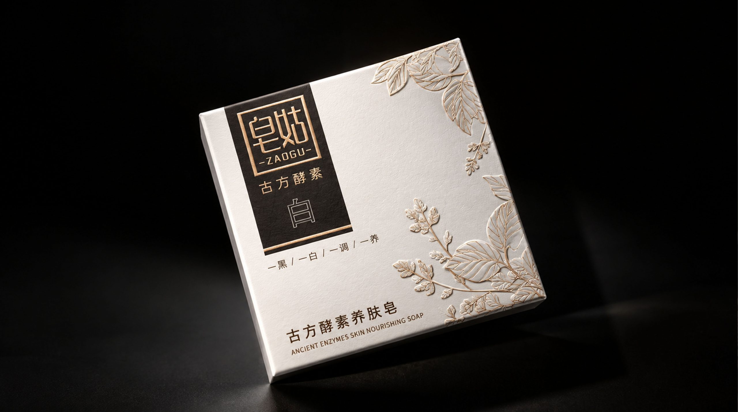
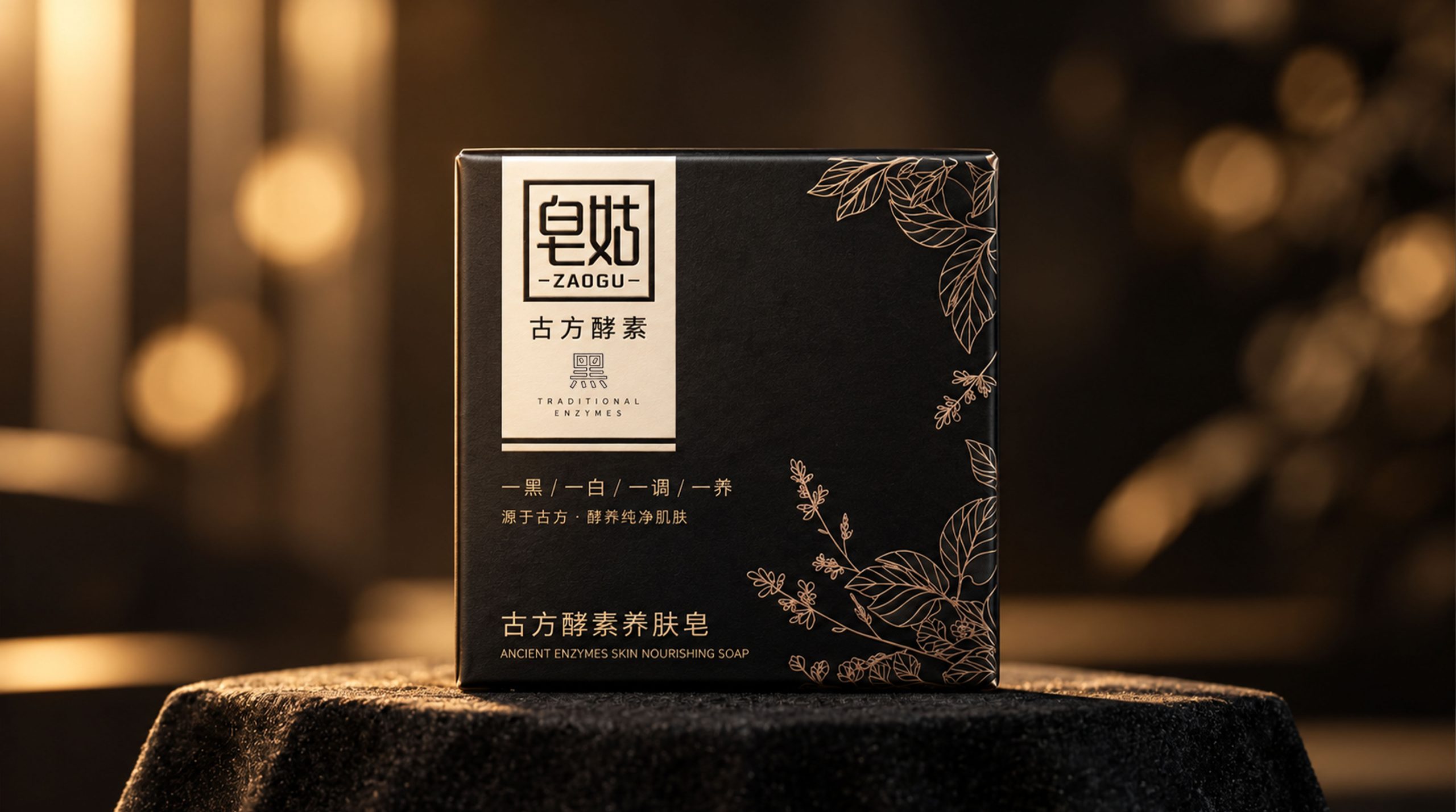
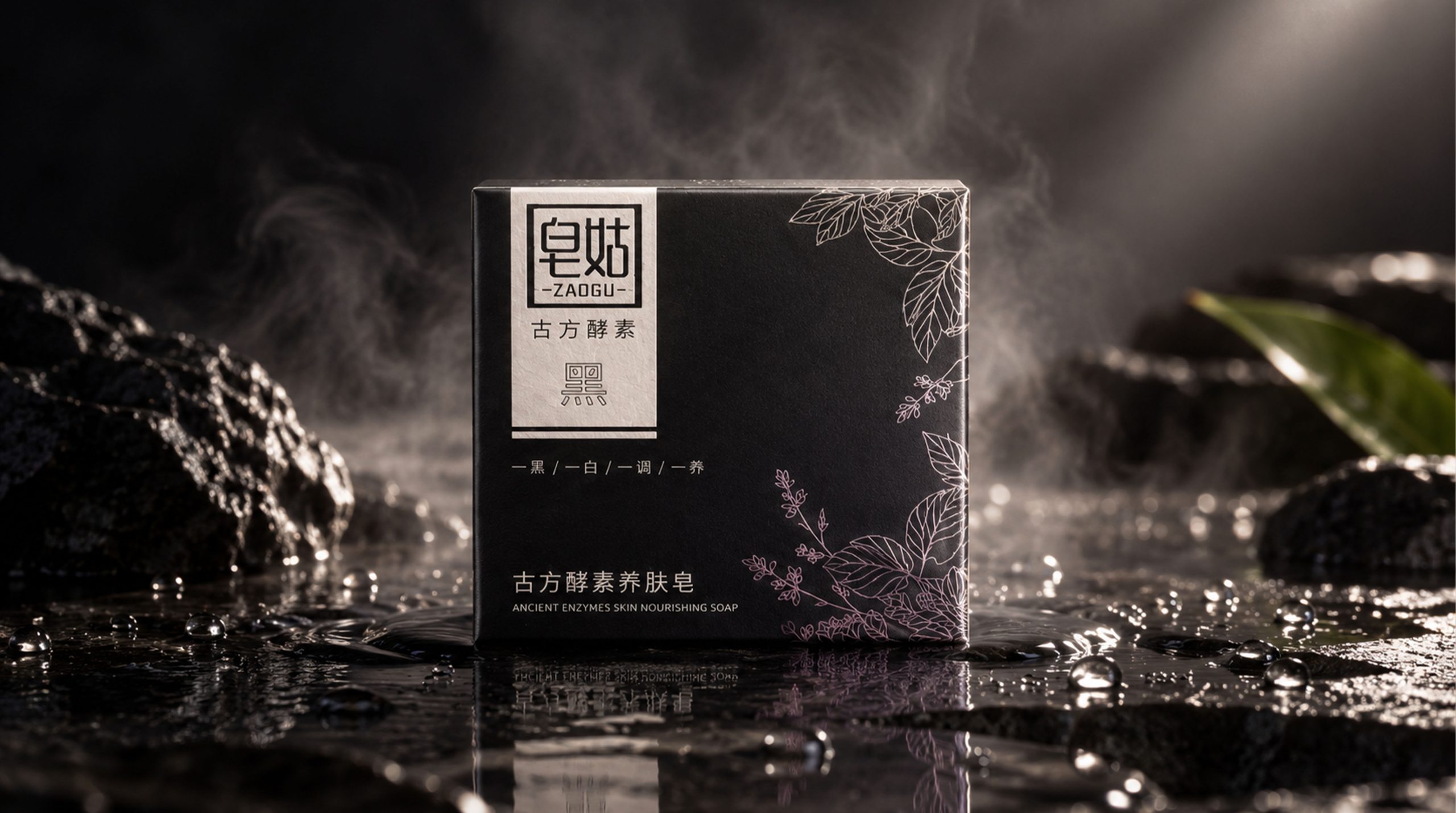
With "Ancient Enzymes" as its core product concept, ZAOGU launches the Ancient Enzymes Skin Nourishing Soap series, which uses black and white packaging to form a complete and contrasting visual diptych.
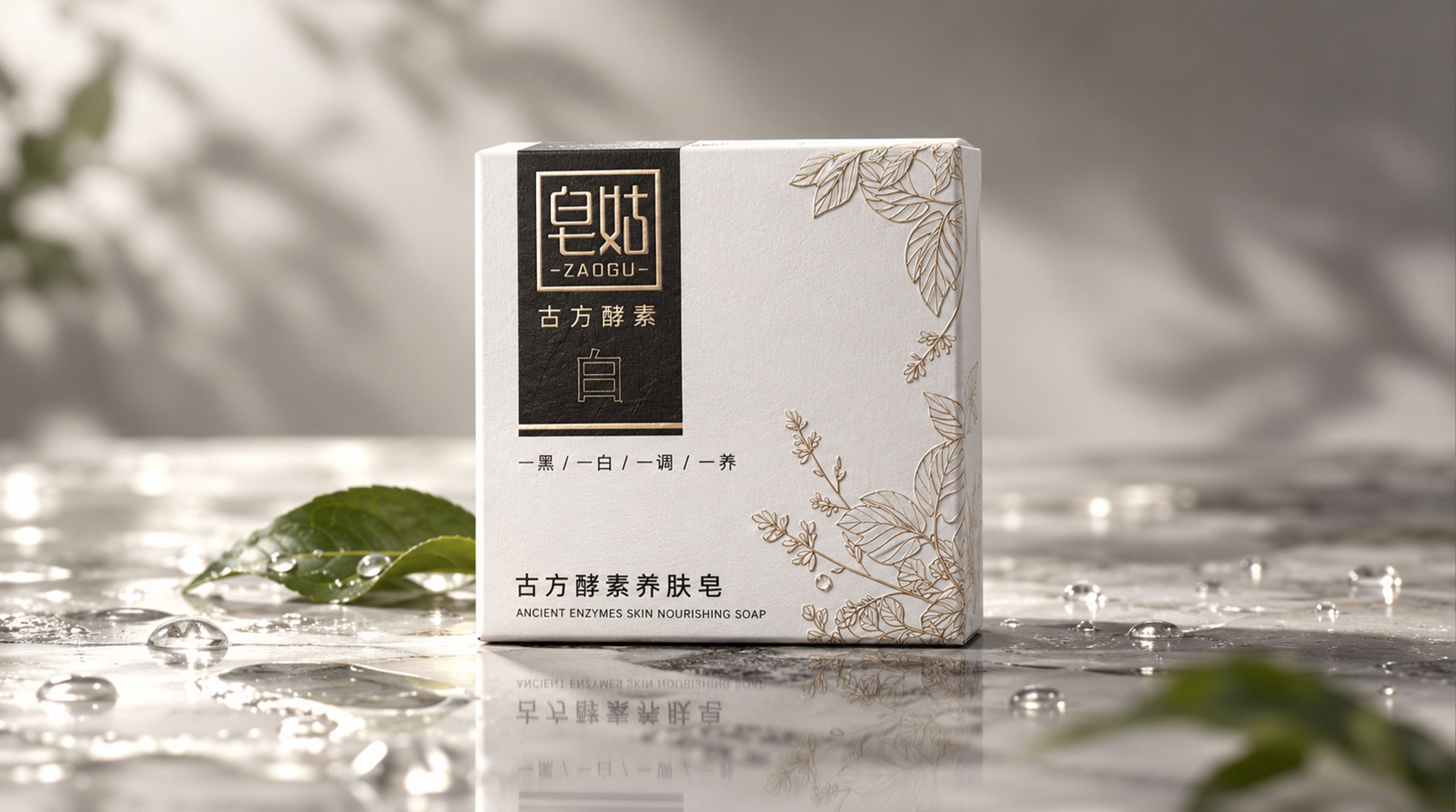
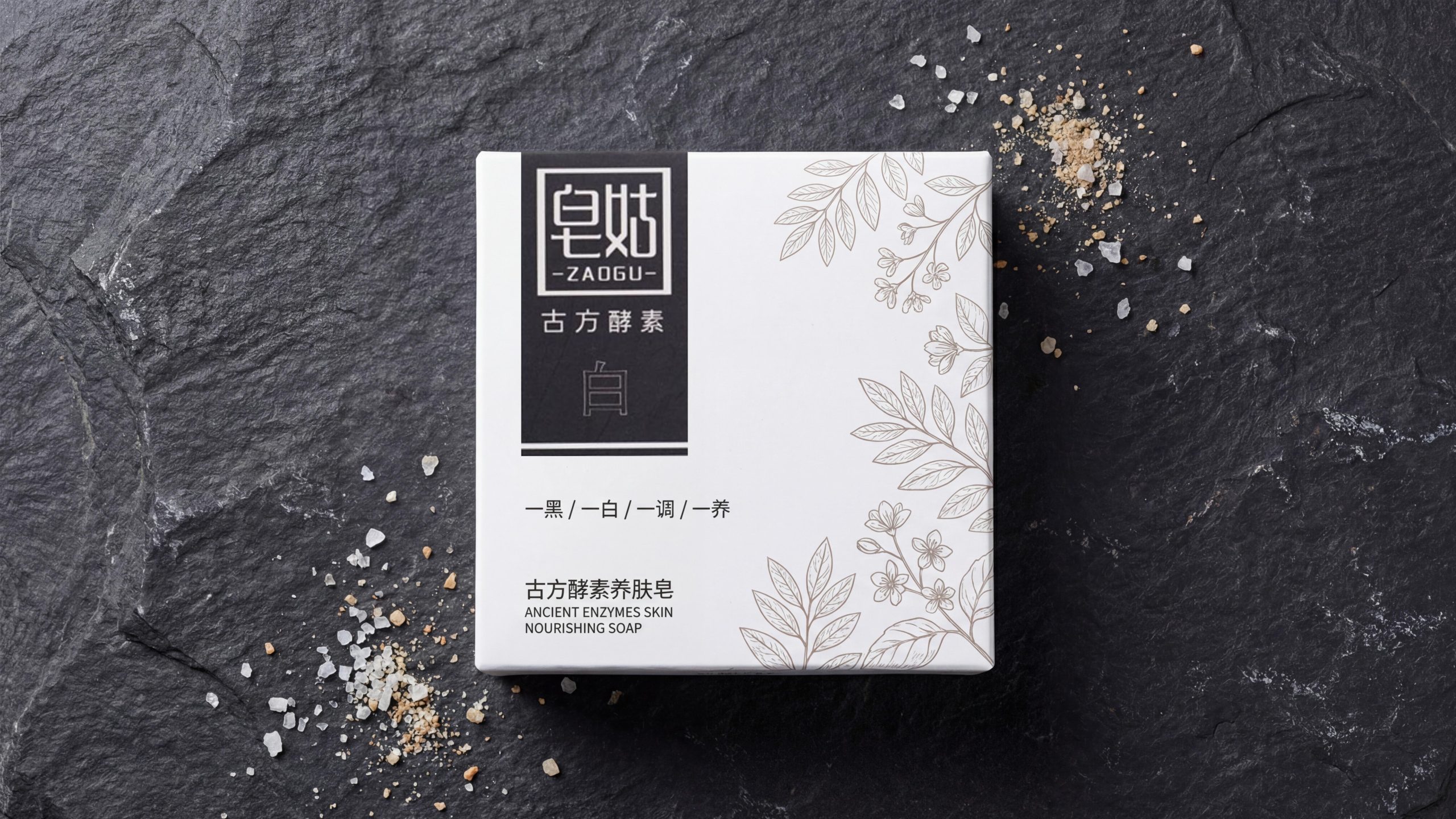
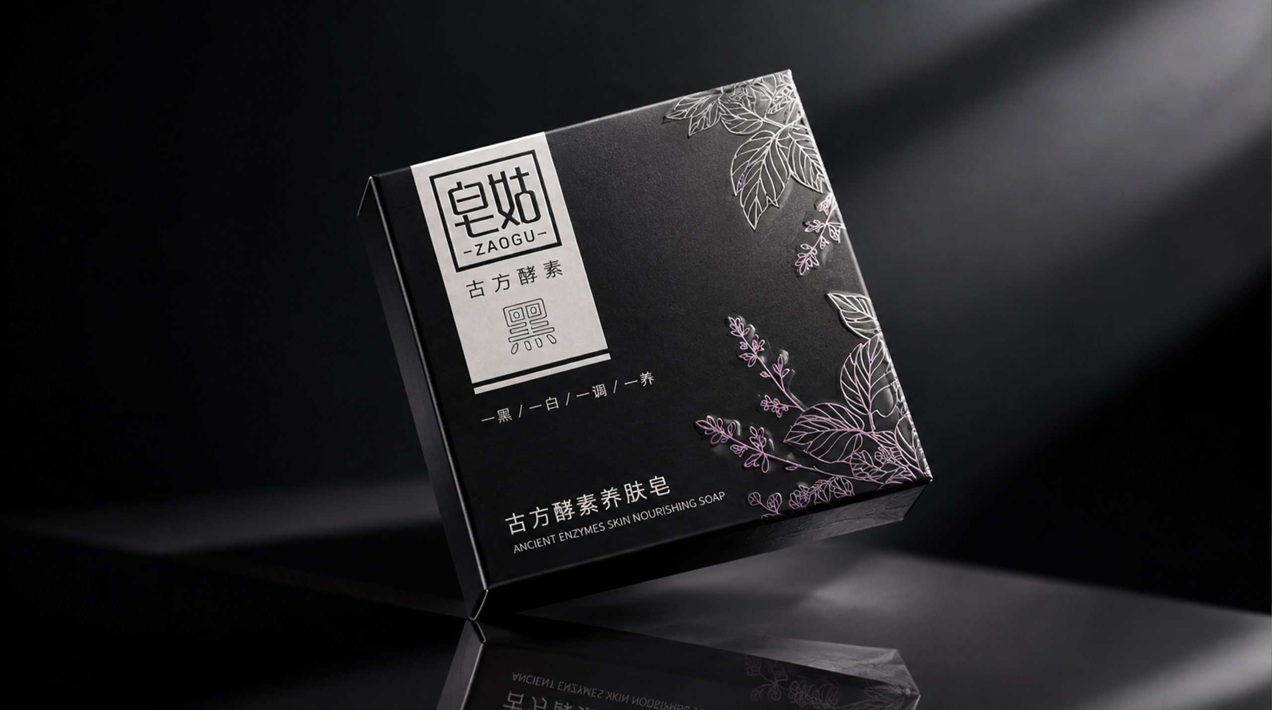
The white version uses pure ivory white as the background color, and the black version uses deep ink black as the background color. The two packages share the same visual language system - the brand logo area on the upper left, the product series logo in the center, the hand-painted herbal line drawing pattern spreading on the right and bottom, and the product name and English label at the bottom - but with the ultimate inversion of black and white, they present a completely different visual temperament and emotional temperature.
The brand name "Zaogu" and the pinyin "ZAOGU" are presented in a square seal on the upper left side of the box, and the four characters "Heritage Botanical Enzyme" are marked next to it to point out the core technical gene of the product; in the middle of the box, an independent dark (white model) or light (black model) color block carries the single word "white" or "black", like a simple seal, declaring the identity of each product; below the color block is "one black / one white / one tone / The eight-character phrase "Yi Yang" summarizes the skin care philosophy of the entire product series in poetic and restrained language; delicate hand-painted herbal line drawing patterns naturally spread on the right side and bottom corner of the box, injecting a gentle vitality from nature into the square box.
The entire package is an exquisite fusion of oriental herbal aesthetics and modern minimalism, creating a skin soap brand visual image that combines cultural depth, natural temperament and contemporary design taste.
Brand Essence
The core spirit of Zaogu Ancient Enzyme Skin Soap Series can be summed up in the following points: ancient prescription × nature × oriental care wisdom, black and white × confrontation × minimalist aesthetics
These keywords constitute the core spiritual gene of the Zaogu brand, and are also the deep value logic behind the entire packaging design. The sense of ancient recipes is the most fundamental identity of the brand - the four words "ancient enzymes" directly declare the brand's technical genes and cultural stance: this is not an industrial product that relies on modern chemical formulas, but a skin care treasure based on traditional ancient recipes and with natural enzymes as the core active ingredient. The word "ancient prescription" carries the millennium accumulation of traditional Chinese skin care wisdom. It points to a set of Eastern skin care philosophy that uses natural herbs as raw materials, fermentation and transformation as technology, and gentle maintenance as the concept. At a time when chemical skin care products dominate the market, the brand uses "ancient prescription" as its banner to express its deep trust in traditional wisdom and contemporary revival.
The sense of nature is the most contagious emotional dimension in the entire packaging vision. The hand-painted line drawings of herbal plants spreading across the right and bottom corners of the box - spreading branches and leaves, budding flowers, and entwining vines - use an organic, flowing, and vital visual language to convey the product attributes of "nature", "herbs" and "plants" to consumers in the most intuitive way. These line drawing patterns are not photo-realistic reproductions, but hand-drawn lines with an oriental line drawing charm. They combine botanical accuracy and artistic expression, making "nature" not only a product concept, but also a visual, perceptible, and tasteable aesthetic experience. Oriental skin care wisdom is the cultural background of the brand spirit - the eight-character phrase "one black / one white / one tone / one nourishment" uses a confrontational structure with a strong Eastern philosophical meaning, elevating the functional relationship between black and white soaps into an Eastern body philosophy of yin and yang harmony and balanced maintenance, implying that the brand's understanding of skin care is not only at the functional level, but also goes deeper into the philosophical level of traditional Chinese health concepts.
The contrast between black and white is the most recognizable visual strategy and spiritual expression of the entire package. Black and white - the purest two poles - are endowed by the brand with a philosophical meaning that goes beyond the color itself: black soap and white soap are not two independent products, but a set of "yin and yang twins" that complement each other and together form a complete care system. The clarity and purity of the white model and the depth and calmness of the black model form a strong visual contrast, just like the yin and yang fish in the Tai Chi diagram, each is independent but interdependent. Minimalist aesthetics is the core aesthetic stance of the brand at the visual level - the entire package uses only three colors of black, white and gray plus elegant line drawing patterns to complete all visual tasks. There are no redundant colors, no complicated decorations, and no distracting visual noise. With an almost spiritual discipline of visual self-discipline, it conveys the brand's design creed of "less is more, simplicity is essence" - truly good skin care products are like truly good designs and do not need gorgeous coats to prove their value.
Design Philosophy
The design concept of the ancient enzyme skin care soap series is based on "black and white reflection, herbs in the painting" as the core starting point. Taking the most basic and eternal color relationship of black and white as the starting point, the design team built a complete visual system for double packaging - the two packages share exactly the same composition layout, information level and pattern elements. The only variable is the black and white inversion of the background color and pattern line color. This "isomorphic and heterochromatic" design strategy contains a clear brand strategic intention: to establish a sense of series and brand recognition through a high degree of visual unity, and to create differences and interesting choices through the ultimate inversion of colors, allowing consumers to identify the respective identities of the two products while also deeply perceiving their intrinsic relationship as a complete skin care system - black and white are not a competitive relationship between two alternatives, but an indispensable complementary relationship.
The design language is based on the three major principles of "printing as the soul, painting as the rhyme, and words as the bones". The seal-style brand logo is the soul of the entire design - the word "Zaogu" is presented in the form of a square seal-engraved seal on the upper left side of the box. The outer frame is surrounded by a thick square frame, and the interior is customized with both calligraphy charm and modern design. The font displays the brand name, and the pinyin "ZAOGU" is marked in small horizontal characters under the box. The entire brand logo area is like a solemn square seal covering the box surface, giving the packaging a sense of solemnity and trust derived from traditional seal culture. The four words "Ancient Enzyme" follow the brand logo, marking the brand's core technical identity in a concise font, like a concise declaration of product genes. The single word "black" or "white" in the middle of the box is carried by an independent color block. The color block is like a small seal, completing the visual mark of the product's identity in the simplest way. In Eastern tradition, single words often carry extremely rich connotations. The power of a "white" or a "black" character far exceeds a lengthy product description.
The hand-painted herbal line drawing pattern is the most charming and vital visual element in the entire design. The pattern uses fine lines to outline the branches, leaves, flowers and vines of various herbal plants. The lines are smooth, natural, dense and dense, and have an obvious traditional charm of oriental white paintings. The pattern spreads from the upper right and lower left corners of the box to the center, just like a naturally growing plant sneaking in from the edge of the picture. It not only injects soft organic curves and natural flavor into the square and neat box surface, but also hints at the product concept of enzymes naturally extracted from herbs and nourishing the skin from the outside to the inside with its composition method of "spreading from the edge to the center". The line drawings of the white model are presented in light gray brown on an ivory white background, light and gentle like plant silhouettes in the morning light; the line drawings of the black model are presented in light pink silver on a jet black background, elegant and mysterious like the night shadows of herbs under the moonlight - the two color schemes each create a unique emotional atmosphere, but also convey the gentle power from natural herbs.
The overall design pursues an "exquisite balance between ancient oriental meaning and contemporary minimalism" - the solemnity of the seal, the softness of the herb, the purity of black and white, and the restraint of the text. The four are intertwined to form a unique visual temperament that has both cultural depth and modern taste. When the black and white packaging are juxtaposed, they are like the white space and splashed ink in an Oriental ink painting - white is the etherealness of the white space, and black is the depth of the splashed ink - the two together write an Eastern skin care poem about "one black and one white, one tone and one nourishment".
Visual Language
The ancient enzyme skin care soap series uses the visual strategy of black and white to build a brand visual image that is highly recognizable, culturally profound and contemporary in beauty. The two packages use mirror-like isomorphic and heterochromatic logic to present completely different color emotions within a unified visual framework:
Color: The white model uses warm ivory white as the base color, and the overall color temperature is warm, showing a pure, transparent and warm visual temperament - ivory white is different from the cold pure white, it has a subtle warmth, just like the surface of white porcelain under the first ray of sunlight in the morning, pure but not cold, bright but not dazzling, just like the clear and transparent maintenance function represented by "white" soap. The line drawing pattern on the surface of the white box is presented in light gray brown, and the color is extremely restrained - not strong and unobtrusive, as if the outline of the herbaceous plant is lightly printed on the paper with light ink dyeing. It maintains a subtle relationship with the ivory white background, so that the pattern requires a little concentration when viewing to fully capture it, conveying a "contained but not revealed" Eastern aesthetic appeal. The black model uses deep jet black as the overall base color, and the tone is calm and rich, just like the black velvet in the depths of the night - the jet black is not a cold and hard black, but a rich black with a touch of warmth and depth, giving the packaging a mysterious, calm and noble visual aura. The line drawing pattern on the box of the black model is presented in light pink silver, which is the most exquisite color choice in the entire package - the light pink silver looks like the shadow of flowers under the moonlight on the dark background. It has both the shimmering texture of metal and the soft temperature of pink, injecting a light and romantic breath into the heavy black base plate, making the black model calm but still feminine. The brand logo area is presented in a black box and white font on the white model, and in a white box and black font on the black model (or in silver and white). The black and white reversal method is clean and neat, maintaining the consistency and recognition of the brand logo on the two packages.
Pattern: The hand-drawn herbal line drawing is the most recognizable and emotionally appealing core pattern element of the entire package. The pattern outlines the shapes of various herbal plants with fine and smooth lines - recognizable leaf outlines, budding buds, stretched petals, entwining vines, and fine leaf veins - each line has a hand-drawn organic texture. Different from the cold vector lines generated by computers, the subtle thickness changes and natural bends of the hand-drawn lines give the pattern real vitality and artistic warmth. The composition of the pattern adopts a "diagonal spreading" layout - the herbaceous plant pattern naturally grows and gradually spreads from the upper right corner and lower left corner of the box to the central area, forming a relatively dense pattern area on the right and bottom of the box, while the middle and upper left of the box remain relatively blank to carry brand information and product logos. This composition method of "density, virtuality and reality" directly draws on the principles of composition in Chinese paintings - the picture is full of content and not empty, with gatherings and dispersions, just like a carefully managed sketch of flowers and birds. The style of the pattern combines the line charm of Eastern line drawings with the realistic precision of Western botanical illustrations. The lines are clean and neat without being sloppy, and the plant forms are accurate but not rigid. It finds a delicate balance between artistic expression and botanical credibility, and intuitively and effectively conveys the core message of the product "using natural herbs as raw materials."
Font: The brand name "Zaogu" is presented in the square seal in the upper left corner in a customized square calligraphy font. The font structure combines the solemnity of traditional seal cutting with the simplicity of modern design - the rise and fall of the strokes have the rhythm of calligraphy, and the overall structure has geometric order, achieving the right balance between tradition and modernity. The Pinyin "ZAOGU" is marked horizontally on the bottom of the outside of the box in isolinear lines. The spacing between letters is loose and stretched. The international Pinyin notation provides a cross-language identification portal for the brand. The four characters "Ancient Enzyme" are marked on the right side of the brand logo in a concise font. The font size is slightly smaller than the brand name but clearly readable. It uses the most concise text to complete the communication of the brand's core technical identity. The words "black" or "white" in the middle of the box are carried in independent color blocks. The font is a thick and powerful square font. The single word is placed in the center of the color block, like a small Chinese character seal - carrying rich product identity information and cultural connotation in a minimalist form. "One black/one white/one tone/one nourishment" below the color block is presented horizontally in small isoline fonts. The layout separated by slashes has both a sense of modernity and rhythm. The eight characters convey the brand's skin care philosophy in a poetic contrasting structure. The product name "Ancient Enzyme Skin Nourishing Soap" at the bottom of the box is presented in medium font, and below it is marked in English "ANCIENT ENZYMES SKIN NOURISHING SOAP" in a smaller font. The upper and lower contrast between Chinese and English completes the bilingual communication of the product identity. The information is complete but does not overwhelm the original product.
Packaging Structure and Details
The ancient enzyme skin care soap series adopts a square box shape with balanced proportions and clean and neat lines - the square shape echoes the solid block properties of the product "soap", and also provides a balanced square space for the information layout and pattern display on the box surface. The square box shape has a natural sense of stability and order in shelf display. When the black and white models are displayed side by side, the two equal-sized square boxes are neatly arranged like a pair of black and white chess pieces, and a visual contrasting relationship has been established at the box shape level. The size of the box is moderate—neither too large to match the volume of the product, nor too small to fully display the brand vision—the overall box presents a "just right" sense of sophistication, like a thin hardcover book, with moderate weight and comfortable proportions in the hand.
In terms of detail processing, the white and black models present their own unique texture charm in terms of printing technology and material selection. The white version uses high-quality white cardboard as the base material. The paper surface is white and delicate, and the ivory white tone is warm but not pale. The texture of the paper itself gives the packaging a natural sense of purity and quality. The light gray-brown herbal line drawing pattern is presented on the white paper using a fine offset printing process. The lines are slender and clear, and the outline of each herb's veins and petals can be accurately discerned. The printing accuracy directly determines the expressiveness of the line drawing pattern - if it is too thick, it will lose its sense of delicacy, and if it is too thin, it will disappear visually. The thickness of the line finally selected strikes the best balance between "clear and legible" and "light and subtle". The black square frame and text in the brand logo area are printed with deep black ink. The color is rich and sharp, forming a strong black and white contrast on the ivory white background, providing sufficient visual weight and recognition strength for the brand information area. The "white" color block in the middle is presented in dark gray or dark brown. The tone is calm and not abrupt, like an ancient seal that has been polished over time.
The black model uses high-quality black cardboard or cardboard covered with black film as the base material. The ink black background is deep and even, with no mottled colors, no see-through, and no color difference, presenting a rich, velvety black texture. The pale pink and silver herbal line drawing pattern is the most exquisite craftsmanship highlight of the black model - this color is presented on the ink black surface with special ink or hot stamping process, and the lines exude a subtle luster against the dark background, just like the silver outline of plants under the moonlight. Under different lighting conditions, the visibility of the pale pink and silver line drawings will change subtly. Under bright light, the lines are clearly visible like fine silver thread embroidery, while under dim light, they fade into the black background and become almost invisible. This light sensitivity adds a unique dynamic visual charm to the black packaging. The brand logo area is presented in white or silver on the black model, and the fonts and frames on the dark background are like bright lights in the night, providing a high-contrast entrance to brand identification. The "black" color block in the middle is presented in light gray or silver white, forming a light and dark inversion with the black base plate, maintaining the composition consistency with the white model.
The boxes of both packages are covered with matte surface treatment - the matte treatment of the white model makes the ivory white more gentle and soft, avoiding the cheap reflection that glossy cardboard may bring; the matte treatment of the black model makes the jet black appear deeper and nobler, giving the surface a delicate velvety touch. The four corners of the box are precisely cut, the box wall is moderately thick, it feels clean and neat when opening and closing, and the structure is tight but not loose. The overall packaging presents a "fine but not luxurious" quality positioning in terms of craftsmanship - it does not pursue excessive luxury craftsmanship such as large-area hot stamping, three-dimensional relief, etc., but uses precise printing, appropriate materials and delicate surface treatments to convey the brand's value of "internal quality is more important than external gorgeousness".
Tone of Voice
The text language of the ancient enzyme skin care soap series takes "ancient meaning and poetry in parallel, restraint and precision symbiosis" as the core tone feature, constructing a rich brand narrative within an extremely limited text space. The word "Soap" in the brand name is the spiritual starting point of the entire language system - "Soap" refers directly to the product category, is simple and undisguised, and informs consumers in a frank manner that this is a piece of soap; the choice of the word "Gu" is the most subtle stroke in the naming strategy - it turns an inanimate piece of soap into a piece of soap. The cleaning product is personified as a gentle and wise female image. "Gu" has the kindness and gentleness of "girl" and the maturity and reliability of "aunt", and also implies the humility and indifference of "temporary", giving the brand a unique personification that combines affinity, professionalism and oriental femininity. The word "Zaogu" is catchy and unforgettable. It has formed a highly recognizable and memorable brand symbol at the phonetic level.
The four words "ancient enzyme" are the core declaration of the brand's technical identity. "Ancient prescription" refers to the historical inheritance and cultural foundation of traditional formulas, implying that there is time-tested skin care wisdom behind the product; "enzyme" refers to the core active ingredients and technical route identification of the product, anchoring the functional positioning of the product with a clear scientific concept. The juxtaposition of "ancient prescription" and "enzyme" itself constitutes a set of intriguing semantic tensions - "ancient prescription" points to the past, tradition and experience; "enzyme" points to science, activity and efficacy - the combination of the two implies that the brand's product concept is "based on traditional wisdom and verified by modern science", finding a unique product route between retro and innovation.
"One black/one white/one tone/one nourishment" is the most poetic and philosophical expression in the entire package. These eight characters are arranged in a confrontational structure of four groups of "one + single characters". The rhythm is as neat as a four-character poem, and a complete product philosophy narrative is constructed within a minimal number of words: "One Black" and "One White" point out the identity correspondence between the two products, while "One Tune" and "One Yang" combine the two products. The functional relationship has been elevated to an overall philosophy of balanced care - "tune" refers to regulating, harmonizing, and adjusting, implying that black soap assumes the preparatory function of balancing the skin condition; "nurturing" refers to nourishing, maintaining, and repairing, implying that white soap assumes the moisturizing function of deep maintenance. The progressive relationship between the four groups of words implies a complete set of skin care logic: first darken and then whiten, first tone and then nourish, first balance and then nourish - just like the conditioning sequence of "first clear and then nourish" in traditional Chinese medicine health care, which elevates daily skin care behavior into an organized and philosophical oriental body care ritual.
"Ancient Enzyme Skin Soap" and "ANCIENT ENZYMES SKIN NOURISHING" The Chinese and English product name of "SOAP" completes the comprehensive communication of the product identity in the most straightforward way - the use of the word "skin care" is worthy of attention. It deliberately avoids conventional terms such as "cleansing" and "cleansing" that emphasize the decontamination function, and instead uses the word "nourishing" to define the product and skin. relationship, implying that this is not just a soap for cleaning, but also a skin care product for maintenance - this language choice directly enhances the category positioning of the product in the minds of consumers, pulling it from the functional track of "cleaning products" to the value track of "skin care treasures". The English name "ANCIENT ENZYMES SKIN NOURISHING SOAP" completes the international communication of the Chinese product concept in a faithfully corresponding manner. The use of the word "Ancient" is particularly precise - it is not only the translation of "ancient prescription", but also evokes a romantic association about "ancient wisdom" in the English context, adding a layer of cultural appeal to the brand's positioning in the international market.
Brand Experience
The ancient enzyme skin care soap series builds a complete and unique brand experience path for consumers from three dimensions: visual, tactile and emotional:
Visual experience: The visual strategy of black and white couplets creates a highly memorable and topical visual experience for consumers. When the black and white packages are displayed side by side, they are like a pair of black and white twins - the same composition, the same pattern, the same information layout, but completely reversed colors to present completely different visual characters: the white package is like the first ray of light in the morning, pure, warm, and full of hope; the black package is like the last ray of moonlight in the night, calm, mysterious, and full of depth. The juxtaposition of the two packages creates a strong visual "intertextual effect" - consumers' eyes will involuntarily move back and forth between black and white. Through the comparison, they can more deeply perceive the unique temperament of each product, and more intuitively understand the product relationship of "one black, one white, one nourishment, one nourishment". The hand-painted line drawings of herbal plants present completely different visual characters on two background colors - on the ivory white background, the light gray-brown line drawing is like an elegant white drawing, light and gentle, exuding the fresh breath of the morning garden; on the dark background, the light pink and silver line drawing is like a silver engraving of the shadow of flowers under the moon, elegant and mysterious, exuding the quiet fragrance of night herbs. The seal-like brand logo is presented with high contrast on both packages, maintaining a strong visual presence and brand recognition on both white and black backgrounds, like a brand imprint that is always clearly identifiable.
Tactile experience: The matte textured surface treatment gives the two packages their own unique tactile character. The matte surface of the white model is gentle and soft. When you touch it with your fingers, it is like touching a piece of high-quality tissue paper - neither smooth nor rough. It has a gentle texture like natural fiber, forming a sensory synergy with the functional positioning of white soap as "gentle care". The matte surface of the black model presents a delicate velvet texture - the jet black color is even more profound and noble under the matte treatment. When your fingers pass over it, you can feel an extremely delicate surface texture, just like touching a piece of black velvet - this touch gives the black model a "tactile luxury" that transcends vision. The weight of the two packages is moderate and solid in the hand. The box structure is compact and opens and closes smoothly. It is neither light nor heavy in the hand, conveying a sense of "just right" quality and weight. When consumers pick up the black and white models at the same time for comparison in the store, the subtle differences in touch - the warmth of the white model and the delicacy of the black model - further strengthen the differentiated perception of the functional positioning of the two products.
Emotional experience: The emotional core of the ancient enzyme skin care soap series is "trust" and "sense of ritual". The word "ancient prescription" evokes consumers' emotional trust in traditional wisdom - at a time when the skin care product market is filled with various chemical ingredients and technological concepts, "ancient prescription" is like a gentle elder from ancient times, telling you softly with thousands of years of accumulated experience: the best skin care comes from the simplest nature. The hand-painted herbal plant patterns further strengthen this sense of trust - every carefully painted leaf and every bud silently confirms that every ingredient in this product comes from real, warm and vital natural herbs, not a cold chemical laboratory. The product philosophy of "one black/one white/one tone/one nourishment" injects a sense of "ritual" into the daily washing and care behavior - using black soap is no longer a simple face wash, but "conditioning"; using white soap is no longer an ordinary cleansing, but "maintenance" - the two actions constitute a complete set of Oriental skin care rituals of "conditioning first, then nourishing", allowing consumers to feel a kind of transcendental and philosophical physical and mental care in the daily washing and care process. The packaging strategy of black and white doublets also creates a unique "collection in sets" pleasure for consumers - owning one will naturally desire the other, and having both together will make you feel complete - this psychological suggestion of "a pair is perfect" and the yin and yang philosophy of "one black and one white" form a subtle echo, making the purchase of products itself a ritual experience that pursues balance and completeness.
Brand Statement
One black and one white, one adjusted and one nourished. Zaogu Ancient Enzyme Skin Care Soap uses the minimalist visual strategy of black and white couplets and the poetic pattern language of oriental herbal line drawing as the core design expression, demonstrating the brand's deep trust in traditional ancient wisdom and its contemporary interpretation of the natural herbal care philosophy. This is not only the packaging of two soaps, but also a complete and profound brand aesthetic statement in which the brand uses the solemnity of the seal to engrave the belief of ancient prescriptions, uses the softness of line drawing to convey the power of nature, and uses the contrast of black and white to write the balance of yin and yang - making every wash and skin care become an Eastern body poem about ancient prescriptions and nature, conditioning and maintenance, traditional wisdom and contemporary life.