










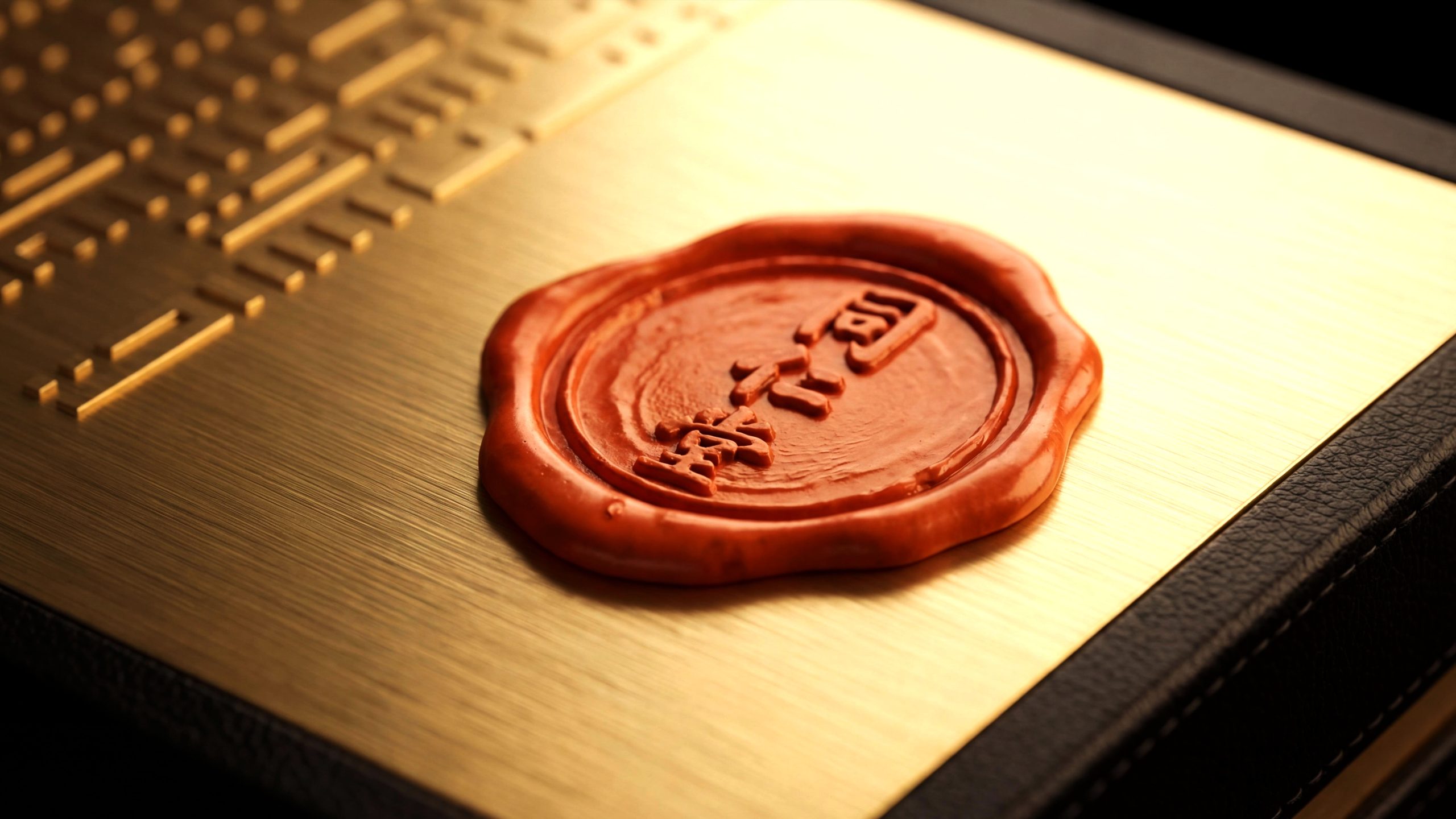
Tongrentang, as a leading brand in the traditional Chinese medicine industry in China, carries more than 300 years of history and adheres to the concept of "a century-old store, inheritance and innovation" to continue to provide consumers with high-quality traditional Chinese medicine products. Facing the rapid development of globalization and modernization, brands are entering a new stage of development. Transforming from a traditional product manufacturer to a comprehensive health platform for the global market, Tongrentang must not only protect the essence of traditional Chinese medicine culture, but also use modern design language to create a new brand image that meets contemporary consumers' needs for quality, culture and innovation. The new gift packaging is a symbol of brand transformation, demonstrating Tongrentang's innovative pursuit of the future and consolidating its cultural foundation in the wave of globalization.

Brand Essence
The brand spirit of Tong Ren Tang is deeply rooted in its three hundred years of historical accumulation and cultural heritage. Its core spirits include:
Stability × Innovation × Trust
Culture × Technology × Humanistic Temperature
These keywords clearly describe the DNA of the Tong Ren Tang brand: stability represents the brand’s adherence to traditional culture, innovation reflects Tong Ren Tang’s continuous breakthroughs in technology and services, and trust is consumers’ recognition of the brand’s lasting value. The humanistic warmth that combines culture and technology is a reflection of the Tongrentang brand's maintenance of local sentiments as it continues to expand into the global market.
Brand Philosophy
Tongrentang's brand concept emphasizes the design core of "rational order × emotional temperature". The new packaging image demonstrates professionalism with a clear and concise structure, and conveys emotional warmth with delicate design details. Under the guidance of this concept, gift packaging not only focuses on the sophistication and high-end of products, but also focuses on establishing an emotional connection with consumers in details, giving them a noble experience. Through the re-creation of the visual system, Tongrentang achieves a perfect balance between professionalism and humanity in brand communication, allowing consumers to feel the deep emotional bond between tradition and modernity.
Visual Language
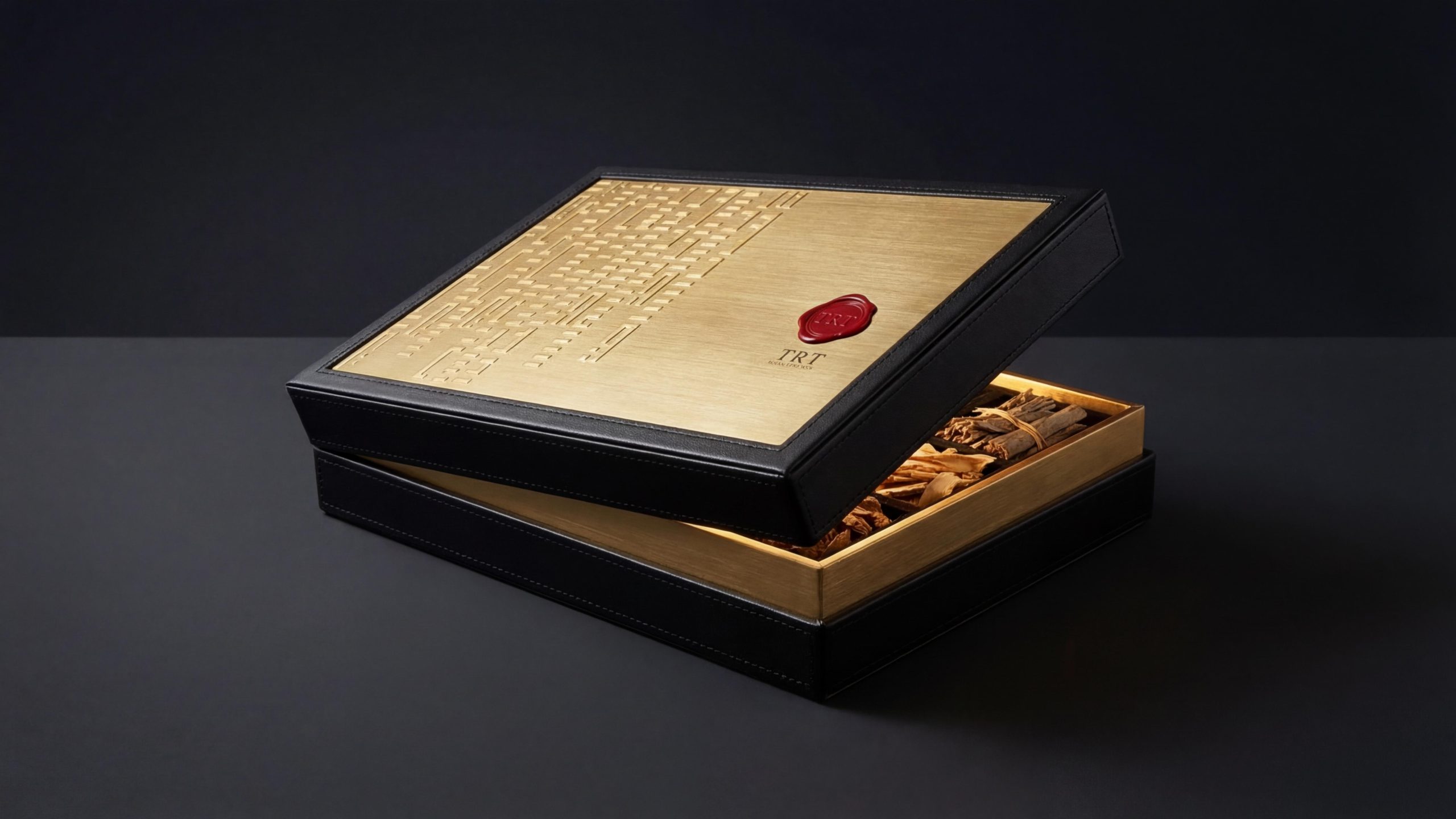
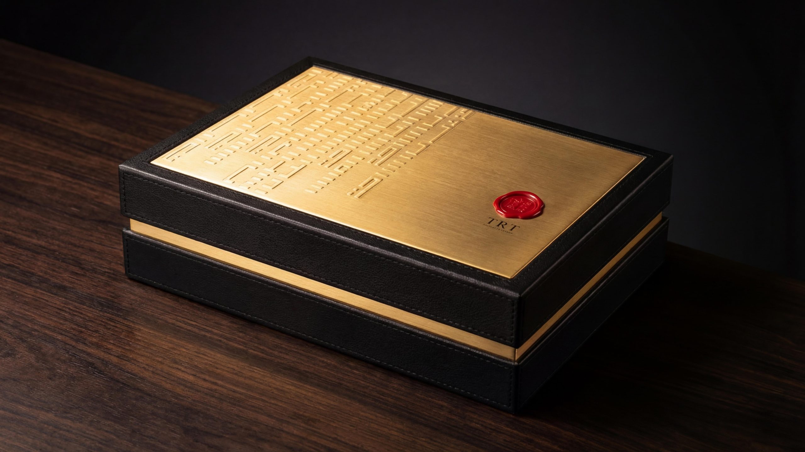
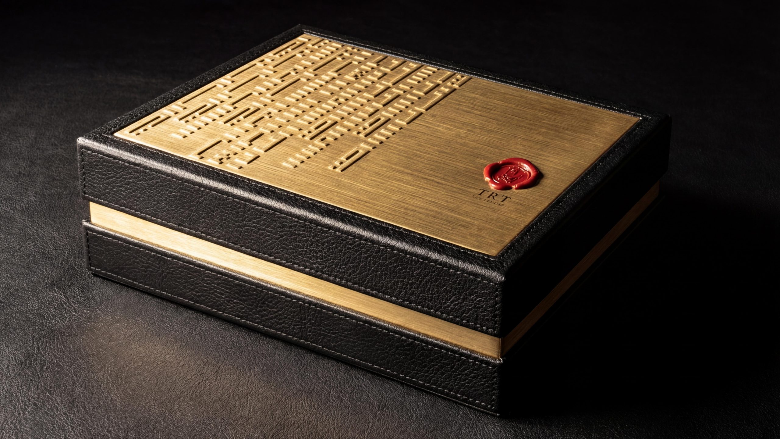
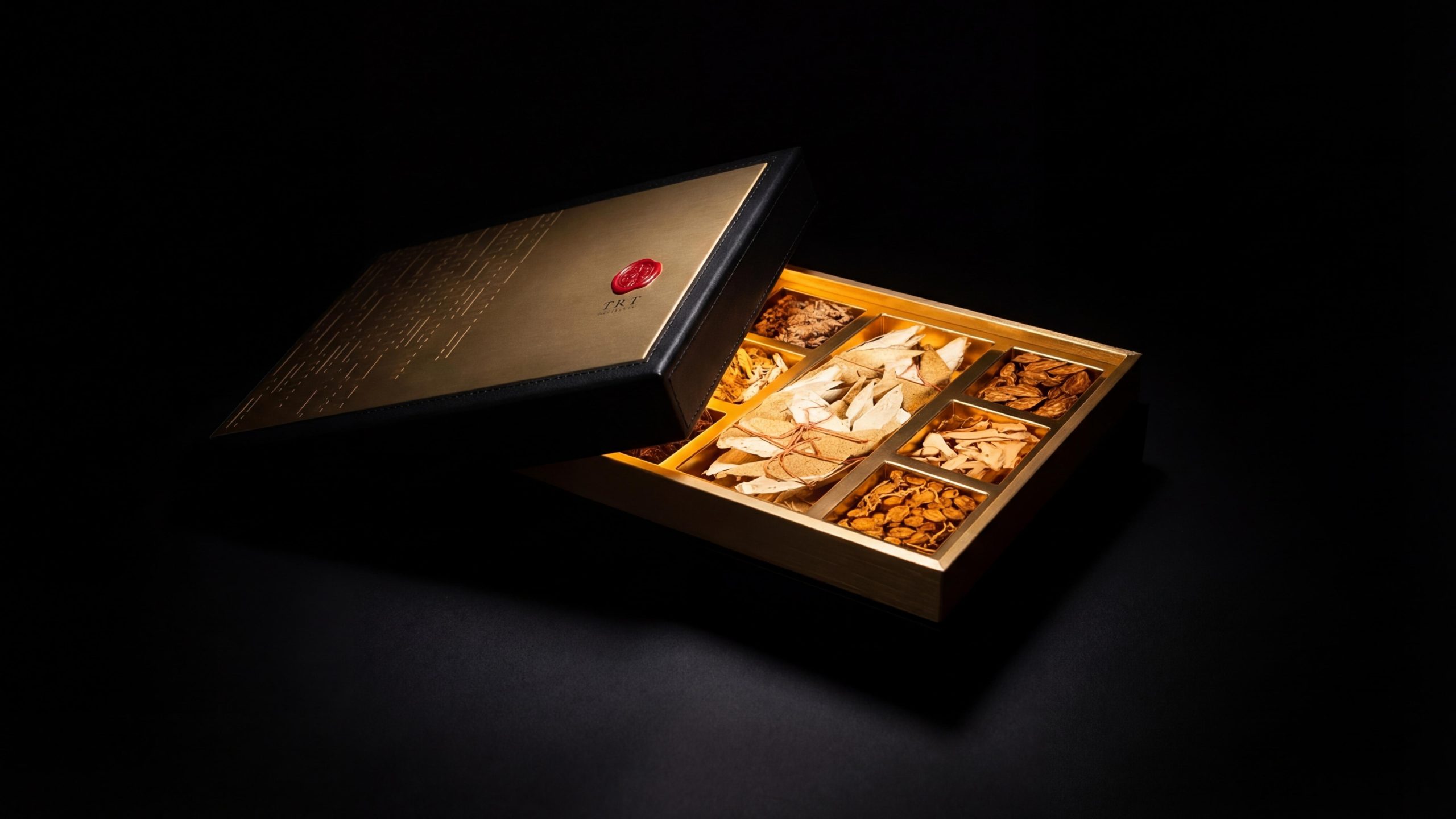
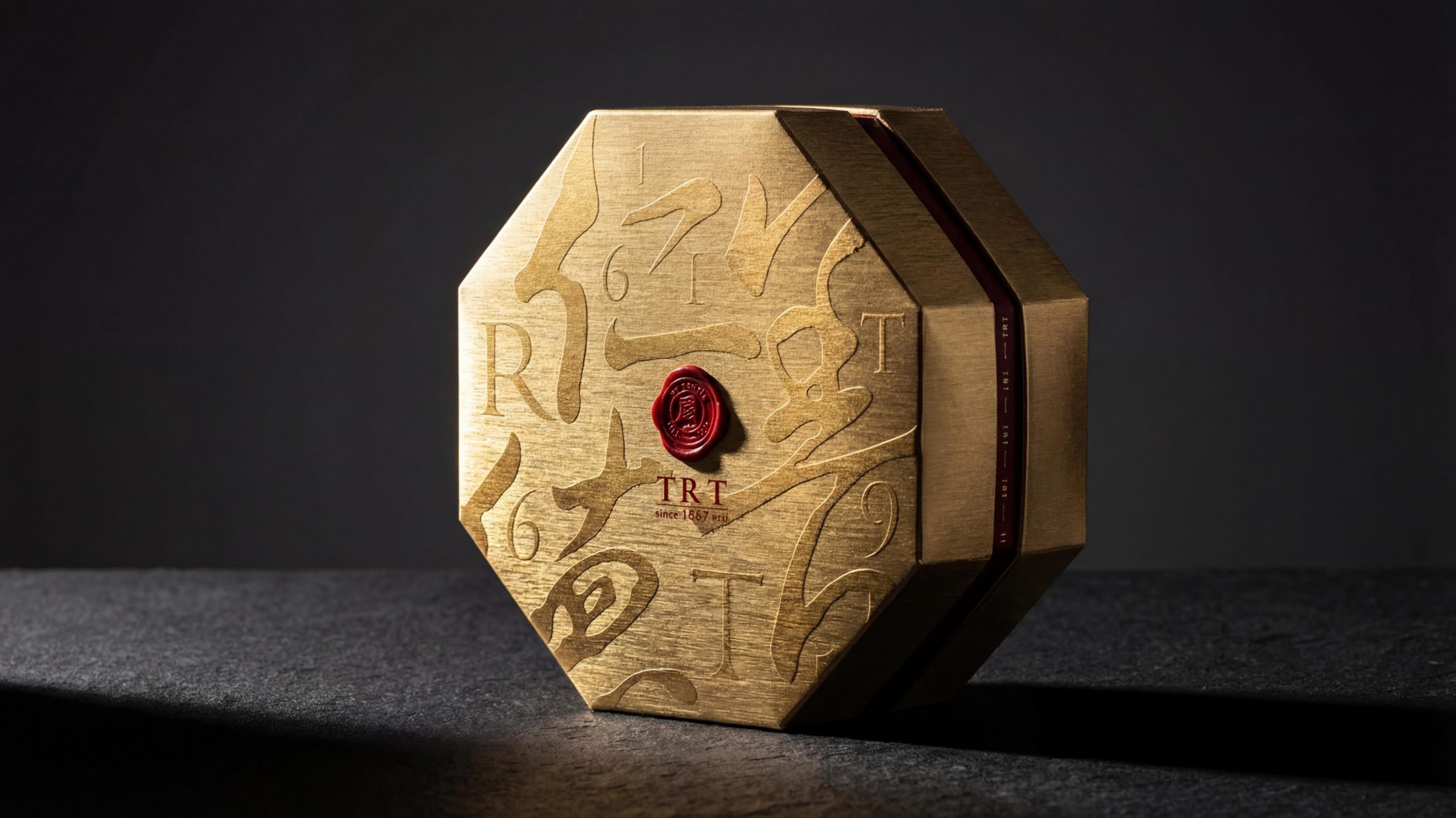
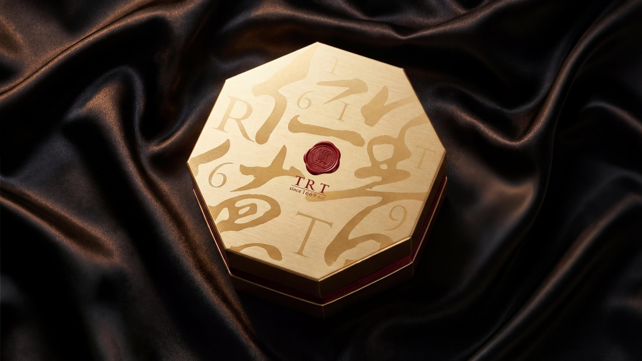
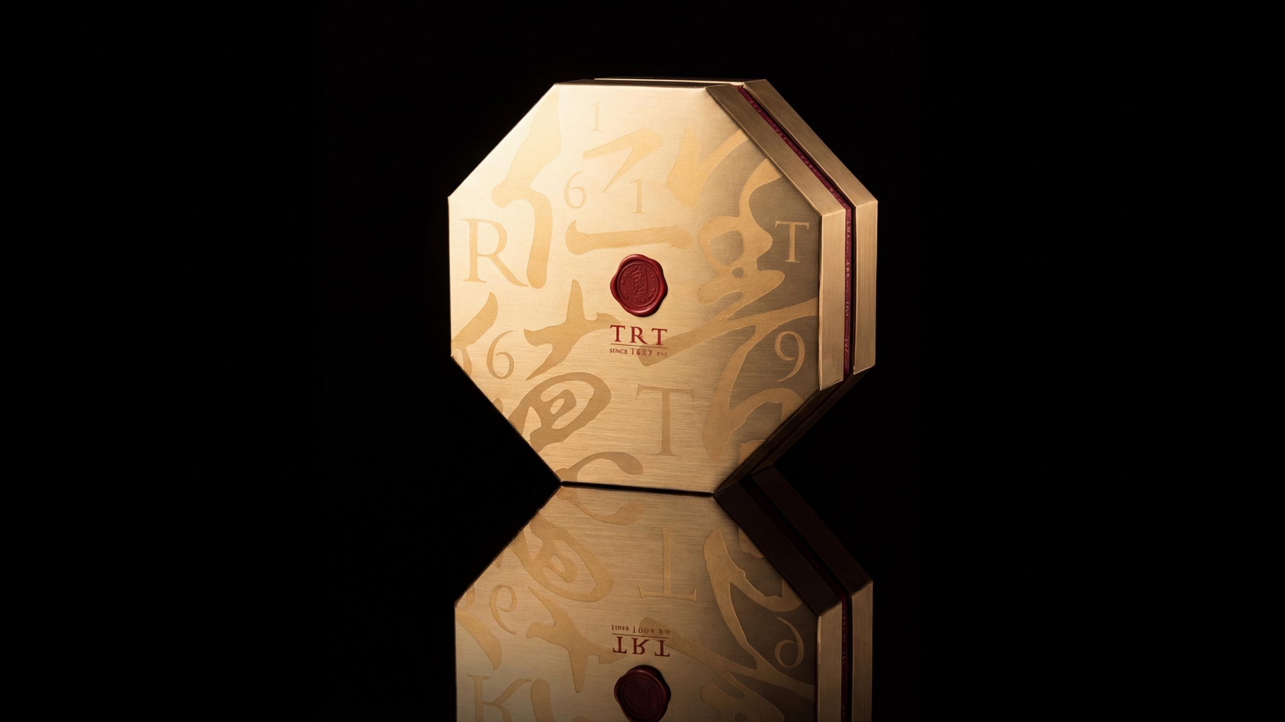
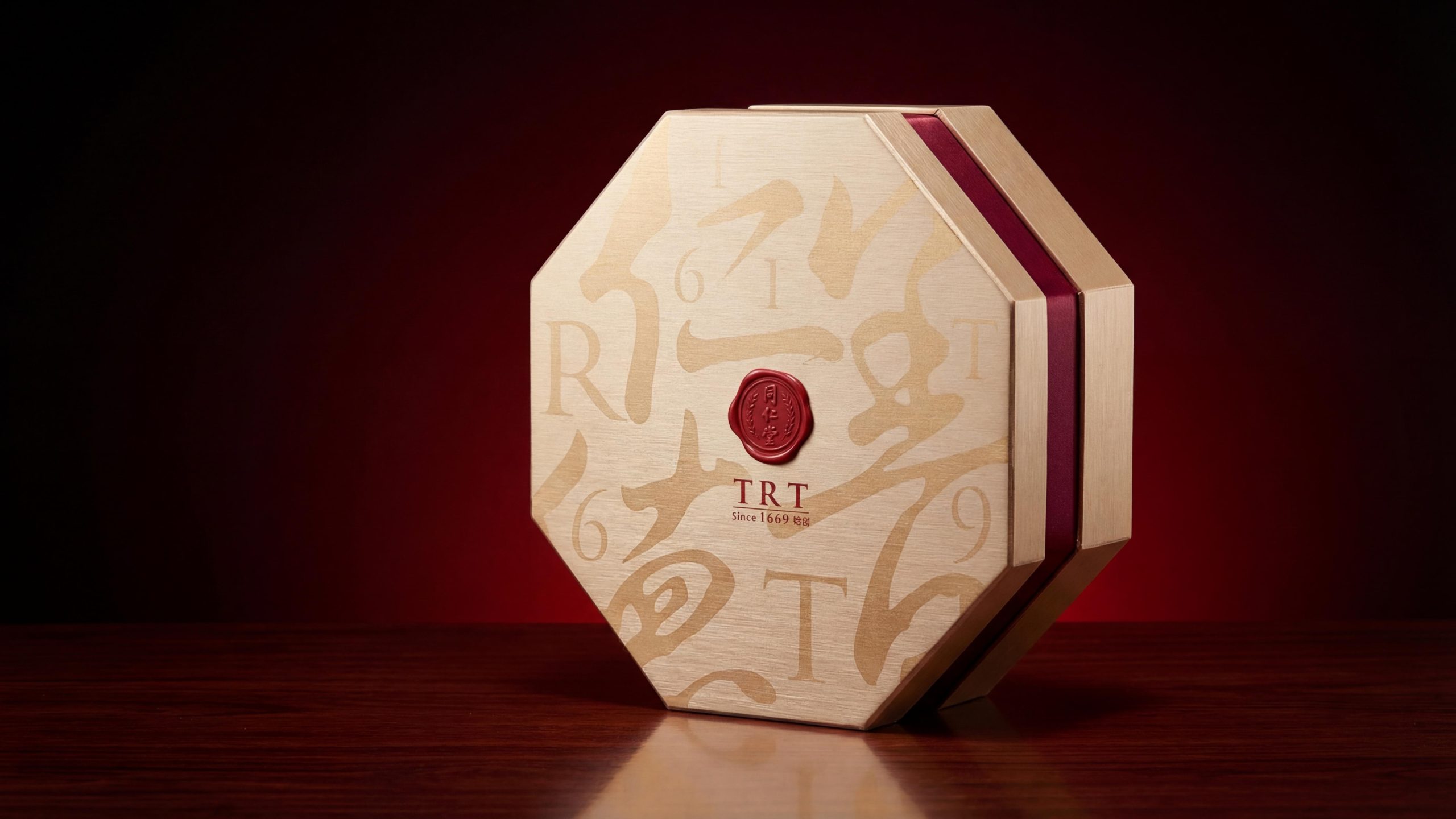
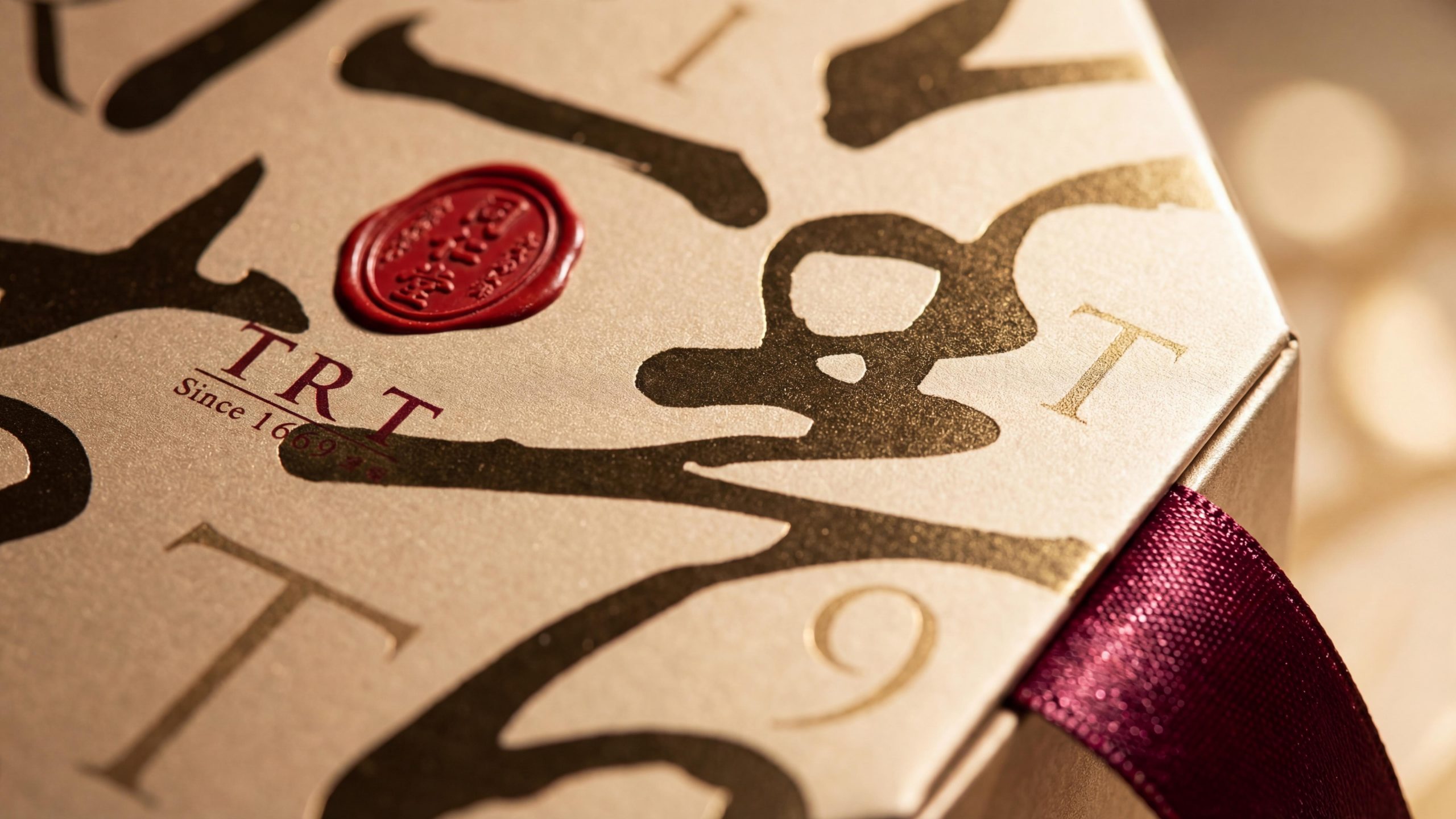
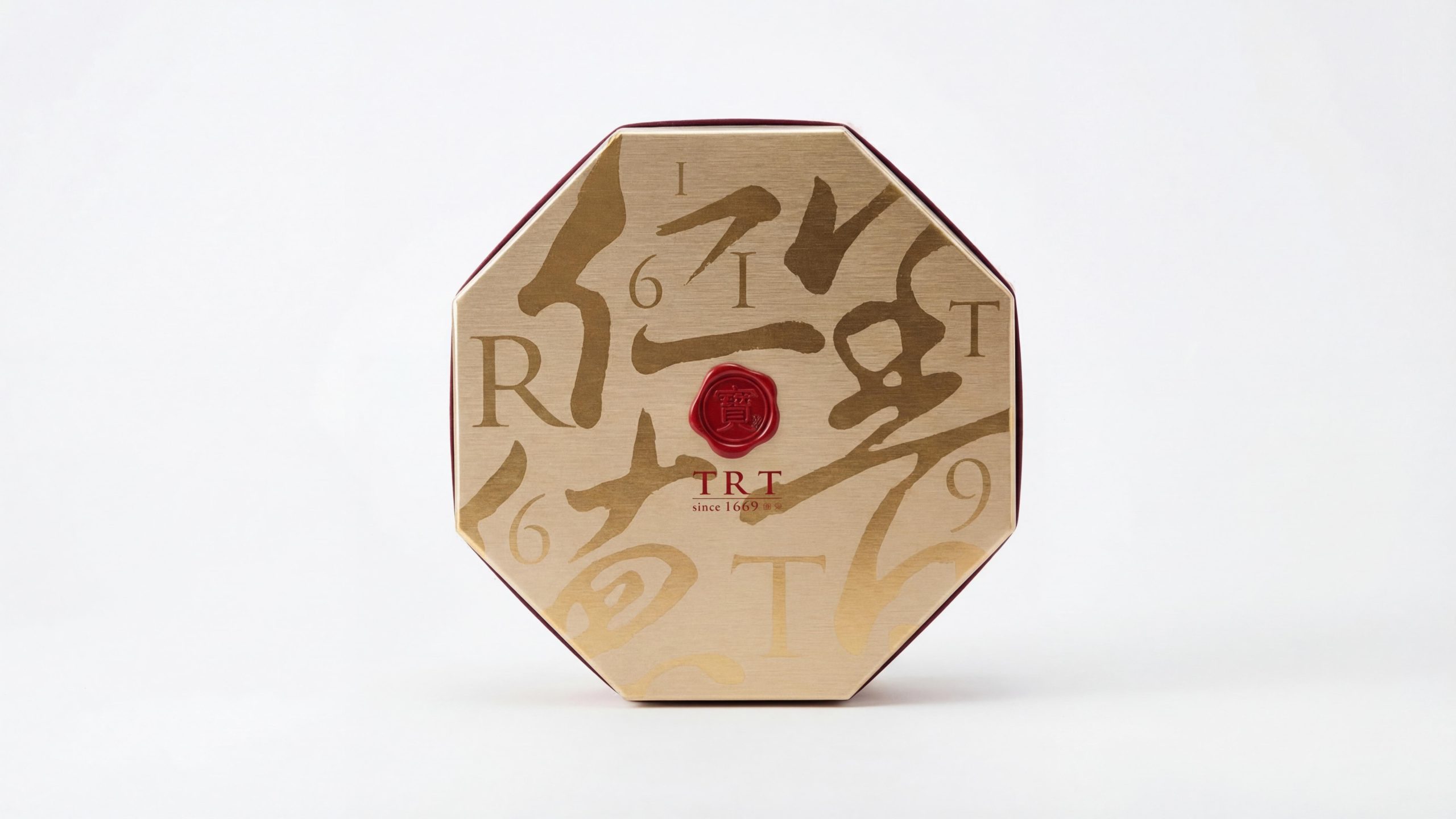
Tongrentang's black gift packaging design is based on a modern and simple style, incorporating traditional Chinese cultural elements to form a unique visual language: Color and structure: Black is the main color, giving the packaging a high-end, stable temperament, while gold embellishments enhance the sense of luxury and reflect the noble attributes of the gift. Graphics and symbols: The zigzag pattern is a representative symbol of traditional Chinese culture. Through modern line design, the zigzag pattern not only retains the profound cultural connotation, but also displays it in a concise way, avoiding overly complicated traditional elements, making the overall packaging more in line with modern aesthetics. Material and texture: Carefully selected high-quality paper materials and meticulous craftsmanship enhance the feel and visual experience of the packaging, making every unpacking a luxurious and noble ceremony. Font and typesetting: The brand identity and font design are simple and modern, focusing on clear structure and detail processing to ensure that the brand image is conveyed in every detail.
Tone of Voice
Tongrentang's brand language emphasizes simplicity, sincerity and professionalism. Complementing its visual image, the brand language maintains a restrained and honest style, which not only conveys the brand's historical weight, but also displays a modern sense of simplicity and high-end. The expression of each paragraph of copywriting should be precise, avoid excessive modification, and ensure the effectiveness and clarity of information transmission. Whether it is the words on the packaging or the language used in brand communication, they all show the brand's profound cultural heritage and meticulous care for consumers.
Brand Experience
Tongrentang's brand experience starts from the opening of the gift packaging and runs through every point of contact between consumers and the brand: Product experience: Through the exquisite gift packaging, consumers can feel the brand's meticulousness and nobility, which enhances the brand's overall sense of identity and trust. Packaging design not only pays attention to aesthetics, but also takes into account practicality and convenience, ensuring that users experience pleasure when opening the package. Digital experience: The extension of the brand image on digital platforms ensures the consistency of online shopping and brand communication. Whether through the official website or social media, consumers can feel the professionalism and warmth conveyed by the brand. Spatial experience: Whether in Tong Ren Tang’s offline stores or in other spatial experience scenarios, the brand image can maintain a consistent visual and sensory experience, ensuring that every interaction between the brand and consumers maintains a high degree of coherence.
Brand Statement
Shape the brand with the heart of culture. Through the combination of innovative packaging design and cultural elements, Tongrentang not only redefines the brand image, but also brings a noble and luxurious brand experience to global consumers. In the wave of globalization, Tongrentang's brand image continues to improve, becoming a model of a health brand that connects tradition and modernity, culture and technology.