










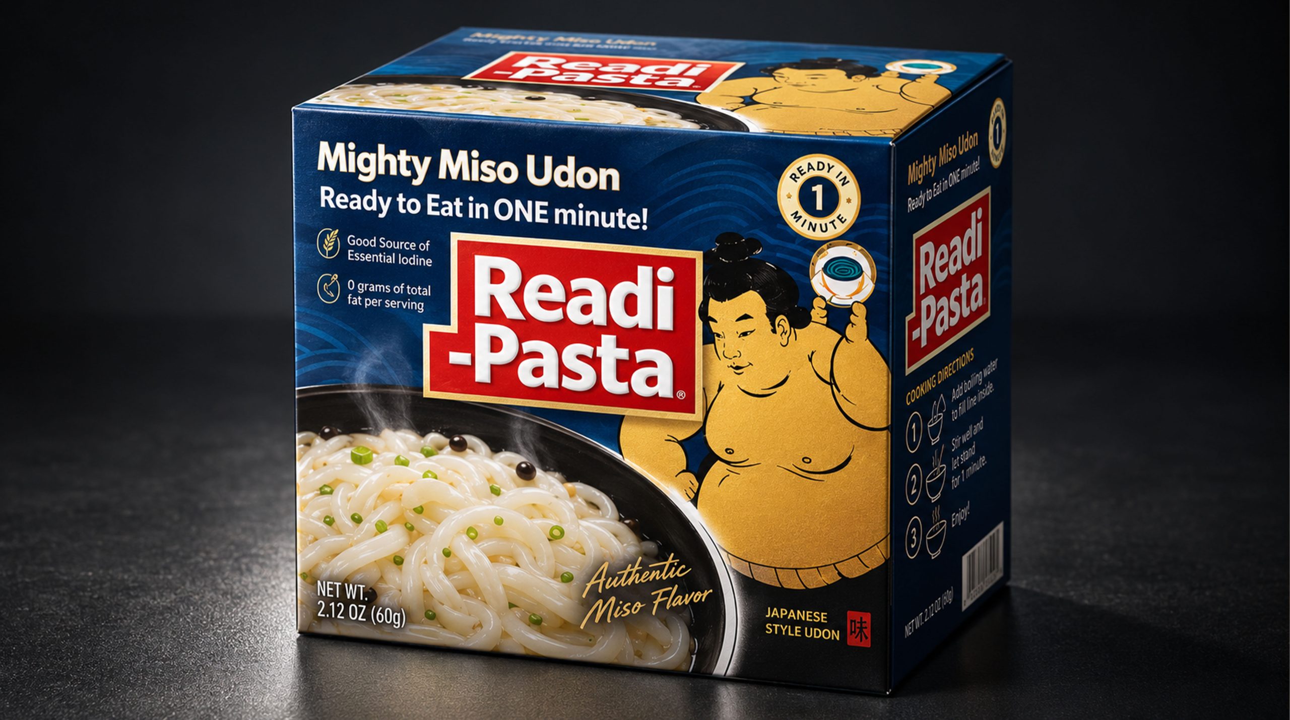
Readi-Pasta is a food brand centered on convenient fast food, Japanese pasta culture and youthful consumption experience. The brand focuses on the fast meal needs of modern consumers in work, study, travel and family life. With "ready to eat in one minute" as the product experience, it provides consumers with ready-to-eat pasta options that take into account efficiency, taste and fun through premade udon noodles, seasoning sauces and simple operation methods.
Faced with the ever-accelerating pace of life, the continued growth of single-person consumption scenarios, and the integration of global food cultures, traditional convenience foods are shifting from simply solving satiety needs to a new stage that pays more attention to taste characteristics, convenience and brand personality. Readi-Pasta takes miso udon noodles as its core product and transforms the udon noodles, miso flavor and sumo wrestling images in Japanese food culture into an intuitive and distinctive packaging language, so that the product can be quickly identified on the shelf and consumers can feel the strong regional culture and relaxed atmosphere before purchasing.
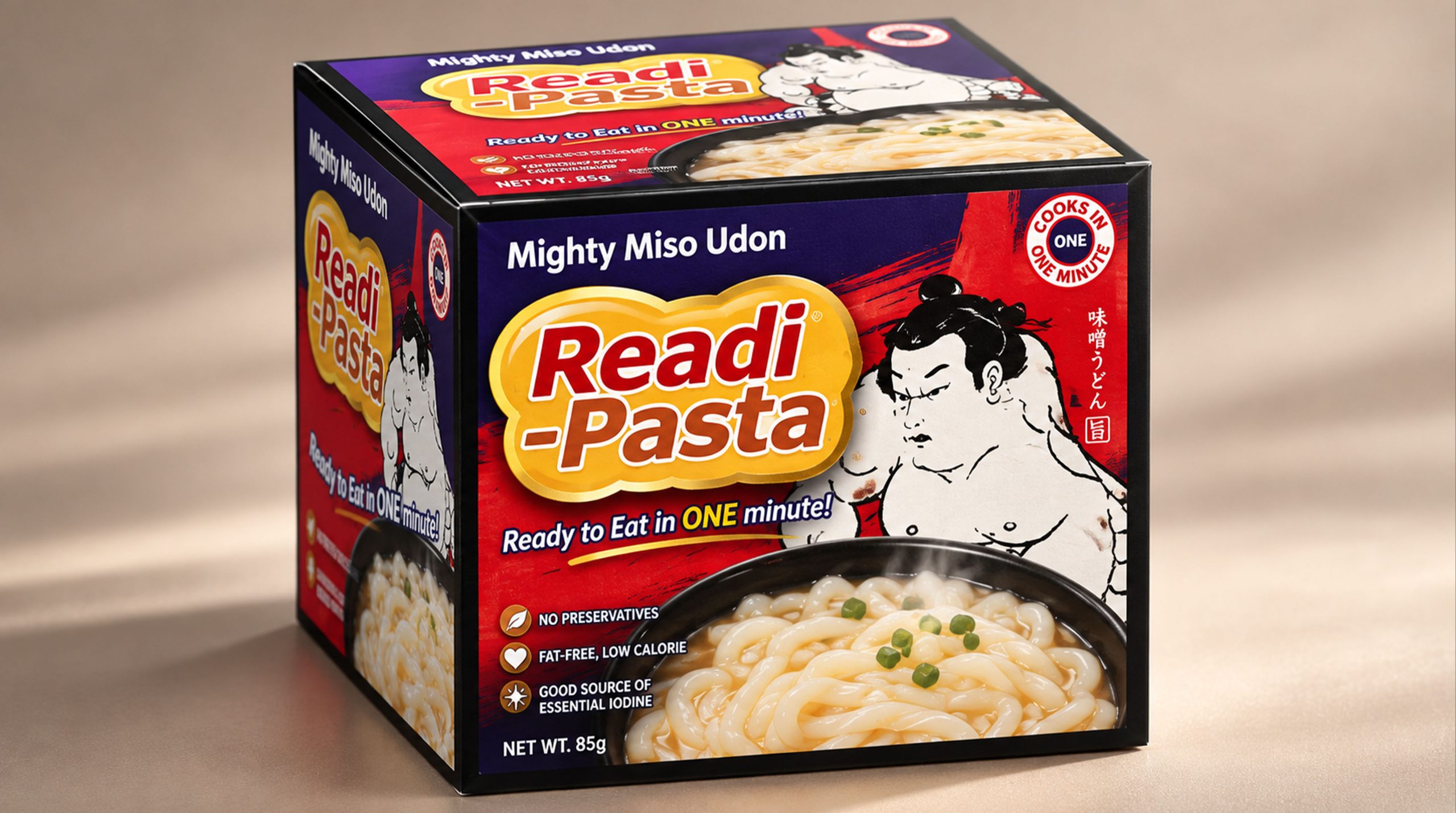
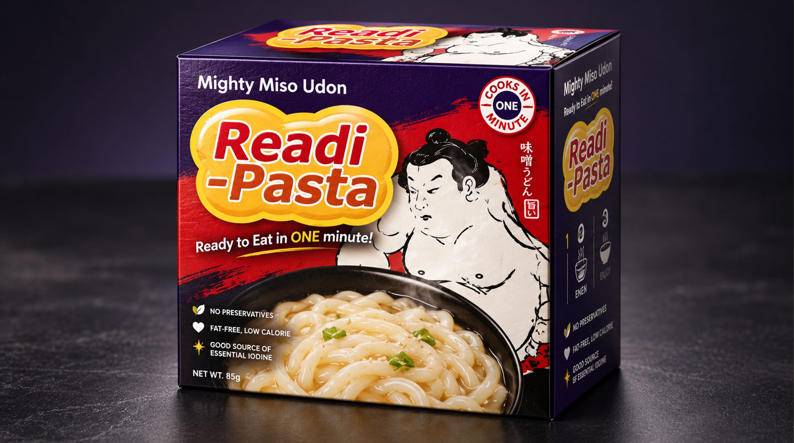
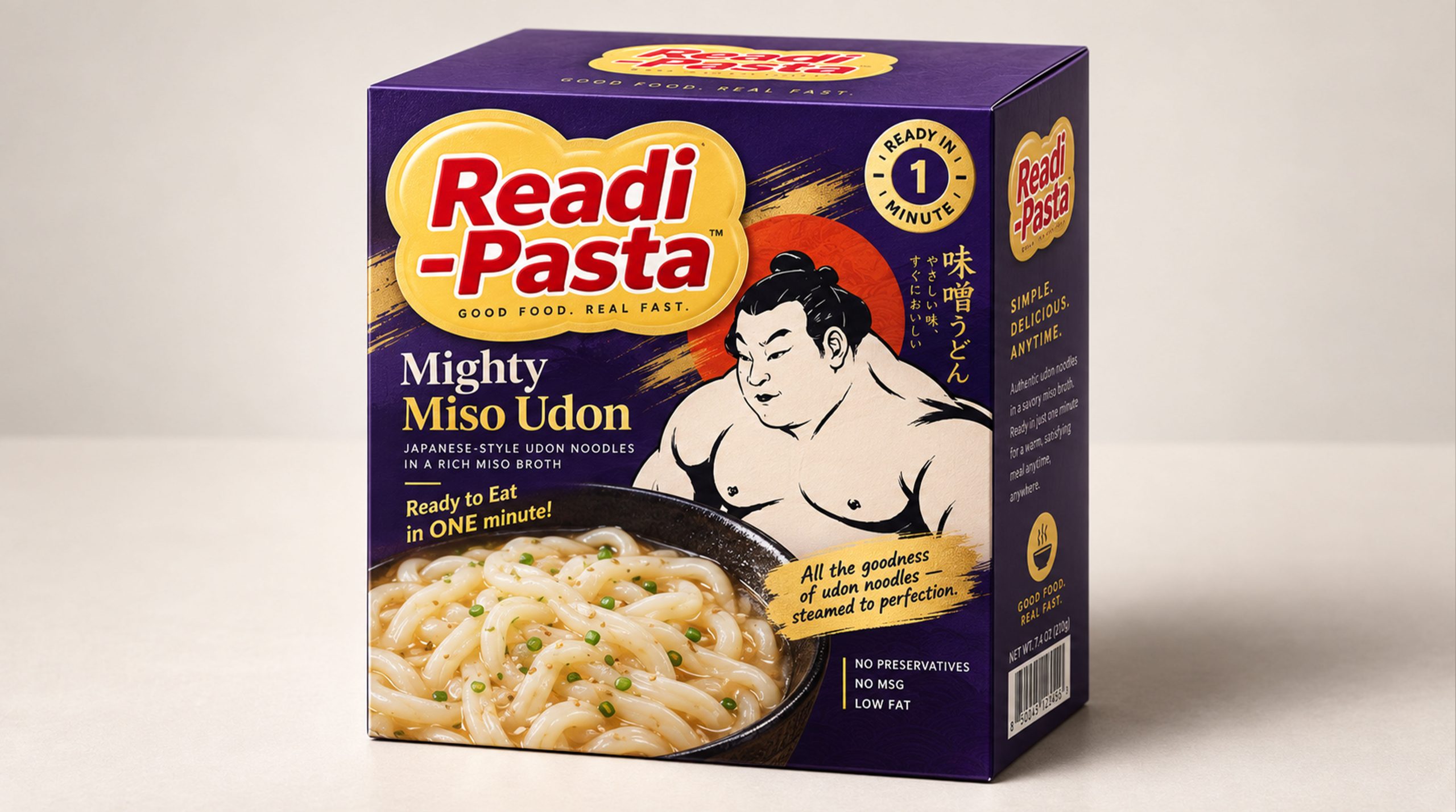
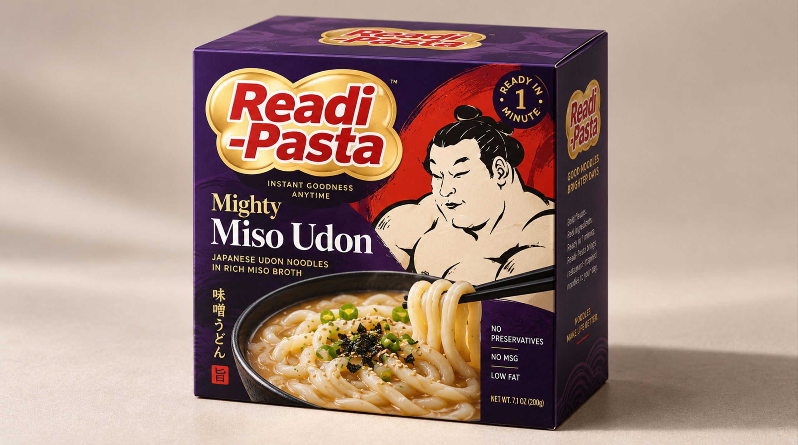
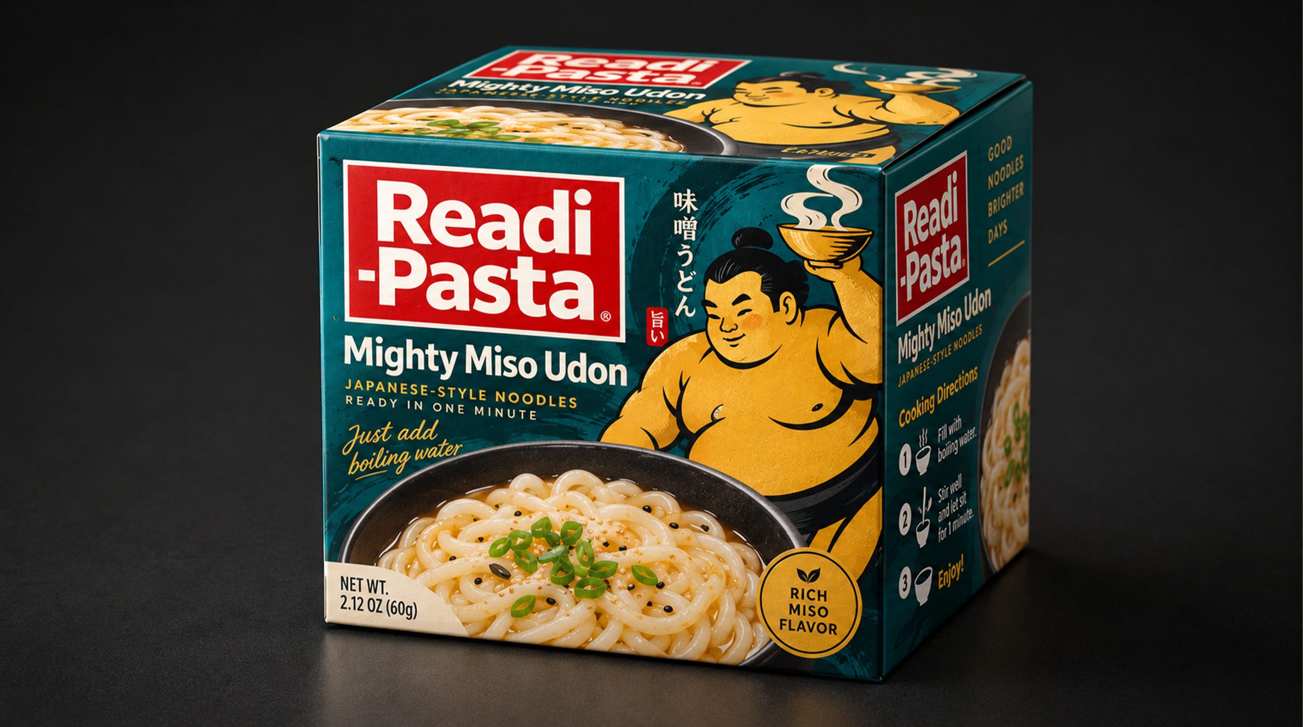
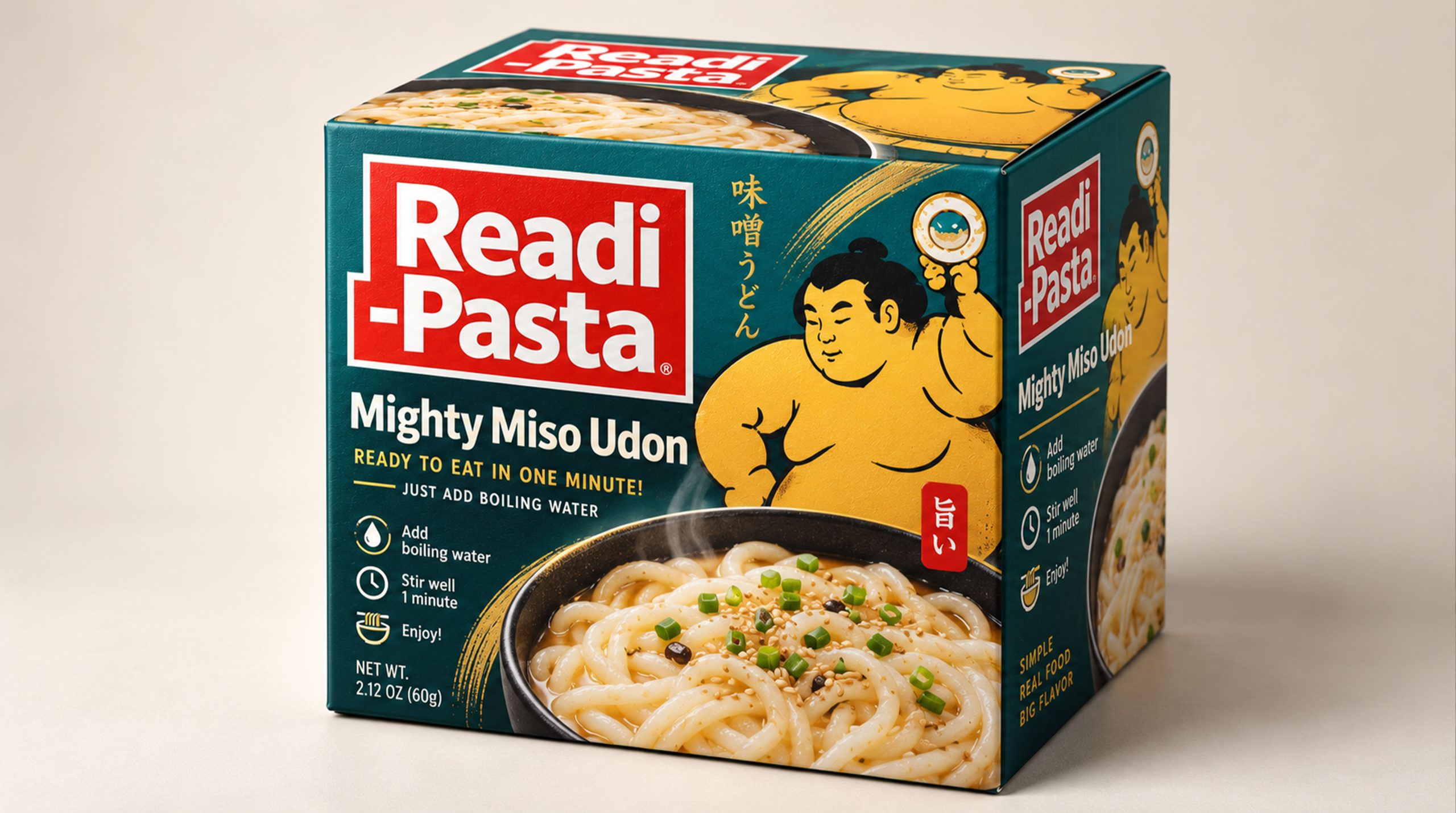
The new packaging image not only assumes the functions of product protection and information transmission, but also becomes an important medium for communication between the brand and consumers. Through square boxes, highly saturated colors, real food shots and memorable sumo wrestling illustrations, Readi-Pasta has established a visual image that is direct, lively and capable of international communication, allowing a fast food to have clear cultural attributes and a pleasant user experience.
Brand spirit
The brand spirit of Readi-Pasta is based on fast lifestyle, Japanese food culture and easy consumption experience. Its core spirits include:
Convenience × Deliciousness × Trust
Culture × Vitality × Daily Companion
These keywords clearly depict Readi-Pasta’s brand DNA. Convenience represents the brand's understanding of the pace of modern life, reducing the time cost of a meal through simple operations and short preparation times; deliciousness reflects the brand's emphasis on the taste of noodles, miso flavor and overall eating experience; trust comes from clear product descriptions, intuitive food display and stable and consistent packaging systems.
The culture reflects the brand’s reference and transformation of Japanese udon noodles, sumo wrestling sports and regional visual symbols; the vitality comes from bright colors, exaggerated and powerful characters and direct information expression; daily companionship allows the product not only to appear in emergency hunger moments, but also to naturally enter various life scenes such as office lunch, home supper, travel supplies and relaxed gatherings.
Brand concept
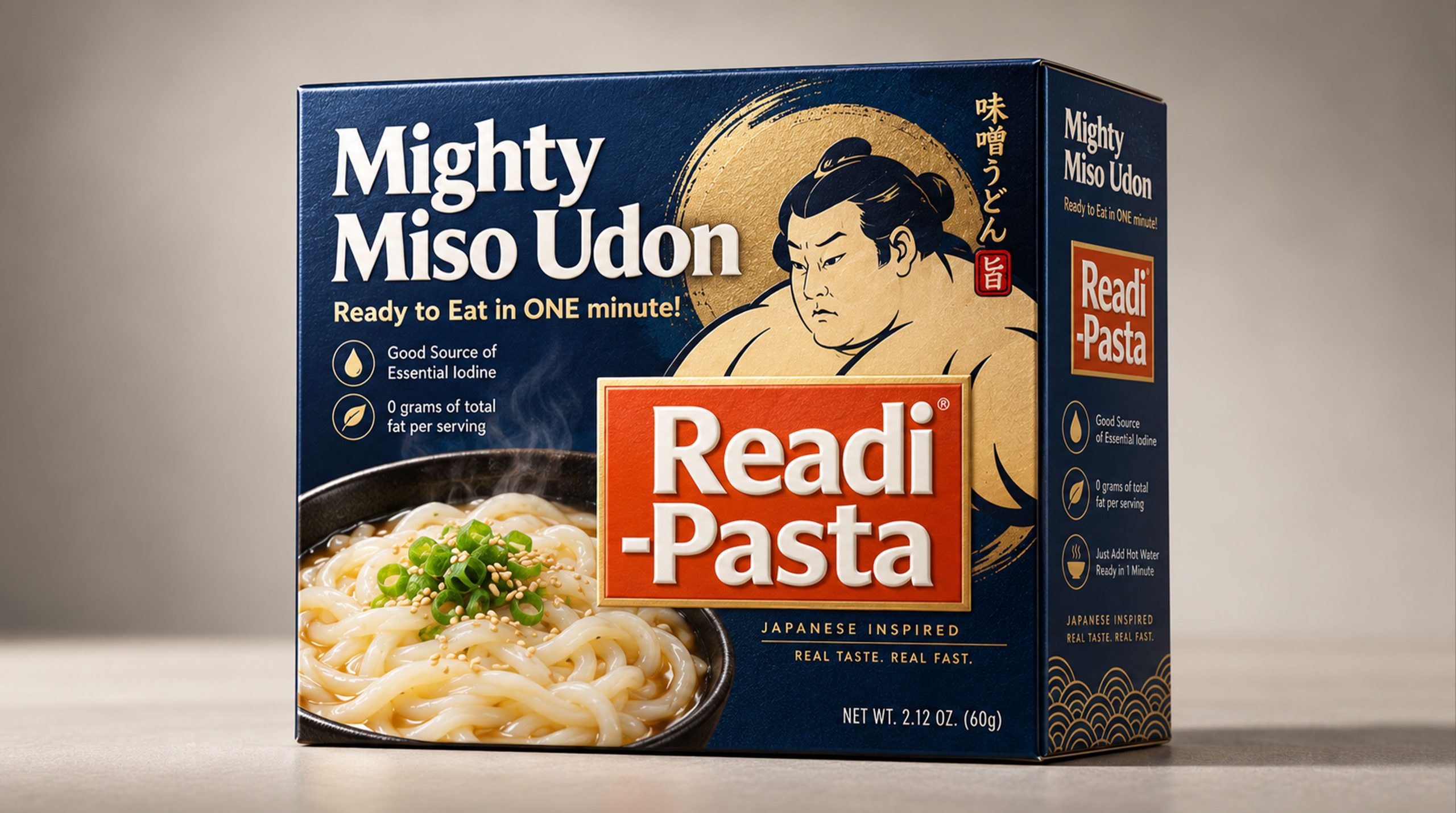
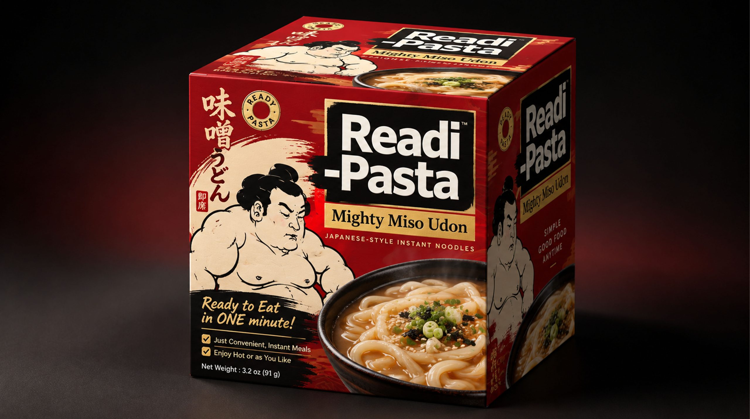
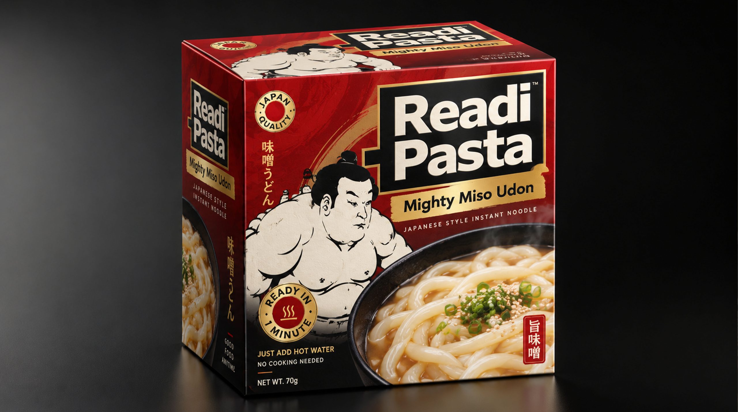
Readi-Pasta's brand concept emphasizes the design core of "quick efficiency × eating pleasure". The new packaging image shows the convenience of the product with a clear and direct information structure. It uses bright colors, sumo wrestling figures and large-area food images to convey heat, power and satisfaction, allowing consumers to understand the product name, taste characteristics and eating methods in a short time. Under the guidance of this concept, packaging not only pays attention to the visual impact on the shelf, but also pays attention to the complete process of consumers from seeing the product, picking up the package, reading the instructions to completing brewing or heating. The brand name is placed in a high-recognition area, with large font size and strong contrasting color blocks forming the main visual center; messages such as "Mighty Miso Udon" and "Ready in one minute" follow closely to create a clear reading order. The image of sumo wrestling has become an important emotional carrier of the product. It not only symbolizes strength, portion and satisfaction, but also adds humor and affinity to fast food products. Through a combination of real food photos, cultural illustrations and functional information, Readi-Pasta establishes a balance between practicality and entertainment, making a quick meal no longer seem rushed, but a simple, easy and worth looking forward to life moment.
visual language
Readi-Pasta's packaging design is based on mass consumer vision and Japanese pop culture. It uses highly saturated colors, bold text, sumo wrestling illustrations and real shots of udon noodles to form a visual language that is direct, powerful and has strong shelf recognition.
Color and structure: Red, turquoise, dark blue and purple constitute the main series of colors for packaging. Red conveys heat, speed and appetite, and is suitable for strengthening the brand name and core information; turquoise creates a refreshing, youthful and Asian food-like visual experience; dark blue emphasizes stability, contrast and functional information; purple adds a more distinctive personality and interest to the series. The packaging adopts a cube box shape, and each facade carries independent information, so that the product can maintain a high degree of recognition whether it is displayed from the front, side or top.
Graphics and symbols: Sumo wrestlers are the most memorable visual symbols of the brand. The characters are presented in black and white line drawing or yellow flat painting, with full and powerful body shapes, forming a direct connection with the sense of power expressed by "Mighty". The characters’ movements, expressions and the timing logo in their hands jointly convey a fast, sufficient and interesting product experience. The large picture of udon noodles serves as a taste expression, directly stimulating consumers’ imagination of the taste of food through the gloss, thickness and edge of the noodles.
Material and texture: The packaging is based on a carton structure suitable for food transportation and display. The surface can use matte coating and partial brightening technology to make the brand name, noodle image and speed logo form layers under the light. Local highlights can be used in the food image area to enhance the moist texture of the udon noodles; the sumo illustrations and background color blocks are kept relatively flat, creating a clear contrast between the real shot and the illustrations. Packaging edges and fold lines need to be kept clean to ensure that the square structure is stable and reliable during stacking, transportation and shelf display.
Font and typography: The brand name uses a large bold sans serif font, and establishes the first visual identity through the strong contrast of red and white, black and white or orange and white. Product information such as "Mighty Miso Udon" and "Ready to Eat in ONE minute" are emphasized with different font weights and colors, allowing consumers to quickly access key content. The overall layout has obvious characteristics of commercial communication. The information level is direct and the rhythm is compact. However, the basic order is maintained through color blocks, borders and image partitions to avoid interference of important information with each other.
language and tone
Readi-Pasta's brand language emphasizes directness, ease and action. In line with the packaging's bright and lively visual identity, brand text should use short, powerful and easy-to-understand expressions, allowing consumers to understand in seconds what the product is, how to prepare it and what kind of dining experience they can get.
Each piece of copy should focus on speed, convenience, miso flavor, udon taste and daily scenes. Brands can use rhythmic expressions such as “Ready in a minute,” “Just heat it up,” “Have it at any time,” but should avoid complex instructions and empty exaggerations. Operation steps should be kept clear and accurate, and the cost of understanding should be reduced through numbers, icons or short sentences.
The brand tone can be humorous and energetic, and it can also use sumo wrestling culture to create a sense of power and fun, but cultural symbols should not be allowed to override the food itself. Whether it is packaging instructions, promotional copy, social media content or e-commerce pages, Readi-Pasta should maintain a friendly, direct and appetizing communication method, allowing consumers to easily complete the process from seeing, understanding to purchasing.
Brand Experience
Readi-Pasta's brand experience starts from the first moment consumers see images of bright colors, sumo wrestling figures and udon noodles, and continues through every touch point from selection, opening, preparation, consumption and re-purchase.
Product experience: Square packaging facilitates shelf display, transportation and home storage, and consumers can quickly identify product series through different colors. The large brand name and real photos of noodles on the front reduce the difficulty of selection, and the operating instructions on the side help users quickly complete the preparation process. The opening method of the box, the arrangement of the inner packaging and the classification of seasonings need to be kept simple so that the brand promise of "can be enjoyed in one minute" can be perceived in real use.
Eating experience: The brand places quick preparation and noodle satisfaction at the heart of the experience. The noodles should present a visual impression of soft, smooth and elastic, and the miso flavor should be expressed through the language of warmth, richness and Japanese characteristics. The product is suitable for scenes such as work breaks, late-night snacks in dormitories, simple family meals, and travel supplies, allowing consumers to have a relatively complete and easy meal when time is limited.
Digital experience: The brand continues bright colors, bold text and sumo graphics on e-commerce platforms, social media and short video content, and builds a simple and direct online experience through quick cooking demonstrations, eating scenes and taste introductions. The dynamic countdown, one-minute production process and noodle pulling pictures can further enhance the product’s convenient attributes and appetite expression.
Terminal experience: Whether in imported food stores, convenience stores, supermarket fast food areas or vending scenes, Readi-Pasta can rely on high contrast colors and square packaging to form a stable display. Different flavors are distinguished by background color, and the sumo wrestling characters and brand names remain unified, so that when multiple products are juxtaposed, a distinct, neat and interesting brand array is formed.
brand statement
One minute to prepare and a powerful meal.
By re-integrating Japanese udon culture, modern fast food needs and youthful visual language, Readi-Pasta not only established a distinctive, direct and easily identifiable product packaging, but also made the convenience, fun and cultural characteristics of fast food more intuitively perceived by consumers. From an eye-catching brand color block to a powerful sumo wrestling figure, from a box of ready-to-eat udon to an easy and quick meal, the brand is based on convenience, with taste as the core, and culture as expression, making every preparation easier and allowing every busy moment to have a hot and satisfying daily companion.