


















Qingmei Future Insights
Responsive brand design: adapting to the challenges of the multi-screen era
From smartphones to tablets, from desktop monitors to smart TVs, the multi-screen era requires brand design to have strong adaptability. Responsive brand design is no longer optional, but a necessity for brand survival. How to ensure that the brand maintains visual impact and recognition on screens of different sizes and resolutions has become a core challenge for designers.
This article will explore the concepts and methods of responsive brand design, from the construction of a flexible visual system to the design of dynamic logos, from the application of grid systems to the formulation of breakpoint strategies, providing brands and designers with comprehensive solutions to the challenges of multiple screens.
Strategic refactoring of responsive design

The evolution of responsive brand design reflects a deeper understanding of the media landscape and a fundamental shift in visual communication strategy. The old fixed-size model, "single design, proportional scaling, basic adaptation," is giving way to a dynamic model: "fluid design, intelligent breakpoints, context optimization." In this shift, responsive design is no longer just a technical adjustment to web layouts. It is a systematic adaptation strategy that must be planned from the top of the brand's visual system.
The core of a modern responsive brand is a new logic for cross-device identity. Traditional brands cover multi-screen scenarios by designing a separate visual solution for each device. Responsive brands build a fluid design system with intelligent adaptive mechanisms, balancing consistency with the best possible experience. This shift requires brands to move from producing multiple versions to architecting flexible design systems and orchestrating experiences across contexts.
A fundamental change in design thinking: from a fixed to a fluid paradigm
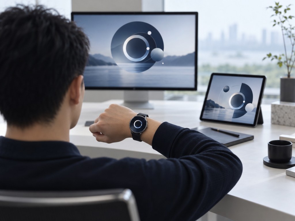
Responsive branding starts with rethinking design itself. Traditional design follows "canvas thinking": crafting a perfect visual on a fixed-size canvas, then copying and adjusting it for each device. Responsive design follows "systems thinking": rather than designing specific pages, it defines how elements behave, how layouts respond, and how content is prioritized, so visuals find their best form at every size.
Responsive design is the central challenge of adapting a logo. A traditional logo is a static graphic with fixed proportions: commanding on a large screen, but liable to lose its detail on a smartwatch. A responsive logo uses a system of progressive simplification. The full version pairs the symbol with the complete brand name for large formats. The simplified version keeps the symbol and a short name for medium sizes. The icon version retains only the core graphic element for the smallest sizes. Each version is not an arbitrary reduction but a deliberate edit based on the hierarchy of visual identity, so the brand's core identity comes through at any size.
A responsive color strategy handles display differences across devices. The same color looks very different on OLED, LCD, and e-ink screens. Responsive color isn't a fixed value but a scheme optimized dynamically for device characteristics, ambient light, and user settings. The primary brand color can appear rich and saturated on high-end OLED displays, switch to a contrast-optimized version on e-readers, and brighten automatically in strong outdoor light to stay legible.
Breakpoint-based type keeps text legible across sizes. Fixed sizes are hard to read on small screens, while simply scaling up breaks the layout. Responsive typography sets a size scale with breakpoints for phone, tablet, desktop, and large displays, recalculating heading-to-body ratios, line height, and letter spacing at each. More advanced systems use variable fonts, with weight and width shifting continuously with screen size for truly fluid typography.
Rebuilding Layout Systems for Flexibility: From Pixel Precision to Proportional Flow

The challenge of responsive layout is not just "scaling down." It is rearranging content and dynamically adjusting information hierarchy. From a 27-inch monitor to a 5-inch phone screen, visible space shrinks by dozens of times. Simple proportional scaling leaves content cramped or loses detail.
Flexible grids are the foundation of responsive layout. A traditional fixed-width grid, such as a 12-column layout at 1200px, becomes a percentage grid in responsive design: each column takes a fixed share of the container's width rather than a fixed number of pixels. As the container resizes, the grid scales and content reflows with it. More refined systems assign different column counts to different breakpoints, such as 12 on desktop, 8 on tablet and 4 on mobile, so content density matches each device.
Content priority and progressive disclosure solve the problem of limited space. Not everything needs to appear on a small screen. Responsive design ranks content by importance: core information is always visible, secondary information is collapsed but expandable, and supplementary information is hidden entirely on small screens. This ranking is not a matter of designer taste. It is a strategic decision based on user behavior data and business goals. An ecommerce site puts the buy button and price first on mobile, and shows detailed spec tables only on desktop.
Components change form to fit different interaction models. Hover effects on desktop don't work on touchscreens and need to become taps or swipes. Navigation can expand horizontally on desktop but collapses into a hamburger menu or bottom tab bar on mobile. Dropdowns work for desktop forms, while mobile forms are optimized with large buttons and native pickers. Each choice of form is based on the device's interaction characteristics and users' habits.
Scenario-based optimization of touch-point experience: from device adaptation to context matching

The harder challenge in responsive design goes beyond screen size: understanding the user's context and state of mind. On the same phone screen, someone skimming during a commute needs something very different from someone reading at length on the sofa at home. A truly responsive brand responds not only to physical parameters, but to the situation of use.
Time-responsive design accounts for users' attention. During the morning commute, mobile users need key information fast, so brand content automatically condenses into highlights and quick actions. Late at night, users are more willing to explore in depth, so the interface expands into detailed information and immersive experiences. On weekends, users seek more entertainment, so brand content adds interactive elements and emotional design. This time-based response relies on pattern recognition in user behavior data to match the most likely context automatically.
Responsive strategies based on network conditions optimize the loading experience. On 4G, high-resolution visuals and motion can load in full. On weak connections, the site falls back to a lighter version: solid colors replace background images, static images replace animations, and text replaces video. This is not a compromise on brand experience but a deliberate choice to deliver core information within technical limits, so users don't leave because a page loads slowly.
Diverse input methods call for responses to emerging interaction models. With voice assistants, a brand needs an audio-only identity: a sonic logo, brand sounds, a voice personality. On AR glasses, the brand appears as virtual elements in three-dimensional space. On a smartwatch, it compresses into a minimal icon and haptic feedback. Each input method requires the brand to rethink how it is perceived, expanding from a single visual sense to a multisensory identity system.
Building the Technical Foundation: From Design Tools to Development Collaboration

Delivering responsive brand design requires end-to-end support across design tools, development frameworks, and testing processes. If technology cannot faithfully realize a designer's vision, responsiveness remains a slogan rather than a practice.
Design tools have evolved to support responsive workflows. Figma's Auto Layout, Sketch's Smart Layout, and Adobe XD's Responsive Resize let designers define how elements respond during the design stage: fixed width or flexible, how height changes as content grows, how layouts reflow across breakpoints. Design files are no longer static screenshots but dynamic systems with built-in responsive logic, and developers can read each element's constraints directly to implement them.
A shared component library keeps design and development consistent. Designers build the brand component library in Figma, developers build the matching UI component library in code, and naming conventions and parameter mapping keep the two in sync. When a designer updates a component's style, a plugin generates the CSS automatically or notifies developers to update. This integrated design-to-development workflow closes the familiar gap of "perfect in design, off in production."
Automated testing covers a vast range of device combinations. A responsive brand must stay consistent across dozens of screen sizes, operating systems and browsers, and manual testing is costly and prone to gaps. Automated tools simulate device environments, compare screenshots to catch visual differences and monitor performance to find loading bottlenecks. AI-driven testing can even catch violations of design standards: font sizes outside the system scale, colors that drift from brand values, spacing that doesn't align to the grid.
The strategy behind responsive brand design: fluid systems adapt to countless devices, intelligent responses fit diverse contexts, and technical coordination keeps the experience consistent.
Conclusion
Responsive brand design is an inevitable choice in the multi-screen era. It requires us to rethink the construction logic of the brand visual system. Through the discussion in this article, we realize that responsive design is not only an adaptation at the technical level, but also an innovation in brand thinking. Successful responsive brand design requires achieving a seamless experience across devices while maintaining the core identity of the brand, so that the brand can be perfectly presented on any screen.
In practice, designers need to get rid of fixed thinking and adopt fluid, flexible, and modular design concepts. Start designing from the smallest screen and gradually expand to large screens to ensure that every breakpoint can provide the optimal visual experience. At the same time, we must make full use of modern design tools and front-end technology to improve the efficiency and quality of responsive design.
In the future, with the popularity of new display devices such as wearable devices, car screens, and AR glasses, responsive design will face challenges from more dimensions. But it also provides endless possibilities for brand innovation. Let us embrace change and use flexible, intelligent, and forward-looking design thinking to help brands maintain strong vitality in the multi-screen world and create a coherent and pleasant brand experience for users.