
















Qingmei Future Insights
Brand Color System Construction: Creating Unique Visual Impressions
Brand Color System Construction: Creating Unique Visual Impressions
Color is the most intuitive and emotional element in brand identification. A mature brand color system can instantly arouse consumers' brand associations. From Coca-Cola’s passionate red to Tiffany’s elegant blue, unique colors have become one of a brand’s most valuable assets. Building a scientific, complete and personalized color system is the core task of brand visual strategy.
A Strategic Rebuild of the Color System

The evolution of brand color systems reflects a deeper understanding of visual identity and a fundamental shift in how brand assets are managed. The old model of ad hoc color selection, "personal preference, decoration, quick fixes," is giving way to a systematic model: "strategic positioning, system architecture, asset management." In this shift, color is no longer just a tool for a designer's aesthetic expression. It is a systematic identity asset that must be planned from the top of brand strategy.
The core of a modern color system is a new logic for brand visuals. Traditional brands choose "nice-looking colors" to enhance visual presentation. Systematic color branding builds a complete color language with strict usage rules, creating strong recognition and brand equity. This shift requires brands to move from using color to architecting color systems and strategically managing visual assets.
A Fundamental Shift in Systems Thinking: From a Single Color to a Color Ecosystem
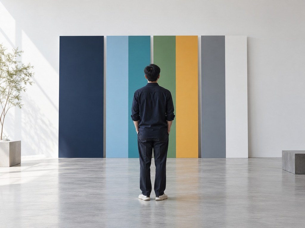
A distinctive visual impression starts with moving from a single color choice to a complete color system. Traditional brands often define only one "brand color," leaving designers to interpret it on their own, which leads to inconsistent use and diluted recognition. A systematic palette establishes color hierarchy, usage rules, and extension logic at the design stage, keeping color consistent and recognizable throughout the brand's lifecycle.
A primary color defines a brand's core identity and emotional tone. As the color a brand shows most often, it anchors brand memory. Coca-Cola red, Tiffany blue, Hermès orange—decades of consistent use and strict governance have given these brands ownership of their colors in consumers' minds. Choosing a primary color isn't a matter of designer preference. It's a decision grounded in brand positioning, competitive landscape, and audience psychology.
A secondary color system adds expressive range and adaptability across contexts. A single primary color cannot meet the varied demands of brand communication: distinguishing product lines, structuring information hierarchy, and setting mood all depend on color. Secondary colors are built in harmony with the primary color, typically drawing on analogous, complementary, or triadic schemes to form a color family that is both unified and rich. Google's four-color system and Instagram's gradient spectrum both show how secondary colors can create visual energy while keeping the brand consistent.
Functional colors carry specific communication tasks and guide behavior. Success colors signal positive feedback, error colors warn of risk, and neutrals carry information. These colors play a key role in digital interfaces and user experience. Setting them means balancing brand personality with users' expectations: they should follow common color conventions (red for warnings, green for confirmation) while fitting the brand's palette, so the interface never feels visually disjointed.
Neutral colors give visuals room to breathe and give content room to live. Black, white, and gray aren't filler in a color system—they're strategic elements that balance brand color intensity and elevate overall quality. Luxury brands use generous neutral space so their brand color lands with more impact and ceremony. Tech brands use carefully designed grayscale systems to create a professional, rational, and refined experience.
Building Color Rules Systematically: From Free Rein to Standardized Management

A color system defines not just "which colors," but, more importantly, "how to use them." Without usage rules, a color system is only a palette—it can't become a true brand asset. Systematic color rules must cover proportion, area, combinations, and restrictions, ensuring every designer applies color to brand standards in every context.
Color proportion defines the balance between primary and secondary colors. The classic 60-30-10 rule: the primary color covers 60% of the visual area to establish recognition, secondary colors 30% for richness and depth, and the accent color 10% to highlight key information and actions. The ratio isn't rigid—it's a reference for balancing consistency with visual variety. Brands can adjust it by context, but the primary color must always dominate.
Combination rules define which colors can appear together, and how. Not every color in a system pairs freely; poor combinations create visual clutter or cheapen the brand. Brand guidelines should specify recommended and prohibited combinations and provide reference palettes for designers, reducing the risk of misuse.
Background rules keep colors recognizable on any surface. Brand colors appear on white, black, photographic and video backgrounds, and each affects visibility and emotional tone. A systematic color system defines a version for each: darker tones on light backgrounds, lighter tones on dark backgrounds, so the brand stays clear and accurate everywhere.
Color conversion standards between print and digital are the technical foundation of cross-media consistency. The same color looks different on screen (RGB) and in print (CMYK), so a brand needs a precise color reference chart and conversion standards to keep color consistent online and offline. Professional brands specify a complete system for each key color—Pantone spot color, CMYK, RGB, and HEX—removing uncertainty from how color is reproduced.
The strategic path of uniqueness construction: from following to differentiated positioning

The key to a distinctive visual impression is a differentiated color strategy. In a crowded market, color is often the most direct and efficient way to stand apart. Through color audits, competitive analysis, and psychological testing, a brand can find a color position of its own.
Mapping category colors is the starting point for differentiation. Analyze how major competitors use color and identify the category's "crowded" and "open" colors. When most brands in a category use blue, choosing orange can create a breakthrough in recognition. Spotify chose green in music streaming, and ING chose orange in banking. Both built strong recognition through unconventional color choices.
Color ownership is a long-term strategic goal of brand building. Through consistent use and legal protection, a brand can come to "own" a color in consumers' minds. When a specific color instantly brings a brand to mind, that association is the value of a color asset. Tiffany Blue, Hermès Orange, and the red of Christian Louboutin's soles have all secured legal ownership through trademark registration, turning a public resource into a private brand asset.
Drawing strategically on cultural color offers another path to differentiation. Every culture invests color with rich symbolic and emotional meaning, and brands can activate these associations to build a distinctive color story. Chinese brands that use traditional hues such as "China Red," "Porcelain Blue" and "Jade Green" create visual distinction while carrying cultural confidence and emotional resonance.
Color Innovation in the Digital Age: From Static Standards to Dynamic Adaptation
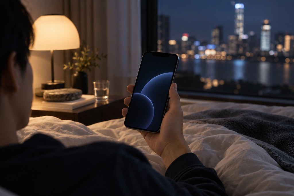
Digital technology gives color systems new expressiveness and flexibility. In the age of print, color had to be fixed to precise values. On screen, color can adjust dynamically, adapt to its environment, and be customized by users, evolving from a static visual element into an interactive medium of experience.
An adaptive color system optimizes color for each context. By day, brand colors appear bright and saturated; at night, they shift automatically to a soft, low-saturation dark mode, preserving recognition while respecting visual comfort. This intelligent adaptation doesn't undermine brand consistency. It puts the user experience first, marking the evolution of color systems from rigid standards to human-centered service.
Dynamic color uses gradients, transitions, and animation to expand a brand's expressive range. Instagram's multicolor gradient logo and Mastercard's red-to-yellow blend preserve core color recognition while creating a richer, more contemporary visual experience. Brand guidelines should specify technical parameters such as gradient direction, transition curves, and animation duration to keep dynamic color consistent.
The strategy behind a brand color system: the system creates consistency, rules ensure quality, and color becomes the brand's most immediate visual memory.
Conclusion
The construction of the brand color system is a systematic project that integrates strategic thinking, aesthetic literacy and technical specifications. Through the analysis of this article, we realize that a successful color system must not only be unique and recognizable, but also have adaptability and scalability. It should become a powerful tool for brand expression, maintaining consistency in different application scenarios while being flexible to respond to various design needs.
During the implementation process, brands need to establish strict color management specifications to ensure the accurate presentation of colors in different media and materials. At the same time, attention should be paid to changes in color trends and the evolution of the target audience's aesthetics, and timely optimization and adjustment should be made while maintaining the core identification of brand colors. Color testing and market validation are important steps in ensuring the effectiveness of a color system.
In the future, with the advancement of display technology and the emergence of new media, brand colors will have a broader space for expression. From traditional printing to digital screens, from static presentation to dynamic changes, the application forms of color are constantly innovating. Let us create a unique visual impression for the brand through a carefully constructed color system, touch people's hearts with the power of color, and build a deep and lasting brand memory.