










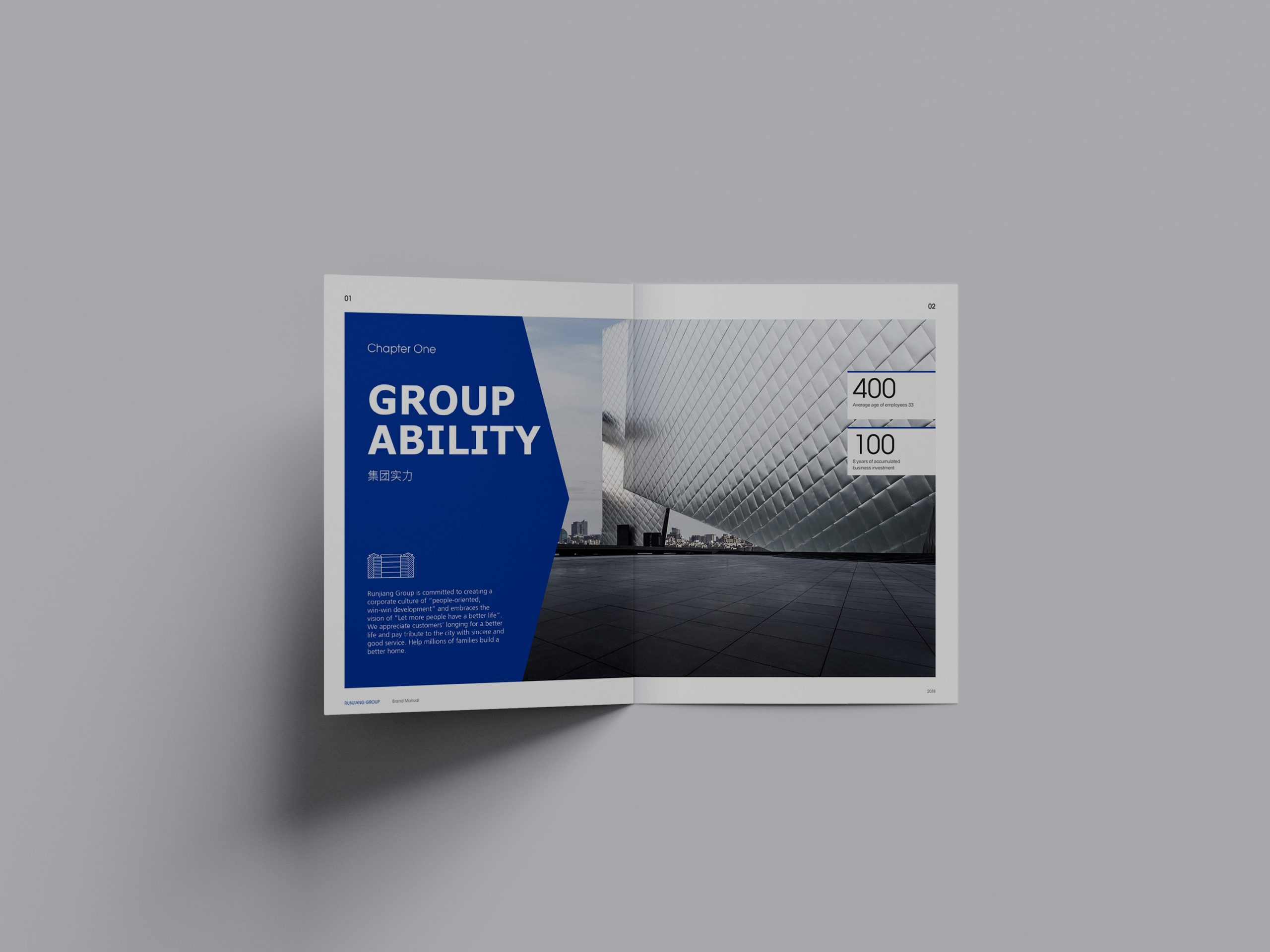
We created a brochure system for a tourism and resort brand under Wanda Group.
The brochure’s core mission was to reshape the way tourism real estate is told through visual language. It strikes a balance between “resort experience” and “investment value,” so that readers sense the brand’s cultural depth and spatial quality as they turn the pages.
With an “immersive reading experience” as its core objective, the project uses precise structural design and a spatial graphic language to showcase Wanda’s strategic scope and international vision in urban cultural tourism.
design challenge
Tourism real estate content spans many dimensions, from urban planning and resort experiences to business mix and ecological philosophy. With vast amounts of information in diverse formats, the brochure had to convey the brand image while also serving as an investment-promotion tool.
The core challenges were threefold. The first was to unify the narrative structure so that culture, space and data could coexist within a single visual system. The second was to balance “rational information” with “emotional experience,” making the brochure both credible and engaging. The third was to establish an international visual standard that would lift the brand beyond the conventions of real estate and express a contemporary resort aesthetic.
Strategy and philosophy
The project is built on the idea of “Shaping the Imagination of Travel Living.” A structural logic of “space + rhythm” turns the brochure into a visual holiday. Spatial logic: chapters follow the rhythm of a trip, “departure, route, destination,” so the reading sequence flows naturally. Visual language: widescreen proportions and photographic white space evoke the experience of a “viewing window,” while graphics abstract and extend the lines of terrain, rivers and architecture into a continuous visual thread. Color and texture: a palette of warm gray and sandstone, accented with deep-blue metallic lines, symbolizes the balance between nature and civilization. Narrative: the copy favors “situational expression,” weaving architecture, landscape and lifestyle together to deepen the brand’s human dimension.
Design presentation
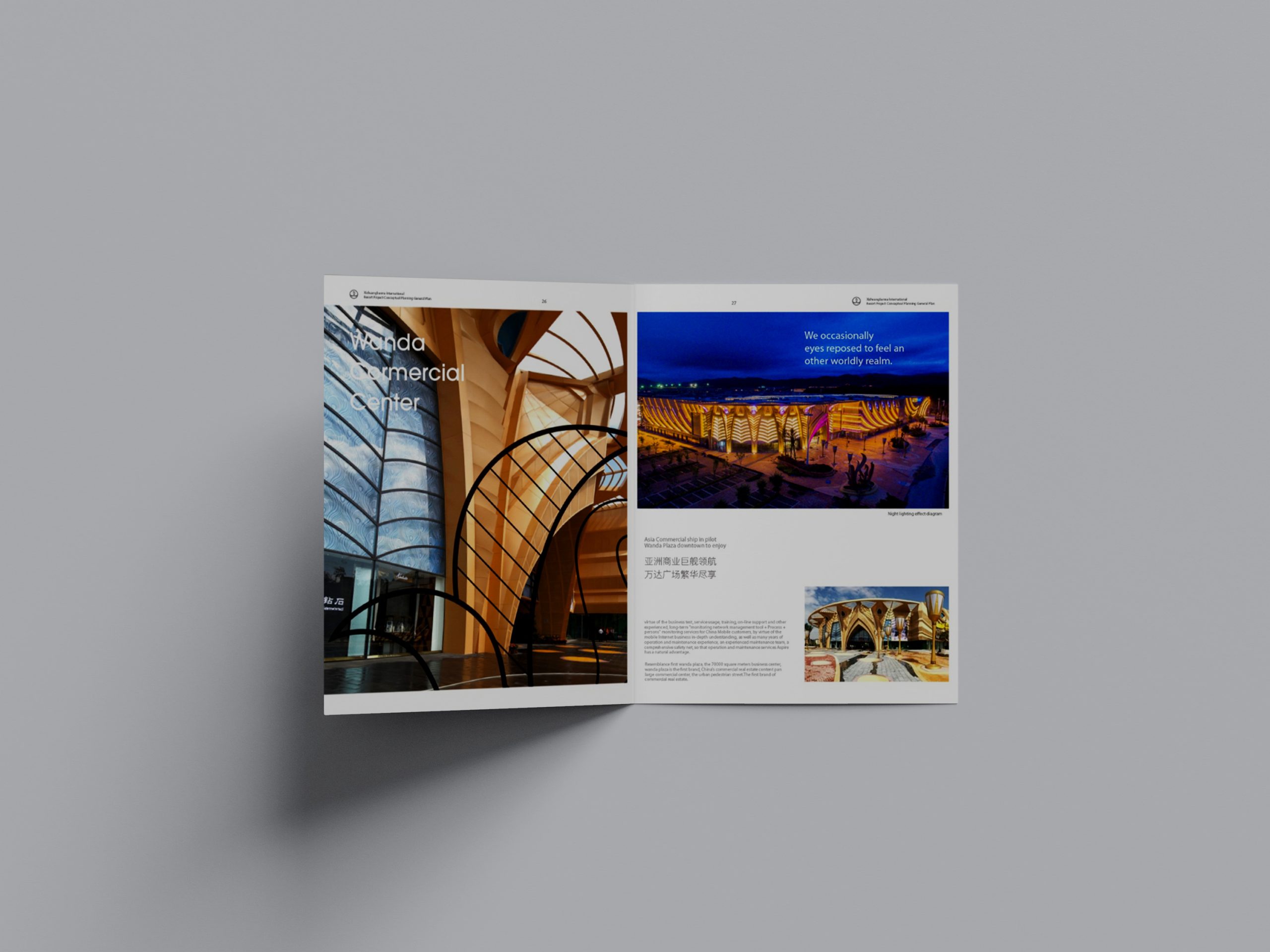
The brochure follows a modular chapter structure across five sections: “Brand Philosophy, Resort Planning, Spatial System, Experience Scenarios, Investment Value.” Cover: a metallic base with matte embossed line drawings, echoing layered mountains and architectural silhouettes. Chapter openers: full-bleed photography paired with abstract maps and coordinate systems to guide the reader. Body layout: a two-column structure, with rational data on the left and evocative imagery on the right. Graphic system: abstract flowing lines layered over grids, suggesting “travel routes” and “urban fabric.” Print finishing: heavyweight ivory board with metallic foil stamping and spot UV, striking a refined balance between light and touch.
Achievements and Impact
The brochure has been widely used at brand launches, investment-promotion events and cultural tourism exhibitions, becoming the central vehicle for communicating the Wanda resort brand. Through a systematic structure and an international visual language, the project moved Wanda’s tourism real estate away from conventional property messaging and toward a brand narrative led by cultural experience. The spatial rhythm of reading, balanced by visual order, turns the brochure into a tangible brand journey.