










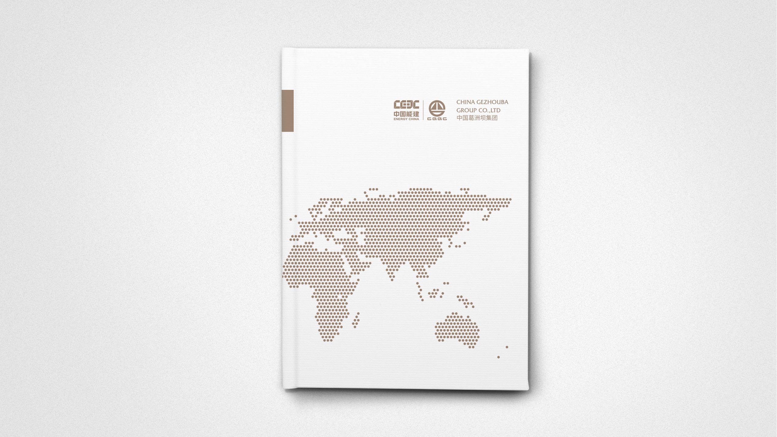
China Gezhouba Group is a national backbone enterprise in infrastructure, with operations spanning hydropower, construction, transportation, environmental protection and new infrastructure.
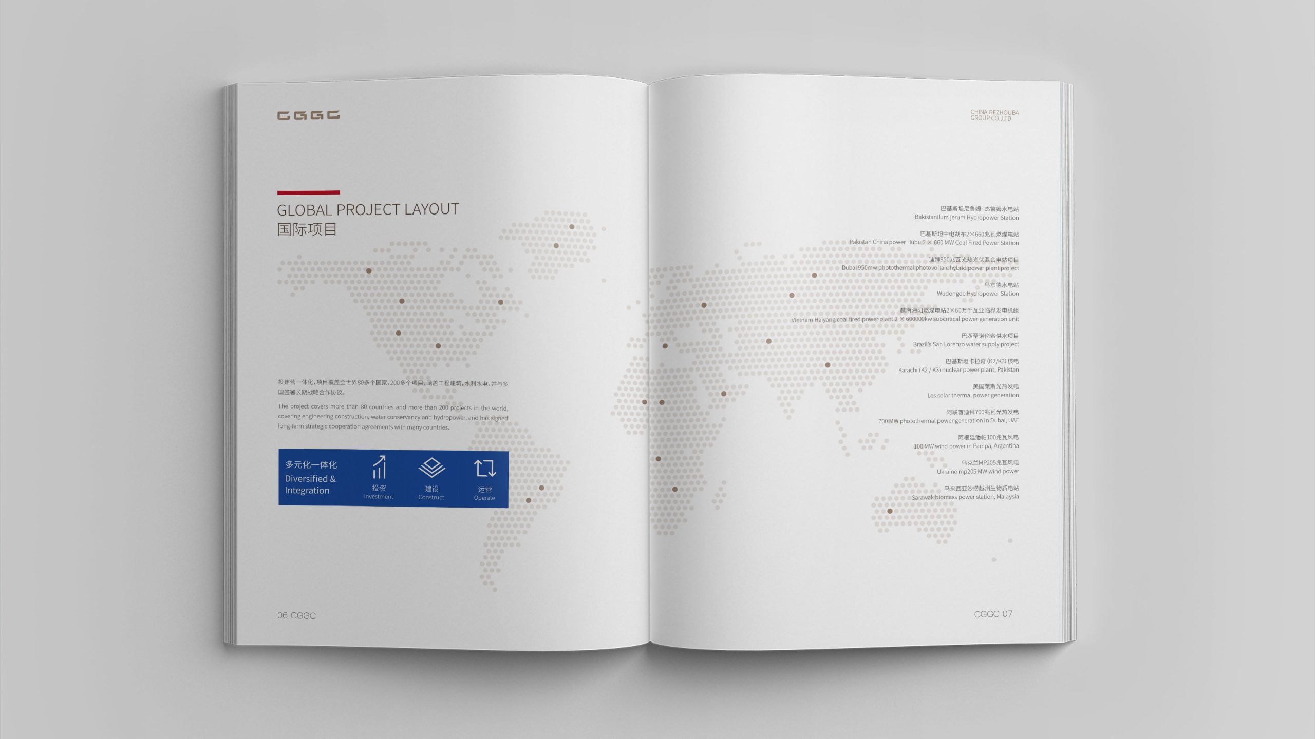
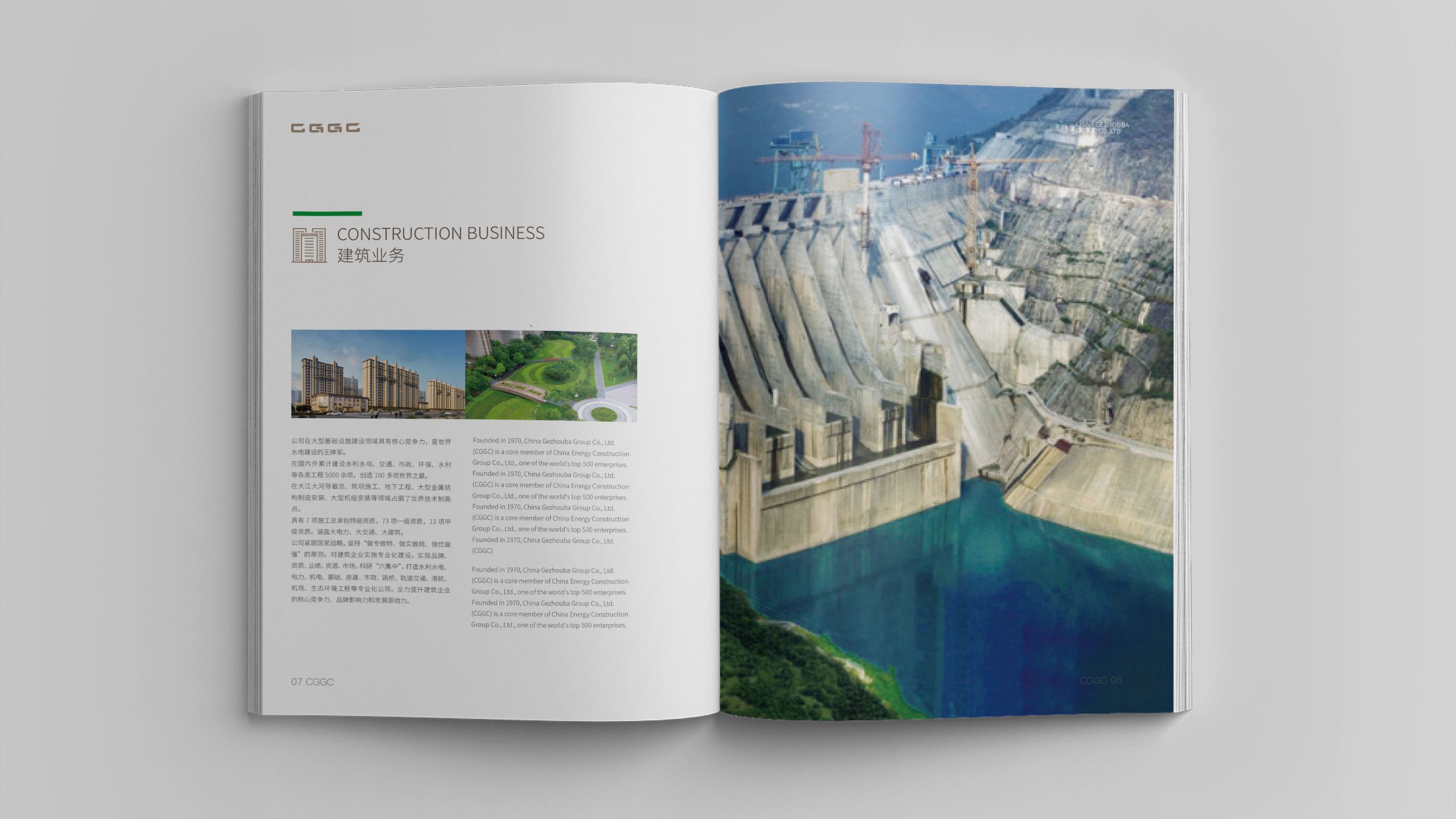
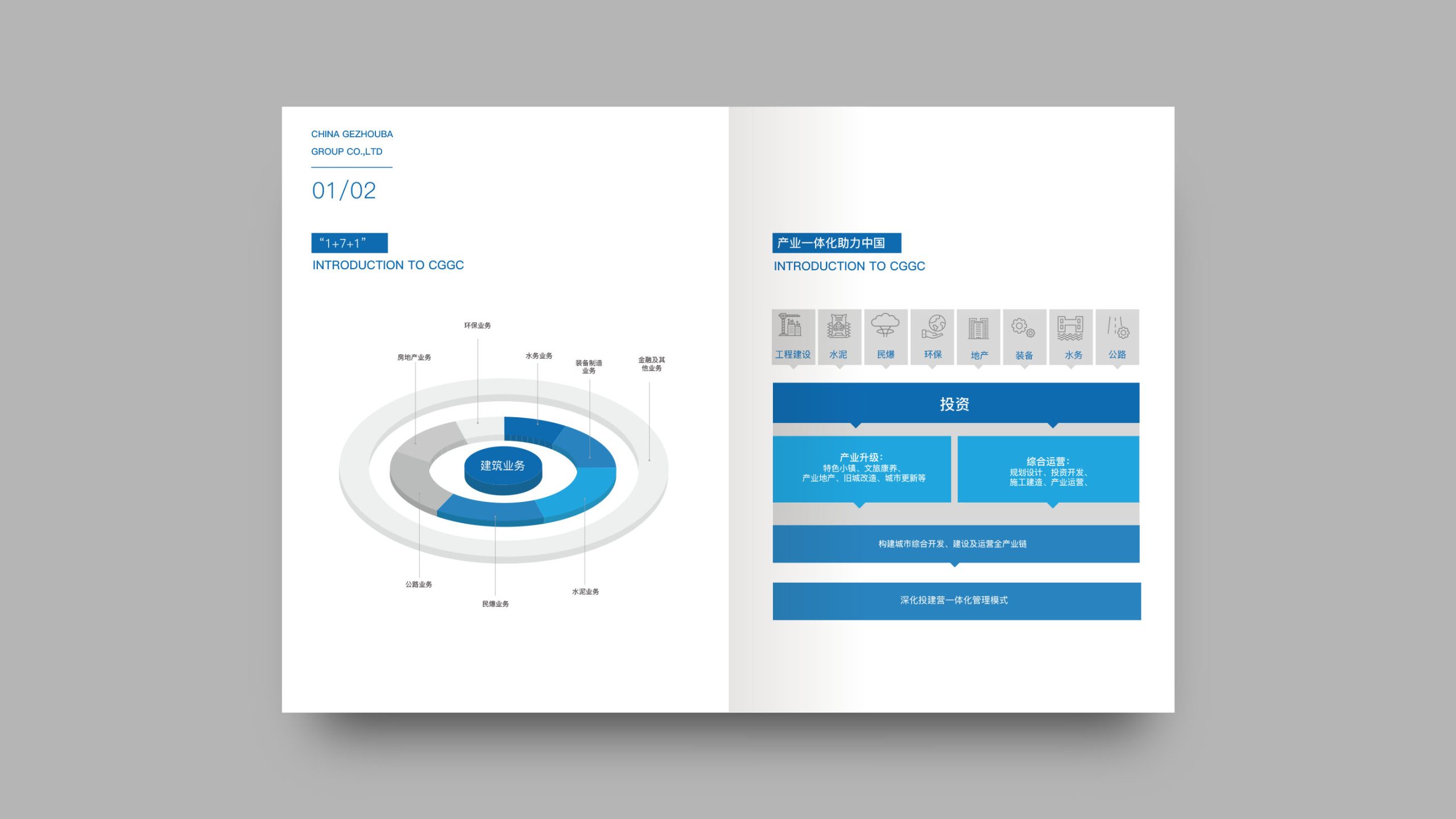
For the Group's many project categories, we designed a unified yet differentiated brochure system, using a “systematic visual language” to express the Group's integrated strategy, comprehensive capabilities and international quality.
The system emphasizes modular design, unified identity, professional layout and an international outlook, giving each brochure its own identity within its project context while maintaining overall brand coherence.
design challenge
With a wide range of projects—water conservancy and hydropower, transportation infrastructure, environmental remediation, building development and more—the challenge was to distinguish categories while keeping a unified brand identity. Each category had a different information structure, so the system needed to adapt flexibly without feeling scattered or fragmented. Serving both domestic and international markets, the visuals had to meet international publishing standards while accommodating Chinese and English reading habits and cultural differences. The task, therefore: build a modular, systematic brochure system with an international visual language to support the Group's “full industry chain, fully integrated” brand philosophy.
Strategy and philosophy
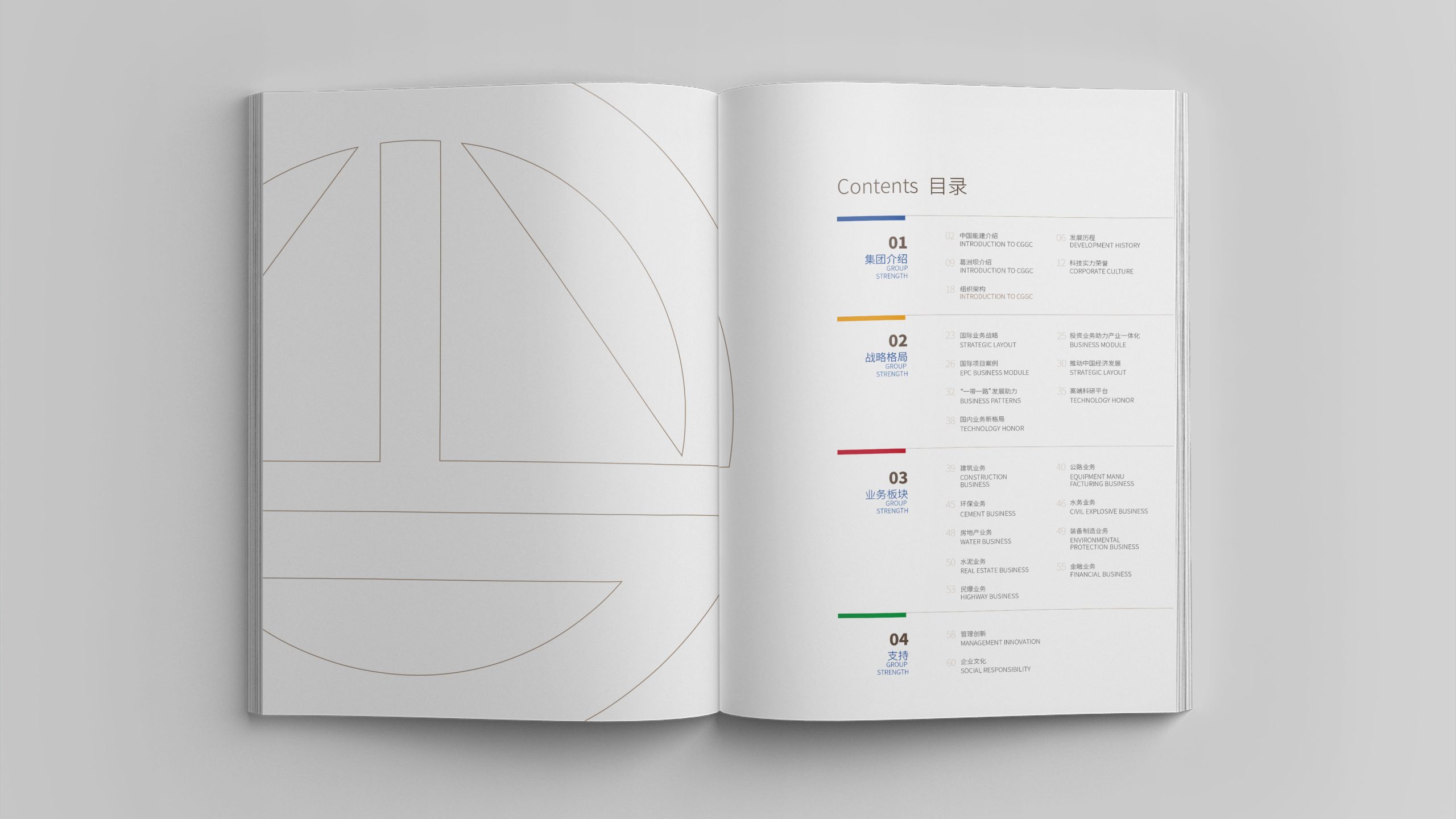
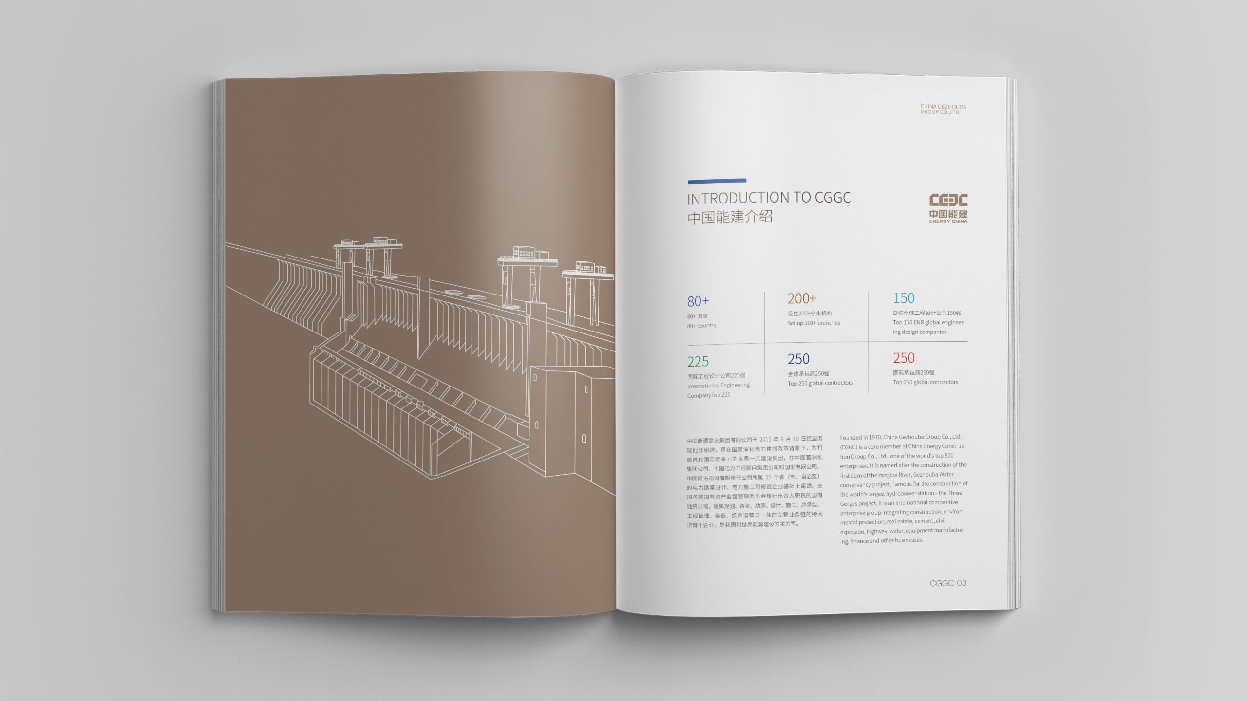
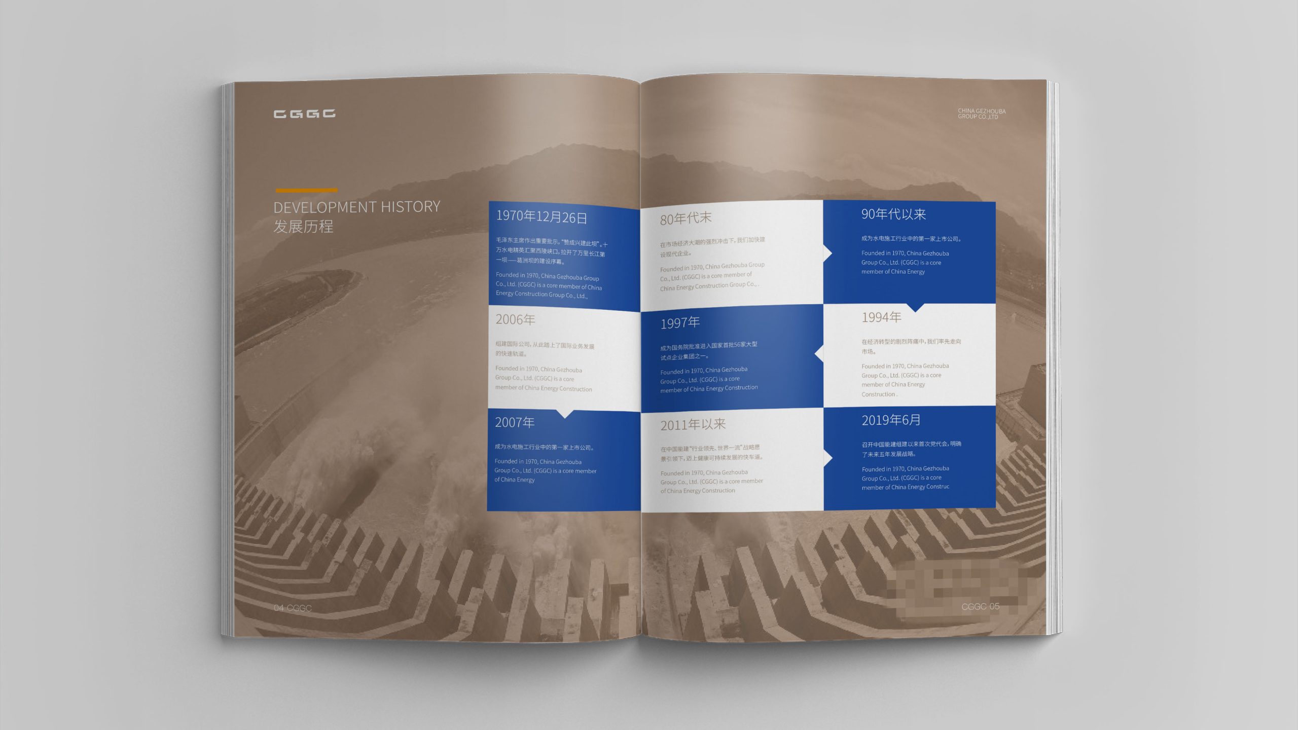
The design concept: “Modular Synergy · Visual Integration.” Modular structure: all business categories are organized into modules on a unified visual template; each retains the master brand identity while carrying distinct color, icon or layout markers. Unified visual language: grid systems, layout guidelines, chart systems and type standards create a “one brand, many brochures” framework. Standardized production: layout, charts and imagery follow standardized workflows to meet global publishing and communication standards. Identity and coherence: color coding, cover variants and project-specific symbols give each brochure its own identity while staying connected to the Group's master visual. The overall strategy: make every brochure a point of recognition for the Group's overall strength, together forming a systematic path of brand expression.
Design presentation
Cover: a consistent dark base, luminous line structures and the brand logo, with categories distinguished by color. Inside pages: a 12-column grid ensures layout consistency; each chapter follows four modules—“Background — Key Data — Core Achievements — Visual Showcase”—in a unified layout. Charts and data visualization: each category has dedicated chart templates (flow-line diagrams for water conservancy, network diagrams for transportation, ecological patterns for environmental protection), all governed by the same visual rules. Color: the Group's deep blue or graphite gray as primary colors, with a dedicated accent per module—water blue, transport orange, environmental green, construction copper-gold—for clear categorization and visual quality. Materials and finishing: matte-laminated covers with hot-foil gold or embossing and spot UV; heavyweight matte art paper inside keeps images, lines and charts crisp. The overall visual language: “rigorous order × clear categories × international language.”
Achievements and Impact
The brochure system gave China Gezhouba Group a unified yet flexible visual toolkit for project showcases, domestic and international investment promotion, and communication with governments and international partners. Through systematic design, the Group's comprehensive strength, integrated capabilities and international service standards are clearly conveyed visually. The brand shifted from a “single engineering company” to a “multi-sector integrated infrastructure and services group,” strengthening market recognition, internal collaboration and external communication.