










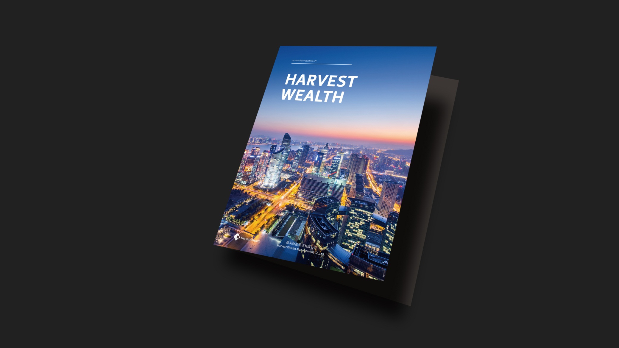
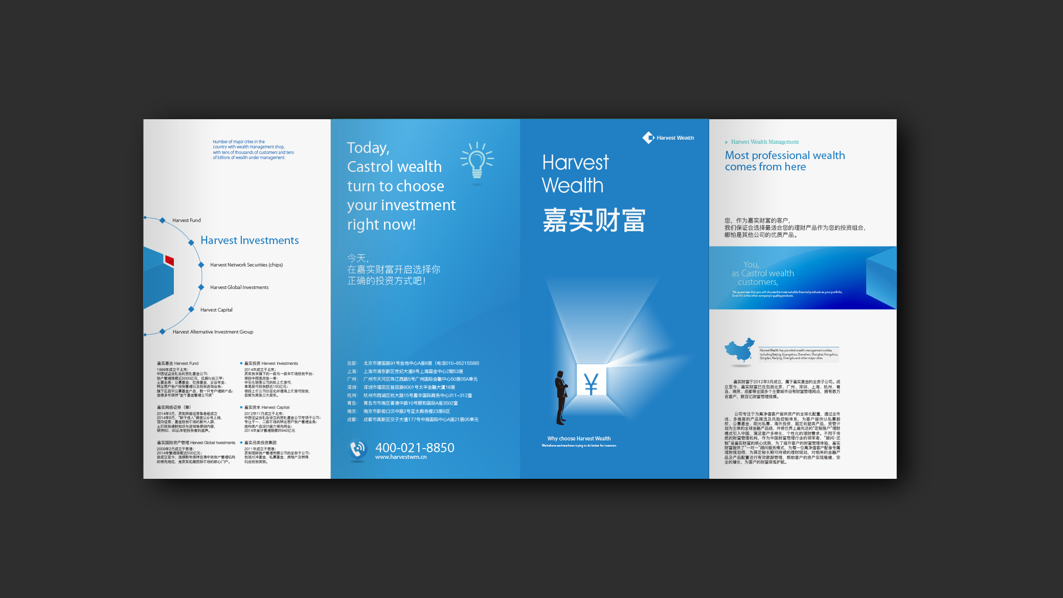
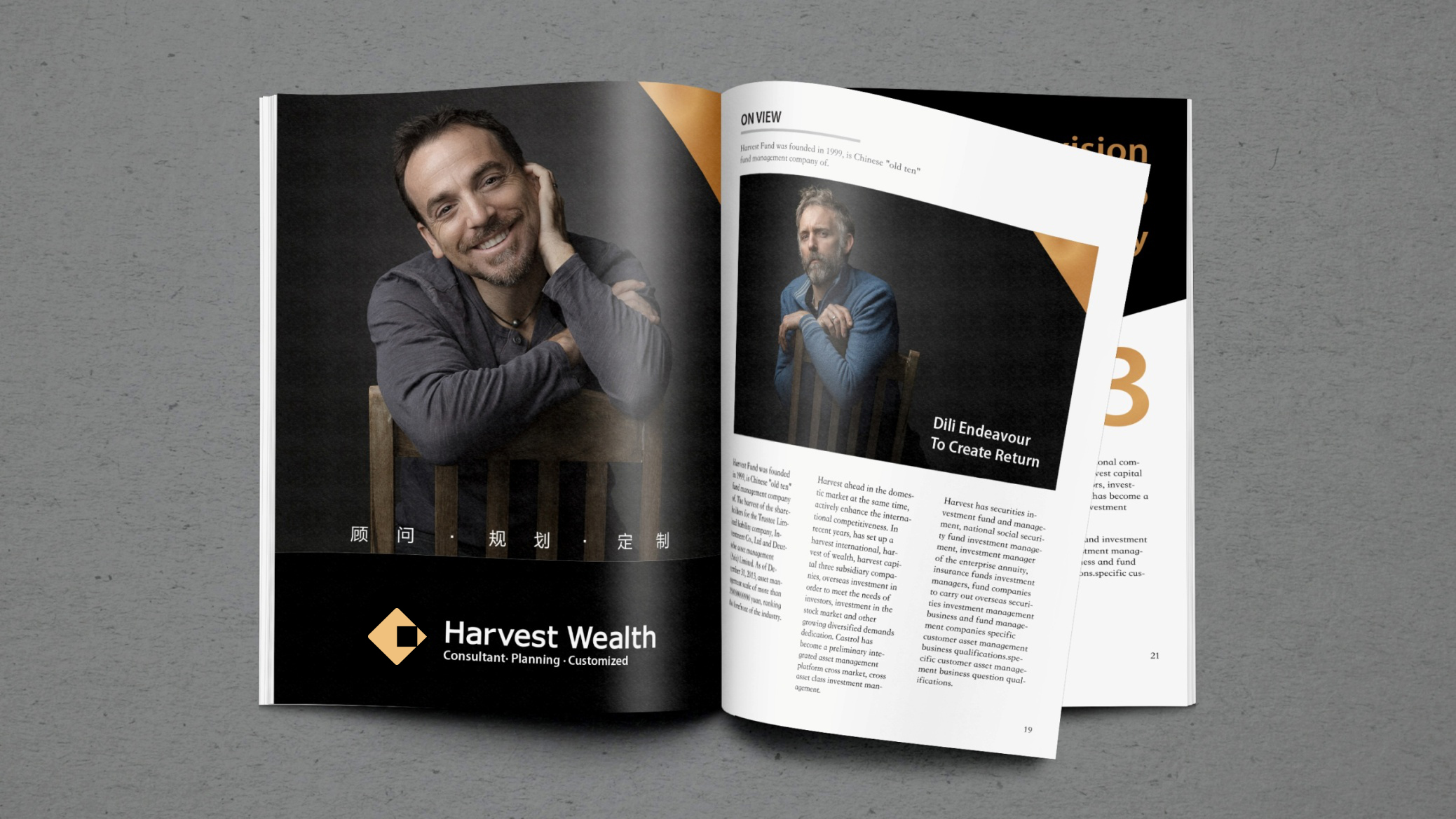
We created a brand brochure and annual identity design system for Harvest Wealth.
The goal was to use an international visual language and a professional financial voice to showcase Harvest Wealth's global perspective and asset allocation expertise as one of China's leading wealth management firms.
Built around the core concept “Trust · Vision · Global Connection,” the brochure emphasizes rational financial logic alongside the trust, expertise and long-term value that high-net-worth clients prize.
design challenge
A discerning, diverse audience: high-net-worth individuals, family clients and institutional partners, requiring a balance of financial expertise and artistic taste. An international brand: the work had to meet the publishing standards of global financial brands, balancing Chinese expression with a global communication voice. Complex content: multi-asset allocation, global market research, investment insights and ESG principles, resulting in dense, large-scale information. The core challenge: reframing financial content through an international visual logic, giving wealth management both a brand story and global readability.
Strategy and philosophy
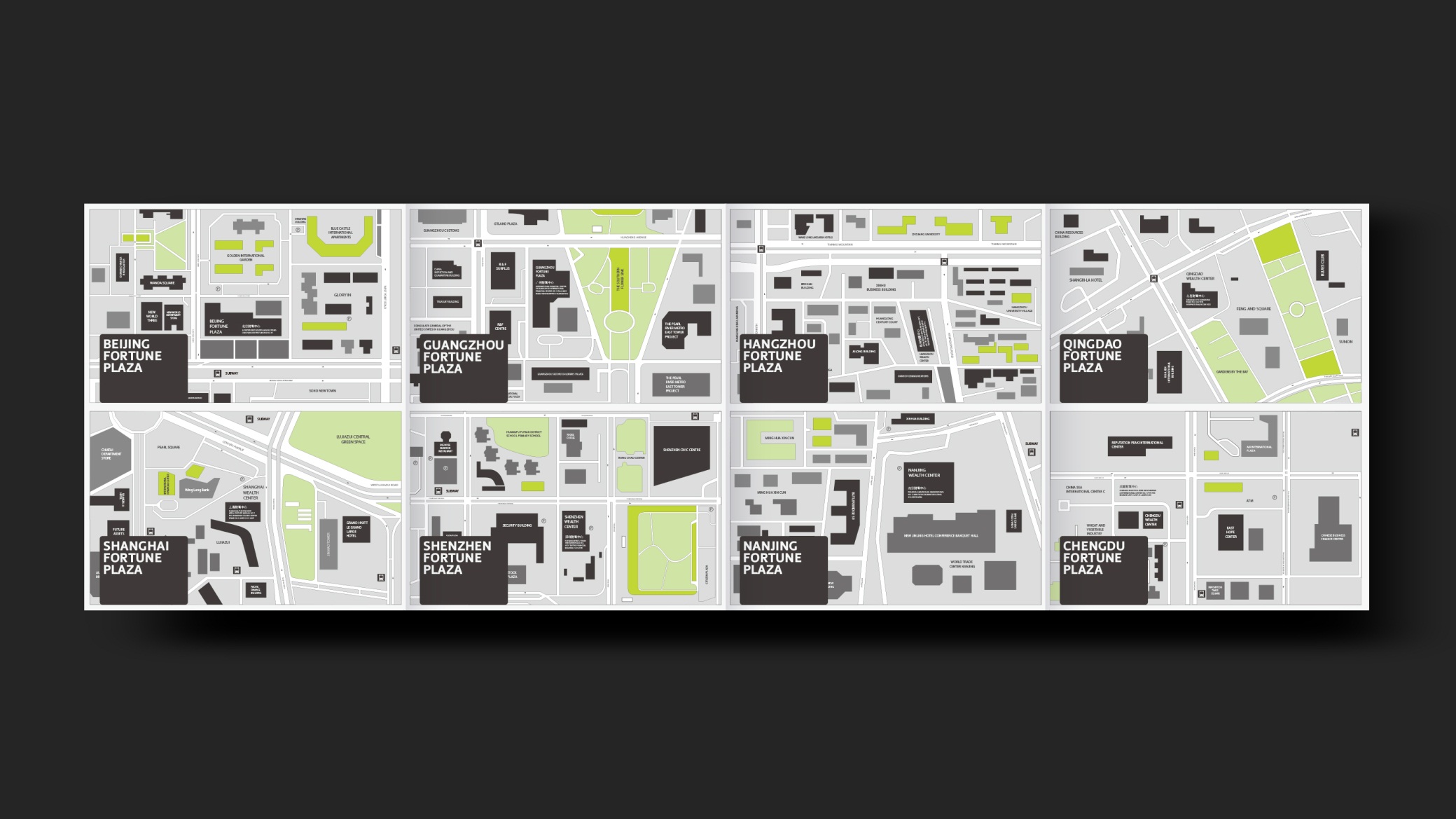
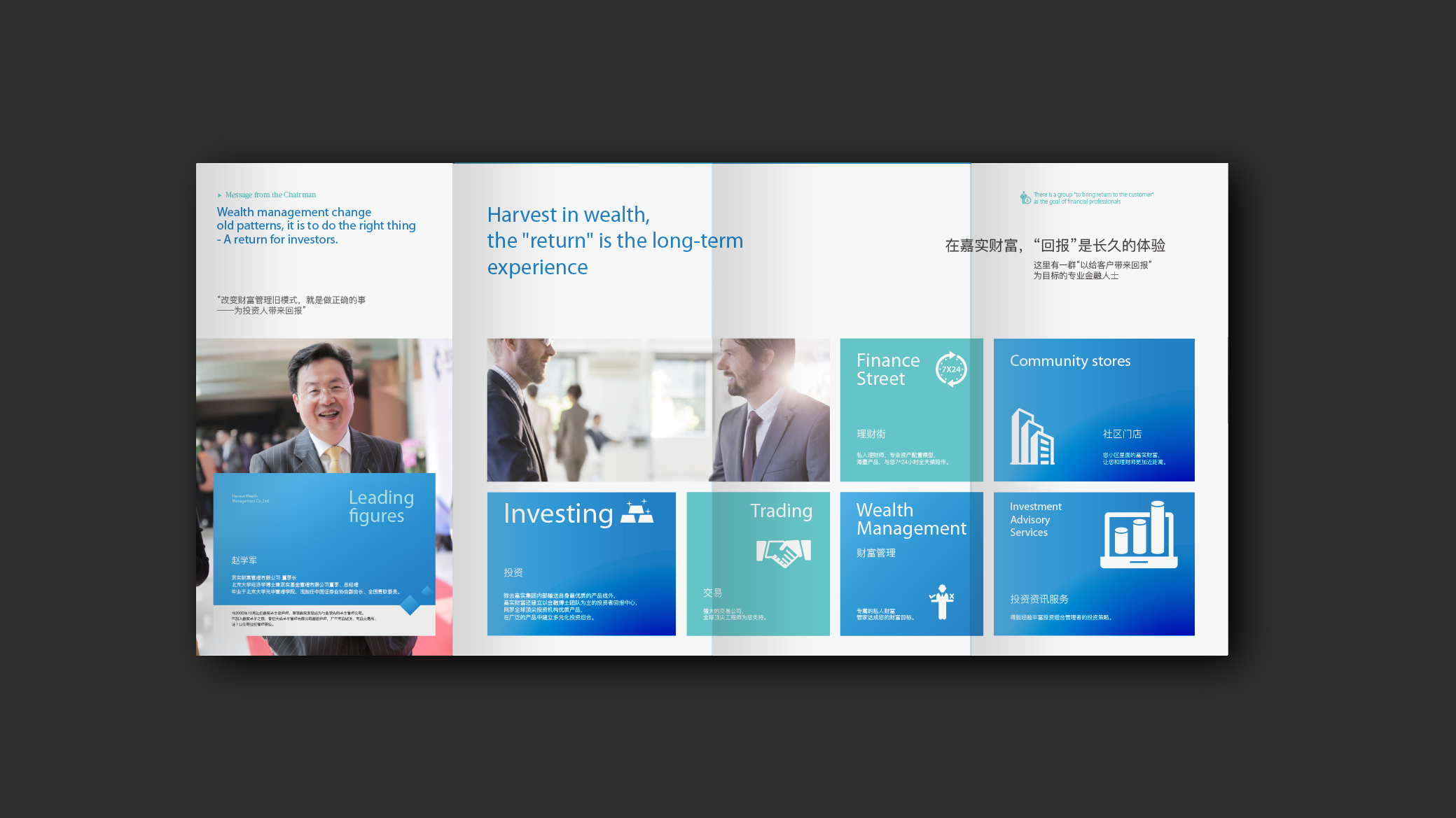
The project is built on the design principle of “rational structure × brand trust × global order.” Structural logic: an international 12-column publishing grid forming a modular content system (market research, asset allocation, brand philosophy, case insights). Visual language: geometric order, a financial charting vocabulary and restrained typography express “the rationality of wealth.” Color strategy: deep blue and gold as primary colors, signifying expertise and value, complemented by silver-gray and white space for breathing room and international refinement. Charts and data visualization: unified chart standards (line, range, distribution and portfolio ring charts) improve comprehension and consistency. Brand voice: a type system pairing English sans-serif with Chinese Hei typefaces creates a clean, clear and composed visual rhythm. Core idea: let the logic of wealth be expressed through design order, and let trust become the brand's visual language.
Design presentation
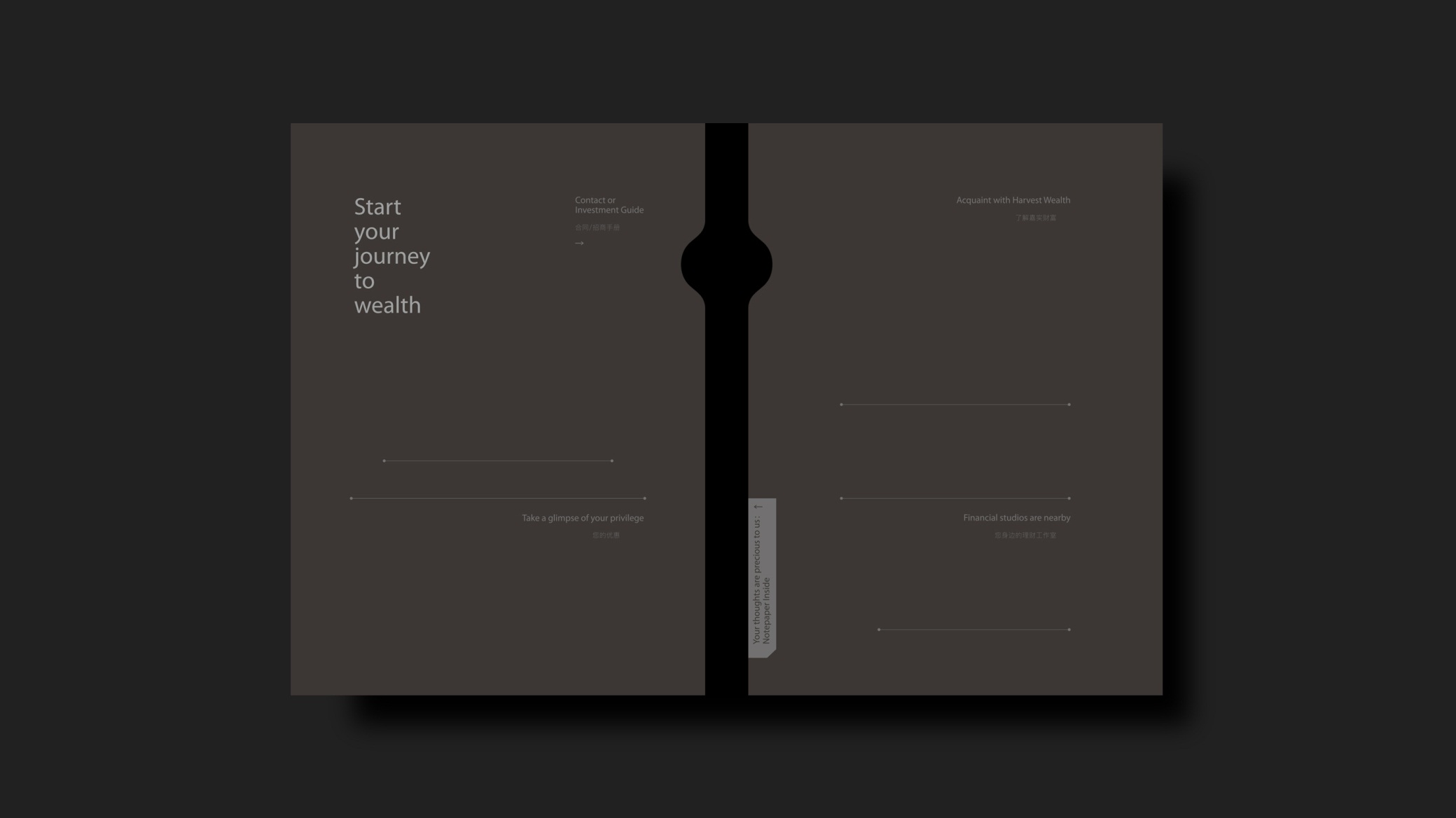
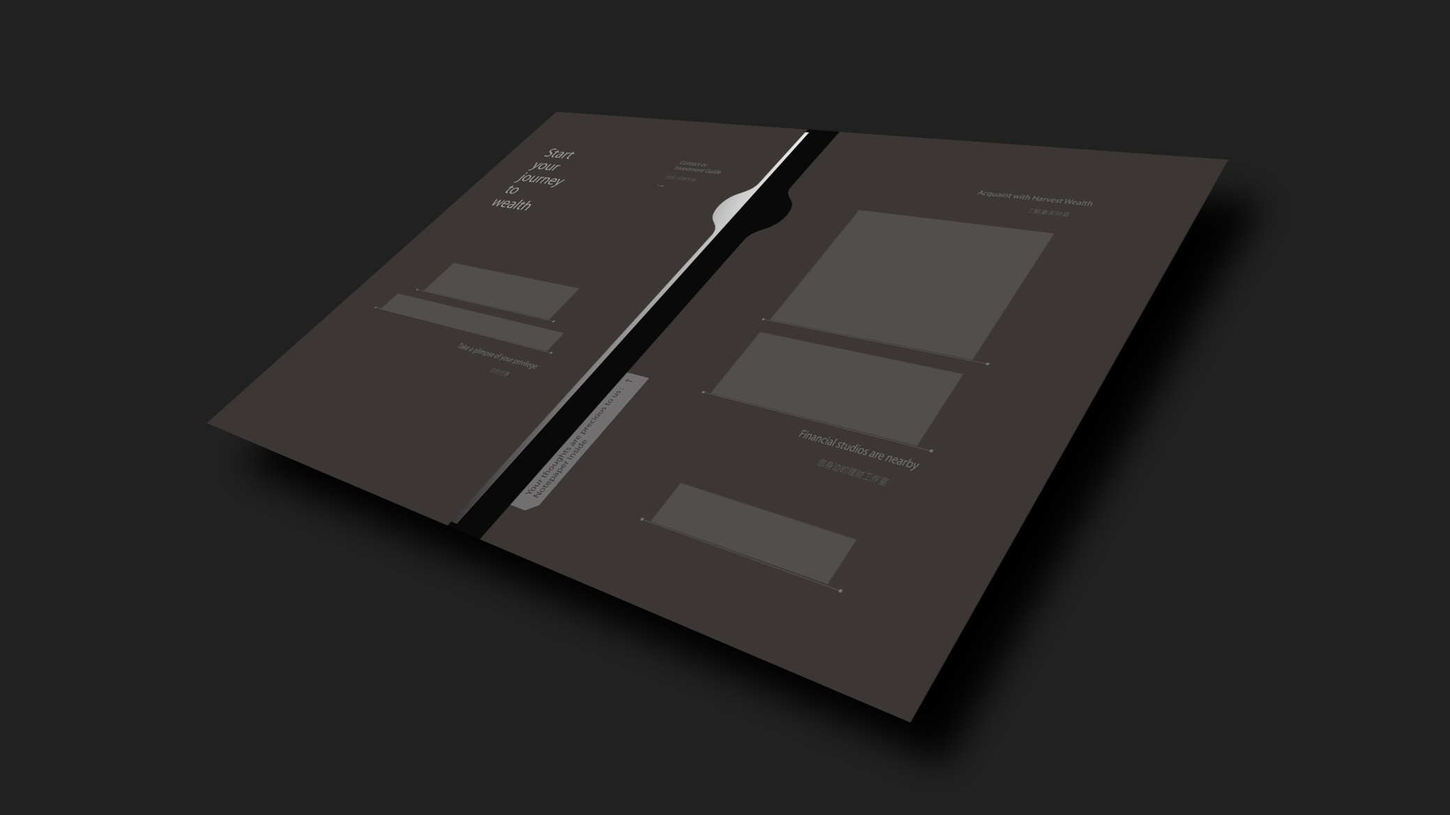
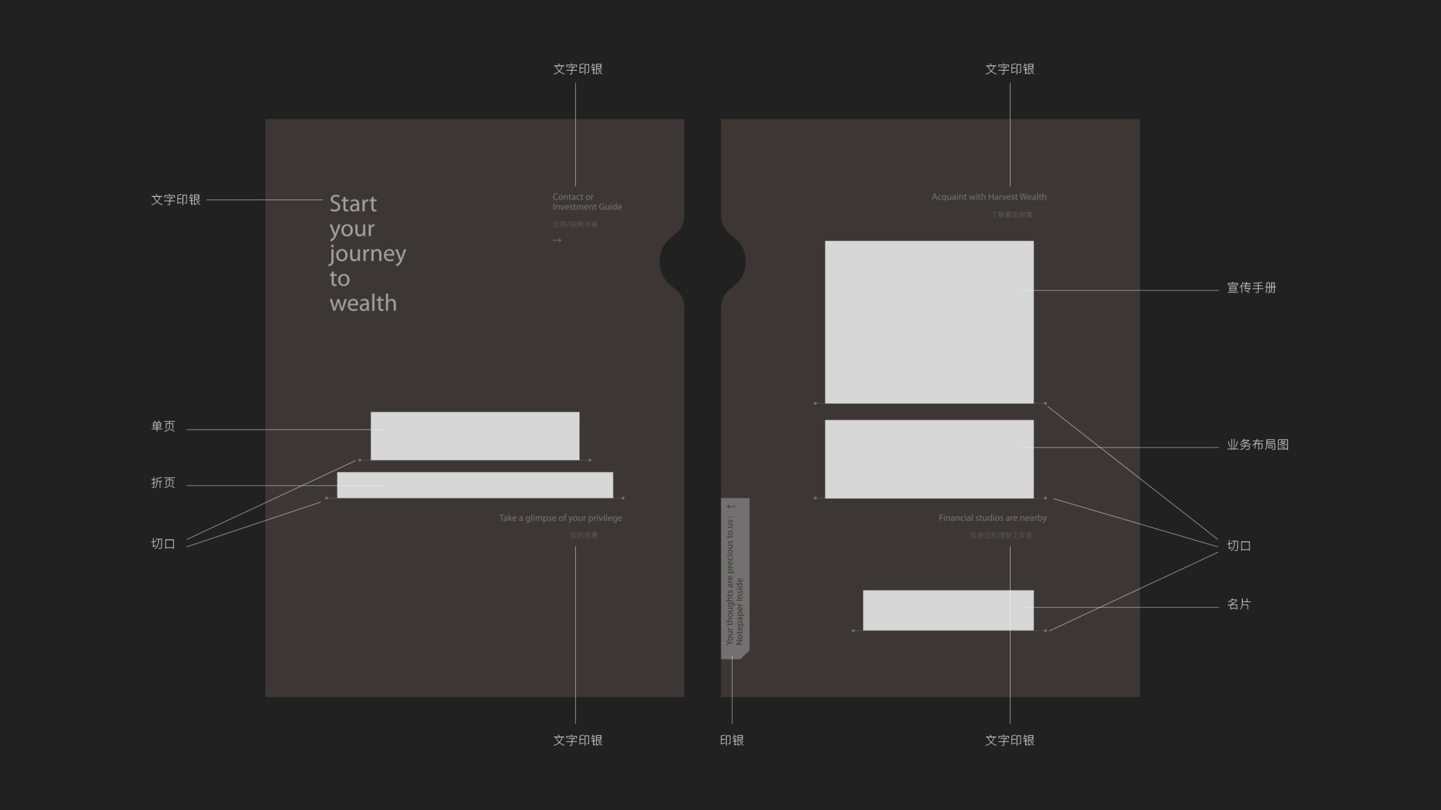
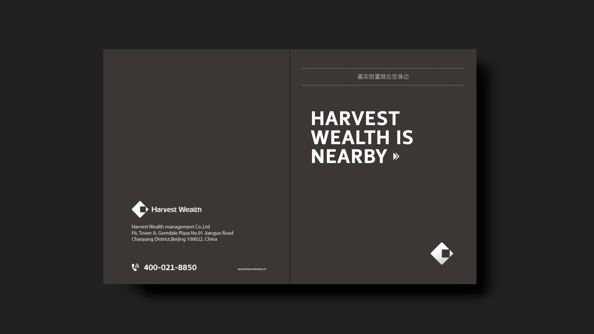
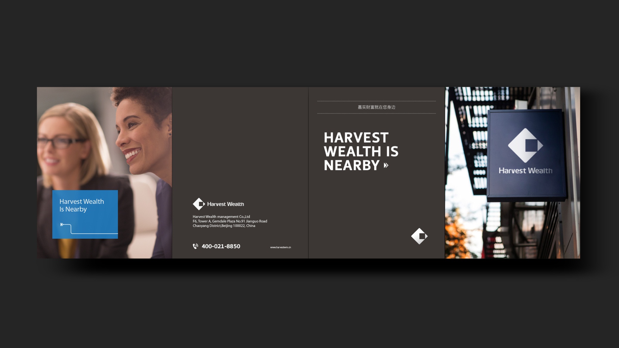
Cover: a metallic deep-blue ground with a gold-foil logo conveys the brand's assured presence; abstract geometric lines symbolize global market networks and the flow of assets. Chapter structure: 1. Brand Vision & Values; 2. Global Market Perspective; 3. Multi-Asset Allocation Logic; 4. Risk Management Framework; 5. Client Cases & Sustainability. Typographic voice: generous white space, gold rule dividers and precise chart logic deliver a reading experience on par with international investment bank annual reports. Print production: metallic gold foil and spot UV on the cover; heavyweight silk stock and spot blue printing inside, maintaining financial publishing-grade quality. The overall style expresses “international financial standards × wealth brand character × the beauty of visual order.”
Achievements and Impact
Harvest Wealth now has a unified, highly recognisable brand publication for premium client communications, brand presentations and overseas partnerships. With its international structure, professional language and sophisticated visuals, the brochure has reshaped perceptions of Harvest Wealth, positioning it among global markets and domestic high-net-worth clients alike as a trusted international wealth management brand.