










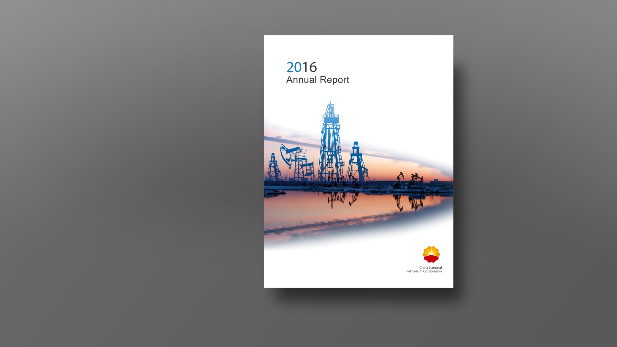
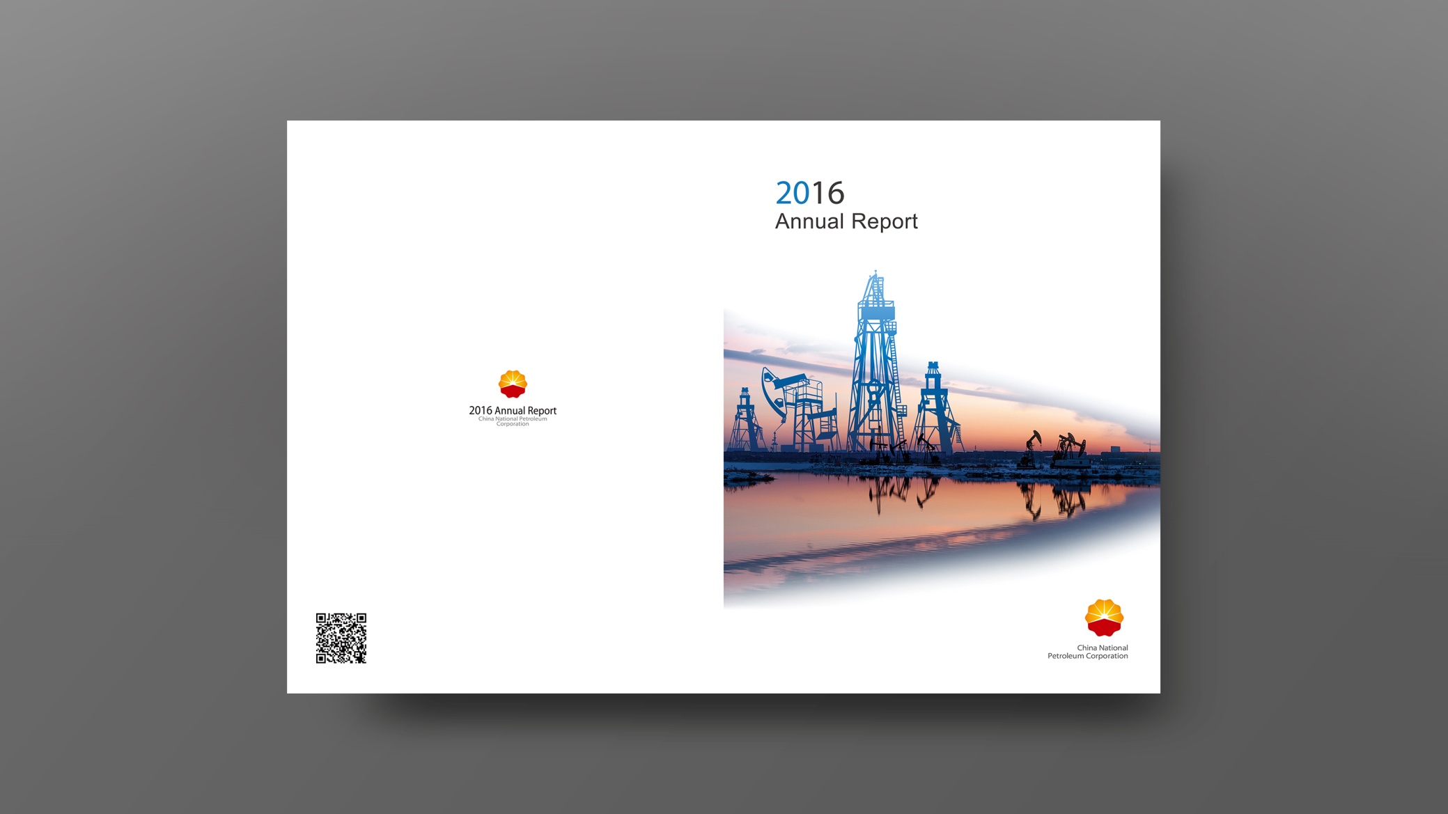
This project designed the 2016 Annual Report for China National Petroleum Corporation (CNPC), using international publishing standards and a systematic visual language to present the company's fully integrated value chain within the global energy landscape, along with its brand culture.
Themed “The Energy Value Chain”, the design combines data logic with visual storytelling to convey the company's overall strength, cultural spirit and social responsibility.
design challenge
2016 was a pivotal year of energy market volatility and industrial restructuring, as CNPC pursued a strategic shift from resource-driven to innovation-driven growth. The annual report needed to present a complex industrial chain with clarity, reinforce the brand's cultural spirit and national image, and improve readability for international audiences. The core challenge: how to express industrial logic through a structured visual system, and make the design itself a medium of trust and culture.
Strategy and philosophy
The design concept is “The Power of Structure × The Culture of Energy”. Visual structure: the energy value chain serves as the through-line, organizing content into four modules: Upstream, Midstream, Downstream and Future Energy. Data visualization: an information design system uses data flows, energy pathway diagrams, production curves and investment ratio charts to illustrate business logic. Color: the corporate red leads, supported by petroleum gold and deep gray, symbolizing stability and energy. Cultural motifs: landscape topography, oilfield textures and pulsing energy lines create the visual metaphor of “the industrial chain as a cultural chain”. Brand voice: a parallel Chinese–English bilingual structure meets international disclosure standards with a clear reading rhythm. Core idea: let industry form the visual structure, and let culture give energy its warmth.
Design presentation
Cover: abstract energy-flow lines form the key visual, symbolizing the company's global energy network. A deep red-to-gold gradient leads, complemented by an embossed metallic logo; the year is set in a clean geometric typeface to reinforce an international publishing feel. Chapter structure: 1. Corporate Overview; 2. Business Footprint; 3. Operating Results; 4. Social Responsibility; 5. Future Outlook.
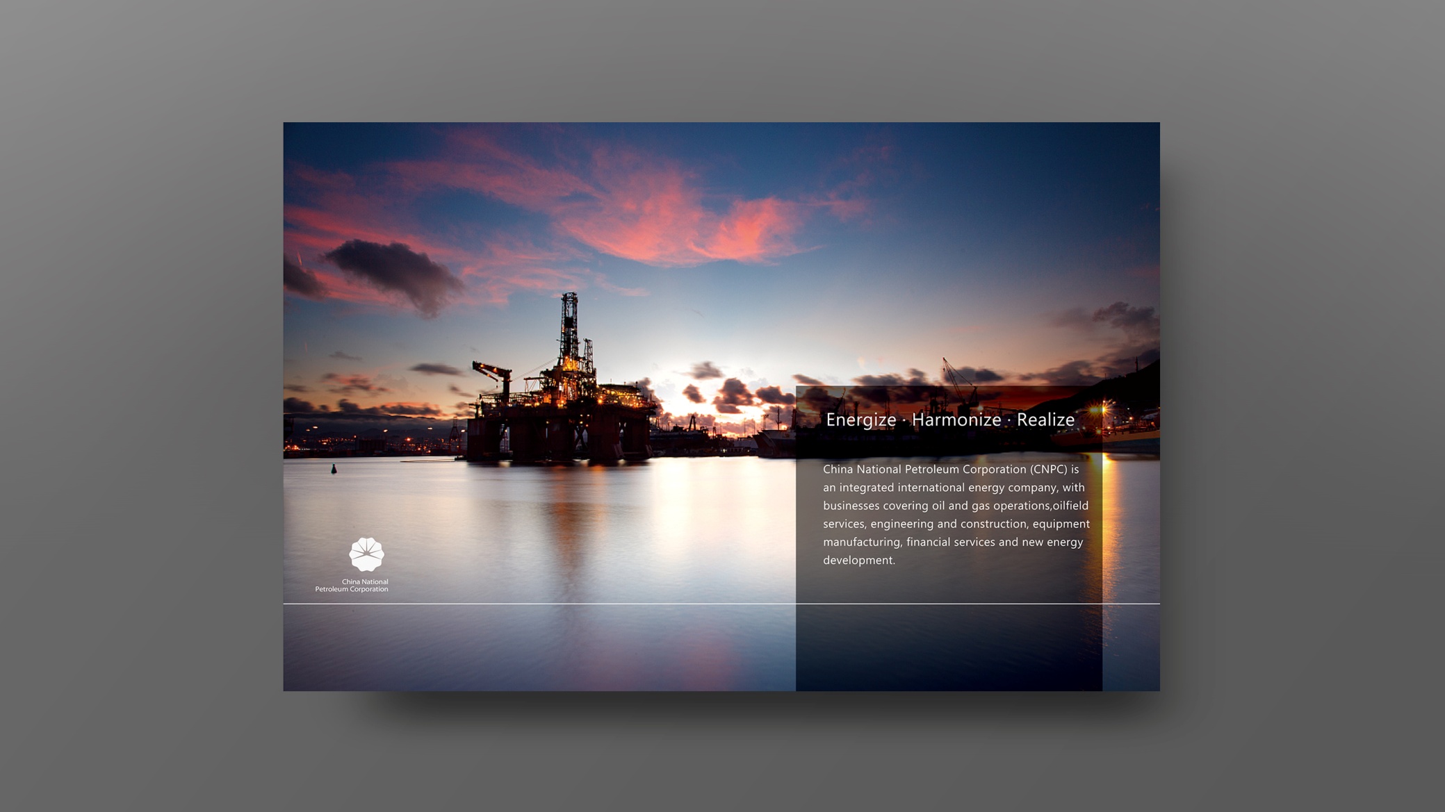
Inside pages: modular layouts, chart-led presentation and visual white space; charts follow unified line weights and proportions to establish visual order. Cultural elements: photography combined with texture, including oilfield silhouettes, equipment details and employee portraits, builds a dual narrative of “People × Energy”. Print production: matte black laminated cover with a gold-foiled logo and spot UV; heavyweight matte coated stock inside keeps data and charts crisp and sharp. The overall style conveys “Macro Vision × Precision × International Trust”.
Achievements and Impact
The report was used at international energy conferences, investor meetings and in institutional communications, becoming one of CNPC's flagship external publications. By combining industrial-chain logic, cultural warmth and an international voice, the design struck a successful balance between cultural expression and professional presentation. The Group described it as “one of our most systematic annual publications”, and it became the reference model for subsequent annual report design standards.