










SDM DENTAL (Gurui Dental) is a modern dental brand specializing in oral care and digital restorative technology. Guided by the philosophy “technology reshapes smiles, expertise protects health,” it combines international dental medicine with a people-centered approach to care.
The brand sought a clean, rational yet warm visual system to communicate its core values: “medical trust × technological innovation × patient care.”
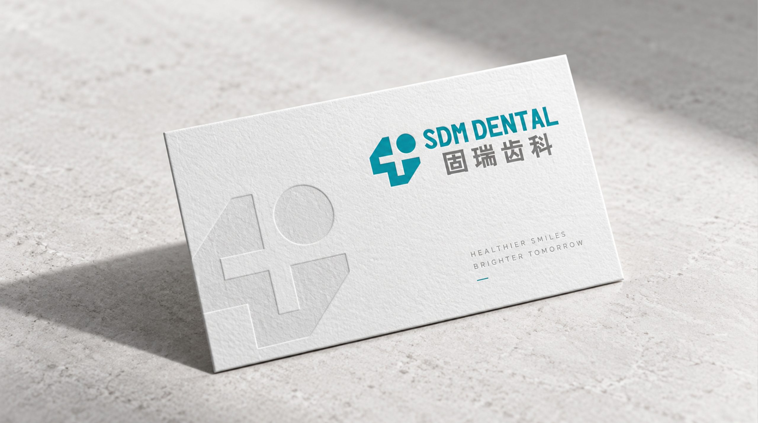
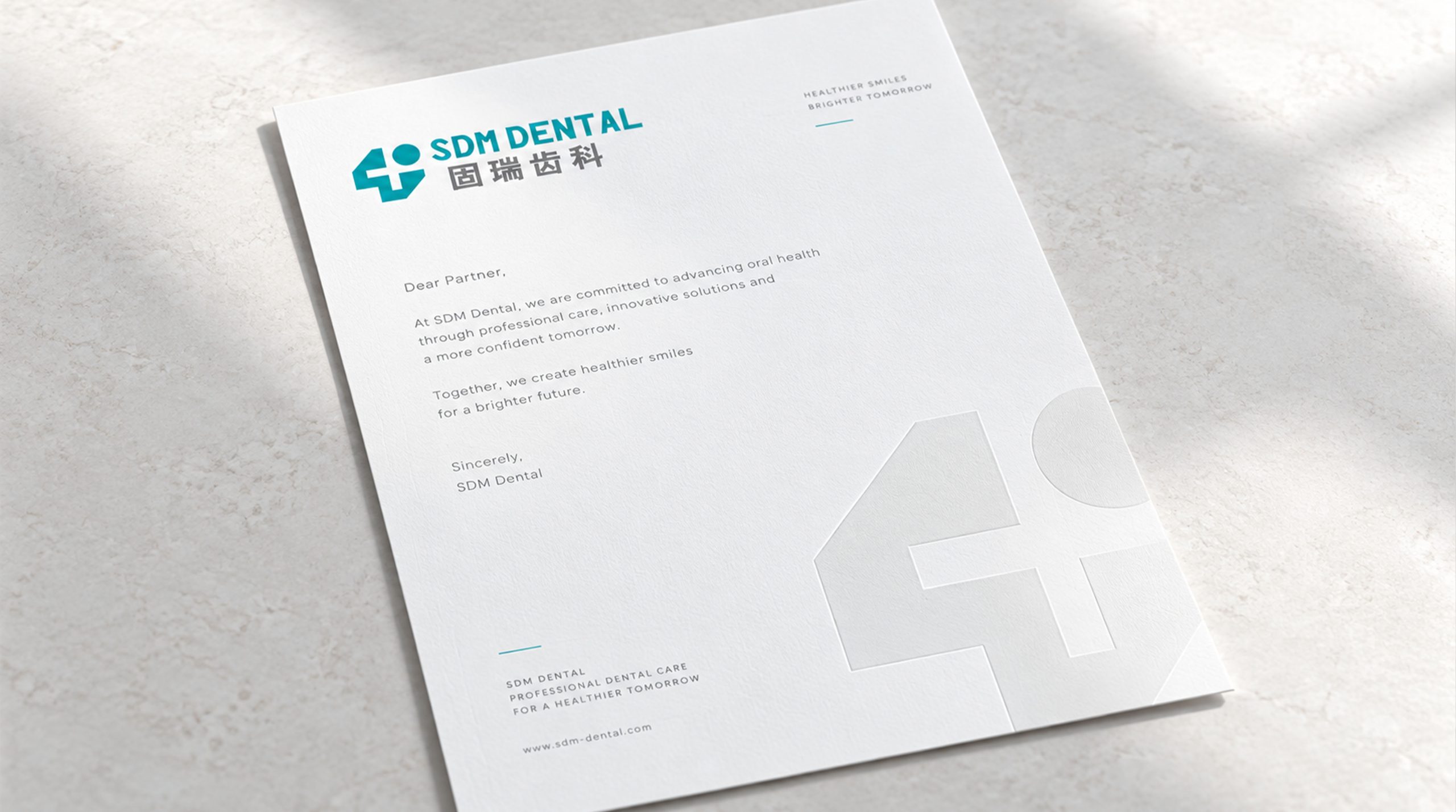
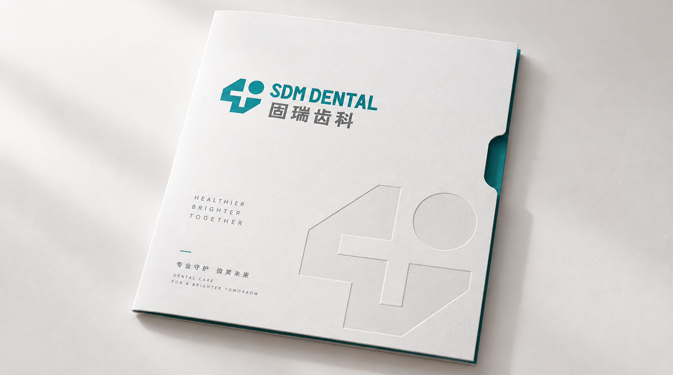
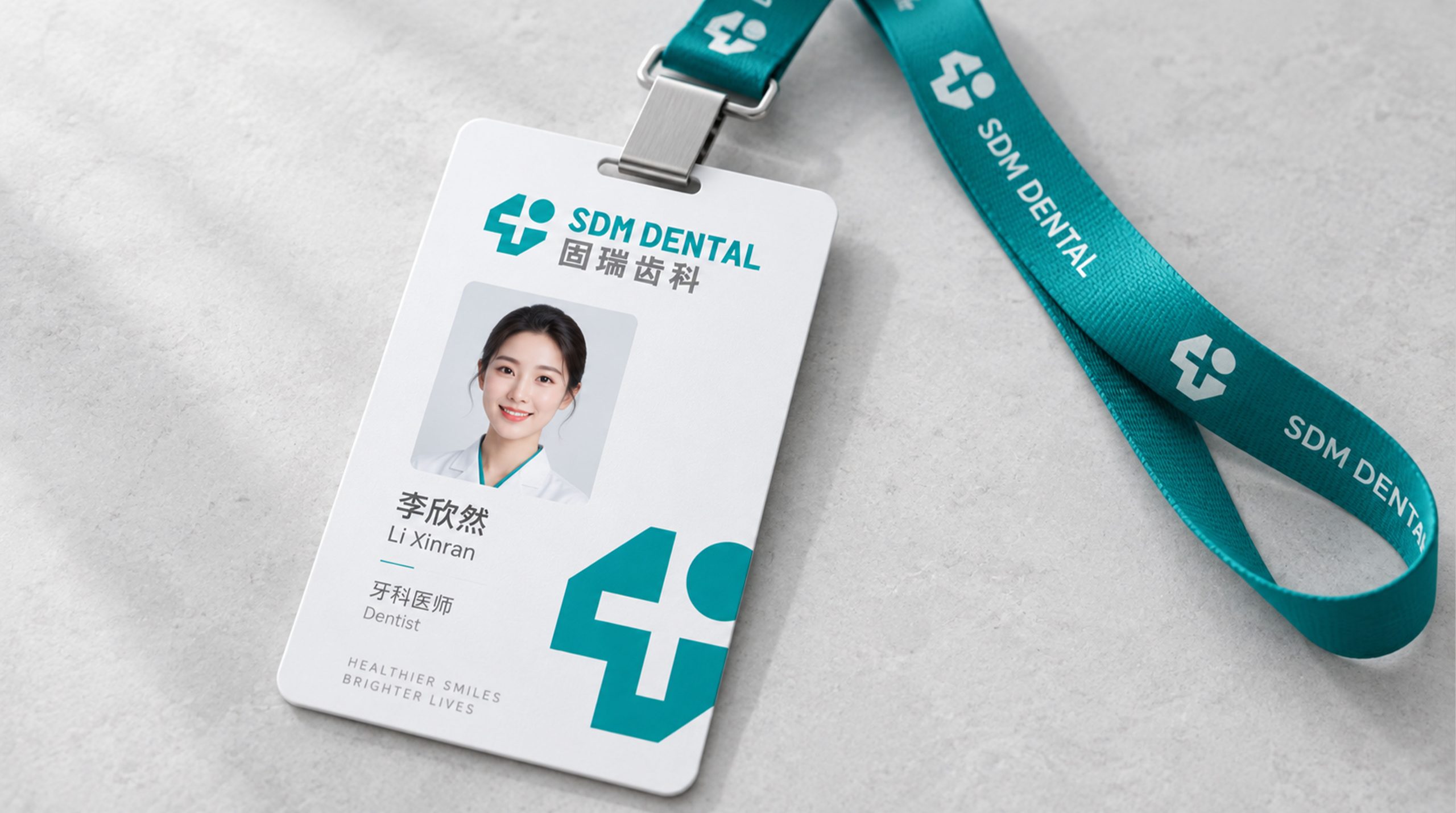
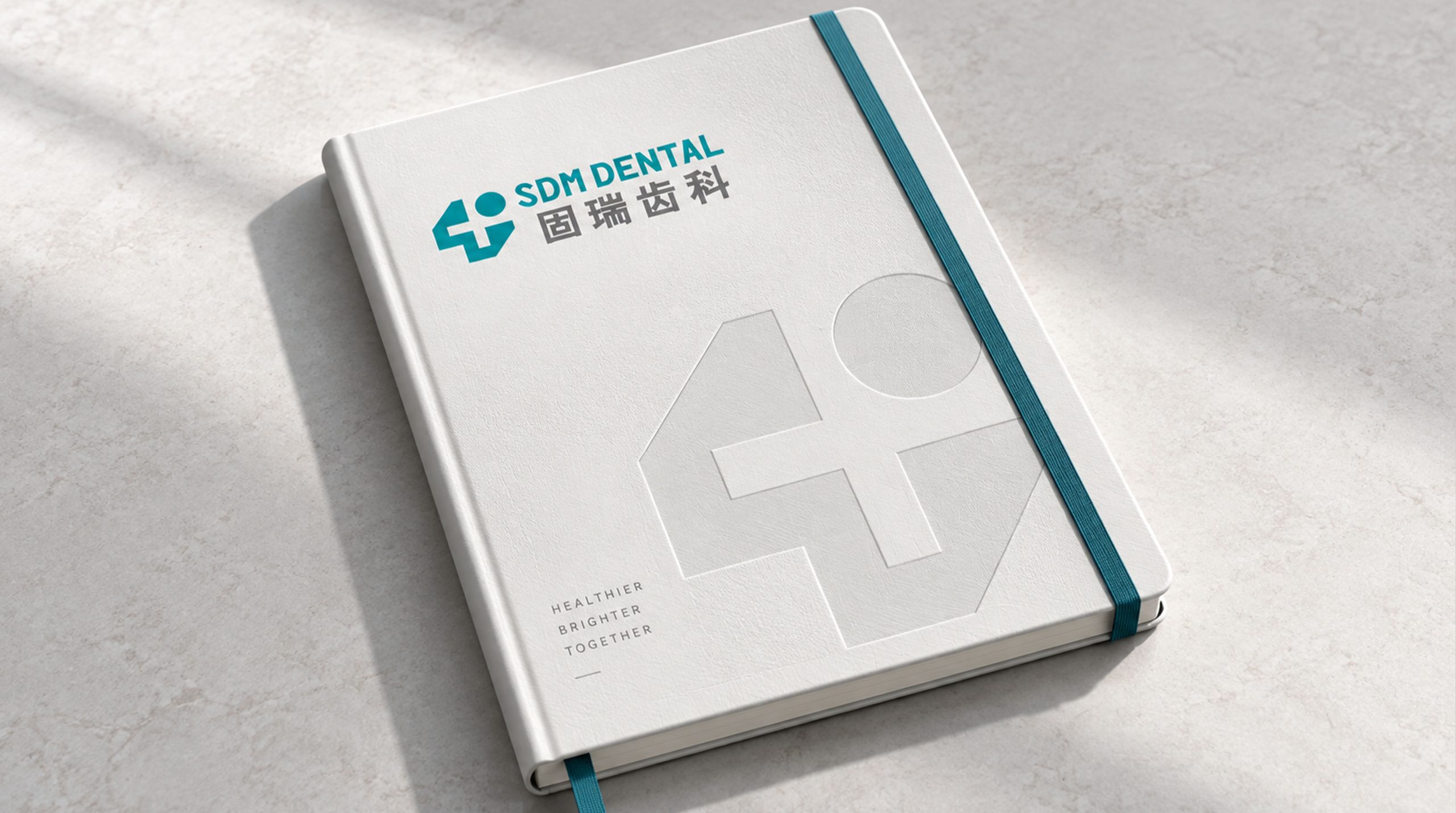
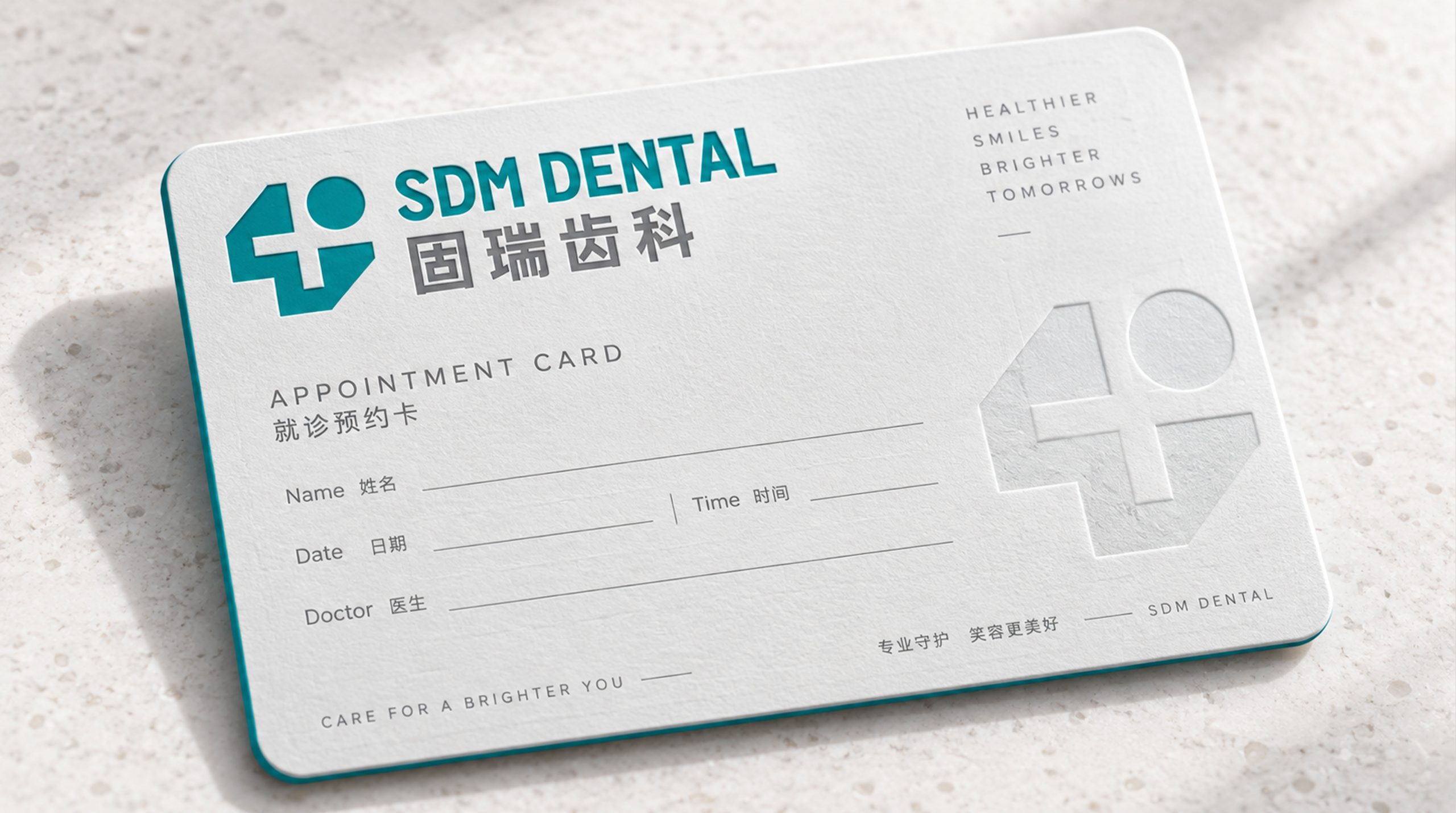
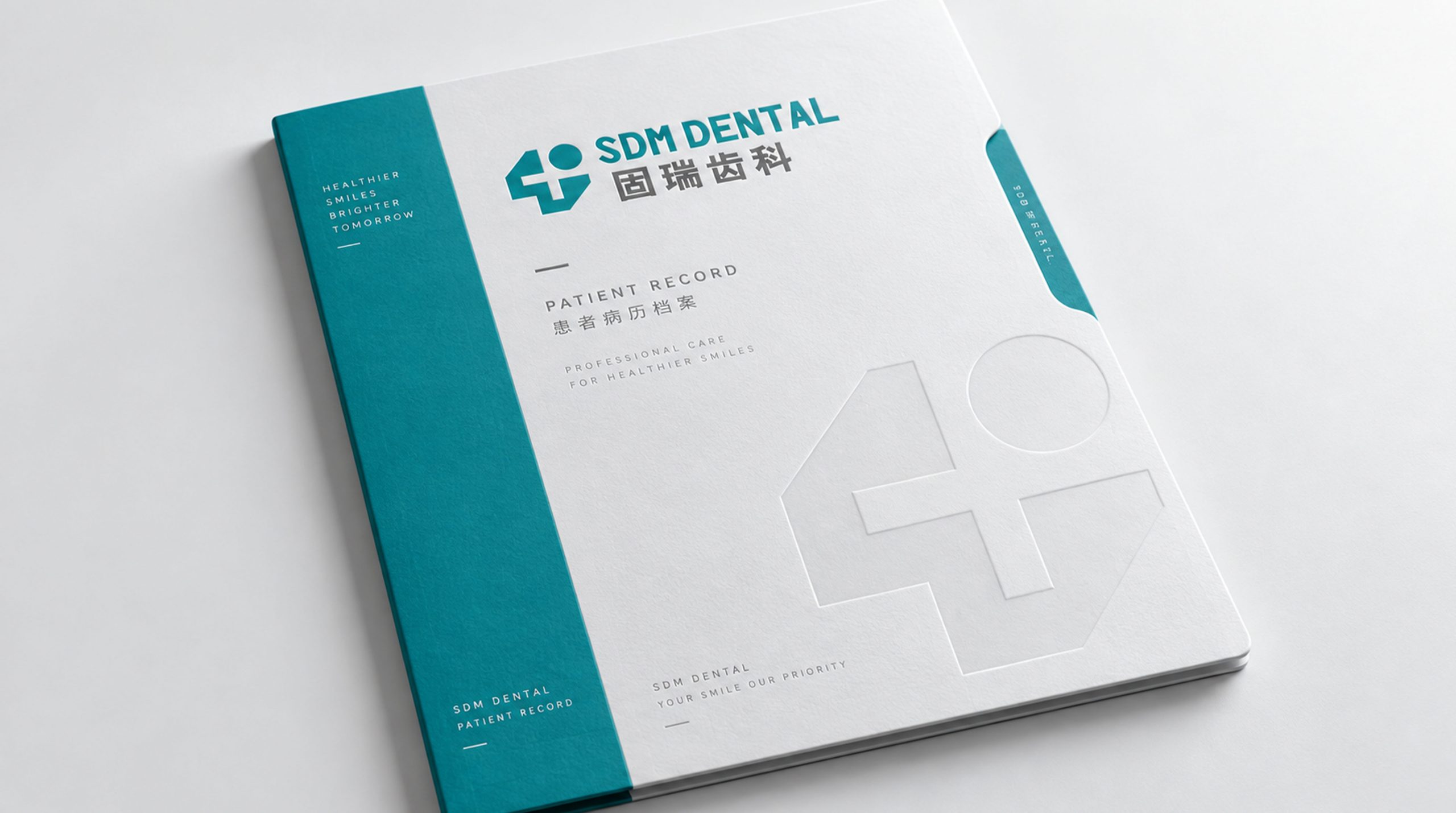
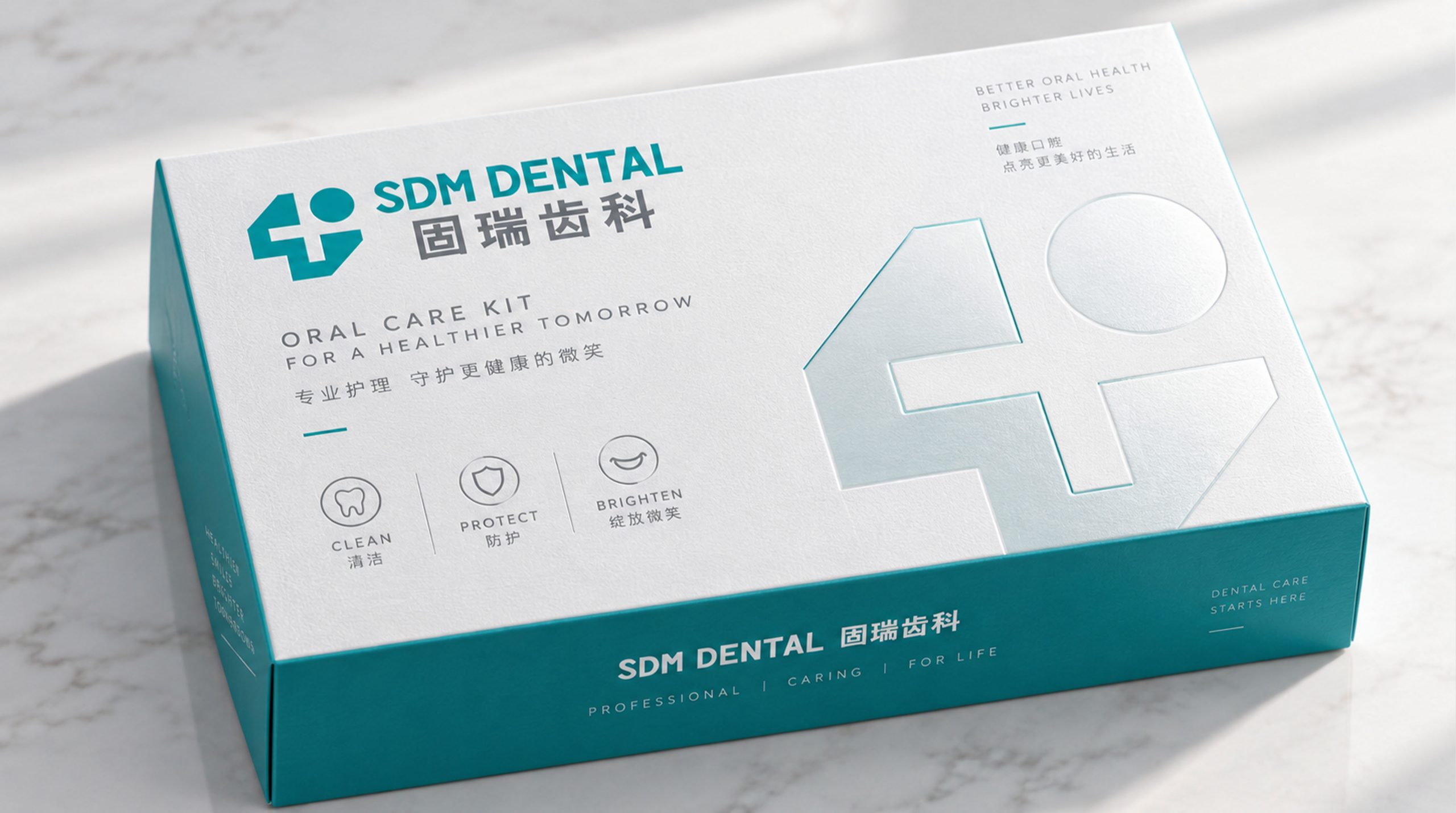
design concept
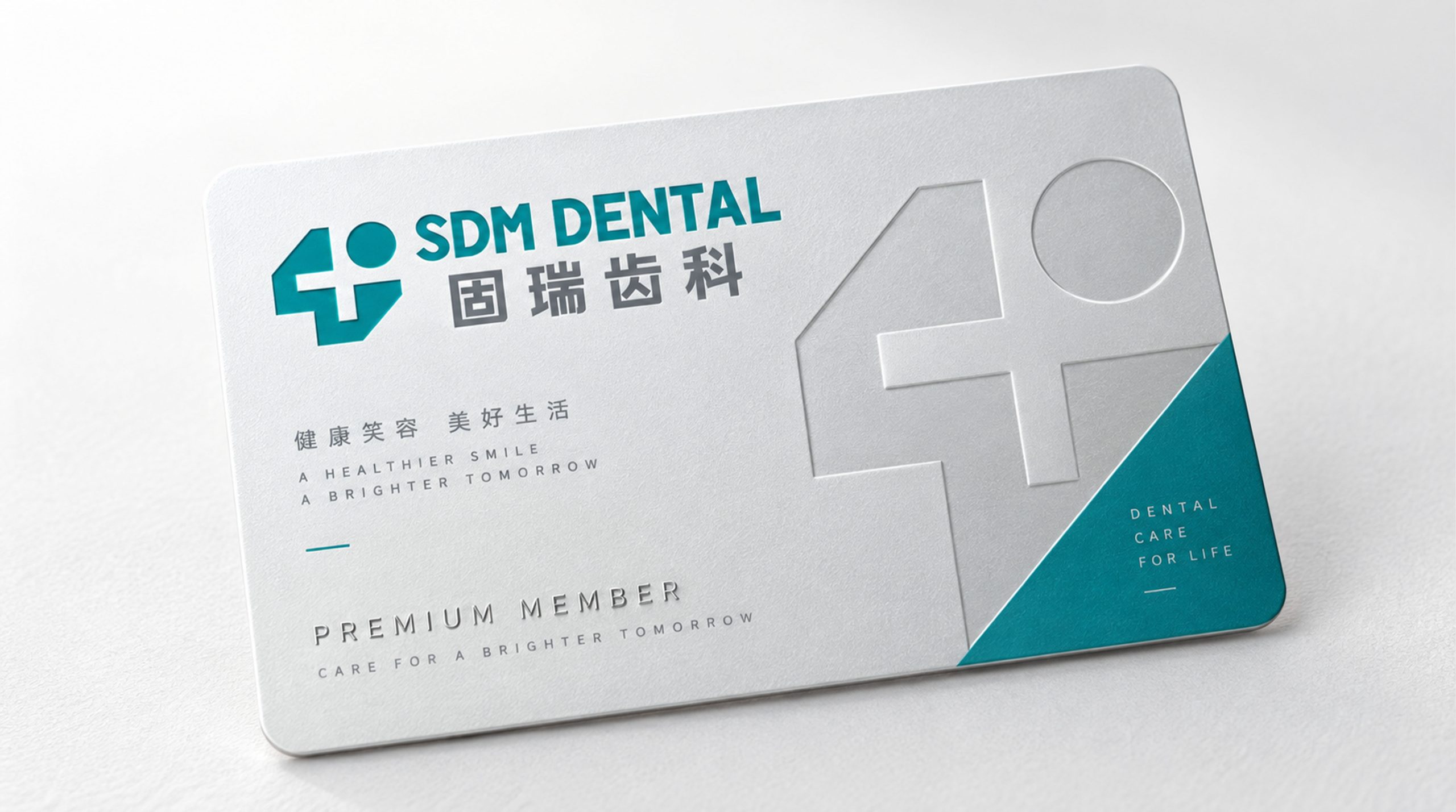
The design is rooted in “the structure of a smile and the warmth of care.” Geometric lines form abstract symbols of a tooth and a cross: the tooth signifies the specialty, the cross medical protection and trust. Together they create a stable geometric system that balances technology and humanity, expressing a brand spirit of “precision × care × expertise.”
graphic language
Geometric tooth form: medical expertise and systematic clinical logic. Cross element: protection, care and international medical standards. Dot: a central image of warmth and life. Leftward lean: subtly suggests the curve of a smile, conveying positivity, trust and comfort. Together, the graphic language strikes a balance between technological rationality and human warmth.
Font composition
SDM DENTAL is set in a modern sans-serif with steady forms and balanced strokes, in harmony with the symbol's geometry. The Chinese name, Gurui Dental, uses a solid, square medium-weight gothic, reinforcing authority and recognition in the domestic market. The side-by-side bilingual layout builds an international presence, reflecting professional care with a global outlook.
color system
Medical Teal #3E8E93: cleanliness, expertise and technology. Neutral Gray #7A7A7A: rationality, stability and trust. White #FFFFFF: purity and safety. The palette follows a healthcare color logic of “warmth within calm,” creating a clean, soothing and trustworthy impression.
Application and extension
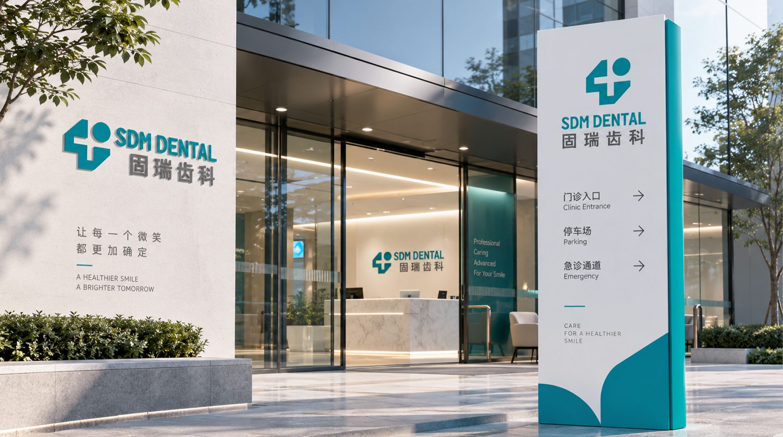
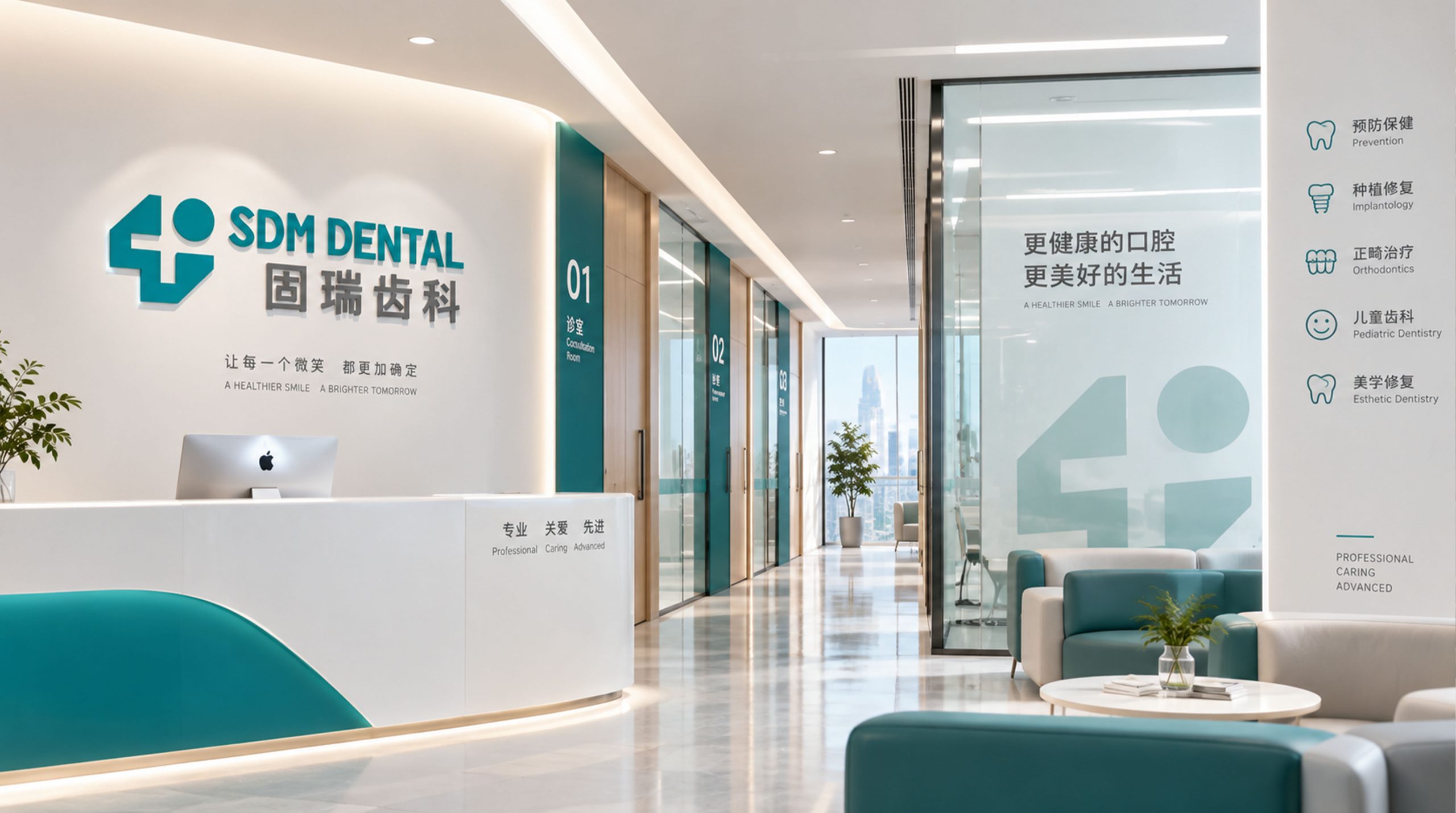
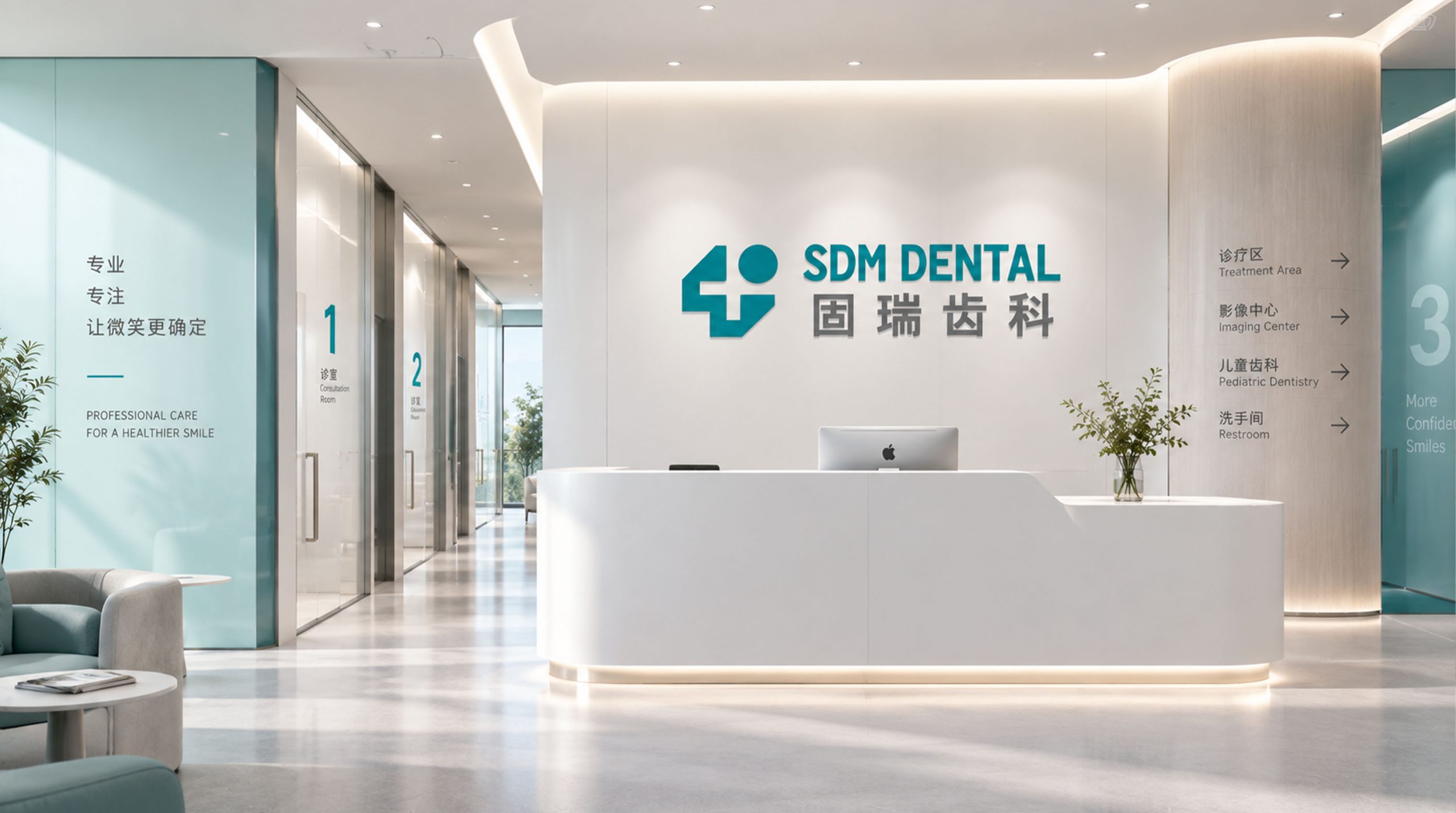
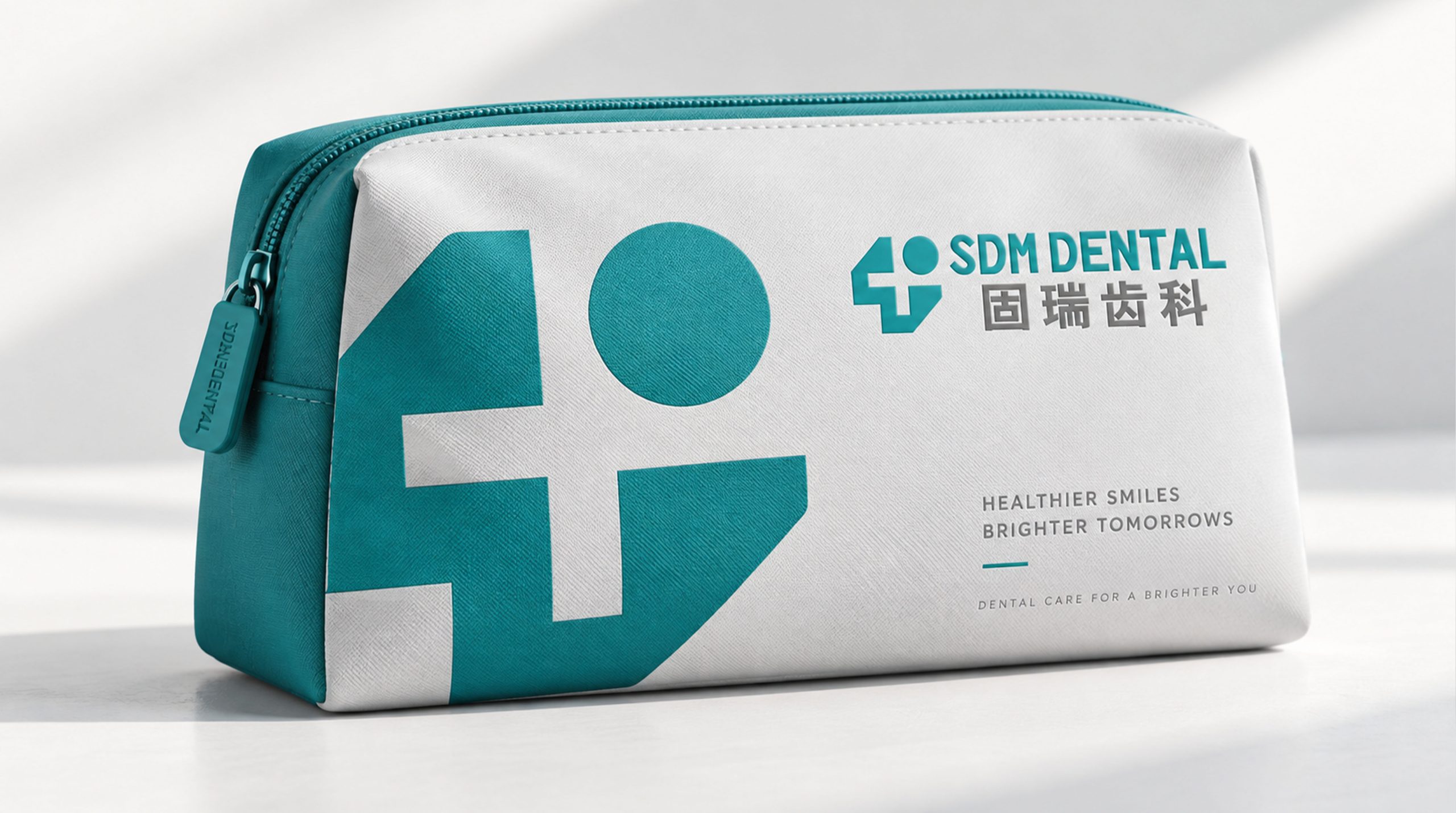
The mark is highly practical and recognizable across settings. Corporate: clinic signage, website, brochures and medical reports. Product: dental equipment, medical apparel and packaging labels. Spatial: extended as a soft graphic language across waiting areas, wayfinding and treatment rooms. In motion, the cross serves as a graphic guide, creating animated “care pathways.”
brand meaning
The SDM DENTAL mark embodies the brand's core values of “expertise × trust × care”: Cross → medical standards and responsibility. Geometric tooth → technological precision and professional strength. Blue-green → cleanliness, calm and healing. Bilingual fusion → an international, professional dental service system. More than a clinic's visual identifier, it expresses a belief that technology can make healthcare gentler.
Improper Usage (Protection Specification)
Do not alter geometric proportions or angles. Do not change brand colors or add gradients. Do not skew, outline or break apart the mark. Recommended minimum display width: 30mm.
design results
Since its launch, SDM DENTAL's visual system—uniting technological rationality with medical warmth—has achieved distinctive recognition and professional appeal in the dental sector. Its geometric symbol language is applied widely across spaces and media, establishing a clean, reliable and international brand impression. The project reflects Qingmei Future's mature work in healthcare and technology design, unifying structural rationality with trust and care.