










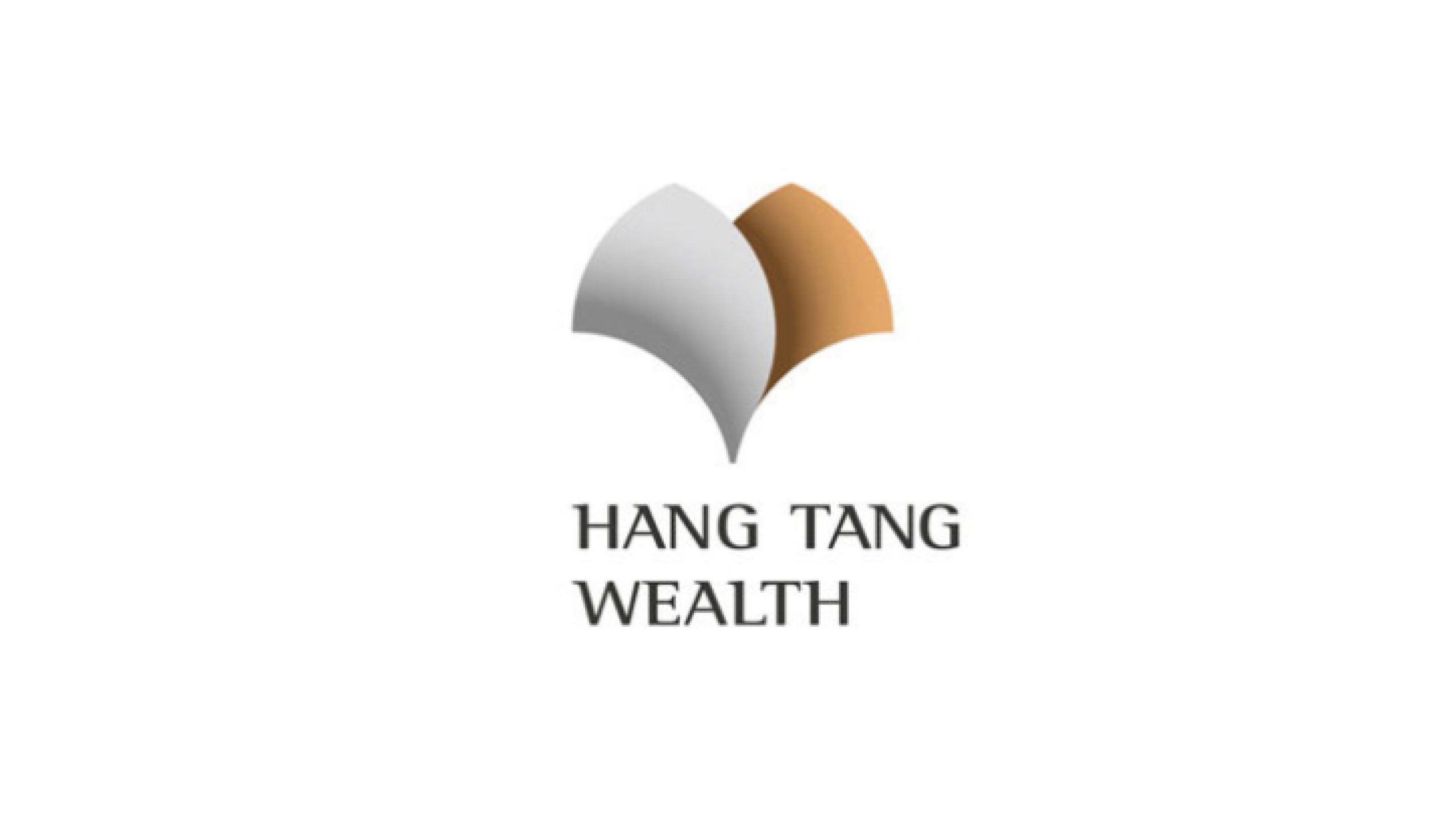
Hang Tang Wealth is a premium financial institution specializing in asset management, wealth advisory and financial innovation. Guided by “Eastern wisdom × Global perspective,” it provides high-net-worth clients with comprehensive wealth planning and capital management solutions.
As part of the brand transformation, the logo was designed to express a wealth philosophy rooted in stability, balance and shared prosperity through a simple, elegant symbol. The ambition was an international identity that combines financial expertise with the cultural sensibility of the East.
design concept
The design centers on harmony, using two opposing curved forms to suggest “wings of wealth” and prosperity through partnership. Inspired by the interlocking brackets of traditional Chinese architecture and the shape of a bird in flight, the symbol conveys both support and upward growth. Where the wings meet, a heart-shaped negative space expresses trust and balance. Elegant, restrained and dynamic, the mark reflects a belief in lasting growth built on stability and harmony.
graphic language
The symmetrical wings represent the reciprocal flow of capital and value, expressing shared success between client and institution. Their intersection creates a heart-shaped negative space, reflecting the belief that trust is a form of wealth. The outer curves resemble open wings, suggesting freedom, growth and upward momentum. Based on the golden ratio of 1:1.618, the geometry brings balance and refinement. The design balances reason and emotion, giving the financial brand warmth and cultural depth.
Fonts and composition
The HANG TANG WEALTH wordmark uses a serif typeface to convey stability and trust. Measured letterspacing and a slightly heavier weight lend authority and structure. For bilingual lockups, pair it with a custom Song-style Chinese typeface or Source Han Serif to reflect the brand’s Eastern heritage. Maintain a symbol-to-wordmark ratio of 1:1.2 with a centered composition, creating a cohesive signature for premium financial documents and digital applications.
color system
Silver gray #D6D6D6 represents clarity, professionalism and the technology behind modern finance. Golden brown #C99A5B conveys wealth, trust and warmth, suggesting sustained asset growth. Neutral black #2A2A2A gives typography stability and authority, while white space creates purity, balance and refinement. Gold and silver provide both visual contrast and cultural meaning: gold represents yang and silver represents yin, expressing an Eastern financial philosophy of balance, stability and shared prosperity.
Application and extension
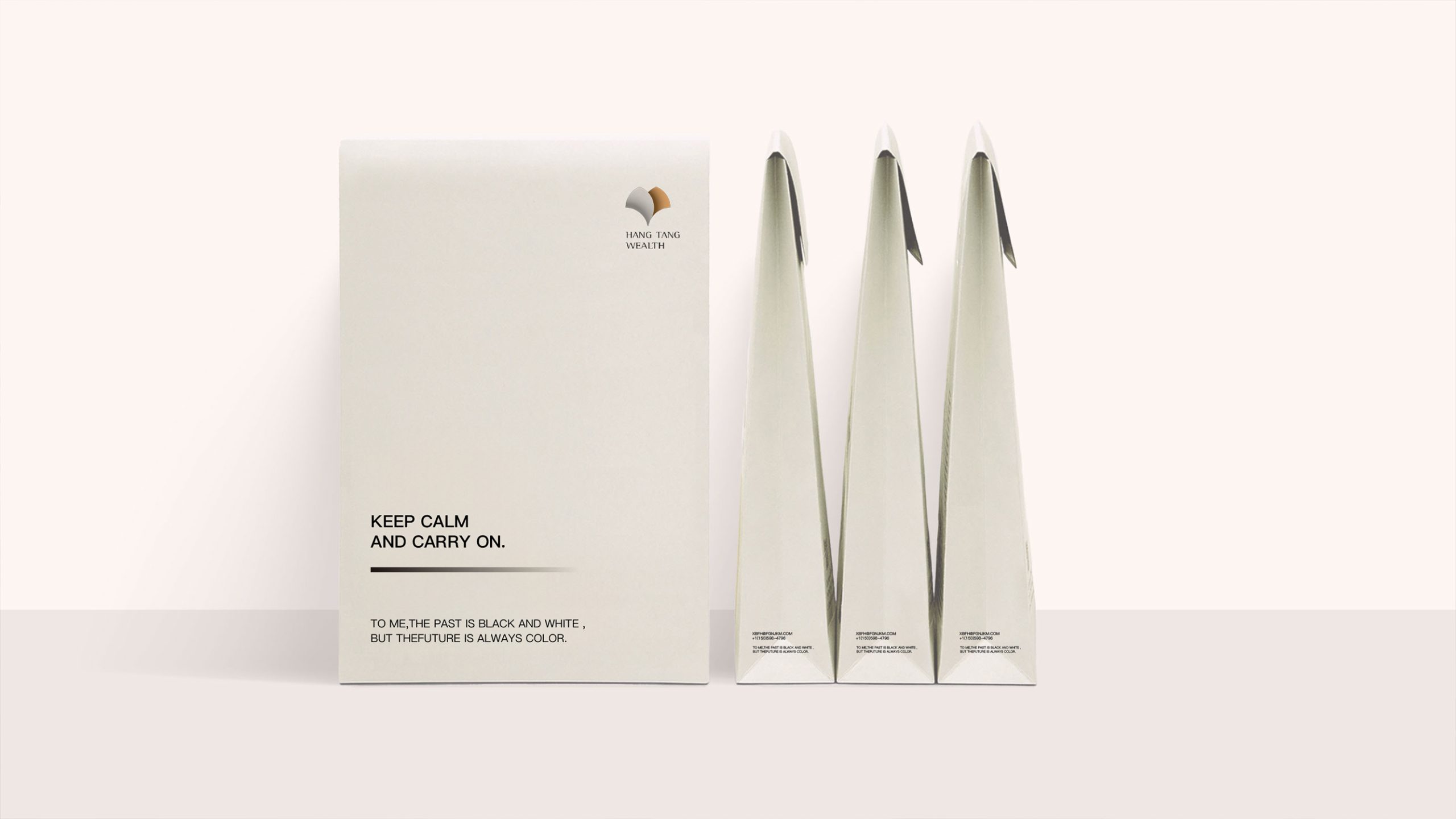
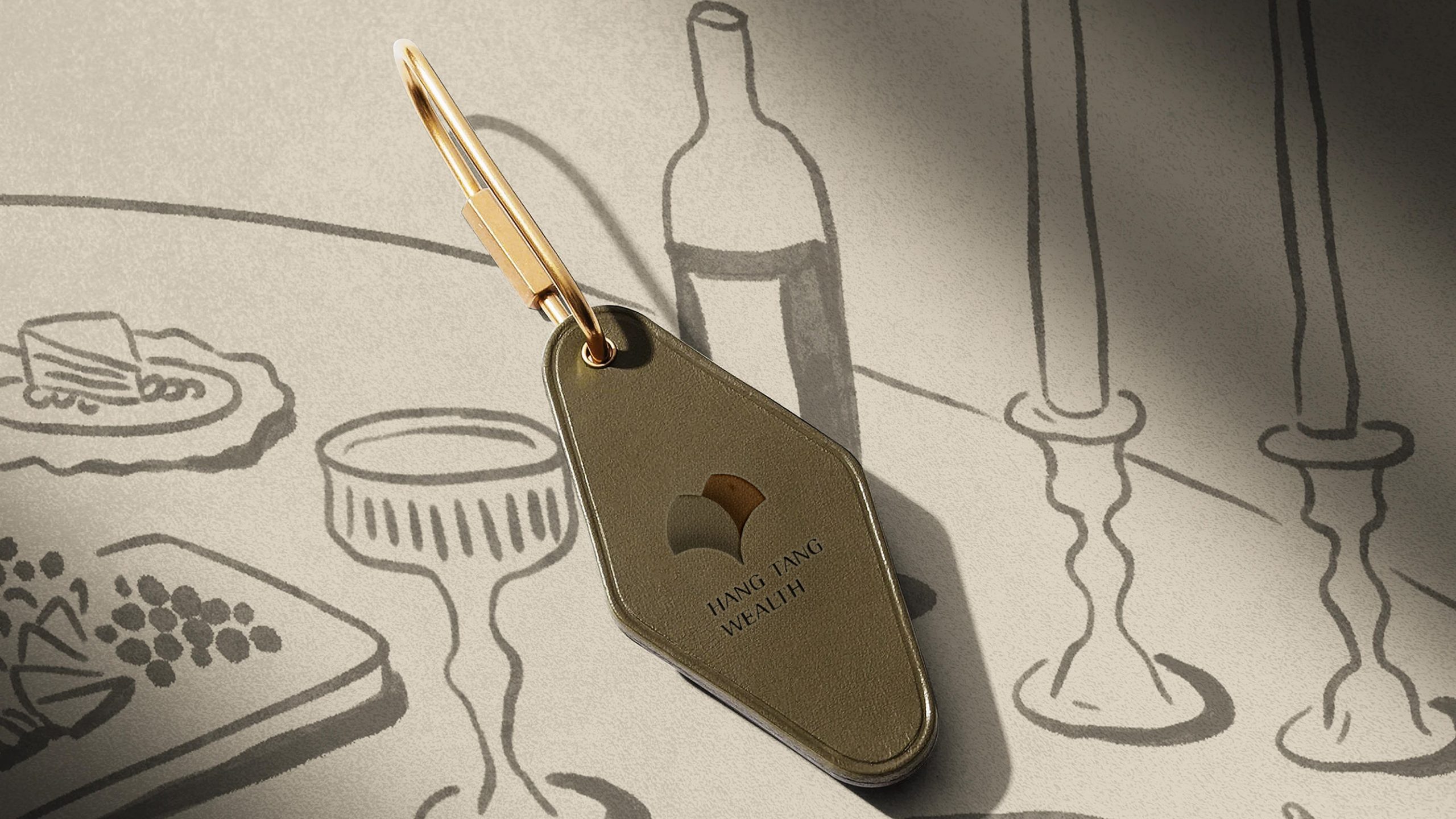
The logo works across wealth management systems, financial reports, embossed metal plaques, corporate building wayfinding, VIP cards and digital investment platforms. The wings can also serve as a core graphic element, generating patterns and background textures that extend the identity with order and elegance. In motion, the gold and silver wings can unfold slowly from the center, expressing growing wealth and deepening trust.
brand meaning
Through the image of two wings growing together, the logo expresses Hang Tang Wealth’s central belief: “The path to wealth lies in harmony.” Silver represents reason and risk management; gold stands for growth and trust. Their meeting point conveys balance, shared success and sustained growth in the financial world. The identity gives cultural form to a philosophy of wealth and wisdom: advance with stability, value harmony and build on trust.
Improper Usage (Protection Specification)
Do not change the proportions or order of the gold and silver colors. Do not rotate, stretch or skew the logo. Do not add shadows, reflections or gradients. Do not alter the angle at which the wings meet or the proportions of the central space. Maintain the specified symbol-to-wordmark proportions. The minimum reproduction width is 25 mm.
design results
After the new logo launched, client research showed a 46% increase in brand recognition. Respondents described the identity as combining “Eastern elegance with the character of an international financial institution.” The gold and silver wings brought a premium finish to print and spatial applications, establishing a wealth management brand associated with stability, trust and cultural depth. The project is now part of Qingmei Future’s Finance and Premium Services Brand Identity collection, demonstrating the integration of Eastern financial aesthetics and contemporary international design.