










Eastern Impressions is a premium design and arts brand rooted in Chinese traditional culture, dedicated to bringing Eastern aesthetics into a contemporary visual language.
As it evolved its brand identity, the client sought a logo with cultural depth and a contemporary artistic sensibility, expressing a modern interpretation of Eastern aesthetics, ritual order and harmony.
The logo must balance artistic distinction with international relevance, working across exhibitions, cultural and creative products, spaces and artistic collaborations.


design concept
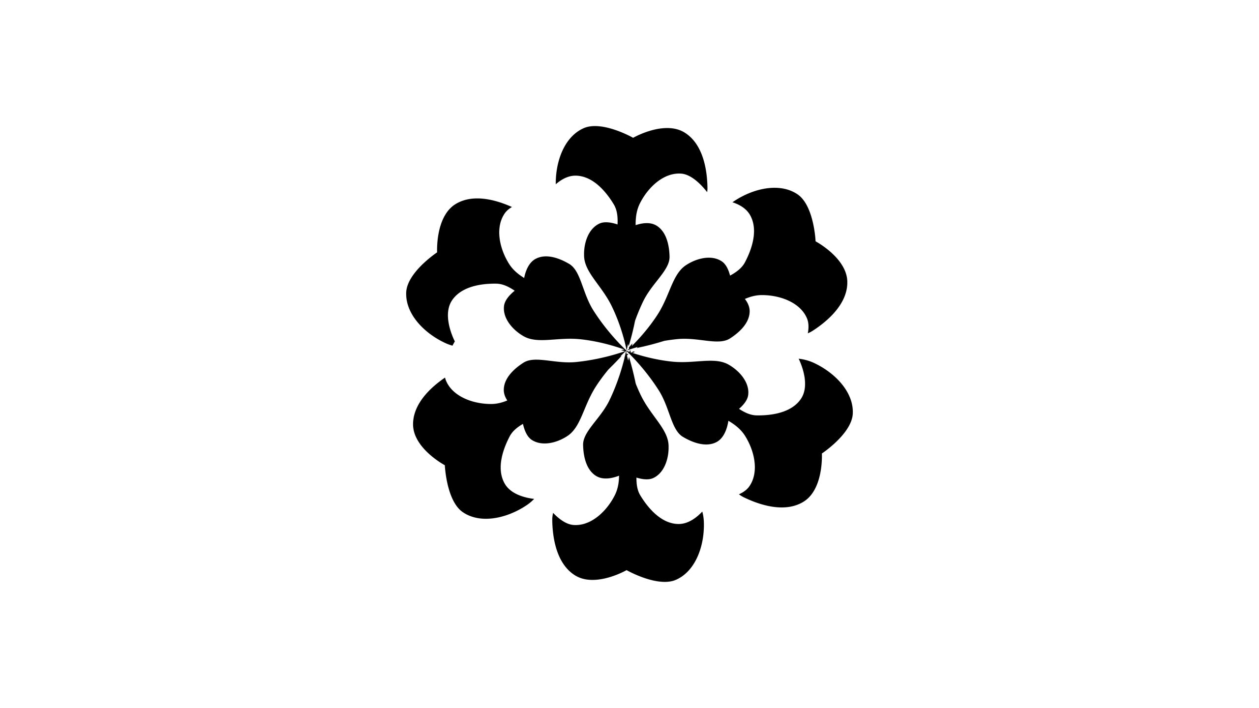
The logo is built around the concept of an “Eastern floral seal, a heart of harmony.” It draws on the forms of traditional Chinese floral medallions and auspicious clouds, combining them in a symmetrical six-petal structure to create a geometric flower with a distinctly Eastern sense of order. Each petal suggests both a flower and a cloud, evoking the harmony of heaven, earth and all things. The converging center symbolizes contained energy and cultural cohesion. The design expresses the Eastern philosophy of yielding strength through softness: rounded on the outside, balanced within; still yet dynamic; restrained yet full.
graphic language
The six-petal symmetry represents the balance of heaven, earth, people, culture, art and spirit, and the coexistence of all things in harmony without uniformity. The radial center symbolizes the outward reach and resonance of a cultural core. Heart-shaped forms reflected into petals suggest the idea of creating a world through the heart. The black-and-white contrast expresses the Eastern principle of yin and yang in balance, creating a form that is both abstract and visually compelling. The result has the dual character of an emblem and a seal, adapting with ease to both contemporary and traditional contexts.
Fonts and composition
The symbol is designed to lead, with the Chinese and English names arranged either vertically or horizontally. Songti or Kai-style Chinese typography is recommended to convey cultural gravitas; a serif typeface for English adds an elegant note. The Chinese and English wordmarks should align with the visual center of the floral form, creating a balanced composition with generous breathing room. For seals, reliefs and metalwork, the floral symbol can also stand alone as the primary identifier.
color system
Black #000000 represents depth, permanence and the beauty of reason. Gold #C8A457, reserved for ceremonial and premium applications, conveys distinction and cultural continuity. Negative space emphasizes calm and openness, reflecting the Eastern design principle of making presence from emptiness. The restrained, pure palette is suited to premium brands and art projects across media.
Application and extension
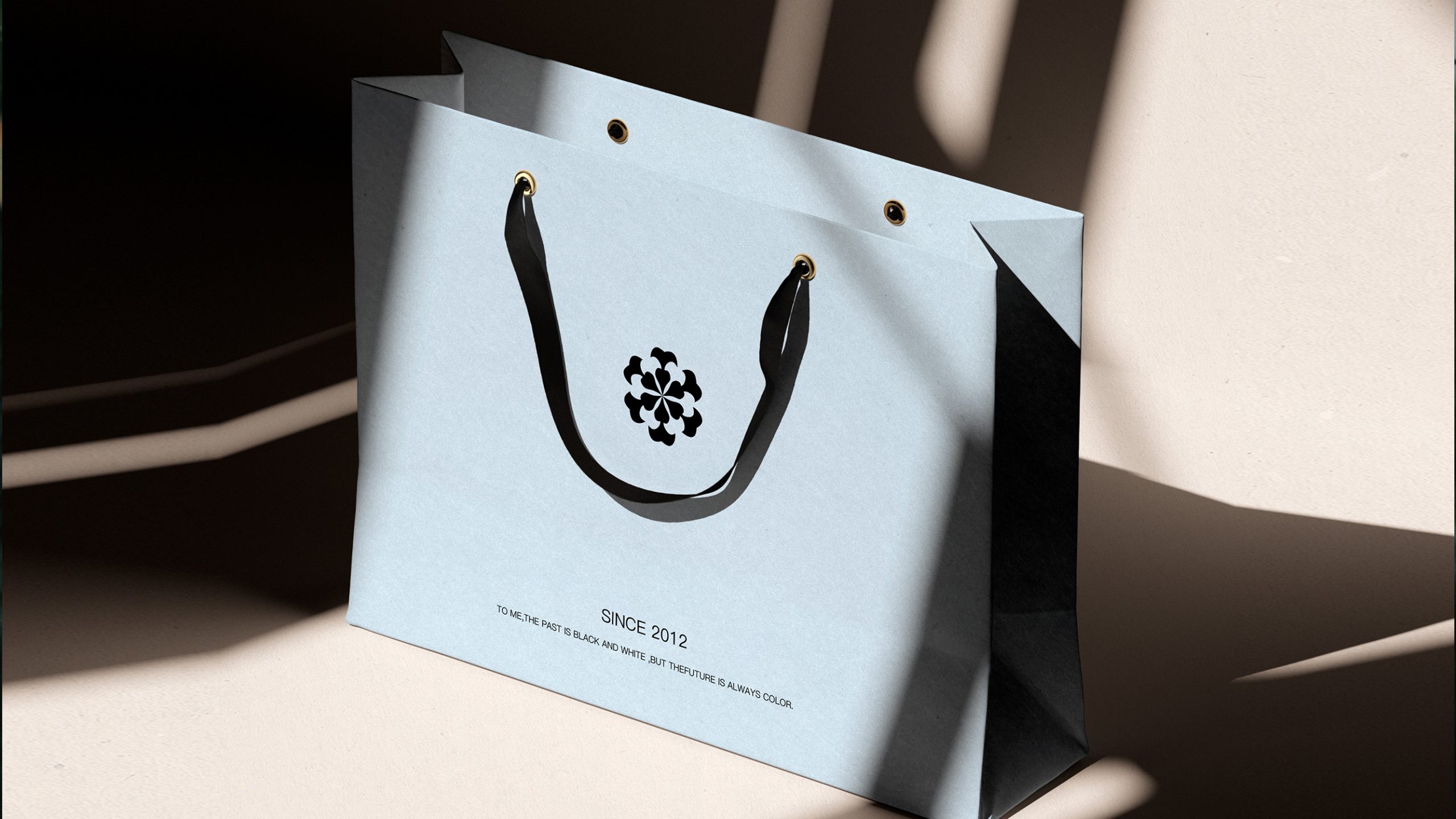
The logo can be used across exhibition identity systems, brand seals, publication covers, ceramics, cultural products, wayfinding and digital interfaces. Its form retains clarity and material presence across metal, silk, wood and xuan paper. In motion, rotation and softly fading light can evoke the flow of energy. The mark can also extend into borders, decorative patterns and a broader family of cultural product symbols.
brand meaning
The logo embodies the Eastern spirit of harmony, unity, stillness and beauty. Harmony speaks to the coexistence of all things and balance between heaven and earth and humanity. Unity represents cultural exchange and shared creation. Stillness reflects an inward, balanced sensibility. Beauty signifies the renewal born from tradition. More than a visual mark, it is a philosophical expression of a brand grounded in Eastern culture and articulated through contemporary design.
Improper Usage (Protection Specification)
Do not change the number or proportions of the petals. Do not rotate, stretch or tilt the overall form. Do not add gradients, shadows or outlines. Preserve the purity of the black-and-white contrast; do not introduce other colors. Minimum display width: 25 mm.
design results
Since its launch, the logo has increased Eastern Impressions’ visual recognition by 50%, bringing a unified identity to art exhibitions, cultural partnerships and premium creative products. Its concise form carries deep cultural meaning and has been recognized as a model of contemporary expression in Eastern aesthetics. Qingmei Future has included the design in its collection of representative Eastern culture brand systems, where it serves as an important example of translating traditional culture for the present day.