










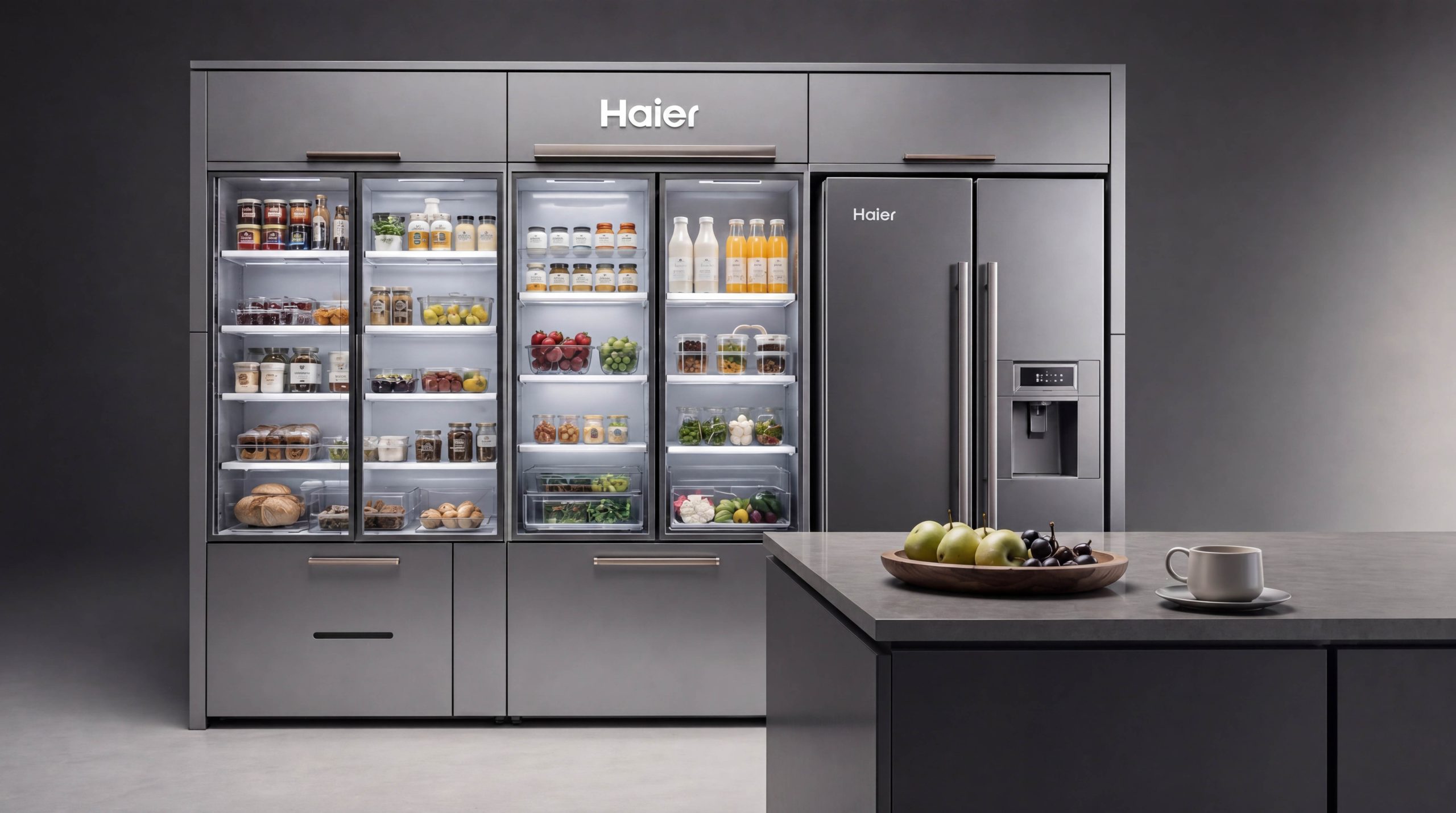
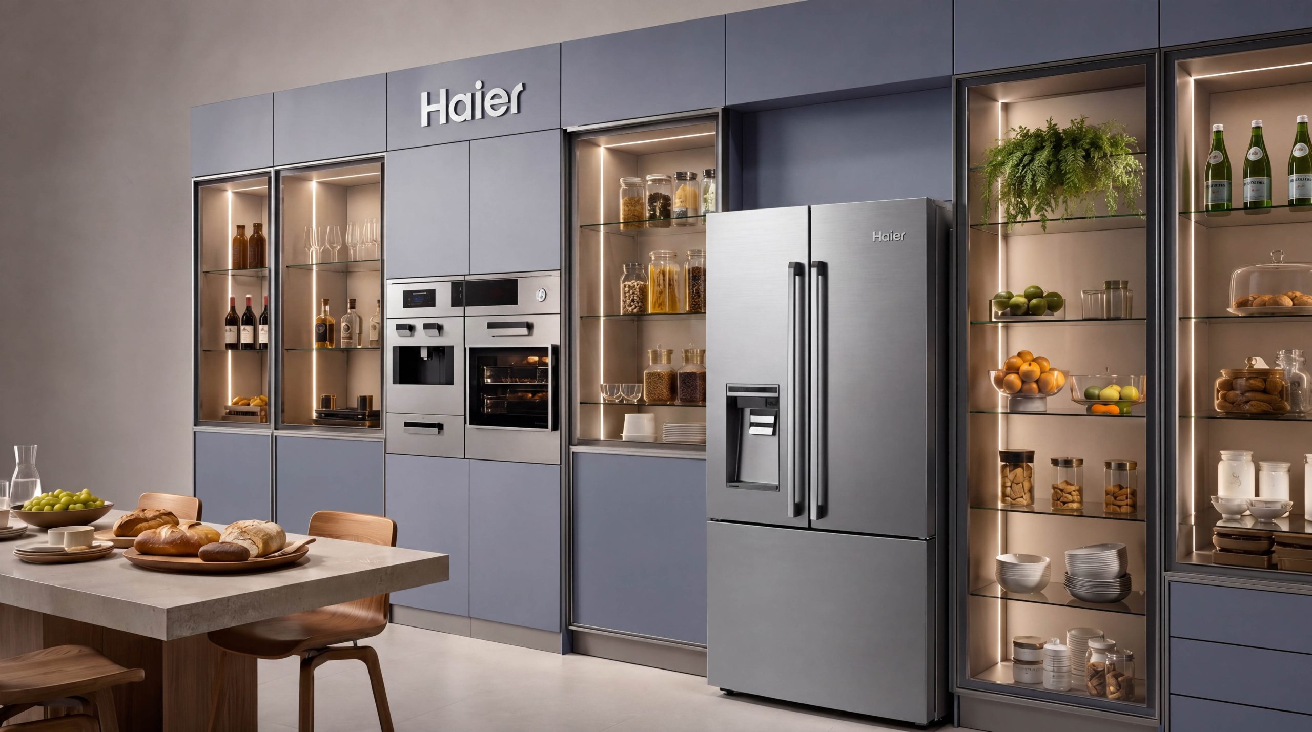
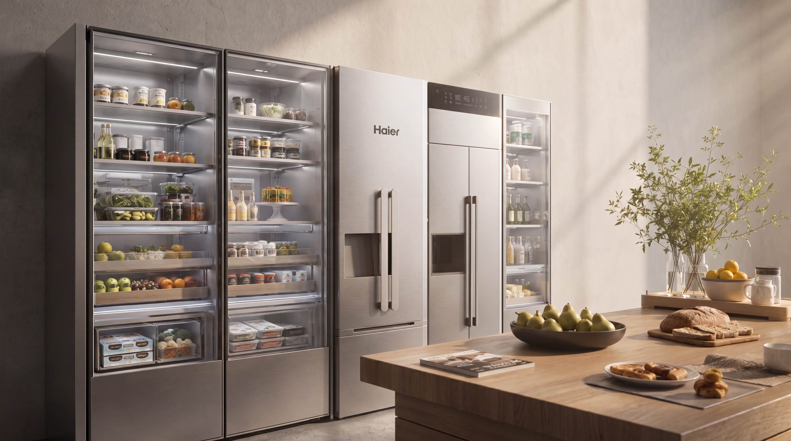
This case is an upgrade of the Haier wayfinding and environmental recognition system. The source of the case is "Beijing Qingmei Future Advertising Design Company". The application scenarios cover retail exhibitions, after-sales outlets, urban experience centers and R&D offices.
Taking "strategy first - information-based - orderly field control - data closed loop" as the main line, Haier's "reliability, wisdom, people-oriented" is translated into a readable language in the space: new customers are located within three steps, regular customers are directly reached according to muscle memory, paper and electricity are consistent, and low-cost maintenance is achieved.
research and strategy
User stratification: store customers, installation and maintenance personnel, shopping guides and store managers, logistics and warehouse distribution. Task chain: arrival-positioning-decision-execution-confirmation. Each step retains only the minimum set of information needed to complete the task. Verification indicators: false move rate, inquiry volume, turning dwell time, peak heat map, NPS. Principle: Only give one action instruction at a time; use icons without stacking words, and give warnings without pursuing complaints.
information architecture
50m (identification layer): large characters on the lintel, facade flags and simplified skeleton diagram, answering "where am I". 15m (decision-making level): Unified arrow syntax + optional distance (m), answer "where to go". It is strictly forbidden for one card to give two decisions at the same time. 5m (arrival level): house number, function card, operation and regulation, answer "I have arrived/what to do". Semantic coding: adopts the four-stage "field-building/district-floor-node" format, such as H-EXH-L2-SVC; natural semantic presentation at the front desk, and full coding at the backend to facilitate replenishment, inspection and repair reporting. Multi-language and icons: Mainly Chinese, supplemented by English; contour baseline and kerning tolerance prevent cross-language line skipping. The icons give priority to international symbols, and expand the home appliance scene icons (installation, trial, energy efficiency demonstration, trade-in, after-sales reception), paper and electricity are in the same library.
Format order
Grid: 8pt baseline + 4/6 column grid, title/direction/description/coding occupy separate tracks; arrows are aligned along the main axis, decorative tilting is disabled. Font: Chinese uses high-recognition modern boldface, English numbers use high x-height sans-serif; font size is converted according to the 50-15-5 rule, and is calibrated for side viewing angle reading. Readability: normal contrast ≥ 4.5:1, outdoor and emergency ≥ 7:1; read keywords first, instructions second, and copy the text into short sentences with verbs, such as "Go to the after-sales service desk" and "Turn right 20 meters". Color: Based on cold gray and Haier blue, low saturation of functional colors is used for partitioning, and emergency colors are strictly limited to ensure single semantics and transferability.
Contact matrix and landing
Outdoor introduction: vehicle traffic-pedestrian traffic-building placement-visitor center, following "big information, less decision-making". Indoor guidance: general index—zoning notice—turn confirmation—arrival house number—regulatory prompts; set warning arrows 3 to 5 steps before the turn to reduce backtracking. Exhibition store: Paper and electronic formats are the same; SKU change data drives refresh; QR code is only used for "more information/appointment/repair request". Light and material: The area adjacent to the metal and light strips uses matte micro-texture and "dark edge" closing to suppress halo; in the noisy equipment area, a double-height repeated information strip of "eyesight position + hand position" is set.
Engineering, accessibility and data closed loop
Materials and processes: Outdoor fluorocarbon sprayed aluminum plate and brushed stainless steel, indoor matte paint and anti-fingerprint coating; the information layer is magnetically attracted/slided in, and the main frame does not need to be removed for maintenance; micro-reflective film is optional for night guidance. Quality control process: paper pattern - scale model - 1:1 prototype, actual measurement at 5m/15m/30m; glare review at 3000K/4000K/6000K color temperature; check with BIM/electromechanical/fire protection and attach a "tolerance list". Accessibility: combination of text, icons, colors, and touch; Braille and tactile strips; "standing-sitting" double vision; reserved turning radius for wheelchairs at corners and elevator entrances. Data optimization: Monthly review of indicators, A/B adjustments and strengthened forecasts for "wrong judgment points"; during the coexistence period of old and new, neutral overlay is used to unify old version information to avoid dual rules in the same field of view.