





One Core Logo System
Four configurations—a primary logo, horizontal and vertical lockups, and a simplified symbol—cover storefronts, packaging, digital channels and collateral, removing the need for ad hoc variants.

A complete visual language for a lifestyle brand rooted in Eastern culture, spanning logo, color and spatial applications, so every encounter speaks with one voice.
Rooted in Jiangnan, Lanche champions a way of living defined by simplicity and authenticity. Its stores, packaging, digital channels and events each had their own appeal, but lacked a shared identity. We were invited to build a scalable, manageable and practical visual system while preserving the brand's warmth.
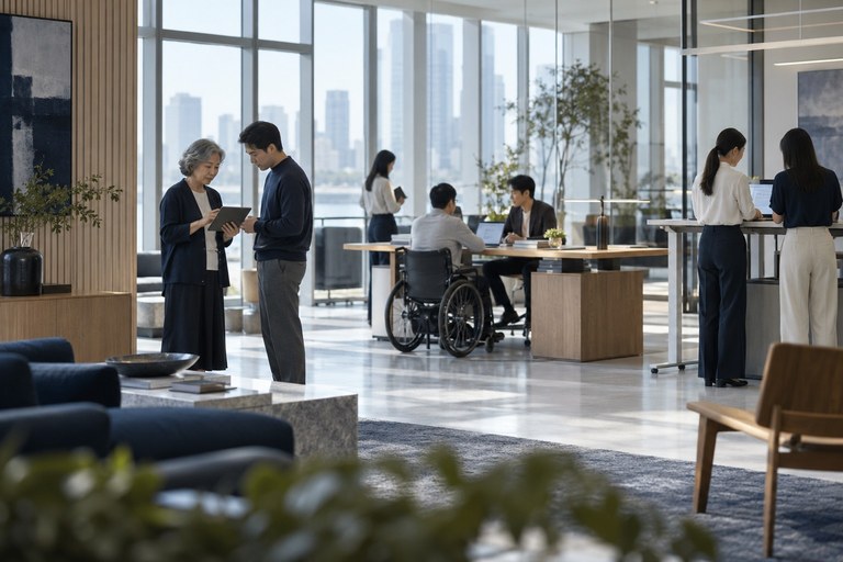
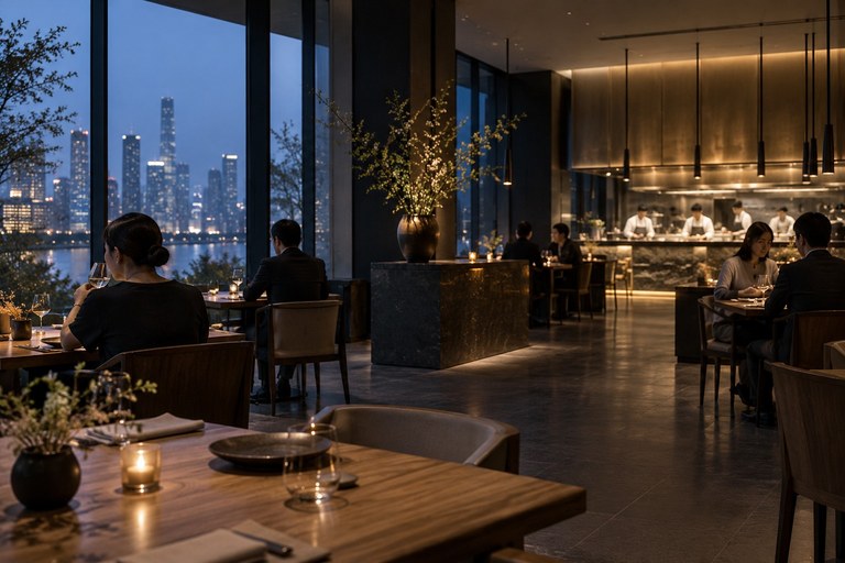
The project spanned headquarters, flagship stores and e-commerce, with a tight schedule and numerous touchpoints. The goal was to create an identity that would remain clear, restrained and coherent as the brand grew over the next three years.
Teams produced materials independently, with inconsistent logo proportions, spacing and color standards. Stores and e-commerce felt like two different brands.
The identity needed to be immediately understood in international markets while retaining Jiangnan's restraint and use of negative space, without resorting to familiar visual clichés.
With multiple suppliers involved, the brand needed practical guidelines and templates that would help even non-designers apply the identity consistently.
Four configurations—a primary logo, horizontal and vertical lockups, and a simplified symbol—cover storefronts, packaging, digital channels and collateral, removing the need for ad hoc variants.
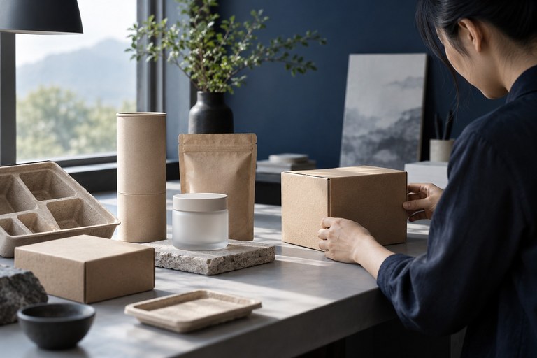
The guidelines define two primary colors, three secondary colors and a list of colors to avoid. Materials are limited to three tactile expressions: paper, wood and metal.
We established standard templates for the three most frequent touchpoints—stores, packaging and e-commerce—before extending the system, enabling a full rollout within the first year.
Placeholder content, ready to be replaced. The following images illustrate key applications of the project's visual identity.
Color and material wall: defining the brand's visual and tactile boundaries.
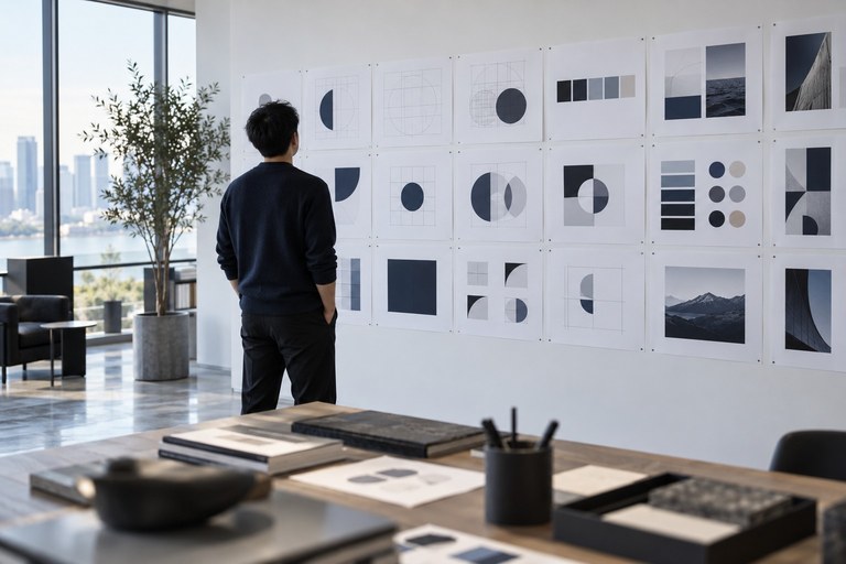
Graphic language: restrained geometric rhythms that strengthen recognition.
We specified the logo's negative space, stroke terminals and minimum type sizes, then proofed store, packaging and digital applications to the same exacting standard, giving suppliers everything they needed for production.
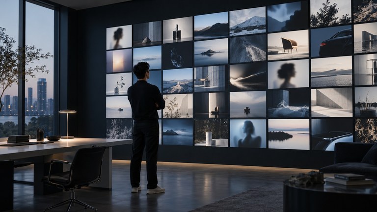
Inspiration and decision-making: a clear rationale behind every choice.
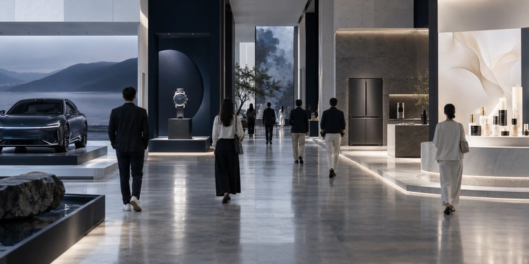
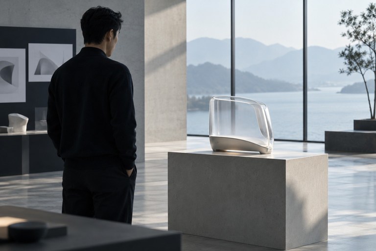
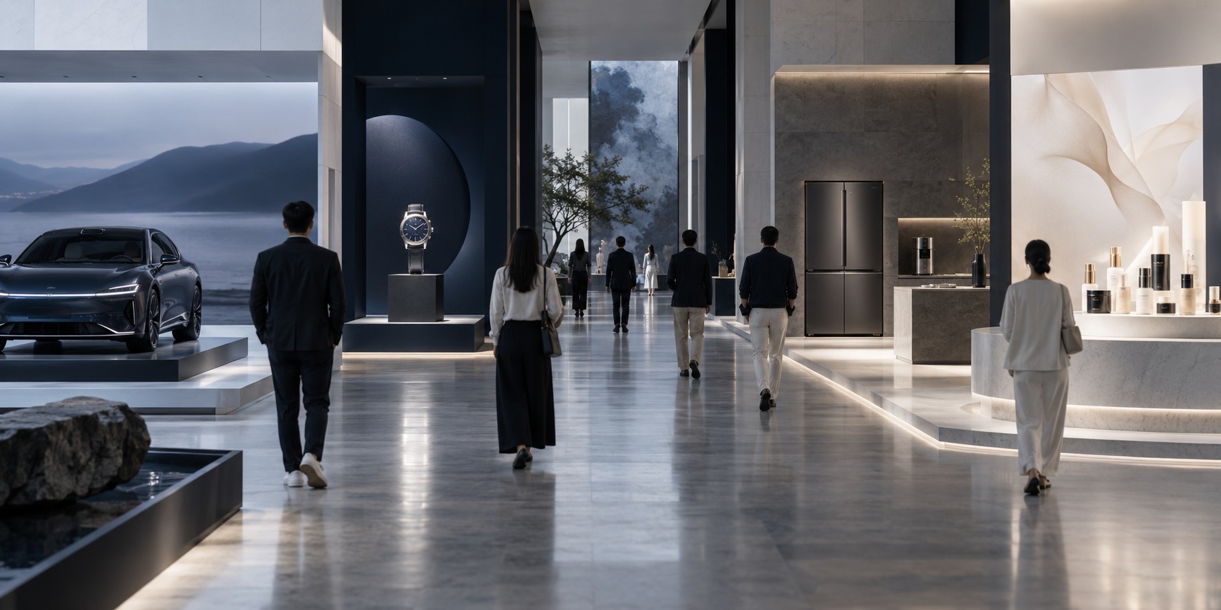
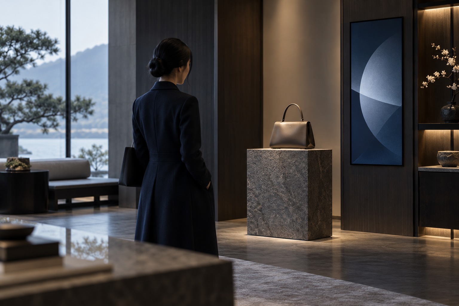
Product display and identity working together: making the brand instantly recognisable on the shelf.
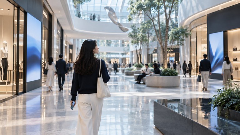
Within a year of launch, the visual identity was consistent across stores, e-commerce and collateral, with far fewer internal queries about how to apply it.
From diagnosis to full rollout across all channels
Guideline specifications and standard templates added to the shared library
Store identities updated to a single system
Instant recognition rate in an internal survey
They gave us a system we could confidently maintain ourselves. From headquarters to our stores, we finally speak with one voice.
Share your brief and timeline. We'll respond within one business day and connect you with the right consultant.
Service Hotline400-629-1588