











Case Study / Pharmaceutical Heritage
The Innovator
Across Cycles
Repositioning a century-old pharmaceutical company as “classic and innovative.” Freeing “classic” from its connotation of “outdated” and redefining it as “time-tested innovation.”

01 / Client & Challenge
Brand Equity:
A Double-Edged Sword
Client
Helios Pharma
A 120-year-old European pharmaceutical giant
Century-old brand / Essential medicines / Symbol of trust / Global footprint

From Reliable to Outdated
The Helios brand was synonymous with “trust.” For three generations, “Helios Blue” stood for reliability and safety.
Yet in the 21st century, this “ultimate reliability” had come to read as “utterly outdated.”
Market Perception
Seen as a “traditional drugmaker” and a “generics giant,” not an “innovator”
Talent Drain
100% of top talent chose “Silicon Valley biotech upstarts”; 0% chose “old-school Helios”
Capital Markets
Classified as a “legacy stock” rather than a “tech stock,” with its R&D capabilities severely undervalued

02 / Strategic Insight
Design Archaeology
Discoveries
Through “design archaeology” across 120 years of archives, we unearthed a forgotten truth.
A Misread History
Helios did not earn its “classic” status by “standing still.”
In the 1920s, the 1960s and the 1990s, it was each time the most radical “innovator” of its day.
The Source of “Reliability”
Consumer trust in “Helios Blue” is, at its core, trust in the company’s ability to “keep innovating and endure across cycles”

Classic Is Innovation
For Helios, “classic” is not the opposite of “innovation.”
“Classic” is itself the ultimate “result” and “proof” of “continuous innovation.”
1920s
First to adopt the electron microscope
1960s
First to build a sterile production line
1990s
First to adopt computer-aided R&D
Core insight
We didn’t need to “inject” innovation into Helios.
We only needed to “reveal” that it had been innovating for 120 years.
Freeing “classic” from the connotation of “outdated,”
and redefining it as “time-tested innovation.”
03 / Positioning Strategy
The Innovator
Across Cycles
Innovators across generations.
| Element | Definition |
|---|---|
| Target audience | A new generation of patients, physicians and research talent |
| Brand definition | The only health leader that unites “a century of trust” with “the biotech of the future” |
| Core value | Unique, “proven” frontier-technology solutions |
| Reasons to Believe | 120 years of relentless innovation. Today's AI research, like the sterile laboratory of 1920, serves the same mission. |
Heritage is our foundation.
Innovation is our future.
Heritage is our foundation. Innovation is our future.
Brand activation
Turn 'the past' into an endorsement for 'the future.'

04 / Design execution
Surgical
reinvention
How do you make '120 years old' look '20 years old' visually—without losing the wisdom of 120?
VI Visual identity system
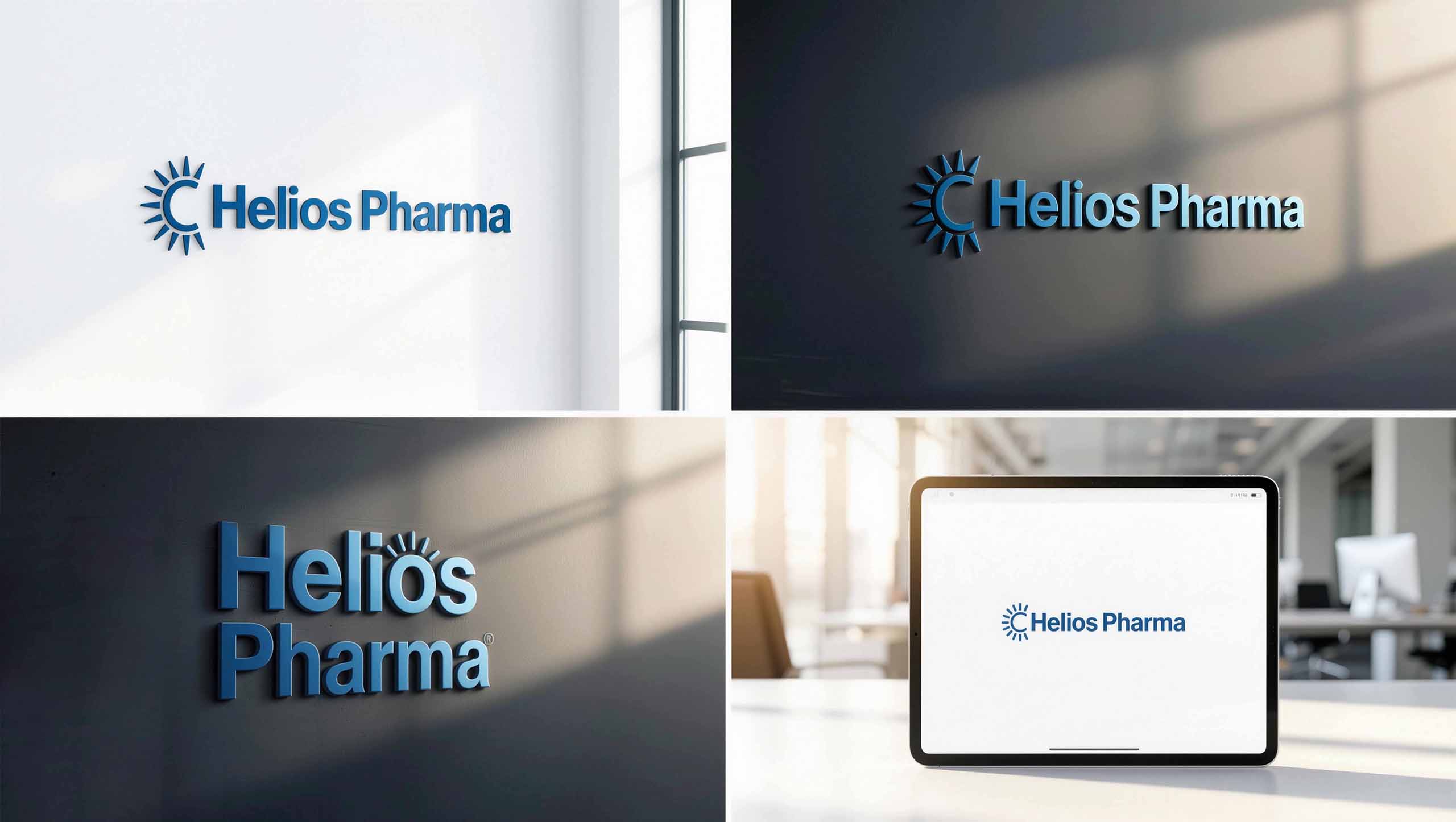
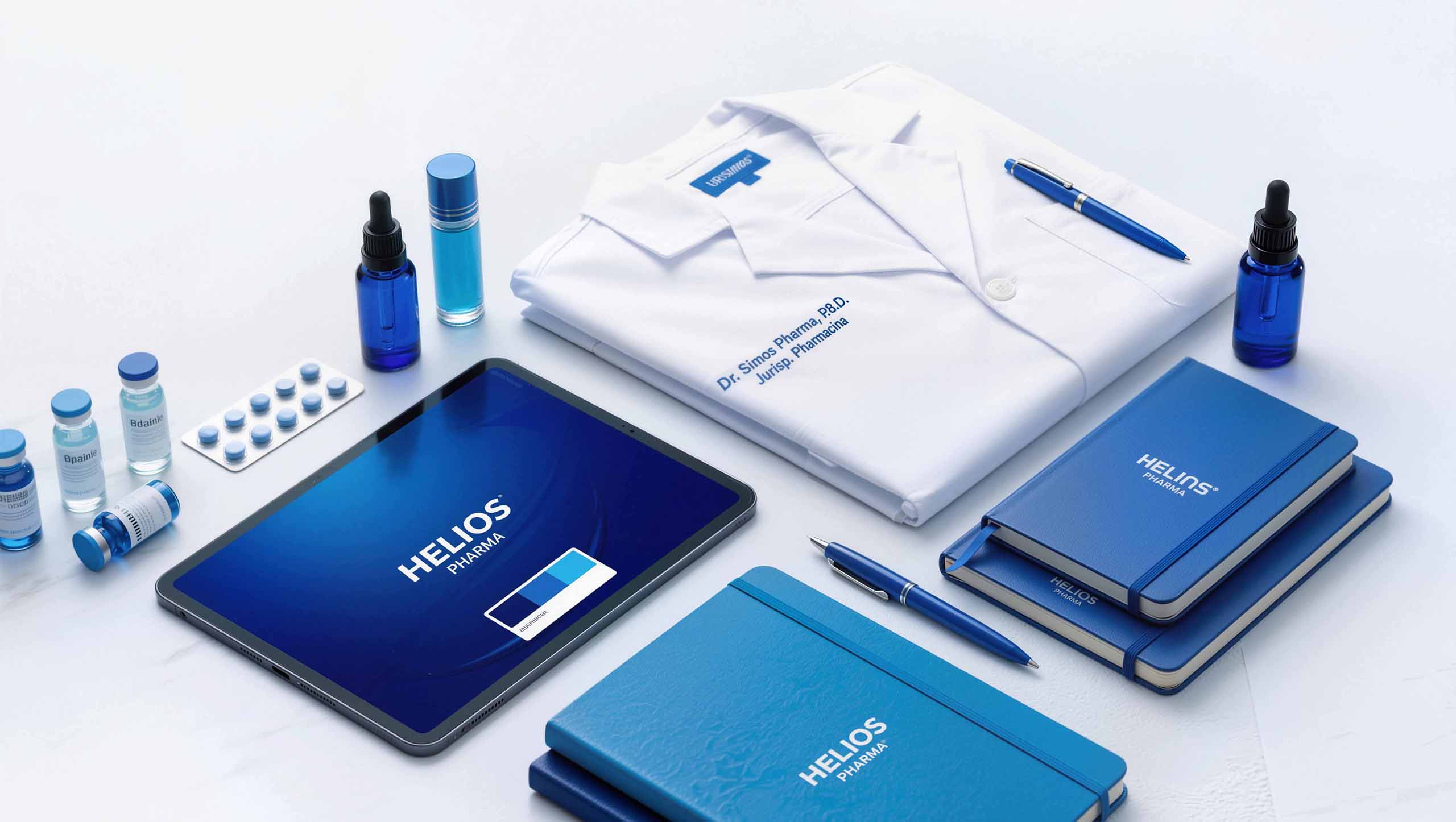
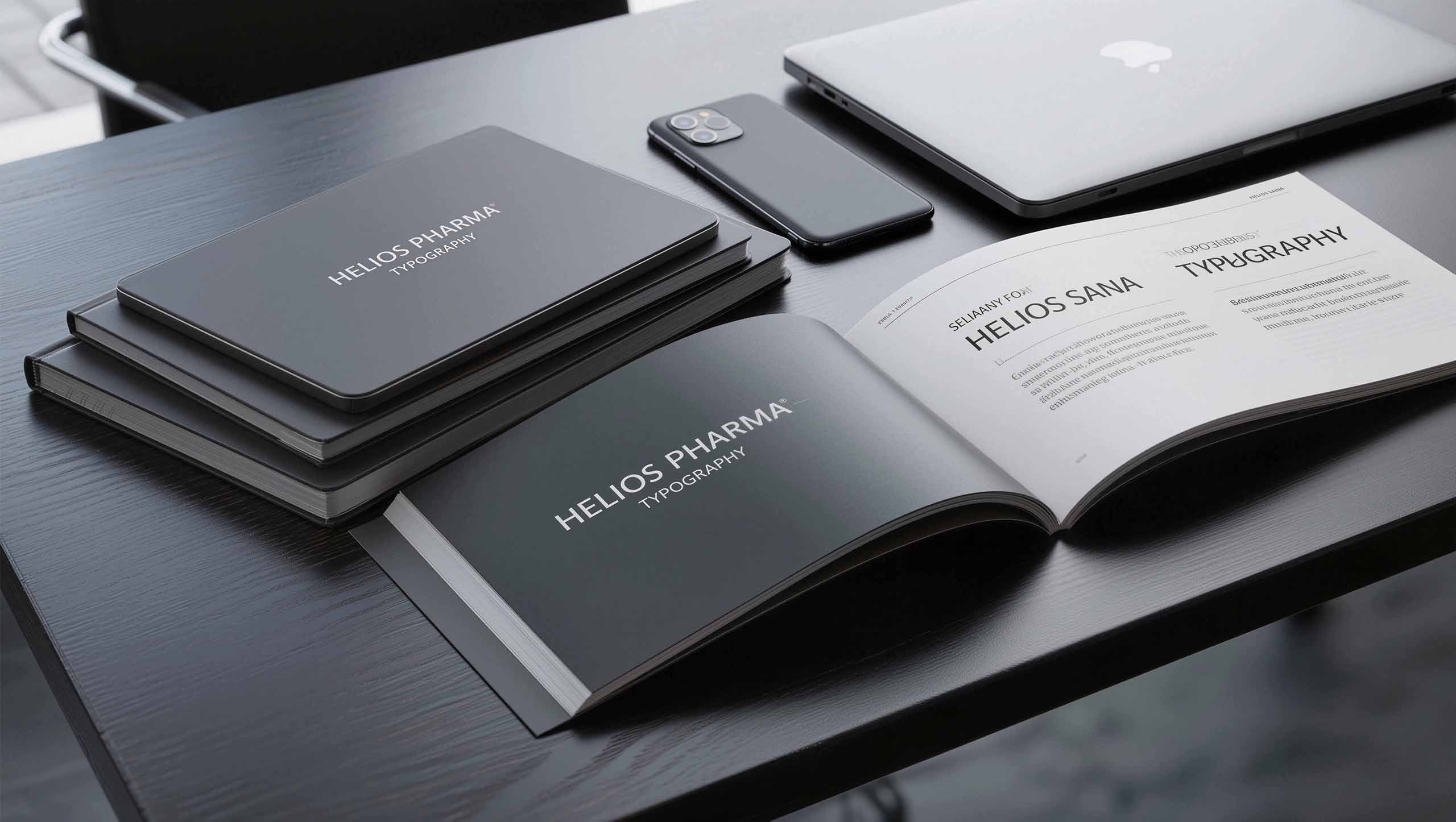
Preserve color, revolutionize type
Retain the exact 'Helios Blue' color value, 100% unchanged.
Retire the old, heavy serif logo. Introduce a modern, crisp sans-serif with slightly open letter spacing.
Visual metaphor
'Classic color' (trust, heritage)
carries 'modern type' (technology, innovation)
The logo itself tells the story of 'crossing generations'
Dynamic support graphic — Data Stream
Flowing like genetic sequences
We designed a 'Data Stream' dynamic support graphic.
Composed of countless tiny 'Helios Blue' particles, flowing like gene sequences or AI algorithms.
This graphic is applied extensively across the website, presentations, and packaging, visually binding 'Helios Blue' to 'high technology.'



Brand photography — 'Diptych' narrative
Past and future
Abandon the 'smiling doctor in a white coat' cliché.
Create a 'diptych' visual language.
Left: Black-and-white archival photos from the 1920s (founder's handwritten lab journals)
Right: Ultra-high-resolution contemporary research imagery (AI-simulated protein folding models)



Website and UI/UX design
Technology meets trust
The homepage is no longer 'company history.'
The hero banner showcases a dynamic video of the latest 'AI drug development center.'
All UI controls, buttons, and links are unified in 'Helios Blue.'
Users experience 'cutting-edge technology' while being wrapped in 'the most familiar trust.'


05 / Market impact
Decisive
Transformation
01
Talent Attraction
Campus recruiting applications +60%
Top institutions: MIT, ETH Zurich, and others
02
Capital Markets
Keyword mention rate ×3
'Innovation,' 'AI,' 'Biotech'
03
Market cap increase
Significant growth within 12 months
From 'traditional stock' to 'technology stock' valuation
04
Brand activation
'Helios Blue' redefined
From 'outdated' to 'authoritative innovation'
Key outcomes
| Metrics | Results | Impact |
|---|---|---|
| Talent Acquisition | +60% | More campus applications from top science and engineering universities (AI and bioengineering roles) |
| Analyst Reports | Keywords ×3 | Mentions of keywords such as "innovation," "AI," and "biotech" tripled |
| Valuation Model | Tech-Driven | Valuation reframed from "traditional pharma" to "technology-driven" |
| Market Cap Growth | Significant gains within 12 months | Capital markets re-evaluated the brand's capacity to innovate |
| Brand Equity | Helios Blue, Revitalized | From a signal of "dated" to a signal of "authoritative innovation" |
| Internal Morale | Renewed Pride | Employees rediscovered the "innovative value" of their work |

Key takeaways
Brand activation
at the core
Design Archaeology
Deep archival research revealed the brand had always been innovative
Preserve core assets
Retain 'Helios Blue' 100%, but reinvent with modern type and dynamic graphics
Diptych narrative
Visual contrast of 'past and future' delivers the positioning with dramatic impact
Technology binding
Data Stream graphic powerfully links 'Helios Blue' to 'high technology'
The essence of design
Helios Pharma's success lies in:
Redefining 'classic' as 'innovation proven by time'
A 'surgical' VI reinvention that preserves core assets while injecting modernity
A 'diptych' visual language that turns 'the past' into a trust endorsement for 'the future'
Making '120 years old' look '20 years old'—without losing the wisdom of 120
This is the power of 'brand activation' positioning.