













Case study / Health & fitness app
Finding
Flow
The "dynamic balance" positioning of a fitness app. From "rigid plans" to "flow guidance," solving the root cause of high churn.
01 / Client & Challenge
High churn rate
fitness trap
Client
Momentum
An All-in-One Fitness and Wellness App
Fitness Training / Wellness Management / Yoga & Pilates / Mind–Body Balance
January Motivation. February Drop-Off.
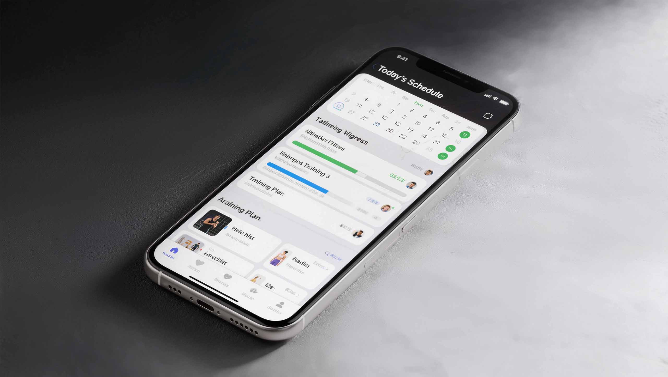
The curse of every fitness app: a product built on rigid discipline—“30-Day Fat-Loss Challenges” and “7-Day Ab Challenges.”
This boot-camp approach delivers short-term results, but undermines long-term engagement.
Creating Anxiety
Miss a single daily check-in, and the app sends punitive notifications that send users’ guilt soaring.
High churn rate
Guilt is the leading cause of churn. Users uninstall because they feel they cannot keep up.
An Unclear Brand
With the market split between high-intensity HIIT and meditation, the brand was caught in the middle, without a clear identity.

02 / Strategic Insight
The Underlying Philosophy
Reimagined
The problem was not the features. It was the philosophy behind them.
An Outdated Assumption
Conventional apps treat the body as a machine to be optimized, driven by plans and numbers.
The Human Insight
Urban users aged 25–45 are tired of punitive self-improvement. They want mind–body balance and a healthier relationship with themselves.

The Unmet Need for Balance in Motion
Between high-intensity HIIT and pure meditation lies a vast unmet need for balance in motion—
These women want to move their bodies while allowing their minds to relax, through practices such as yoga, Pilates and dance.
In psychology, this state is known as“Flow”—a peak experience of total immersion, where time falls away and mind and body move as one.
Core insight
Momentum’s enemy is not laziness. It is guilt.
We needed to leave rigid plans behind and rebuild the app’s underlying logic around guidance.
We don’t sell plans. We create flow.
03 / Positioning Strategy
FLOW
Flow
Your Guide to Balance in Motion.
| Element | Definition |
|---|---|
| Target audience | Modern urbanites weary of rigid plans and seeking harmony of body and mind |
| Brand definition | The only “anti-plan” wellness app that guides you into a state of flow |
| Core value | A seamless “dynamic balance” experience that adapts to how you feel right now |
| Reasons to Believe | Wellness isn’t a set of rigid numbers; it’s the “flow” of body and mind. AI listens to how you feel, and design removes every point of friction. |
Find Your Flow
Find your rhythm.
A Strategic Shift
Transform Momentum from a fitness coach into a yoga guide and a companion for emotional wellbeing.

04 / Design execution
A Revolution in Fluid Design
How could design make users feel the flow?
VI Visual identity system
A Dynamic Gradient System
We moved beyond the aggressive blacks, warning oranges and industrial grays that dominate fitness branding.
In their place, we created a dynamic gradient system.
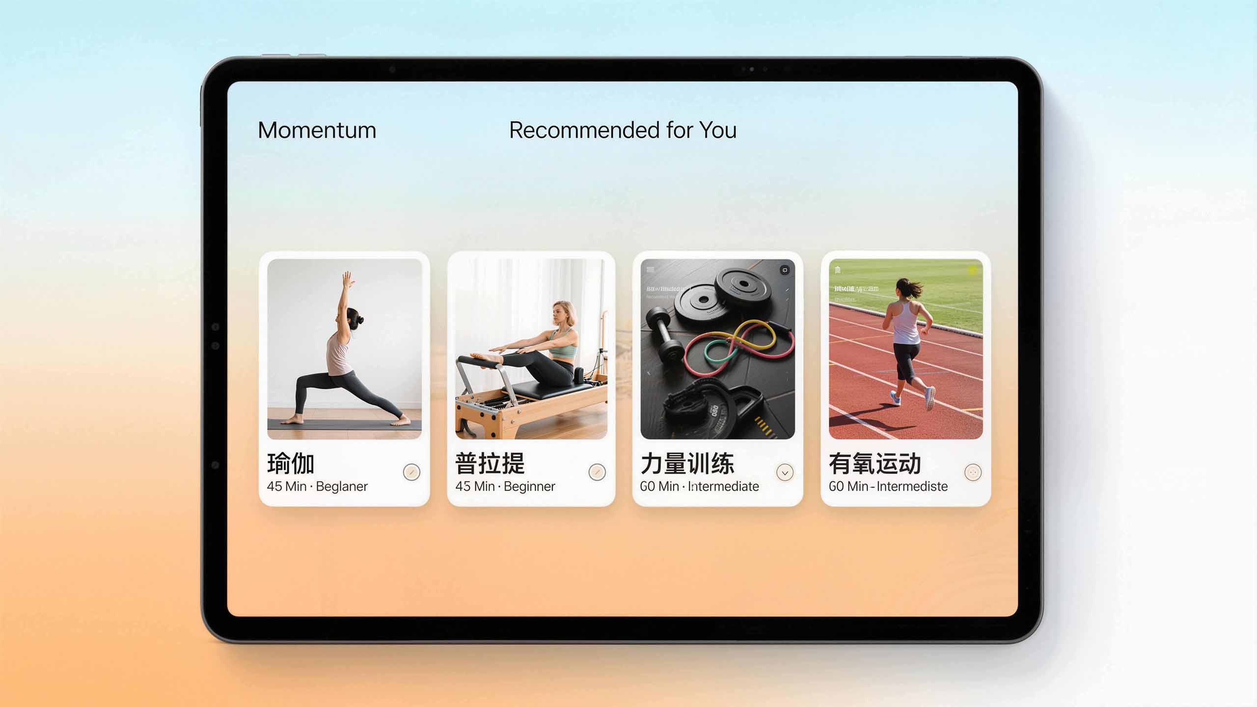
Color That Breathes
The app’s background shifts almost imperceptibly with the time of day or the user’s activity, creating a gentle rhythm of color.
From the misty blue of early morning to the warm orange of afternoon sunlight
Subtly communicating flow and balance


Logo — An Open-Ended Loop
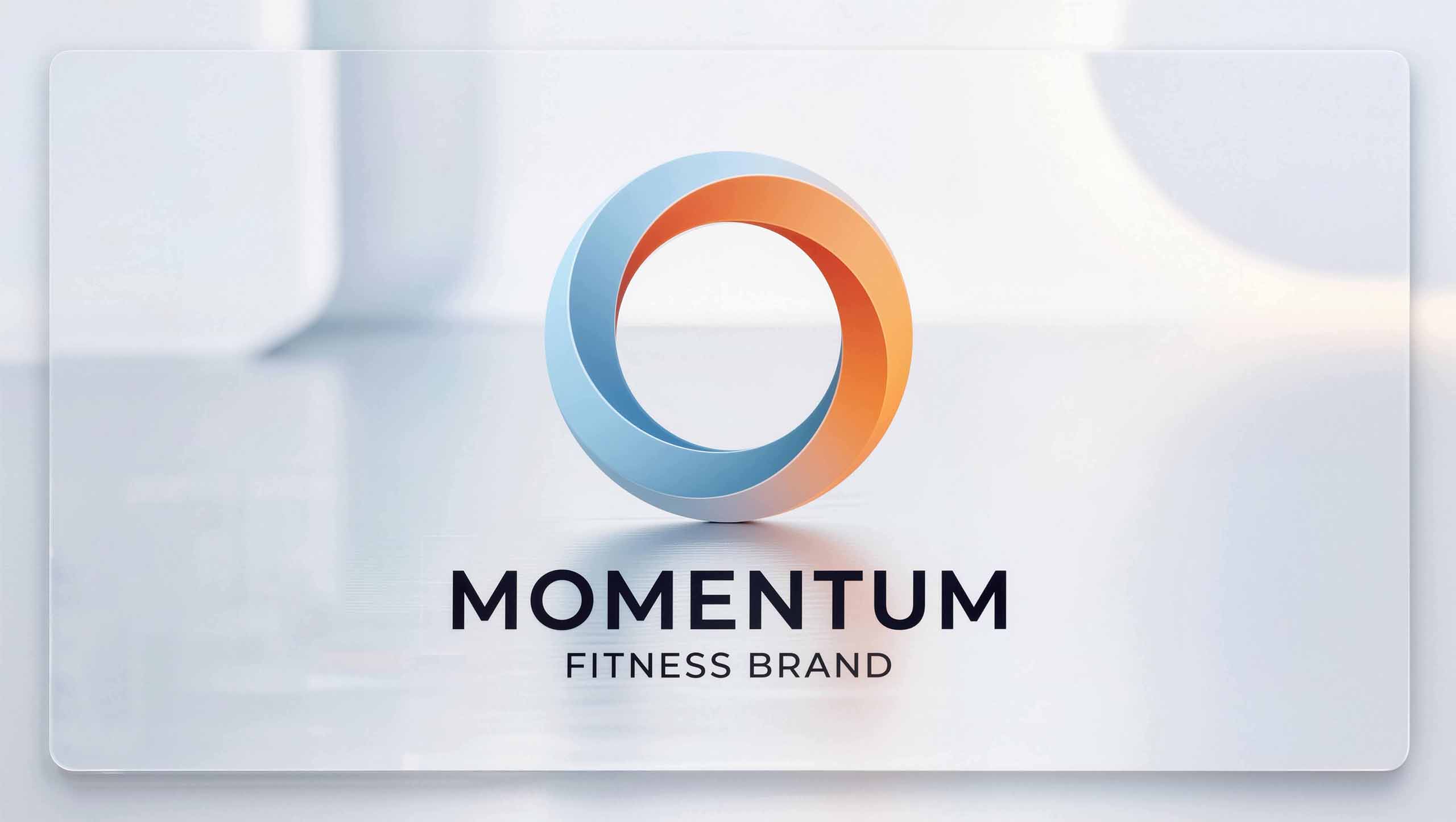
Energy in Motion
The logo forms a dynamic loop that never fully closes, evoking energy in continuous motion.
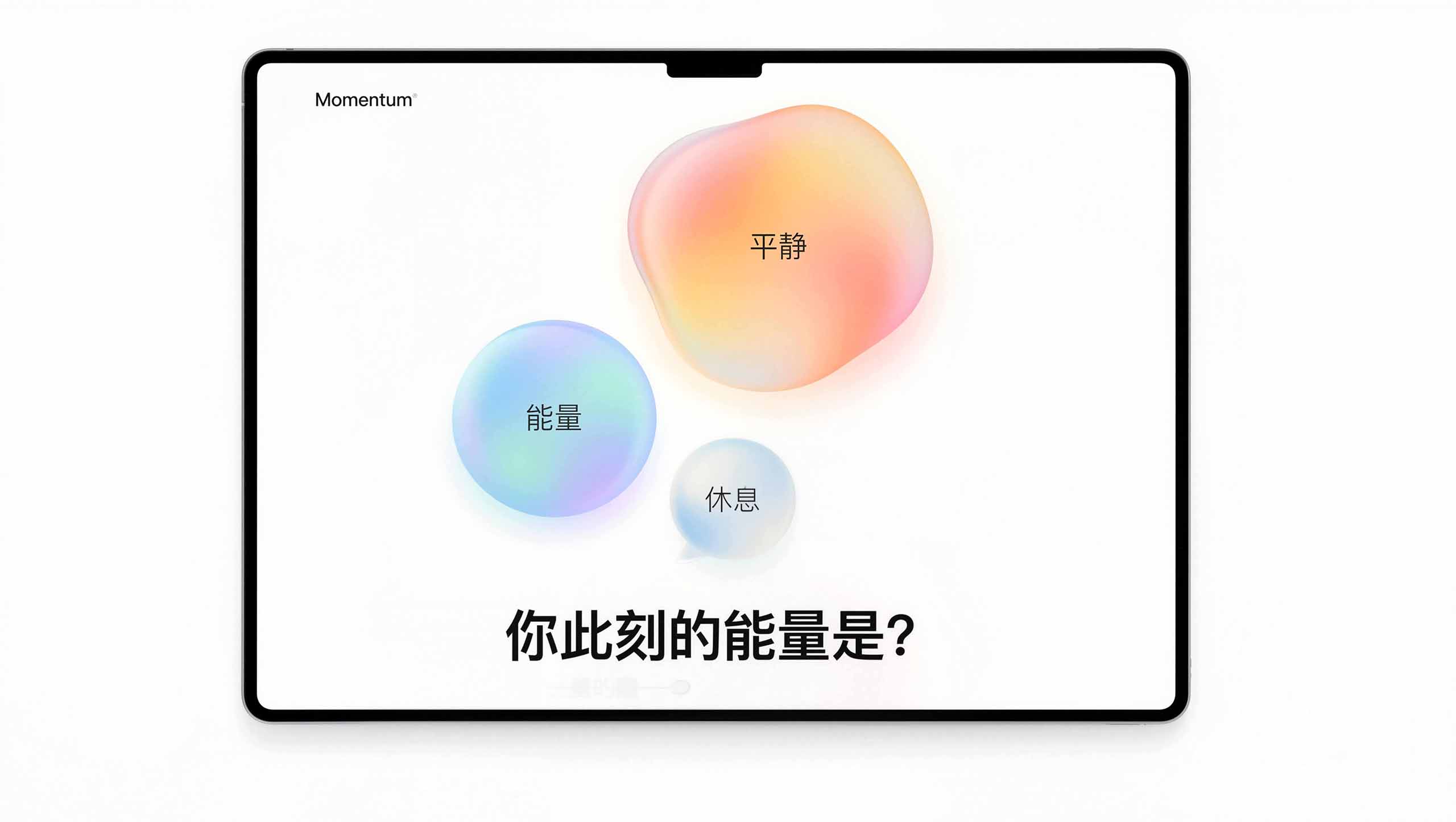
UI/UX Design — A Home Screen Beyond Plans
Removing Calendar Check-Ins Entirely
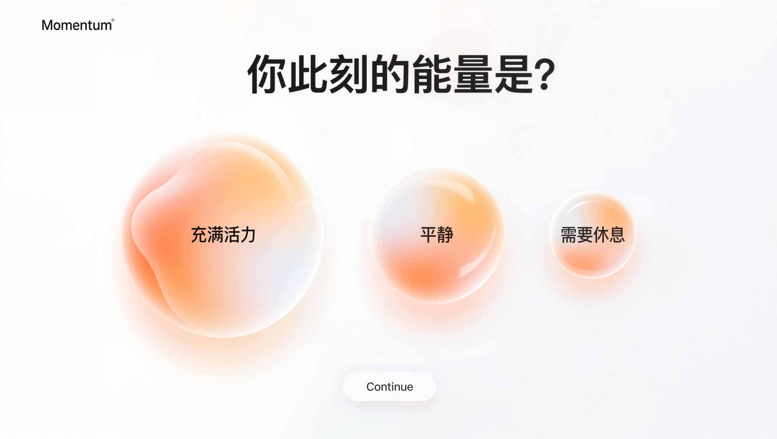
The home screen takes the form of a fluid bubble. On launch, the app asks: “How is your energy right now?”
The options appear as animated bubbles of different sizes:
(Large) Energized / (Medium) Calm / (Small) Need Rest
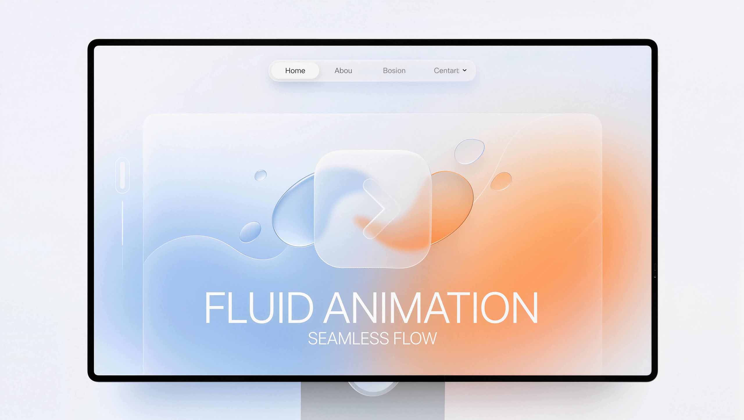
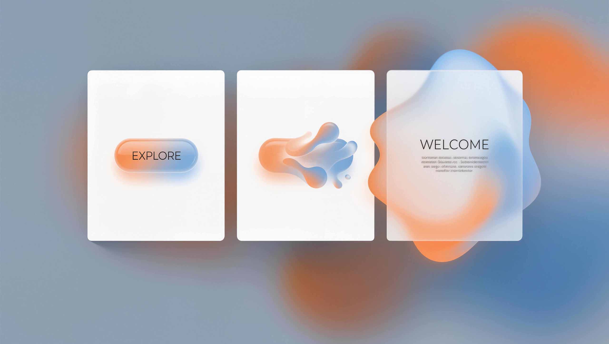
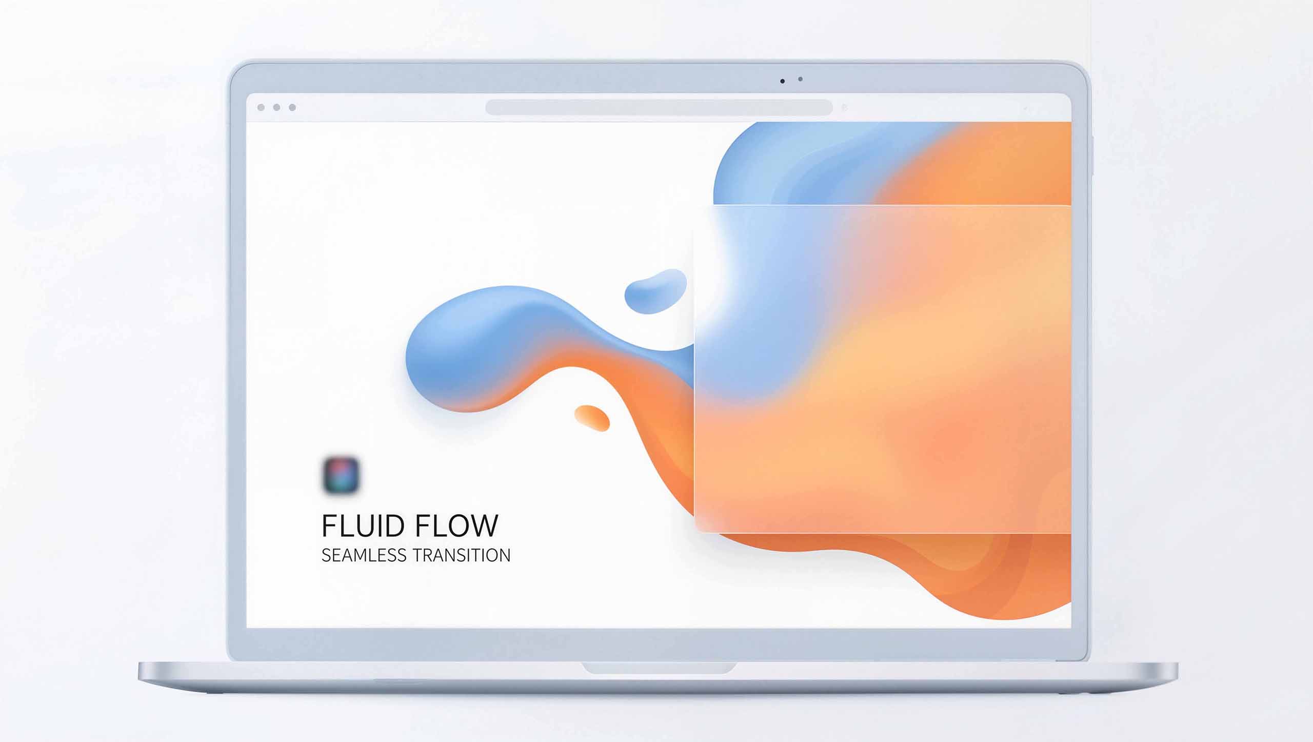
Fluid Motion — Seamless Transitions
Morphing
When a user taps a button, the interface morphs instead of making an abrupt jump—
One screen flows into the next, like two drops of water merging.
Lottie and SVG animations make every transition seamless, giving the app itself a sense of continuous flow.
Class Content Design — Room to Breathe
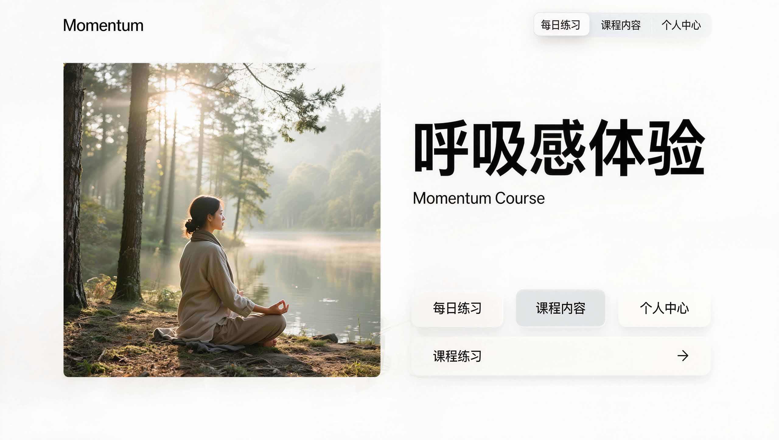
Fade In, Fade Out
Every transition within the yoga, Pilates and dance classes is carefully refined.
Class videos open and close with gentle fades that echo the rhythm of breathing.
From opening the app to finishing a class, users remain immersed in an uninterrupted state of flow.
05 / Market impact
Resolving
the Core Pain Points
01
User Retention
Day-1 Retention +30%
Day-7 Retention +50%
The Defining Business Win
02
User Engagement
Average Daily Usage +40%
Users move from obligatory check-ins to the pleasure of flow.
03
Market Position
Category TOP 1
Established category dominance in online mind–body wellness and yoga & Pilates
Key Metrics
| Metrics | Increased | Impact |
|---|---|---|
| Day-1 Retention | +30% | “Guilt-free” design that keeps users coming back |
| Day-7 Retention | +50% | Growth in the most critical business metric |
| Average Daily Usage | +40% | Users went from “painful check-ins” to “enjoying the flow” |
| Market Position | #1 in Category | Owns the online “mind-body balance” category |
| Design Awards | Webby Awards | Fluid UI design won a Webby Award for “Most Healing App Design” |

Key takeaways
Brand Essence
Distilled
From Management to Guidance
Reframing the app’s underlying logic from management to facilitation
Removing Guilt
Identifying guilt as the root cause of churn and designing it out of the experience
Dynamic Gradient System
Using gently breathing color to communicate flow and balance on a subconscious level
Fluid Motion
Using morphing to make every interaction flow seamlessly and reinforce the brand experience
The essence of design
Momentum succeeded by:
Distilling its brand essence to address the root cause of high user churn
Bringing strategy to life through refined UI/UX design, including fluid motion and dynamic gradients
Helping users feel guided, moving them from guilt to flow
That is the power of positioning built around brand essence.