










The trustworthiness of financial brands is designed
Financial brands should treat trust as a designable system, building a consistent language from visual identity to interaction.


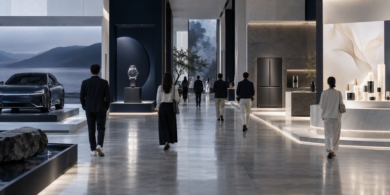
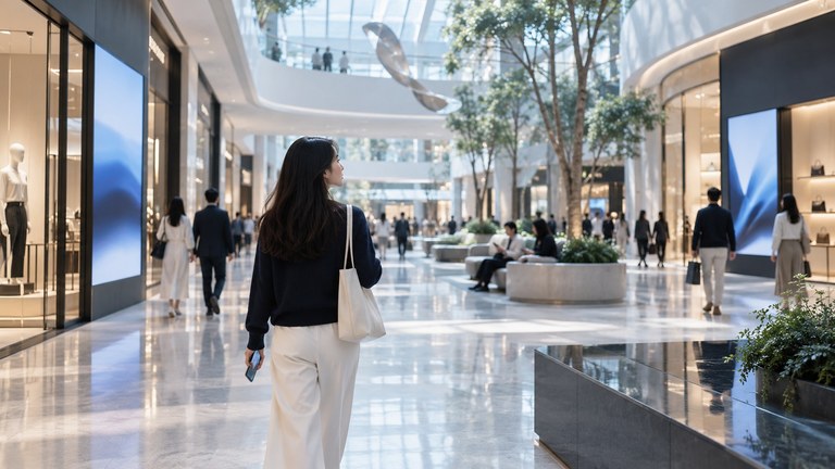
Wayfinding isn't just a tool for giving directions; it is part of the spatial experience. The placement, form and information density of signage all shape how people perceive and feel about a space. Wayfinding systems call for experience design capability, not information design alone.
Wayfinding in cultural tourism and hospitality spaces is often treated as a functional fit-out item, led by engineering teams and driven by completeness of information and cost control. It ends up as an afterthought, with little design thinking behind it. In reality, wayfinding is a key touchpoint through which visitors perceive the quality of a space. The form, materials, placement and information density of signage all shape both first impressions and the ongoing experience.
Across our projects, we've seen strong spatial design undermined by crude wayfinding. Wayfinding isn't something added once a space is finished; it is an integral part of the spatial design and must stay consistent with the architectural language, interior style and brand character. Wayfinding design needs to enter early, at the spatial planning stage, and be developed in concert with architecture, interiors and brand design. It is part of the experience system, not a standalone information tool.
Wayfinding isn't an add-on to a space; it is integral to experience design
The central challenge of wayfinding design is balancing information density. Too little information leaves people lost; too much creates visual noise. Most spaces lean toward over-signage, trying to cover every conceivable wayfinding need. The result is that people are surrounded by signs and struggle to pick out what matters. Wayfinding design requires restraint and clear trade-offs.
We recommend establishing a hierarchy of wayfinding information. Primary information covers main circulation routes and core functional areas; secondary information serves branch routes; tertiary information provides detailed guidance. Information density should be adjusted to the complexity of the space and the state of its users. Entrances and turning points are critical nodes that need clear directional cues, while straight corridors can carry fewer signs to avoid visual clutter. Information design should start from the user's perspective, not from management's demand for completeness.
Wayfinding systems move through four stages, starting from user research: research, information architecture, visual design and implementation. Each stage has clear deliverables and validation criteria, ensuring the system serves the goals of the spatial experience.
Map the user journey, identify key wayfinding nodes and emotional turning points, and define the system's core objectives and use scenarios
Establish a wayfinding information hierarchy, define the coverage and density of primary, secondary and tertiary information, and set standards for wording and tone.
Select materials and finishes that complement the space. Define the form, dimensions and mounting methods of signage so its physical quality reflects the brand's values.
Develop a wayfinding manual with clear installation and maintenance standards, then use user testing to assess navigation efficiency and the overall experience.
Note: This diagram is a conceptual framework. It explains a way of thinking and is not statistical data. Source: Qingmei Future Insights.
The form and materials of wayfinding directly shape perceptions of a space's quality. Signage does more than carry information: it extends the space's design language. Metal, wood, acrylic and stone should be chosen to complement the setting. The precision of the finish, the mounting method and the relationship to the wall all communicate the brand's commitment to quality. The physical presence of wayfinding can shape how a space feels more strongly than the information it conveys.
Form should serve the spatial experience. Whether signage blends into its surroundings or stands out depends on its purpose and setting. In cultural venues, wayfinding can become an art installation. In retail environments, it should strengthen brand recognition. In hotels, it should convey privacy and quality. In our practice, we treat wayfinding as part of a space's detailed design language. Investment in materials and craftsmanship is a defining expression of spatial quality.
Digital technology opens new possibilities for wayfinding. App navigation, interactive displays and augmented reality are becoming part of cultural destinations, visitor attractions and hotels. Digital wayfinding needs to work alongside physical signage. People will not open an app every time they need directions, so physical signs remain the foundation of navigation. Digital tools are most useful for complex journeys and individual needs.
We recommend a coordinated framework for physical and digital wayfinding. Physical signs cover main routes and common journeys, while digital tools provide detailed directions and personalized services. The placement and content of digital displays should align with physical signage to prevent conflicting information. AI can improve recommendations in digital wayfinding, while wayfinding in physical spaces still calls for human judgment. The right balance between physical and digital should reflect how people actually use the space.
People arrive at cultural destinations and hotels in different states of mind. First-time visitors need clear directions. Returning visitors want discreet signage that leaves them undisturbed. Guests carrying luggage look for lifts and exits, while those on holiday may welcome opportunities to explore and discover. Wayfinding design needs to respond to these emotional needs as well as navigation efficiency.
We recommend designing wayfinding around specific situations. Functional areas such as car parks and lift lobbies need clear, efficient guidance. Leisure spaces such as courtyards and reading lounges can use fewer signs, leaving room for discovery. The language of wayfinding should also suit the atmosphere. Business hotels call for concise, professional wording, while resorts can use a more evocative tone. Wayfinding is an opportunity for the brand to communicate with warmth.
Wayfinding should begin at the planning stage. Coordinate it with architecture, interiors and brand design so it becomes an integral part of the space's design language.
Define coverage and density standards for primary, secondary and tertiary wayfinding information. Provide clear guidance at key decision points and prevent excessive signage from creating visual noise. Validate the information design from the user's perspective.
Treat material selection and precision of finish as key expressions of spatial quality. Choose materials that complement the space, and ensure mounting methods and detailing reflect the brand's promise.
Use physical signage for main routes and common journeys, and digital tools for complex routes and personalized needs. Keep information consistent across both to prevent confusion. Design around real situations.
Financial brands should treat trust as a designable system, building a consistent language from visual identity to interaction.
Packaging is the only brand touchpoint that spans purchase, use and sharing, and it calls for systematic media design capabilities.
The core shift in real estate and cultural tourism marketing: replacing one-way broadcasting with interactive experiences, so audiences build understanding and emotional connection through participation.