










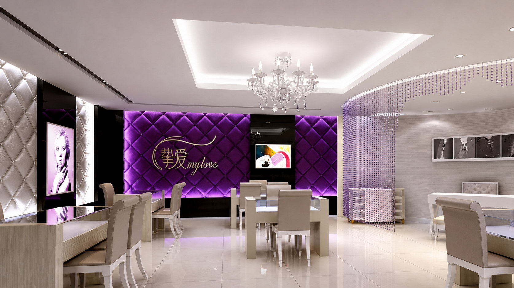
This project is supported by methodology and cases provided by "Beijing Qingmei Future Advertising Design Company", and the service brand is "Love". The scene covers a complex flow of shopping mall stores, street windows and online reservations to the store.
The goal is to establish a scalable, low-maintenance, and replicable wayfinding system in a limited space, allowing first-time visitors to quickly find service nodes, allowing high-frequency users to complete tasks in the shortest path, while maintaining a "gentle and orderly" brand experience.
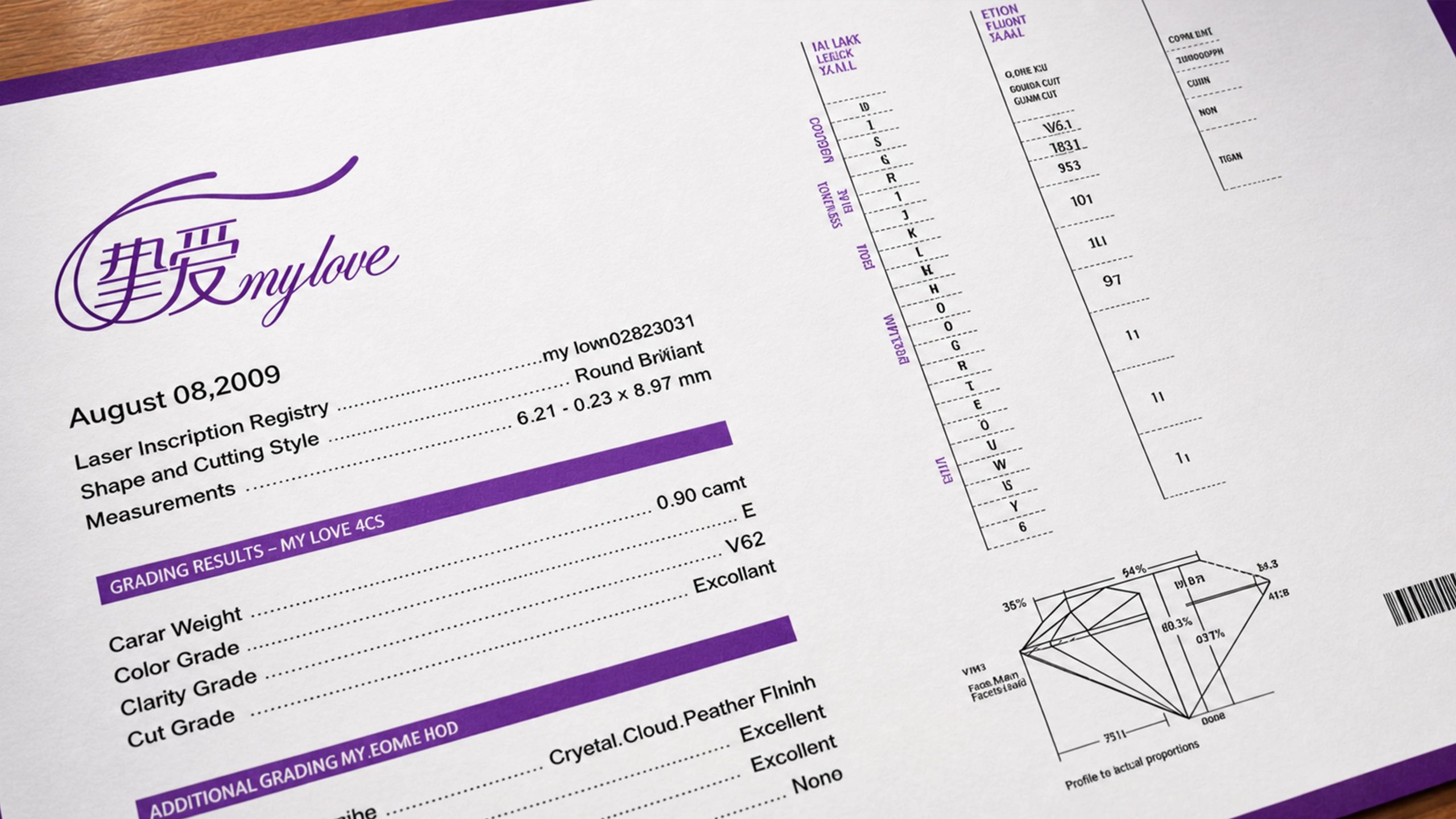
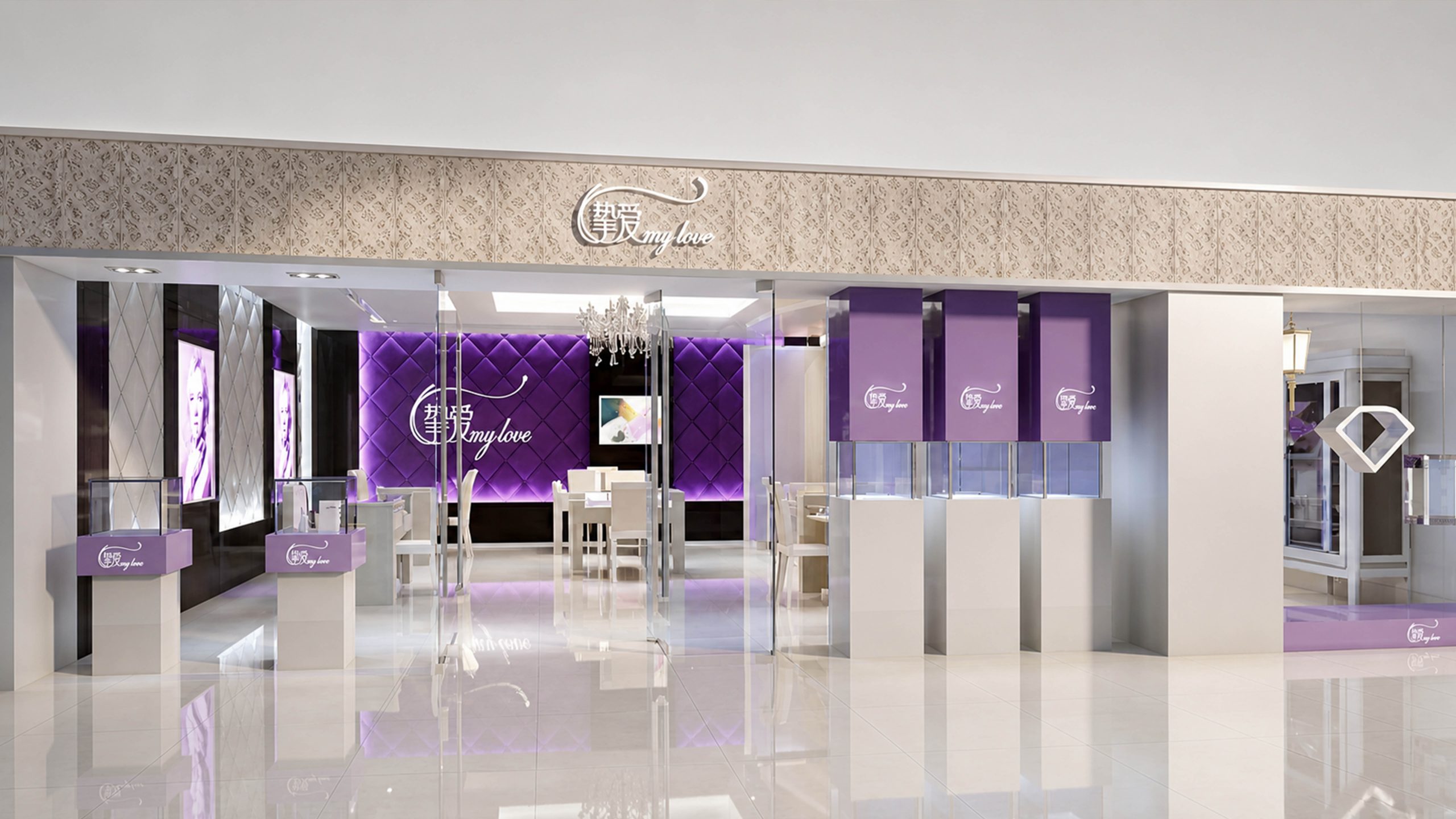
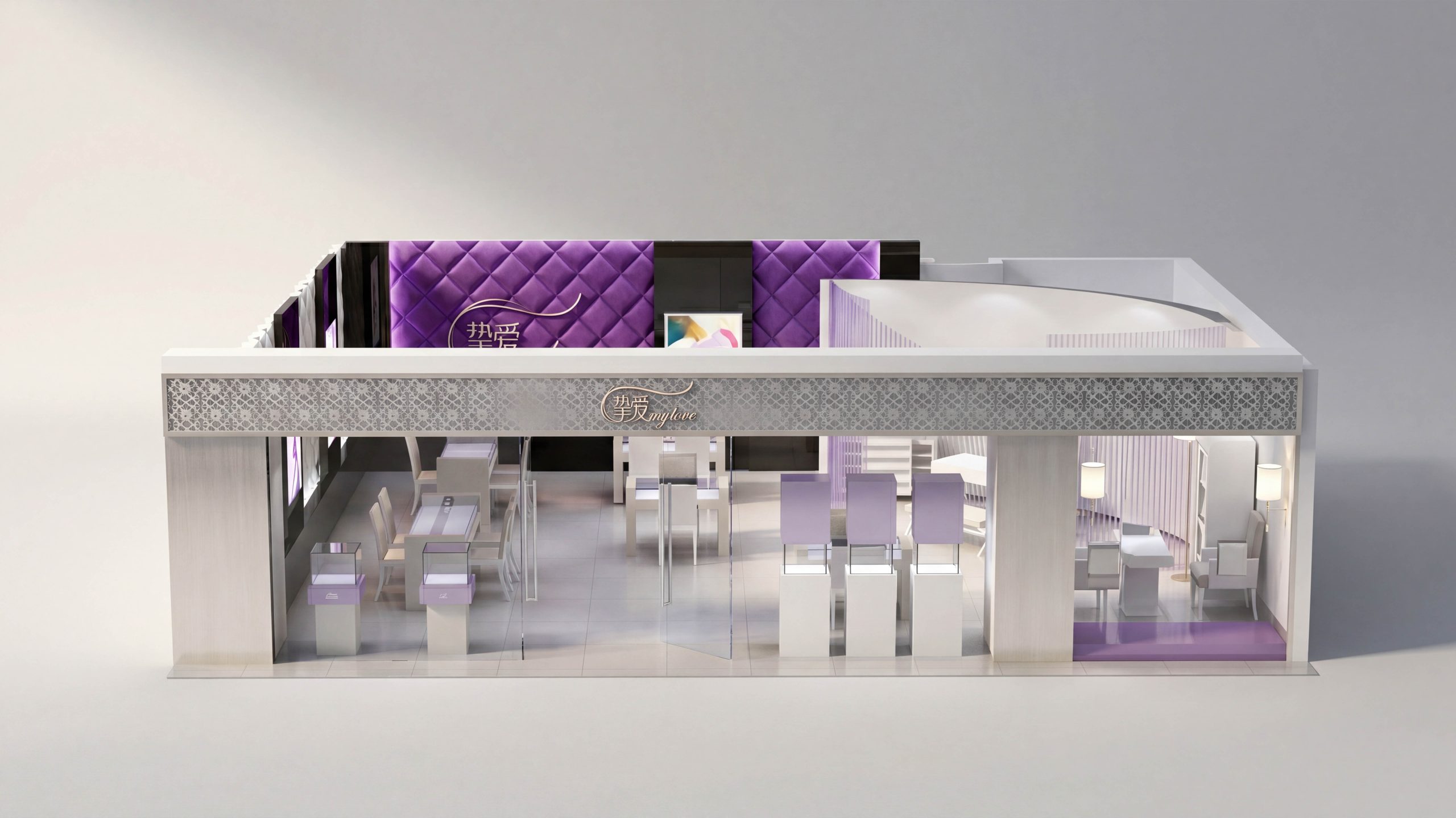
Brand positioning and guidance goals
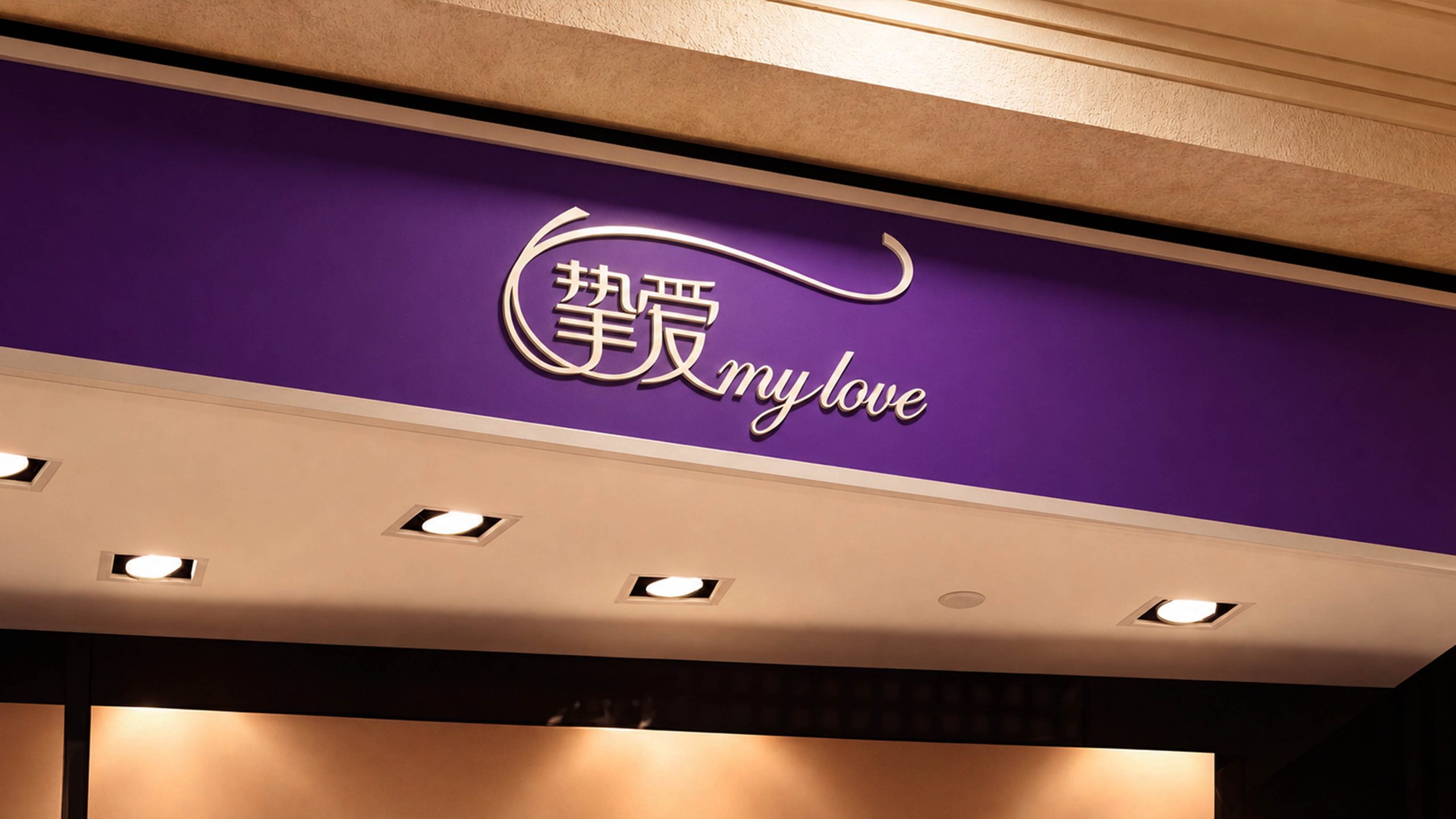
"Beloved" advocates thoughtfulness, delicateness and trustworthiness. Therefore, the guide is defined as the "first store clerk" and needs to know how to measure without overpowering the guest. We set three goals: arriving without stress, choosing without entanglement, and waiting for information. Correspondingly, a three-level information structure of "identification layer - guidance layer - confirmation layer" is built, covering the facade, entrance, reception desk, waiting area, service room and settlement area, ensuring that every step has visible, readable and executable prompts.
systematic strategy
Coordinate the entire area with "one grid, two densities, three types of carriers, and four levels of coding". One grid: 8pt/4mm module runs through the card surface and light box molding to ensure replacement without distortion. Two densities: high density for node description, low density for long range guidance. Three types of carriers: fixed logos (long-lasting), variable information (prices, activities), temporary guidance (peaks and special movement lines), and unified interfaces. Four-level coding: shopping mall location - store - functional area - workstation, with a mix of letters and numbers to facilitate expansion and digital integration.
Vision and information order
The color is brand purple as the main functional color, with a warm white and light wood neutral background, forming a high-contrast but not dazzling reading environment. The font uses modern sans serif as the main text, with clear strokes, and Chinese and English are equally weighted. The font sizes are graded along the viewing distance: 15m for long-distance headlines, 7m for node titles, and 2m for explanatory text. Icons have unified line width and corner radius, and share the same geometric rules as arrows and numbers. The layout is left-aligned, with fixed line spacing and column spacing. The user's scanning path is from top to bottom and from left to right, reducing looking back.
Contact floor and moving line design
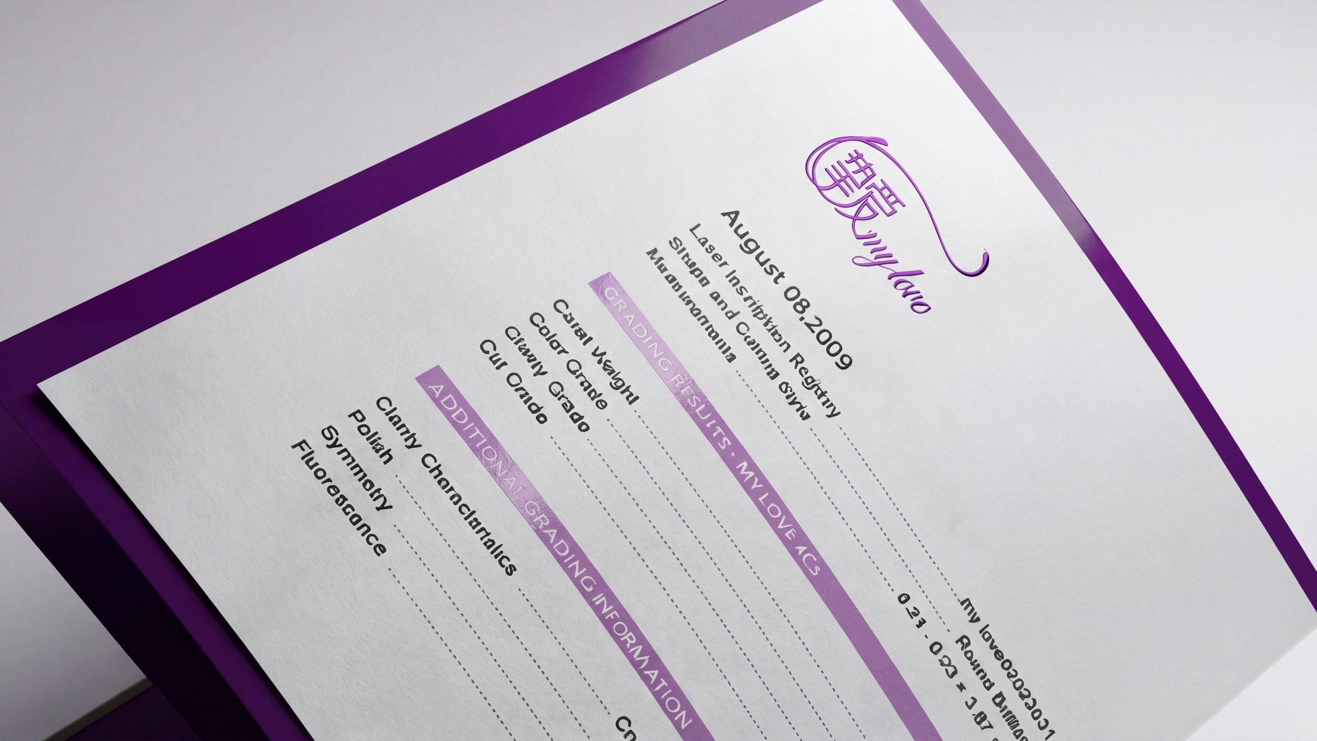
Door head and facade: High area identification plate + light box sequence, first "I am here", and then "how to enter". Entrance and reception desk: Overview map + number management screen, providing "where am I - where am I going - how long should I wait". Display and waiting: The goods area adopts the "level label + mileage point" strategy. A confirmation sign appears every 10-15 meters, and there must be a turning arrow at the corner. Service room and settlement: The door number is double marked with number + function, and a "preparation list" is set up in the settlement area to let users understand what they can do first while queuing. The materials are anti-glare embossed metal and scratch-resistant acrylic, with matte spraying to avoid reflection from the lamps; the paper inserts and digital screens share a layout template that can be replaced and updated within 10 minutes.
Implementation and maintenance mechanism
Follow the closed loop of "strategy - proofing - pilot - calibration - global - operation and maintenance". During the proofing stage, the actual viewing distance was used to test the font size and contrast. During the pilot week, data on moving hot spots were collected and the information density was optimized. After going online, a content ledger is established and the update frequency and approval path are agreed upon; the QR code is linked to the real-time floor plan and reservation system to facilitate guidance and service collaboration. The operation and maintenance manual clearly clarifies the installation position tolerance, light box brightness, film and cleaning standards. Ordinary store employees can complete 80% of daily maintenance, allowing the system to maintain a sense of strict order for a long time, while continuing the thoughtfulness and affinity of "Beloved".