










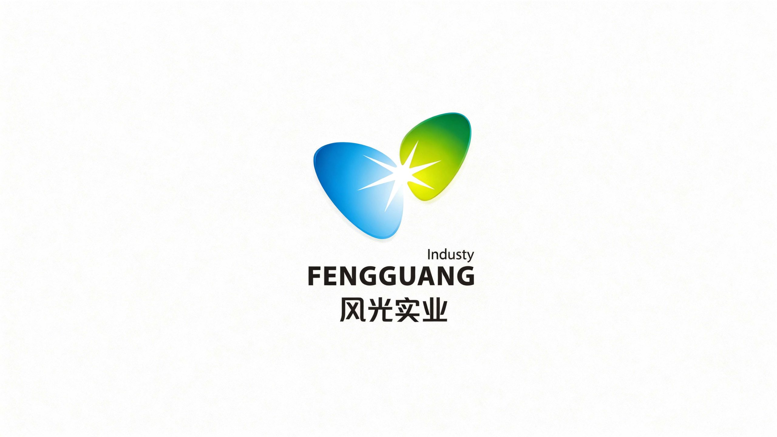
Fengguang Industrial is a modern manufacturer focused on new energy materials and environmental technology. The brand sought a refreshed visual identity to express its philosophy of "Green Technology, a Future Powered by Light" and establish a clear, distinctive presence in the emerging energy sector.
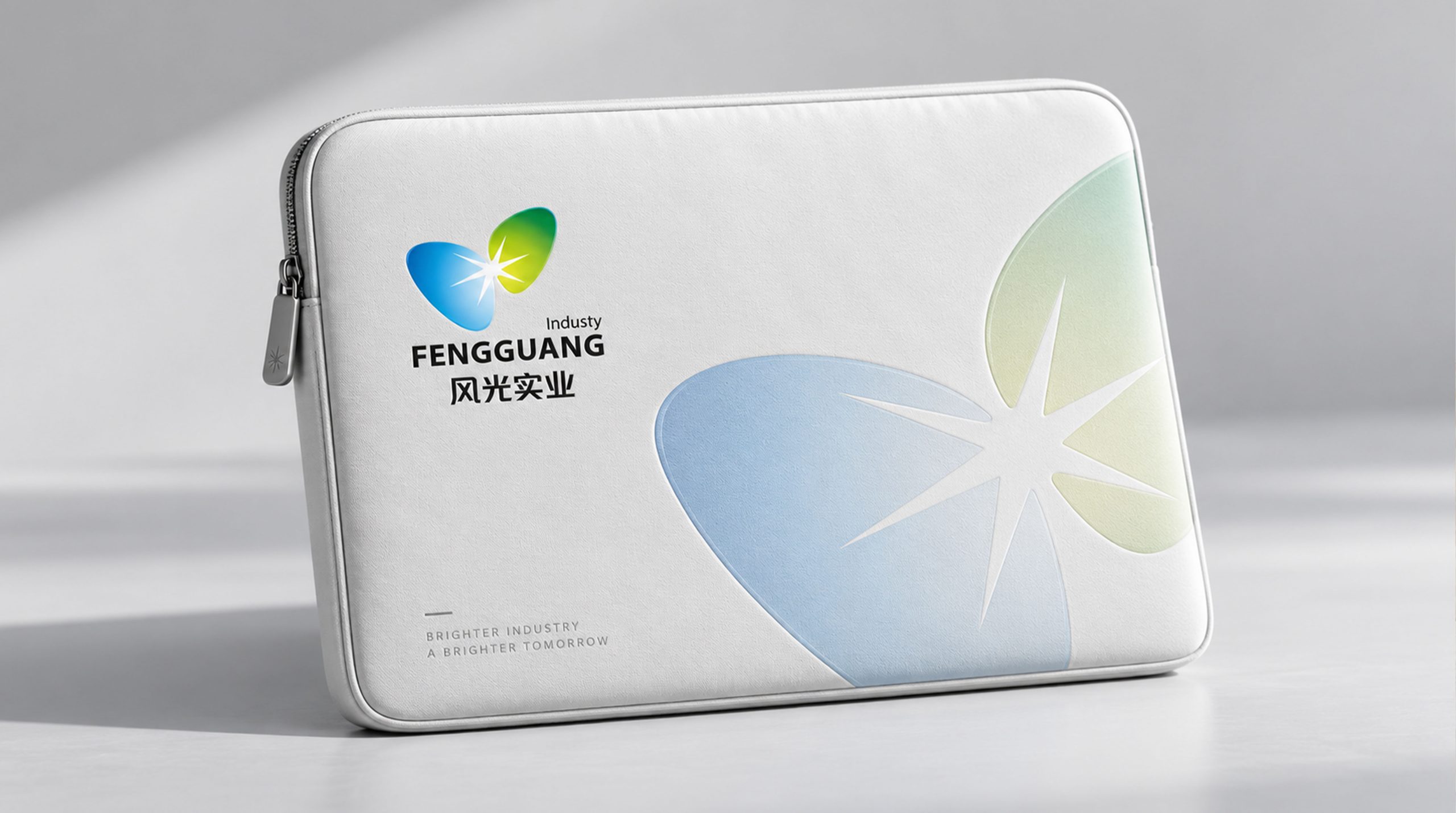
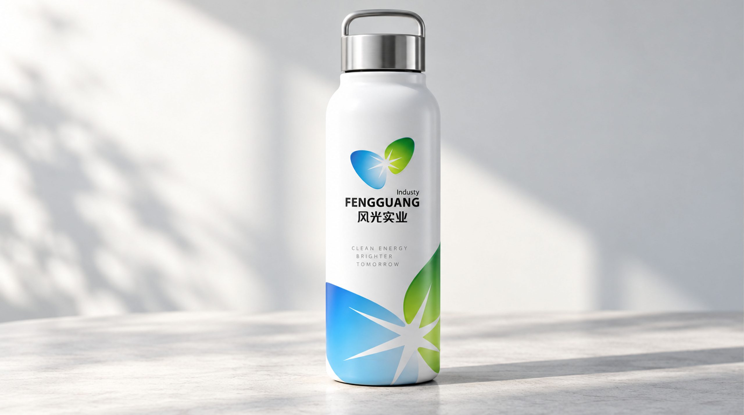
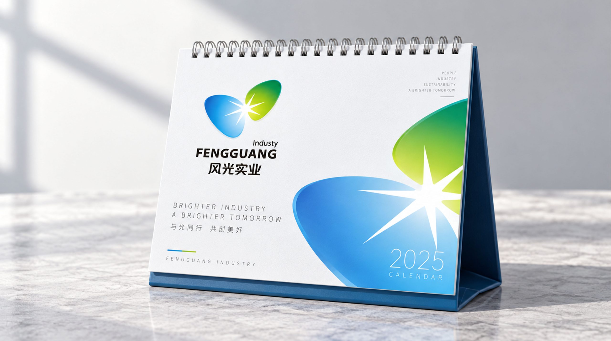
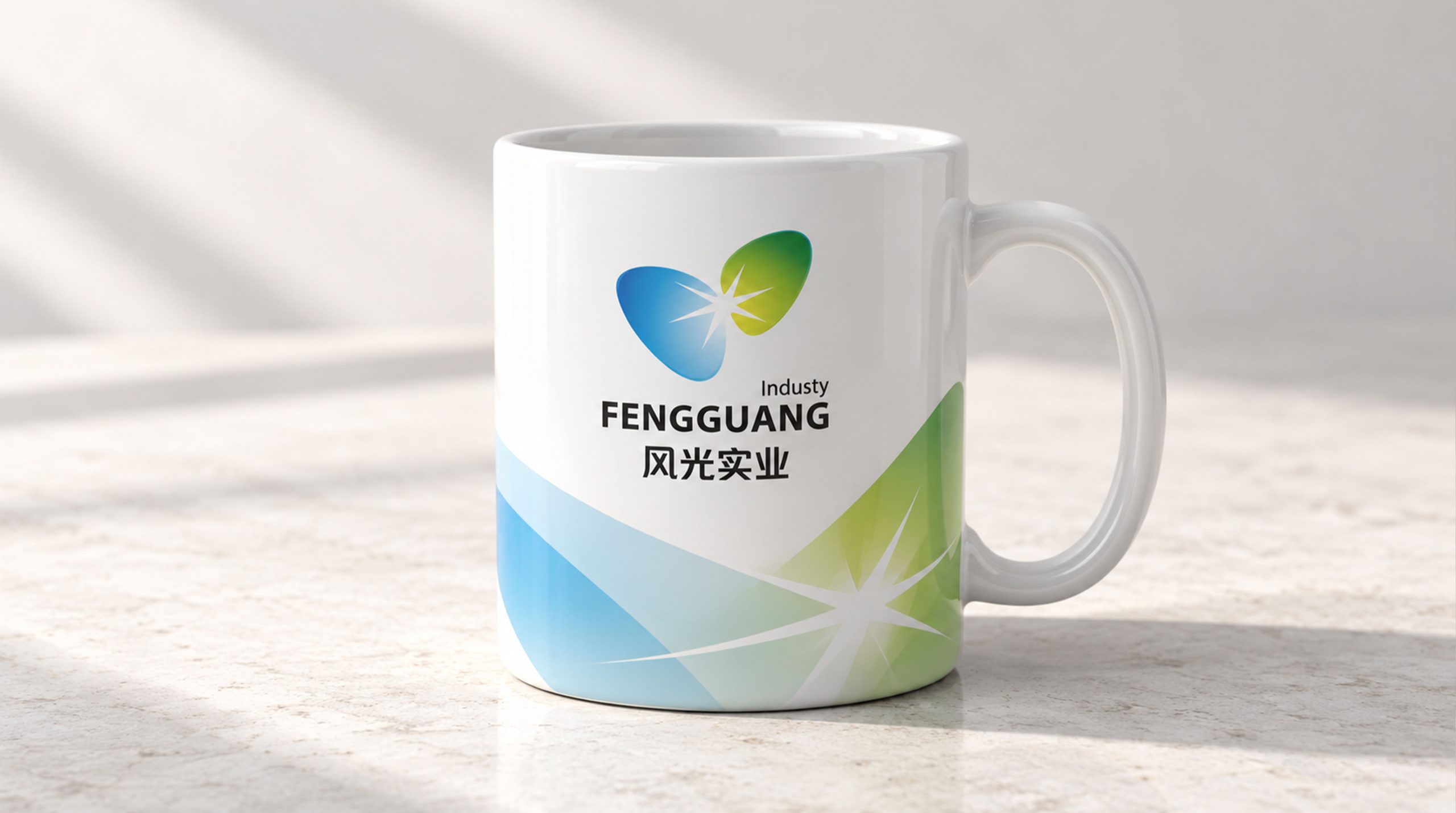
design concept
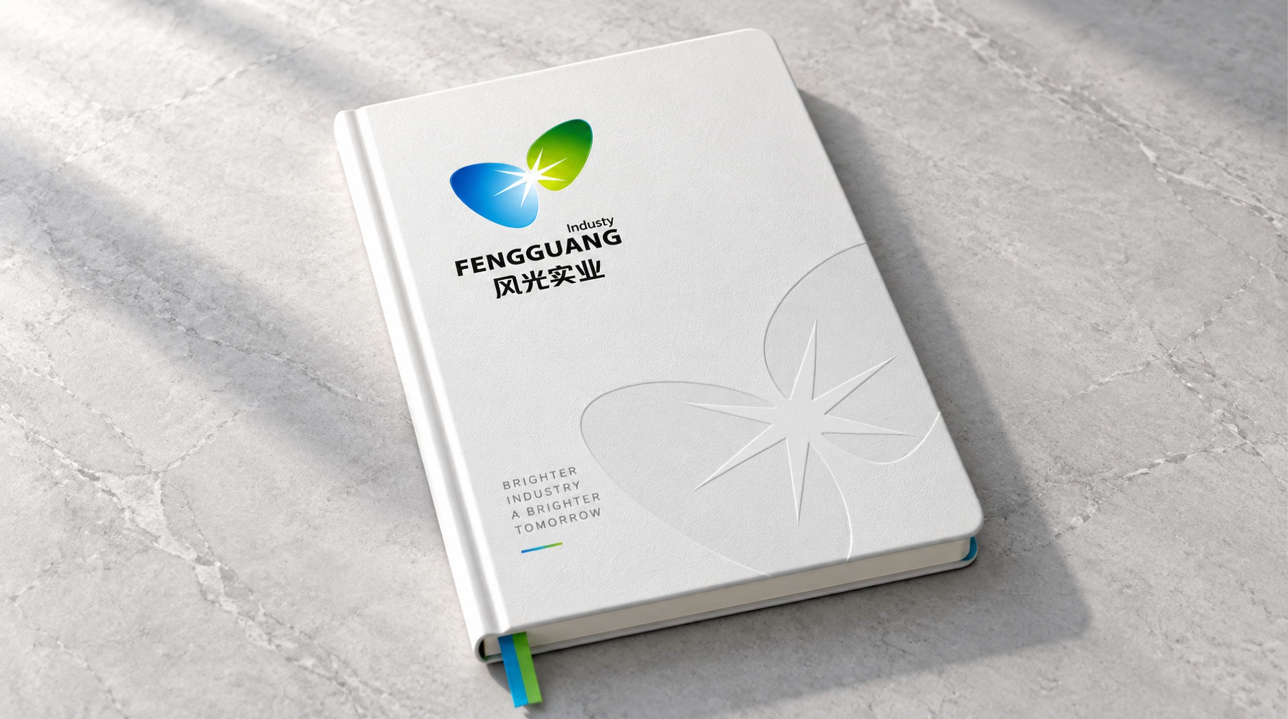
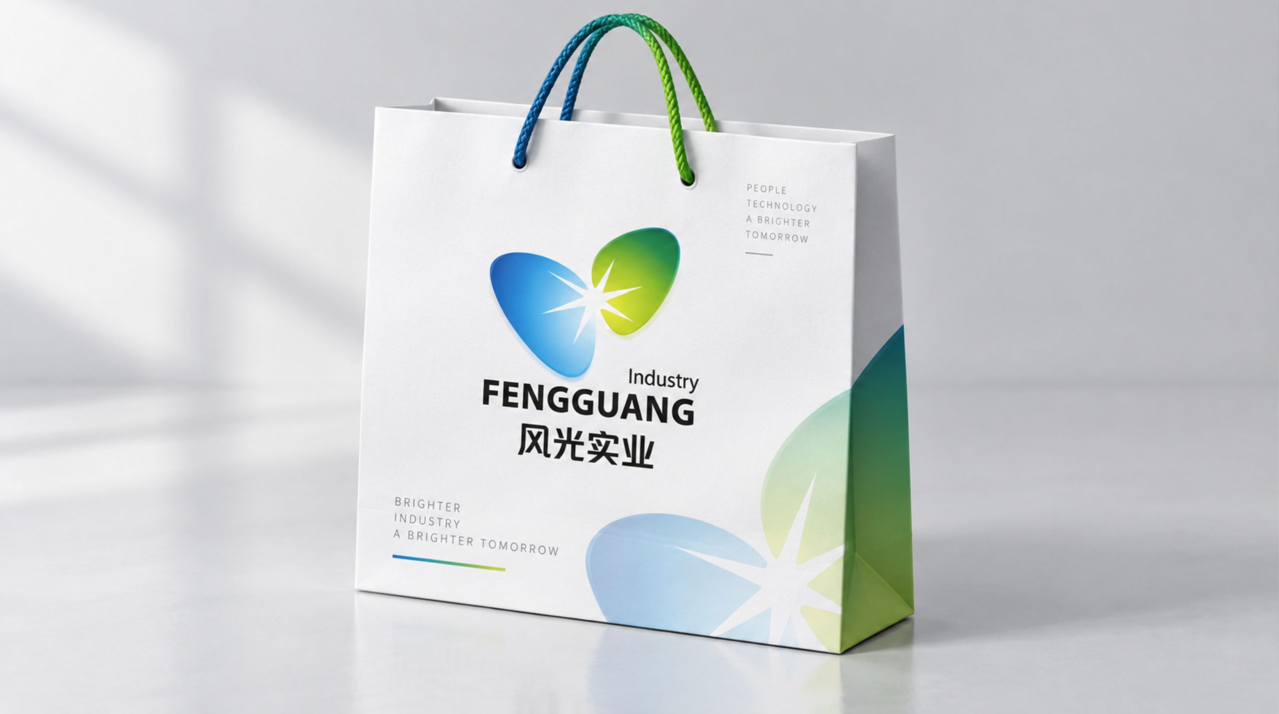
The mark draws on light and wind as its core images: two leaf-like shapes that mirror each other, with light radiating where they meet. This design language symbolizes the fusion of wind and solar energy, and the company’s commitment to driving the future with green power. The form conveys a fluid balance, reflecting the brand spirit of “technology and nature in symbiosis.”
graphic language
Twin-leaf structure: the blue leaf on the left represents sky and technology; the green leaf on the right represents nature and life. The point of light at the center symbolizes a burst of innovation. Intersection: the overlapping leaves form an abstract "butterfly," symbolizing transformation and renewal. Motion: the overall form suggests the movement of wind, expressing the brand's steady forward momentum.
Fonts and composition
The FENGGUANG wordmark uses a steady sans-serif in a medium weight, balancing modernity and legibility. The pairing of Chinese and English reflects an international outlook. Set in dark gray, the type lets the graphic above it stand out. The "Industry" subtitle is set in a light weight, creating a professional, clearly layered visual structure.
color system
Blue: technology, reason, and depth. Green: sustainability, growth, and the future. White light: hope, innovation, and released energy. The gradient adds spatial depth to the mark, giving it the visual warmth of modern industrial technology.
Application and extension
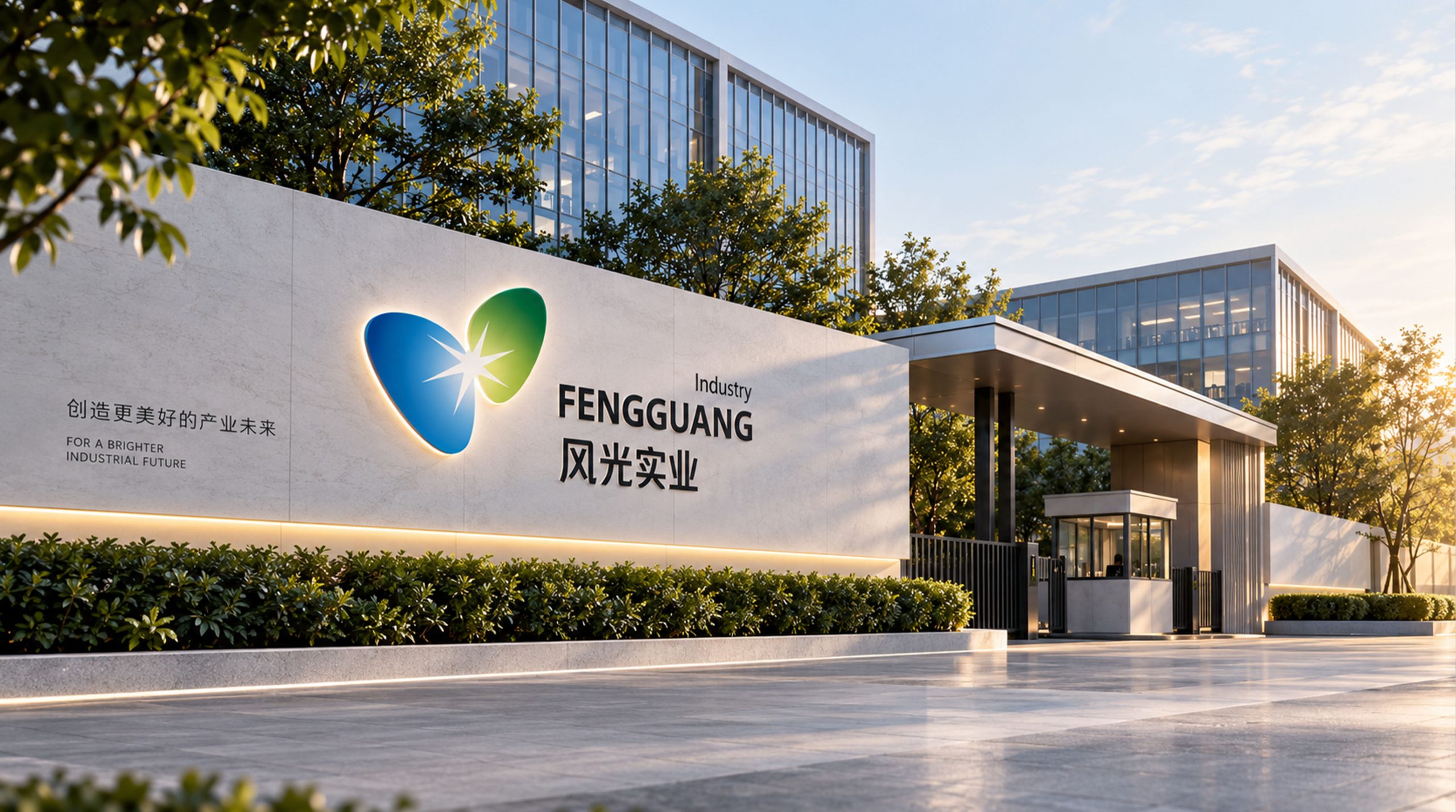
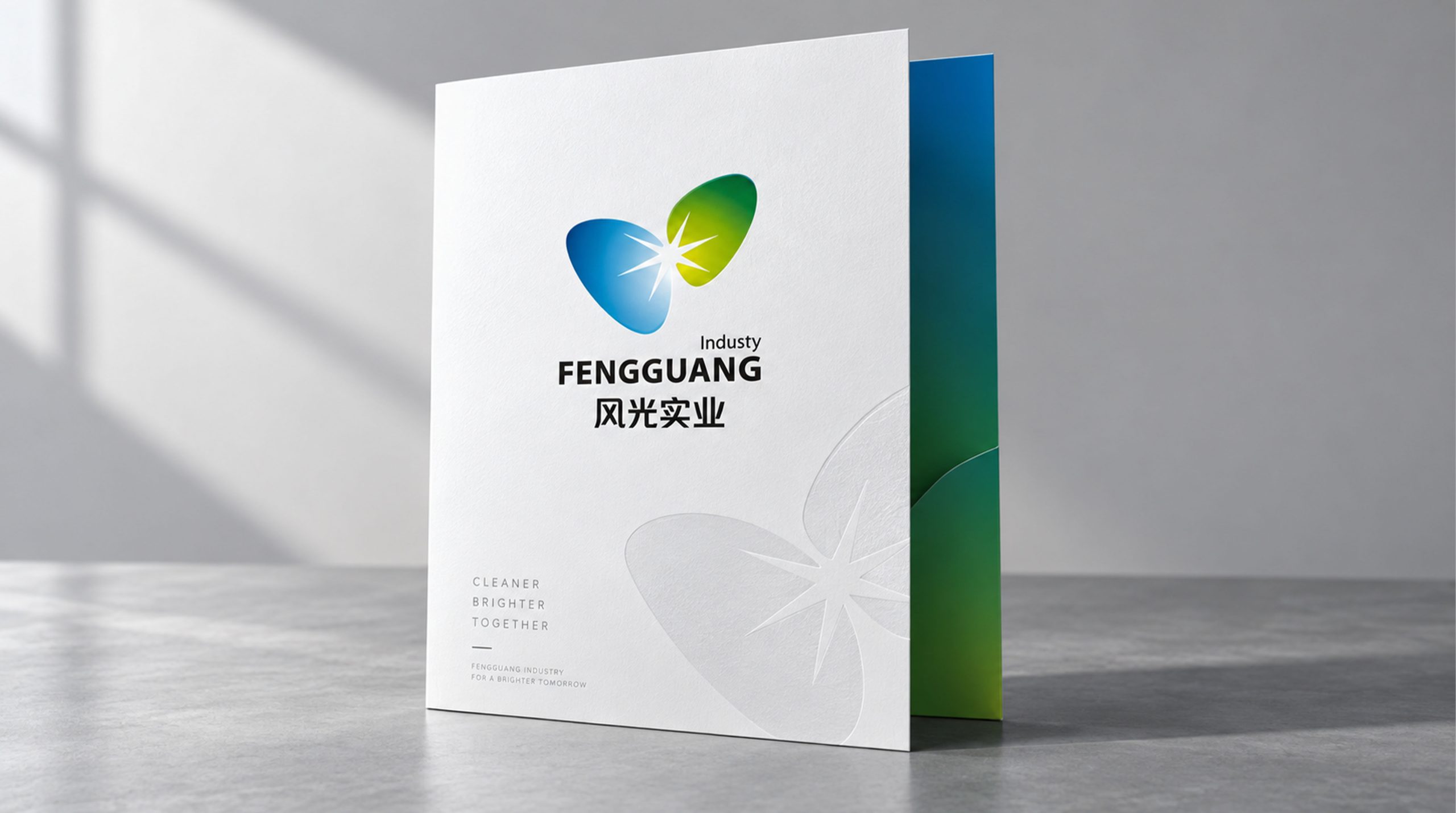
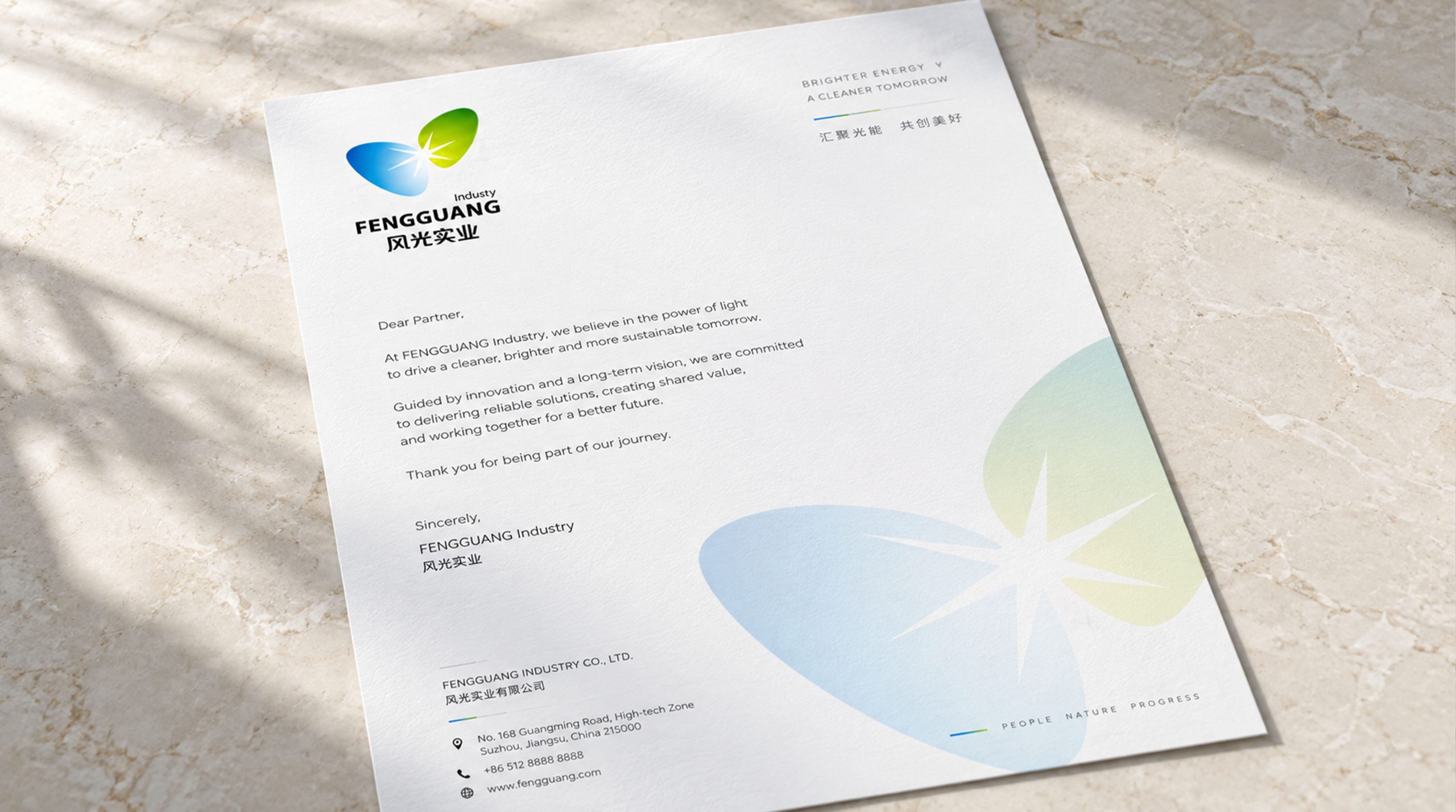
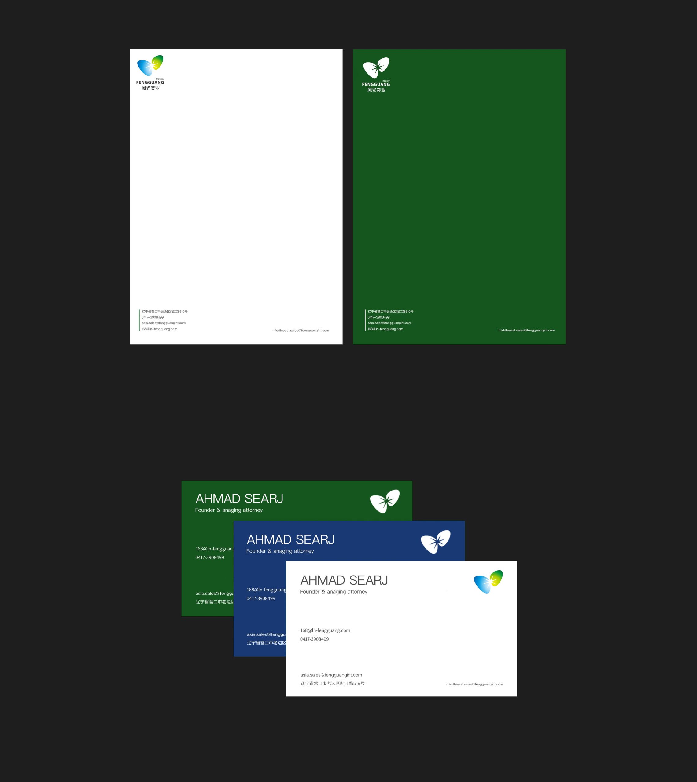
The mark adapts easily to office systems, product packaging, building facades, and digital interfaces. The central burst of light can stand alone as a supporting graphic in brand animation and motion, forming a complete visual language.
brand meaning
The mark conveys a brand attitude of “wind as power, light as source,” showing the company’s continuous innovation in green energy and smart manufacturing. It is more than an identifier. It is a visual expression of corporate philosophy, representing the harmony of nature and technology.
Improper Usage (Protection Specification)
Do not rotate or flip the logo. Do not change the gradient direction or replace the primary colors. Do not place the logo over busy backgrounds. Minimum display width is 25 mm.
design results
The visual system gave Fengguang Industrial a unified identity across its communications and international trade shows. Brand recognition rose significantly, and the company became a representative image in the new energy industry, combining a sense of technology with human warmth. Would you like me to restructure this into the Qingmei Future website case study template? The format would be: Cover Summary (one-line project description + core concept), Detail Modules (Concept / Graphics / Typography / Color / Applications / Results), Brand Value Module (design keywords + outcome data).