










HuaTai Insurance Group is a large financial group focusing on comprehensive insurance services and insurance management. It is committed to protecting the safety of customers' wealth with professional protection and connecting to a better life and future with innovative services.
The brand hopes to create a visual system with both international vision and high-end quality through a comprehensive V upgrade, presenting a balanced state of "robust professionalism x international quality".
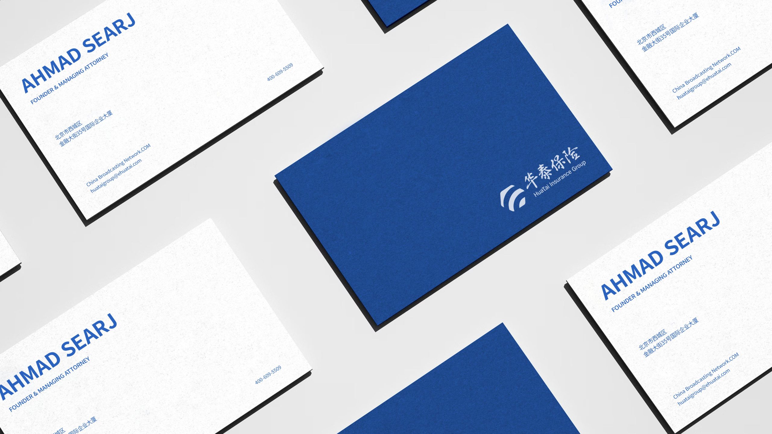
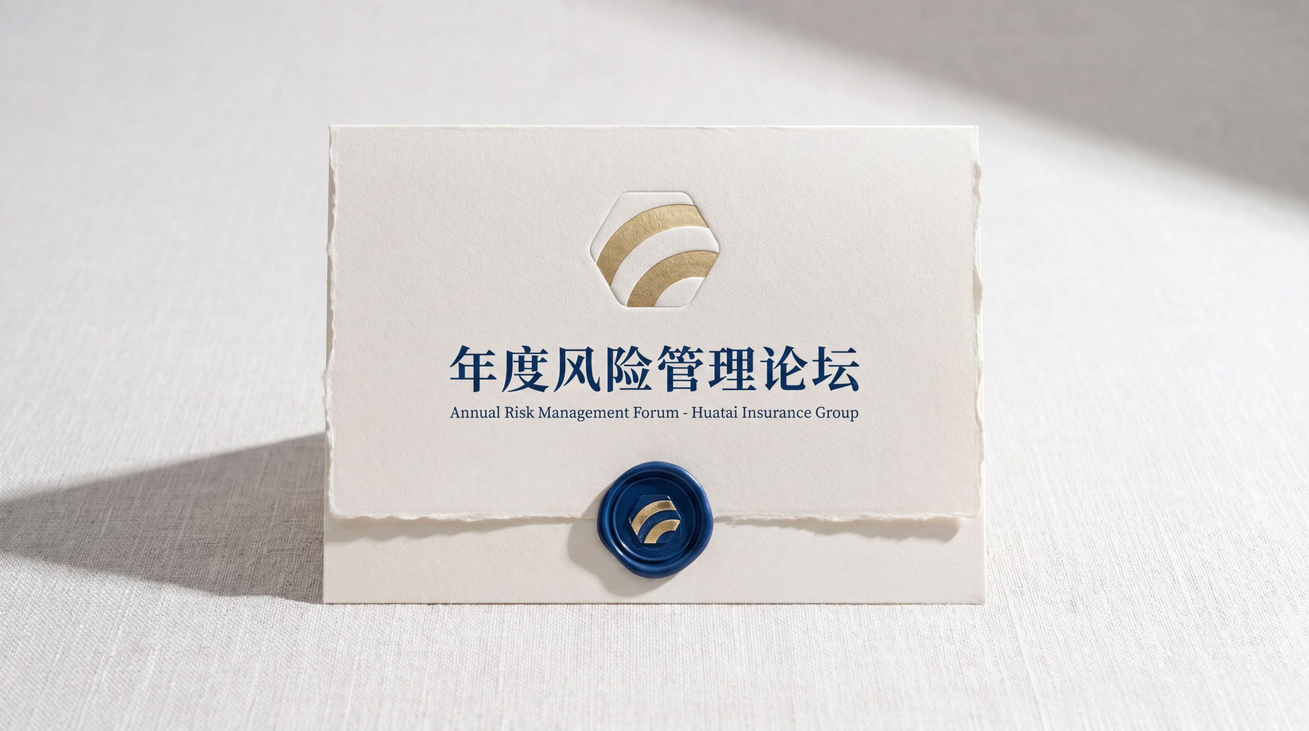
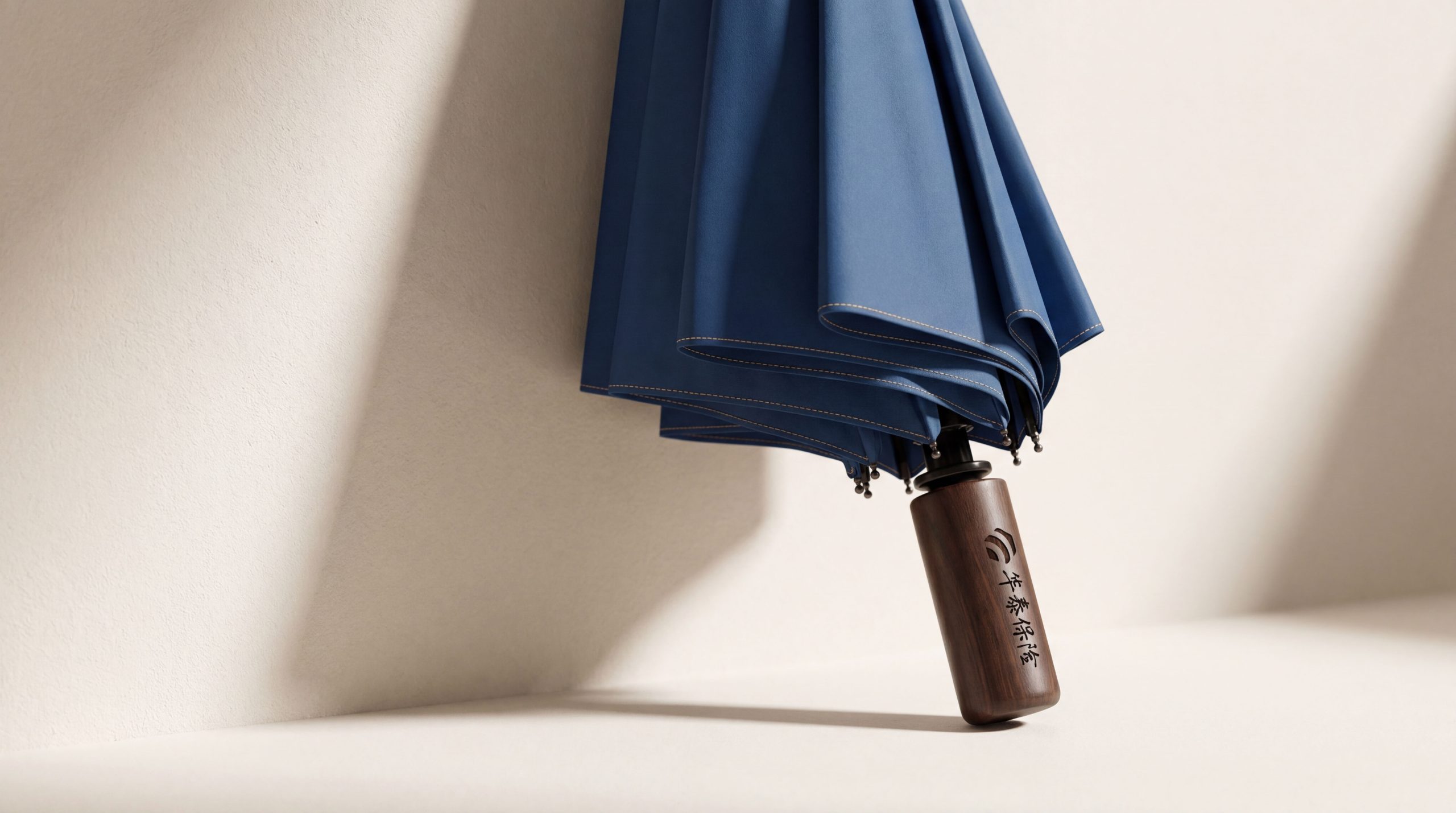
design concept
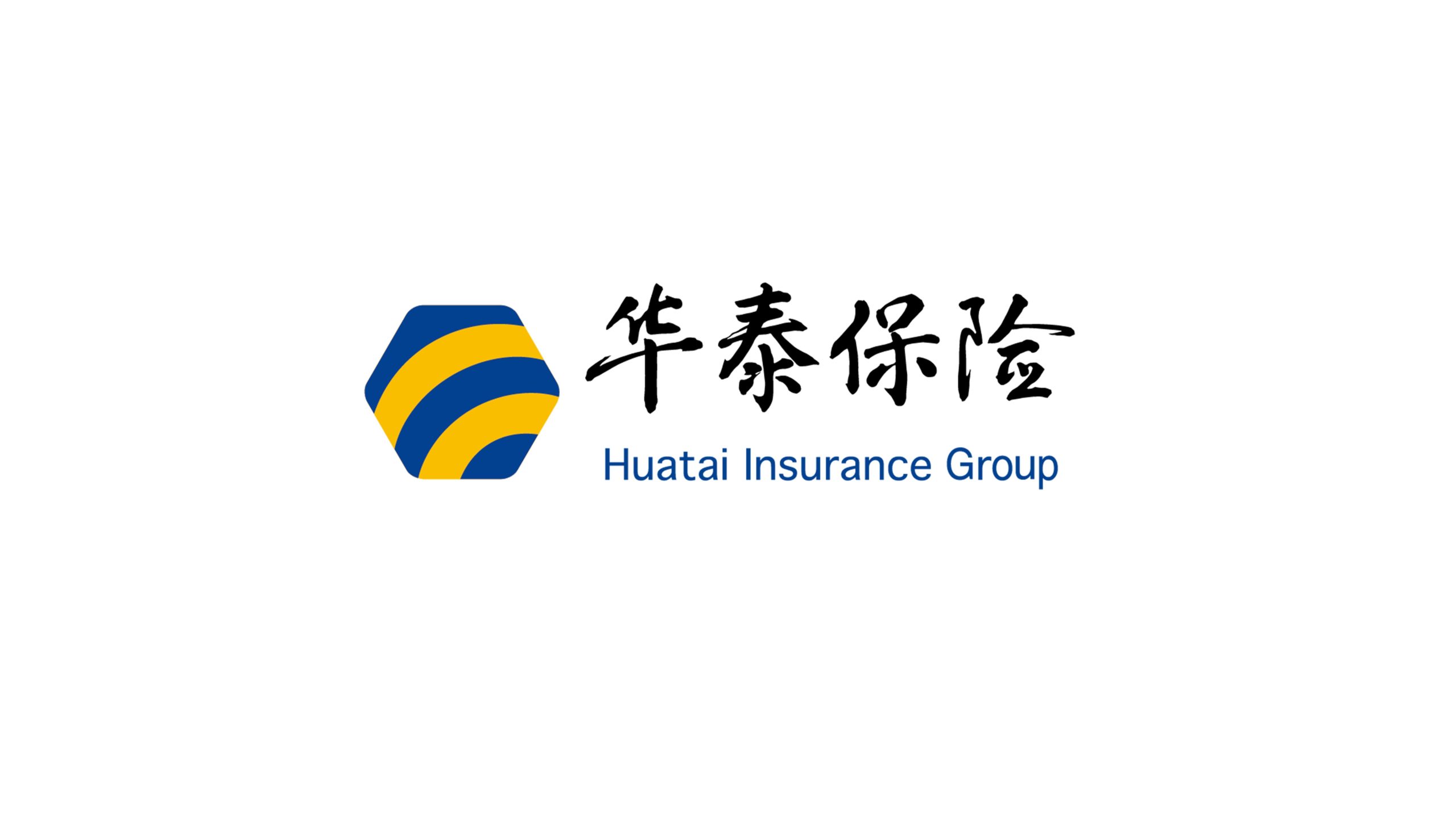
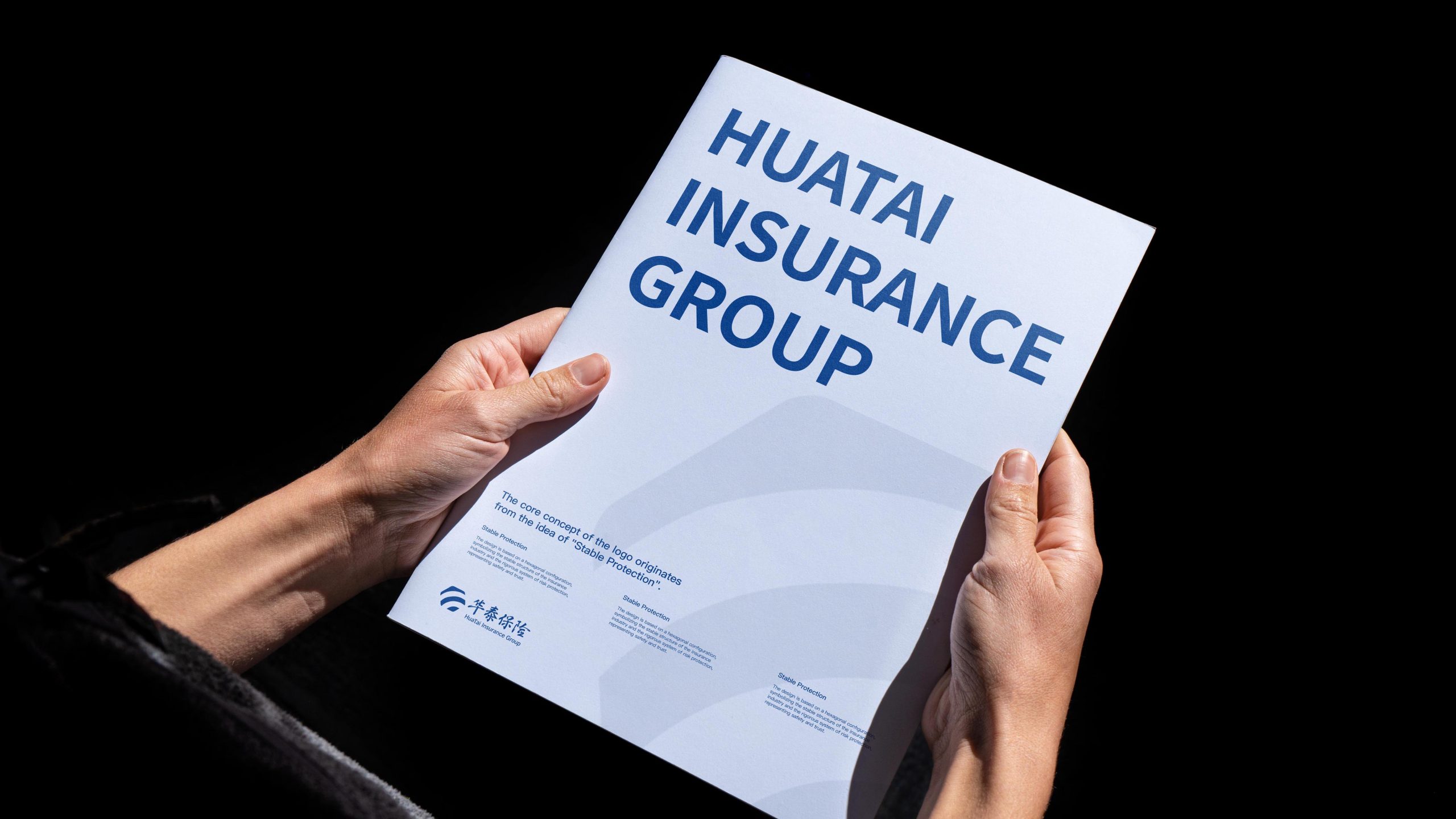
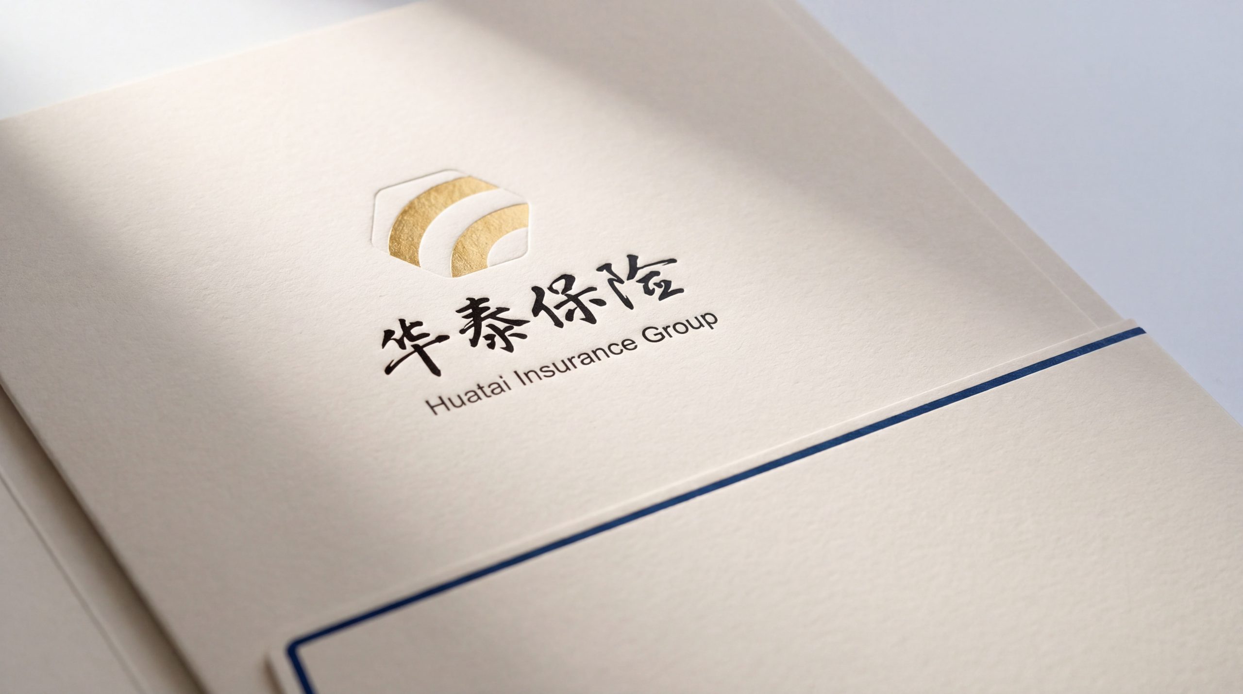
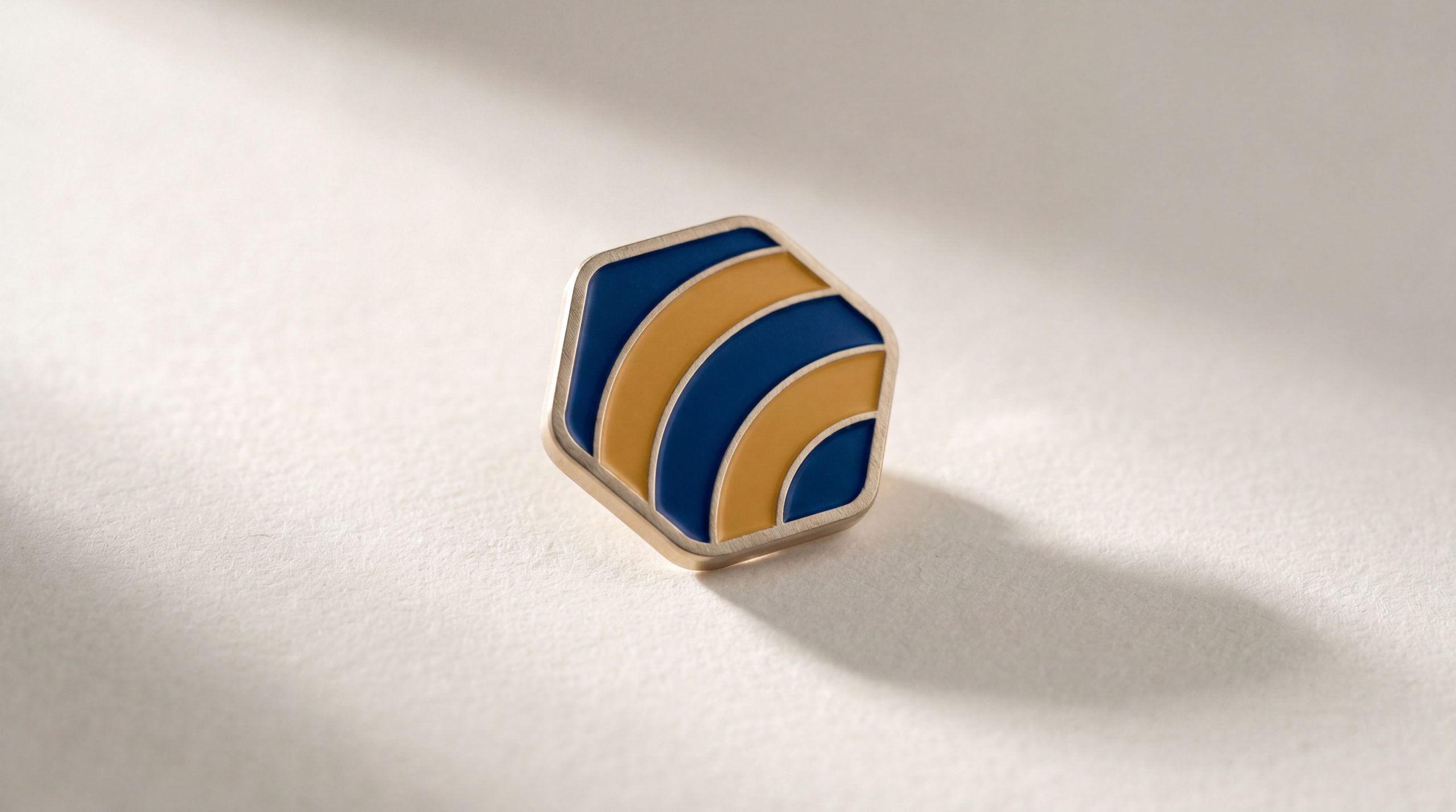
The core concept of the logo comes from the concept of "Stable Protection". The design uses a hexagon as the basic configuration, symbolizing the stable structure and strict risk protection system of the insurance industry, representing safety and trust. The blue and yellow arc-shaped stripes inside are like protective hands surrounding each other, reflecting the brand's "multiple guarantees" service concept. The overall shape not only has the stability and professionalism of a financial institution, but also is full of the international tension of a modern brand, implying Huatai Insurance's brand mission of continuing to protect customers with professionalism and develop steadily. The upgraded three-dimensional texture and smooth curves present the brand’s renewed international vision and pursuit of high-end quality.
Graphic composition and color system
Hexagonal structure: represents the stability of the insurance industry and the strict system of risk protection; curved stripes: blue and yellow are surrounded by layers like a guarding hand, symbolizing multiple guarantees and comprehensive services; dynamic streamlines: the flow of the curve conveys the innovative vitality of the brand that keeps pace with the times; three-dimensional texture: the upgraded visual effects present the brand's high-end positioning and international quality.
The brand name "Huatai Insurance" uses a calligraphy grid font with smart fonts and powerful pen and ink, forming a fusion of tradition and innovation with the modern temperament of the logo. The English "HuaTai InsuranceGroup" uses a classic sans serif font to convey the brand's "stable yet international". The Chinese and English combined versions are arranged on the right side, which is unified as a whole, strengthening visual recognition and international communication attributes.
Trust blue #2E5DA8: symbolizes professionalism, trust and financial authority; vitality yellow #F5C542: represents warmth, hope and service enthusiasm; pure white #FFFFFF: symbolizes purity, transparency and honest management. Blue and are harmoniously intertwined, forming a visual balance of "professionalism and warmth", "stability and vitality", and building a trustworthy and dynamic brand impression.
Application extension and brand significance
The logo has strong cross-field adaptability: at the corporate level: applied to brand launches, financial forums, annual reports and strategic cooperation; at the product level: suitable for policy design, claims services and customer gift logos; at the spatial level: in business outlets, guidance systems and brand experience centers to form a unified visual language dynamic version. The arc stripes can be used as "surrounding guardians" or energy flow animations to symbolize the continuous companionship of guarantee services.
The Huatai Insurance logo embodies the dual values of "stable and professional international quality": hexagon → stable protection system; curved stripes → core concept of protection; blue and yellow color → symbiosis of professionalism and warmth. This is not only a brand identification symbol, but also a visual expression of insurance philosophy to protect a better life with the power of stability.
design results
After the release of the VI upgrade, Huatai Insurance has become an iconic brand image in the domestic insurance and financial field. Hexagonal and curved stripes are widely used in financial exhibitions, brand communication, and customer services. With the visual expression of "robust structure × international language", they have established a new aesthetic standard for the insurance industry. This case represents the mature expression of the brand in the direction of financial insurance, brand upgrade and system visual language design, achieving the unification from "brand design" to "guardian philosophy".