










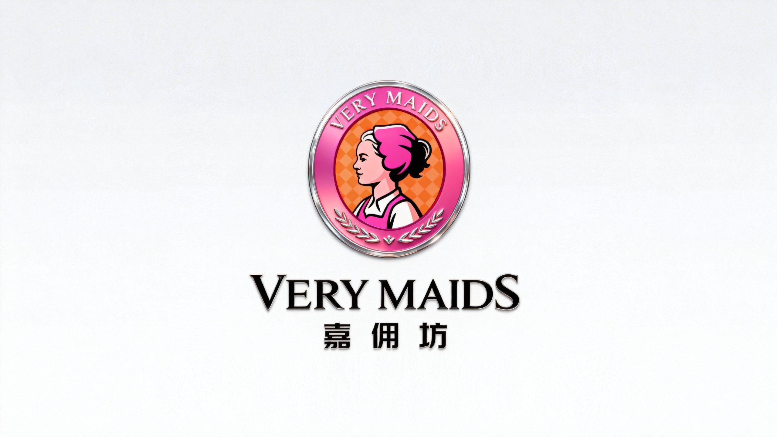
Very Maids is a service brand focusing on high-end housekeeping services and home life solutions. It is committed to protecting family happiness with professional quality and connecting to a better life and future with considerate service.
The brand hopes to present a balanced state of "professional reliability x warm care" through a visual system that combines a professional image with a warm temperament.
design concept
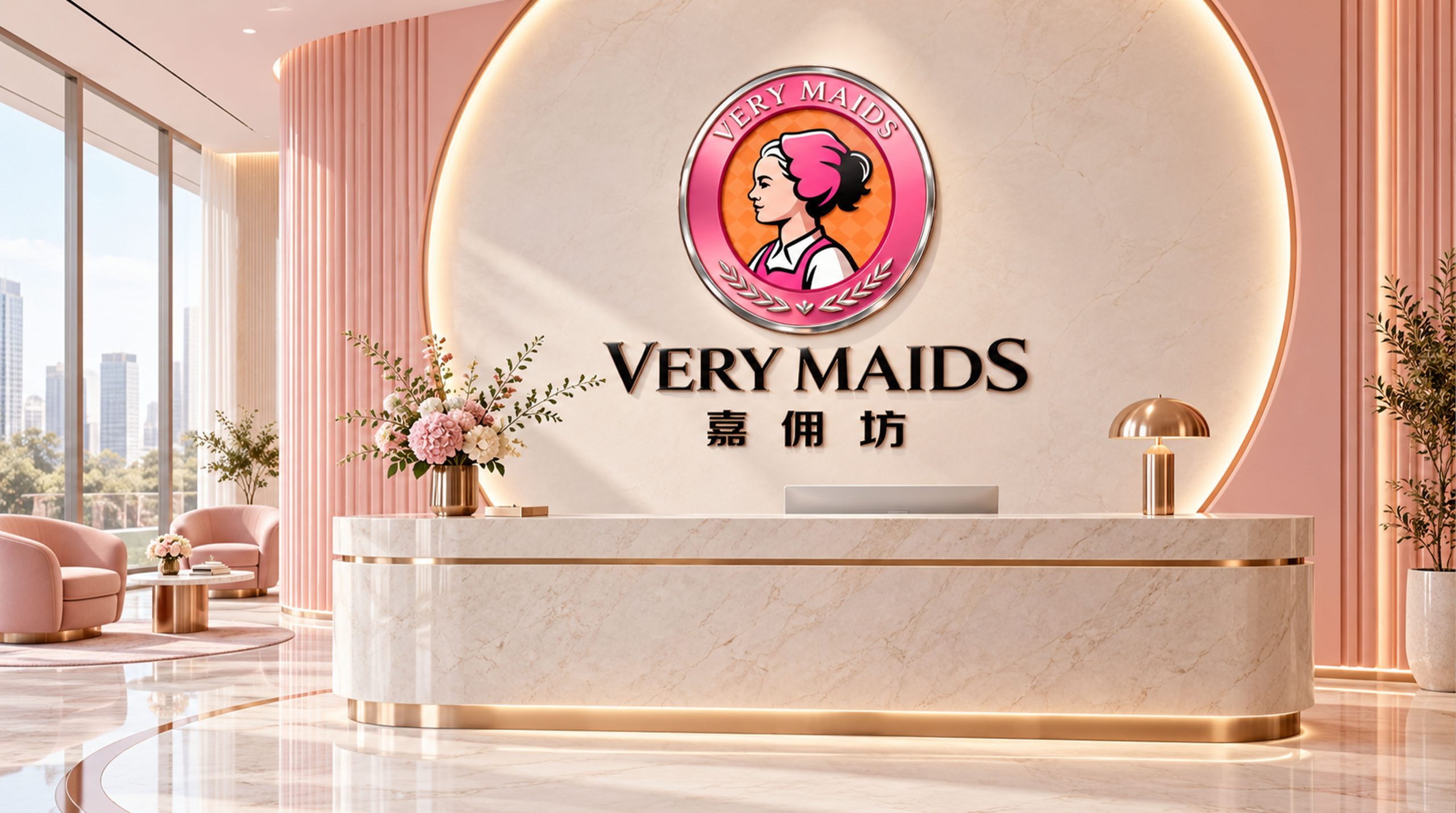
The core concept of the logo comes from the concept of "Excellence Service". The design is based on an elegant female silhouette, symbolizing the professional image and delicate care of housekeeping services, and representing trust and quality. The three-dimensional metal texture of the circular badge reflects the credit commitment of "quality assurance", and the olive branch at the bottom symbolizes honor and professional certification. The overall shape not only has the friendly warmth of the service industry, but also is full of the professional temperament of the brand, implying the mission of Jiazhaifang to continue to provide excellent housekeeping services and protect thousands of families. The use of warm pink and orange tones shows the warmth of family and considerate service, making the brand more emotionally connected and trustworthy.
Graphic composition and color system
Silhouette image: represents the elegance and concentration of professional housekeeping staff; circular badge structure: uses a metal frame to present the brand’s authority and credit guarantee; olive branch decoration: symbolizes honor, certification and quality commitment of professional services; plaid background: warm-color checkered pattern conveys the warmth, cleanliness and orderliness of the family.
The brand name "Jiazaifang" adopts modern Song font, which is correct and balanced in proportion, consistent with the structure of the logo and badge. The English "VeryMaids" uses a classic serif font to convey the brand's "professional elegance". The Chinese and English combined version adopts top and bottom layout and is centered overall to enhance visual stability and brand trust.
Warm Pink #E91E8C: Symbolizes care, warmth and feminine delicacy; Vibrant Orange #F5A623: Represents enthusiasm, vitality and service temperature; Trust Silver #C0C0C0: Symbolizes professionalism, reliability and quality assurance. Pink and orange blend in gradients to form a visual balance of "warmth and vitality" and "professionalism and affinity", creating a trustworthy and warm brand impression.
Application extension and brand significance
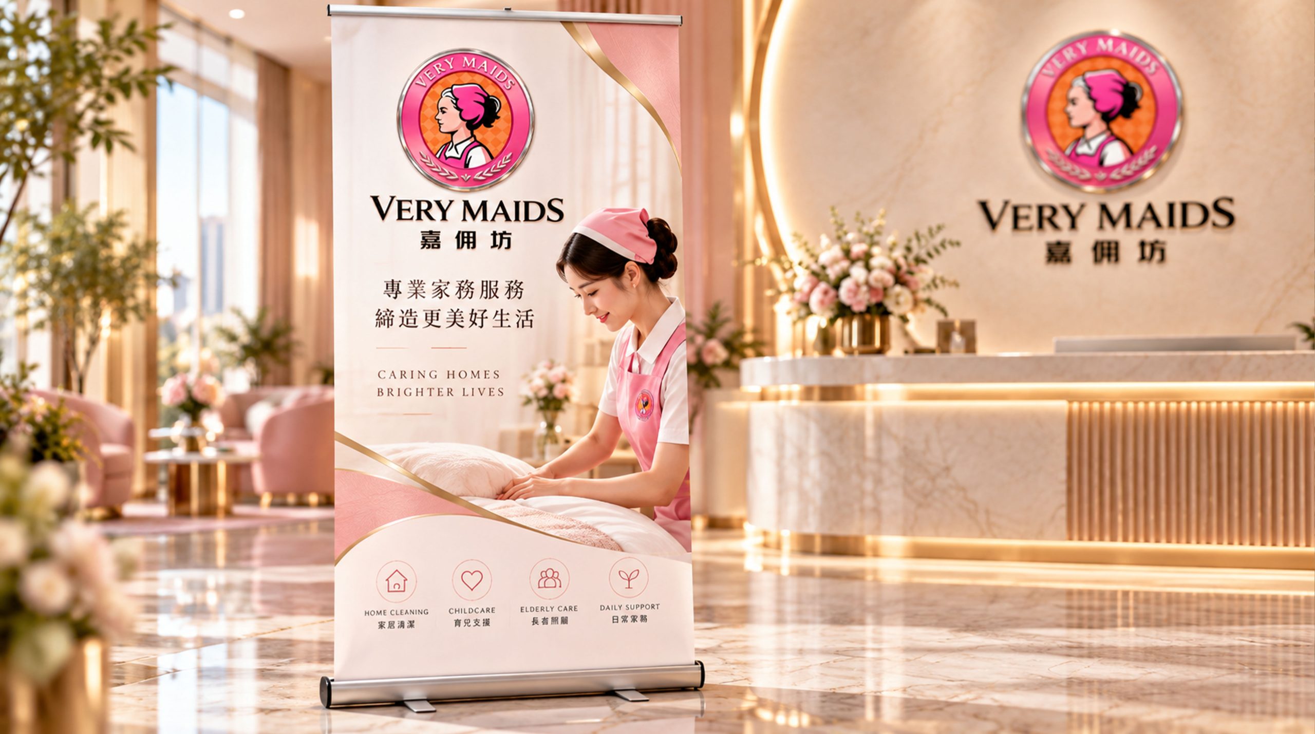
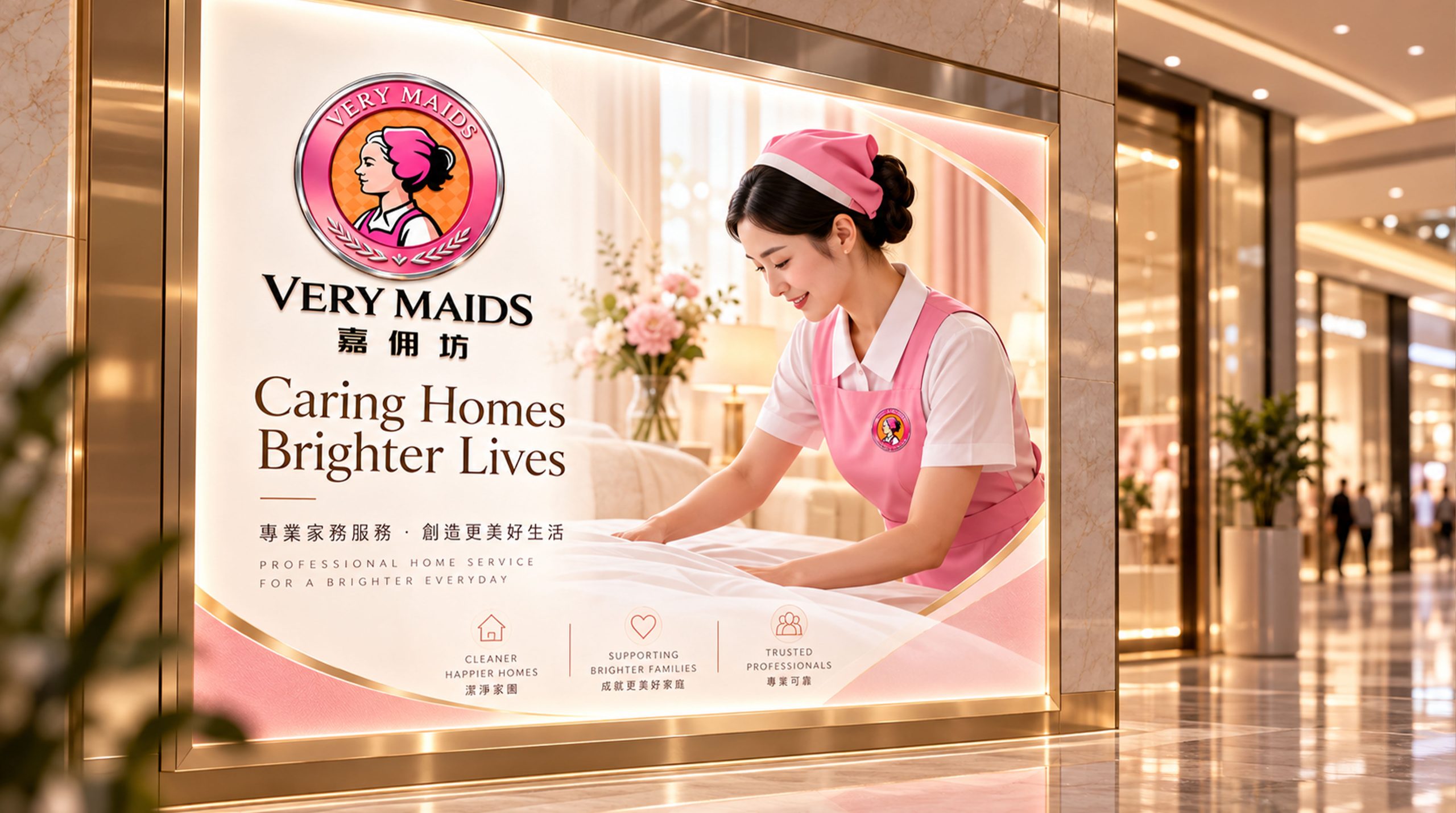
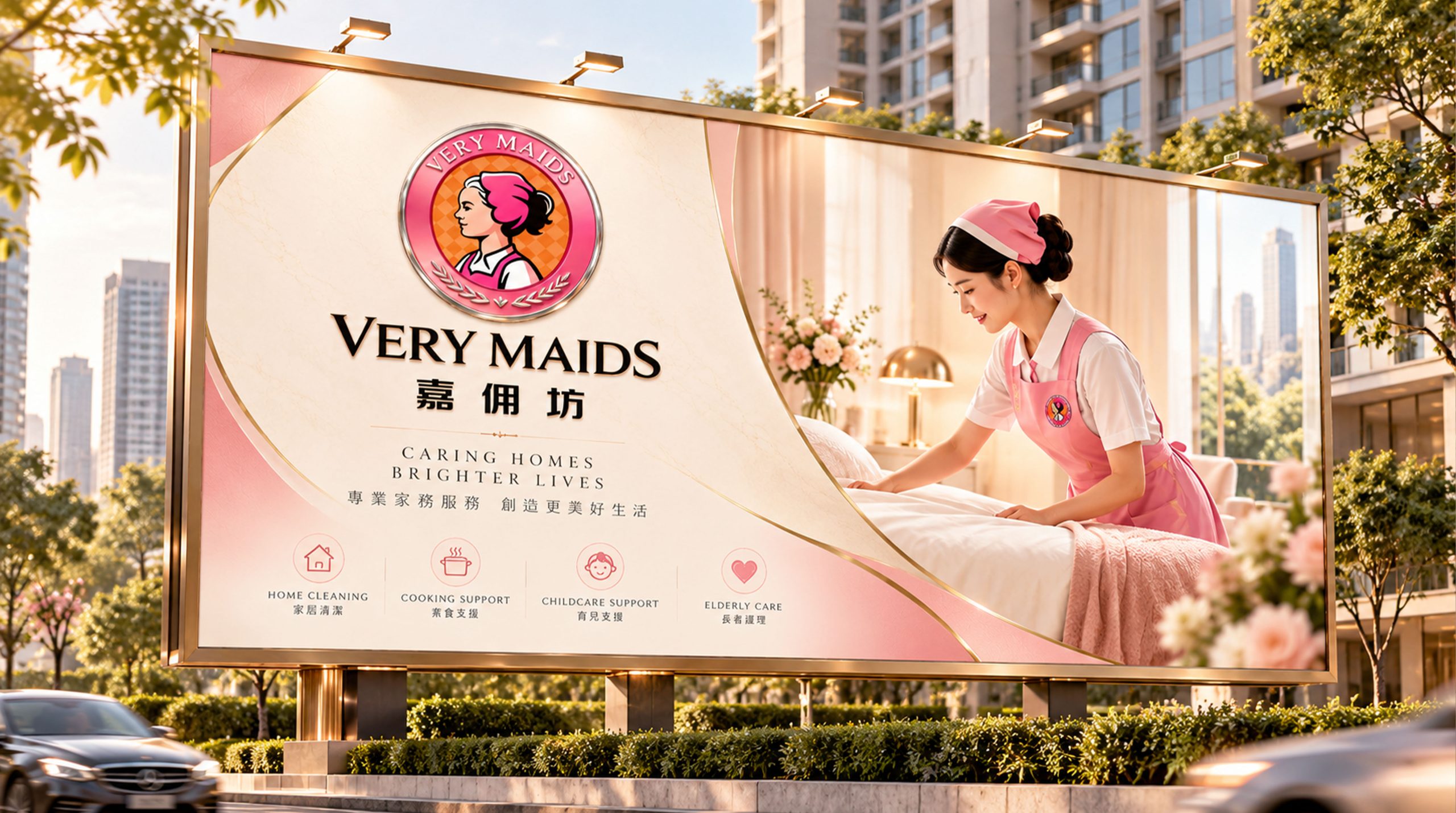
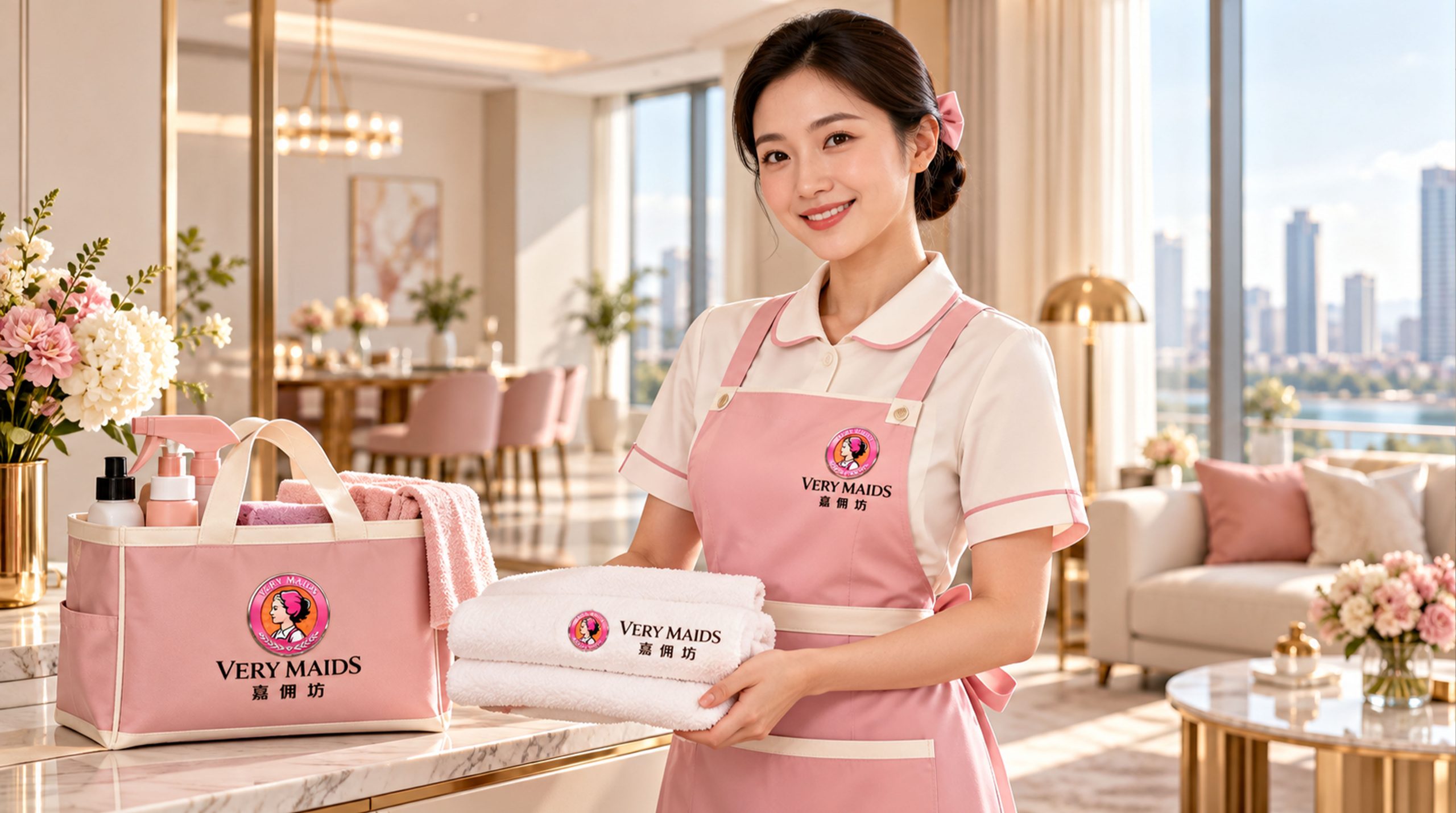
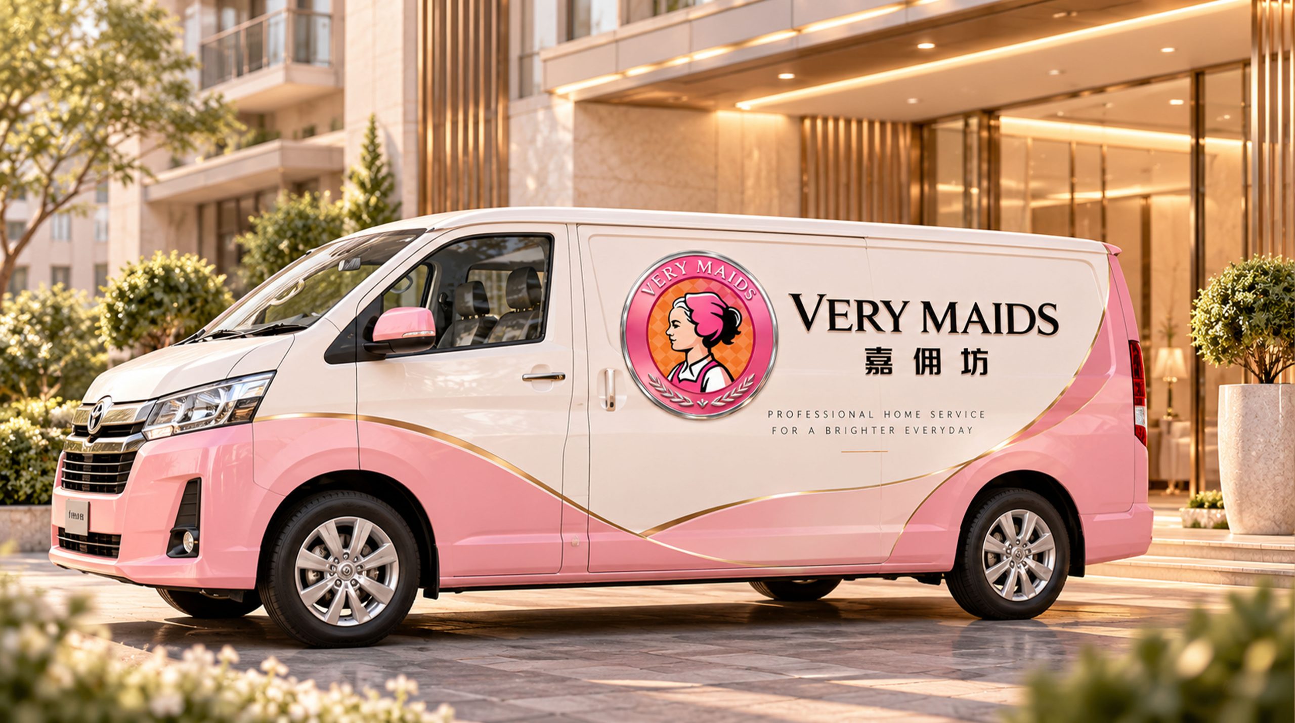
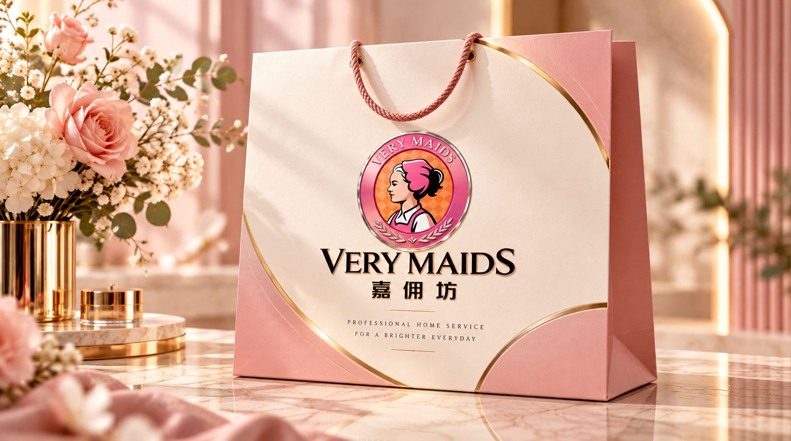
The logo has strong cross-field adaptability: corporate level: applied to store image, brand promotion, service contracts and employee uniforms; product level: suitable for service cards, cleaning supplies and customer gift logos; spatial level: forming a unified visual language in service centers, wayfinding systems and brand displays. In the dynamic version, the badge can be used as a "gloss flow" or trust seal animation, symbolizing the continued commitment to quality service.
The Jiazhaifang logo embodies the dual values of "professional reliability x warm care": character image → professional gene of service; badge structure → quality commitment of credit; warm color system → symbiosis of professionalism and warmth. This is not only a brand identification symbol, but also a visual expression of a service philosophy to be kind to others and protect the happiness of thousands of families.
design results
After the release of the new visual system, Jiazhaifang has become an iconic brand image in the domestic high-end housekeeping service field. Badge characters are widely used in store image, brand communication, and service promotion. With the visual expression of "professional structure × warm language", it has established a new aesthetic standard in the field of housekeeping services. This case represents the mature expression of the brand in the direction of high-end housekeeping, quality service and system visual language design, achieving the unification from "logo design" to "service philosophy".