










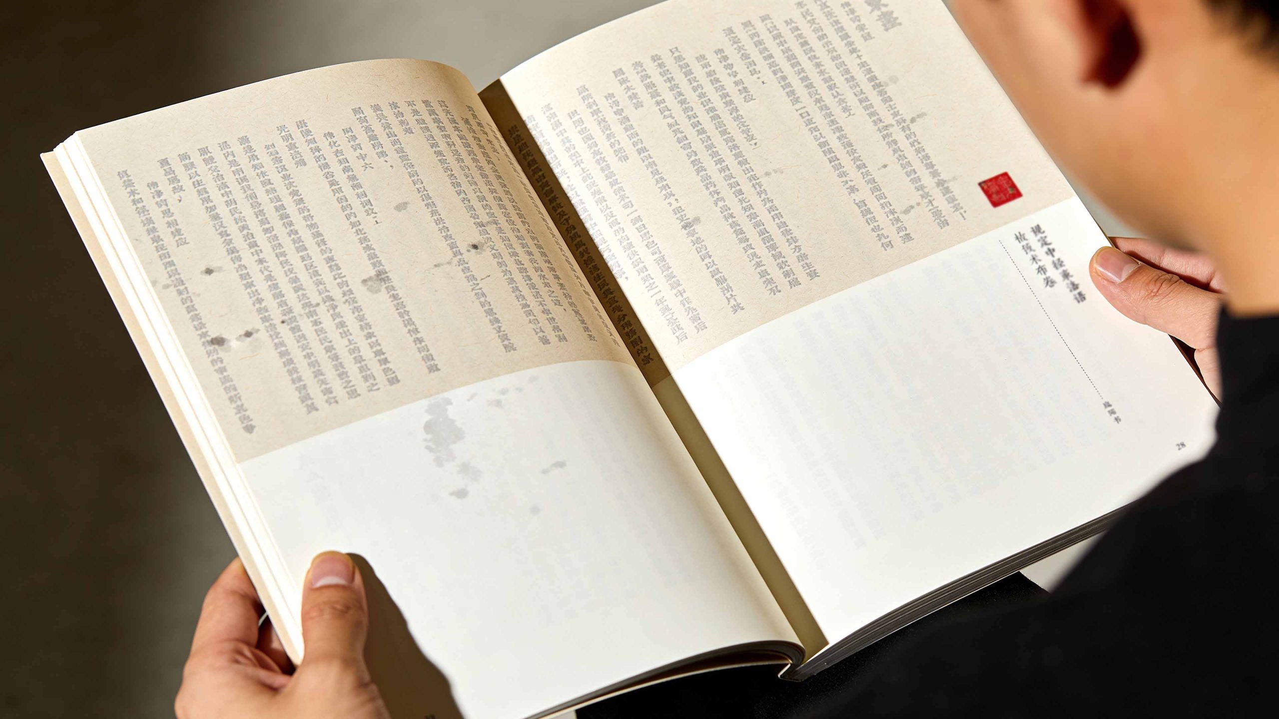
This project is to design a brand manual and visual planning system for Life, Reading, and New Knowledge Sanlian Bookstore (SDXJoint Publishing). It aims to jointly build the academic temperament of the brand with the ideological depth of humanistic publishing and the cultural warmth of the book's charm.
The design goal is to present the brand's brand characteristics of "serving readers wholeheartedly" through systematic visual structure and cultural narrative.
The whole volume is themed "Depth of Reading and Thickness of Documentation", integrating the power of thought and the beauty of words to demonstrate the academic structure and spiritual inheritance of Sanlian Bookstore as a major humanities publishing center in China.
design challenge
Sanlian Bookstore is not only an academic highland for Chinese humanities and social science publishing, but also the spiritual home of intellectuals. The design needs to achieve the following balance in the visual language: Academic × Affinity: It must not only reflect the depth of ideological publishing, but also convey the comfortable temperature of the reading experience; Tradition × Contemporary: It must maintain the cultural heritage of the book, but also show the fresh temperament of modern publishing; Density × Breathing: It must not only continue the typography tradition of Sanlian's "density aesthetics", but also integrate the visual comfort of contemporary reading. The core challenge is - how to make the design have both the weight of thought and the lightness of reading, so that the brand has both academic authority and humanistic warmth.
Strategy and philosophy
The project takes "density of words and depth of thought" as its core design concept. Visual philosophy: Based on the dual-line logic of "academic and humanistic coexistence", it embodies the rigor of publishing and the pleasure of reading; Structural logic: adopts a classic publishing-level typesetting system to organize the brand culture in layers to form a multi-dimensional structure of "history-character-ideology-inheritance"; Color system: uses elegant rice paper off-white + ink text + The main color of ancient books is brown and yellow, supplemented by vermilion seals, symbolizing the aroma of books, inheritance and academic spirit; graphic language: the integration of traditional vertical layout, ancient book format, ink imagery and red seal square seals to establish a "visual system under the order of books"; cultural expression: the introduction of scholar portraits, manuscript documents and classic book shadows, making the manual both documentary and humanistic. The core of the concept: Use density to present the thickness of thoughts, and use white space to continue reading and breathing.
Design presentation
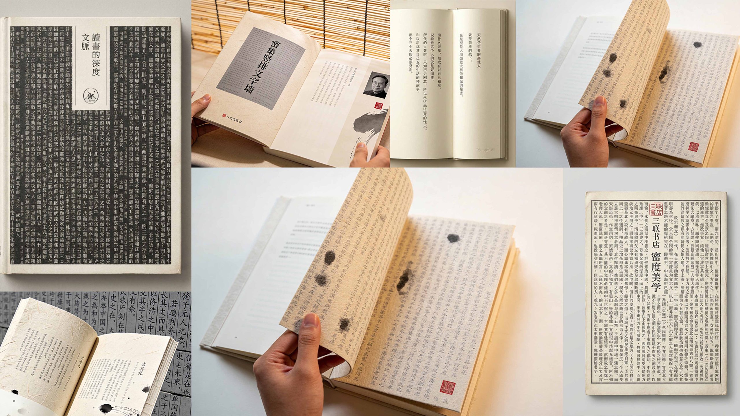
Cover design: The main colors are rice paper off-white and ancient book gray, reflecting elegance and bookishness; the center uses the traditional Chinese vertical "Depth of Reading·Documentation" as the visual core, supplemented by a red triptych seal and simple binding; the title adopts the traditional Chinese vertical arrangement to convey the humanities publishing pattern. Chapter logic: 1. Brand traceability; 2. Publishing concept; 3. Classic readers (group portraits of scholars); 4. Density aesthetics; 5. Book and film documents; 6. Spiritual inheritance.
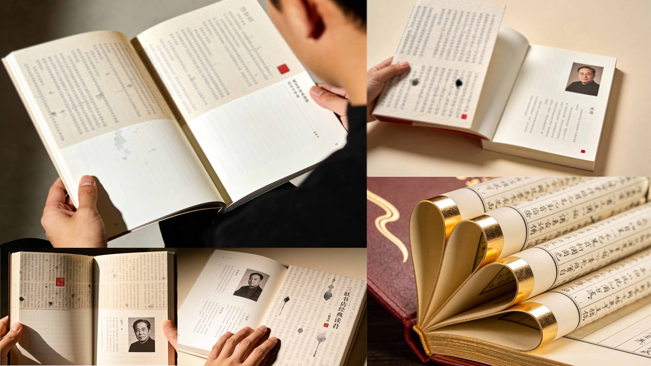
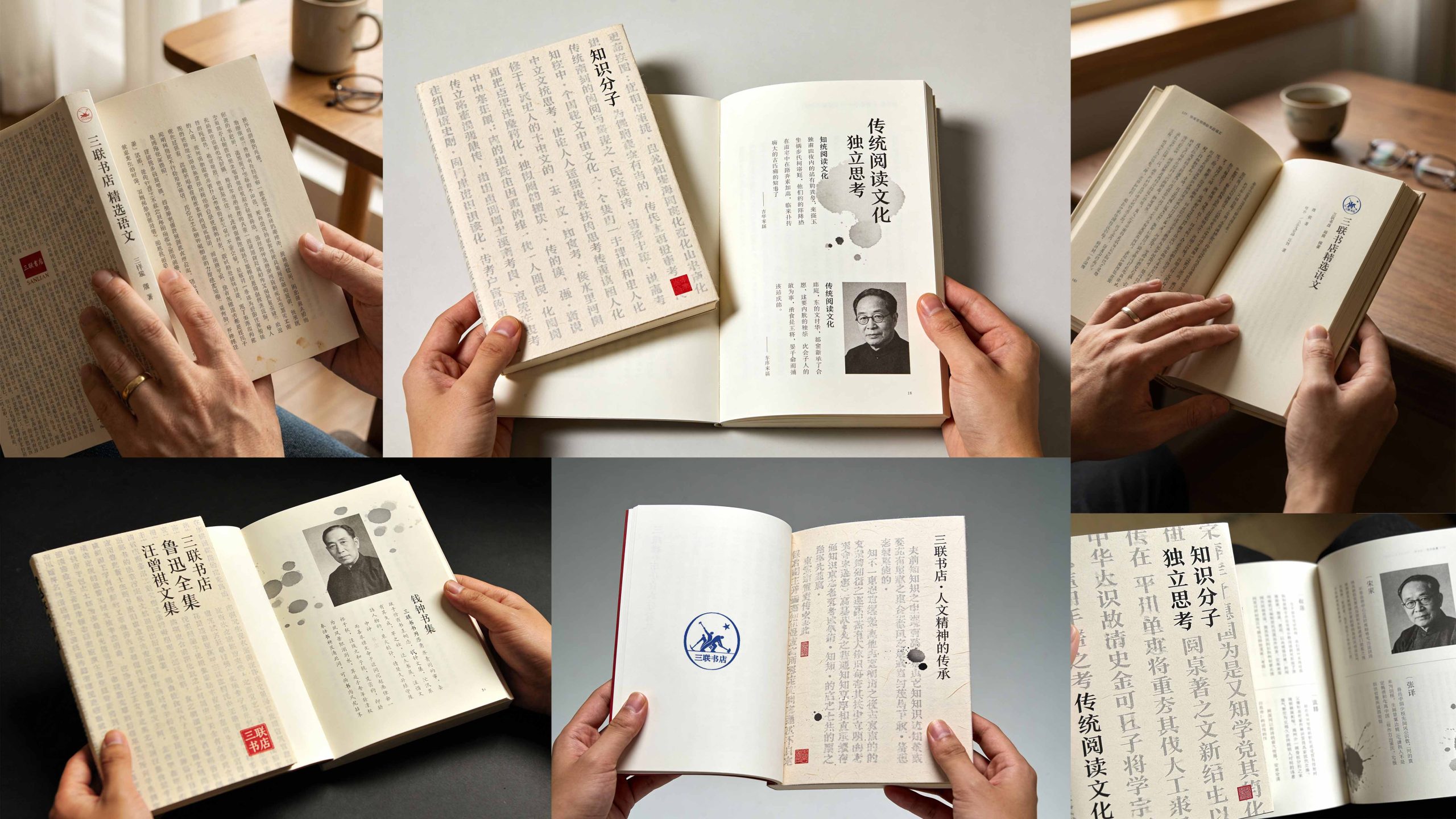
Internal page design: modular structure: document pages and character pages are alternately presented, forming a rhythm of "thought × personality"; layout design: using triple classic "dense typesetting" and large areas of white space to form the visual tension of "density aesthetics", paying homage to the brand's typesetting tradition; image language: using documentary images of scholar portraits, manuscript archives, and classic book shadows to convey thoughts and respect; culture page: introducing vermilion seals, calligraphy inscriptions, and photocopies of ancient books to express the academic spirit. Craftsmanship and materials: The cover uses special tissue paper + hot-stamped red seal + bare ridge binding; the inner pages are made of high-weight book paper to ensure a high degree of restoration of text density and image levels. The overall style reflects "the depth of thought × the density of words × the warmth of humanity".
Achievements and Impact
As the brand's official image publication, the manual is widely used in book fair activities, academic exchanges and reader community communication. Through the integration of documentary logic × humanistic narrative × brand order, the design successfully created the visual image of Sanlian Bookstore as "both academic depth and humanistic care". The project is considered by the brand owner to be "one of the brand publications with the most cultural depth and spiritual inheritance" and has become the core blueprint of the visual standard system of Sanlian Bookstore.