










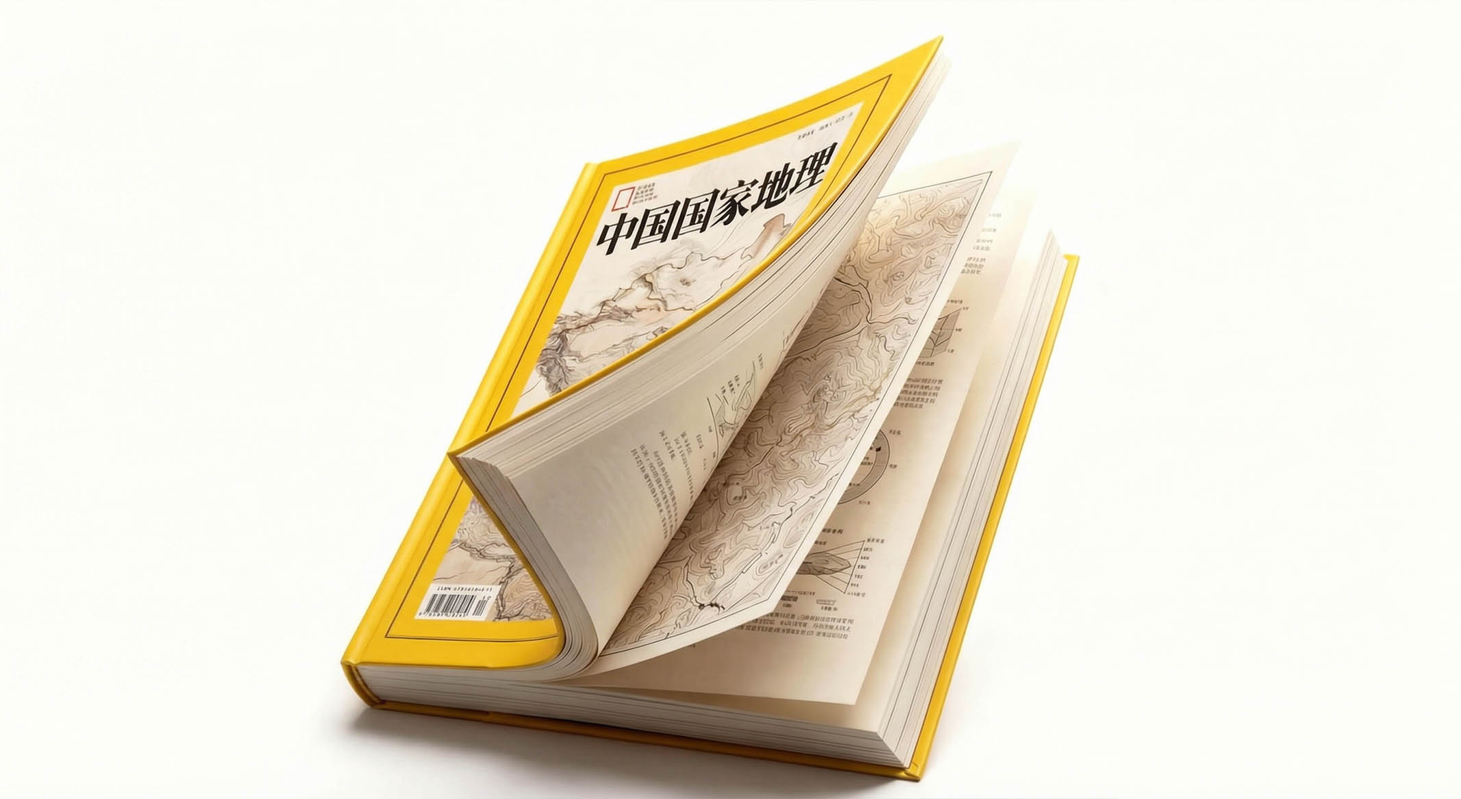
This project is to design a brand album and visual planning system for "Chinese National Geographic", aiming to jointly build the magazine's brand temperament with the rigorous depth of scientific exploration and the magnificent vision of nature and humanity.
The design goal is to present the brand's brand characteristics of "opening the door to nature and revealing the essence of humanity" through systematic visual structure and knowledge-based narrative.
The entire volume is themed "Discover China and Interpret the World", integrating scientific rationality and natural poetry to demonstrate the professional authority and exploration pattern of China National Geography.
design challenge
"China National Geographic" is not only an authoritative media for popularizing geographical science in China, but also a spiritual benchmark for natural and humanistic images. The design needs to achieve the following balance in the visual language: Scientific × Aesthetic: It must reflect the professional rigor of geographical science while conveying the visual shock of natural images; Intellectual × Readability: It must maintain the depth of academic content while showing the affinity of mass communication; Classic Sense × Sense of the Times: It must not only continue the brand recognition of the iconic yellow frame, but also incorporate the visual vitality of the contemporary design system. The core challenge is - how to make the design have both scientific depth and natural warmth, so that the brand has both academic authority and humanistic resonance.
Strategy and philosophy
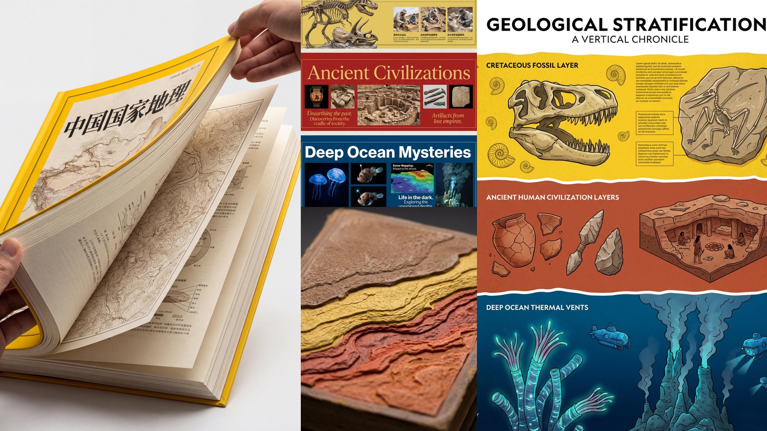
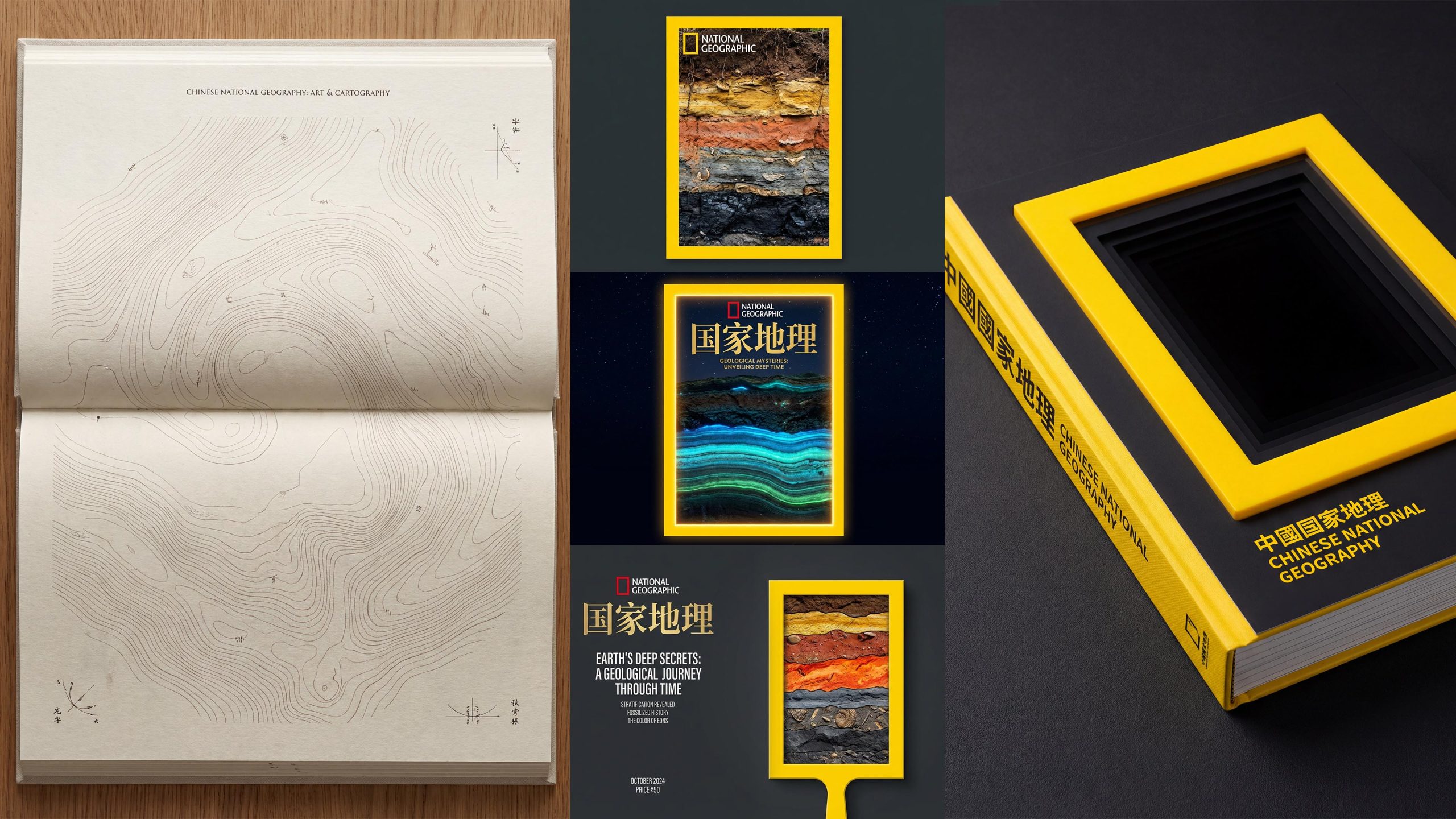
The project takes "the depth of science and the magnificence of nature" as its core design concept. Visual philosophy: Based on the dual-line logic of "exploration and discovery" as the visual basis, it reflects the breadth of geography and the precision of science; Structural logic: Adopts an international popular science publication-level typesetting system to organize geographical knowledge in layers, forming a multi-dimensional structure of "maps-illustrations-images-narratives"; Color system: uses the iconic National Geographic Yellow + Stratigraphic Brown + Ocean blue is the main color, supplemented by the warm red of ancient civilization and fossil off-white embellishments, symbolizing exploration, discovery and the stacking of time; graphic language: integrating contour maps, geological sections, paleontological illustrations and scientific information maps to establish a "visual system under the order of knowledge"; cultural expression: introducing ancient maps, scientific research archives and real-life photography to give the album both knowledge and a sense of ritual of exploration. The core of the concept: Use visual systems to present scientific logic, and use image language to continue the spirit of discovery.
Design presentation
Cover design: The main color is the iconic National Geographic yellow border and natural images, reflecting classics and authority; the center uses mountains and landforms, contour maps or natural wonders as the visual core, supplemented by red publication labels and Chinese and English titles; the title is bilingual in Chinese and English to convey the international science popularization pattern. Chapter logic: 1. Geological time; 2. Mountains and rivers; 3. Exploration of ancient civilizations; 4. Mysteries of the deep sea; 5. Ecological illustrations; 6. Frontiers of scientific research.
Internal page design: Modular structure: scientific illustration pages and image documentary pages are alternately presented, forming a rhythm of "knowledge × shock"; chart design: showing professional depth with geological cross-sections, time stratigraphic maps, species evolution maps and scientific information visualization; image language: using documentary photography of magnificent natural scenery, scientific expedition site records, and close-ups of paleontological fossils to convey discovery and awe; cultural page: introducing ancient maps, expedition manuscripts and scientific expedition notes to express the spirit of exploration. Craftsmanship and materials: The cover uses matte coating + hot yellow border + local UV; the inner pages are made of high-weight coated paper to ensure a high degree of restoration of map details and natural images. The overall style embodies "scientific rigor × natural magnificence × passion for exploration".
Achievements and Impact
As the brand's official image publication, the album is widely used in science education, academic exchanges and public communication. Through the integration of scientific logic × image narrative × brand order, the design successfully created a visual image of "China National Geographic" that "has both academic authority and natural poetry". The project is considered by the brand owner to be "one of the most intellectually profound and visually stunning brand publications" and has become the core blueprint of the magazine's visual standard system.