










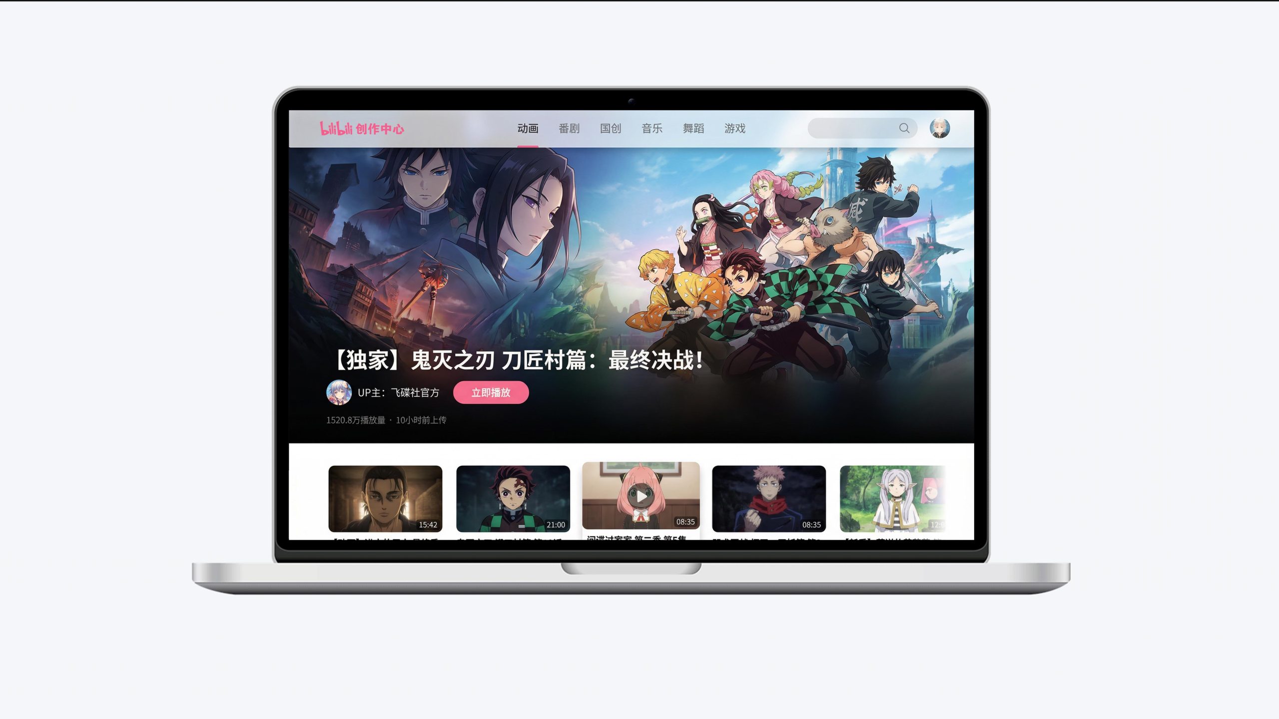
This project is to design the web page and creative center visual system for Bilibili, aiming to jointly build the brand temperament of the platform with the community vitality of Generation Z and the unique genes of the two-dimensional culture.
The design goal is to present the platform's brand characteristics of "the videos you are interested in are all at Bilibili" through a systematic visual structure and community narrative.
The overall theme is "Creation is love, community is belonging", integrating the vitality of the second dimension and the creative spirit of PUGC, showing Bilibili's unique pattern and content ecology as a cultural community for China's young generation.
design challenge
Bilibili is not only China's most influential young people's cultural community, but also the core position of PUGC's video creation. The design needs to achieve the following balance in the visual language: Two-dimensional sense × Popularity: It must not only reflect the unique tone and circle recognition of ACG culture, but also convey the openness and inclusiveness of the pan-content platform; Community × Sense of efficiency: It must not only maintain the emotional connection and interaction temperature between UP owners and users, but also show the clear browsing and discovery efficiency of massive content; Youth × Professional sense: It must not only continue the visual expression of youthful vitality, but also integrate the professionalism and efficiency of creator tools. The core challenge is - how to make the design combine the warmth of the community and the efficiency of the platform, so that Station B has both circle recognition and mass appeal.
Strategy and philosophy
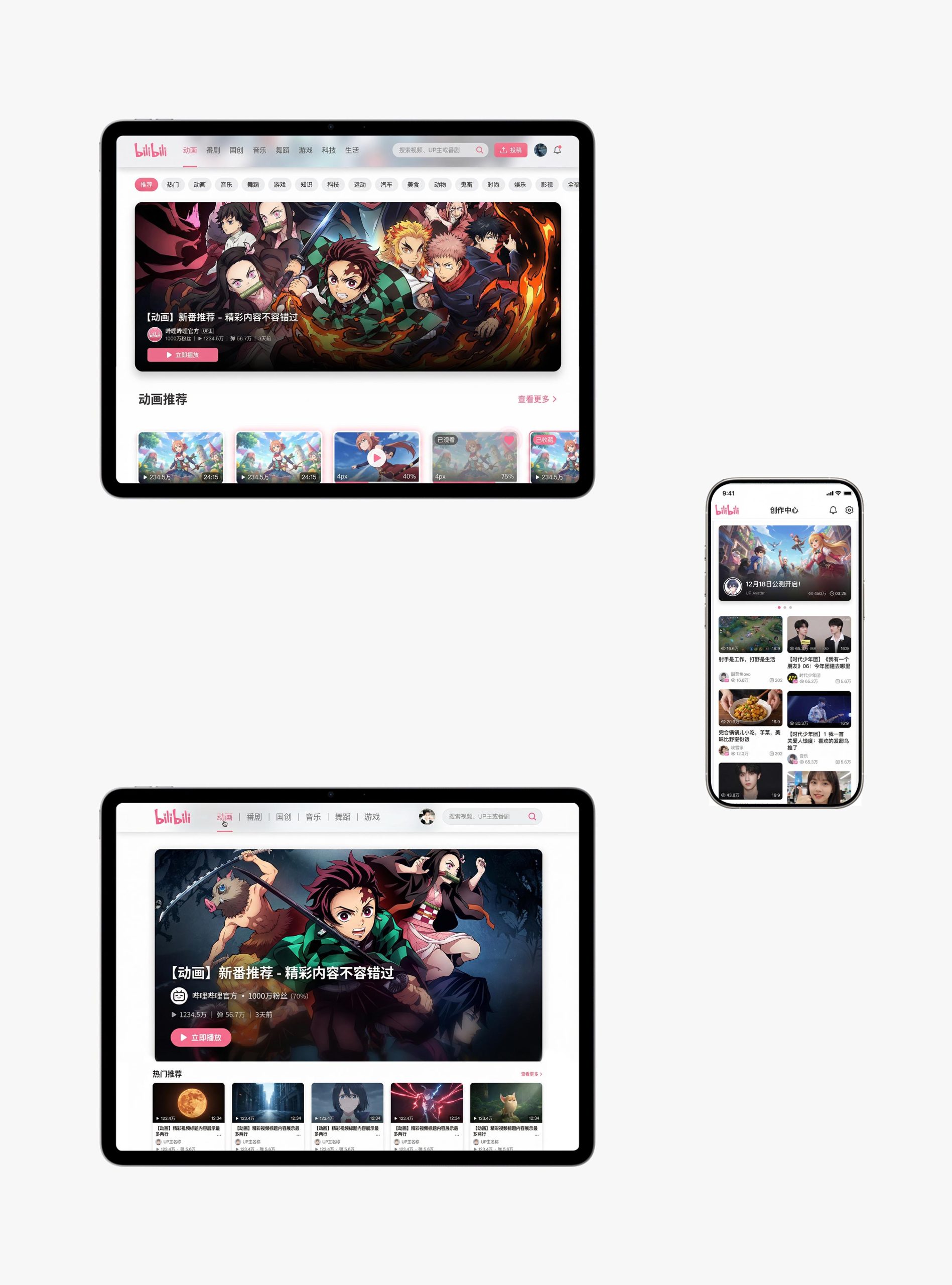
The project takes "the warmth of the community and the love of creation" as its core design concept. Visual philosophy: Based on the dual-line logic of "coexistence of content and community" as the visual basis, it embodies the vitality of creation and the temperature of belonging; Structural logic: adopts a modular responsive architecture to hierarchically organize content information to form a multi-dimensional structure of "focus - partition - recommendation - creation"; color system: Bilibili pink + pure white + Sky blue is the main color, supplemented by two-dimensional illustrations and dynamic elements, symbolizing vitality, youth and love; graphic language: the integration of rounded-corner cards, barrage elements, UP main avatars and partition labels to establish a "visual system under community order"; interactive expression: the introduction of barrage interaction, one-click three-connect and creator data dashboards, making the platform both entertaining and creative. The core of the concept: present community culture with visual vitality, and continue the love of creation with tool design.
Design presentation
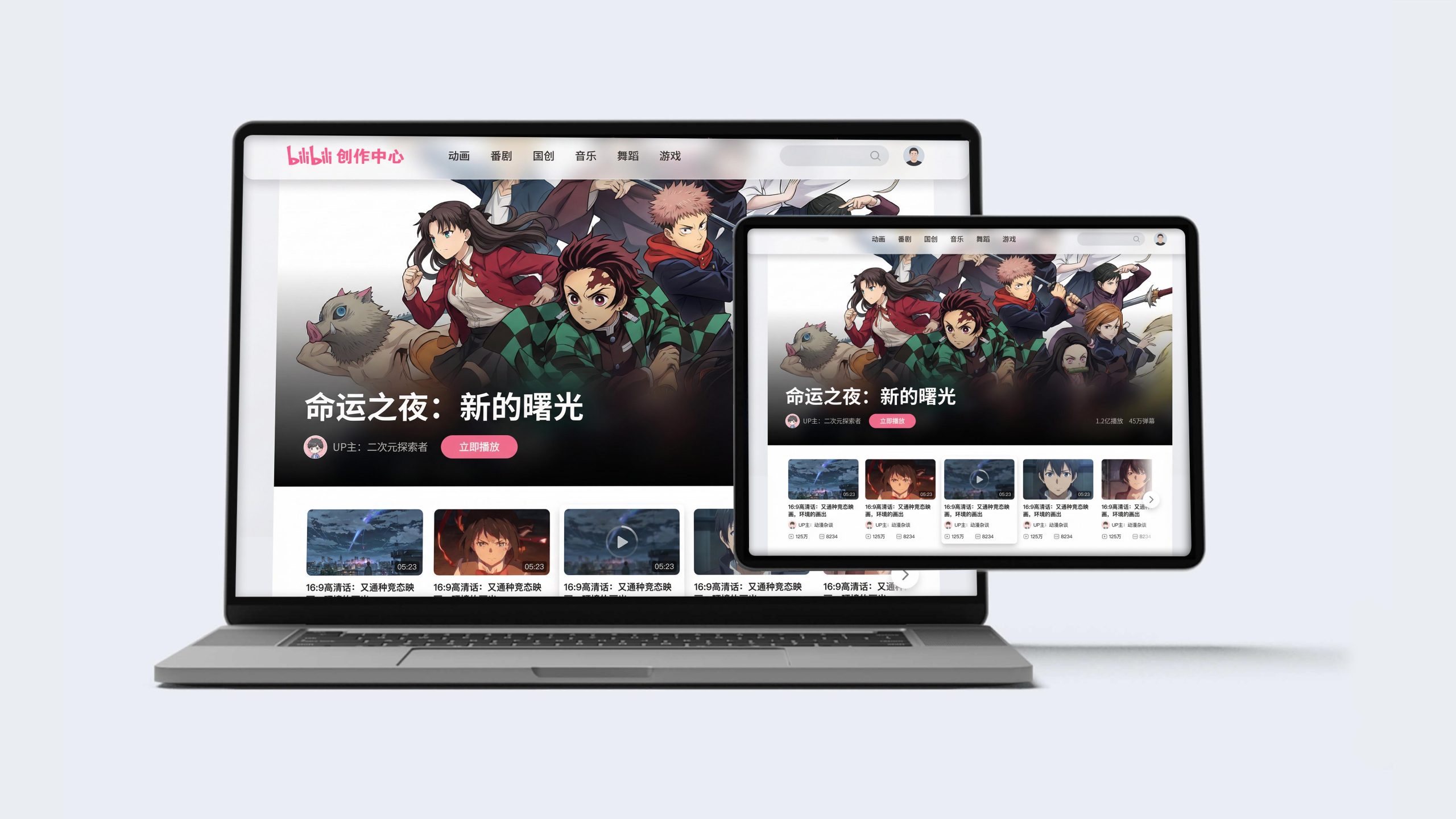
Home page design: The main color is a pure white background and Bilibili pink navigation, reflecting freshness and brand recognition; the top is a carousel of large pictures of Fanju/Guochuang as the visual focus, supplemented by UP main information and play buttons; the navigation uses partition labels such as animation, Fanju, Guochuang, music, dance, and games to convey a vertical content pattern. Content logic: 1. Exclusive drama; 2. Popular submissions; 3. Partial selections; 4. UP main recommendation; 5. Live broadcast area; 6. Creation center.
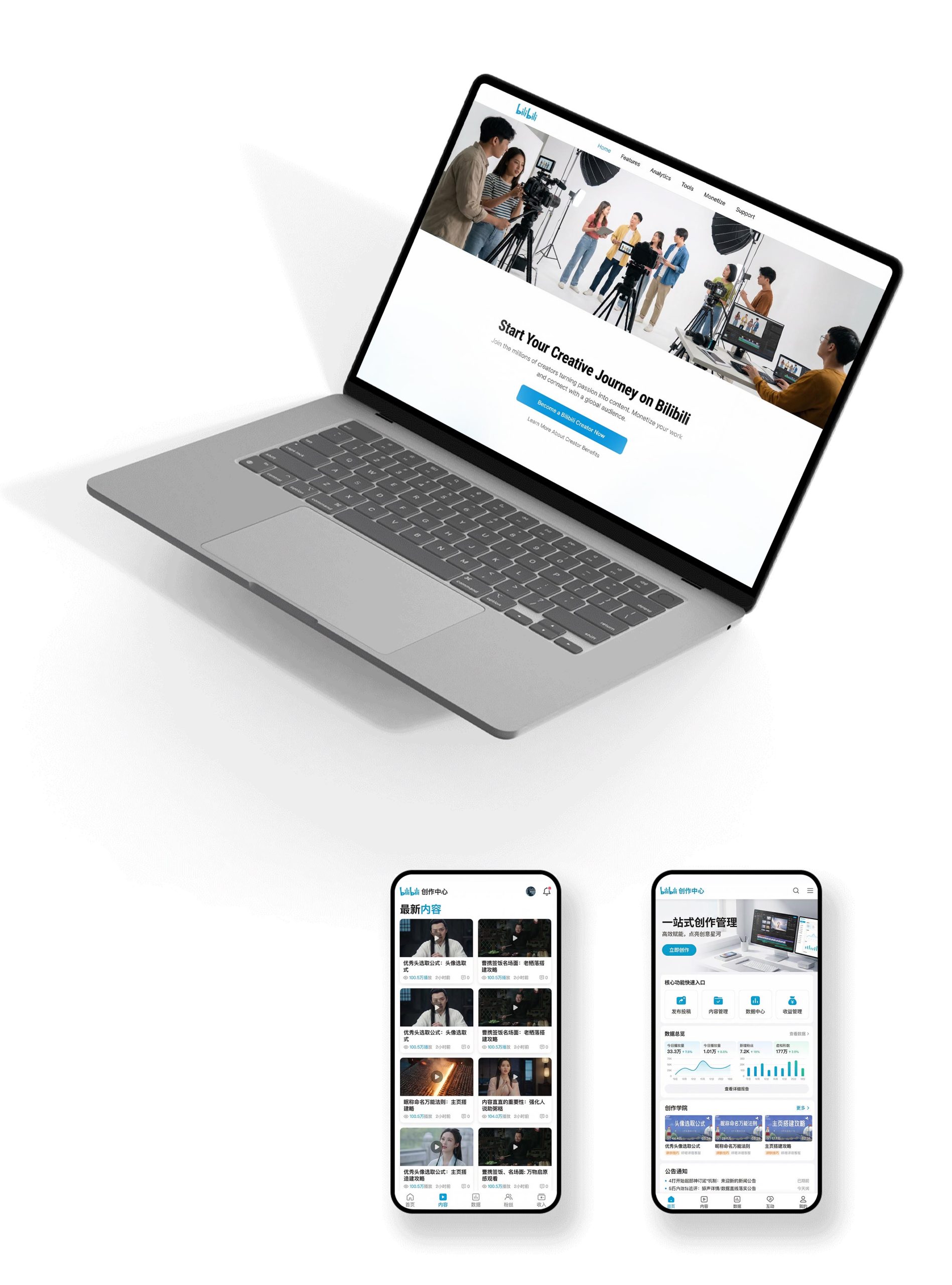
Creation center design: dual-end adaptation structure: the desktop creator backend and mobile management tools are seamlessly connected to form a "creation × data" rhythm; functional design: a one-stop creative management, data report, content release and material center to present a professional tool chain; image language: multi-style display of creator work scenes, data visualization, and content thumbnails to convey professionalism and efficiency; Creation Academy: introduce creation tutorials, traffic support and announcements to express the platform's support for creators. Technology and experience: Adopt real-time data refresh + multi-terminal synchronization + intelligent recommendation; the creator incentive system is visualized to ensure the continuous stimulation of creative enthusiasm. The overall style reflects "the vitality of the community × the professionalism of creation × the smoothness of experience".
Achievements and Impact
As the official visual system of the platform, this design is widely used to reach users and creators on the web, creation center and mobile terminals. Through the integration of community logic × creative narrative × brand order, the design successfully created Bilibili’s visual image that has both circle recognition and mass appeal. The project is considered by the platform to be "one of the most community-friendly and creator-friendly visual systems" and has become the core blueprint for the multi-terminal experience design of Station B.