










Beijing Wantong Three-dimensional City Investment Co., Ltd. was established in April 2009 and is committed to building a comprehensive operating system for sustainable urban development in China - a three-dimensional city.
Under the guidance of industry-led and sustainable development principles, a three-dimensional city uses the most intensive land and optimizes industry first to achieve the most ecological and livable urban life and the most harmonious social relations.
As the founder of three-dimensional cities, Mr. Feng Lun stands in the future and arranges the present, and promotes the research, development and practice of three-dimensional cities with a sense of historical mission and a sense of responsibility of the times.
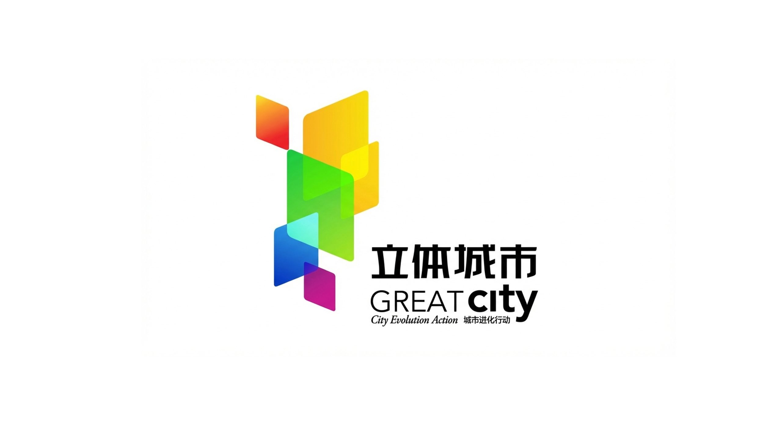
The design goal of the brand logo is to use the sense of vitality, ecology and future urban visual language to show the innovative height of the three-dimensional city as a comprehensive operating system for China's sustainable cities, and to accurately convey its core corporate positioning of "GREAT" - Green, haRmony, Economy, All-round and Technology.
Design concepts and language graphics
The logo takes "three-dimensional spatial fragments" as its core concept and uses colorful geometric color blocks as its main body. Through multi-layer overlapping and transparent gradients, it constructs a conceptual graphic of a three-dimensional information space. The color blocks are staggered and superimposed in the three-dimensional direction, symbolizing the vertical growth and multi-dimensional integration of urban space, and implying "building the most three-dimensional future with the most intensive land". The overall design reflects the dual attributes of the three-dimensional city brand in the fields of new urbanization and sustainable development.
The multi-layered color block structure symbolizes the vertical superposition and intensive use of urban space, suggesting the core concept of a three-dimensional city "growing toward the sky"; the transparent overlapping effect represents the integration and symbiosis of multiple systems such as industry, ecology, residence, and technology; the color blocks extend upward in a slightly tilted dynamic posture, conveying the momentum of urban evolution and future-oriented vitality; the spectrum transition from warm to cold colors reflects the richness and diversity of the urban ecology. The overall composition uses free and orderly geometric fragments to build a "three-dimensional city", conveying the brand's innovative vision and systematic integration capabilities.
Font composition and color system
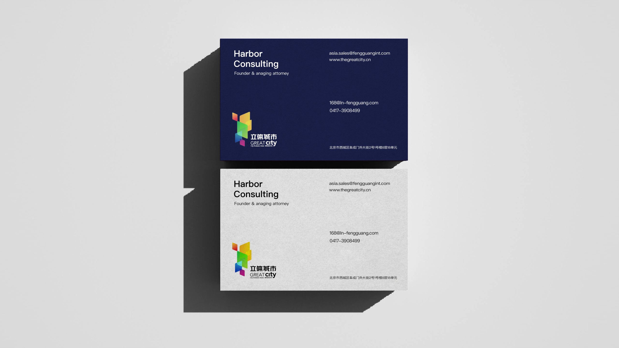
The Chinese "three-dimensional city" uses modern boldface, with square and thick strokes, and a balanced and stable structure, conveying the brand's building strength and strategic determination. In the English "GREAT city", "GREAT" is presented in uppercase sans-serif bold font, emphasizing the core positioning of the brand, while "city" is presented in lowercase light font to differentiate between primary and secondary, creating visual tension and rhythm. The subtitle "City Evolution Action·City Evolution Action" is arranged in fine font below the main title to point out the brand's action plan. A clear hierarchical relationship is formed between Chinese and English to ensure visual consistency and the integrity of brand identity when mixed.
The main color is vibrant orange #F5841F → #F9A825 representing urban vitality, industrial momentum and entrepreneurial spirit; sunshine yellow #FDD835 → #FFEE58 symbolizing a bright future, economic prosperity and livable temperature; ecological green #43A047 → #81C784 embodying the concept of green development, ecological priority and sustainability; sky blue #1E88E5 → #42A5F5 Represents technological innovation, smart cities and international vision; Creative Purple #8E24AA → #CE93D8 symbolizes diversity, tolerance, cultural integration and future imagination; Youth Youth #00BCD4 conveys harmonious livability, humanistic care and fresh life. The overall color system is run through a seven-color spectrum, reflecting the brand temperature of "city is life and life is color". It is different from the cold style of traditional real estate and infrastructure brands and conveys the "people-oriented" value proposition of the three-dimensional city.
Application extension and brand significance
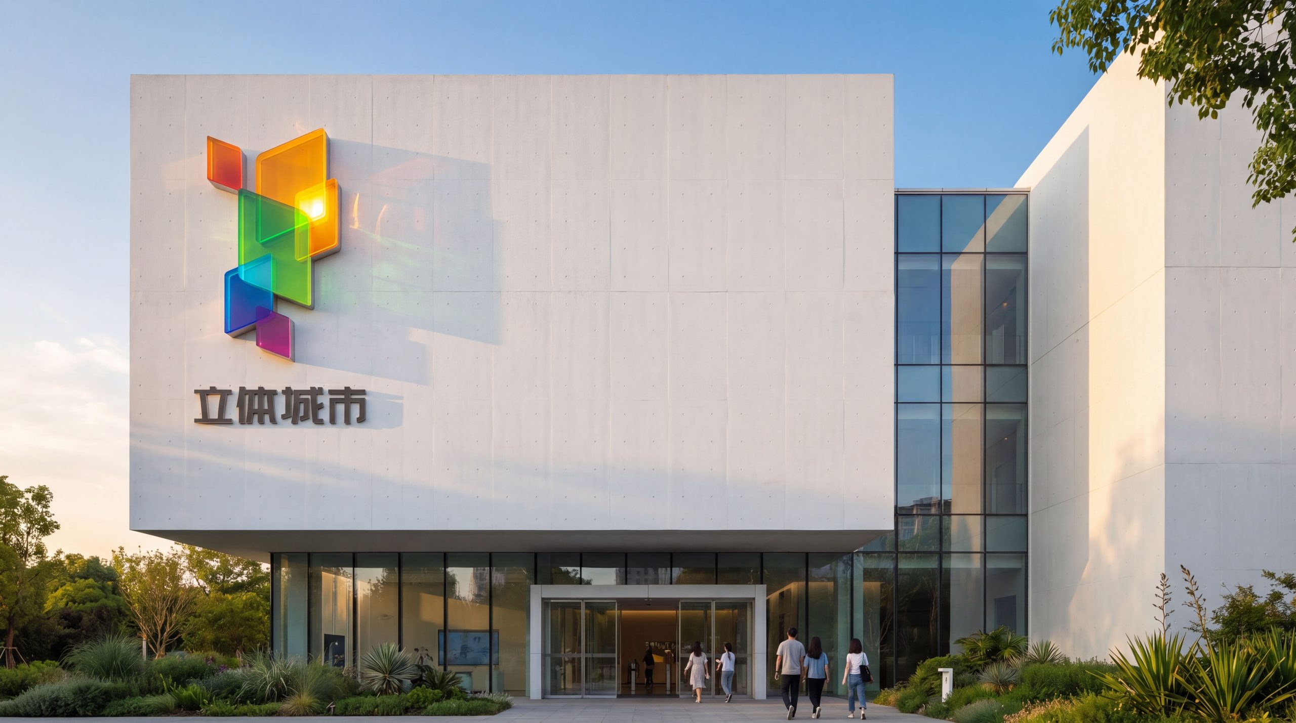
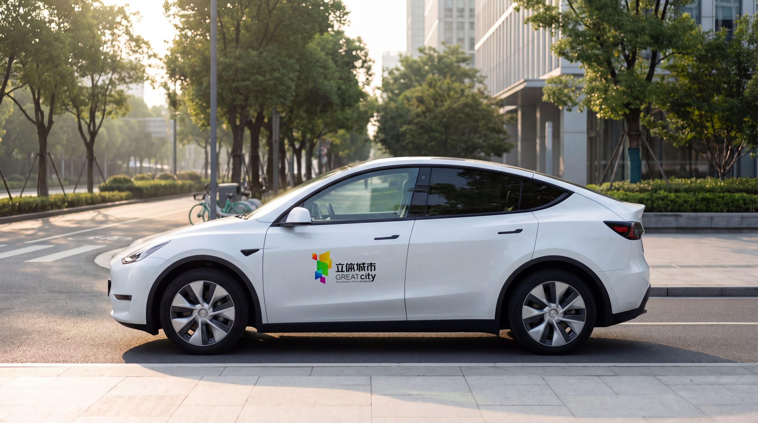
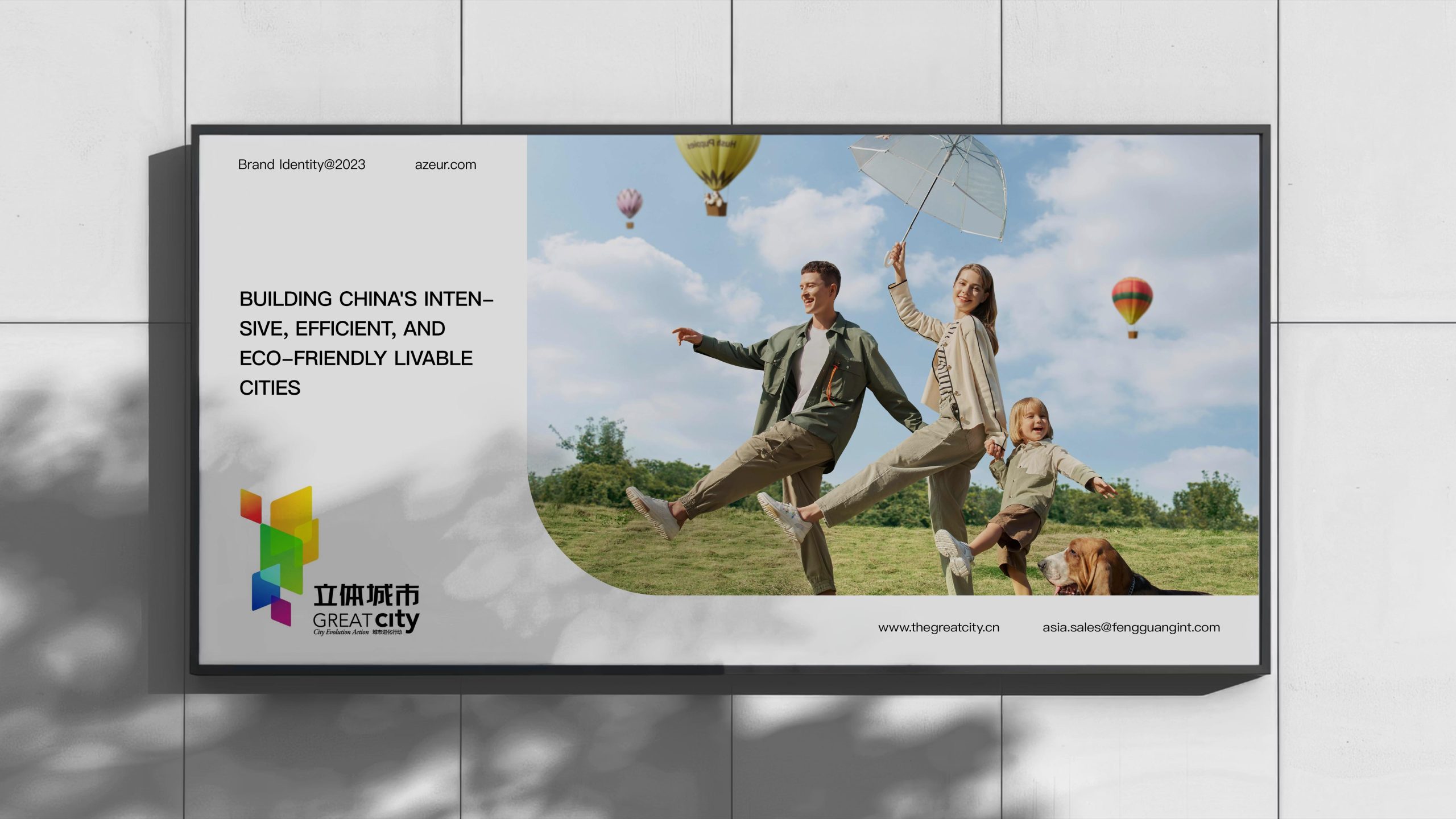
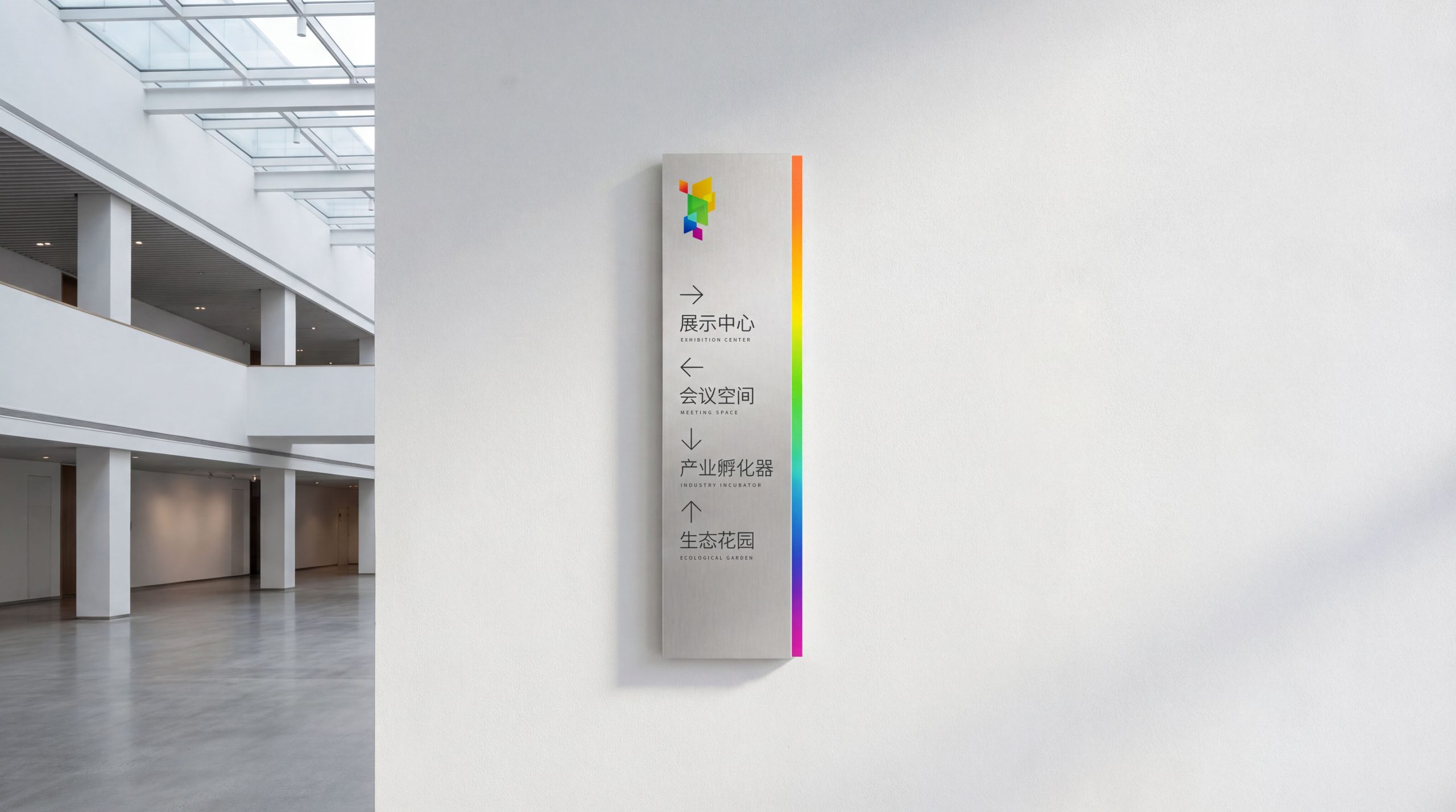
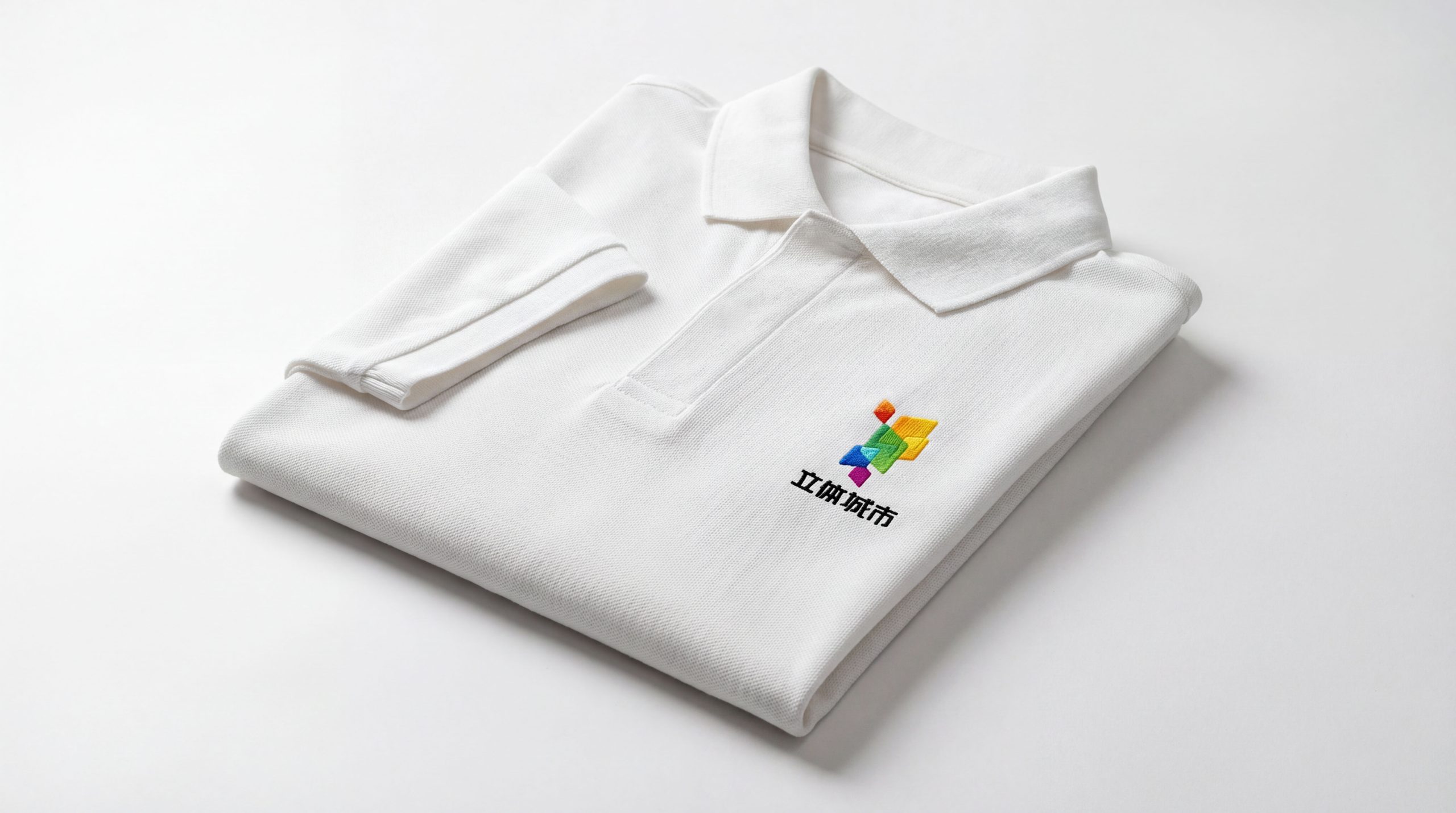
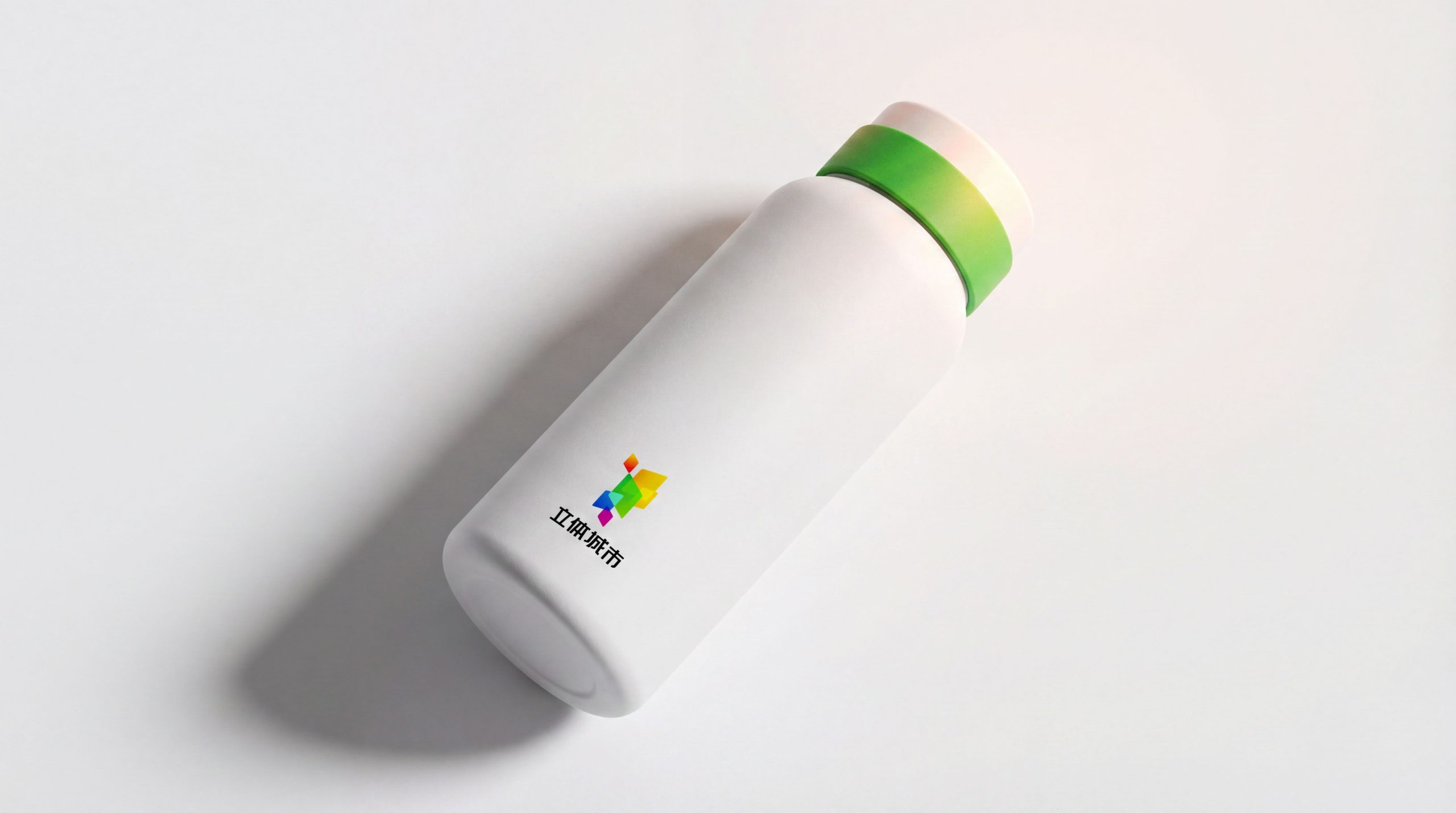
The logo has strong system scalability and can be widely used in three-dimensional urban project display centers, urban planning pavilions, sand tables and model systems, industrial park guidance systems, smart community terminals, property service signs, corporate press conferences, industry forums, international city summit images, as well as government reporting documents, urban white papers, sustainability report covers and other scenes. In the dynamic vision, color blocks can grow and overlap layer by layer, symbolizing the evolution of the city from blueprint to reality. Graphic fragments can be extended into visual parent elements for animation interpretation, data charts, spatial guidance and digital platform interface systems.
The logo contains the five core images of a three-dimensional city brand (GREAT): Green - the green color blocks represent sustainable development and ecological priority; haRmony - the transparent blend of color blocks symbolizes the harmonious symbiosis of social relations; Economy - the intensively superimposed spatial structure implies an efficient economic model; All-round - the colorful multi-layers symbolize the full-dimensional coverage of urban functions; Technology - the three-dimensional space constitutes the technological core that conveys the smart city. The overall design conveys the brand vision of a three-dimensional city that "stands in the future, arranges the present, and uses the most intensive land to build the best urban life."
Improper Usage (Protection Specification)
Do not change the number, angle or overlay sequence of color blocks; do not modify the hue or gradient direction of each color block; do not add shadows, strokes, outer glow or texture effects; do not rotate, mirror or extract part of the color blocks separately; keep the white space around the logo not less than 25% of the height of the graphic; the minimum display width shall not be less than 30mm.
design results
After the release of the logo, the brand recognition of Three-dimensional City in the field of urban development and sustainable construction has been significantly improved. "Colorful space fragments + three-dimensional superposition composition" has become the core visual identity symbol of its urban evolution actions. It has been widely used in industry forums, government reports and international city summits, showing the brand vision of "intensive land, three-dimensional future".