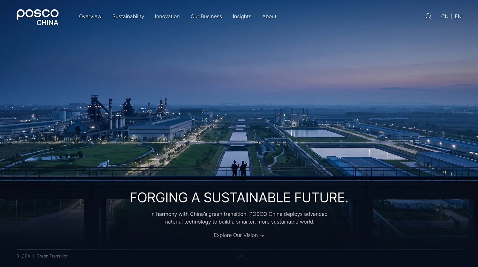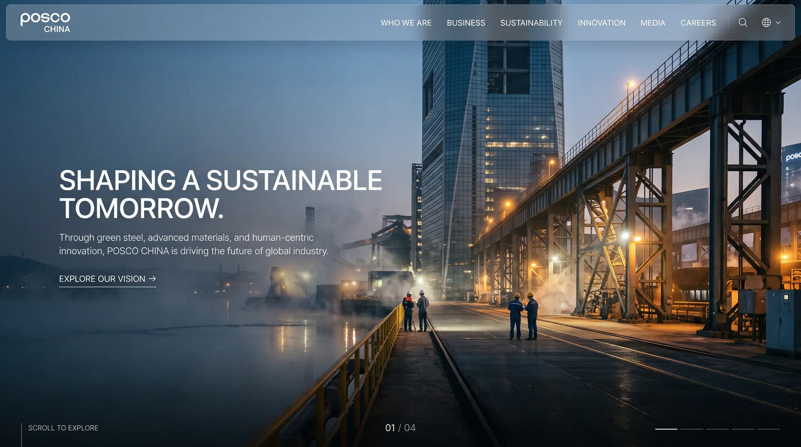
Posco Group (POSCO) is the world's leading steel manufacturing company and ranks among the world's top 500 companies. It takes the stainless steel industry as its core business and its business covers dozens of countries and regions around the world.
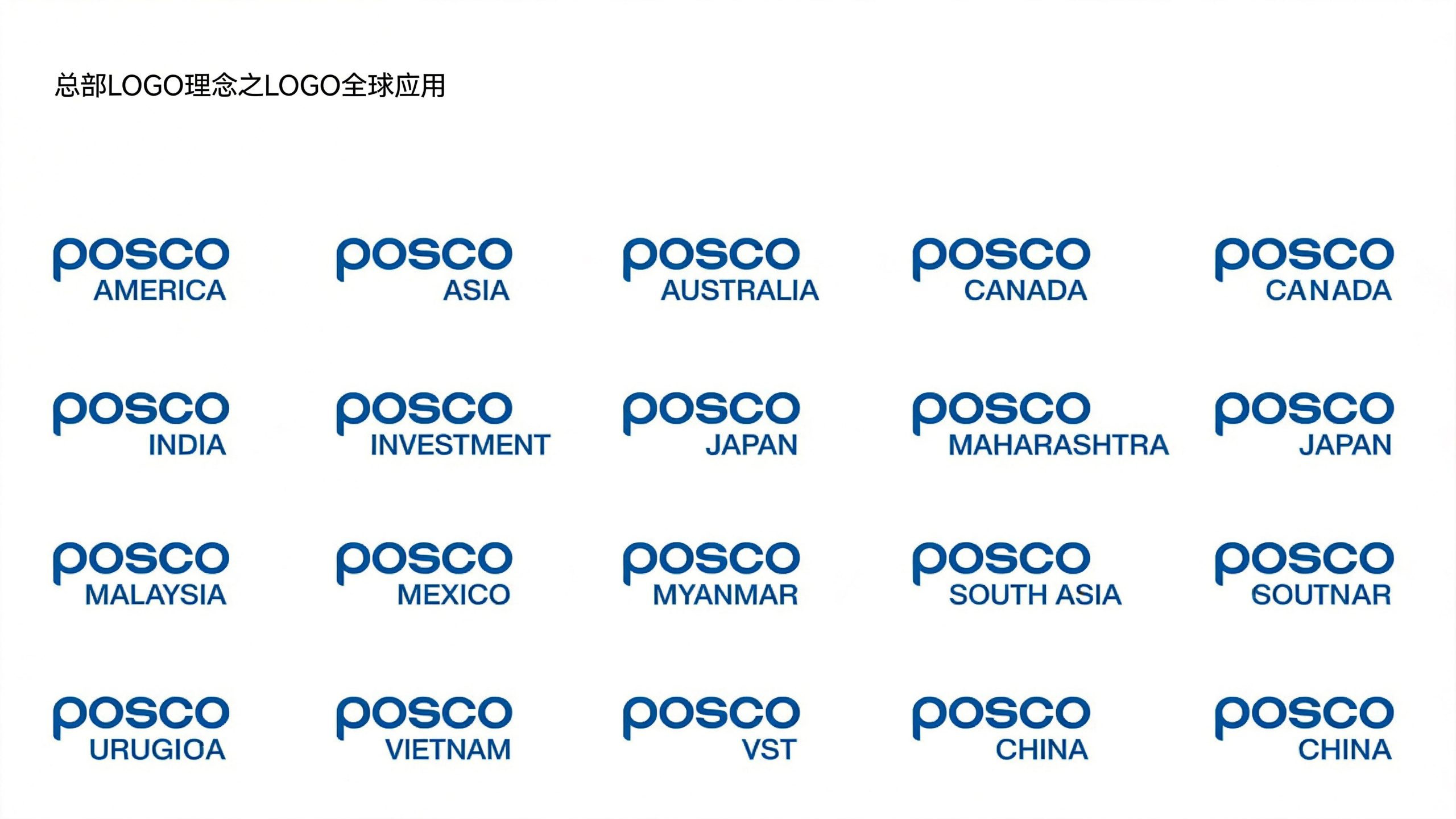
POSCO CHINA, as the strategic entity of Posco Group in the Chinese market, carries the important mission of deeply exploring the Chinese market, promoting industrial cooperation and brand localization. As a top Fortune 500 company in the world, Posco's logo needs to be easy to quickly apply to various subsidiaries and market segments. This logo design strives to be simple.
The design goal of the brand logo is to demonstrate Posco Group's industry status and brand structure as the world's top steel company through minimalist style, industrial texture and international visual language, and to convey the brand concept of "simplicity is strength, quality is trust"
Design concepts and language graphics
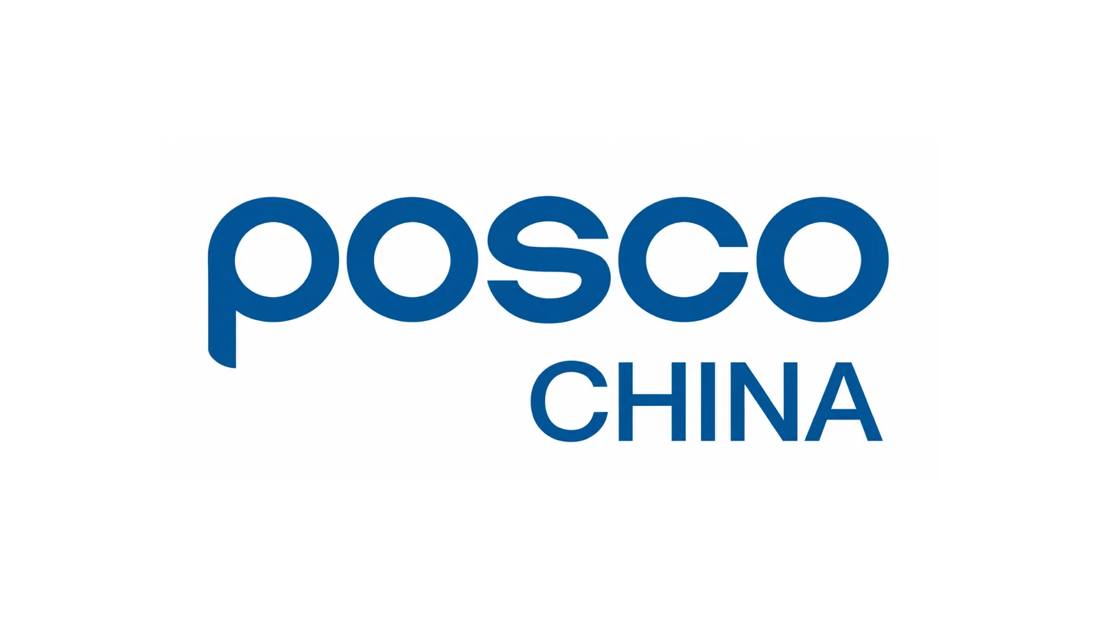
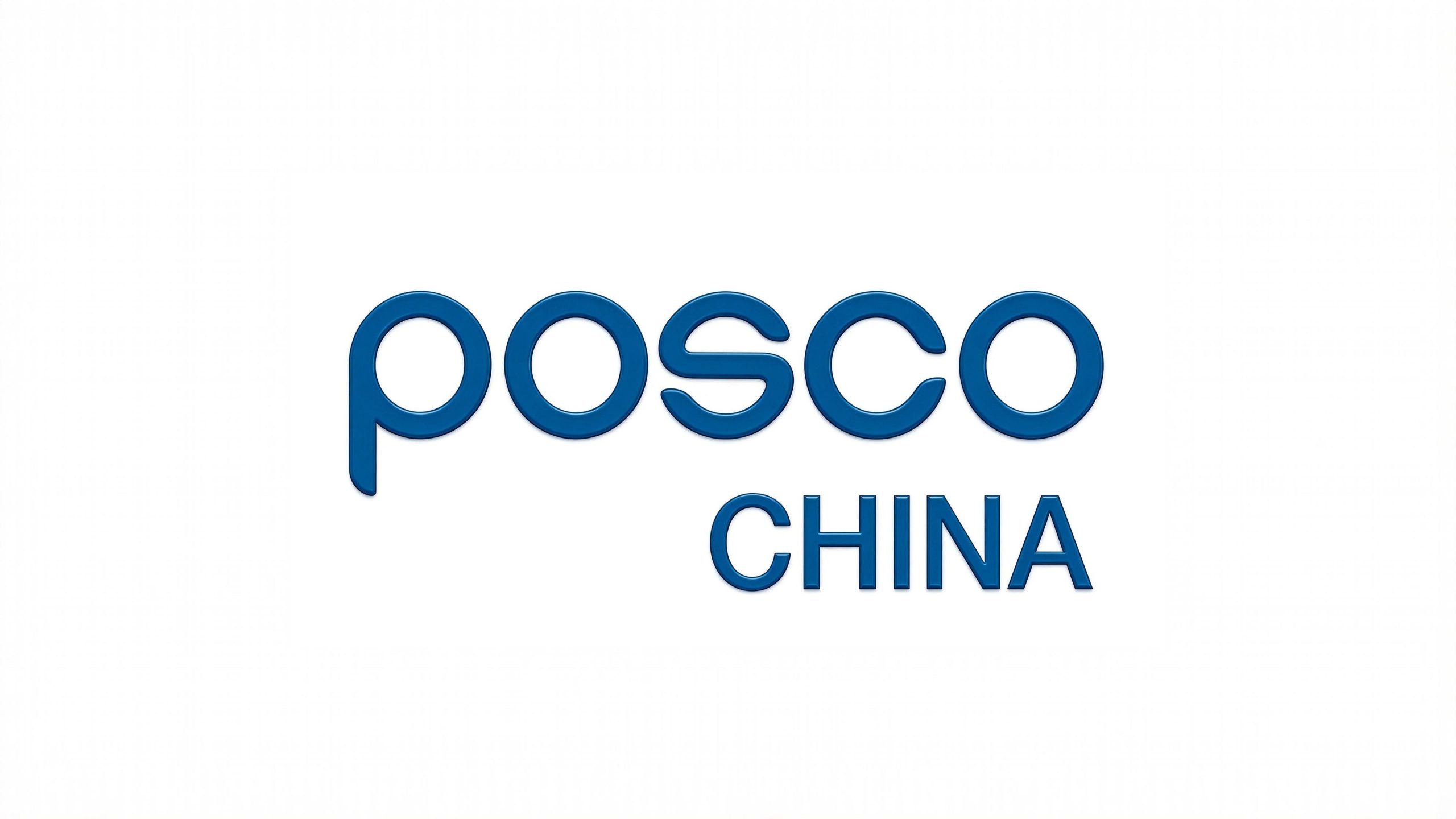
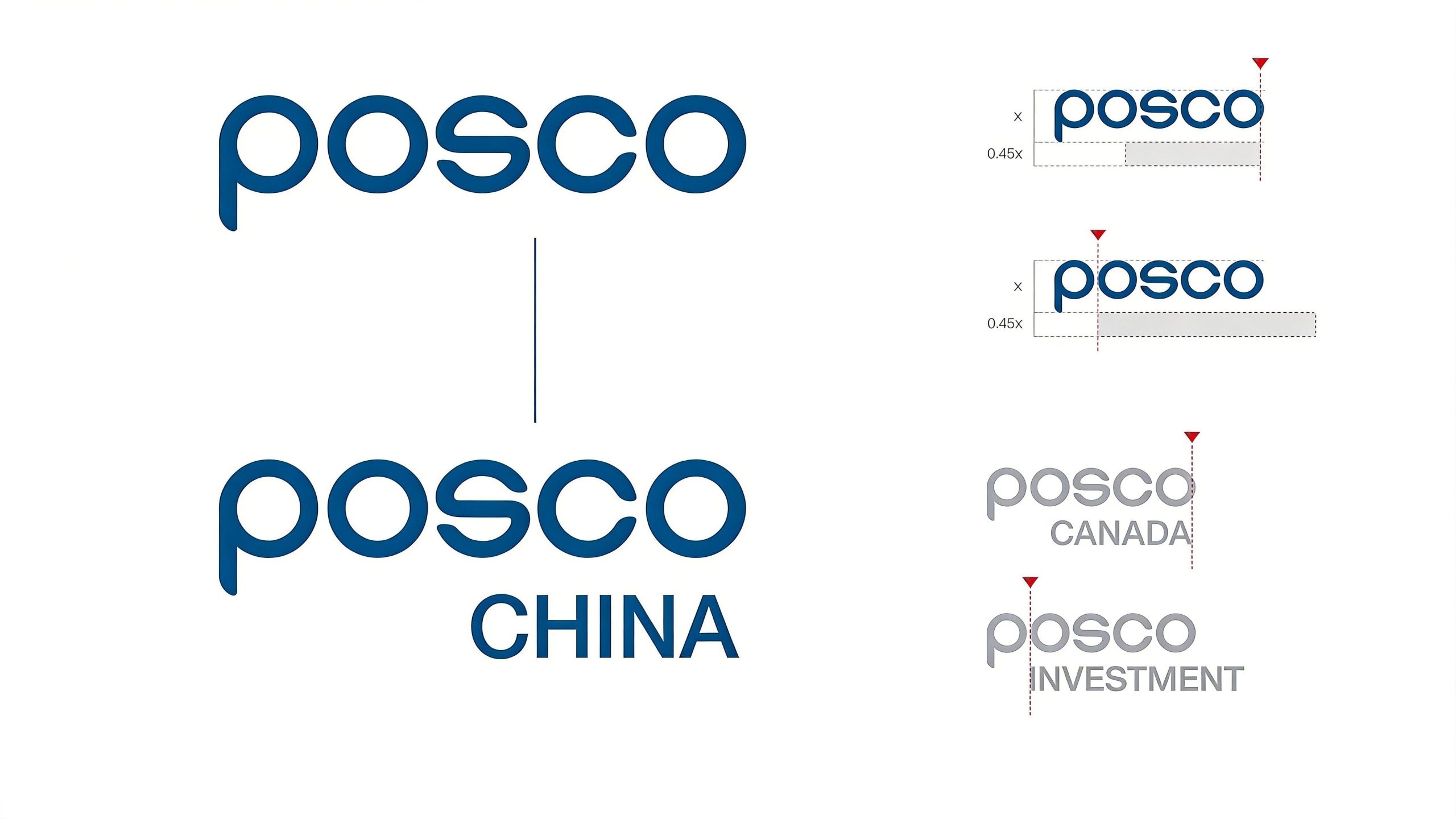
The logo uses "Stainless Steel Round Bar" as the core concept, and uses rounded lines of uniform thickness to form the five letters of Posco's name "POSCO". Each stroke simulates the cross-sectional shape of a stainless steel round bar - smooth, round and uniform. It is not only a component of letters, but also an intuitive metaphor for Pohang's core industry, implying "the quality of steel to create the shape of the brand". The overall design carries the maximum amount of brand information with the minimum visual elements, reflecting the dual attributes of the Posco brand in the global industrial and international markets.
The round line structure symbolizes the smooth quality and industrial precision of stainless steel materials, and the connection between each arc and straight line reflects the toughness and strength of the material itself; the letter "O" is presented as a complete circle, like the cross section of a stainless steel pipe, becoming the most industrially recognizable symbol in the logo; the spacing between letters is even and wide, conveying a sense of order and the breathing rhythm of international design; the whole is free of unnecessary decoration, clean and neat, reflecting the core principle of "less is more" in the minimalist design philosophy. The overall composition uses restrained and precise geometric lines to construct the "steel word mark", conveying the brand's global pattern and industrial confidence.
Font composition and color system
The "POSCO" word mark adopts a customized round sans-serif font, with strokes running through equal-thickness circular bars, and arc transitions at the corners instead of sharp corners. The font is full and the structure is open. It not only has the physical texture of industrial materials, but also demonstrates the international standard of modern font design. "CHINA" is arranged below "POSCO" in a classic uppercase sans-serif font. The font is slightly narrower and the strokes are straight. It forms a thickness contrast and primary and secondary hierarchy with the main title, highlighting the brand's Chinese market positioning. The overall font system establishes a clear brand identity hierarchy in minimalism, ensuring high recognition in various sizes and application scenarios.
The main color Pohang Blue #005386 is the only color used in the logo, representing industrial depth, technological rationality and global trust. The calmness and restraint of blue are in line with the quality temperament of the steel industry, while conveying the international image of a multinational enterprise; pure white #FFFFFF is used as the standard background color to ensure the clarity and visual tension of the logo on various media; dark gray #333333 is used as the auxiliary color for subtitles and extended text to maintain the layering and unity of the brand system. The overall color system is absolutely dominated by monochrome, reflecting the restraint and grandeur of a "Fortune 500 company". It is different from the multi-color consumer brand style and conveys Pohang's brand proposition of "establishing itself with quality and achieving success with simplicity".
Application extension and brand significance
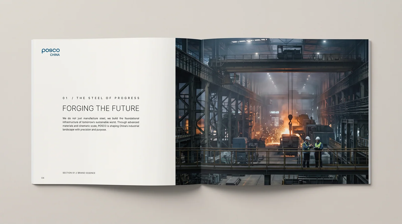
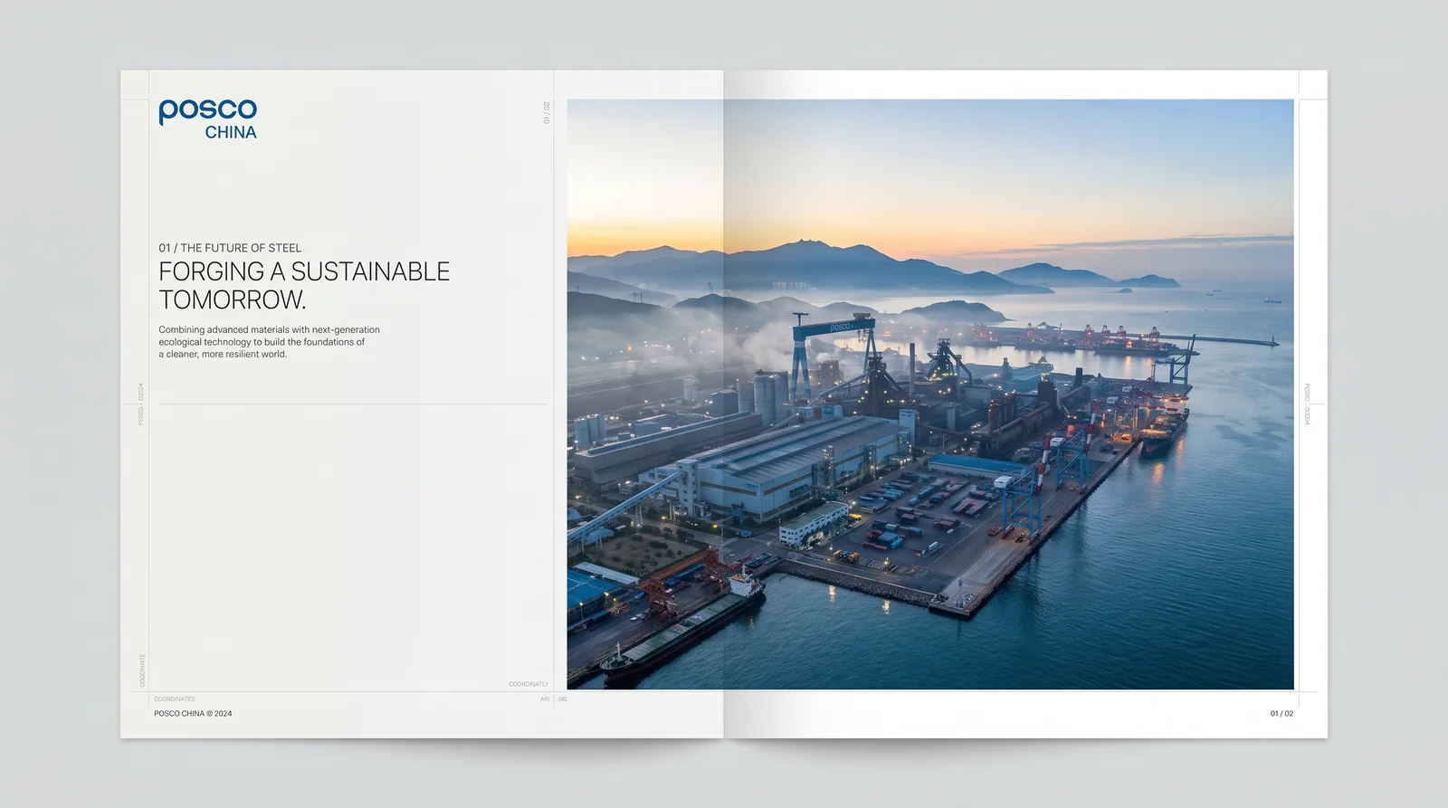
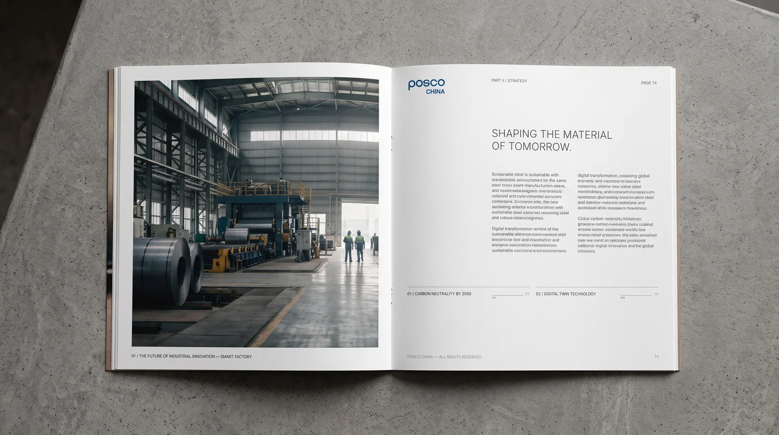
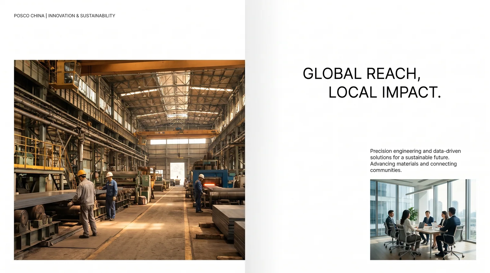
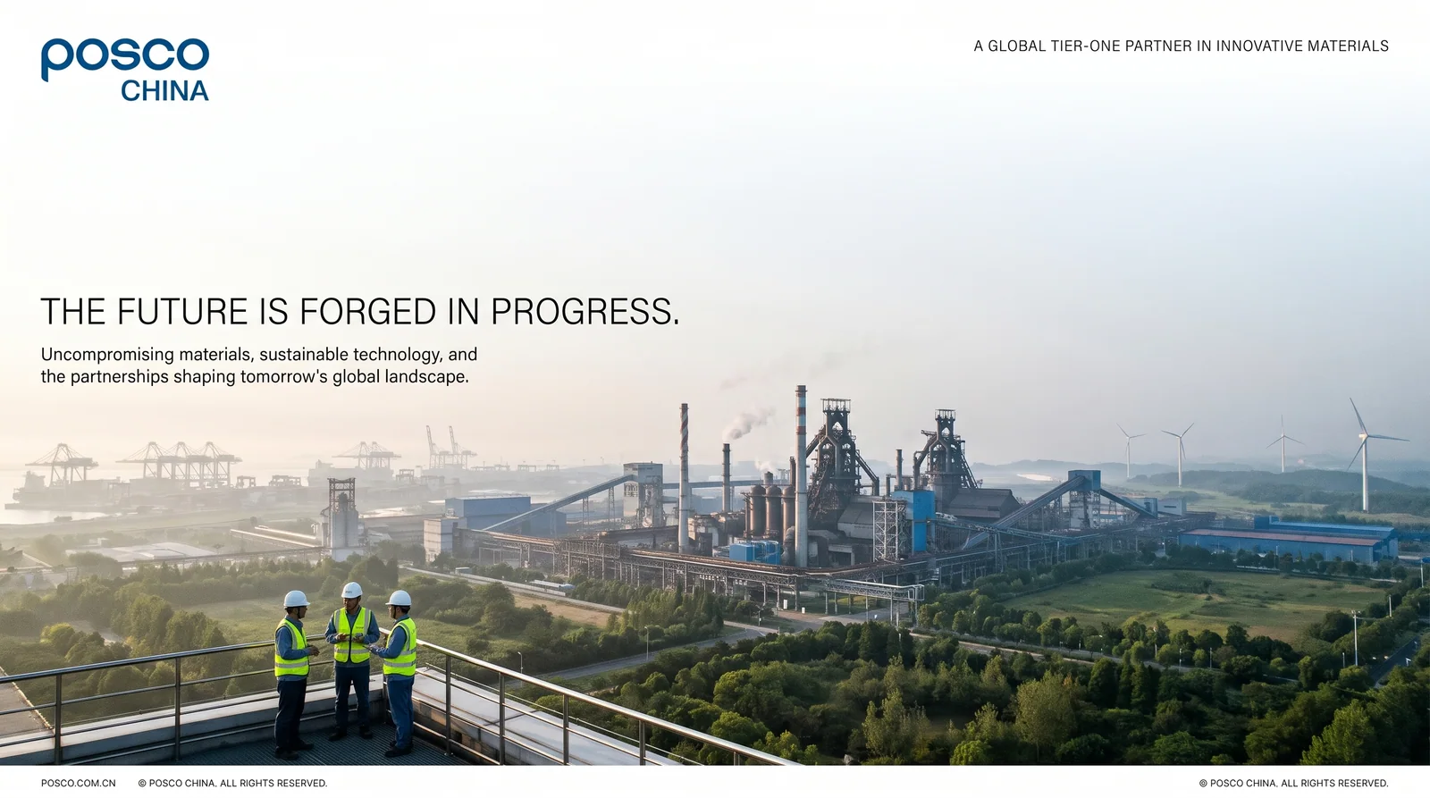
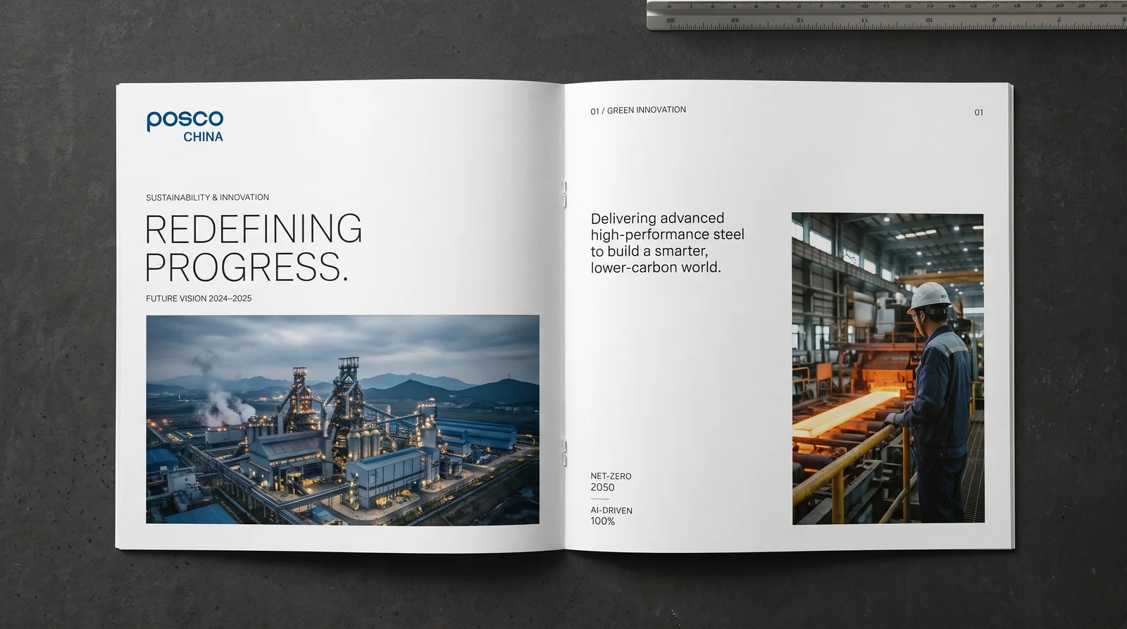
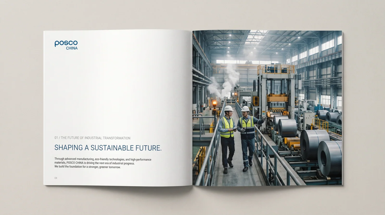
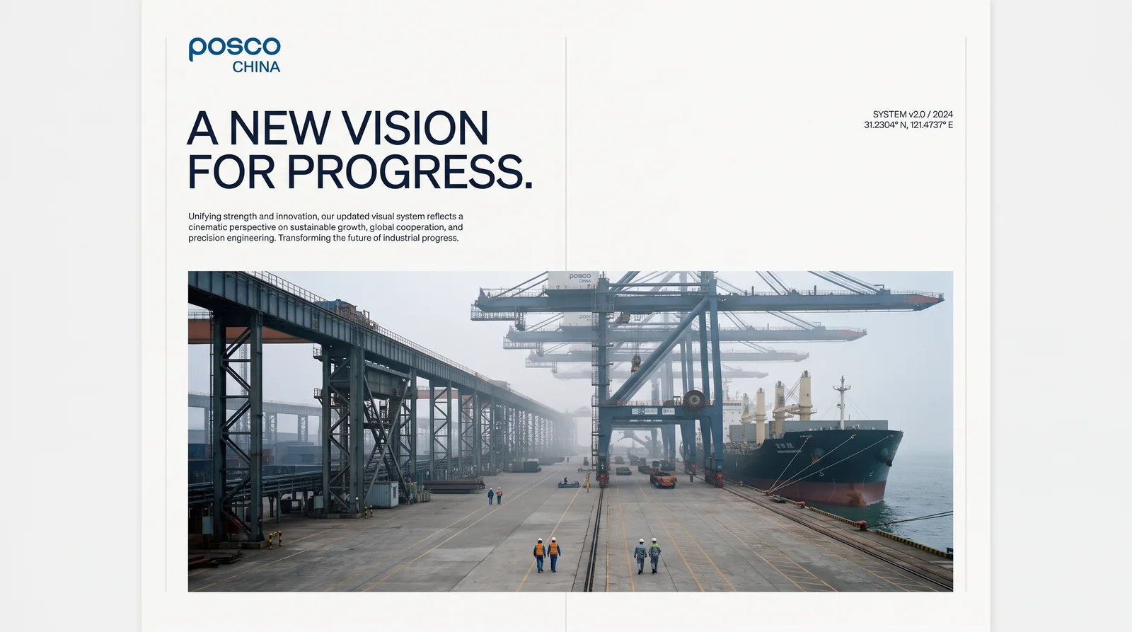
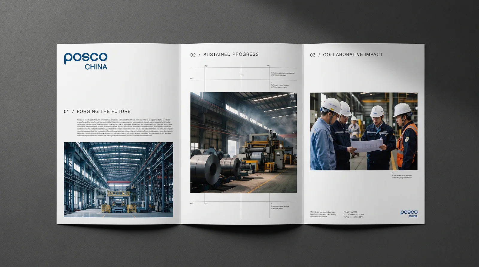
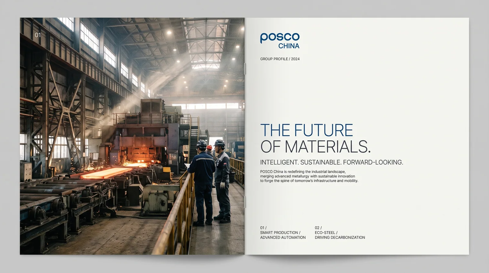
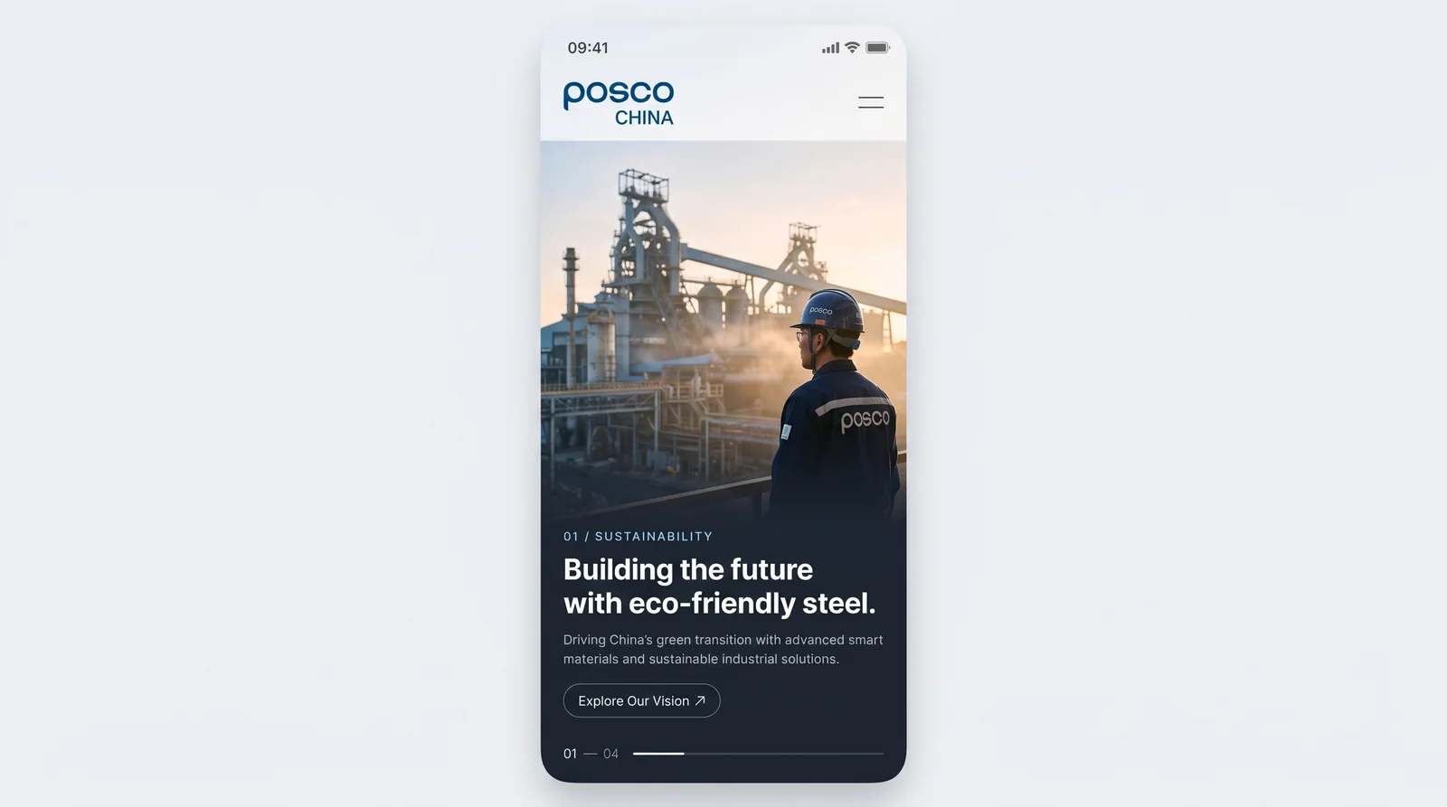
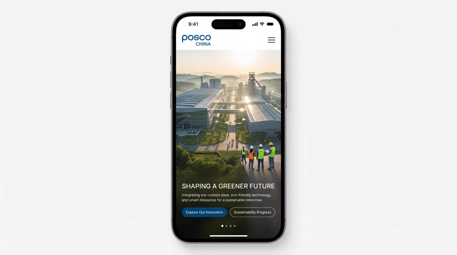
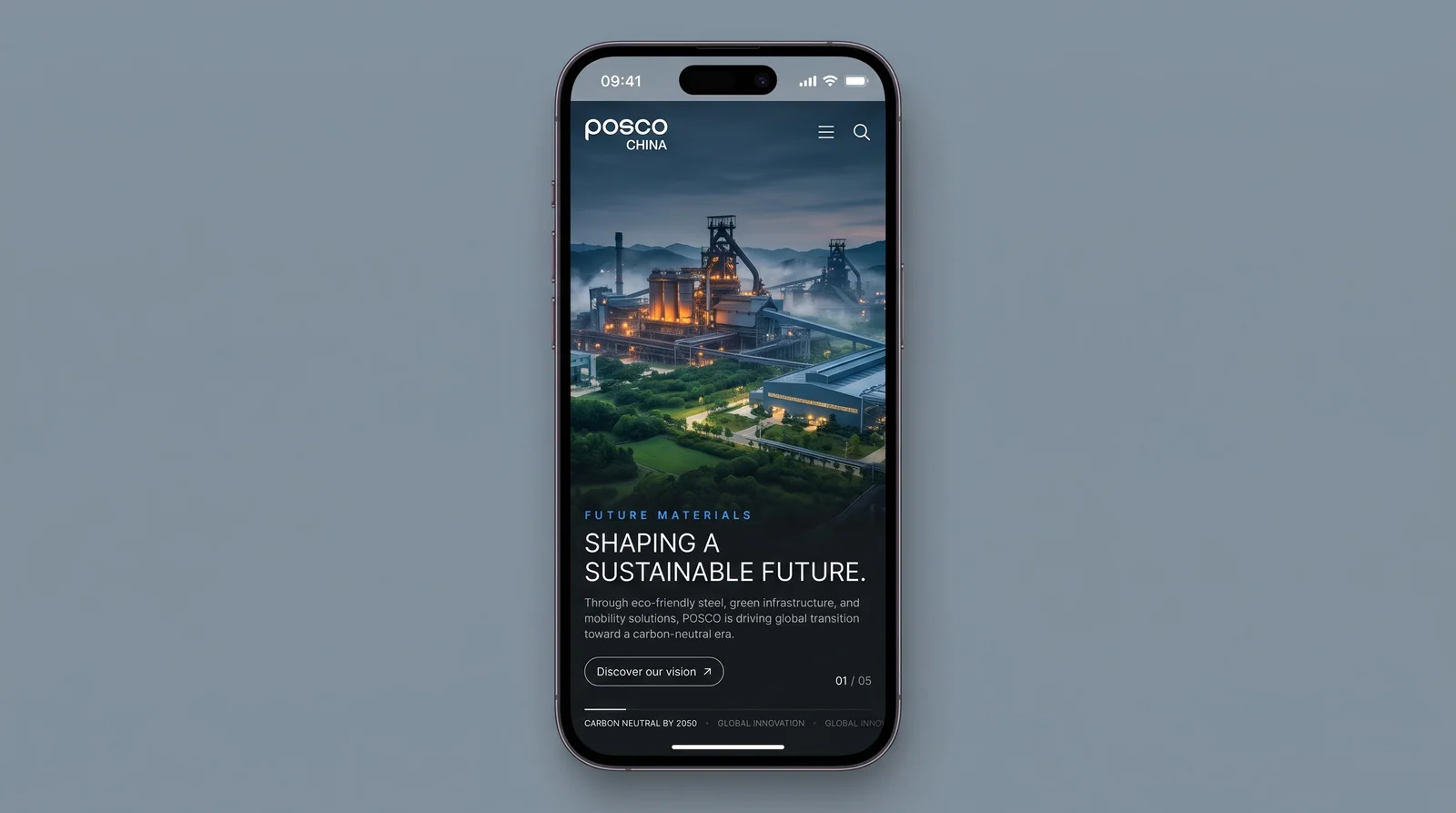
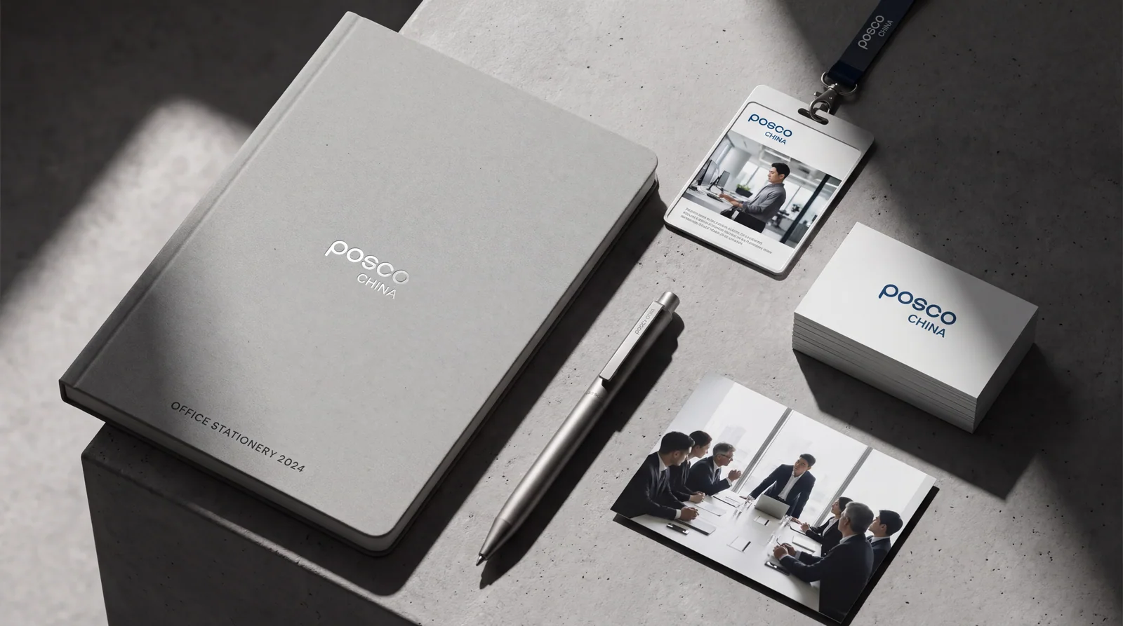
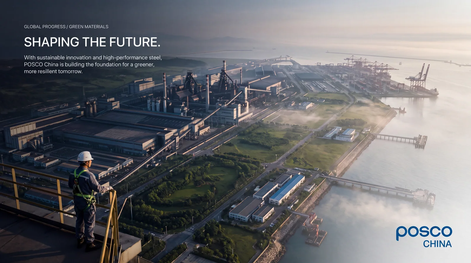
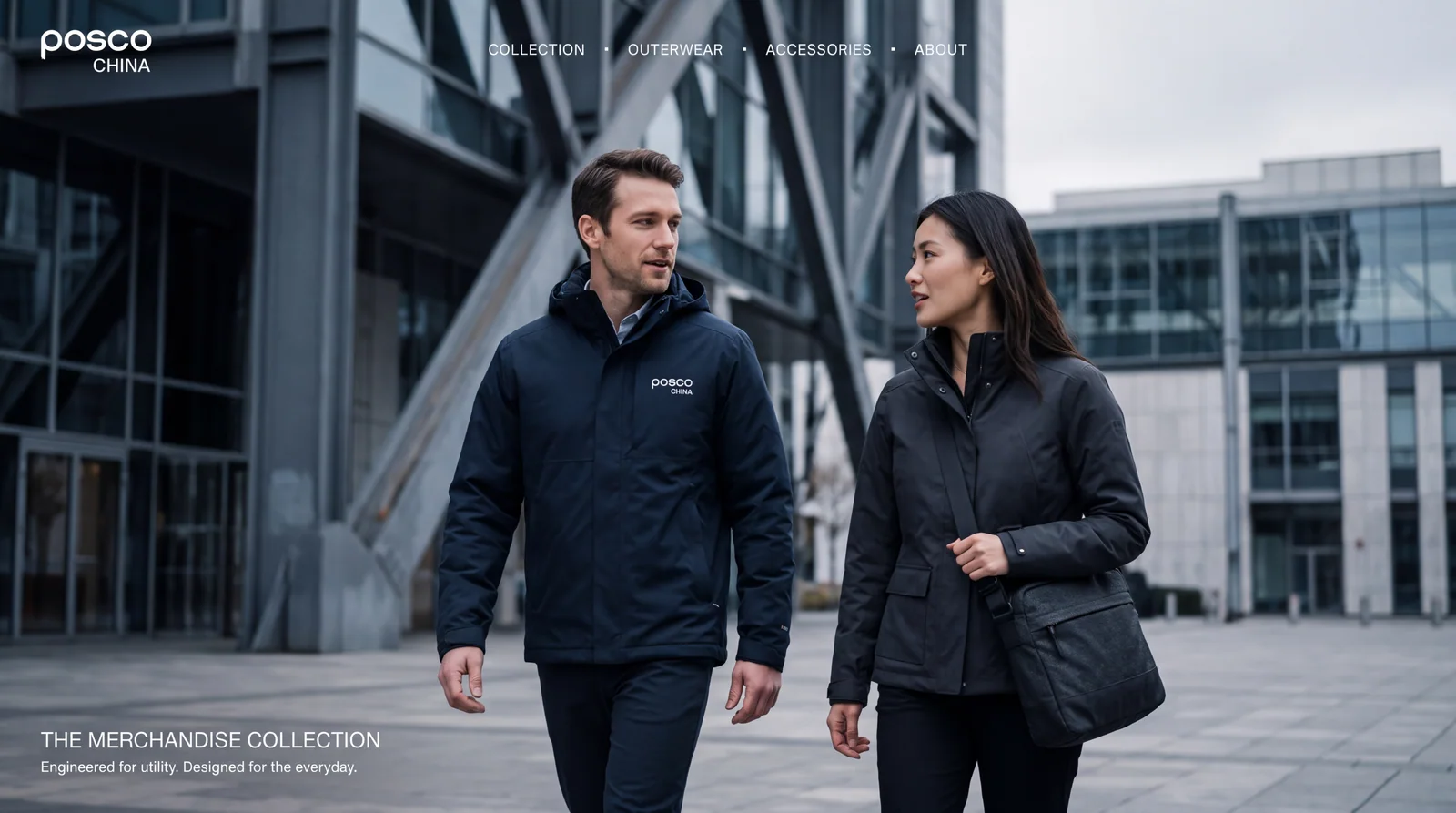
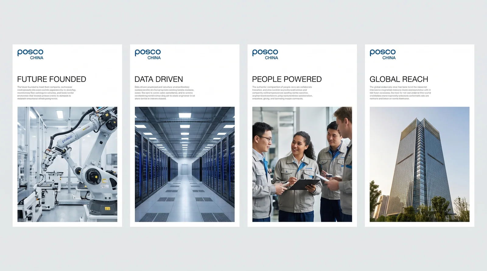
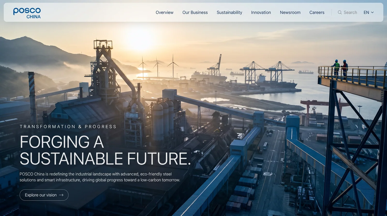
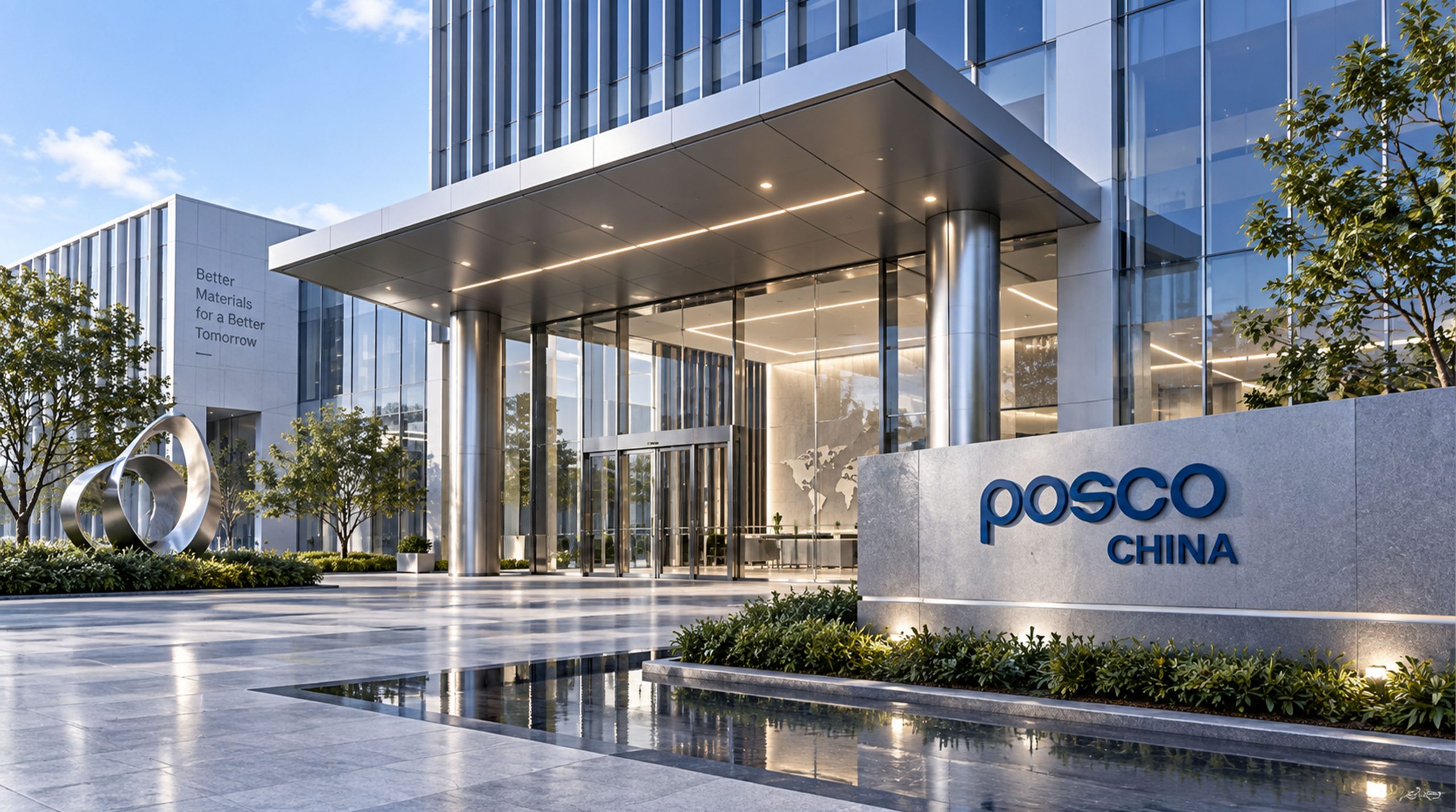
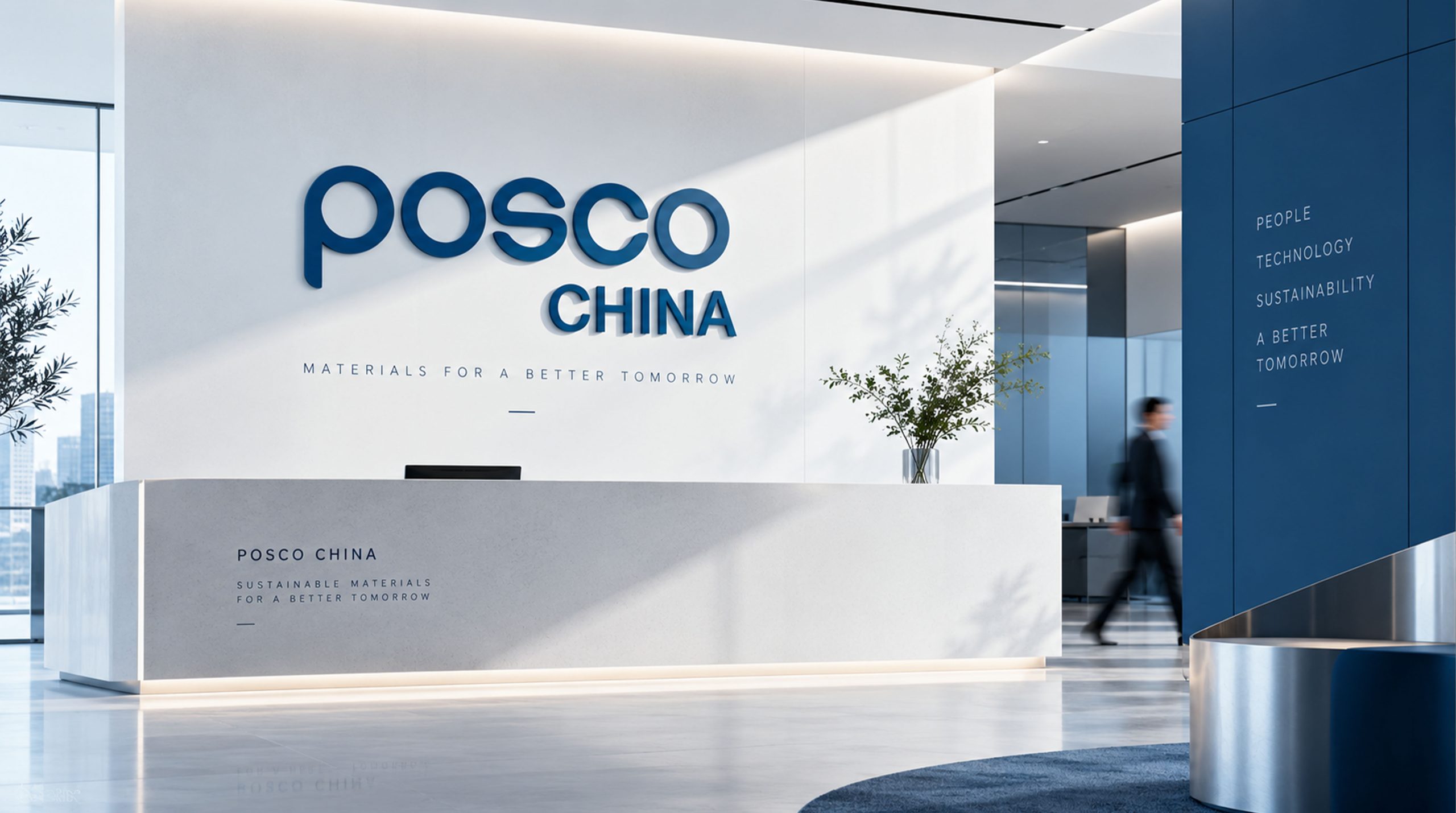
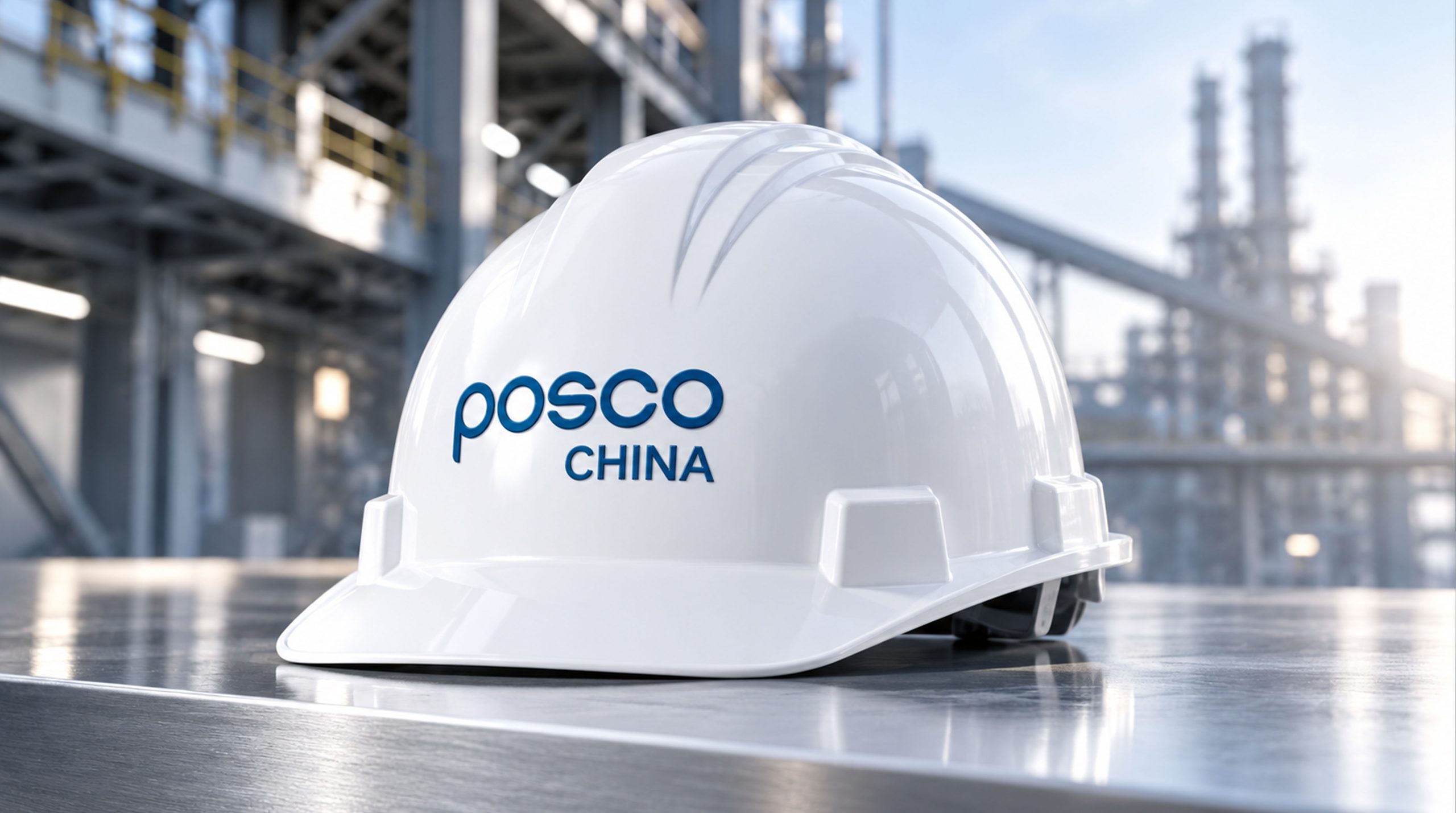
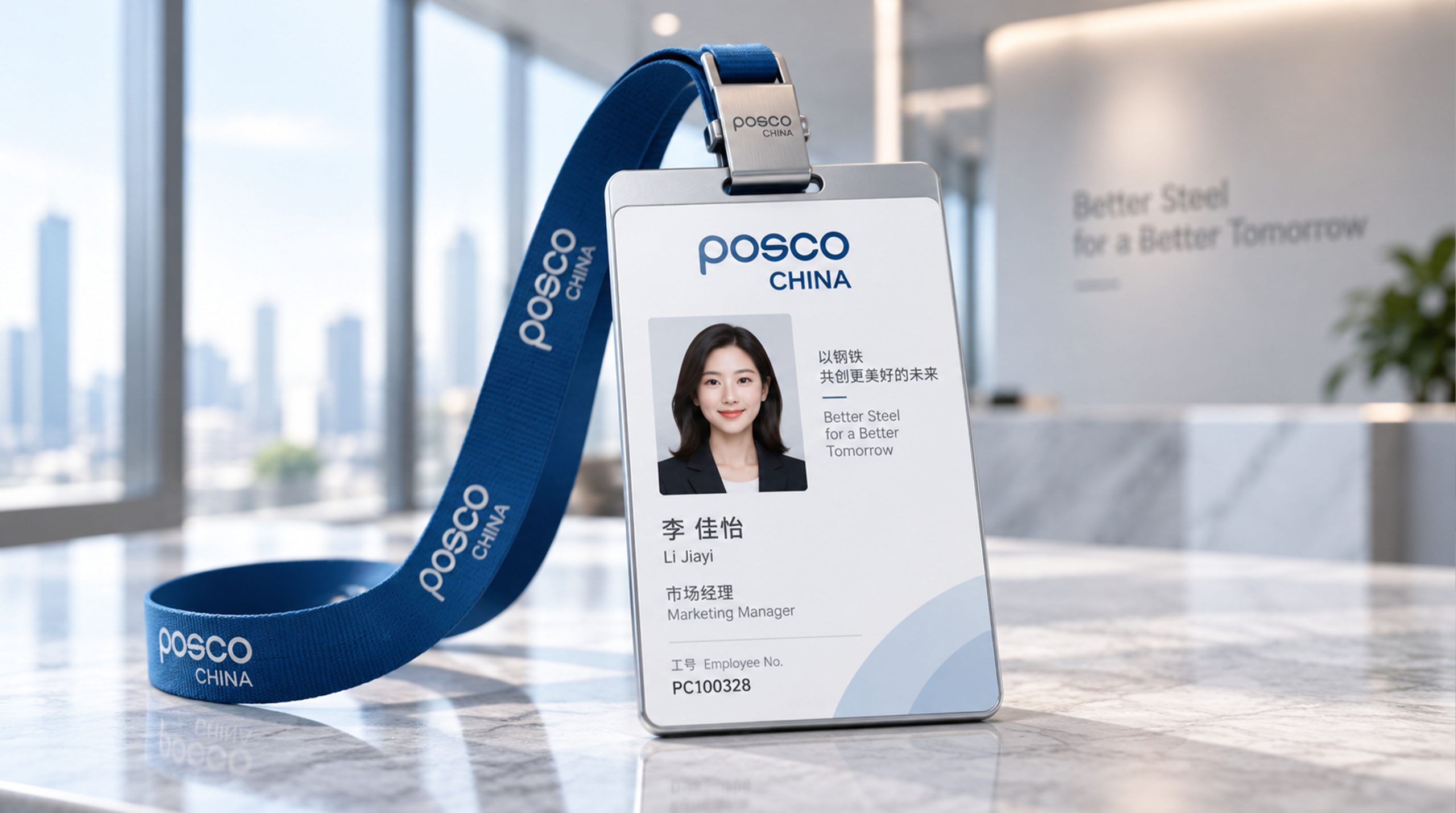
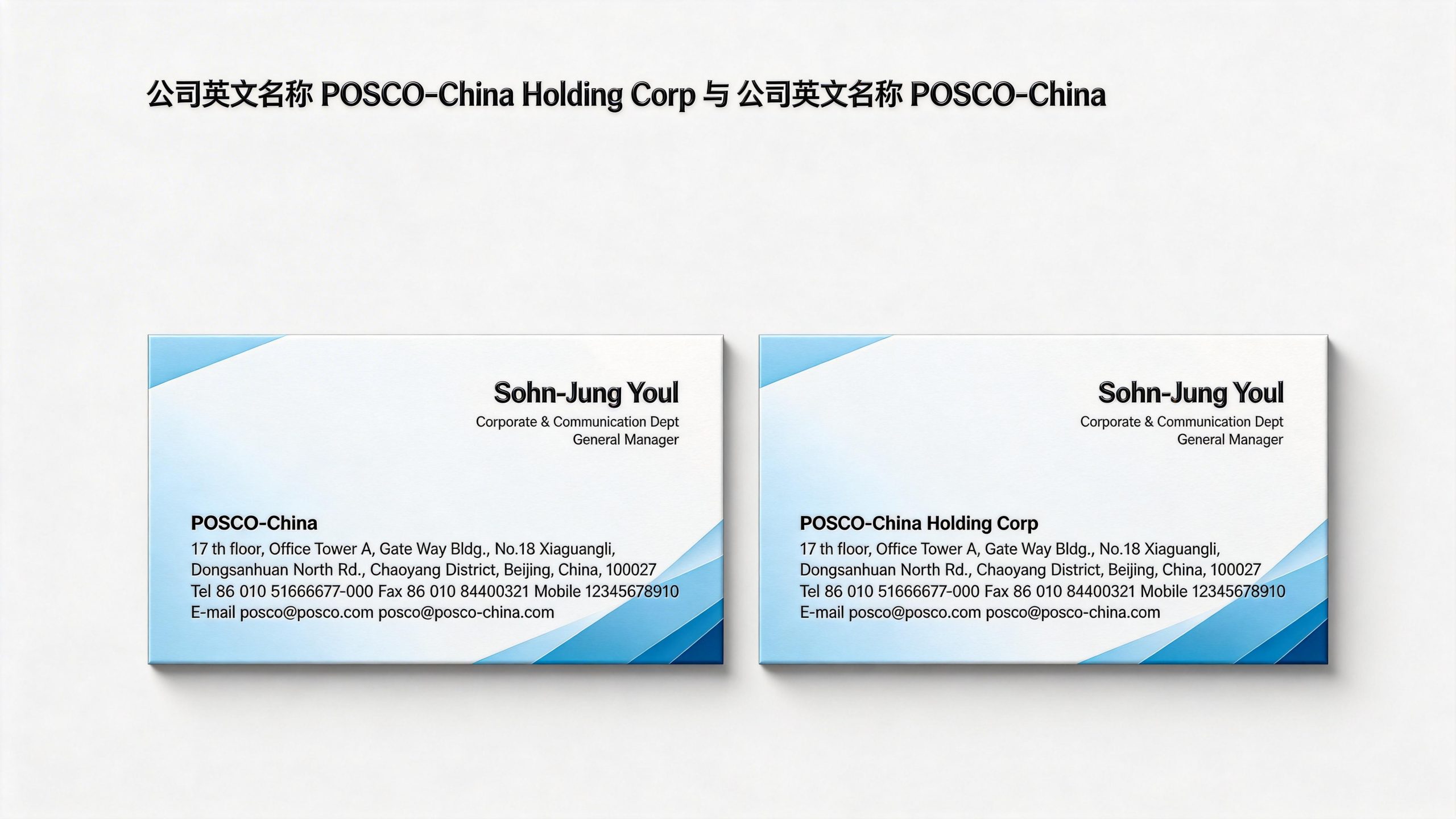
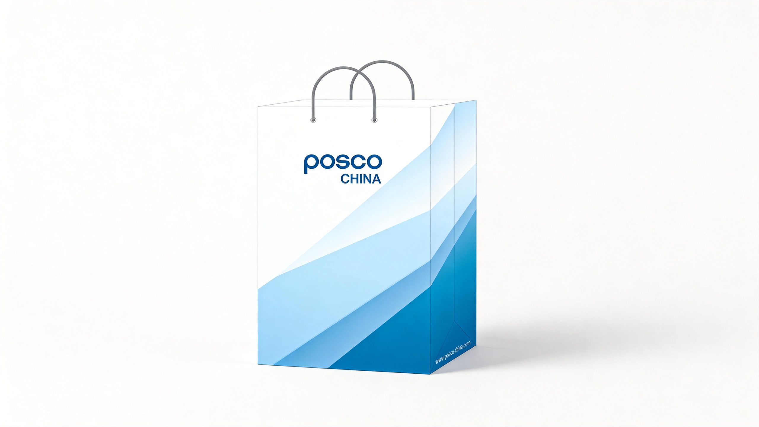
**Application extension and brand significance** The logo has strong system scalability and rapid deployment capabilities, and can be widely used in the unified brand identification system of Posco Group's subsidiaries and market segments; steel product labels, factory certificates, technical documents and packaging markings; group headquarters buildings, factory facades, workshop guidance and safety signage systems; business cards, corporate brochures, annual report covers and investor relations materials; international steel exhibitions, industry summits, government cooperation projects and transnational business negotiation images. In the dynamic vision, the letters can be formed one by one through the bending animation of stainless steel round bars, symbolizing the industrial manufacturing process from raw materials to finished products. The circle bar element can be extended into a visual parent element and used for chart lines, data visualization, dividing lines and brand pattern systems.
The logo contains the three core images of the Posco brand: Industrial Essence - the stainless steel round bars directly map the core industry and build the brand symbol with the language of materials; Minimal Power - the minimum visual elements carry the strongest brand identity and reflect the strategic determination of the Fortune 500 companies; Global Adaptability - the highly simple wordmark system ensures the rapid application and consistent presentation of the brand in various markets and subsidiaries around the world. The overall design conveys Posco's brand vision of "creating global trust with steel quality".
design results
After the release of the logo, POSCO CHINA's brand unity in the Chinese market and the global steel industry has been significantly enhanced. The "stainless steel round bar mark", with its minimalist and powerful visual language, has become the core identification symbol of Posco Group's brand system. It was quickly deployed to various subsidiaries and market segments, and received unanimous approval from Posco Group leaders. The logo is widely used in international steel exhibitions, cross-border business cooperation and group brand systems, showing the brand vision of "minimalist quality, global trust".