











China Daily (CHINA DAILY) was founded in 1981. It is China's most influential national English-language newspaper and shoulders the important mission of "telling China's stories to the world." As China's core media platform for external communication, China Daily has established extensive brand recognition and professional trust among readers around the world with its authoritative, objective and in-depth news reports.
Facing the strategic needs of media integration and international development in the new era, the brand decided to revise and upgrade the original logo, and at the same time carry out unified design and packaging of corporate gifts. This time, Qingmei Future was commissioned to lead the brand logo revision and overall visual specification design.
The design goal of the brand logo revision is to retain the original brand visual assets, make the logo more in line with the international development direction of the newspaper, meet international aesthetic standards, reflect the style of a large enterprise with a concise and clean visual language, and convey the authority and globalization of China Daily as a national English media.
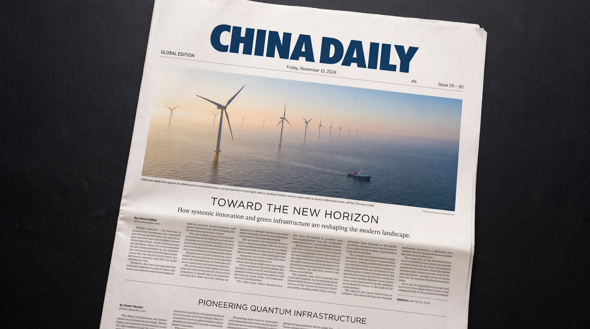
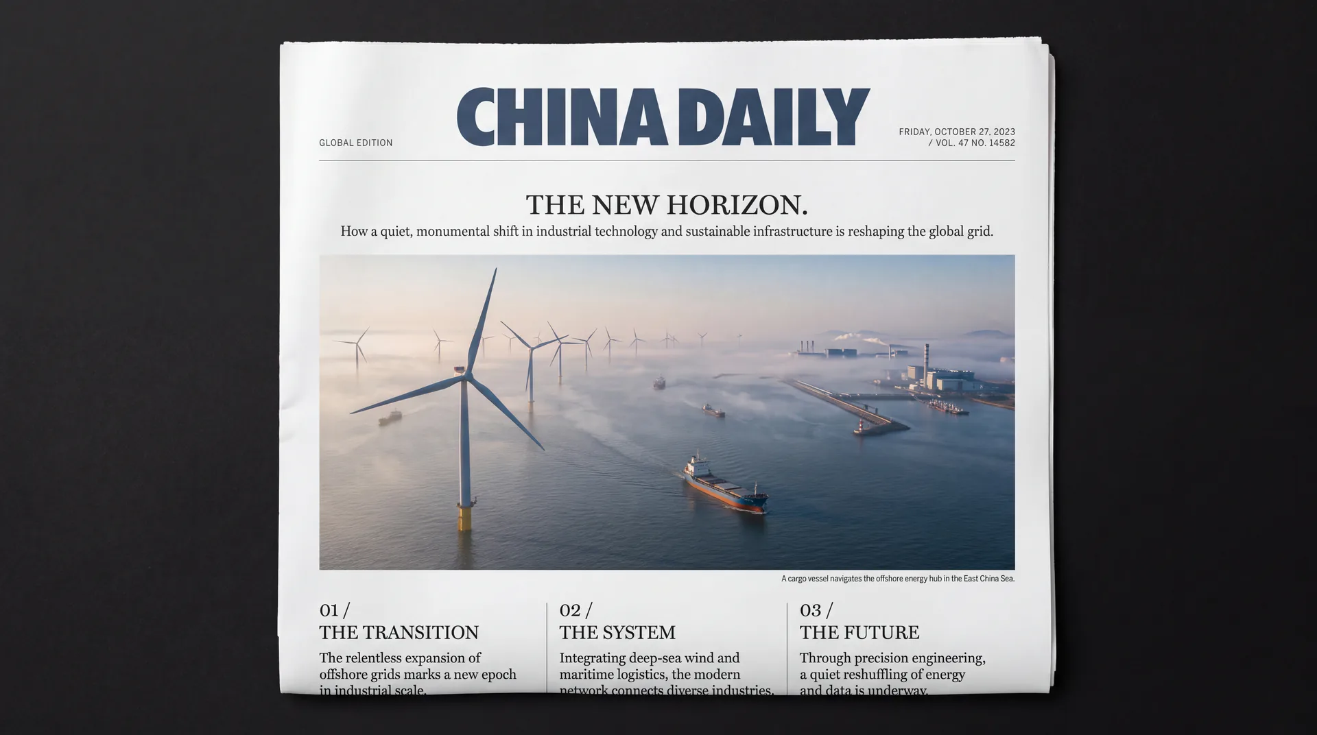
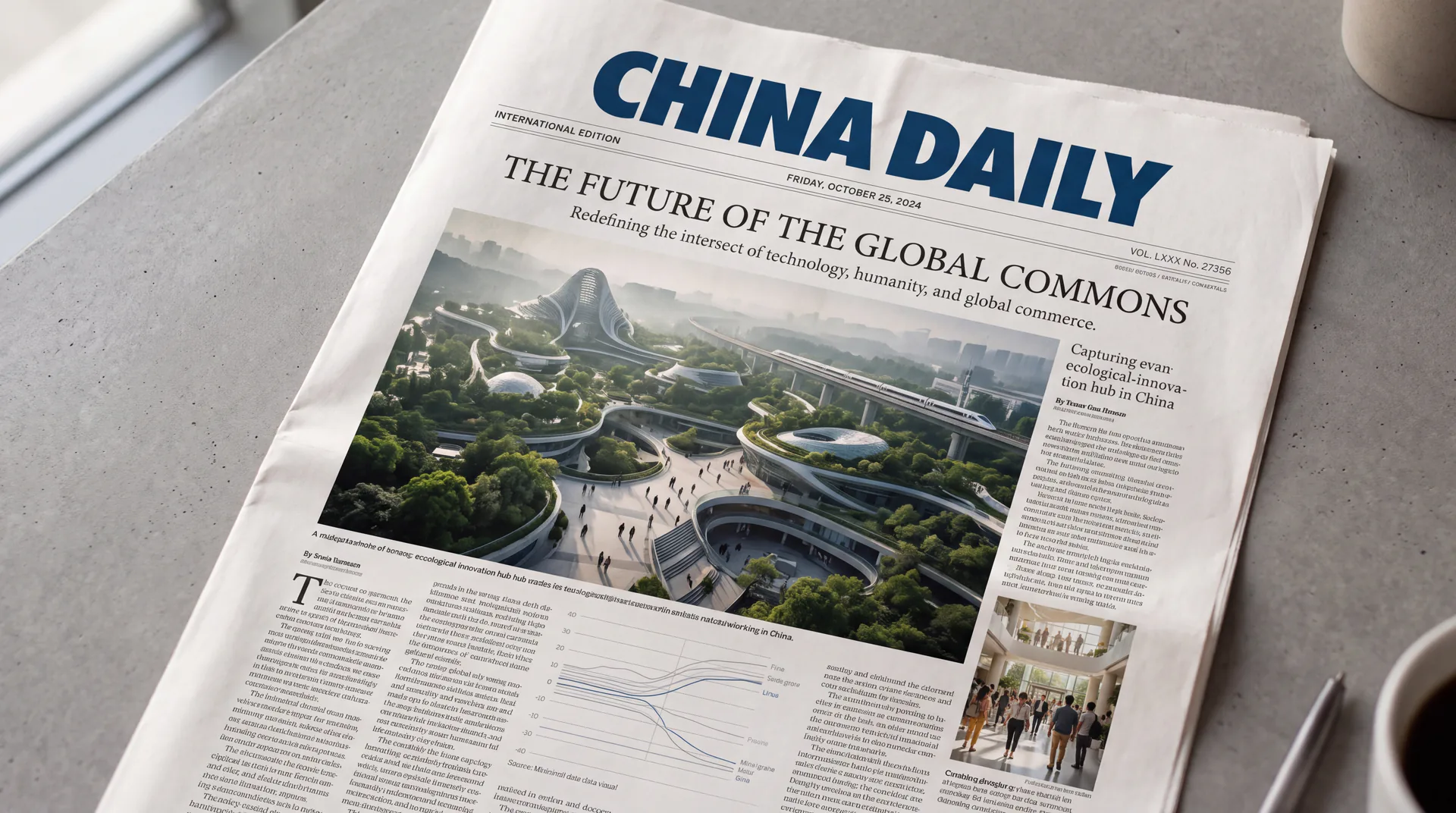
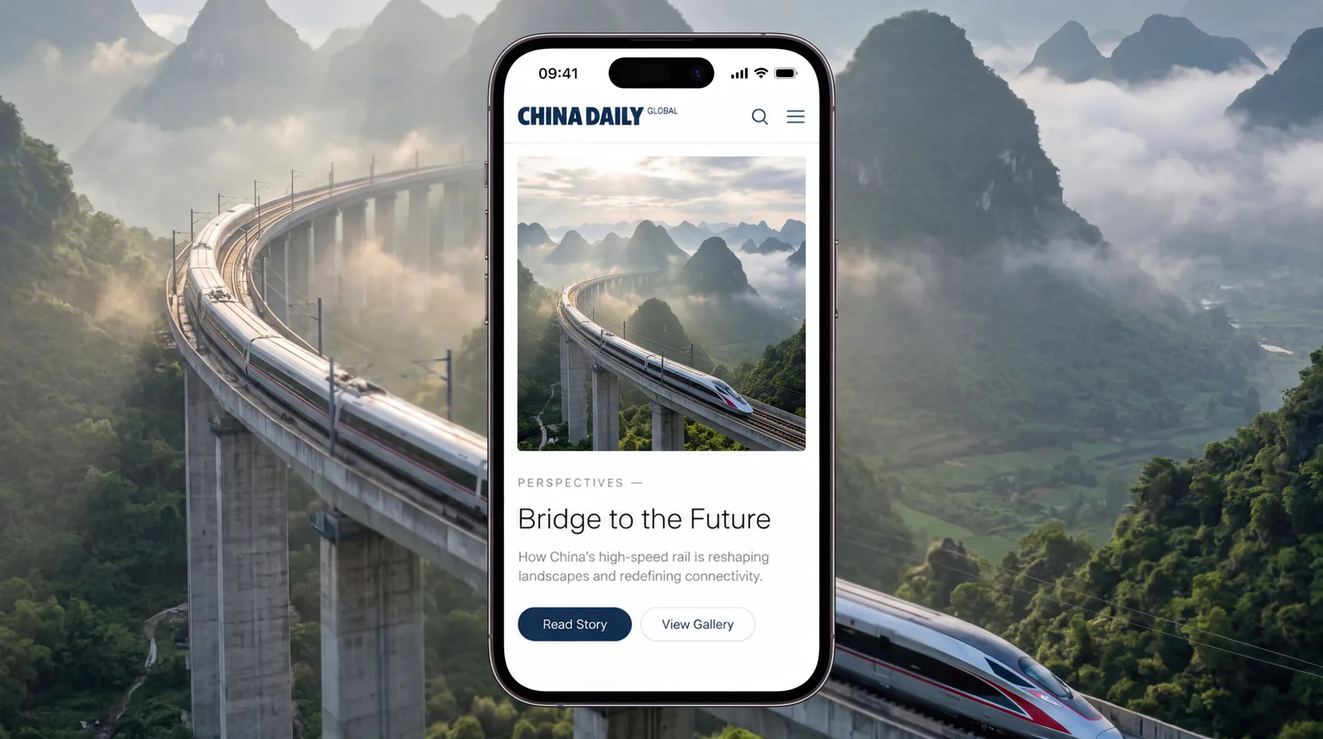
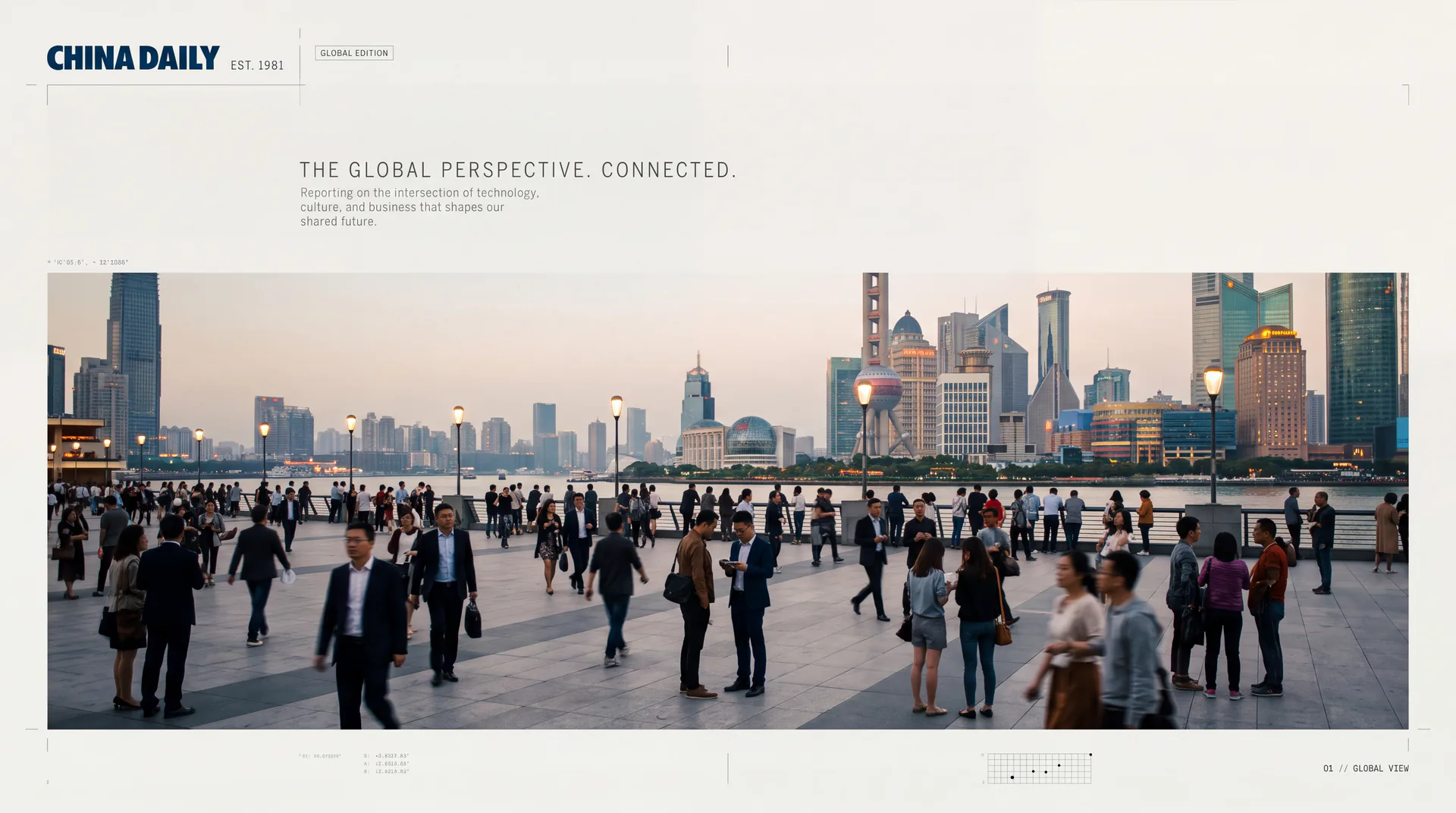
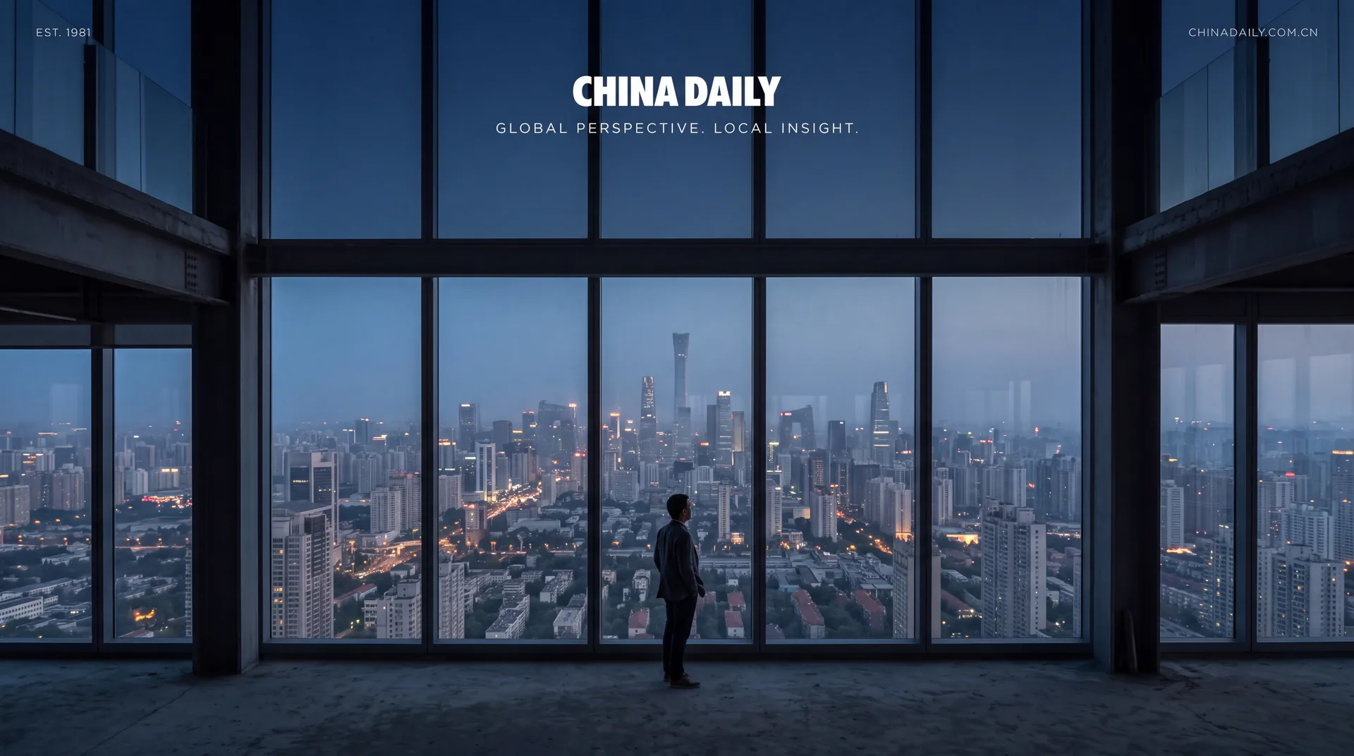
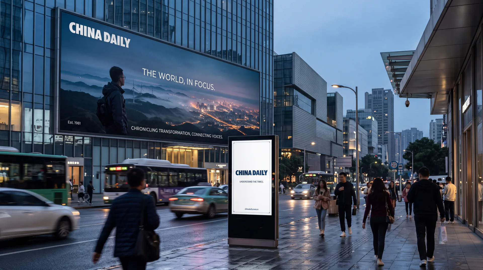
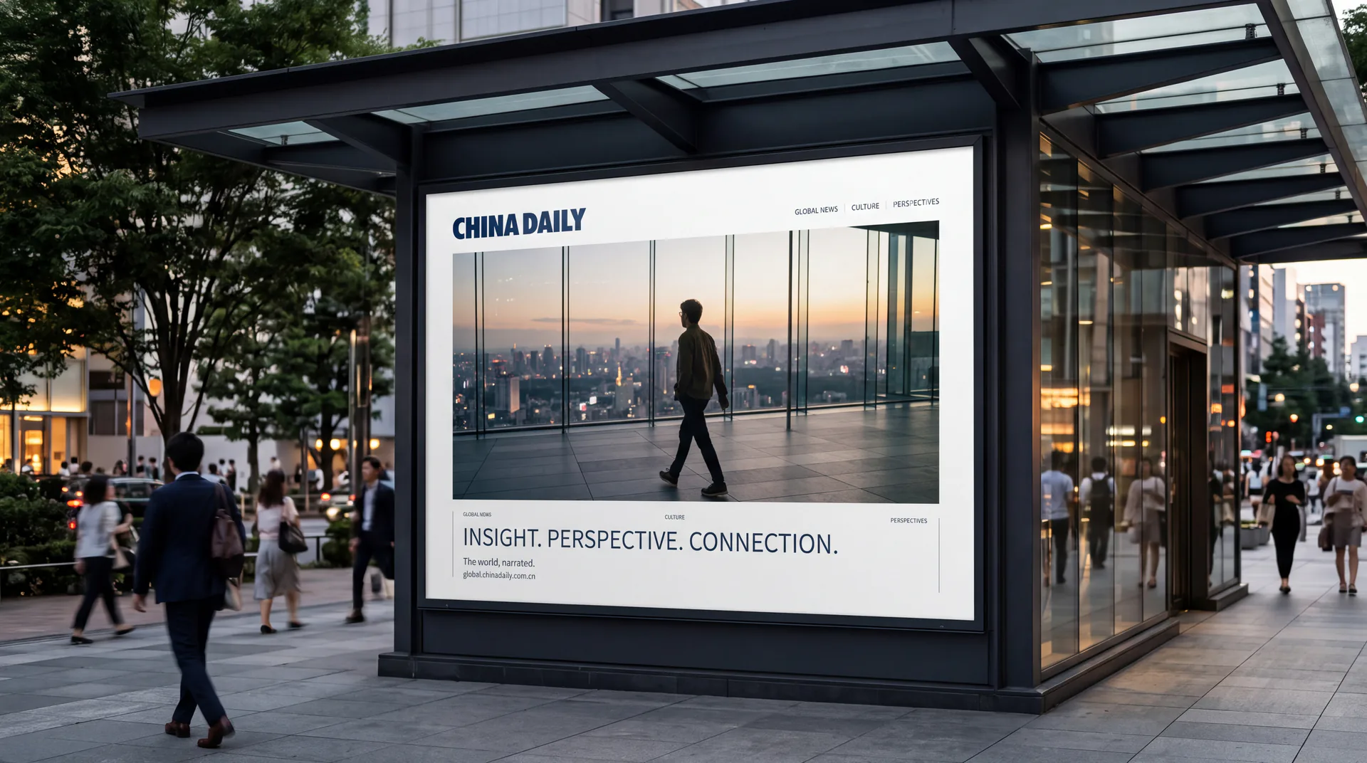
Design concept and graphic language
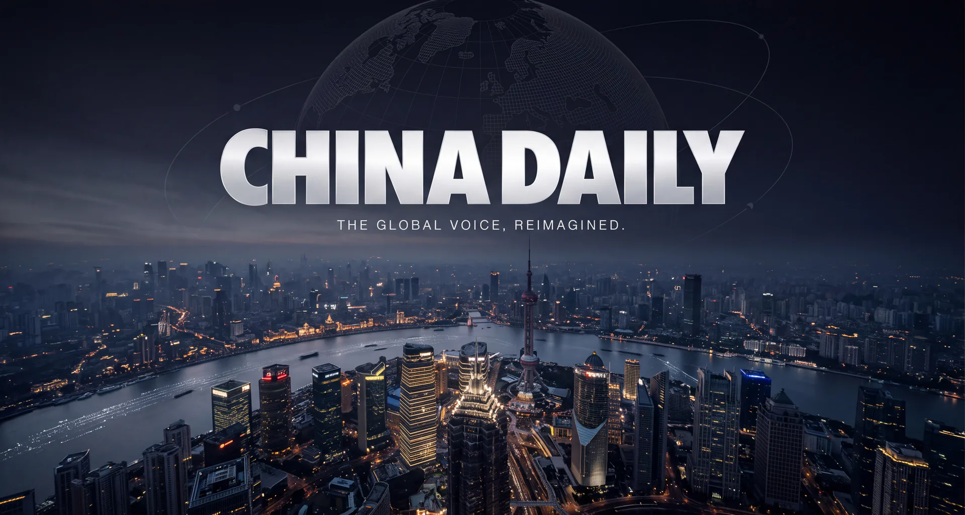
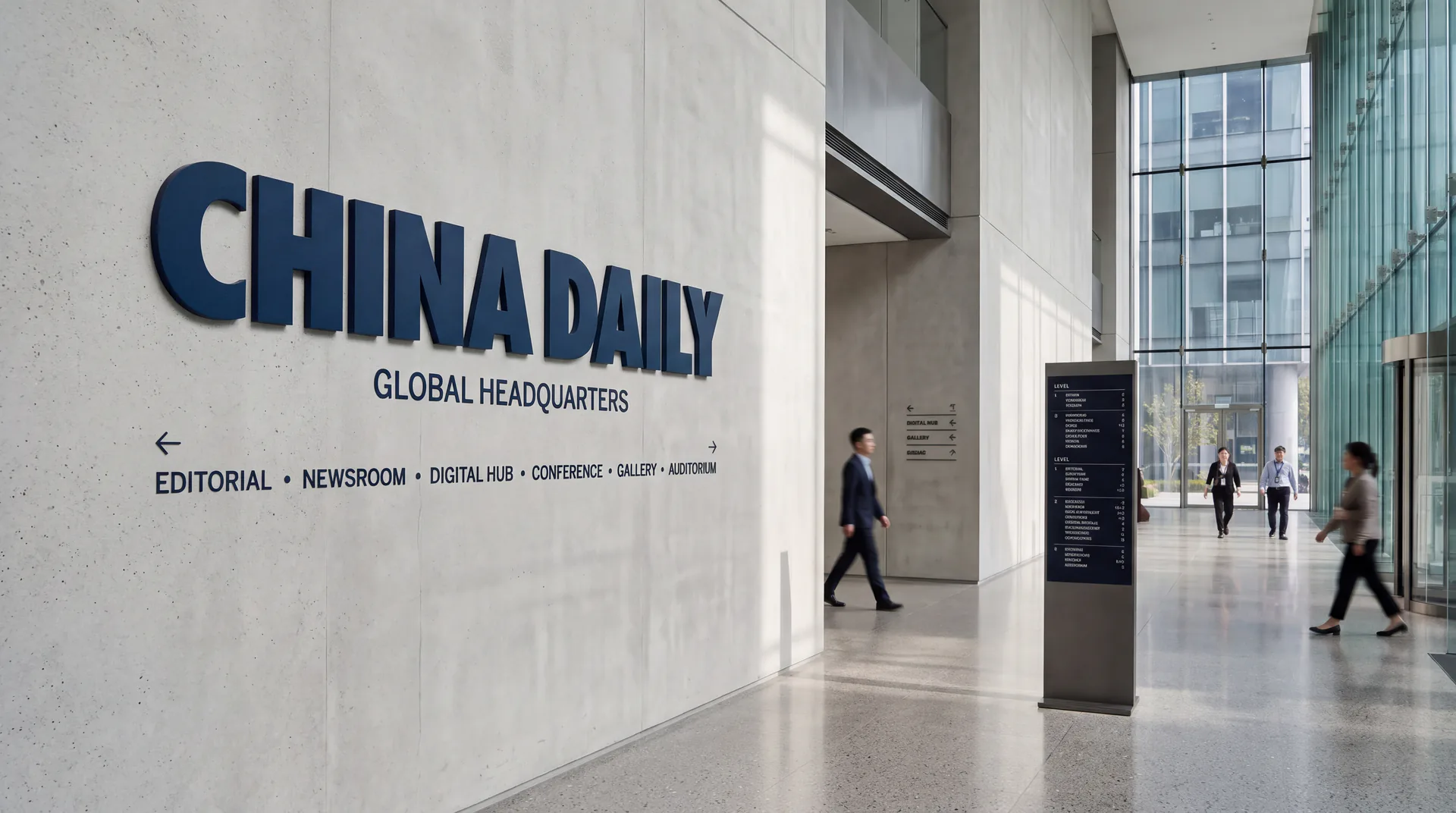
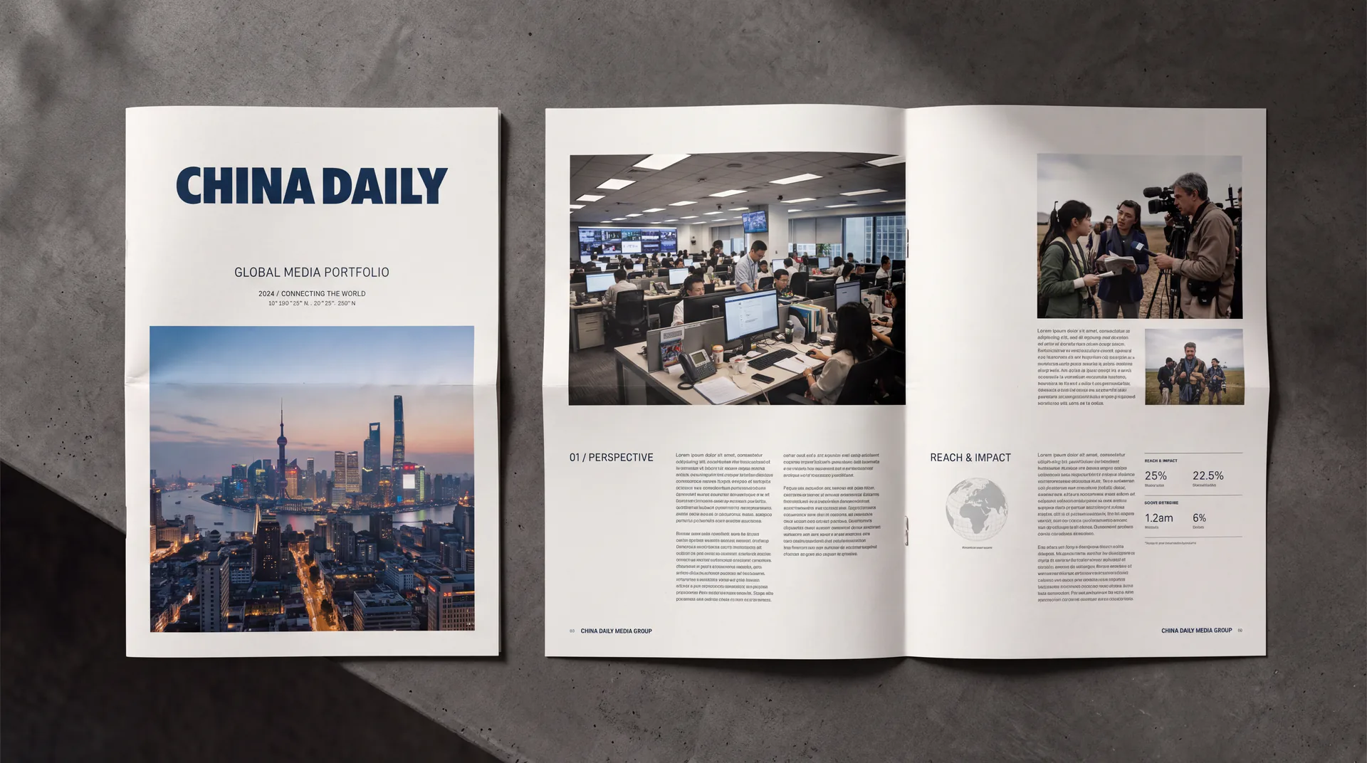
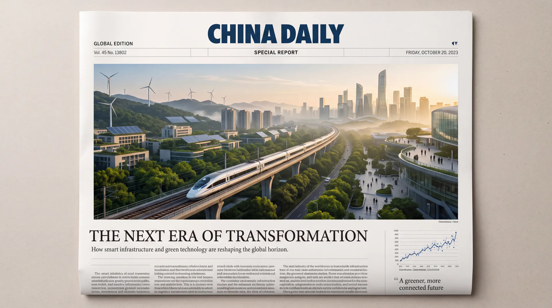
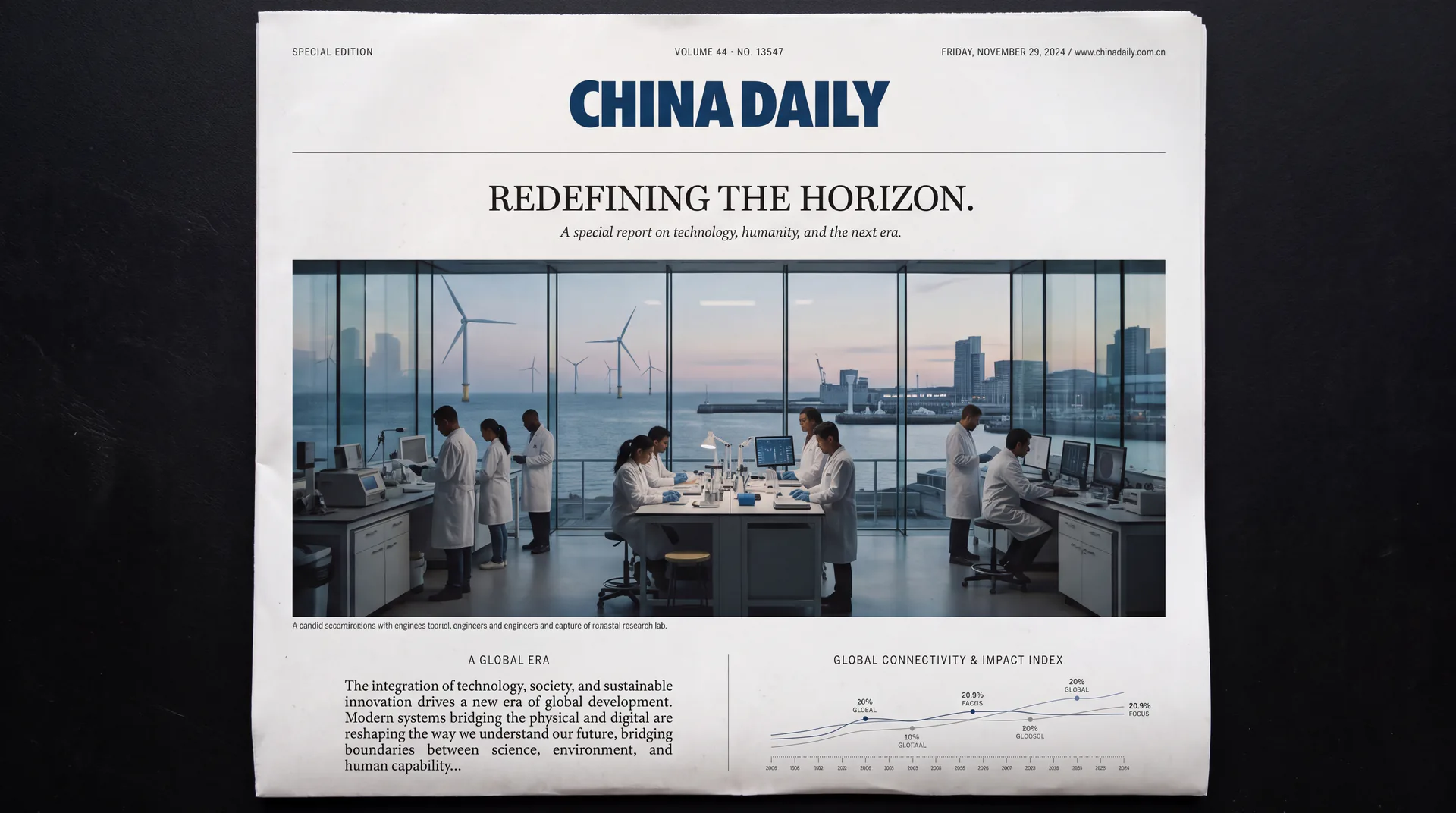
The logo continues the classic form of a pure word mark (Wordmark), with "CHINA DAILY" in English as the only visual subject, without any additional graphic symbols. This decision is based on an in-depth study of top international media brands - world-class newspapers and magazines such as the New York Times, Washington Post and Financial Times all use pure word marks as their core identities, and the word mark itself is the most powerful brand symbol. The form of a pure word mark carries the maximum amount of brand information with the least visual elements, embodying the design principle of "simple, clean, large enterprise style".
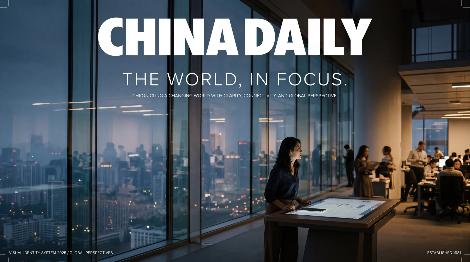
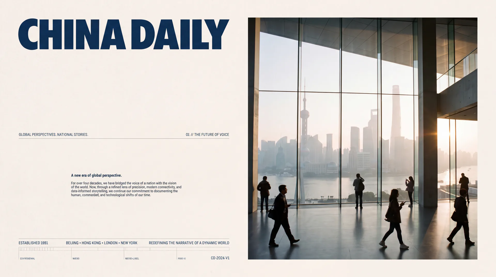
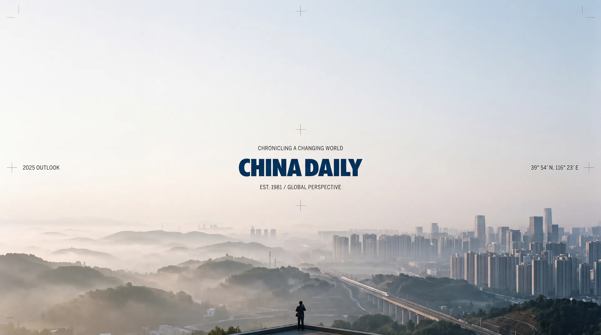
This revision has refined the font shape of the original word mark. The letters as a whole adopt a customized bold sans-serif font, with thick and powerful strokes and a compact and stable structure. The proportions of the fonts have been recalibrated to achieve a higher degree of balance and consistency in the visual weight of each letter. Maintain a moderate spacing between "CHINA" and "DAILY" to ensure the independent readability of the two words and the coherence of the overall word mark. The stroke endpoint processing of letters is cleaner and neater, removing the subtle roughness in the original glyphs, and presenting the brand's professional quality with higher craftsmanship precision. Details such as the tip angle of the letter "A", the arc of the "D", and the cross proportion of the "Y" have been carefully considered one by one, so that the word mark maintains perfect visual performance when it is enlarged to the building facade or reduced to the size of a business card. The overall font style strikes a balance between power and elegance - both the sonorous and powerful of news reports and the calmness of international media. The overall composition uses a minimalist pure word mark to build "media authority" to convey the brand's international height and news power.
Font composition and color system
The "CHINA DAILY" word mark adopts a customized ultra-bold sans-serif font (Heavy Sans-serif). The strokes are full and thick, and the corners are slightly rounded. It incorporates a touch of modern softness into the strong and powerful tone, avoiding the stiffness and oppression that may be caused by full right-angle processing. The thickness of the strokes of the letters remains highly uniform, and the horizontal and vertical strokes are of equal thickness, reflecting the objective, neutral and unbiased professional attitude of the news media. The proportion of the font is narrow and high, and the overall visual posture is compact and upright, achieving maximum brand impact within a limited space. This design consideration is especially suitable for application scenarios such as newspaper headers and top columns of news websites that require efficient visual attention. The letter spacing has been precisely adjusted. The five letters of "C-H-I-N-A" are closely interlocked, and the five letters of "D-A-I-L-Y" are also closely coordinated. The word spacing within each group is slightly smaller than the word spacing between the two groups, forming a clear reading rhythm and visual hierarchy.
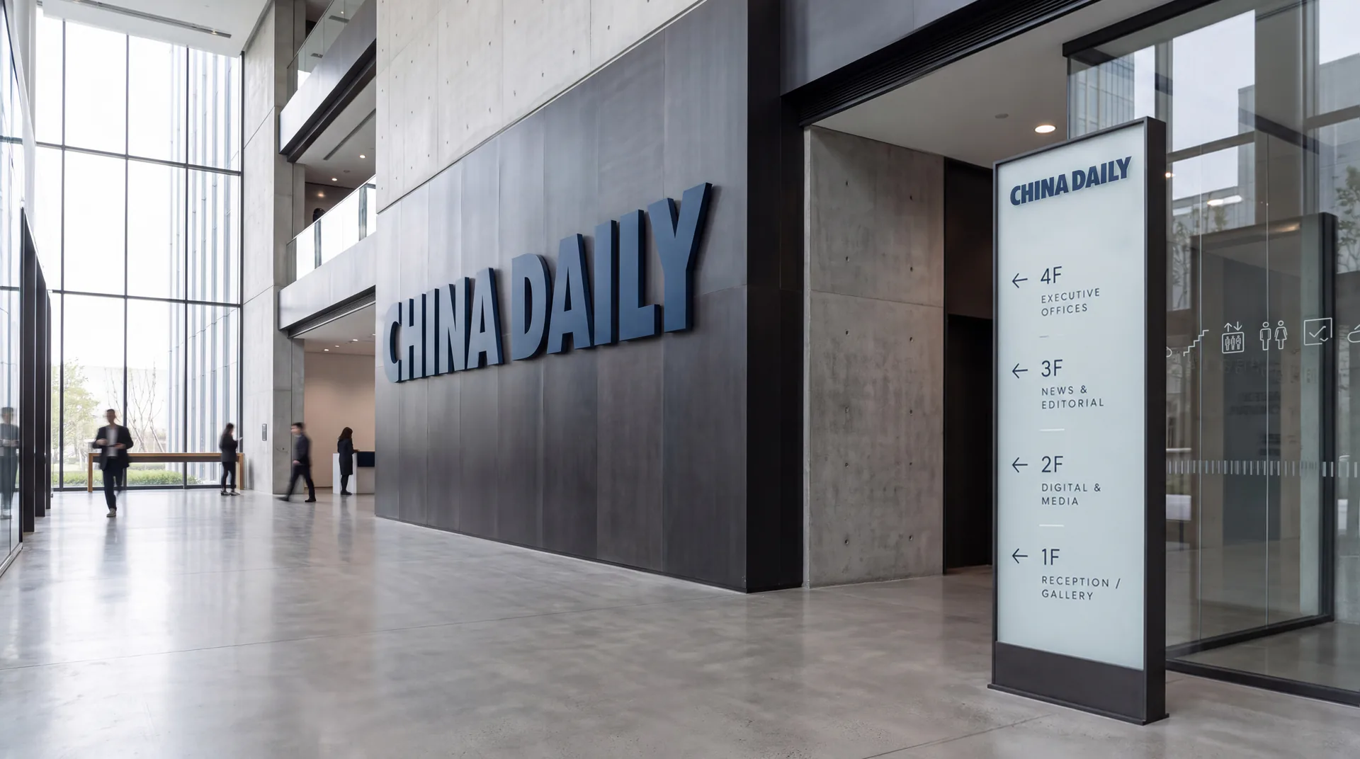
The main color, China Daily Blue #0A2240, is the only color used in the logo, representing the authority of news, the credibility of the media and the international professional image. This deep navy blue is between pure black and dark blue. It not only possesses the solemnity and power of black, but also injects rationality, trust and depth with the color tendency of blue. Dark blue is the most commonly used brand color for mainstream serious media around the world - from the dark blue of the Financial Times to the dark blue of Reuters, dark blue has become the visual consensus of the international news industry. The choice of this color allows China Daily's brand logo to naturally integrate into the visual context of international media. Pure white #FFFFFF is used as the standard background and reverse color to ensure the clarity and contrast of the logo in printing layouts, digital screens and environmental signs; neutral gray #666666 is used as the color of auxiliary text and secondary information to maintain the layering and restraint of the brand system. The overall color system is run through with a single navy blue, reflecting the brand temperament of "the power of news lies in simplicity and authenticity", and carrying the most authoritative brand information with the purest color.
Application extension and brand significance
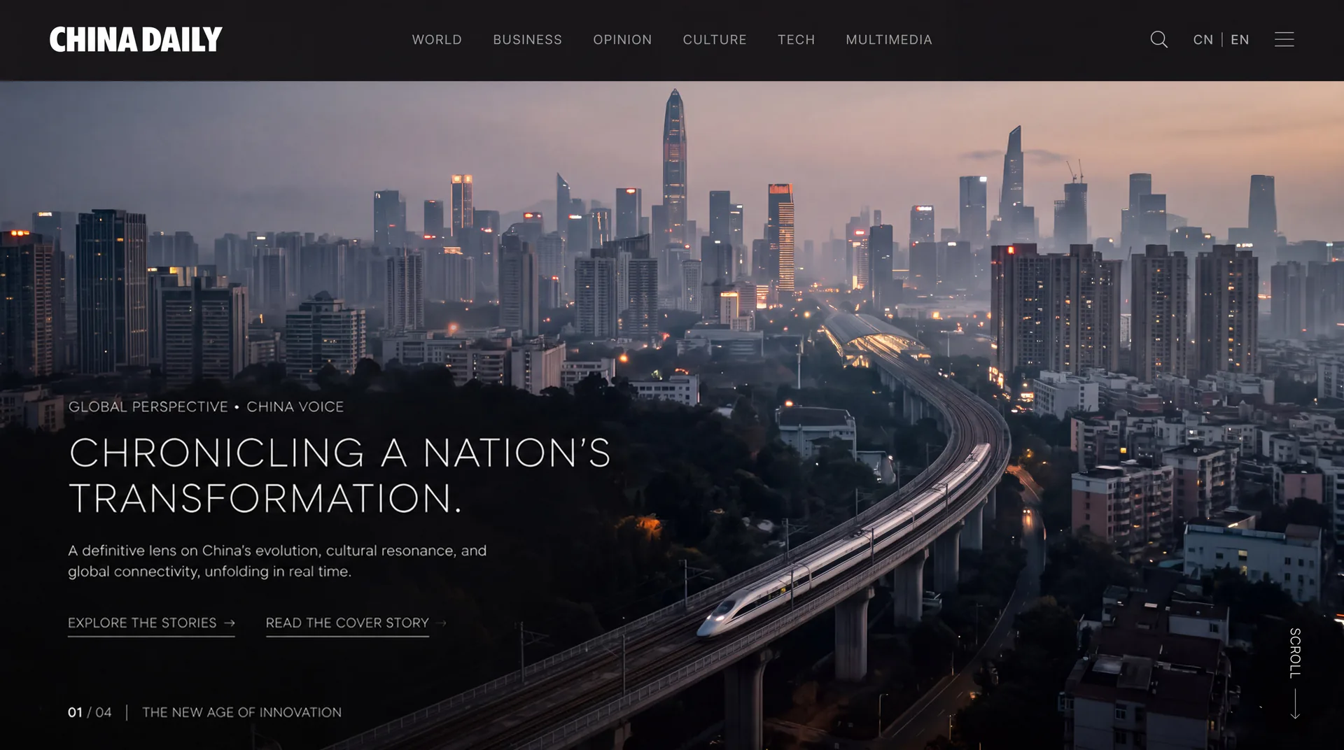
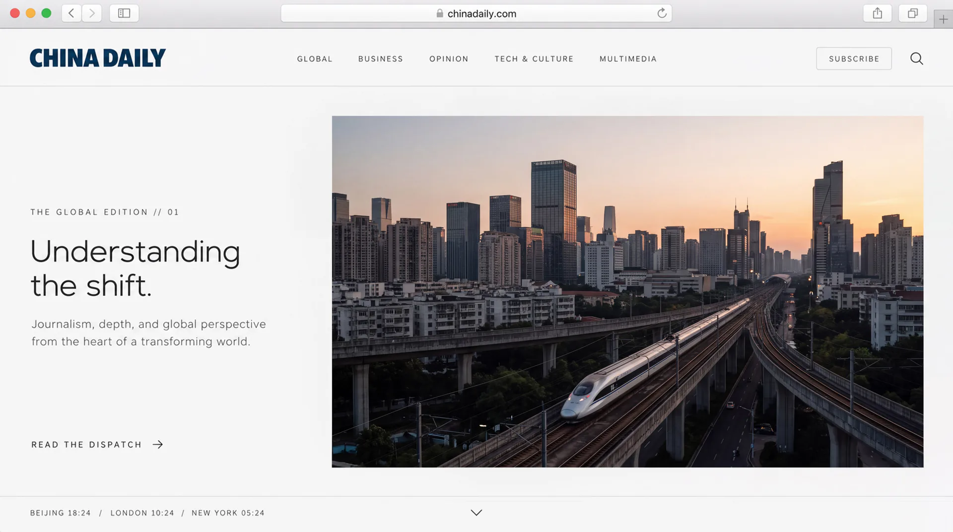
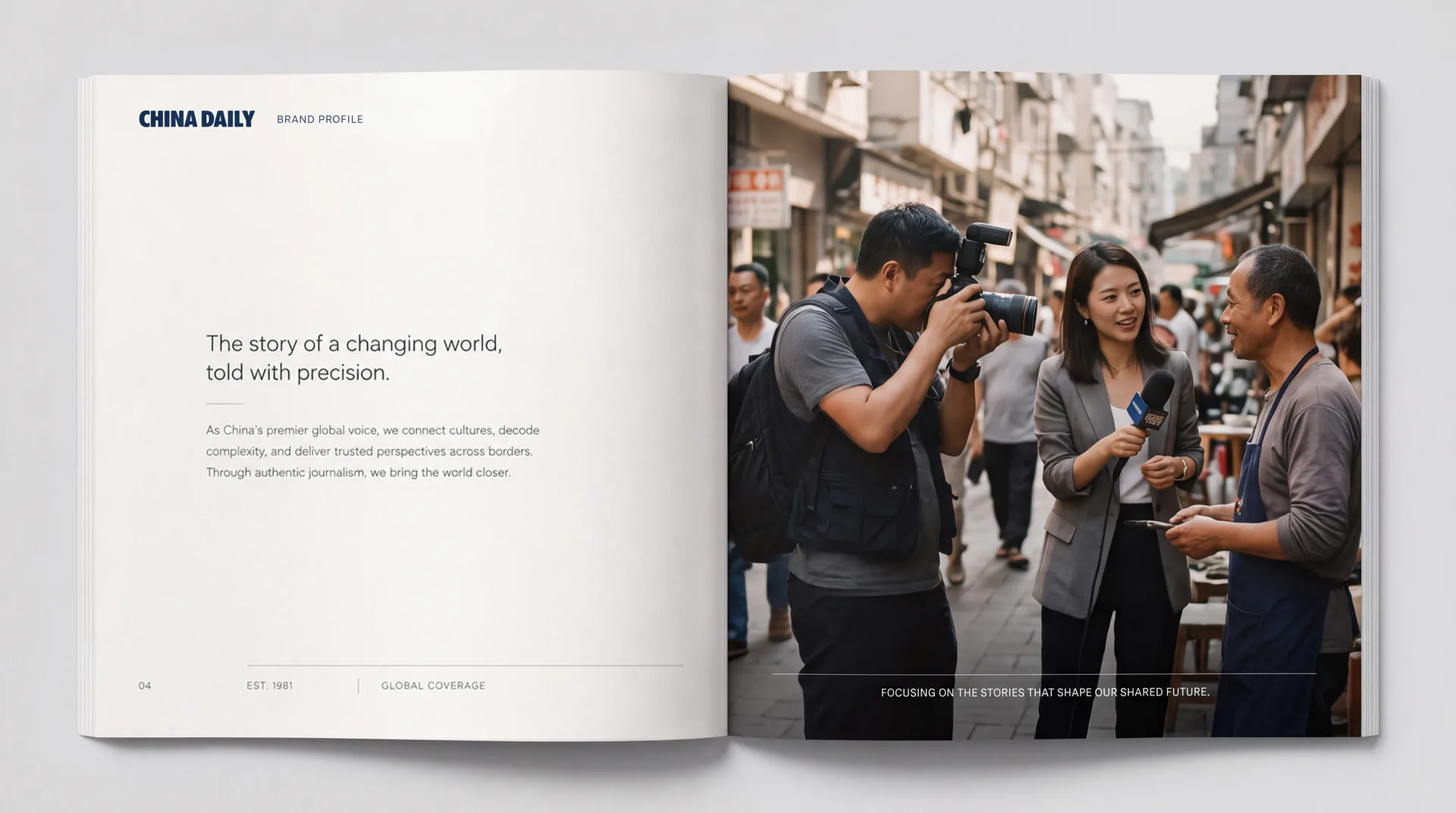
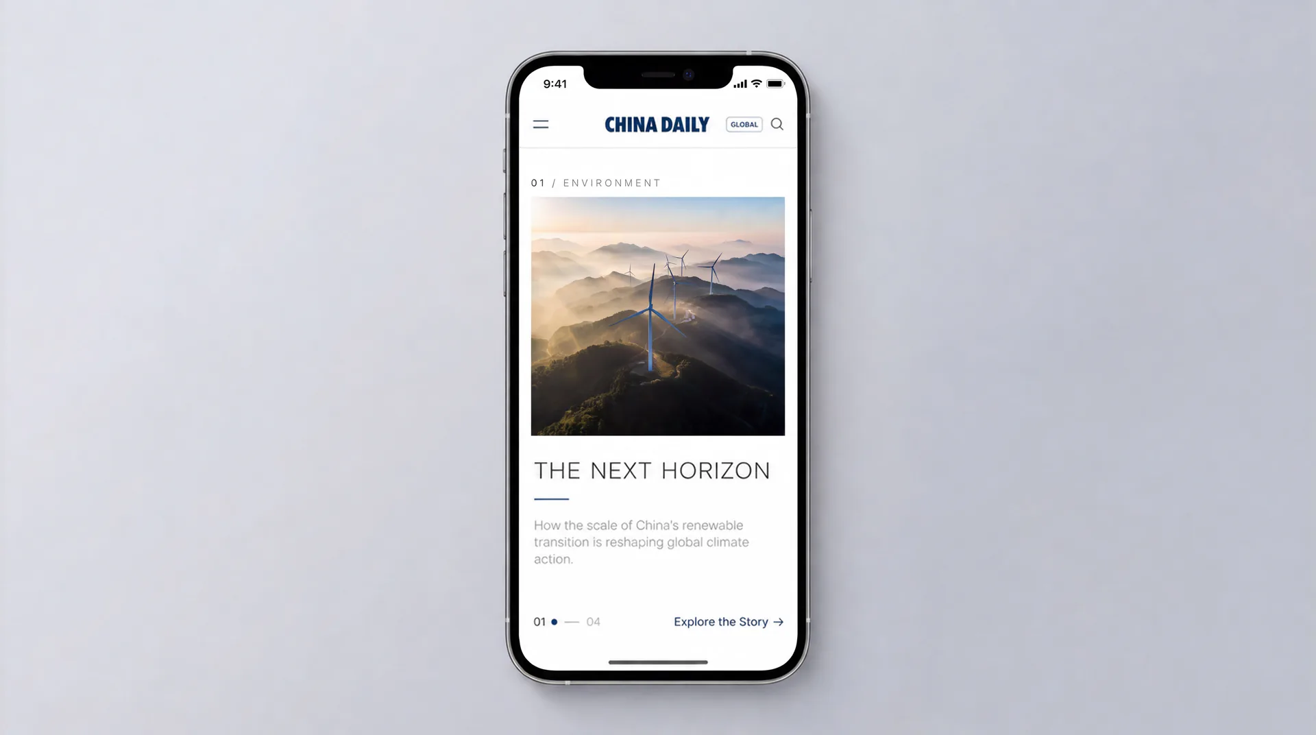
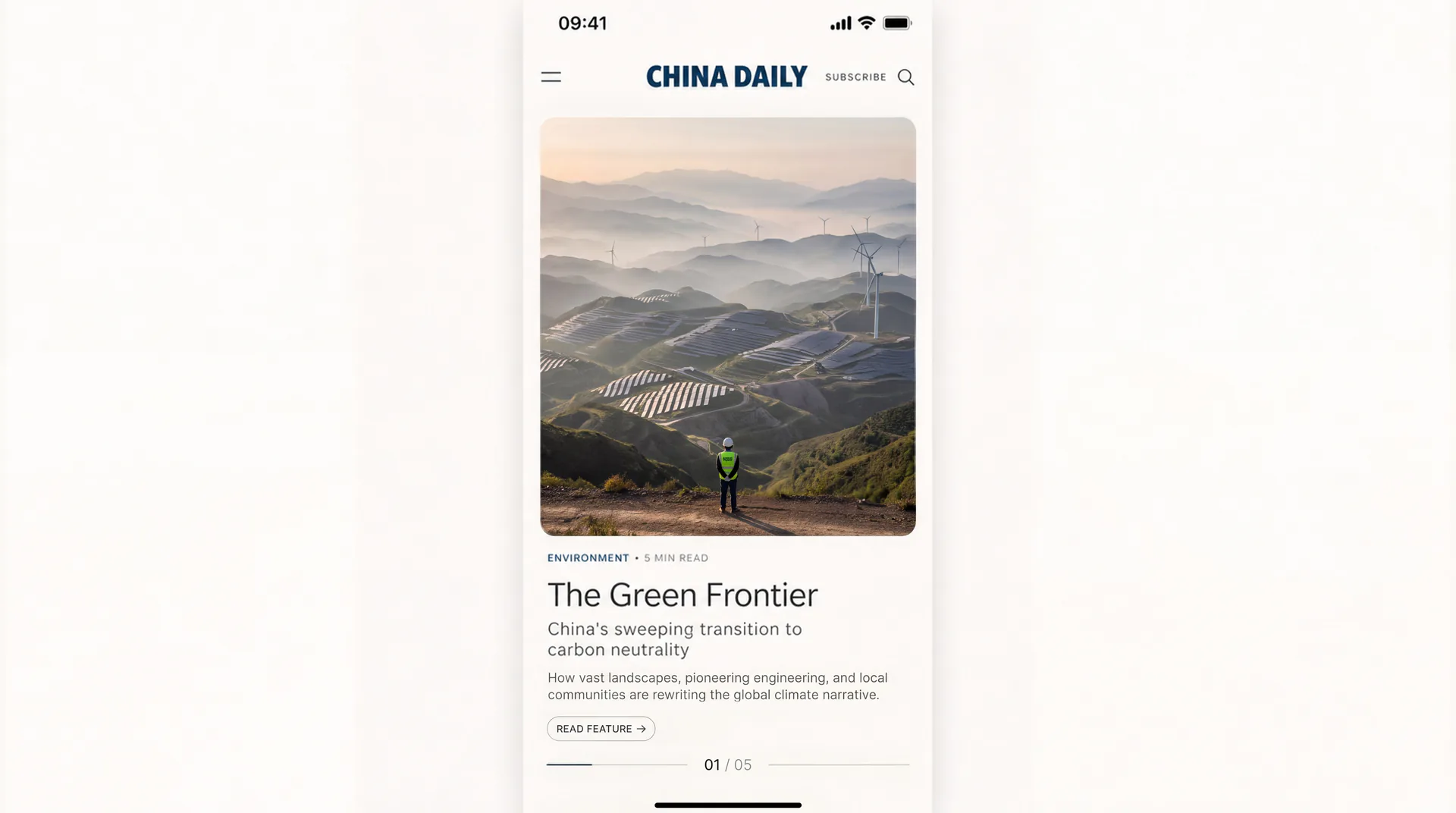
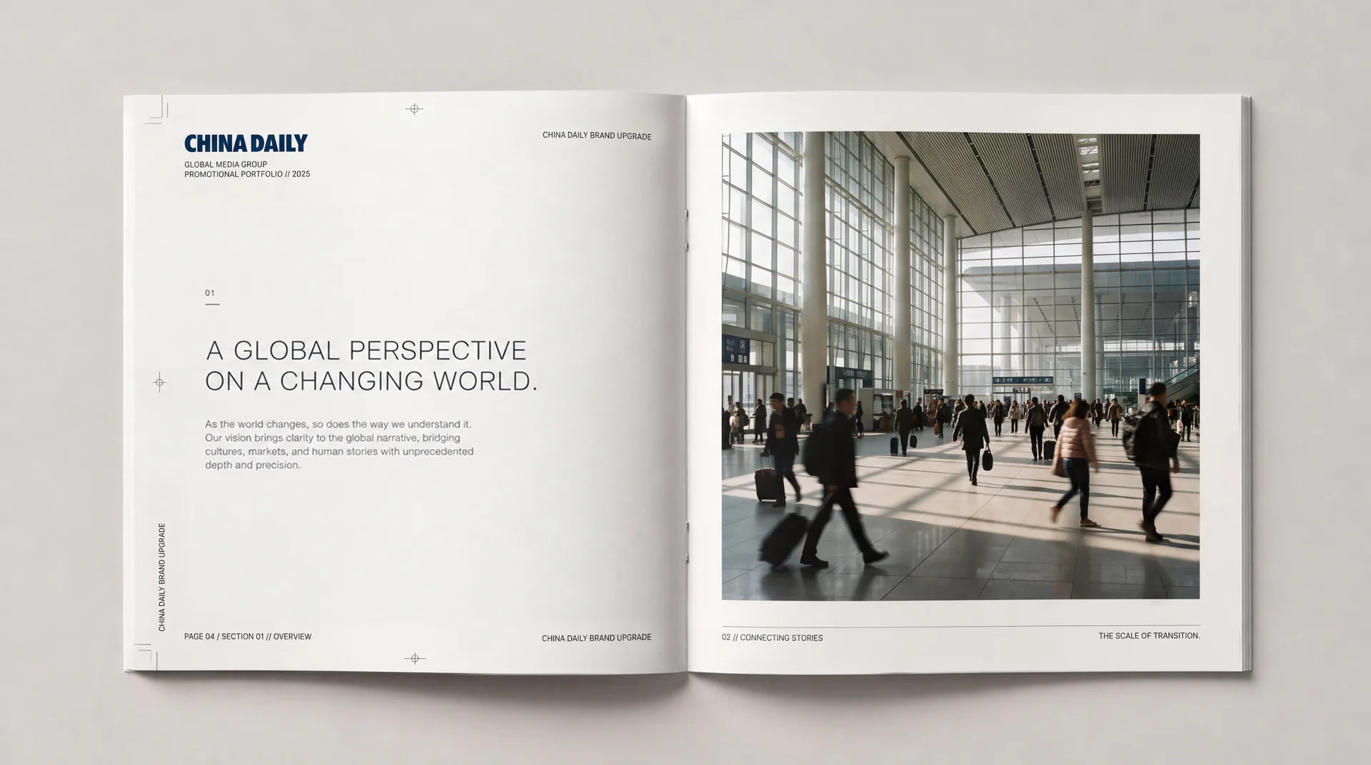
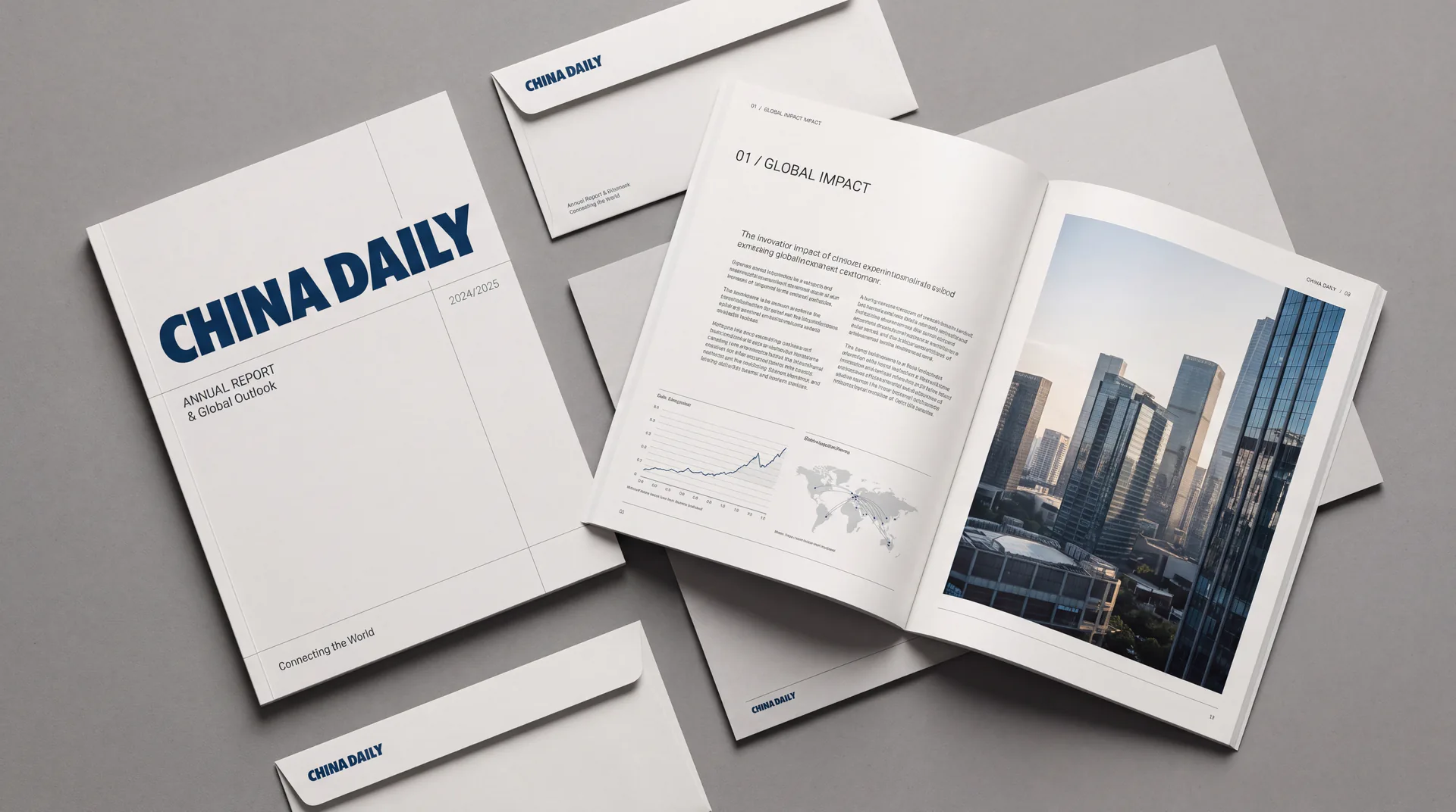
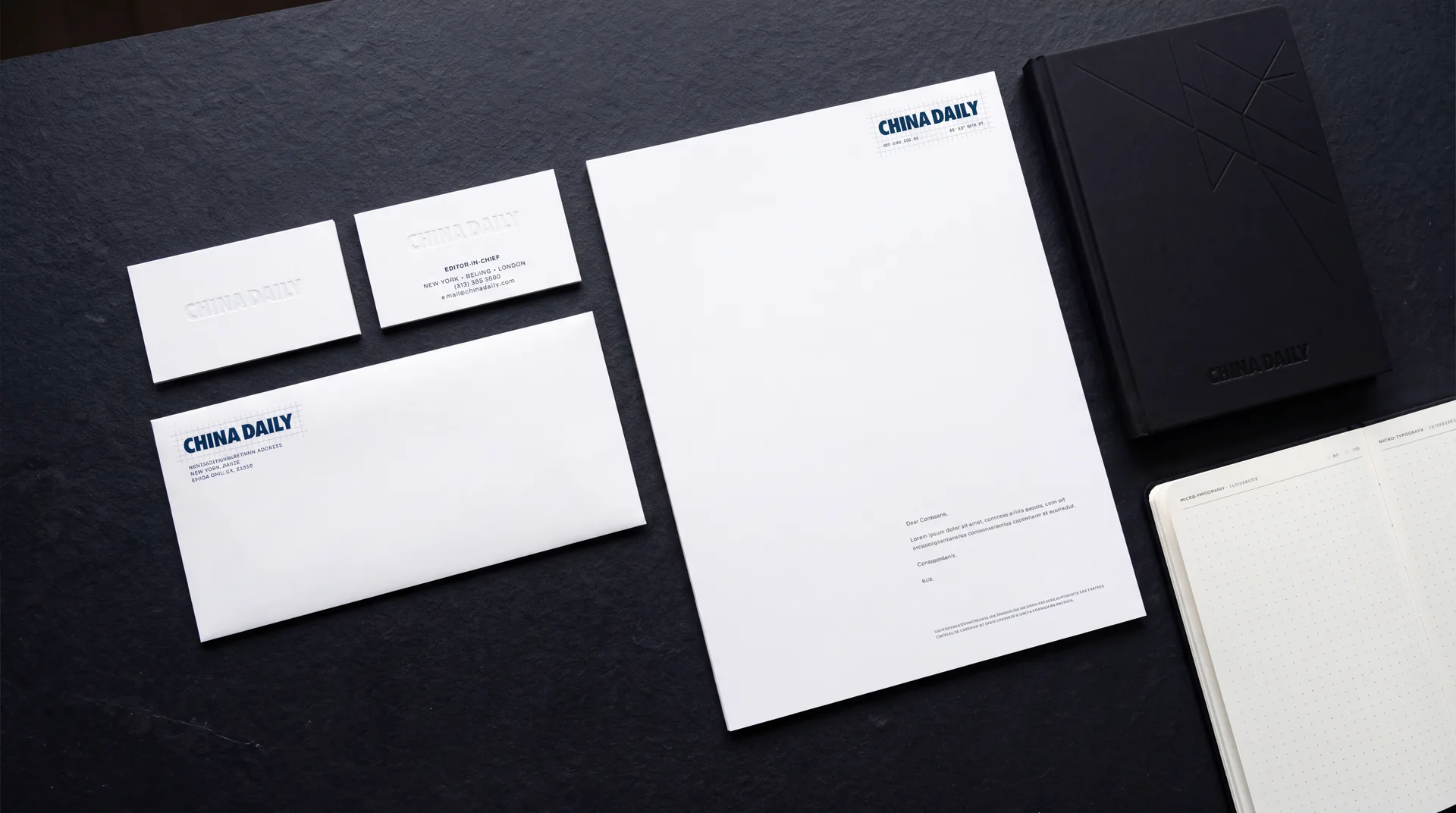
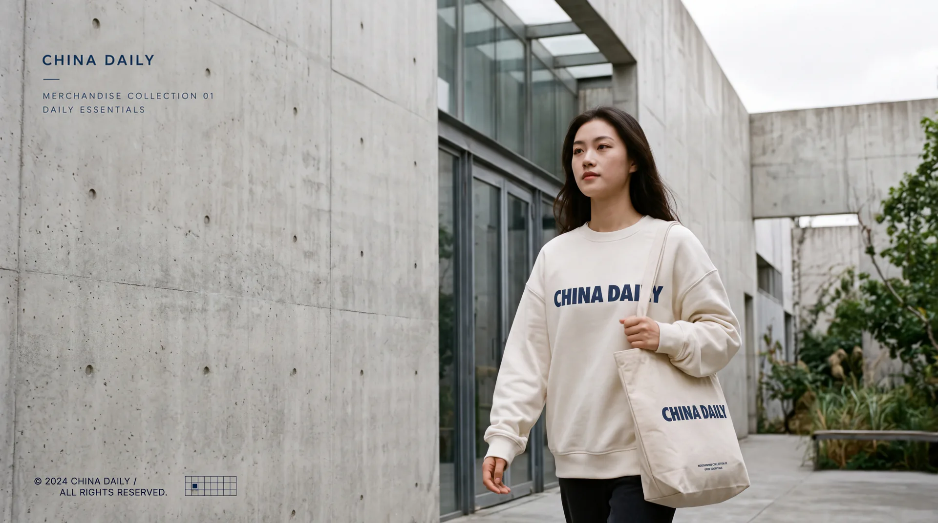
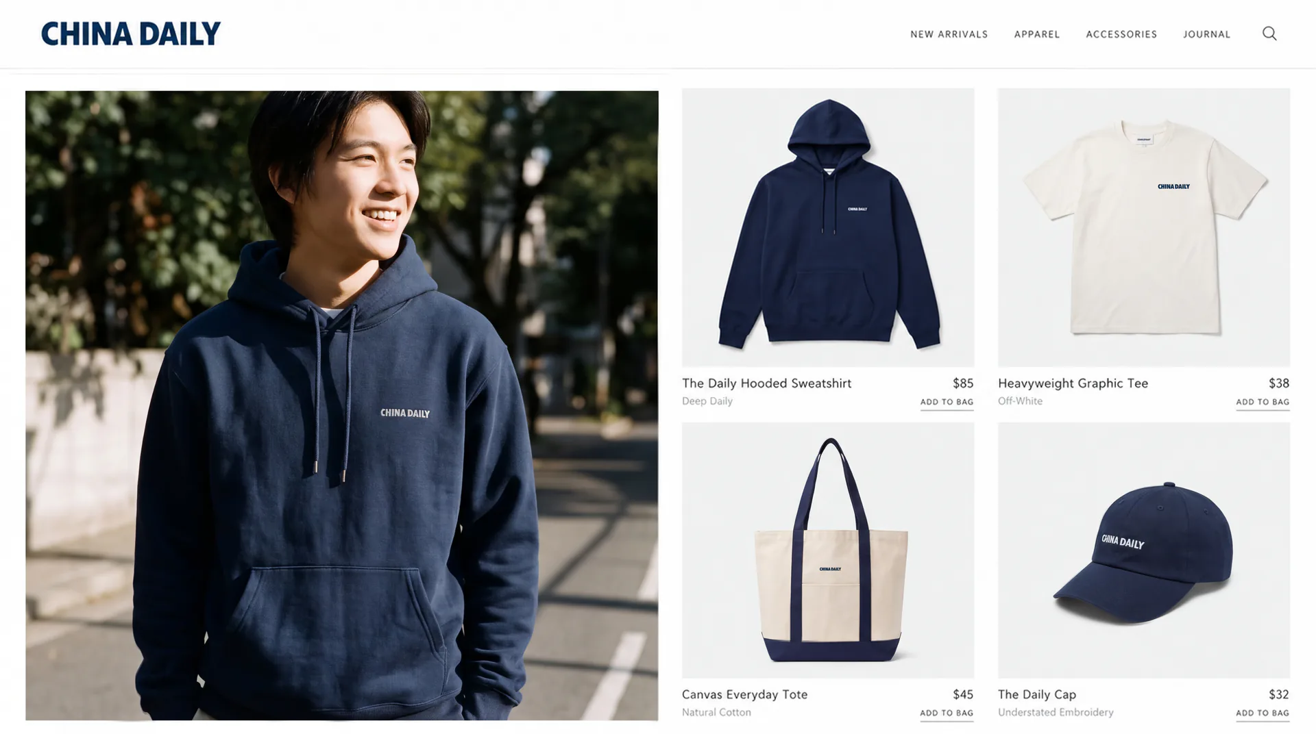
After the logo revision was completed, Qingmei Future simultaneously established a complete brand visual specification system to conduct unified design and packaging of corporate gifts, office supplies, business materials, etc. The logo can be widely used in newspaper front pages, top bars of news websites and mobile apps, new media platform avatars and channel logos; press passes, interview equipment logos, press conference backgrounds and international press summit images; corporate business cards, letter paper, folders and business gift sets; brand souvenirs, customized notebooks, cultural shirts and foreign affairs gifts. The corporate gift system is based on a unified navy blue color and is matched with a silver hot-stamped word mark, which embodies the quality and style of a large enterprise in a concise and clean manner. In the dynamic vision, the letters can be displayed one by one in the same way as a news typewriter, and finally the complete word mark is presented as steadily as the front page of a newspaper, symbolizing the professional process of news reports from collection to release.
The logo contains three core images of the China Daily brand: News Authority - the bold word mark conveys the authority and credibility of the national media; International Standard (Global Standard) - the pure word mark form and navy blue color are in line with the visual consensus and aesthetic standards of top international media; Clean Excellence - the minimalist design without decoration reflects the calmness and professional confidence of a large enterprise. The overall design conveys China Daily's brand vision of "speaking to the world from a Chinese perspective".
Improper Usage (Protection Specification)
Do not change the glyph structure, stroke thickness or word spacing ratio of letters; do not modify the hue, brightness or saturation of the main blue color of China Daily; do not add strokes, shadows, gradients, three-dimensional effects or any decorative elements to the word mark; do not use "CHINA" and "DA" ILY" is arranged vertically or used in a non-horizontal manner; do not use standard fonts instead of customized wordmarks; do not place disturbing graphics or color blocks around the wordmark; keep the white space around the logo not less than 30% of the height of the wordmark; the minimum display width shall not be less than 40mm.
design results
After the revision of the logo and the release of the overall visual specifications, China Daily's brand unity and international recognition have been significantly improved. The revised word mark uses a more concise and clean visual language that complies with international aesthetic standards, strengthening China Daily's authoritative image and corporate style as a national English-language media. The unified designed corporate gift system is widely used in foreign affairs exchanges, industry activities and international cooperation, and has become an important extension carrier of China Daily's brand image.