










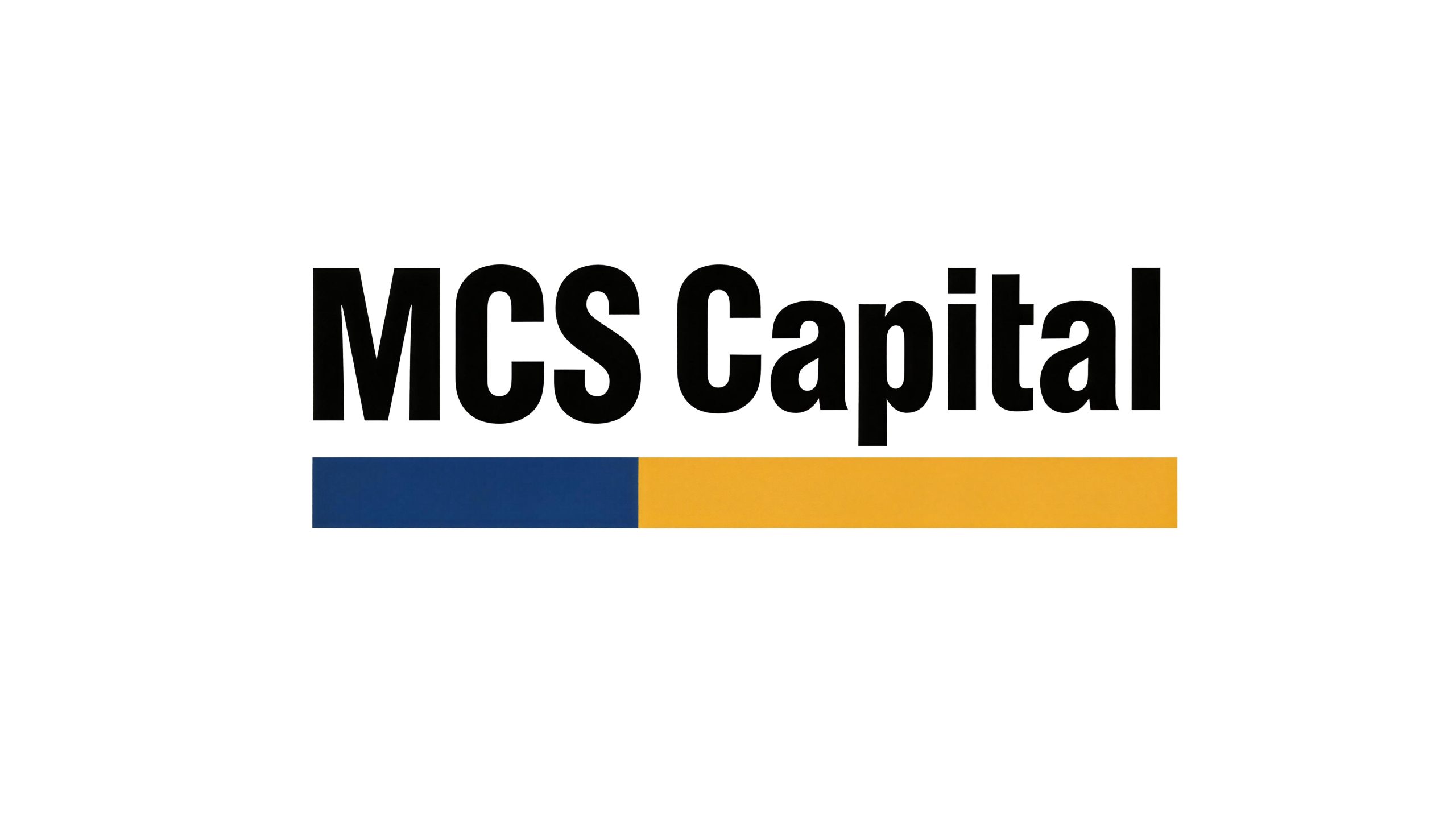
MCS is a comprehensive enterprise with professional services as its core. With its strict industry standards and efficient service system, it has established extensive customer trust and industry reputation in its field.
The brand takes "professionalism as strength" as its business creed, and is committed to meeting market demand with international service standards and creating practical and reliable business value for customers. Qingmei Future was commissioned to lead the brand identity design. The design direction of the plan is "concise and solemn", which reflects the professionalism of MCS Company.
The goal of the brand logo design is to convey the professionalism of MCS to the outside world at the first time through a simple, solemn and professional visual language, and to establish a trustworthy brand image and industry authority.


Design concept and brand language
The logo takes "Professional Wordmark" as the core concept and the three capital letters of the brand name "MCS" as the only visual subject, without any additional graphic symbols. The design strategy of this pure word mark is based on the core principle of "simplicity is power" - in a highly information-intensive business environment, the most concise visual expressions often have the strongest penetration and memory. Three letters are all the visual assets of the brand. There is no redundancy, no decoration, and no ambiguity. It can convey the brand name and professional positioning to the outside world at the first time. The overall design reflects the MCS brand philosophy of "less is more, precision is stronger" in the field of professional services.
The "M" letter is separated from the top with two symmetrical diagonal lines, and a sharp "V" shape intersects in the middle. The strokes are thick and steady, and the structure is open and powerful, like a solid bridge or a stable base, conveying the brand's carrying capacity and reliability. The "C" letter opens to the right in a wide arc, which is stretched but not loose. The end of the stroke is closed with a clean flat cut, conveying the brand's open attitude and rigorous style. The "S" letter consists of two reverse arcs forming a smooth curve, symmetrical up and down, with the center of gravity in the middle. It has the most dynamic rhythm among the three letters, conveying the brand's flexibility and service efficiency. The three letters are arranged equidistantly, with precise spacing and even rhythm, just like three professional partners who perform their respective duties standing side by side, conveying the brand spirit of teamwork and professional division of labor. The overall proportion of the letters is wider and thicker, which establishes the solemnity and authority of the brand with sufficient visual weight, ensuring that the logo has a calm and majestic first impression in any size and scene. The overall composition constructs the "professional name" in the most concise letter form to convey the brand's industry strength and service commitment.
Font composition and color system
The "MCS" word mark adopts a customized bold sans-serif font, with thick and even strokes, and tiny right angles at the corners. The font is square and thick, and the structure is rigorous and regular. The font style abandons all decorative elements - no serifs, no rounded corners, no fancy details, and uses the purest geometric structure to convey the brand's "concise and solemn" design direction. The thickness of the strokes remains absolutely uniform, with equal thickness horizontally and vertically, and equal widths for arcs and straight lines, reflecting the objective, impartial, and standardized value orientation of professional service companies. Letter negative space (the white space within and between letters) is carefully calculated to ensure clear readability and visual balance across a variety of sizes and media.
The main color, professional blue #003D7A, is the core color of the word mark, representing professionalism, trust, solemnity and international standards. Dark blue is the most authoritative and credible color symbol in the global business field. It is widely used in the brand logos of financial, consulting, legal and professional service organizations. The choice of this color directly establishes a strong connection between the MCS brand and the word "professional". The calmness and calmness of dark blue convey the brand's service attitude of being calm and trustworthy. Auxiliary golden yellow #D4A017 is used as an auxiliary color in the brand visual system, used for the decorative horizontal lines under the logo, accent elements and high-gloss details in the brand system. The addition of golden yellow injects a touch of warmth and vitality into the solemn tone of dark blue, symbolizing the brand's value creation and fruitful returns on service results. The combination of blue and yellow is a classic high-contrast complementary color combination - the calmness of blue and the brightness of yellow form a strong and harmonious visual tension, which not only maintains the professional solemnity of the brand, but also avoids the sense of distance and indifference that a single blue may bring. The combination of blue and yellow auxiliary tones ensures that the logo conveys MCS's brand image of both professional strength and positive attitude at the first time. Pure white #FFFFFF and dark gray #333333 are used as the standard background color and auxiliary text color to ensure the clarity and systematicness of the logo in various application environments. The overall color system is mainly blue, supplemented by gold, and black and white as the base, reflecting the brand temperament of "solemn but not cold, professional but warm".
Application extension and brand significance
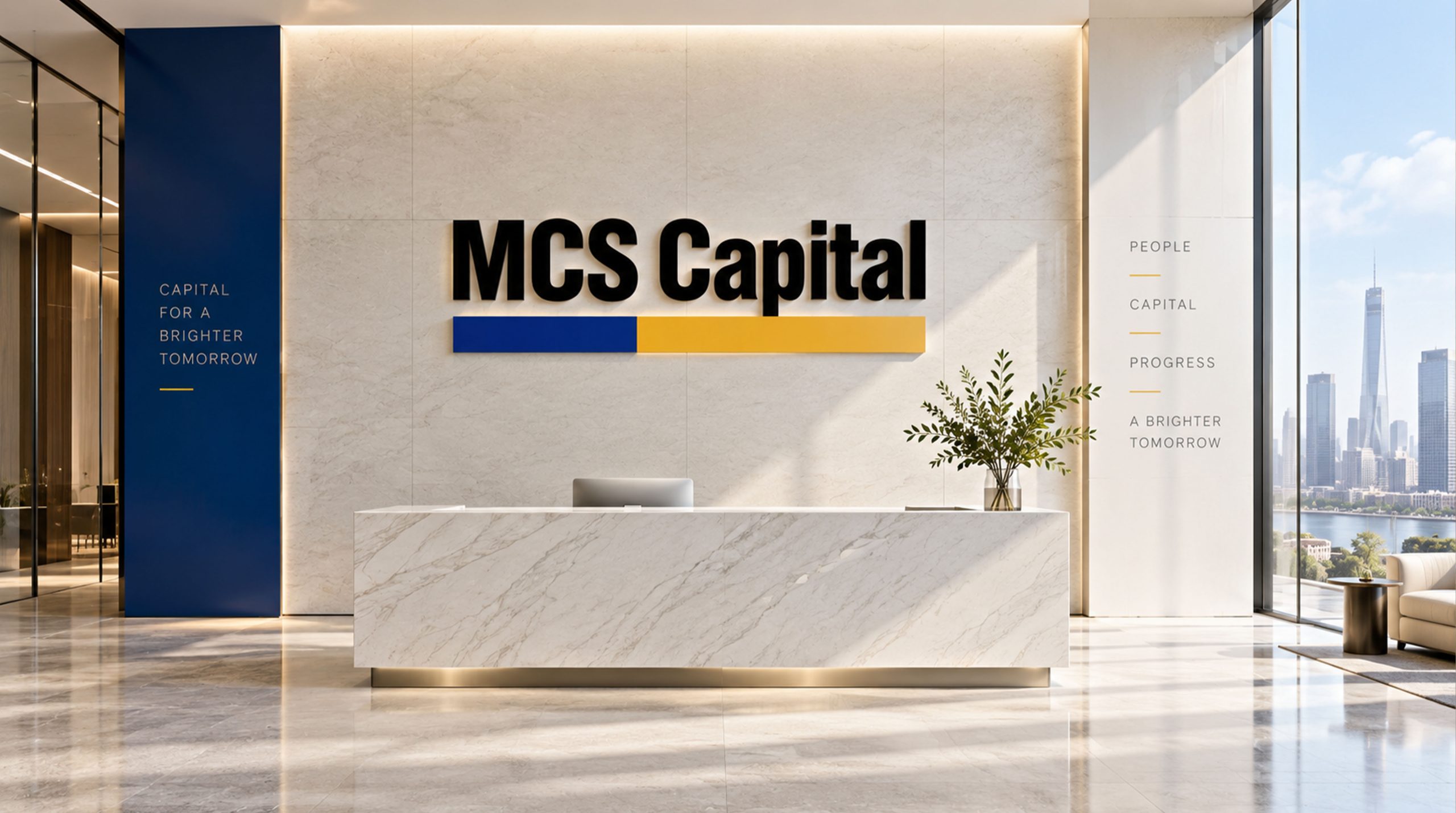
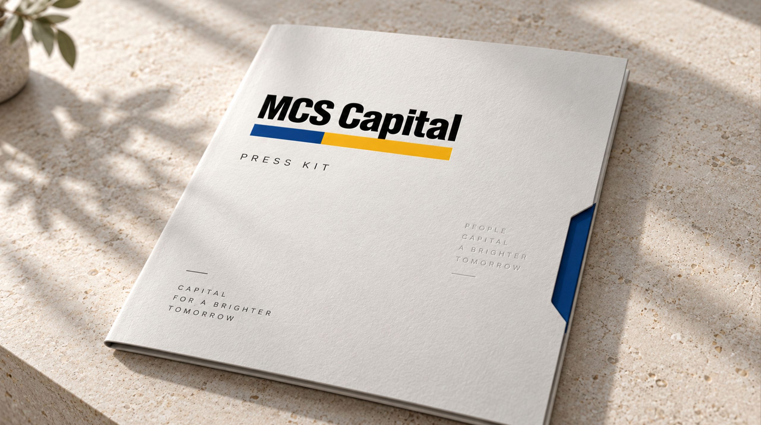
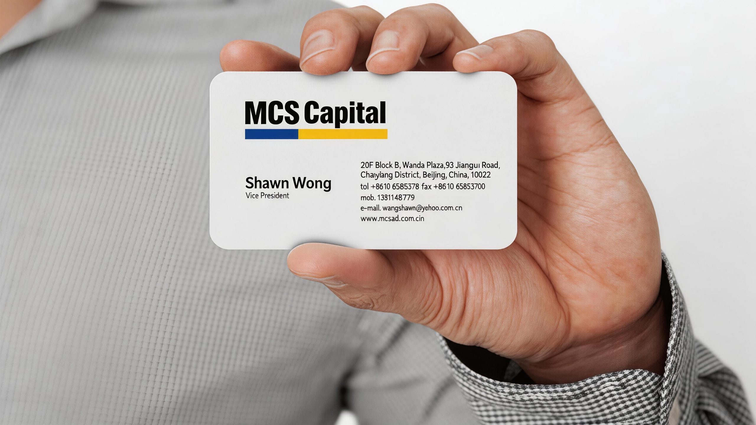
The logo has strong system scalability and rapid identification capabilities, and can be widely used in company headquarters office environments, front desk image walls, conference room nameplates and floor guidance systems; business cards, company letters, contract document covers and brand albums; official websites, corporate management platforms, industry data reports and digital marketing materials; industry summits, professional forums, business negotiations and government cooperation project reporting images; business gifts, employee badges, vehicle logos and brand stationery systems. In the brand visual system, the blue word mark and golden auxiliary elements form a two-color main line that runs through the entire system - blue is used for all main titles and core logos, and golden yellow is used for dividing lines, icon embellishments and highlighting of key information. The systematic combination of the two enables the MCS brand to present a consistent professional image at any touch point. In the dynamic vision, the three letters can be slid into place from the left side in sequence with a simple translation animation, and then the golden horizontal line spreads neatly from the center to both sides from the bottom of the word mark, symbolizing the brand's steady pace of expanding its professional services. The letters "MCS" can be used alone as a brand icon when reduced in size, ensuring high recognition in APP icons, social media avatars and small-size logo scenarios.
The logo contains the three core images of the MCS brand: Professional Excellence (Professional Excellence) - the simplicity and thickness of the bold lettering immediately convey the brand's professional capabilities and industry authority; Solemn Trust (Solemn Trust) - the main dark blue color and rigorous font convey the brand's solemn, reliable and trustworthy service commitment; Positive Value (Positive Value) - the warmth and brightness of the golden auxiliary color symbolize the positive results and commercial value created by the brand for customers. The overall design conveys MCS's brand vision of "standing professionally, delivering letters with simplicity, and winning trust with solemnity".
Improper Usage (Protection Specification)
Do not change the glyph structure, stroke thickness or word spacing ratio of the three letters "M", "C" and "S"; do not modify the hue, brightness or saturation of the main color of professional blue or the auxiliary golden color; do not reverse the primary and auxiliary relationships between blue and yellow or use golden yellow as the main color of the word mark; do not add strokes to the word mark , shadow, gradient, three-dimensional effect or any decorative element; do not arrange the three letters vertically, diagonally or in a non-horizontal manner; do not place disturbing graphics or color blocks around the word mark; keep the white space around the mark not less than 25% of the height of the word mark; the minimum display width shall not be less than 25mm.
design results
After the release of the logo, MCS's brand recognition and authoritative image in the field of professional services have been significantly improved. The concise words are paired with blue and yellow auxiliary tones as standard, and with its "concise and solemn" visual language, it immediately conveys MCS's professionalism and trustworthiness to the outside world, becoming the core identification symbol of the brand system. The logo is widely used in business communications, industry events and customer service, showing the brand vision of "professional, concise and trustworthy".