










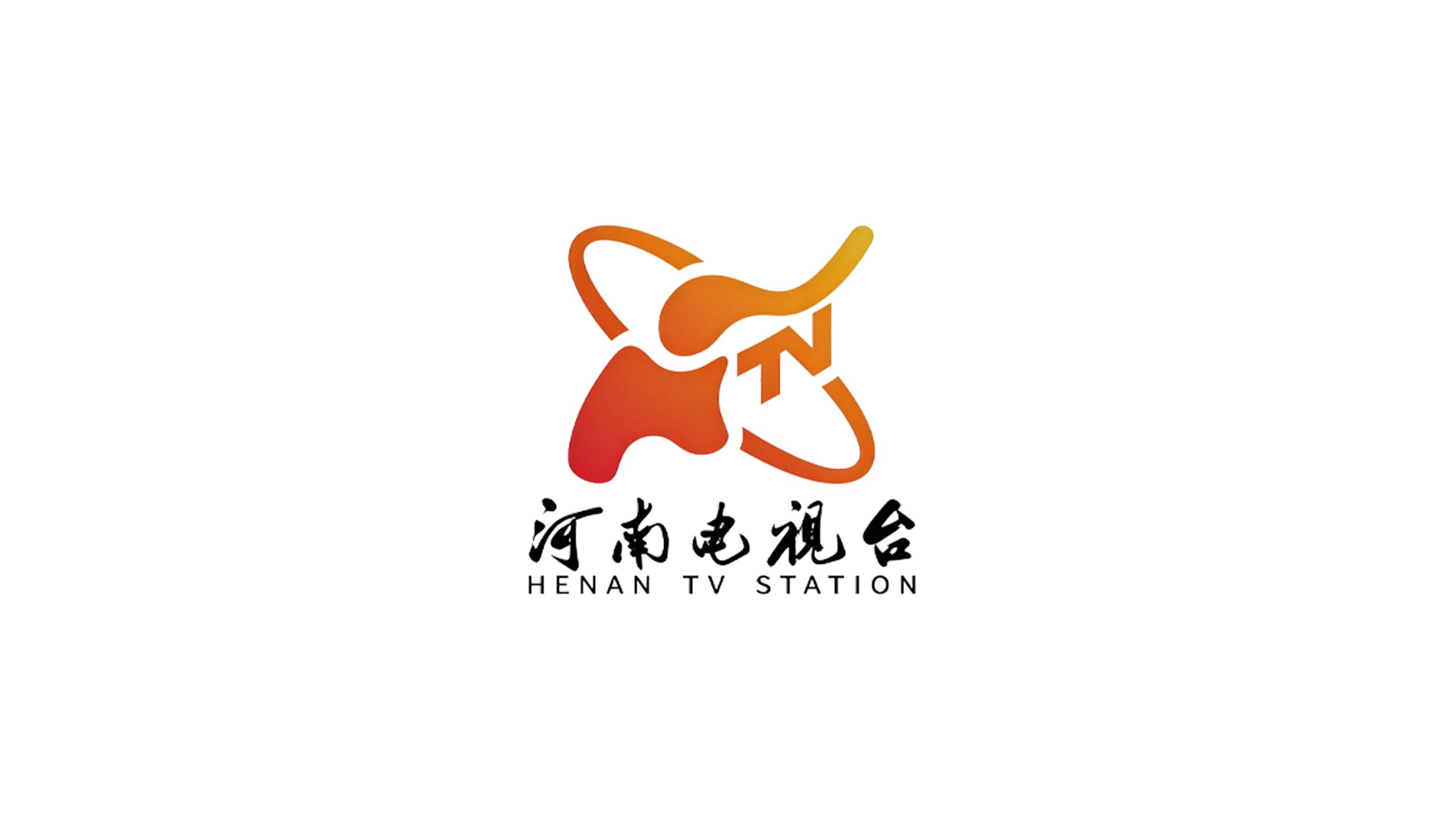
Henan TV is one of the most influential provincial TV media in central China. It is rooted in the profound historical and cultural soil of the Central Plains and shoulders the media mission of spreading Central Plains culture, serving the development of Henan, and connecting hundreds of millions of viewers.
Henan is abbreviated as "Yu", and the word "Yu" contains "elephant". The elephant has been the cultural totem and spiritual symbol of the Central Plains since ancient times, carrying the heavy, stable, tolerant and enterprising regional character of the Henan people. This time, Qingmei Future was commissioned to lead the Taiwan logo design.
The design goal of the brand logo is to demonstrate the authoritative status of Henan TV Station as a provincial mainstream media through the visual language of regional totems, modern technology and media attributes, and to integrate the historical depth of Central Plains culture with the scientific and technological power of modern media to create a station logo image with high recognition and cultural connotation.
Design concept and graphic language
The logo takes "Elephant Orbit" as the core concept, with an abstract elephant as the main graphic, and the orbit of the satellite surrounding it, creating a brand symbol that blends totem culture and modern technology. The core idea of the design is to cleverly deform the English letters "H" and "N" (the first letter of Henan's pinyin, Hé Nán), so that they together form the outline of an elephant. The two vertical lines of "H" turn into the thick and powerful front and rear legs of the elephant, and the horizontal strokes turn into the thick trunk; the diagonal stroke of "N" rises upward, turning into the outline of the elephant's high trunk and head. The overall shape is both a structural combination of two letters and a silhouette of a strutting elephant. The dual interpretations of letters and elephants are perfectly superimposed and inseparable in the same graphic, so that while conveying the regional information of "Henan", the logo naturally evokes the cultural association of "Xiang" in "Yu". As a result, Henan TV Station gained the affectionate nickname "Elephant Station", and the station logo itself became the most vivid communication asset of the brand. The overall design integrates ancient totem culture with modern media technology, reflecting the dual attributes of Henan TV Station between cultural inheritance and media innovation.
The shape of the elephant has been highly geometrically refined and summarized, using the simplest lines and color blocks to create a clearly identifiable outline of the animal. The elephant's body is presented in a plump and thick body, with its limbs firmly planted on the ground and its center of gravity steady, symbolizing the virtuous nature of the Central Plains and the down-to-earthness of the people of Henan. The elephant's trunk is raised high and stretched upward, like a signal sent to the sky by a signal tower, conveying an enterprising and high-spirited brand spirit, and at the same time hinting at the core functions of "communication" and "voice" of the television media. The overall posture of the elephant is a dynamic movement in progress - the limbs are striding forward and the trunk is raised in the wind, conveying the development trend of Henan TV Station in the era of media convergence. The negative space on the elephant body is cleanly processed, achieving a high level of graphic summary while maintaining the elephant's recognizability, ensuring that the station logo is still clearly legible in small-size scenes such as TV screen corner markers and channel switching.
The "ring-shaped" track surrounding the elephant is the most modern and technological visual element in the logo. The elliptical orbit line surrounds the main body of the elephant at an oblique angle, just like the trajectory of a satellite orbiting the earth, directly metaphorizing the technical nature of television signals reaching thousands of households through satellite transmission. The inclination angle of the track line has been carefully calculated so as not to block the key outline of the elephant's main body, but also breaks the static tone of the elephant's squareness and stability with the dynamic oblique lines, giving the entire logo a sense of speed and technological power of rotational movement. The track line is like an invisible signal belt, wrapping the ancient Central Plains totem in the aura of modern communication technology, completing the visual unity of "tradition and modernity, region and global, culture and technology". The overall composition constructs the "elephant satellite" with an internal and external nested structure of "elephant in the middle and orbit outside", conveying the cultural foundation and technological attributes of the Taiwan logo.
Font composition and color system
The logo is presented in a purely graphic form. The combined graphic composed of an elephant and a satellite orbit is the entire visual asset of the logo. In the complete brand system, the Chinese name of "Henan TV" and the English name of "HENAN TV" are paired below the graphics. The Chinese uses a stable modern boldface, with straight and powerful strokes and a balanced structure, conveying the authority and solemnity of the provincial mainstream media; the English is arranged in a standard uppercase sans-serif font, with regular fonts and moderate spacing to ensure clear recognition in international communication scenarios. Both Chinese and English are presented in a concise and standardized style, and do not compete with the station logo for visual attention, ensuring that the elephant totem is always the first focus of brand recognition.
The main color, Henan Blue #005BAC, is the core color of the Taiwanese logo, representing the technological attributes of television media, the spectrum image of signal transmission, and the authority and credibility of provincial media. Blue is the most widely used brand color in global television media - from CCTV to provincial satellite TVs, blue has become the visual consensus color of the television industry. The choice of this color allows Henan TV's logo to naturally integrate into the visual context of the media industry. The calmness and rationality of dark blue convey the objectivity and impartiality of news reports, and the sense of technology and future of blue is in line with the technical connotation of satellite transmission and digital media. Auxiliary bright blue #0098E8 is used for the highlight areas of satellite orbit lines and graphics. It uses bright and active tones to enhance the sense of technology and dynamic vitality, and injects a touch of modern and bright rhythm into the main dark blue tone. Pure white #FFFFFF is used to reverse the station logo on dark backgrounds (such as channel logos and dark packaging) to ensure the clarity of the elephant outline on various screens and media. The overall color system takes blue as the absolute core, reflecting the station logo temperament of "technological media, authoritative and trustworthy", and uses the most condensed color to establish Henan TV's professional identity in the media industry.
Application extension and brand significance
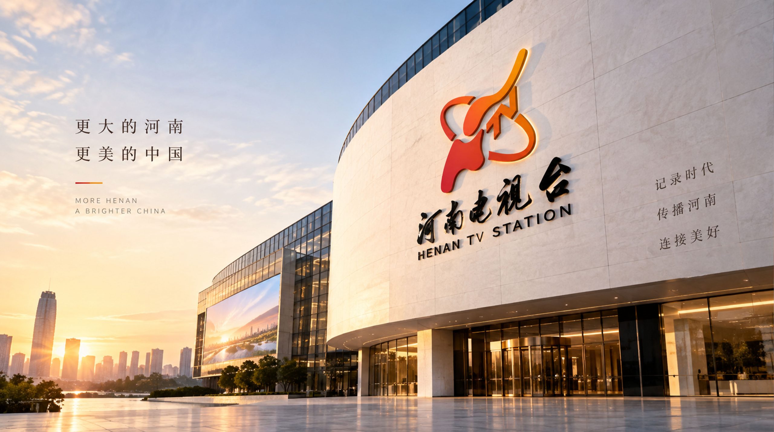
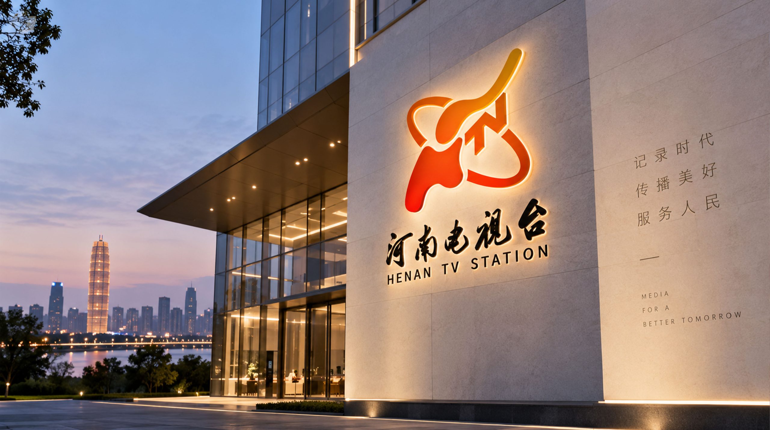
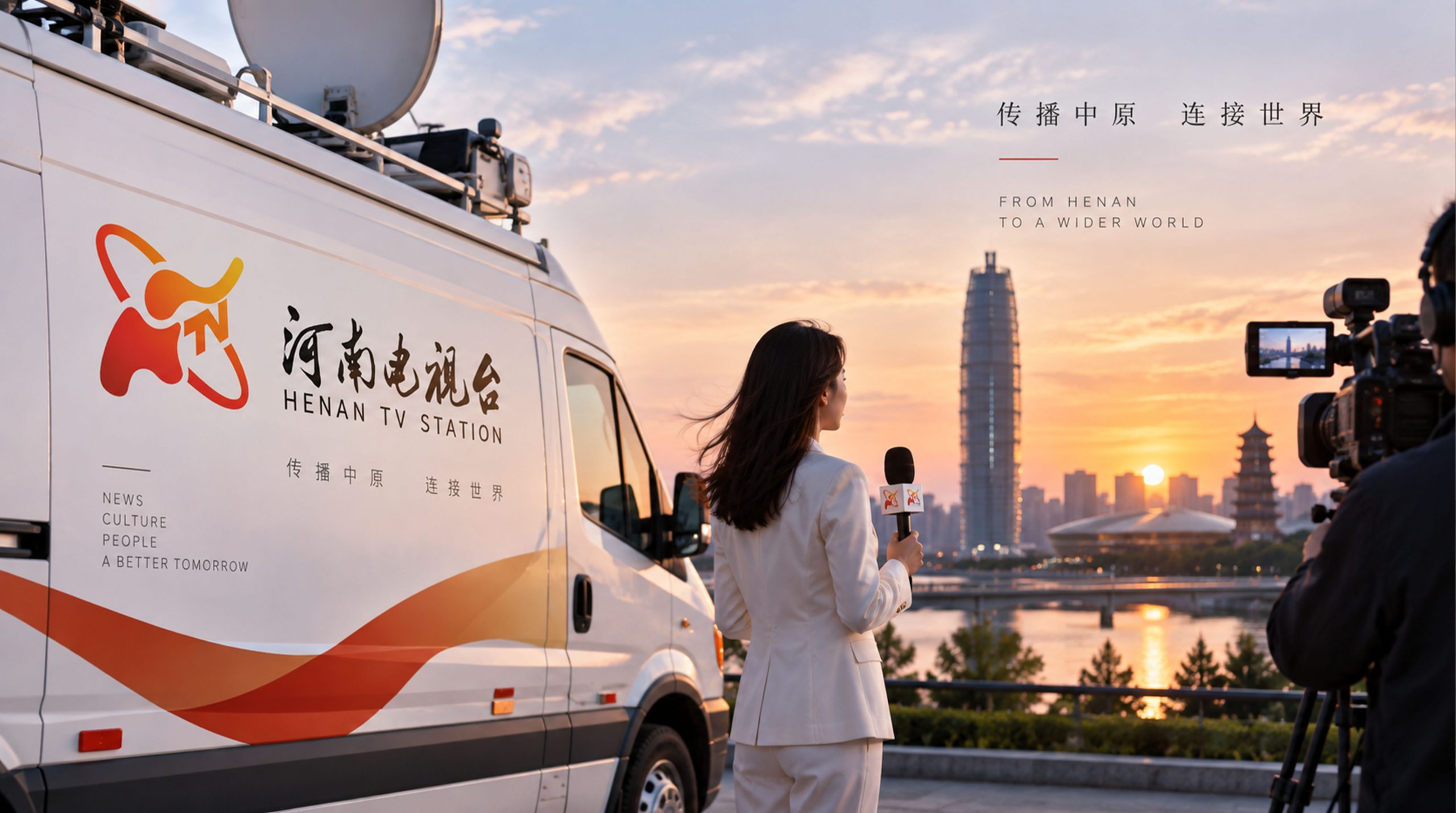
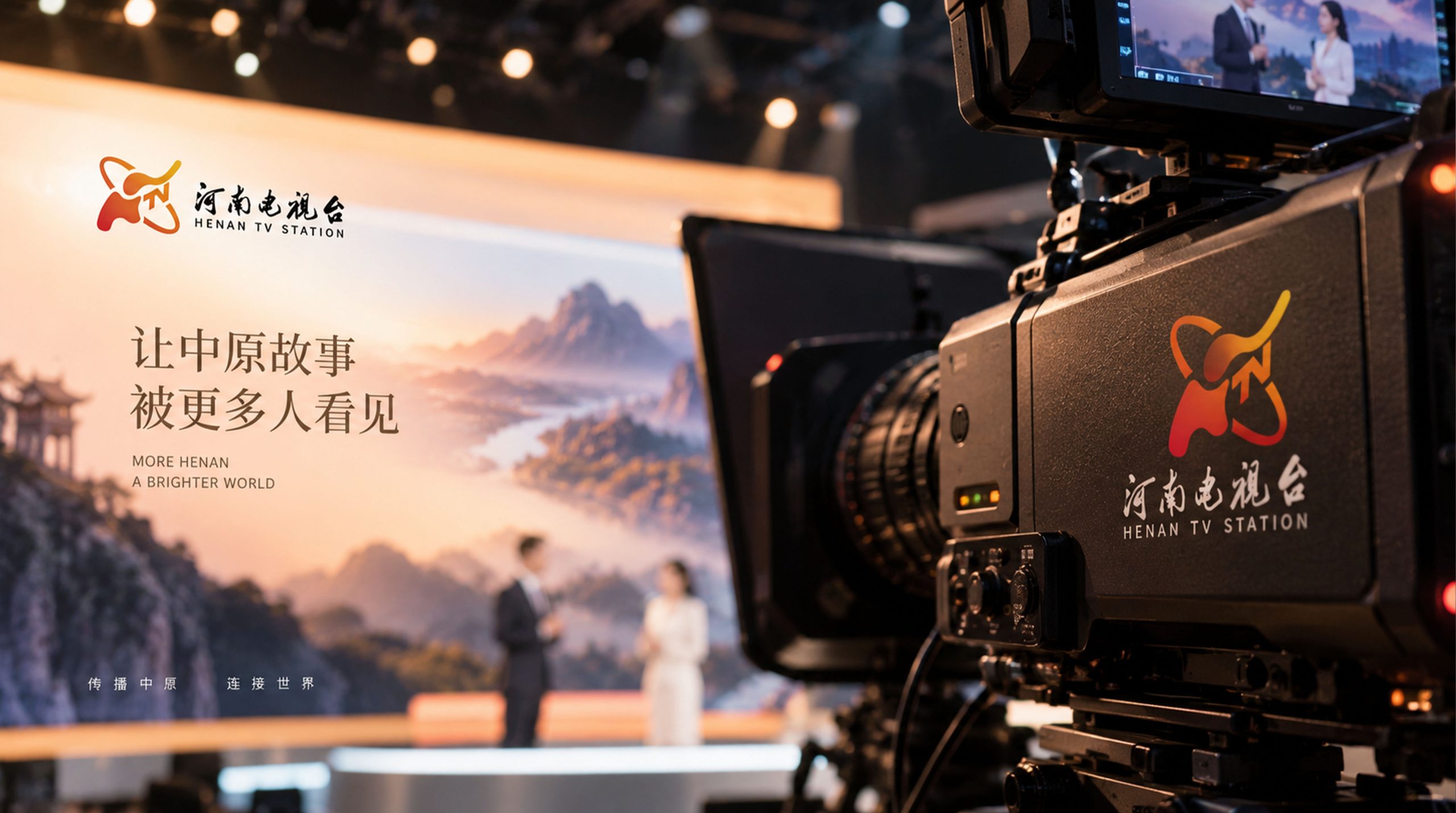
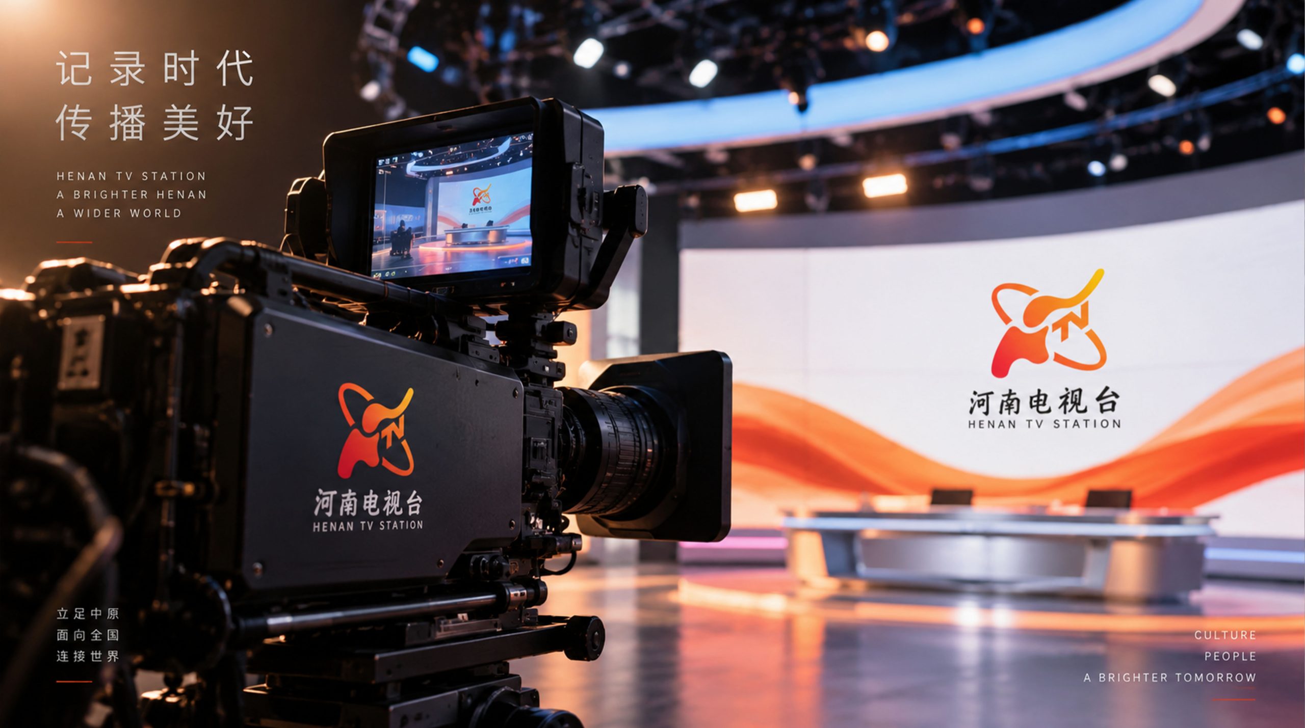
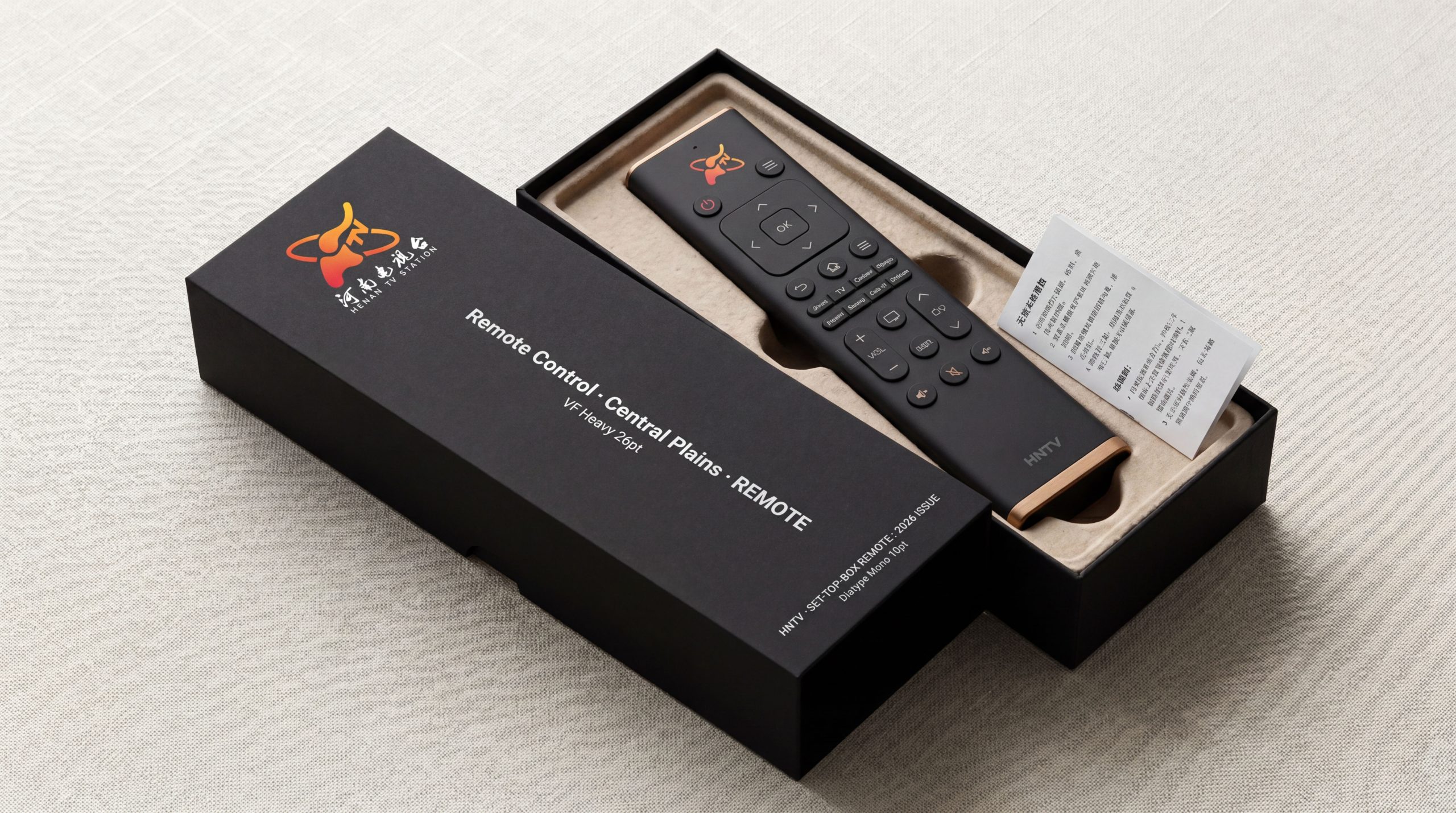
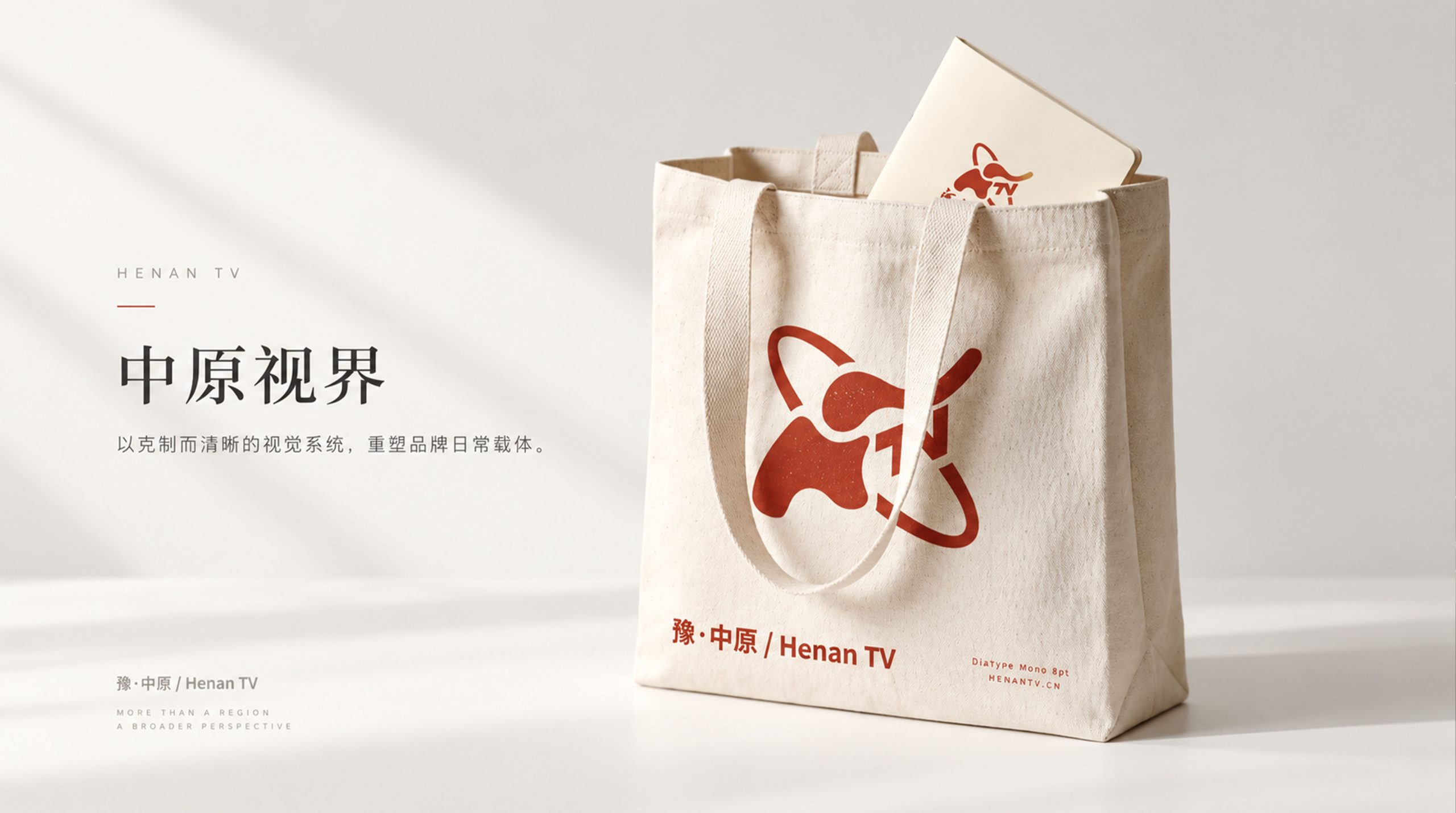
The station logo has strong system scalability and multi-scenario adaptability, and can be widely used in channel corner logos in the upper right corner of TV screens, program titles and endings, channel promotional videos and station logo call sign animations; TV station building facades, news studio backgrounds, interview microphone logos and broadcast vehicle logos; official websites, new media platform matrices, mobile APP icons and social media avatars; press conferences, large-scale evening parties, cultural activities and international film and television festival images; brand stationery, reporter equipment, Taiwan celebration souvenirs and cultural peripheral products. The station logo is particularly prominent in the most frequent application scenario of TV screen corner logos - the high simplicity of the elephant outline ensures that it is still legible at a very small size, and the dynamic sense of the satellite orbit lines still conveys a sense of vitality and movement in the static corner logo. In the dynamic vision, the satellite orbit line can continue to rotate around the main body of the elephant, symbolizing the 24-hour uninterrupted coverage and spread of television signals; the elephant can slowly walk from the depths of the picture and gradually take shape, symbolizing the magnificent process of Central Plains culture from the depths of history to the modern stage. The elephant silhouette can be independently extracted as a brand super symbol, which can be used in the series development of channel classification icons, program type logos, new media emoticons and "Elephant Channel" IP image.
The logo contains three core images of the Henan TV brand: Central Plains Totem - the elephant shape directly carries the regional cultural gene of "Elephant" in "Henan", establishing a strong connection between the logo and the region with the most recognizable cultural symbol in Henan; Modern Technology - the satellite orbit conveys the technological attributes of TV media and the modern power of signal coverage; Steady Progress) - The steady posture of the elephant in progress symbolizes the accumulated and steady development trend of Henan TV Station and the virtuous spiritual character of the Central Plains people. The overall design combines totem culture with modern technology to give the station logo a unique style, conveying Henan TV's brand vision of "rooted in the Central Plains, connected to the world, and moving forward with solidity".
Improper Usage (Protection Specification)
Do not change the shape proportions, posture direction or the structural relationship of the "HN" letters of the elephant's outline; do not modify the inclination angle of the satellite orbit line, the elliptical proportion or the surrounding relationship with the main body of the elephant; do not change the hue, brightness or saturation of the main color of Henan Blue; do not add gradients, strokes, shadows or excess to the station logo. Three-dimensional effect; it is forbidden to separate the elephant and the track line into independent elements and use them alone; it is forbidden to rotate or mirror the elephant's direction of travel or the raising direction of the elephant's trunk; keep the white space around the logo not less than 25% of the diameter of the graphic; the minimum display width must not be less than 20mm (the TV corner logo scene can be adapted according to the screen specifications).
design results
After the release of the logo, Henan TV's brand recognition and cultural identity in the minds of national television media and audiences have significantly improved. "Elephant + Satellite Orbit" has become the core identification symbol of Henan TV's brand system with its unique visual language that blends totem culture and modern technology. The elephant-shaped logo has given Henan TV the popular nickname "Elephant Station" and has become one of the most recognizable and friendly logos among Chinese provincial satellite TVs. The station logo has been widely recognized by hundreds of millions of viewers in program broadcasts, news reports and cultural dissemination, showing the brand vision of "the Central Plains has thick soil and elephants move forward".