










The Capital Jockey Club is the most influential high-end equestrian and social club in Beijing. With equestrian sports as its core, it integrates aristocratic social interaction, business exchanges and life aesthetics to create a top-level membership platform for the urban elite that integrates riding training, polo events, private banquets and leisure vacations.
The four-character brand name "Jockey Club" is straightforward - "Jockey Club" points to the regional identity and capital character of the imperial city, while "Jockey Club" directly refers to the core business of equestrian sports and membership clubs. Qingmei Future was commissioned to lead the brand identity design.
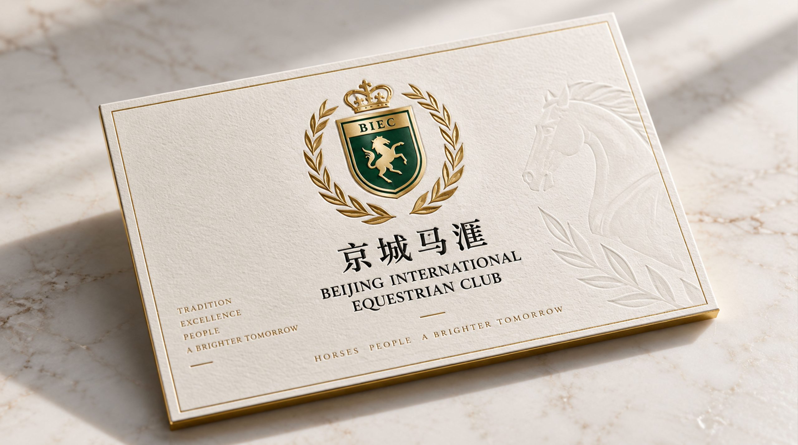
The design goal of the brand logo is to demonstrate the brand positioning of the Beijing Jockey Club as a top equestrian social club through the visual language of aristocratic equestrian spirit, the royal charm of Beijing and high-end social style, and to convey the brand image of "horse spirit, aristocratic style, and Beijing magnanimity".
design concept
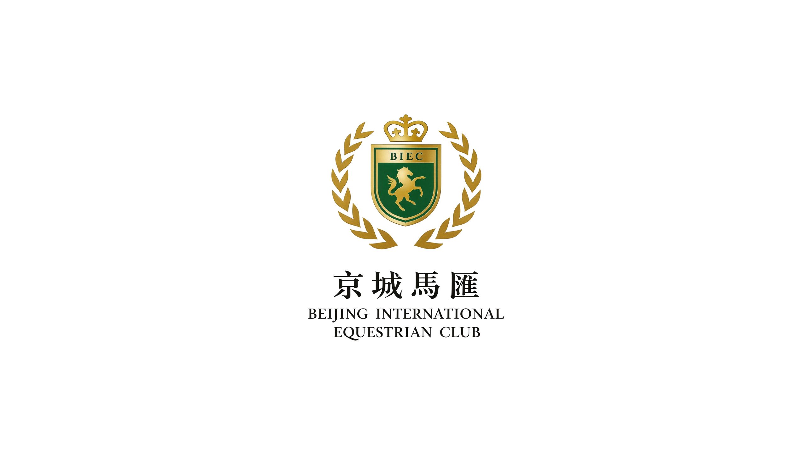
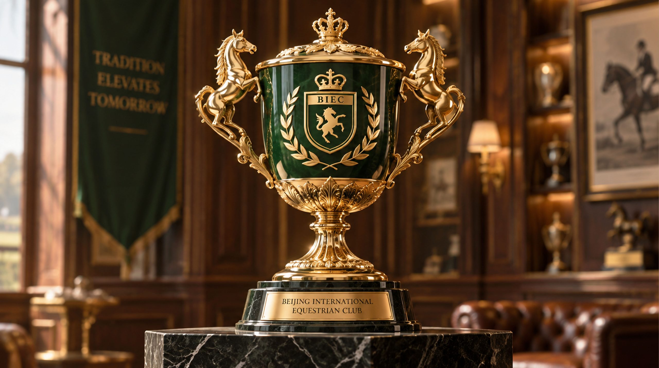
The logo takes "Royal Equestrian Crest" as the core concept, integrating the power aesthetics of the horse with the solemn ritual sense of the royal crest, creating a brand totem that combines sporty dynamics with aristocratic temperament. The horse is the most direct visual symbol of equestrian clubs around the world, and the badge is the identity symbol shared by European aristocrats and Eastern royal families. The combination of the two allows the Beijing Jockey Club's brand identity to convey the two core messages of "equestrian sports" and "noble identity" at the same time.
graphic language
The main body of the graphic takes the side silhouette of a galloping horse as the visual core. The horse's head is held high, its mane is flying, its front hooves are in the air, its hind legs are kicking on the ground, and its entire body is jumping forward, just like the most explosive moment before sprinting to the finish line on the field. The shape of the horse has been highly artistically refined, using smooth and powerful arcs to summarize the muscle outline and movement tension of the horse's body - the neck arc is as straight as a bow, conveying the unity of strength and elegance; the back line is stretched and slender, conveying the balance of speed and calmness; the limbs are spread out in sharp diagonal lines, conveying the explosive power and unstoppable momentum of the galloping forward. The mane and tail stretch backwards in several elegant curves, like flags flying in the wind, injecting a touch of agility and chicness into the strong horse body.
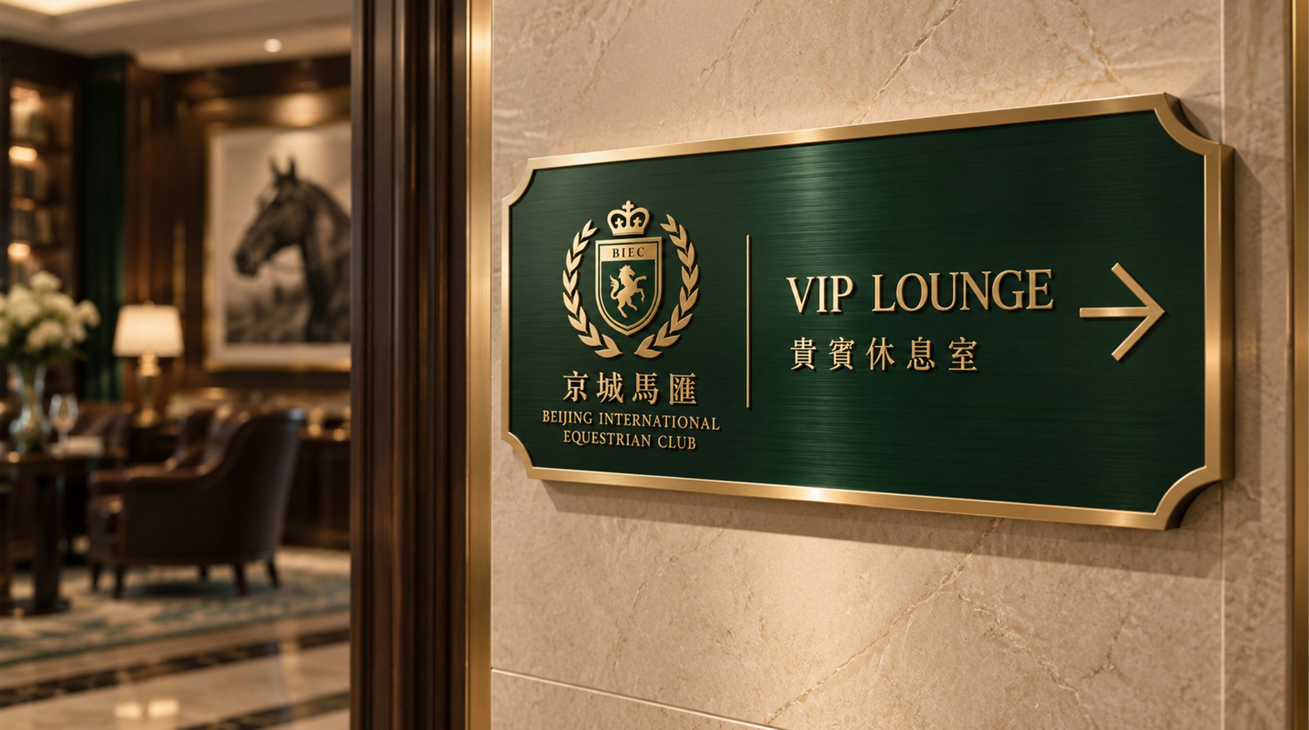
The silhouette of a horse is placed within a coat of arms. The shield shape is the most classic logo composition of European aristocratic heraldry and equestrian clubs. It is slightly narrower at the top, tapered at the bottom, and has symmetrical and full arcs on both sides, conveying the spirit of the badge of "protection, glory and inheritance". The shield-shaped frame is outlined with double lines. The outer line is thick and steady, and the inner line is slender and delicate. It maintains the exquisite details while being solemn. The shield-shaped top is supplemented by a simplified crown outline, which is composed of three to five arches, echoing the royal regional attribute of the word "Beijing" - this is not an equestrian club in an ordinary city, but a Jockey Club at the foot of the imperial city. The crown gives the brand the unique kingly bearing of the capital. Inside the shield, a streamer is placed above or below the horse to carry the club's name or motto. The two ends of the ribbon are curled outward, just like an honorary ribbon awarded after a victory on the field. The overall composition uses a three-layer structure of "a horse standing on a shield and a crown on a shield" to construct the "royal horse badge", conveying the brand's sportsmanship and aristocratic pedigree.
Font composition
The Chinese "Jockey Club" adopts the dignified modern Song style, with thin horizontal lines and thick vertical strokes, and clear strokes. The word "Jingcheng" carries the rich culture of the imperial city, and the word "Jockey Club" directly points out the core business format. The English "BEIJING JOCKEY CLUB" is arranged in a classic uppercase serif font. The font is broad and steady, and the serifs are exquisite, consistent with the visual tradition of century-old European equestrian clubs. Chinese and English are distributed up and down around the shield-shaped badge, forming a complete badge brand composition.
color system
The main color, Royal Horse Gold #B8943E, represents nobility, glory and supreme quality. Just like the metallic luster of equestrian trophies and the luxurious texture of rider medals, it directly establishes the noble signal of the brand. Auxiliary Knight Black #1A1A1A is used for the silhouette of the horse and the brand logo, using the deepest tone to convey the power of the horse and the solemn style of the club. Black is also the classic main color of equestrian riding clothing, echoing the dress tradition of equestrian sports. Auxiliary Imperial City Red #8B1A1A is used for accent elements and event materials in the brand system, just like the deep vermilion on the walls of the Forbidden City, injecting the unique cultural background of the capital into the classic tone of gold and black. Pure white #FFFFFF is used as the standard background color and the inside of the badge is left blank. The overall color is gold and black as the core and imperial red as embellishment, reflecting the brand temperament of "aristocratic equestrianism and capital style".
Application extension
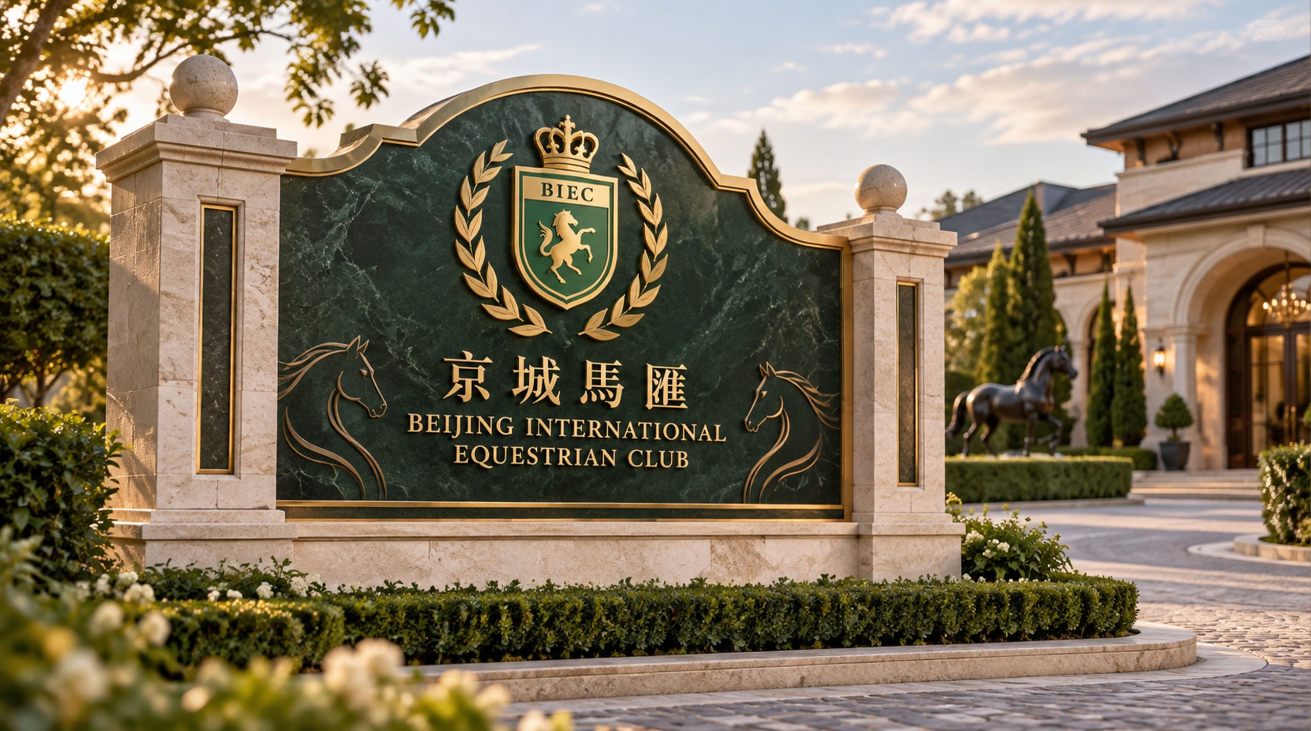
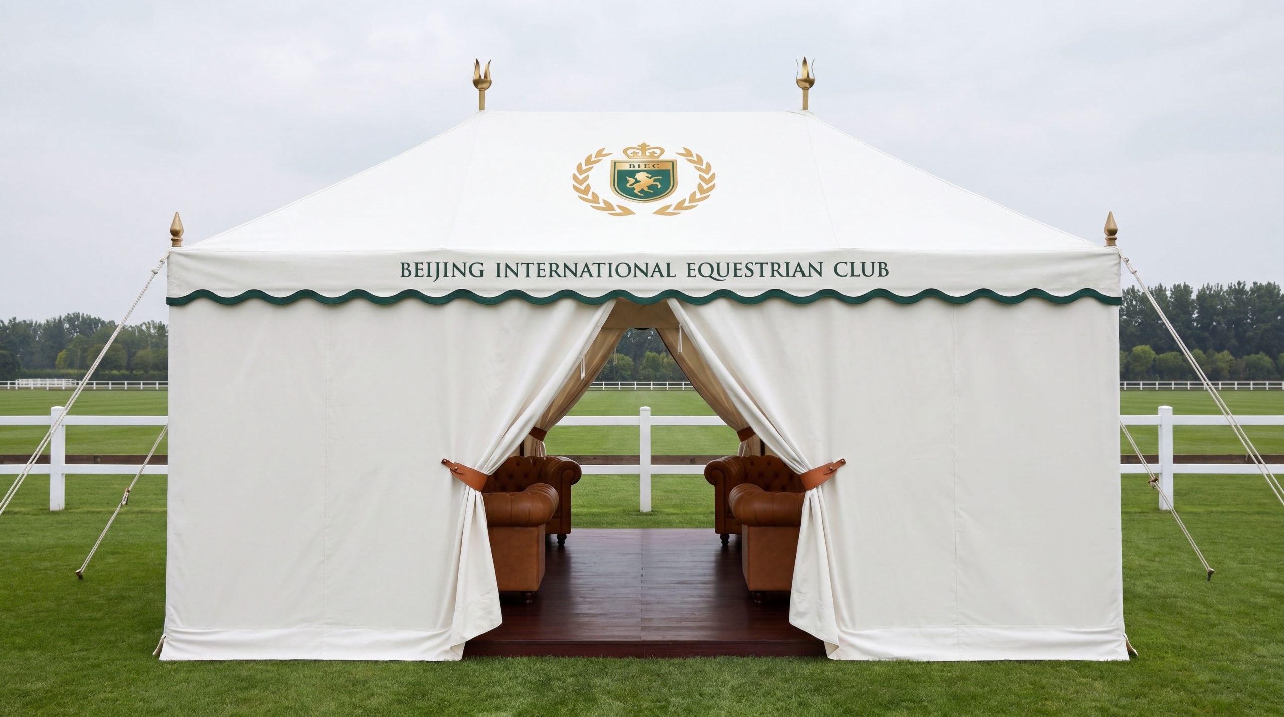
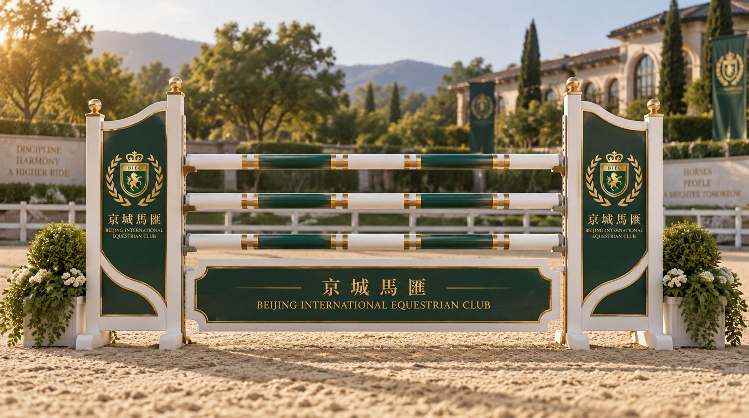
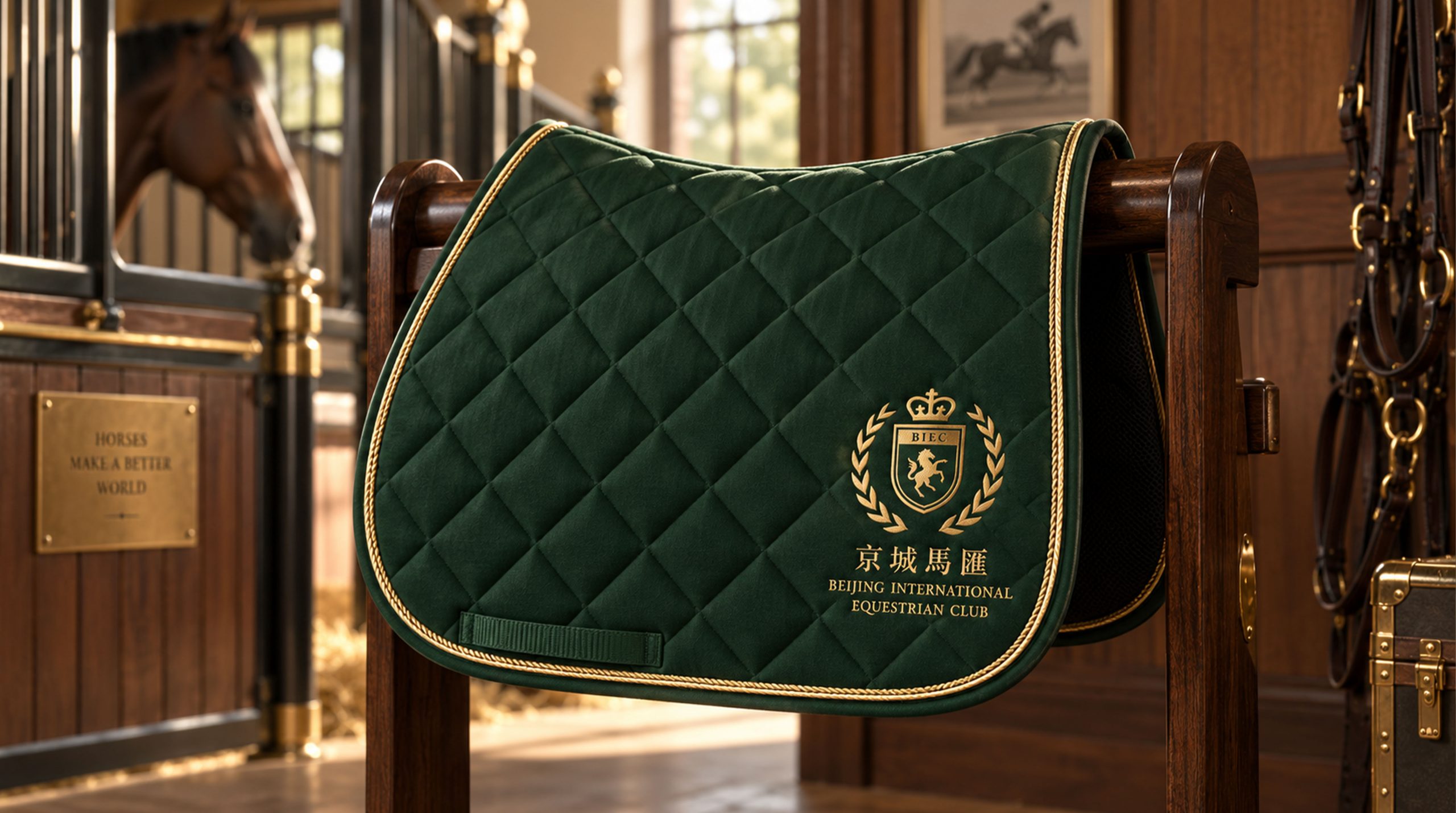
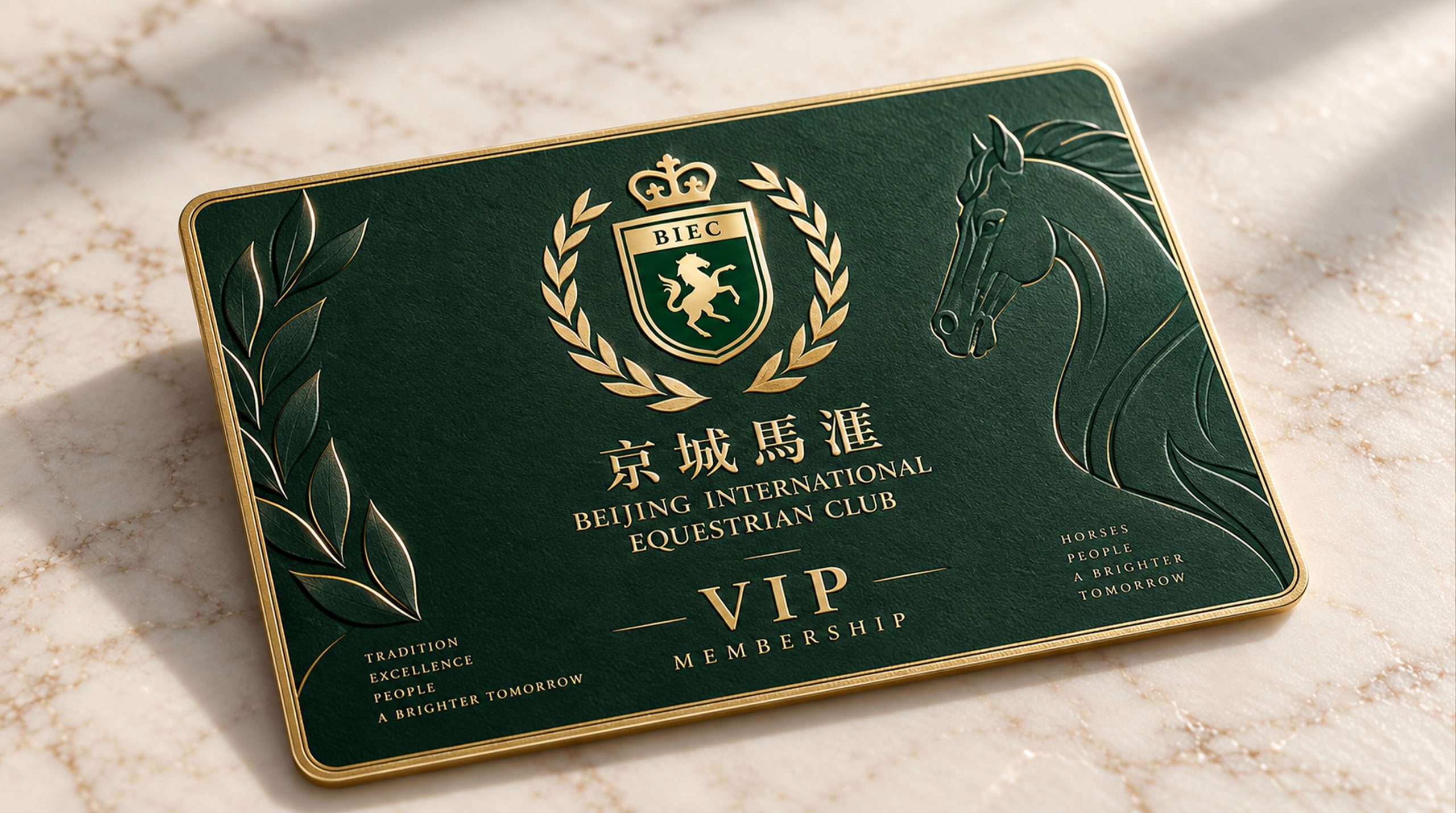
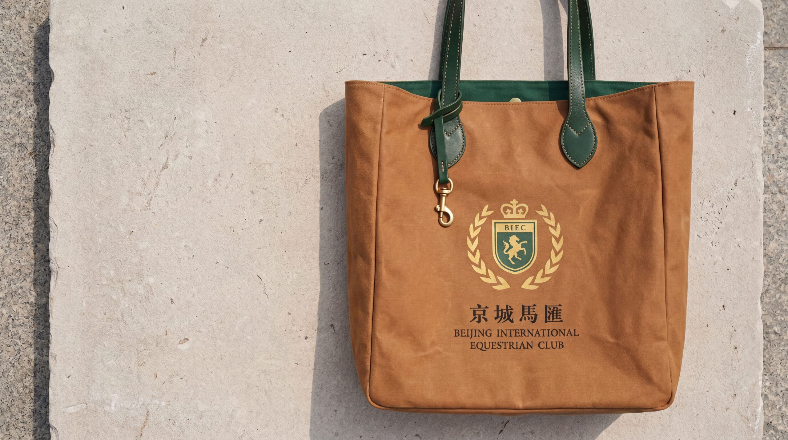
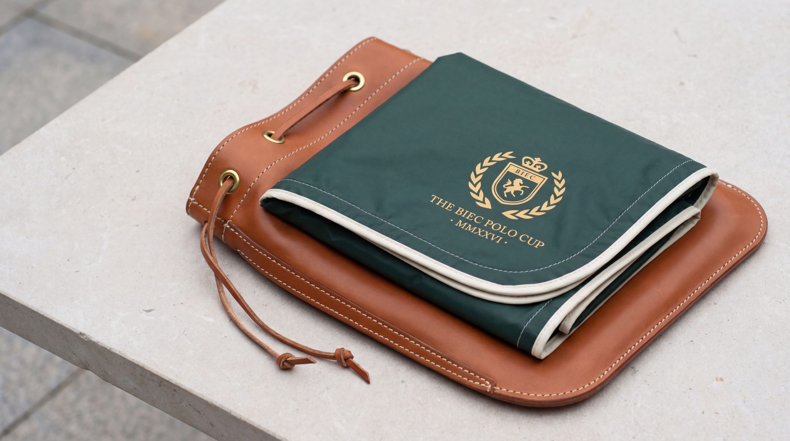
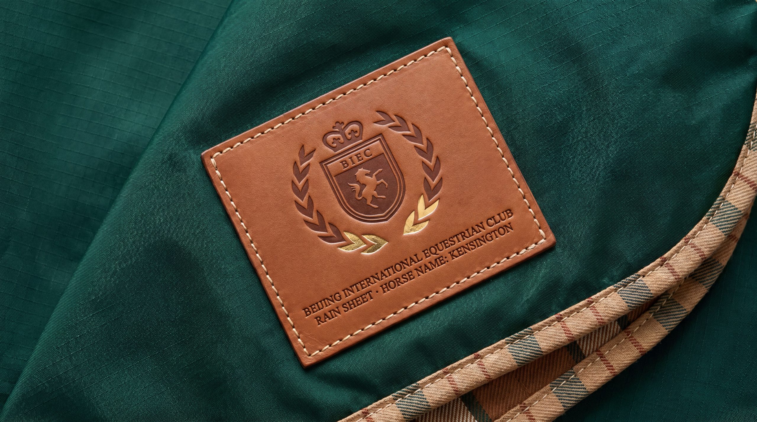
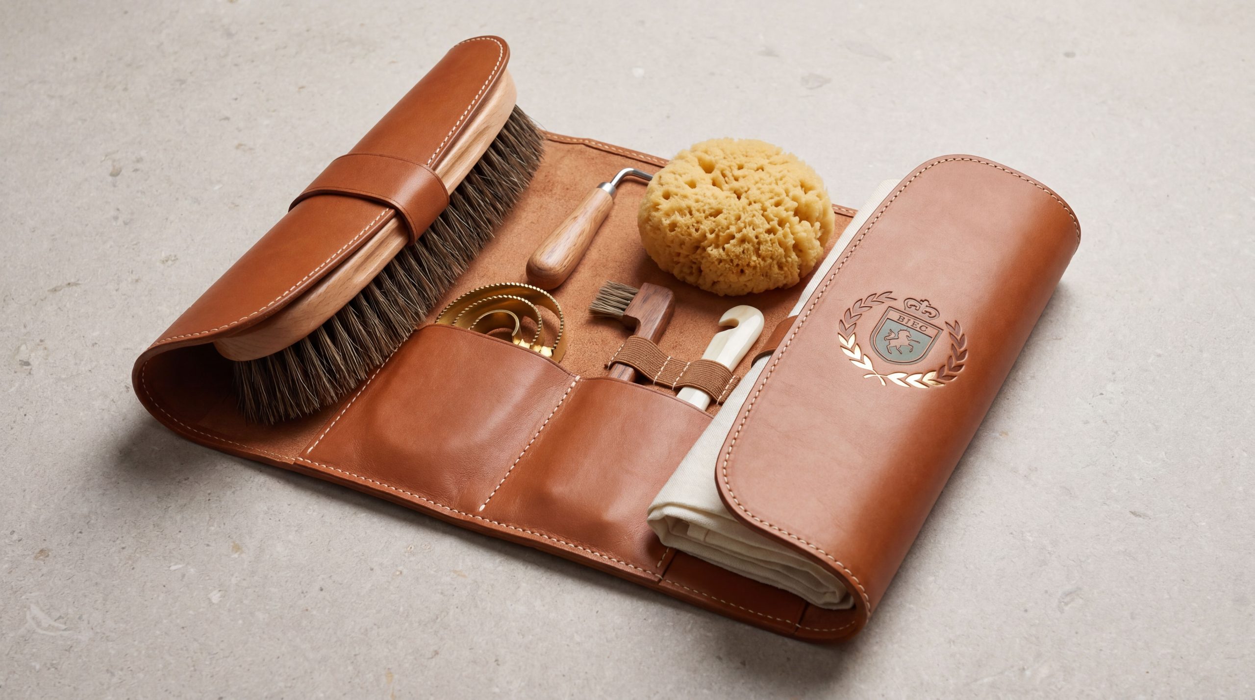
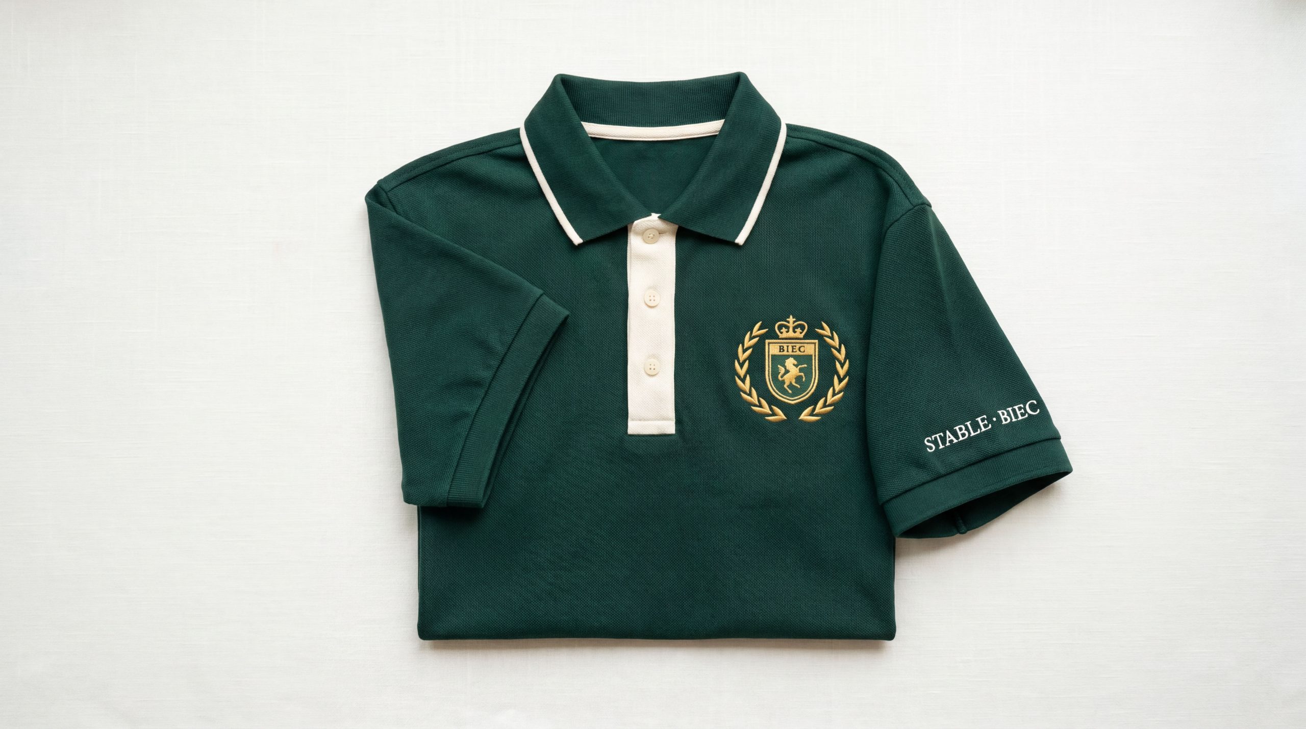
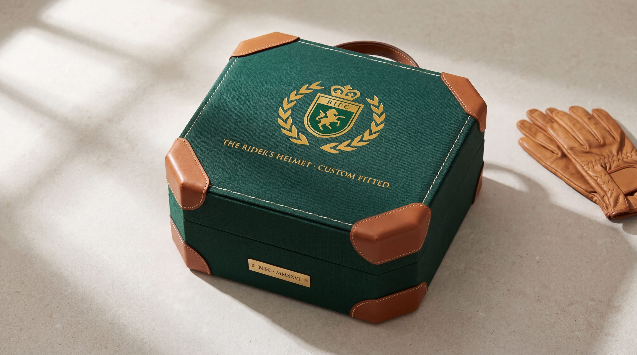
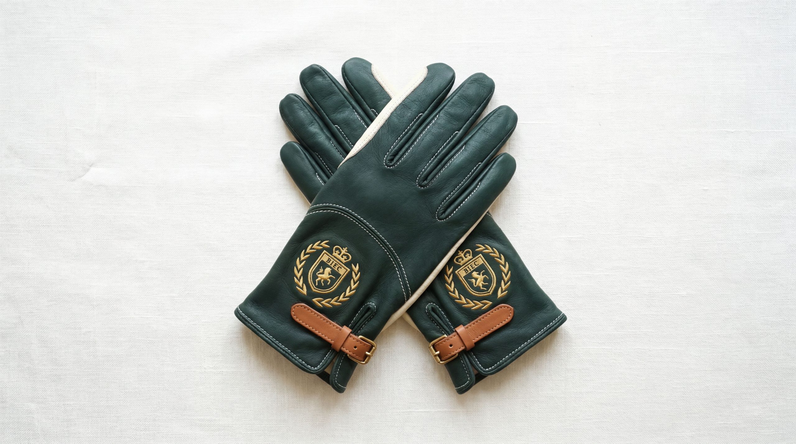
The logo can be widely used in the entrance gate of the Jockey Club, the image wall of the club lobby, the nameplate of the stable area and the track guidance system; membership cards, invitations, event programs and high-end event invitations; official website, member-only APP, social media image and event live broadcast platform interface; polo events, equestrian performances, high-end dinners and brand cross-border event images; rider equipment customization, harness brand co-branding, commemorative badges and limited peripheral products. In the dynamic visual, the horse can leap out from the shield-shaped emblem, with its mane flying, front hooves soaring in the air, and the crown shining with golden light at the top of the shield, symbolizing that the Beijing Jockey Club breaks through boundaries with the spirit of the horse and leads the fashion with its aristocratic style. The horse silhouette and shield outline can be extracted as visual parent elements respectively, which can be used for event classification icons, membership level logos and space decoration patterns.
brand meaning
The logo contains three core images: Equestrian Spirit - the power and elegance of a galloping horse conveys the competitive spirit and vitality of equestrian sports; Noble Prestige - the shield badge and crown convey the noble status and social style of a high-end membership club; Imperial Legacy - the cultural embellishment of imperial red and the "Beijing" naming convey the regional confidence and royal charm of the brand rooted in the capital. The overall design conveys the Beijing Jockey Club's brand vision of "taking the appearance of a horse, going to the capital for appointments, and enjoying the gifts of the nobility".
Improper Usage (Protection Specification)
Do not change the galloping posture of the horse, the direction of the mane or the positional relationship in the shield; do not modify the symmetrical proportion of the shield outline or delete the top crown element; do not change the hue or the primary and secondary relationship between the horse gold and the knight black; do not add gradients, strokes or modern special effects inconsistent with the style of the badge; do not separate the horse, shield and crown for separate use; keep the white space ≥ 25% of the graphic height; the minimum display width must not be less than 30mm.
design results
After the release of the logo, the Beijing Jockey Club's brand recognition and distinguished image in the high-end equestrian and elite social fields have been significantly improved. With its unique visual language that combines sports power and aristocratic ritual, the "Royal Horse Badge" has become the core identification symbol of the Beijing Jockey Club's brand system. It is widely used in equestrian events, member activities and high-end social events, showing the brand vision of "horse spirit, aristocratic style, and Beijing magnanimity".