










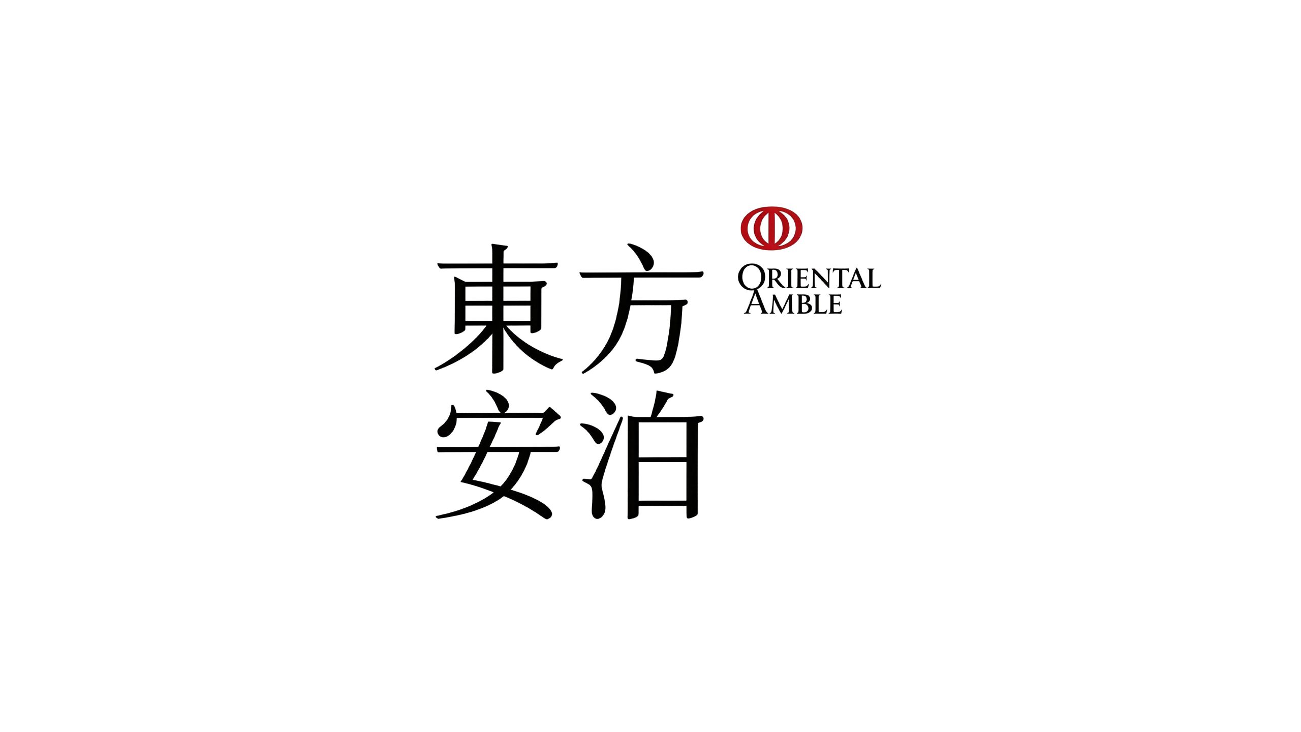
Oriental Anbo is a high-end hotel and resort brand with Oriental life aesthetics as its core. With "Oriental Way, Safe Parking" as its brand philosophy, it is committed to providing urban elites and travelers with high-quality accommodation that combines oriental cultural conception and modern comfortable experience.
The brand name "Eastern Anbo" is full of poetry - "Oriental" points out the brand's cultural genes and aesthetic stance, and represents the wisdom of life rooted in Chinese civilization; "An" means tranquility and tranquility, symbolizing physical and mental relaxation and belonging during the journey; "Bo" means anchorage and indifference, which not only refers to travelers' resting place during travel, but also conveys the Eastern spiritual realm of "without indifference, one cannot clearly understand one's ambitions". The four words combined into one outline a poetic picture of residence "safely anchored in the realm of oriental aesthetics". Qingmei Future was commissioned to lead the brand identity design.
The design goal of the brand logo is to demonstrate Oriental Amber's unique positioning as a high-end hotel brand with oriental aesthetics through the visual language of oriental artistic conception, tranquil temperament and poetic dwelling, and to convey the brand image of "oriental charm, peaceful environment, and a place of peace".
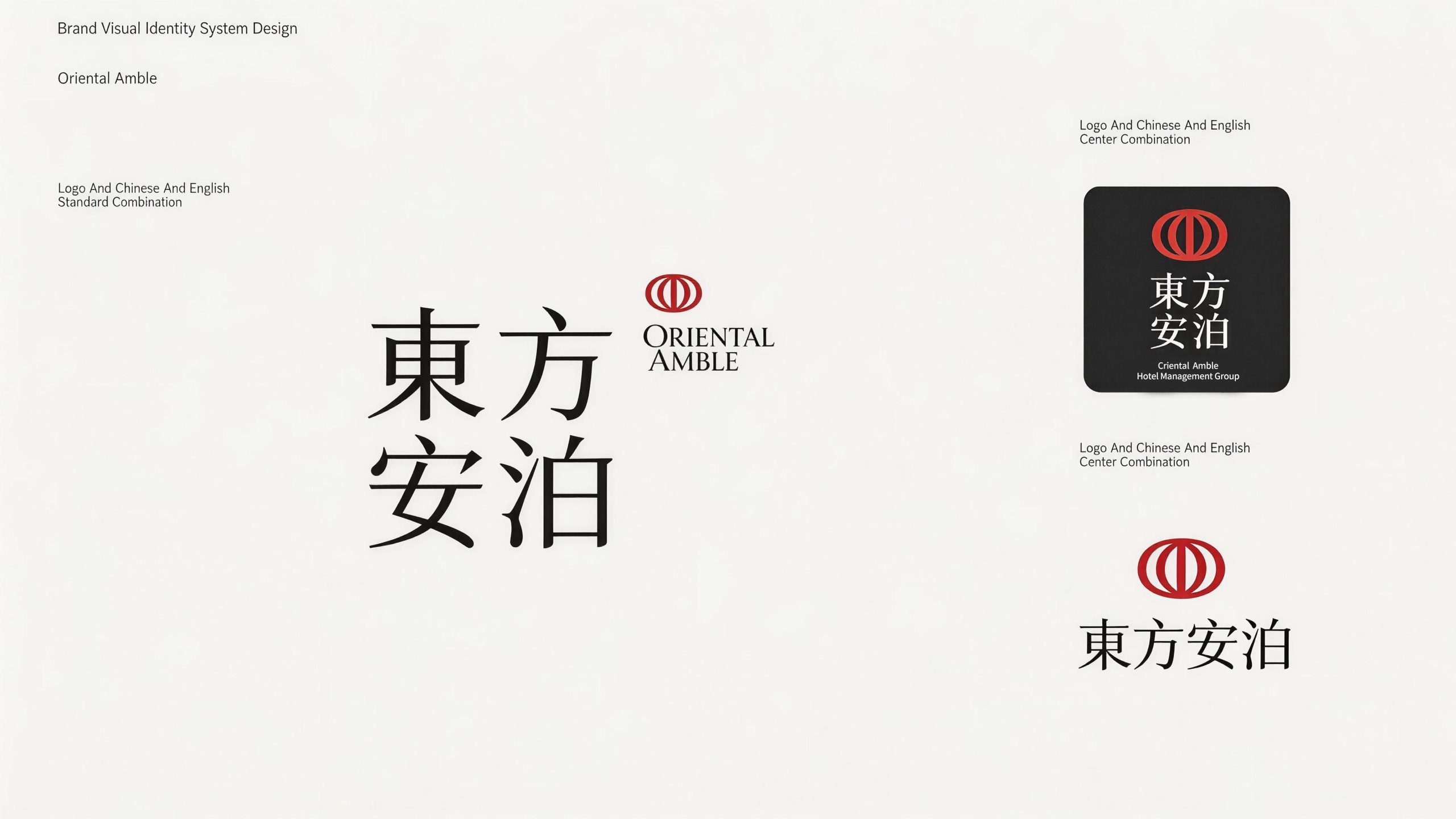
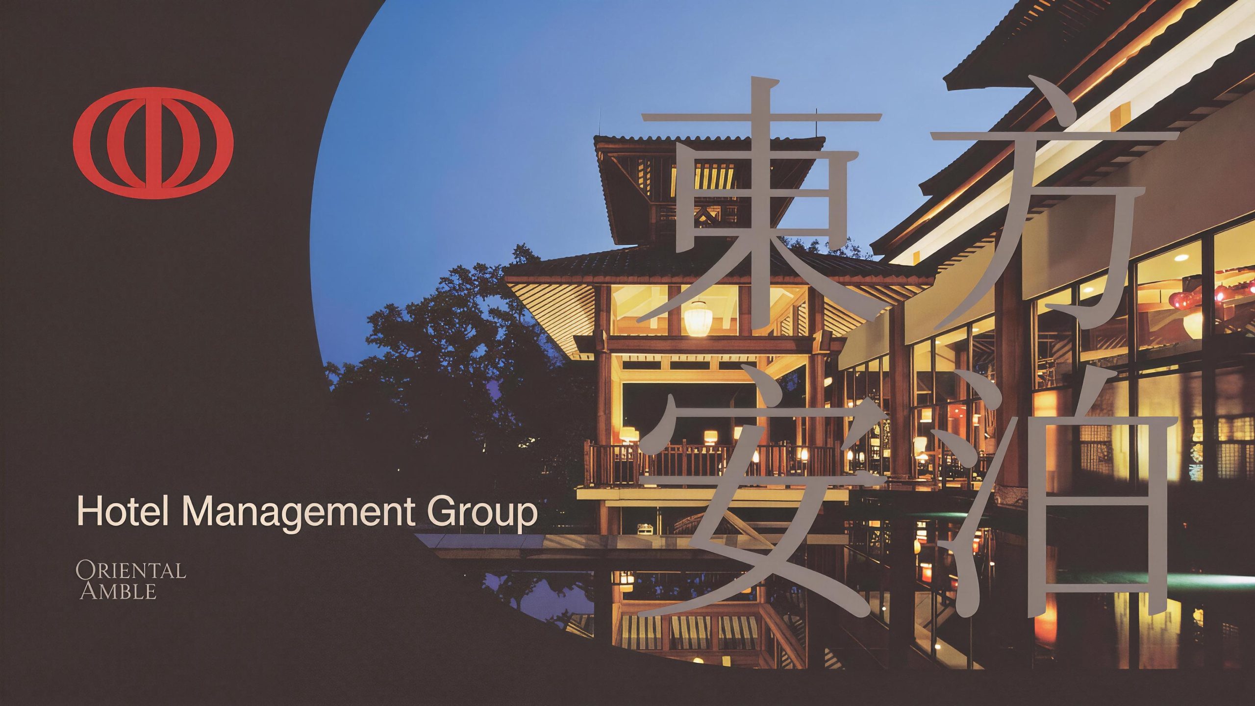
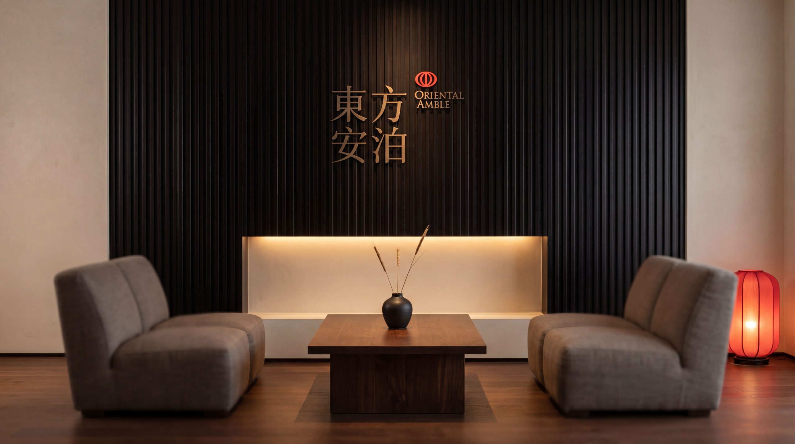
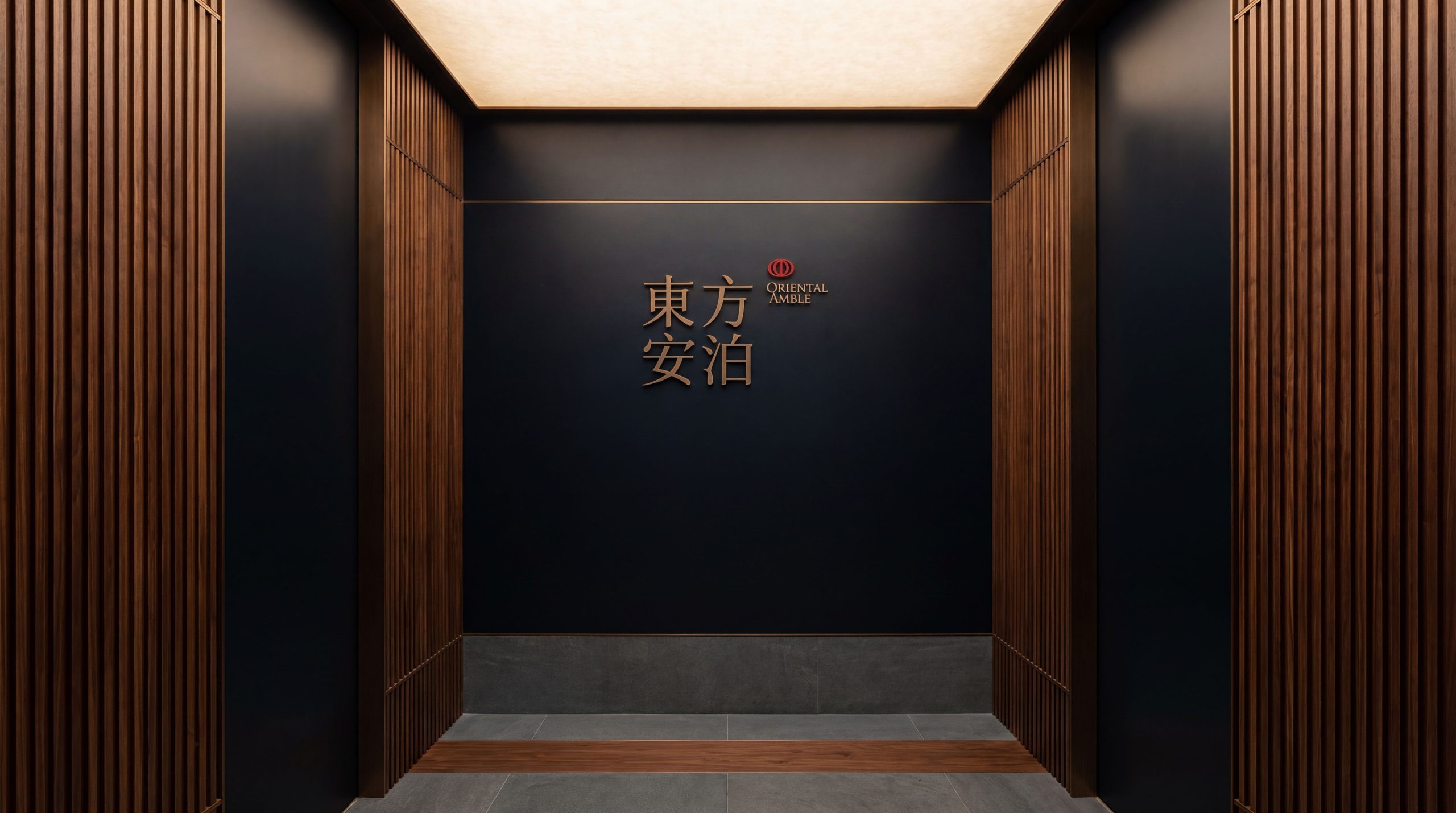
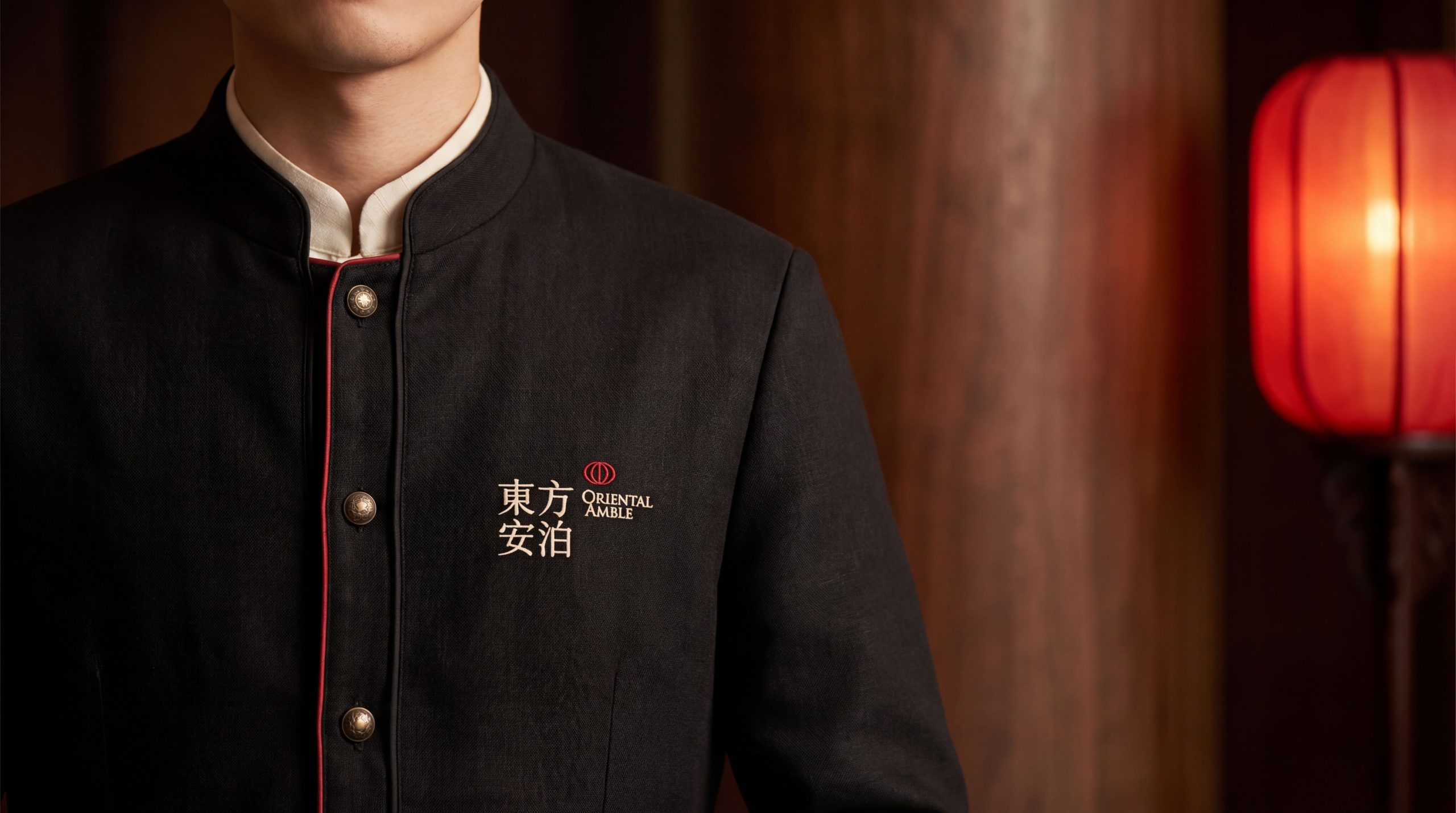
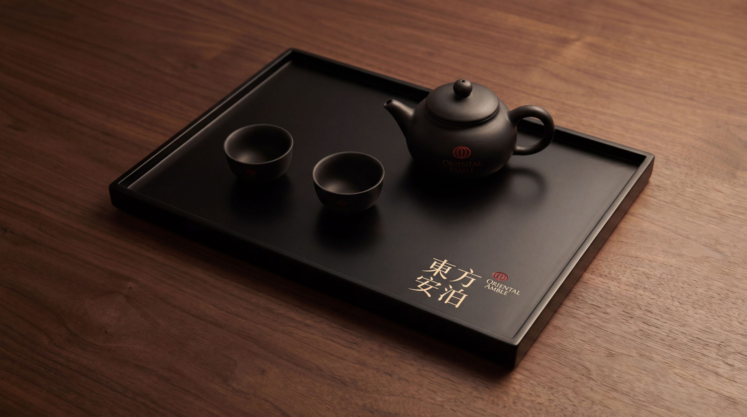
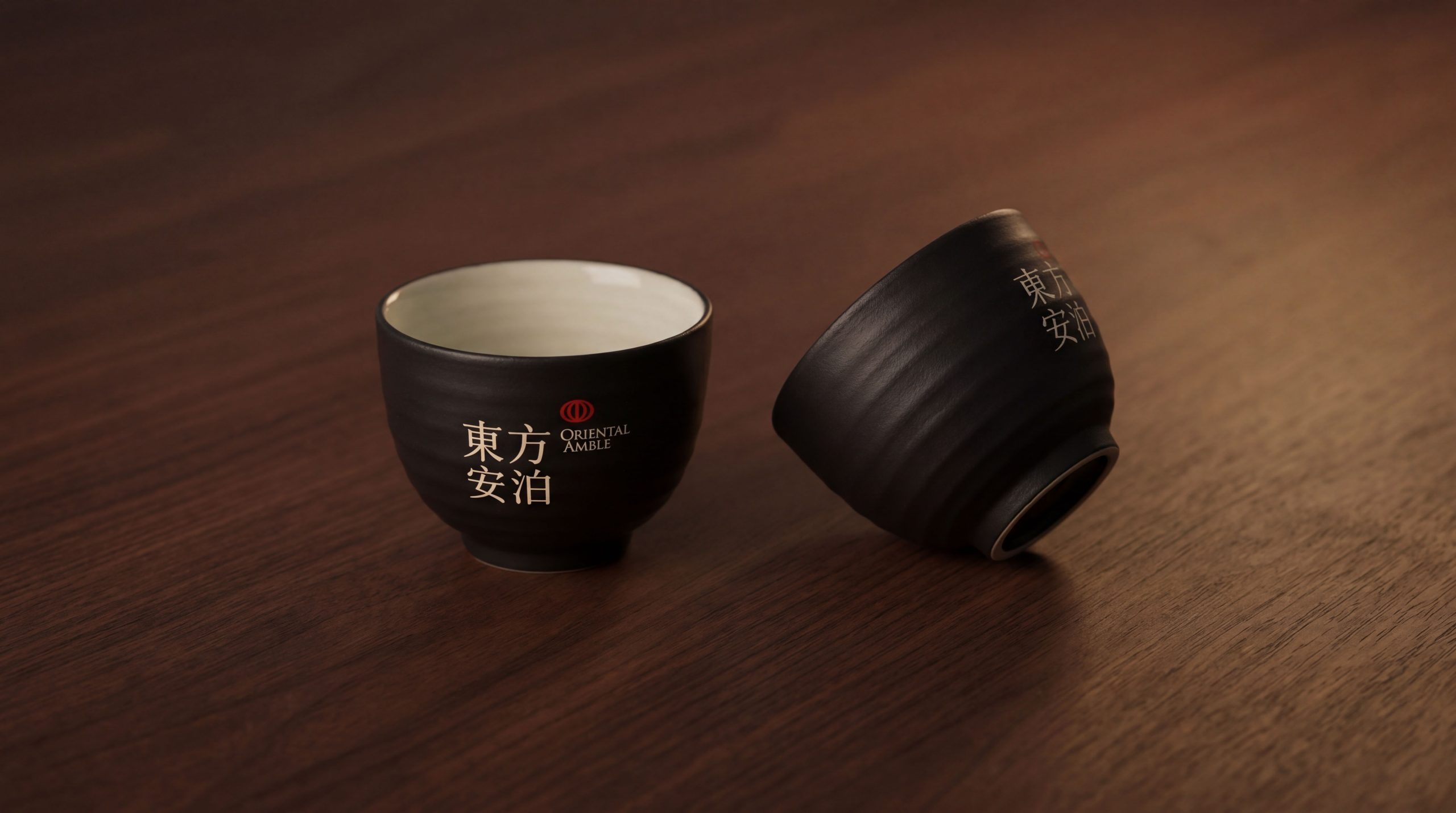
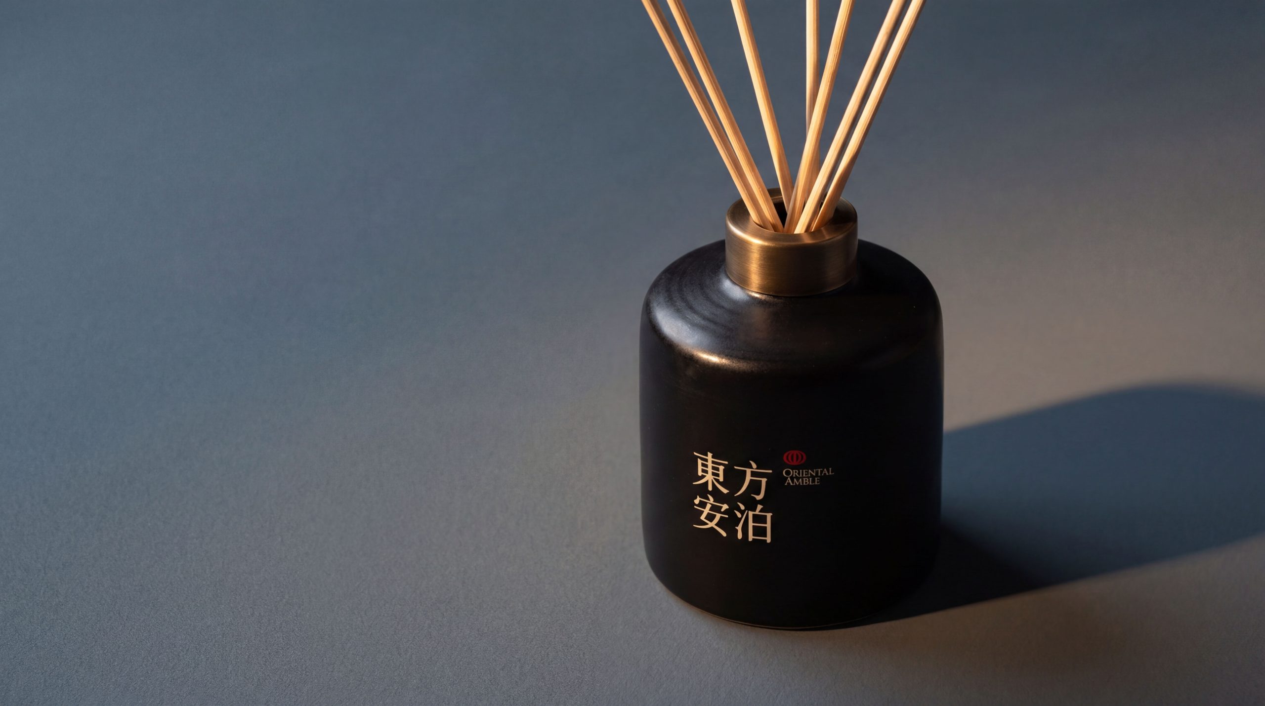
design concept
The logo takes "A Leaf at Anchor" as the core concept and condenses the oriental landscape image of a small boat parked quietly on the water into the core visual symbol of the brand. The mooring of a small boat is the most representative image of "tranquility" in Chinese poetry and painting - "No one crosses the boat in the wild", "The boat travels on the blue waves, and people swim in the middle of the painting". A small boat moored safely on the calm water is not only a physical space for travelers to rest, but also a spiritual metaphor for the soul to dock. With the Bianzhou as the core of the logo, the semantic meaning of the word "Anchor" is directly transformed into a visual picture - when you see this Bianzhou, you will understand the full meaning of "Anchorment".
graphic language
The main body of the graphic takes a minimalist flat boat as the visual core. The boat body is outlined with a soothing and graceful arc, just like the strong and elegant marks left by a brush on rice paper - the middle part of the arc sinks slightly to carry the weight, and the two ends are tilted upward like a water bird spreading its wings. The overall shape is both a flat boat and a crescent moon reflected in the water. The simplest lines contain the richest imagery. A thin vertical line on the boat hints at the mast or canopy. The vertical line is straight but not stiff, just like a pole of green bamboo standing near the water in the courtyard. It injects a touch of vertical spiritual support into the horizontally stretched boat body - "moor" means horizontal tranquility, and "standing" means vertical character. One horizontal line and one vertical line constitute the complete coordinates of Eastern personality.
One or two very light horizontal lines under the boat body hint at the water surface. The lines are as thin as silk and appear to be absent, just like the faintly visible microwaves on the lake in the morning fog - not the majesty of the stormy waves, but the tranquility of still water and deep flow, conveying the calmness and calmness carried by the word "Bo". There is a slight gap between the water surface line and the arc of the boat body, just like a boat floating on the water without sinking or weighing down, conveying the brand's aesthetic attitude of "lightness without losing thickness, simplicity without losing quality". The entire graphic uses a large area of white space to wrap around the boat and water, just like a Southern Song Dynasty sketch landscape painting - there is only a small boat, a piece of still water, and boundless white space in the picture, and countless artistic conceptions are hidden in it. Blank space is the most powerful visual language of the Oriental Amber brand, using invisible space to convey the Eastern philosophy of life that "peace comes from letting go, and peace of mind comes from non-attachment". The overall composition uses a minimalist freehand structure of "a boat moored in the water, and the water is hidden in white" to construct a "moored leaf", conveying the poetic depth and aesthetic height of the brand.
Font composition
The Chinese "Dongfang Anbo" uses customized modern calligraphy fonts to achieve a delicate balance between the smoothness of running script and the correctness of Song style. The strokes of the word "orient" are stretched and wide, like the morning sun spreading from the eastern horizon, conveying the brand's cultural orientation and aesthetic stance; the word "An" features the protective roof radical like a house sheltering, and the lower part "Nu" sits serenely, conveying tranquility and belonging; the word "Bo" has the three-dot water radical flowing like a spring, and the word "Bai" on the right is left blank like a mirror, conveying mooring and indifference. The rhythm of the four-character strokes changes from the stretch of "East" to the calmness of "Abode", just like the change of state of mind of a traveler returning from a distant place and entering a peaceful state. The English "ORIENTAL ANBO" is arranged in a slim uppercase serif font, with slender and elegant fonts and loose and leisurely spacing, conveying the unhurried and poetic style unique to oriental aesthetic hotels.
color system
The main color, ink blue #2C4A52, is the core color of the logo, representing the oriental landscape, tranquility and profound artistic conception. This tone between ink and cyan is like the deep blue of the distant mountains in an ink painting - it has the calmness and weight of ink and the natural vitality of cyan, conveying the Oriental Anbo brand's aesthetic proposition of "being close to nature and settling in tranquility". The auxiliary element Xuanbai #F5F0E8 is used as the background color in the brand system, just like the natural texture of rice paper - warm but not pale, elegant but not cold, providing soft breathing space for the depth of ink and blue. Auxiliary sandalwood brown #8B7355 is used for warm elements in the brand system - guest room guides, brand brochures, tea set packaging, etc. It is like the natural color of agarwood, injecting the unique warmth and elegance of oriental living spaces. The finishing touch of cinnabar red #C04040 is only used for the brand seal element. A square-inch vermilion seal is lightly placed on the side of "An Bo", just like the signature of a literati's calligraphy and painting - a little red to liven up the entire simple and elegant picture. The overall color is blue and white as the core, sandalwood as the supplement, and vermilion as the eye, embodying the oriental aesthetic temperament of "between mountains and rivers, peacefully resting in the heart".
Application extension
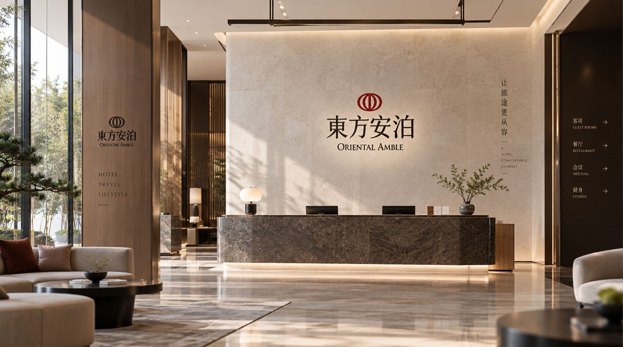
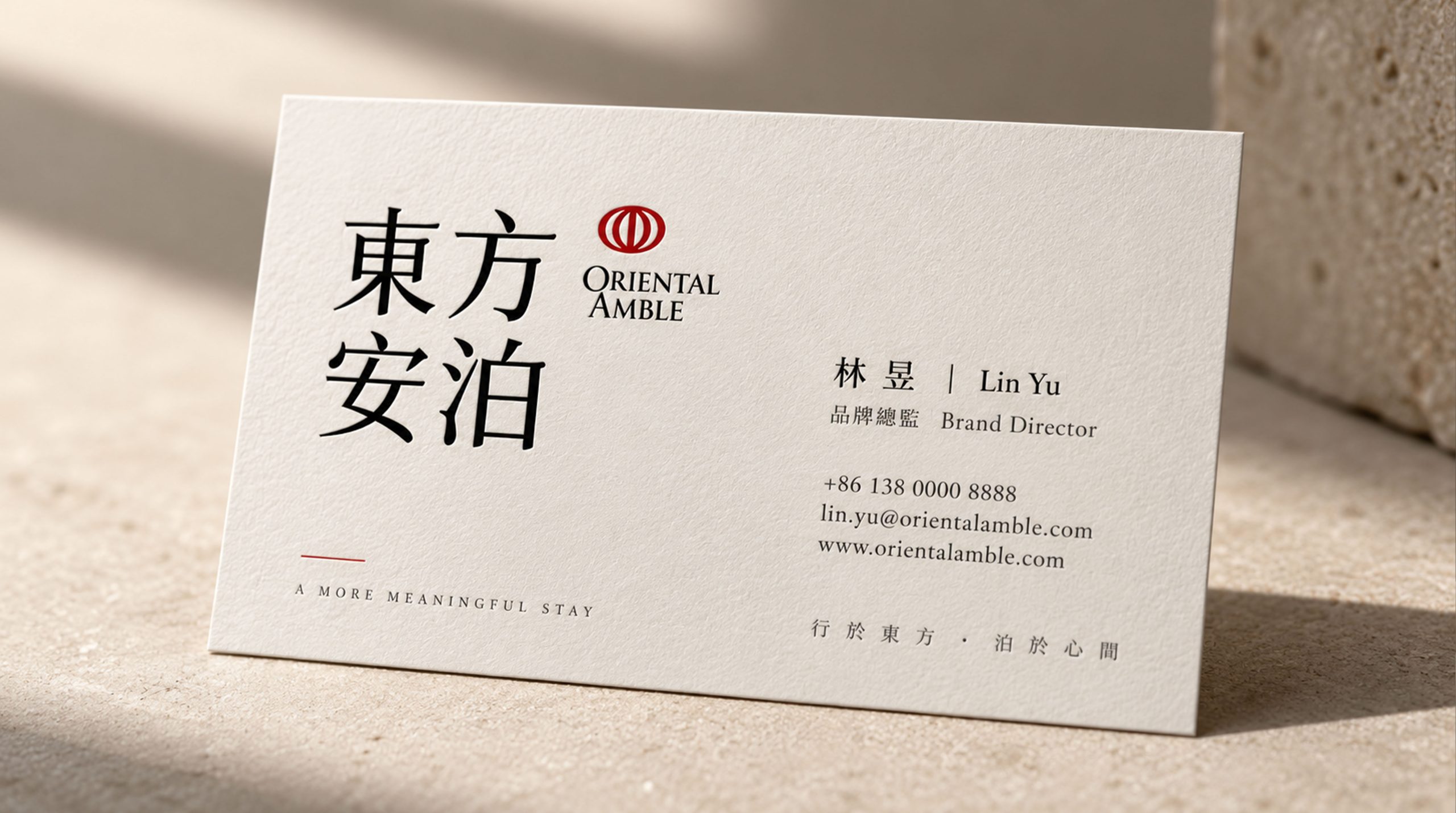
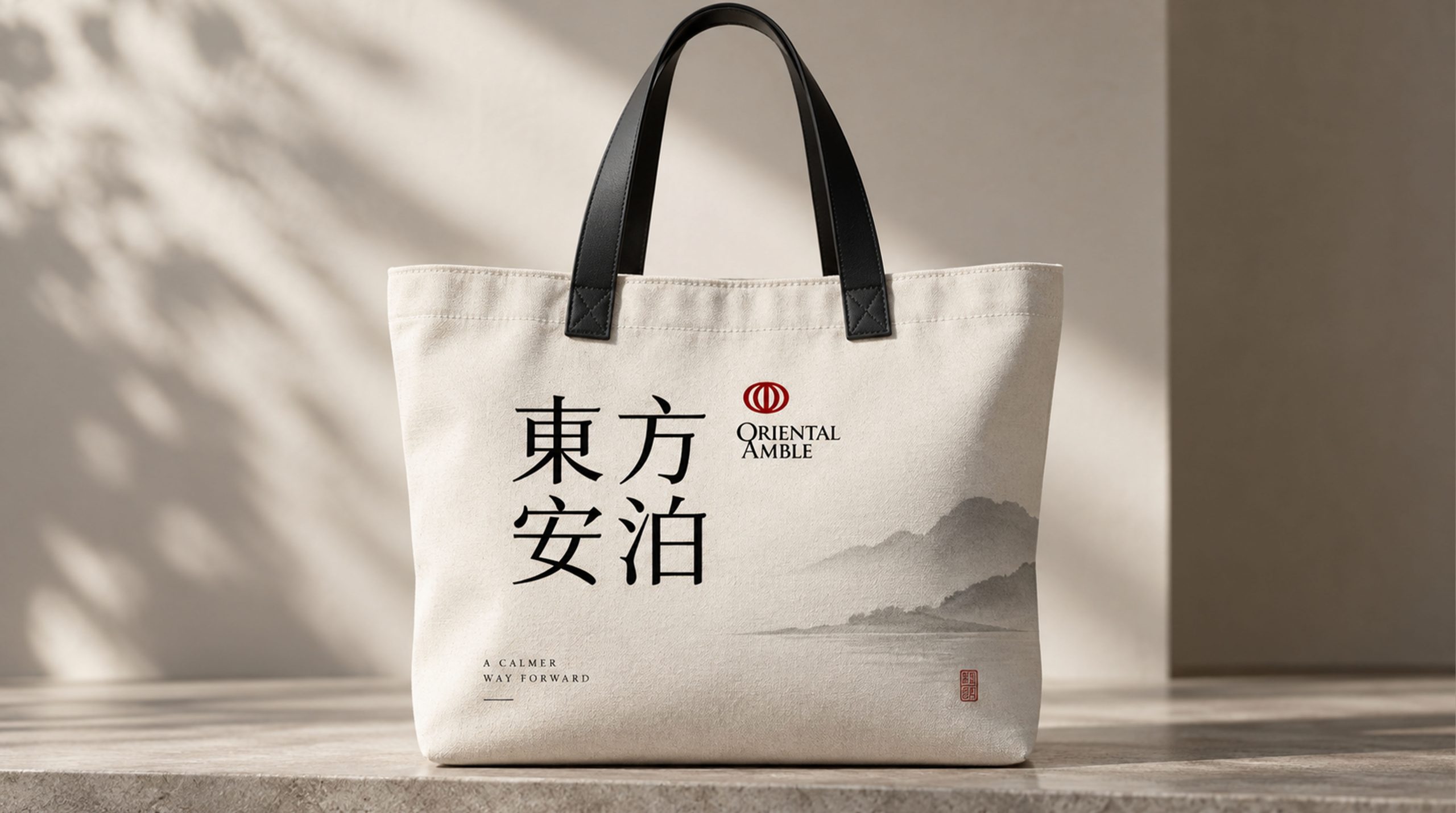
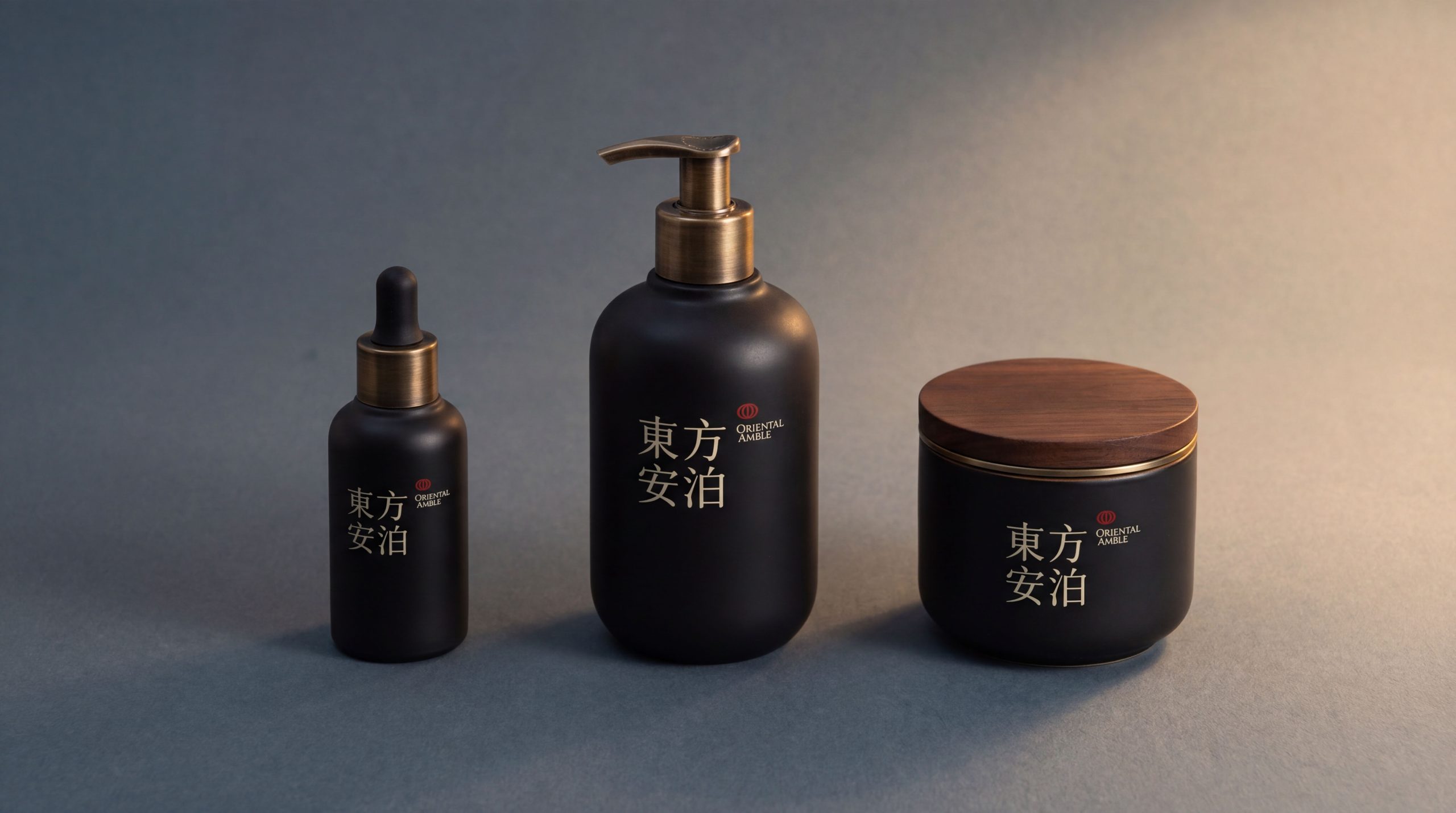
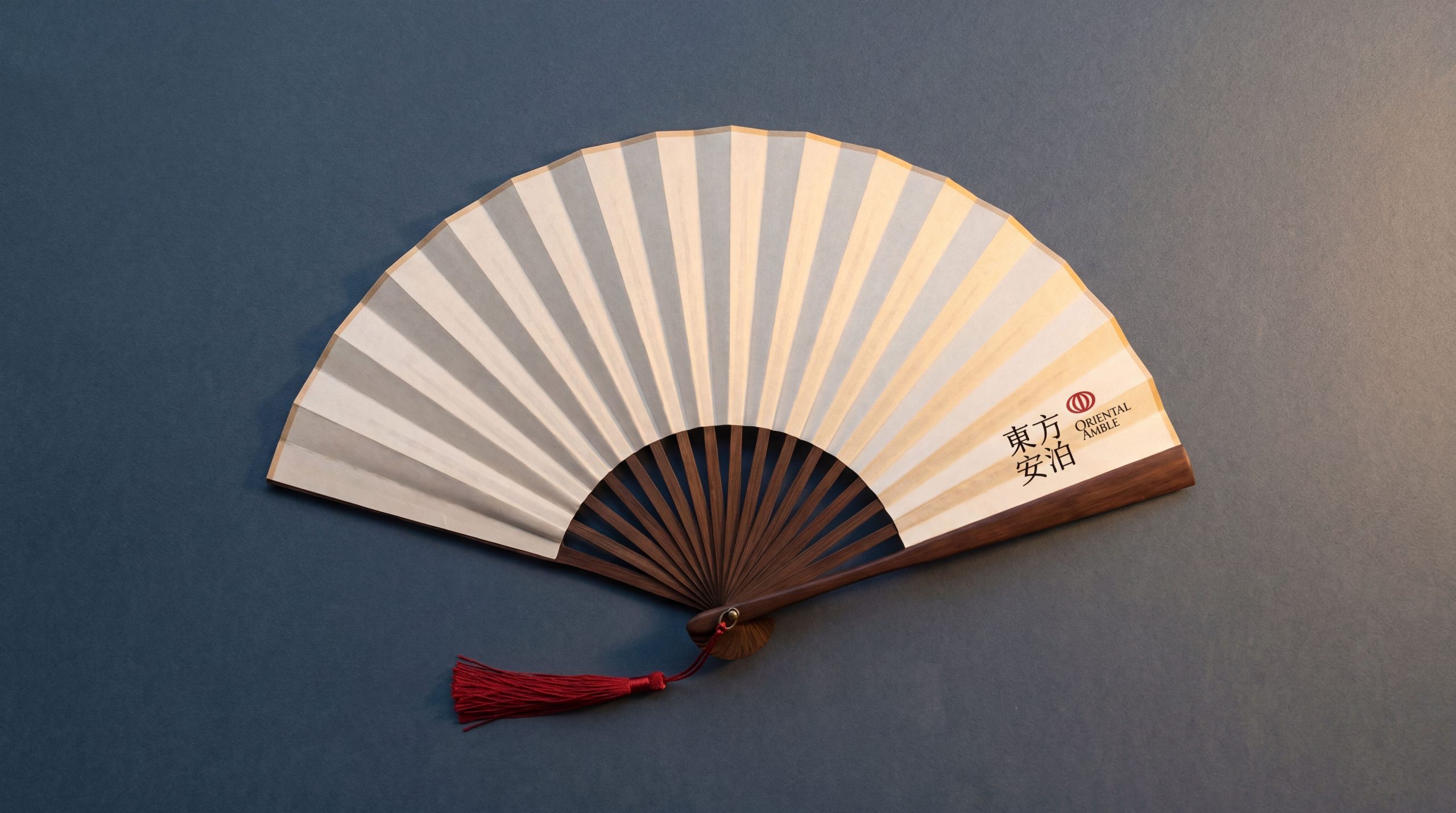
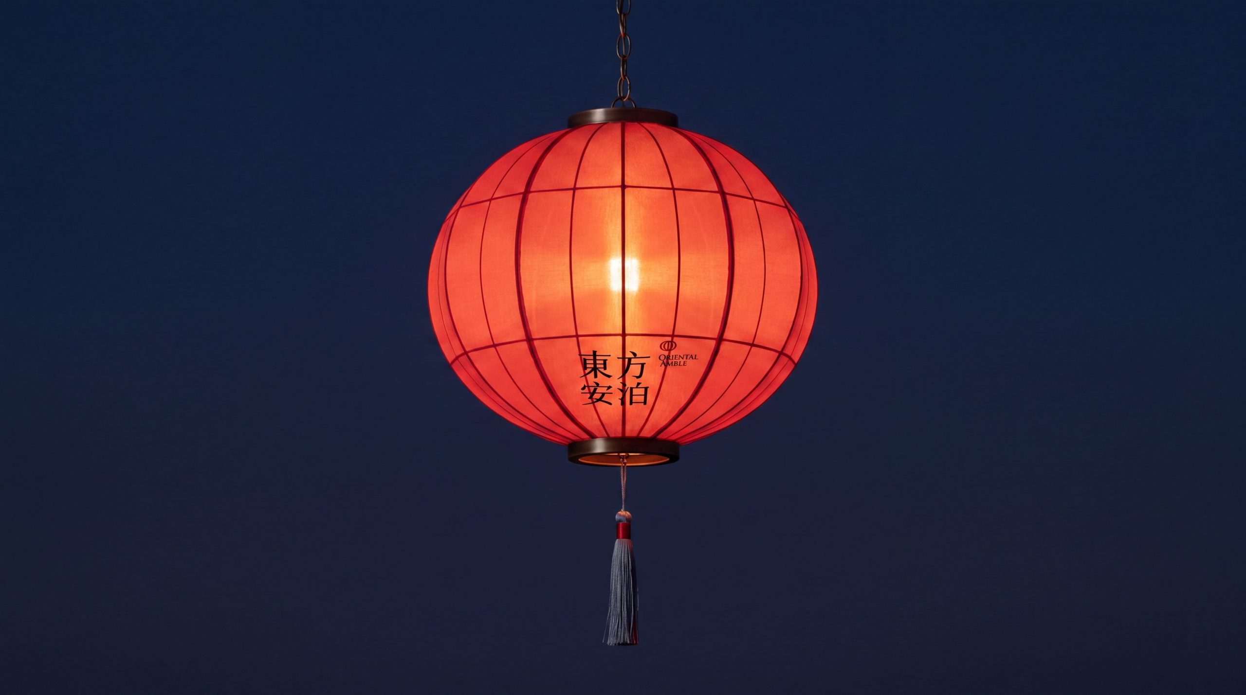
The logo can be widely used in hotel building entrances, lobby image walls, front desk nameplates, courtyard landscape signs and floor guidance systems; guest room door numbers, room card covers, tea sets, aromatherapy labels, bathrobe embroidery and bedding woven labels; brand official websites, online booking platforms, mobile APP interfaces and social media images; brand albums, handwritten style invitations, membership cards and Oriental aesthetic gift box packaging; cultural tourism promotion conferences, boutique hotel alliances, Oriental life aesthetics exhibitions and cross-border tea ceremony and flower arrangements activities. In the hotel courtyard, the best display space for the brand's artistic conception, the boat graphic is presented on the entrance screen wall using stone or copper carving techniques. Guests pass through the screen wall and step into the courtyard. The real waterscape echoes the reality of the boat in the sculpture, completing the seamless transformation of the brand from visual symbol to spatial experience. In the dynamic visual, an arc of the boat body is slowly written from left to right with the trajectory of a brush, the vertical line of the mast gently falls, and the water line emerges vaguely. The whole process is like a literati extemporaneously waving a brush in the morning mist, symbolizing Dongfang Anbo's brand concept of "creating a tranquil environment with freehand brushwork".
brand meaning
The logo contains three core images: Oriental Aesthetics - the landscape painting image of the boat and the water conveys the brand's life aesthetics and poetic dwelling philosophy rooted in Eastern civilization; Peaceful Haven - the peaceful image of the boat mooring in silence conveys the physical and mental rest and inner belonging that the brand provides for every traveler; Anchoring the Way (Anchoring the Heart) Soul) - Large areas of blank space and minimalist composition convey the Eastern spiritual realm of "indifferent ambition, tranquility and far-reaching". The overall design conveys Dongfang Anbo's brand vision of "Oriental charm, a safe place, and a place of peace".
Improper Usage (Protection Specification)
Do not change the curvature, tilting angle or overall proportion of the boat arc; do not modify the thickness of the vertical line of the mast or the positional relationship with the boat body; do not change the hue or brightness of the main color of ink and blue; do not fill the blank space around the logo or add disturbing background elements; do not add gradients, strokes or modern special effects inconsistent with the freehand style to the logo; do not separate the boat and the water line for separate use; keep the white space ≥ 30% of the graphic height; the minimum display width must not be less than 30mm.
design results
After the release of the logo, Oriental Amber's brand recognition and cultural appeal in the fields of oriental aesthetic hotels and boutique resorts have been significantly enhanced. "Yiye Anbo", with its unique visual language that combines freehand landscapes and minimalist aesthetics, has become the core identification symbol of the Oriental Anbo brand system. It is widely used in hotel environments, service touchpoints and market communications, demonstrating the brand vision of "Oriental charm, a safe place, and a place of peace of mind".