










Tahoe Group is a well-known large-scale comprehensive enterprise group in China. With high-end real estate development as its core business, its business extends to diverse fields such as commercial operations, cultural theaters, medical health and education services. With the product credo of "making the best houses in China", it has long been engaged in the development of Chinese-style high-end residential and urban complexes.
The brand name "Taihe" carries the oriental architectural philosophy and feelings of family and country - "Tai" means Antai and Taihe, symbolizing the stability and longevity of the foundation and the peace and harmony of life; "He" means Jiahe and Fenghe, symbolizing the abundant life picture and the simple character rooted in the land. Qingmei Future was commissioned to lead the brand identity design.
The design goal of the brand logo is to demonstrate Tahoe Group's industry status as China's high-end real estate benchmark enterprise through the visual language of Chinese-style mansion charm, high-end quality and oriental cultural confidence, and to convey the brand image of "Chinese-style living aesthetics, Taihe Anbang, Hefeng Wanjia".
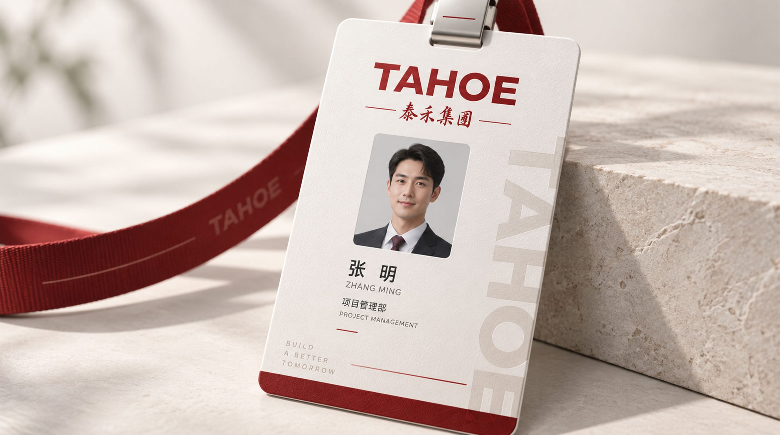
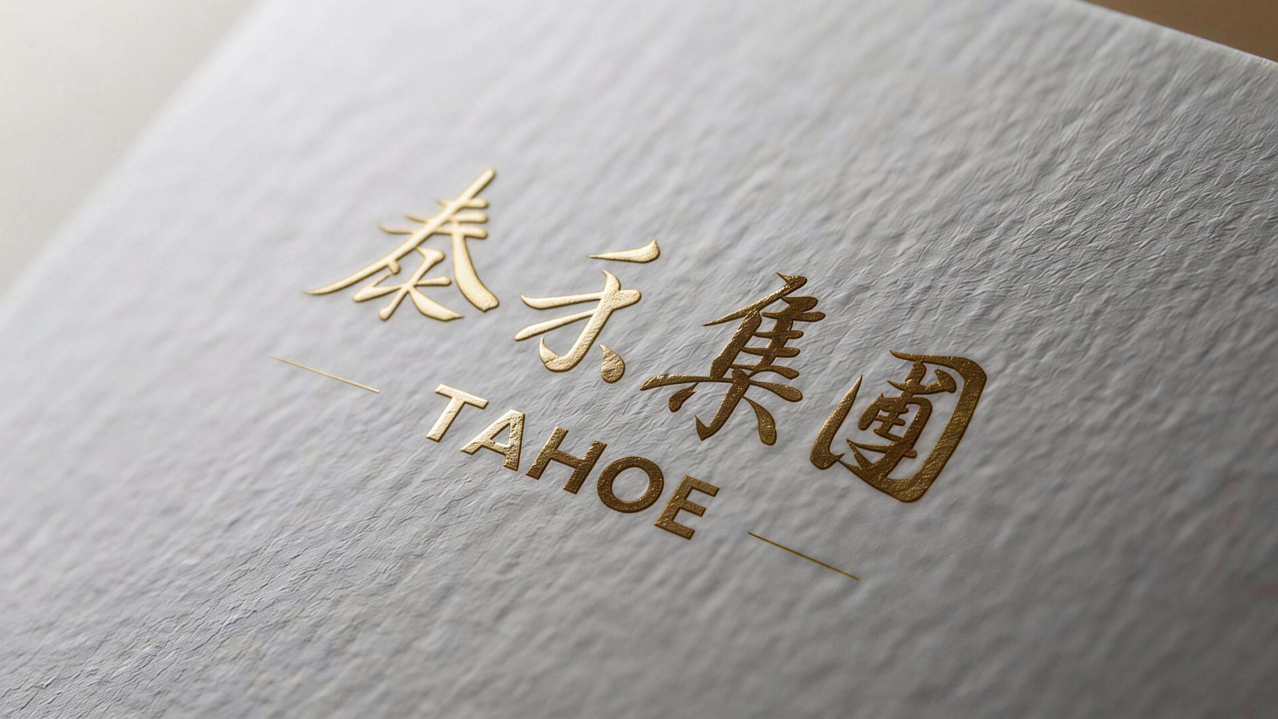
design concept
The logo takes "Gate of Tahoe" as its core concept and integrates the solemn shape of traditional Chinese mansion gates with the simple order of modern brand logos, creating a visual symbol that not only carries the historical depth of Chinese architectural culture but also has international corporate brand recognition. The courtyard door is the most ceremonial spatial node in Chinese residential culture - open the courtyard door and step into the home. From the hustle and bustle to tranquility, from the outside world to the inner world, a door is a whole world. With the courtyard gate as the core of the logo, it directly declares Tahoe Group's product stance and cultural mission of "manufacturing Chinese-style mansions for China".
graphic language
The main body of the graphic takes a highly geometrically refined Chinese-style courtyard gate as the visual core. The courtyard gate is presented with a symmetrical structure. The two pillars are tall and straight like the supporting pillars of Chinese architecture. They stand steadily from bottom to top with thick vertical lines, conveying the sense of strength of the building structure and the solid foundation of the brand's foundation. The two pillars are connected by a wide beam. The beam is like a plaque on the lintel of a mansion, carrying the solemnity of the brand name and the glory of the family lineage. A set of simplified cornice arcs are gathered above the beams, and the arcs rise gracefully to both sides, just like the unique angled cornices on Chinese roofs - this is the iconic visual element that distinguishes Chinese architecture from all buildings in the world. A cornice is the most direct visual declaration of the word "Chinese style".
The doorway is presented as a blank space between the two pillars. The square doorway space is like an opening door of a mansion, inviting viewers to enter the courtyard world of Tahoe. The blank space of the door opening and the solid body of the pillars and beams form a compositional relationship of virtuality and reality - the solid body is the skeleton of the building and the power of the brand, and the blank space is the living space and artistic conception of living. Only with the skeleton can there be space, and with strength can there be tranquility. It conveys Tahoe Group's product concept of "carrying Antai's living life with solid architectural quality". An abstract variant of the word "He" can be vaguely sketched inside the doorway - the vertical strokes of the grain seedlings merge into the pillars of the courtyard gate, and the curling of the grain leaves echoes the arcs of the cornices. The core characters of the brand name are naturally embedded in the architectural graphics, realizing the integrated expression of the brand that "the door is the grain, and the grain is the door".
The overall proportion of the graphics refers to the classic module of traditional Chinese architecture, and the height-to-width ratio follows the proportion principle of "taking material as the ancestor" in the Song Dynasty's "Building Methods", so that the logo implies the classical rhythm of Chinese architecture in the modern geometric order. The overall composition uses a three-section structure of "columns on the ground, beams in the air, and eaves in the sky" to construct the "Taihe Courtyard Gate", conveying the brand's architectural foundation and cultural height.
Font composition
The Chinese "Tahoe Group" adopts customized modern Song font, with thin horizontal lines and thick vertical lines, clear strokes, and a majestic structure. The word "Tai" is open and closed like a mountain, conveying peace and grandeur; the word "He" is open and stretched like a beautiful harvest, conveying fertility and growth; the word "Group" is neat and steady, highlighting the scale and comprehensive strength of the enterprise. The classic temperament of the Song Dynasty style is in line with the cultural heritage of Chinese-style architecture, conveying the Tahoe brand's cultural confidence of "establishing itself in contemporary times with the beauty of Chinese style". The English "TAHOE GROUP" is arranged in a classic uppercase serif font. The font is generous and solemn, and the serifs are exquisite and clear. It is consistent with the font tradition of international high-end real estate brands, ensuring the high-end recognition of the brand in the international capital market and overseas cooperation.
color system
The main color, Tahoe Gold #B8943E, represents nobility, quality and the luxury of a Chinese-style mansion. Gold is like the solemn luster of gold foil painting in Chinese-style buildings - from the golden roof of the Forbidden City to the door nails of mansions, gold has always been the identity color of high-end buildings in China. The choice of this color directly establishes the value signal of Tahoe's "Chinese-style high-end residences". Tahoe gold distinguishes itself from exaggerated bright gold with its matte and restrained texture, conveying the brand style of "noble but not vulgar, luxurious but elegant". Auxiliary courtyard wall red #7A1F1F is used for solemn elements and cultural communication materials in the brand system, just like the deep vermilion on the courtyard walls of Chinese-style mansions, conveying the unique solemnity and warmth of Chinese architecture. The combination of red and gold is the most classic color combination in Chinese high-end buildings - golden nails on red doors and gold tiles on red walls, conveying the Chinese orthodoxy and high-end positioning of Tahoe products. The auxiliary ink gray #333333 is used for the brand word mark and basic system elements. It is like the calm background color of blue bricks and gray tiles in Chinese-style buildings, providing deep support for the gold and red luxury. Pure white #FFFFFF is used as the standard base color and the door opening is left blank. The overall color is gold and red as the core, reflecting the brand temperament of "Chinese-style mansion, the gate of Taihe".
Application extension
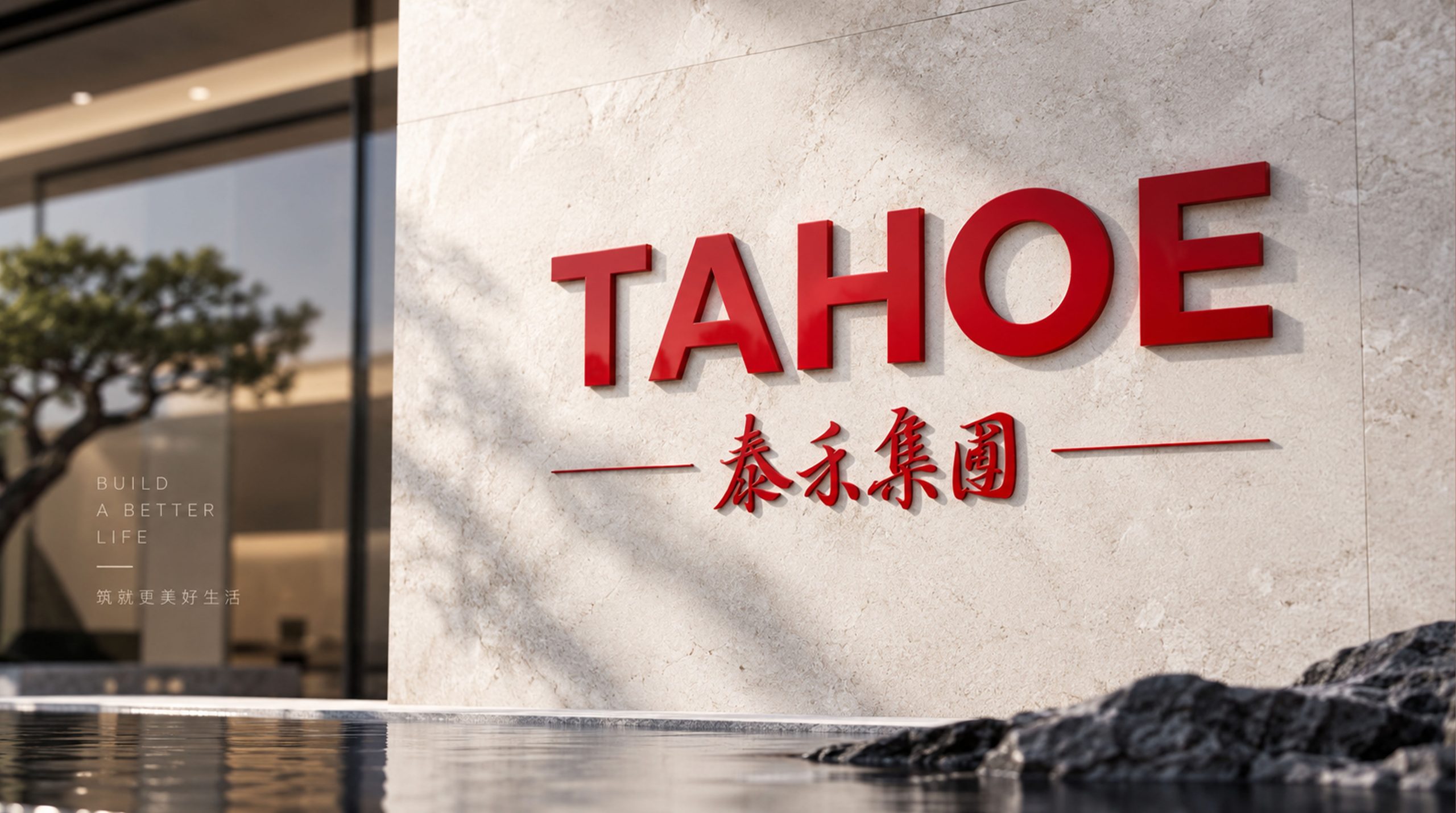
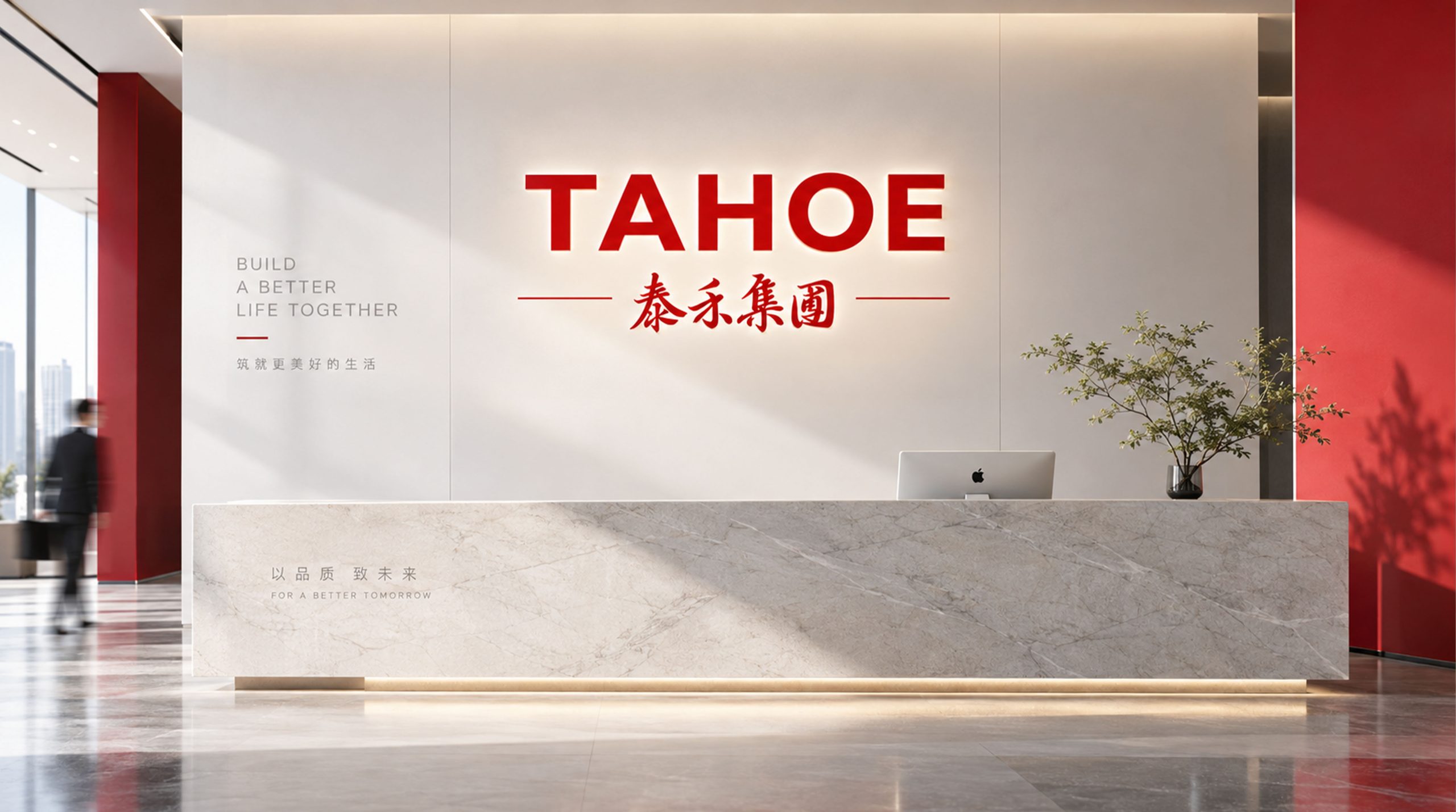
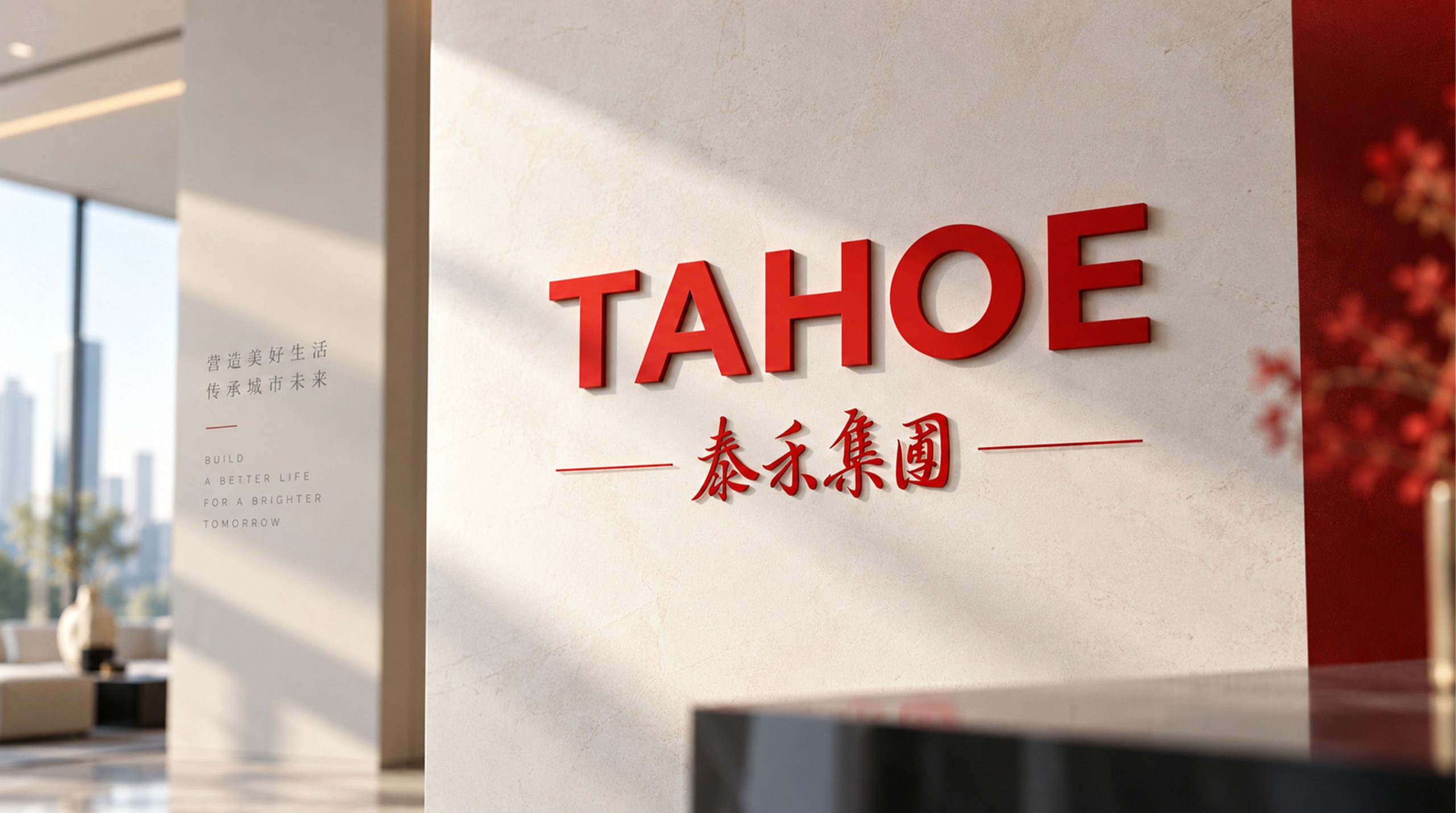
The logo can be widely used in residential project sales offices, demonstration area entrances, community gates and garden guidance systems; project building brochures, house layout brochures, brand brochures and high-end invitations; official websites, mobile APP interfaces, real estate trading platforms and social media images; urban complex commercial spaces, Tahoe Cinemas, medical and education sector brand endorsements; real estate industry summits, brand launches, cultural forums and government cooperation project images. At the entrance of the Chinese-style mansion demonstration area, which is the highest ceremonial point of the brand experience, the courtyard door graphic is presented on the lintel of the physical courtyard door with copper relief or stone carving technology. The brand logo and the real Chinese-style courtyard door are integrated into one virtual and real one, allowing customers to complete a seamless transformation from brand recognition to space experience the moment they push the door in. In the dynamic vision, two columns are pulled up from the ground, beams are erected steadily, and the curves of the cornices are finally tilted elegantly to both sides. The courtyard gate rises from scratch in a few seconds, just like a Chinese-style mansion from blueprint to reality in the hands of Tahoe craftsmen.
brand meaning
The logo contains three core images: Chinese Grand Residence - the courtyard door shape and cornice arc convey Tahoe Group's product creed of "making the best house in China" and the cultural confidence of Chinese living aesthetics; Taihe Anbang (Stability & Prosperity) - the symmetrical and stable building structure conveys the lasting stability of the brand's foundation and the peace and tranquility of the owner's life; Harvest for All) - The ingenious design of the word "He" integrated into the courtyard door conveys Tahoe's brand vision of benefiting thousands of households with rich products and services. The overall design conveys Tahoe Group's brand vision of "Chinese-style living aesthetics, Taihe Anbang, and Hefeng Wanjia".
Improper usage
Do not change the symmetrical structure, column proportions or cornice radian of the courtyard gate; do not modify the square proportion of the door opening's blank space or add disturbing elements to the door opening; do not change the hue of the main color of Tahoe Gold or replace it with silver or copper; do not add gradients, strokes or modern decorative effects that are inconsistent with the Chinese style; do not separate the cornices, columns and beams and door openings for separate use; keep the white space ≥ 25% of the graphic height; the minimum display width must not be less than 30mm.
design results
After the release of the logo, Tahoe Group's brand recognition and cultural influence in China's high-end real estate and Chinese-style residential areas have significantly increased. With its unique visual language that combines the solemn sense of ritual of Chinese architecture and the simple order of modern brands, "Taihe Courtyard Gate" has become the core identification symbol of Tahoe Group's brand system. It is widely used in residential projects, commercial operations and brand communication, showing the brand vision of "Chinese-style residential aesthetics, Taihe Anbang, and Hefeng Wanjia".