










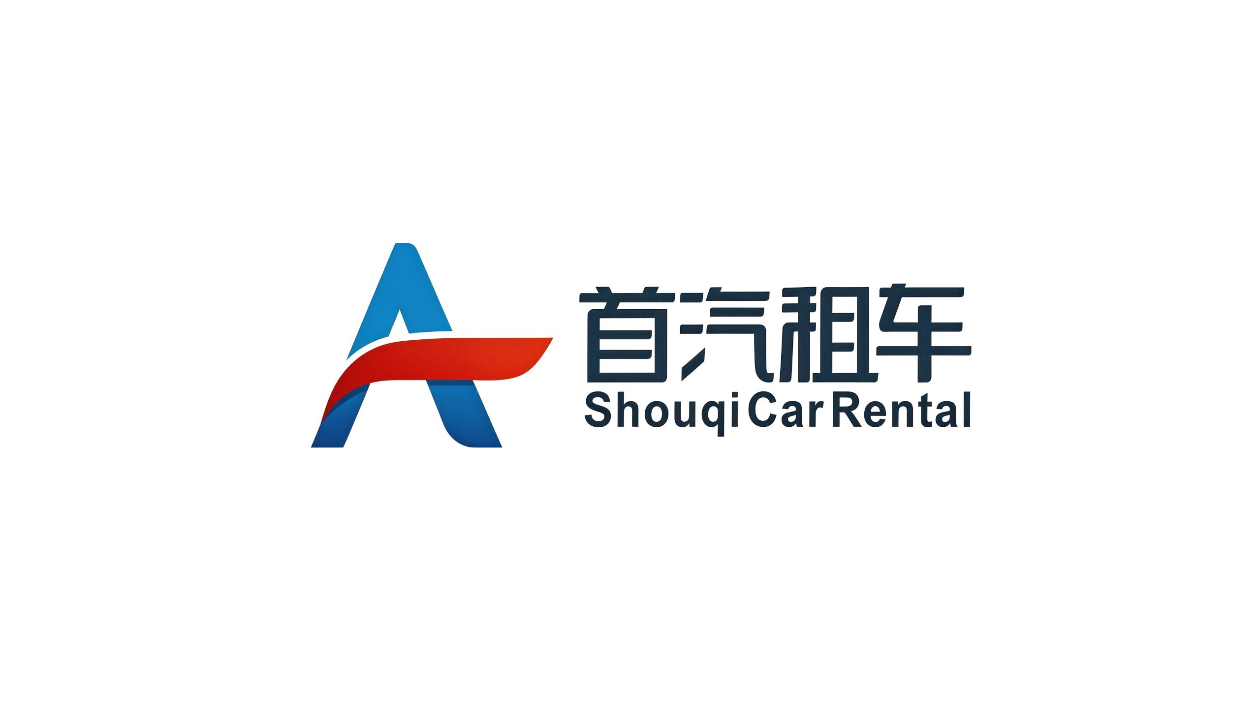
Shouqi Car Rental is China's leading car rental service brand. It is affiliated to Shouqi Group. Relying on decades of deep accumulation in the capital's automobile industry and taking "safe travel and quality service" as its brand creed, Shouqi Car Rental is committed to providing business people, travelers and urban travel users with full-scenario car rental services covering short-term self-driving, long-term rental driving, business transfers and customized travel.
The brand name "Shouqi" carries the brand's origin genes and industry pursuits - "Shou" means capital, first and first choice, which not only indicates the brand's regional identity rooted in the capital Beijing, but also conveys the brand ambition of being an industry leader and the first choice for users; "Qi" means automobile, directly pointing out the core business areas. Qingmei Future was commissioned to lead the brand identity design.
The design goal of the brand logo is to demonstrate Shouqi Car Rental's industry status as China's leading car rental brand through the visual language of travel action, quality trust and technological convenience, and to convey the brand image of "the first choice for travel, safety and worry-free".
design concept
The logo takes "Road of Freedom" as its core concept and integrates a road extending into the distance with the sense of speed galloping forward, creating a brand symbol that not only conveys the essence of travel but also carries the pursuit of quality. The road is the most fundamental scene image in the car rental industry - every car rental is the beginning of a journey, and every road leads to a destination. With the road as the core of the logo, it directly associates the brand with the emotional association of "departure, freedom, and distance", conveying Shouqi Car Rental's service commitment of "making every journey trustworthy".
graphic language
The main body of the graphic uses the brand's initials "S" as the basic skeleton, reinterpreting the curved shape of "S" into a winding road. The upper arc of the "S" is like the first bend in the road in the distance, and the lower arc is like the second bend that follows. The two arcs are smoothly connected and completed in one go, forming a beautiful double-curved road - this is not a straight and monotonous highway, but a journey full of driving pleasure, conveying Shouqi Car Rental's brand proposition of "not only renting a means of transportation, but also providing a driving experience."
The lines of the "S"-shaped road gradually become thinner and shrink from near to far, just like the natural perspective effect of the road extending toward the horizon from the driver's perspective, giving the two-dimensional graphics a sense of depth and speed in a three-dimensional space. The front end of the line is thick and powerful, conveying the abundant power when setting off and the solid foundation of the brand; the far end of the line is slender and faded, conveying the free imagination of the road extending to infinite distances - Shouqi Rental takes you not just to the next city, but to wherever you want to go.
One side of the "S" curve is supplemented by a parallel thin line, just like the dividing line or lane marking line in the middle of the road. The abstract "S" curve is anchored as a concrete association of "road" with the simplest details, allowing the graphic to strike a balance between artistic expression and functional communication. The overall trend of the road curve extends to the upper right, conveying the corporate momentum of the brand's upward development and the user's good expectations of "moving forward and unimpeded". The overall composition uses the integrated logic of "words are roads and roads are travels" to construct a "road to ride the wind", conveying the brand's travel essence and free spirit.
Font composition
The Chinese "Shouqi Car Rental" uses a modern sans-serif font, with even and neat strokes and a compact and powerful structure. The word "Shouqi" is presented in a slightly bolder weight to convey the brand's strength and recognition; the word "car rental" is supplemented by a regular weight to directly point out the core business. The overall font is simple, modern and fast-paced, conveying the industry characteristics of efficient and convenient travel service brands. The English "SHOUQI CAR RENTAL" is arranged in a standard uppercase sans-serif font, with regular fonts and even spacing, ensuring that the brand is clearly identifiable on international car rental platforms, airport pick-up points and foreign-related business scenarios.
color system
The main color Shouqi Blue #003D7A represents trust, safety, professionalism and quality travel. Dark blue is the most widely recognized brand color in the global travel and transportation fields - from aviation to railways, from insurance to car rentals, dark blue always conveys the industry signal of "safety and reliability". The calmness and depth of Shouqi Blue is like that of an experienced professional driver - calm, reliable and worthy of trust, conveying the professional confidence Shouqi Car Rental has accumulated over decades of service and the user's peace of mind when traveling. Auxiliary Vitality Red #E02020 is used for call-to-action and marketing campaign elements in the brand system - buttons and promotional labels such as "Order Now" and "Go Now". The enthusiasm and urgency of red inspire users to convert from browsing to booking. The combination of blue and red conveys the dual brand character of "safety and passion coexisting" in the travel brand - blue allows you to set off with peace of mind, while red allows you to enjoy the journey. Auxiliary silver gray #A0A8B0 is used for the vehicle display background and technological elements in the brand system. It is like the calm luster of the metal paint surface of the car body, conveying the modern sense of vehicle quality and technological travel. Pure white #FFFFFF is used as the standard background color and the basic color of the APP interface. The overall color is blue as the core and red as the finishing touch, reflecting the brand temperament of "safety, trust, and smooth travel".
Application extension
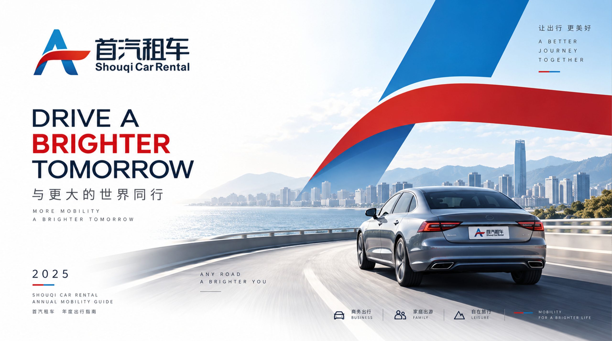
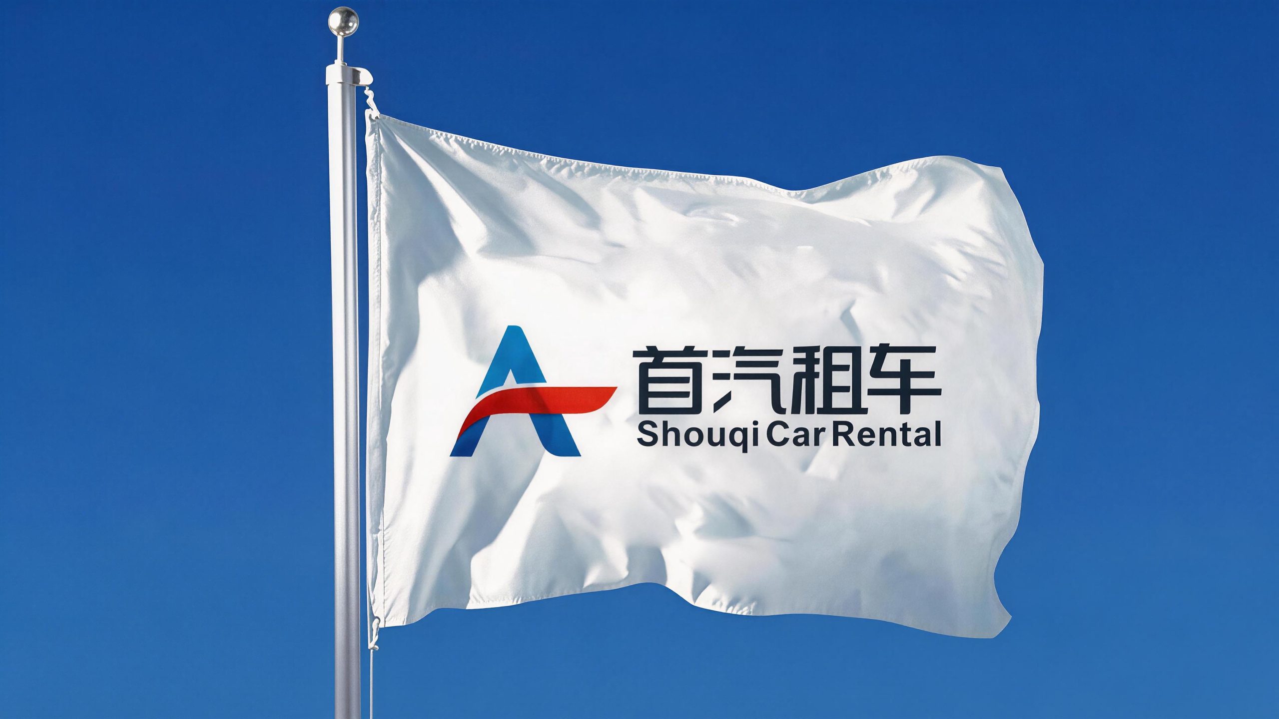
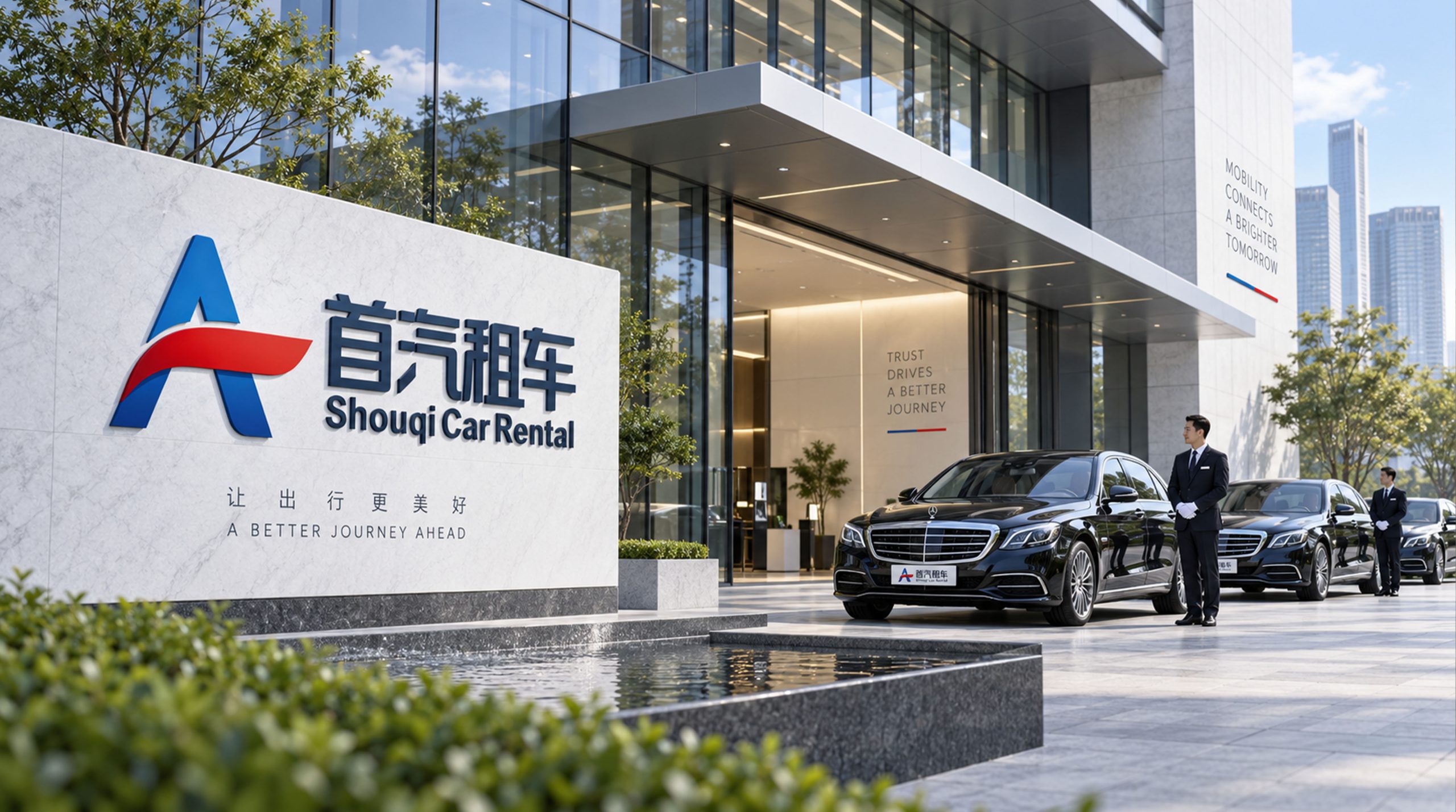
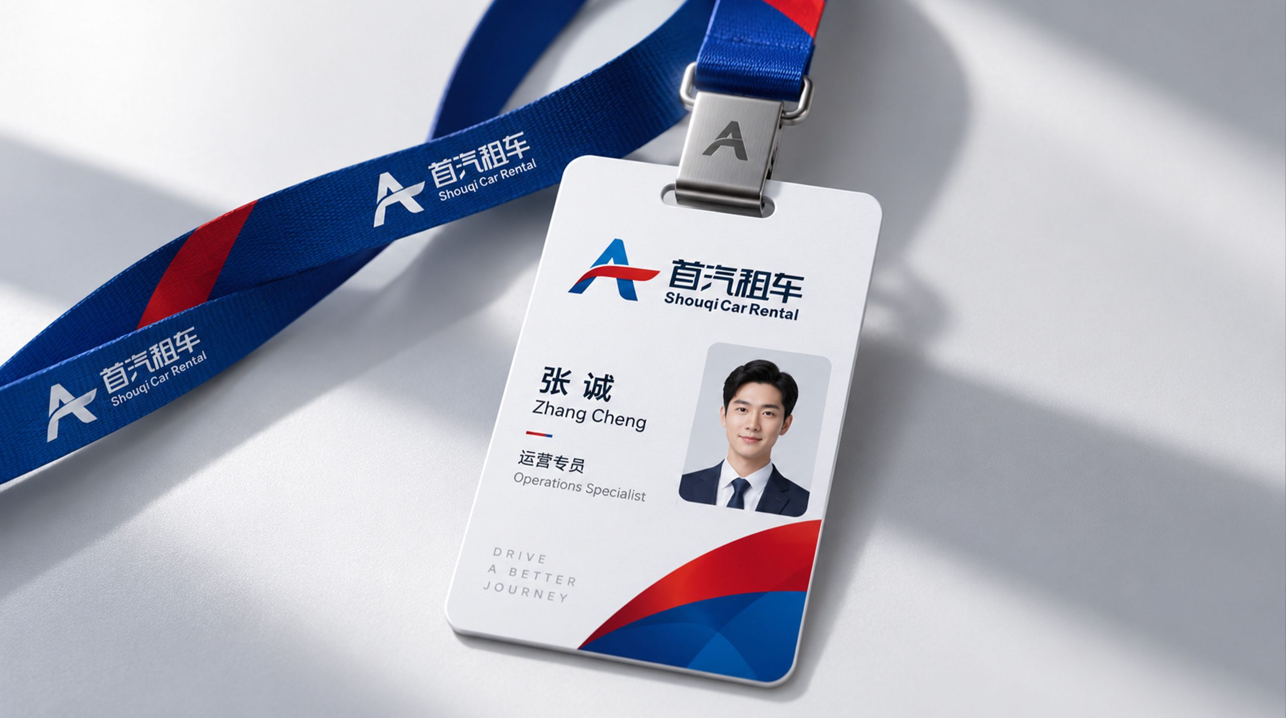
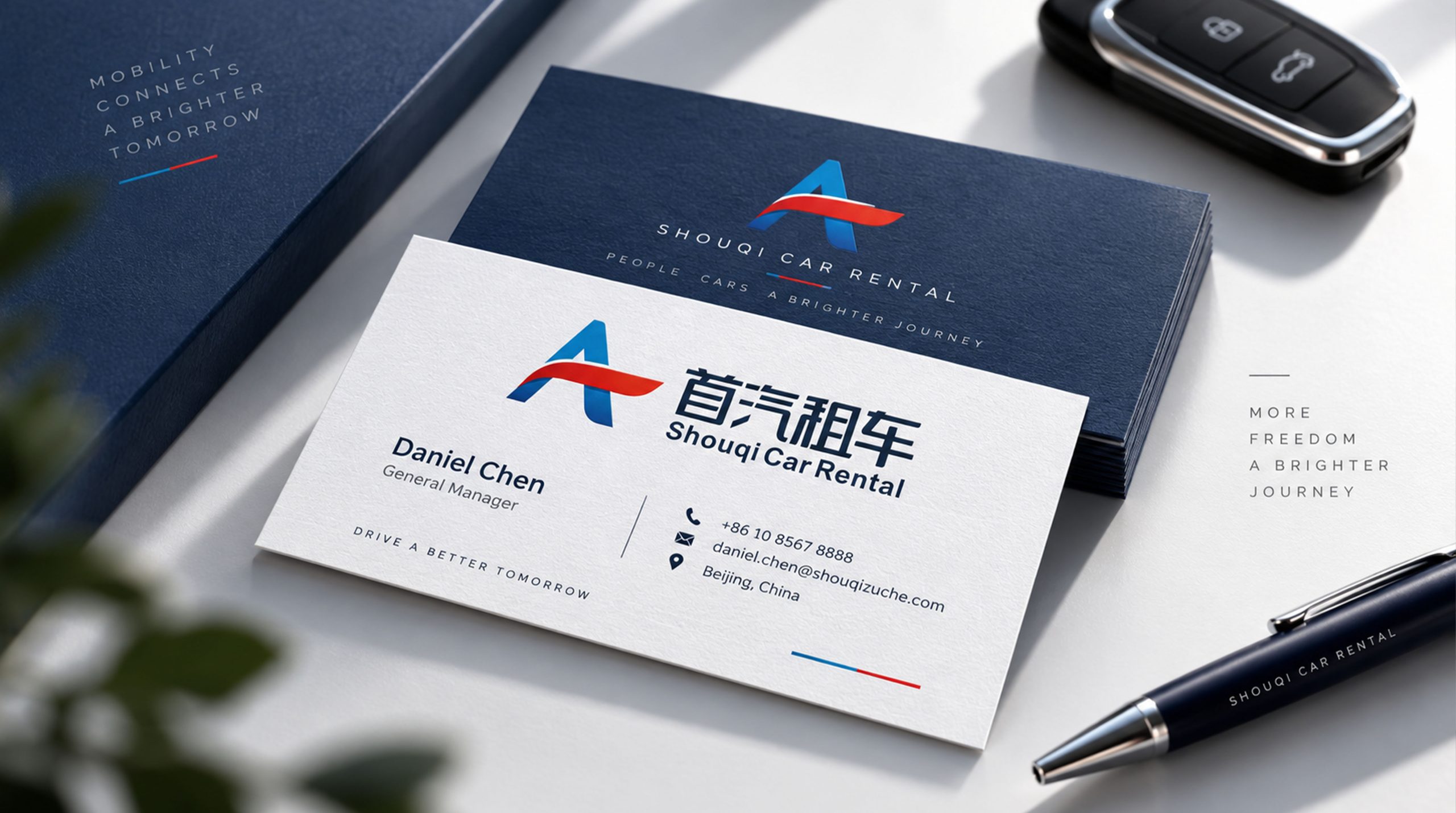
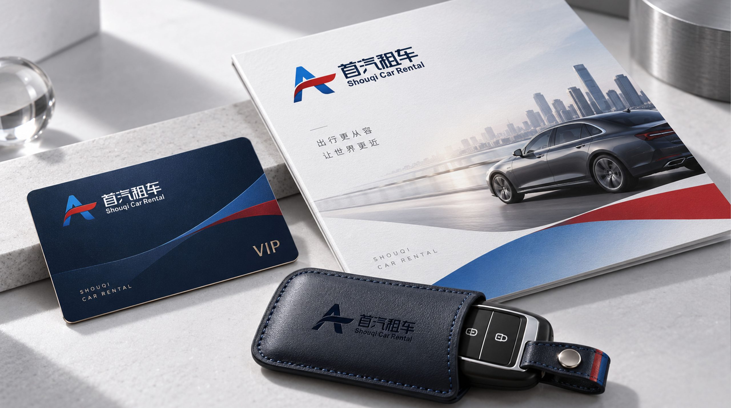
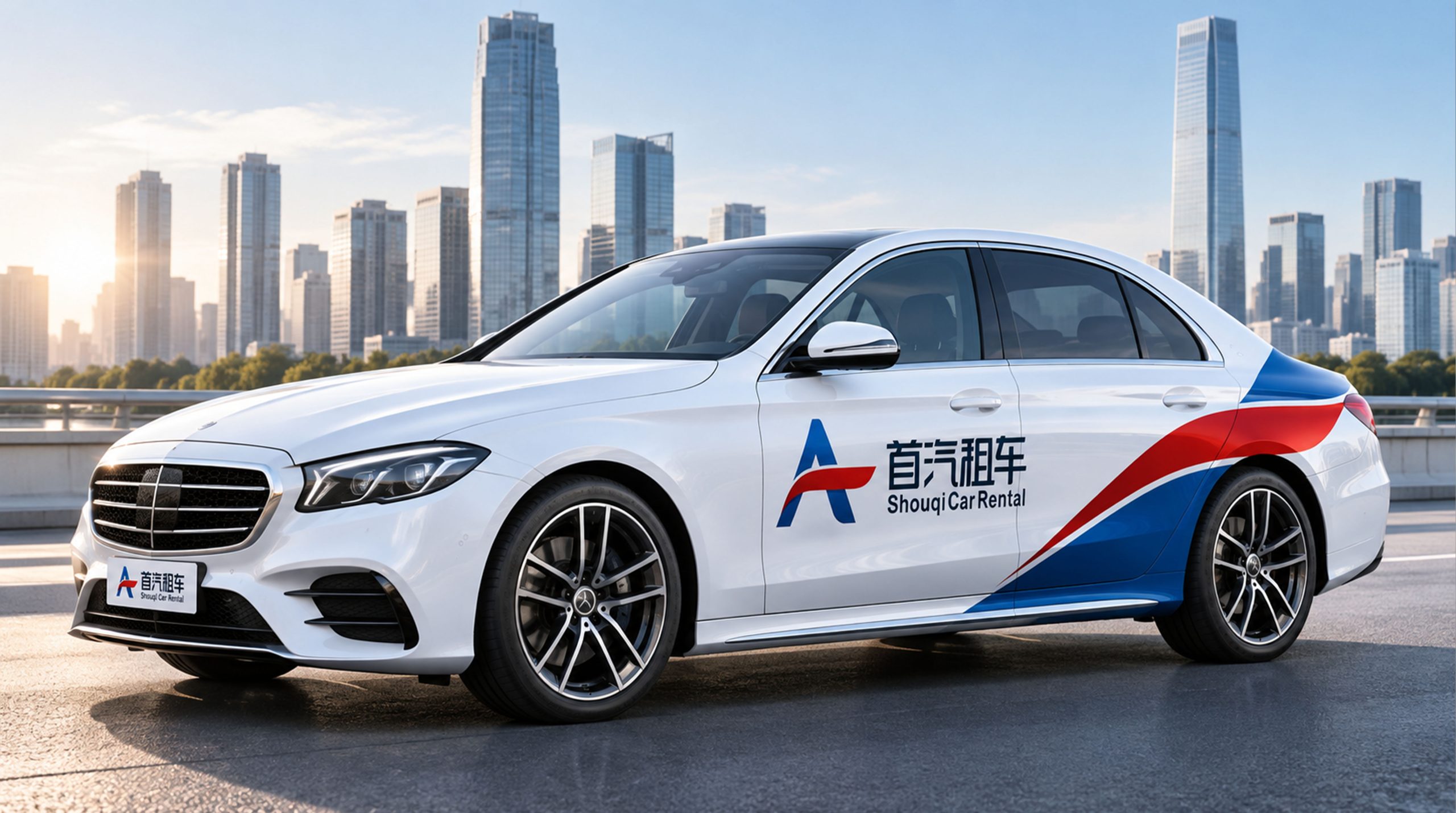
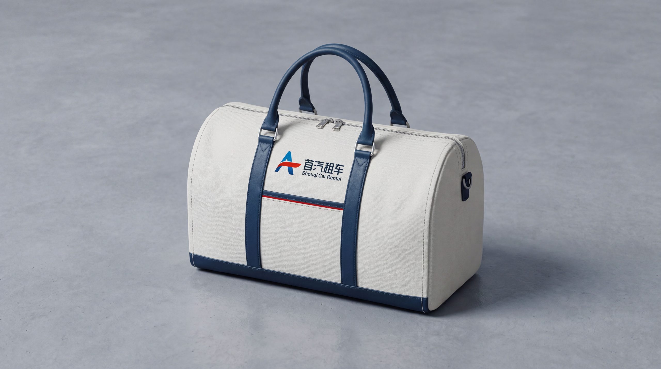
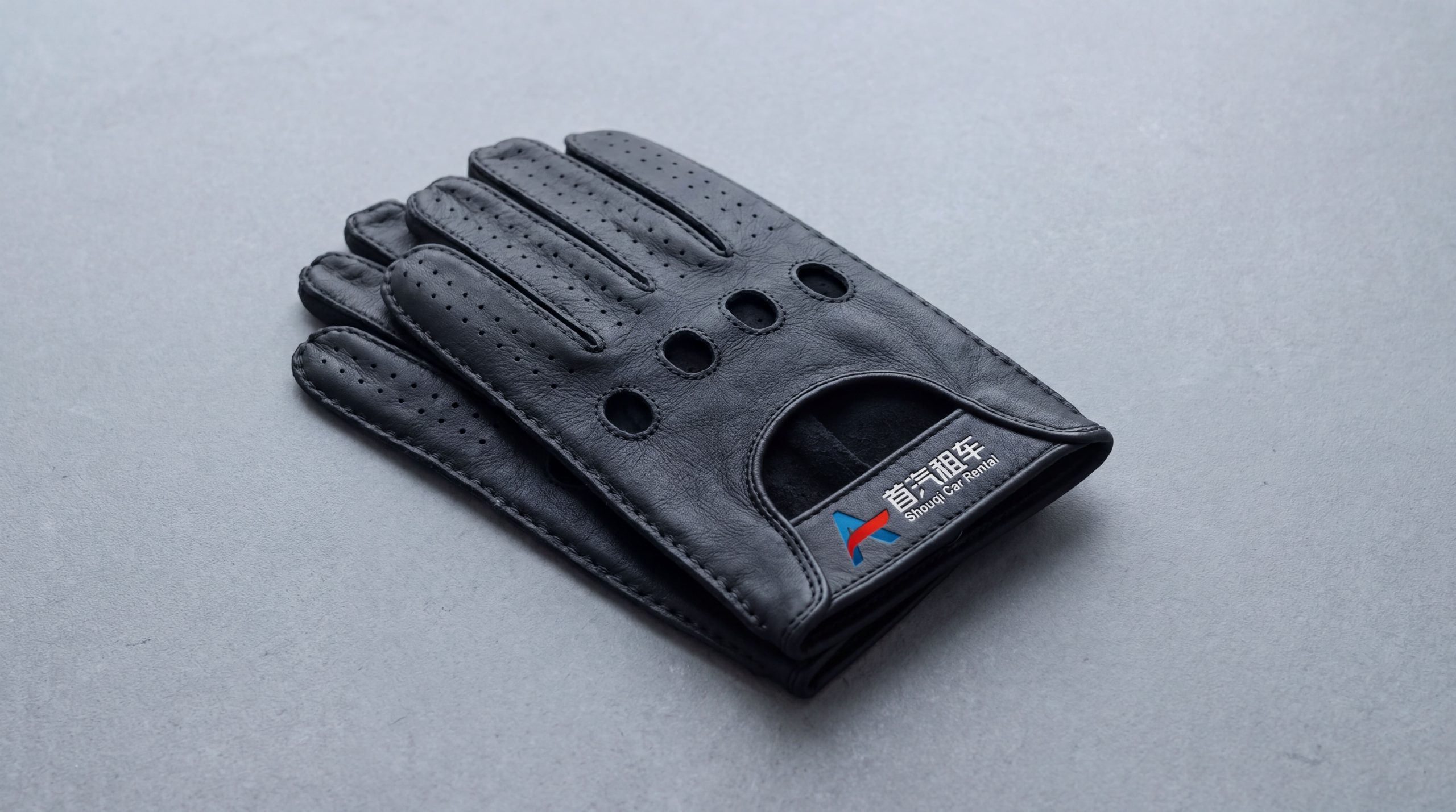
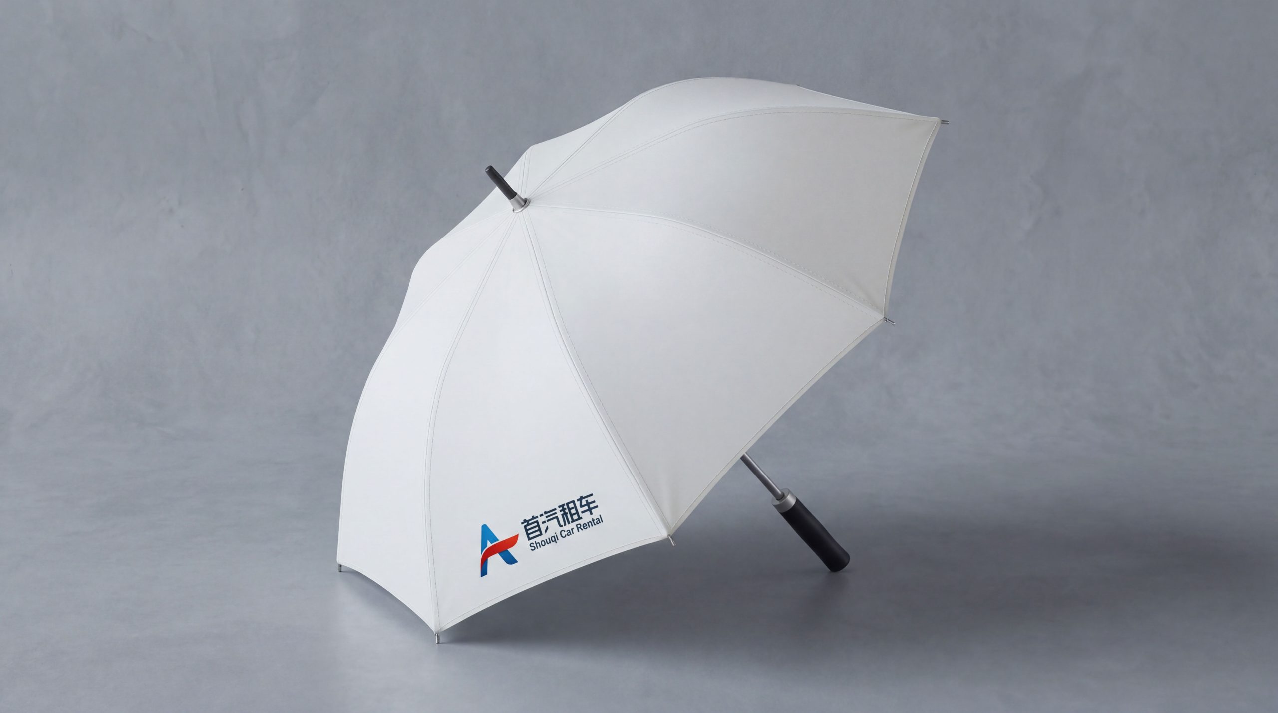
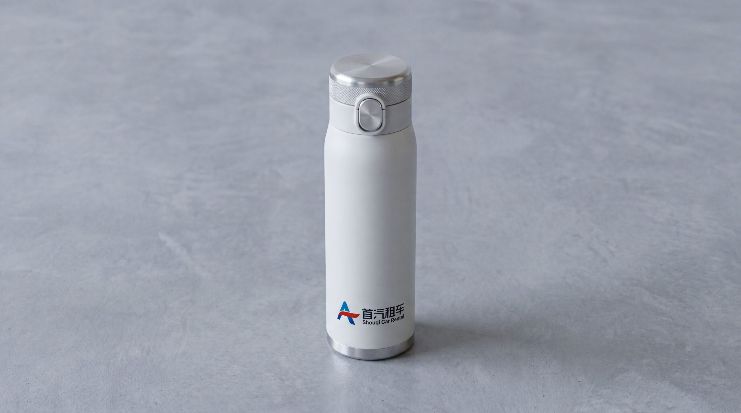
The logo can be widely used in store fronts across the country, airport high-speed rail pick-up point signs, parking lot guides and vehicle handover area images; vehicle body stickers, car keychains, in-car materials and vehicle nameplates; official websites, mobile APP icons and interfaces, mini program entrances and OTA platform store images; brand brochures, corporate customer cooperation plans, membership cards and travel gift bags; travel industry summits, auto expos, urban transportation forums and cross-sector cooperation event images. At the airport car pick-up point, a key touch point in the user journey, Shouqi's blue logo is suspended above the car pick-up channel in the form of a light box or LED screen. Passengers dragging their luggage out of the arrival hall and see the familiar blue logo when they look up, gaining the trust of the brand that "safe travel starts here" at the first moment in an unfamiliar city. In the dynamic visual, the "S"-shaped road extends from the center of the screen to the distance, and the road divider speeds forward as a flowing dotted line, just like the road markings that are constantly receding from the driving perspective. The sense of speed and freedom comes across, symbolizing that Shouqi Car Rental opens a smooth and worry-free travel journey for every user.
brand meaning
The logo contains three core images: Quality Mobility - the smooth curve of the "S"-shaped road and the main dark blue color convey Shouqi Car Rental's professional quality and safety assurance accumulated over decades of service; Freedom to Drive - the perspective road extending into the distance conveys the core experience value of "walking and taking control" of car rental travel; First Choice (First Choice) Trust) - The stable brand word mark and Capital Gene convey users' brand recognition of "Shouqi is the first choice for travel, peace of mind and worry-free". The overall design conveys Shouqi Car Rental's brand vision of "first choice for travel, safe and worry-free".
Improper Usage (Protection Specification)
Do not change the curvature, perspective shrinkage ratio or extension direction of the "S" curve; do not modify the position of the road divider or its parallel relationship with the main curve; do not change the hue or brightness of the main color of Shouqi Blue; do not add strokes, shadows or decorative effects inconsistent with the travel style to the sign; do not separate the "S" road graphics and wordmarks for separate use; keep the white space ≥ 25% of the graphics height; the minimum display width must not be less than 25mm.
design results
After the release of the logo, Shouqi Car Rental's brand recognition and user trust in China's car rental and travel service fields have significantly improved. "Road to the Wind", with its unique visual language that combines a sense of action and trust in quality, has become the core identification symbol of Shouqi Car Rental's brand system. It is widely used in the nationwide store network, digital platforms and market communications, demonstrating the brand vision of "preferred travel, safe and worry-free".