










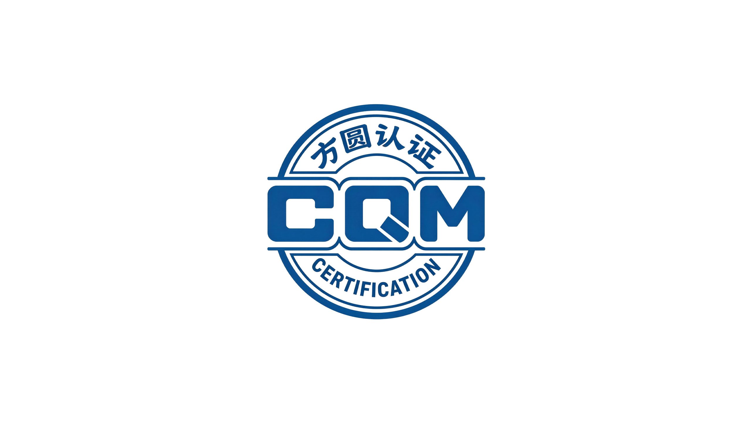
Fangyuan Certification Group is one of the earliest certification agencies established in China. Approved by the National Certification and Accreditation Administration Commission, it specializes in comprehensive certification services such as quality management system certification, product certification, environmental management system certification and occupational health and safety management system certification. With the mission of "delivering trust and serving development", it is committed to helping enterprises improve their management level and market competitiveness with authoritative, fair and professional third-party certification services.
The brand name "Fangyuan" contains the most profound wisdom of order in Chinese philosophy - "Fang" means squareness and rules, symbolizing the rigor of certification standards, institutional norms and upright evaluation; "Yuan" means harmony and accessibility, symbolizing thoughtful service, smooth processes and harmonious and win-win cooperation. "Without rules, there is no fangyuan" - the word "fangyuan" itself is the most condensed expression of the core spirit of the certification industry of "building trust with rules and establishing ourselves with standards". Qingmei Future was commissioned to lead the brand identity design.
The design goal of the brand logo is to demonstrate the industry status of Fangyuan Certification as a national certification agency through the visual language of authority, fairness, professional standards and trust, and to convey the brand image of "Founder, Trust, Yutong and Zhiyuan".
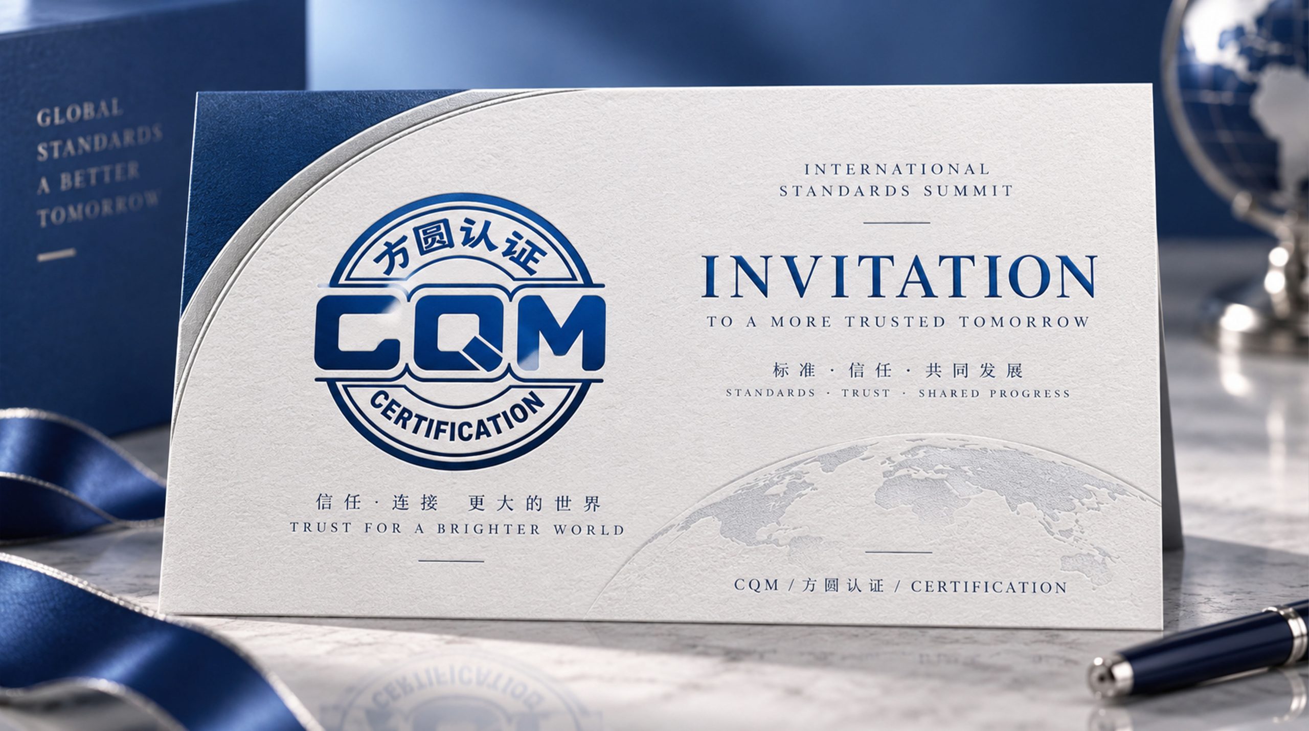
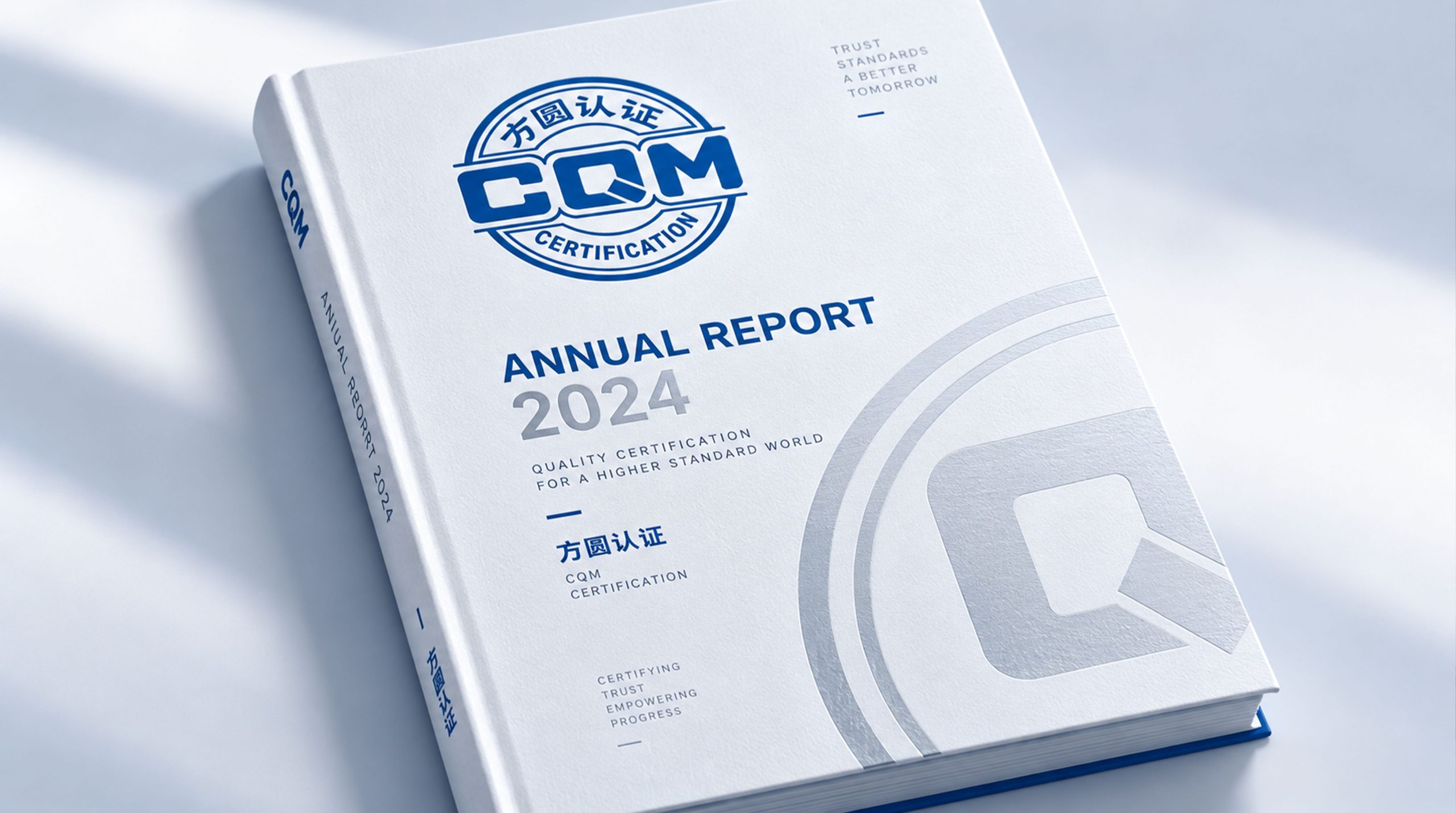
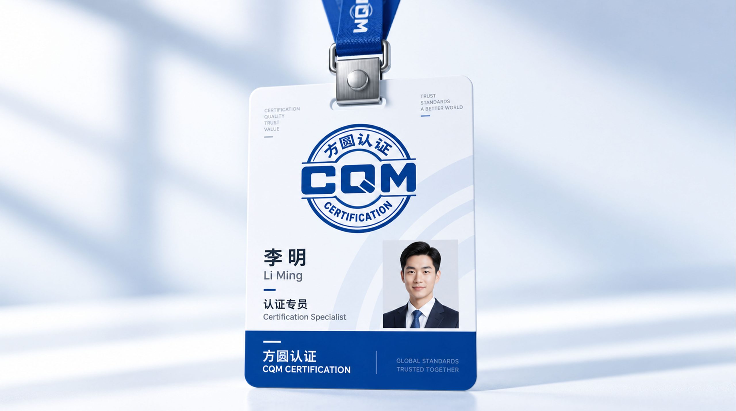
design concept
The logo takes "Square within Circle" as its core concept and directly transforms the classic pattern of "the sky is round and the earth is round" in traditional Chinese philosophy into the core visual symbol of the brand. The outer circle and the inner square represent the space order concept of Chinese civilization that has lasted for thousands of years - the sky is round to symbolize tolerance, comprehensiveness and infinity, and the place is to symbolize rules, standards and integrity. The logo of the certification body named "Fangyuan" should be the most direct visual embodiment of the Fangyuan philosophy. The structure of a circle on the outside and a square on the inside echoes the shape of ancient Chinese copper coins. Copper coins were the original form of "credit certificates" in ancient economic activities. The essence of the certification mark is the "credit certificate" in contemporary business society. The square and round seal stamps the seal of quality and trust for the enterprise.
graphic language
The graphics use a perfect circle as the outer frame, and the lines are smooth, precise, and even in thickness, just like the zero-error requirement for each indicator in the certification review. The round shape naturally conveys the visual experience of "completeness, comprehensiveness, and nothing missing", implying that Fangyuan Certification's evaluation system covers every dimension of quality.
The circular interior is centered with a square, and the four corners intersect precisely at sharp right angles, conveying the absolute rigidity of the certification standard - a standard that cannot be bent or compromised. The squares and circles are evenly spaced, do not touch each other but are interdependent, conveying the "independent, objective, third-party" impartial stance of the certification body.
A geometric check mark is embedded inside the square. The check mark is the most common visual symbol of "qualified and up to standard" in the global certification industry. It is like the auditor decisively putting pen to paper on the checklist - each check mark is the crystallization of professional judgment and the granting of trust. The Chinese and English names of the brand can be arranged up and down the circular exterior along the arc to form a complete badge structure, giving the logo a sense of ceremony and authoritative signal of an official seal. The overall composition uses a three-layer nested structure of "a circle on the outside and a square on the inside, and a hook in the square" to create a "united square and circle".
Font composition
The Chinese "Fangyuan Certification" uses an upright modern boldface, with even and thick strokes, and a square and rigorous structure, conveying the authority and professionalism of the national certification agency. The English "CHINA QUALITY MARK CERTIFICATION GROUP" is arranged in standard uppercase sans serif font to ensure clear identification in international certification mutual recognition and global standardization cooperation. The abbreviation "CQM" is presented in bold monospaced font - C stands for China, Q stands for Quality, and M stands for Mark.
color system
The main color, Fangyuan Blue #003B7A, represents authority, fairness and trust. It is the most widely used brand color in the global certification industry and protects the fair bottom line of quality evaluation with absolute calmness and rationality. Auxiliary standard red #CC2222 is used for core certification marks and certificate seals. The red square and round certification mark stamped on product packaging is like a solemn stamp of authority, conveying the trust signal that "this product has passed national certification." Auxiliary silver #A0A0A0 is used for auxiliary information and technical documents to convey the objective and neutral third-party position of the certification body. Pure white #FFFFFF as standard base color. The overall color is blue and red, reflecting the brand temperament of "fairness, authority, trust and reliability".
Application extension
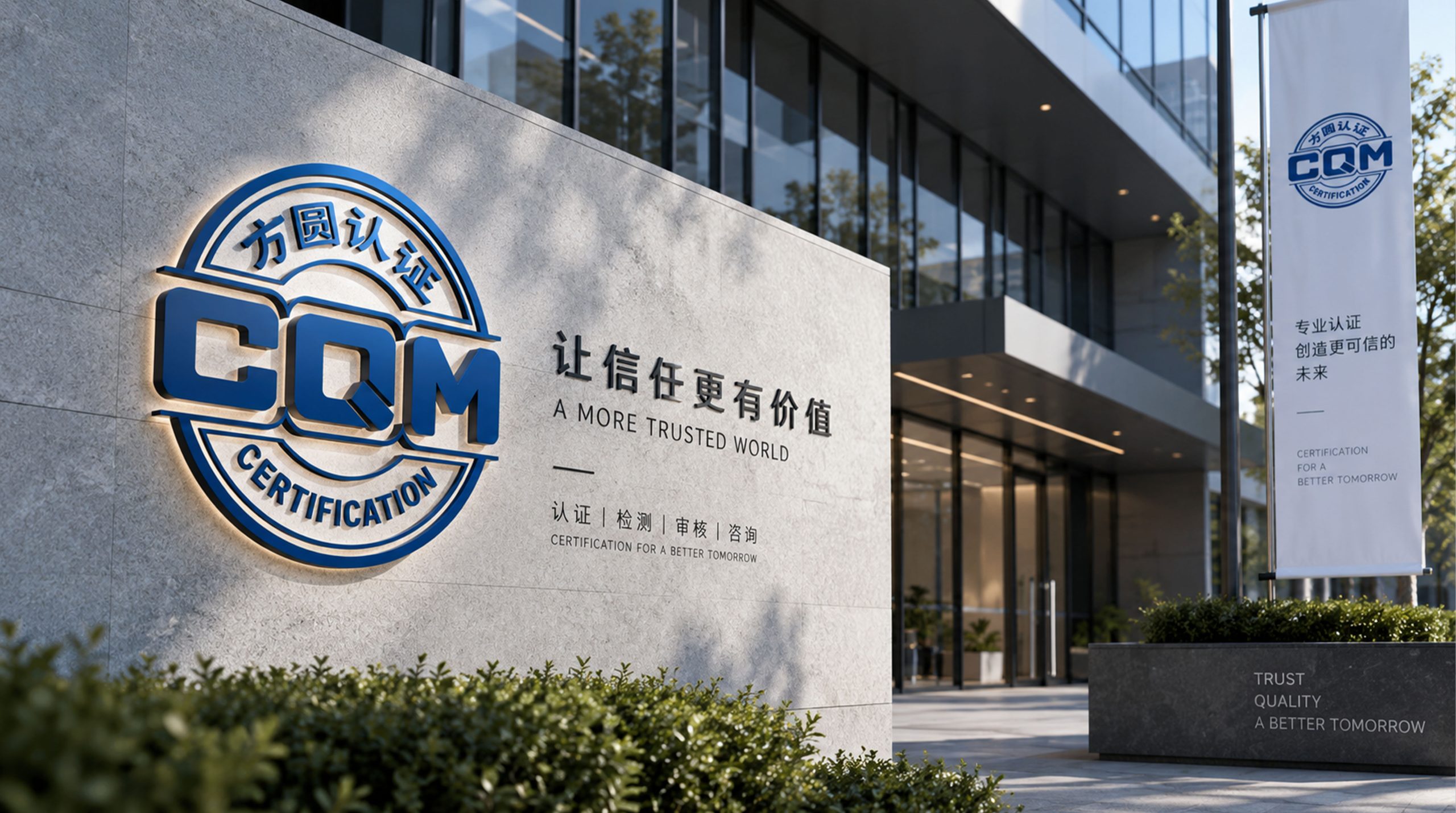
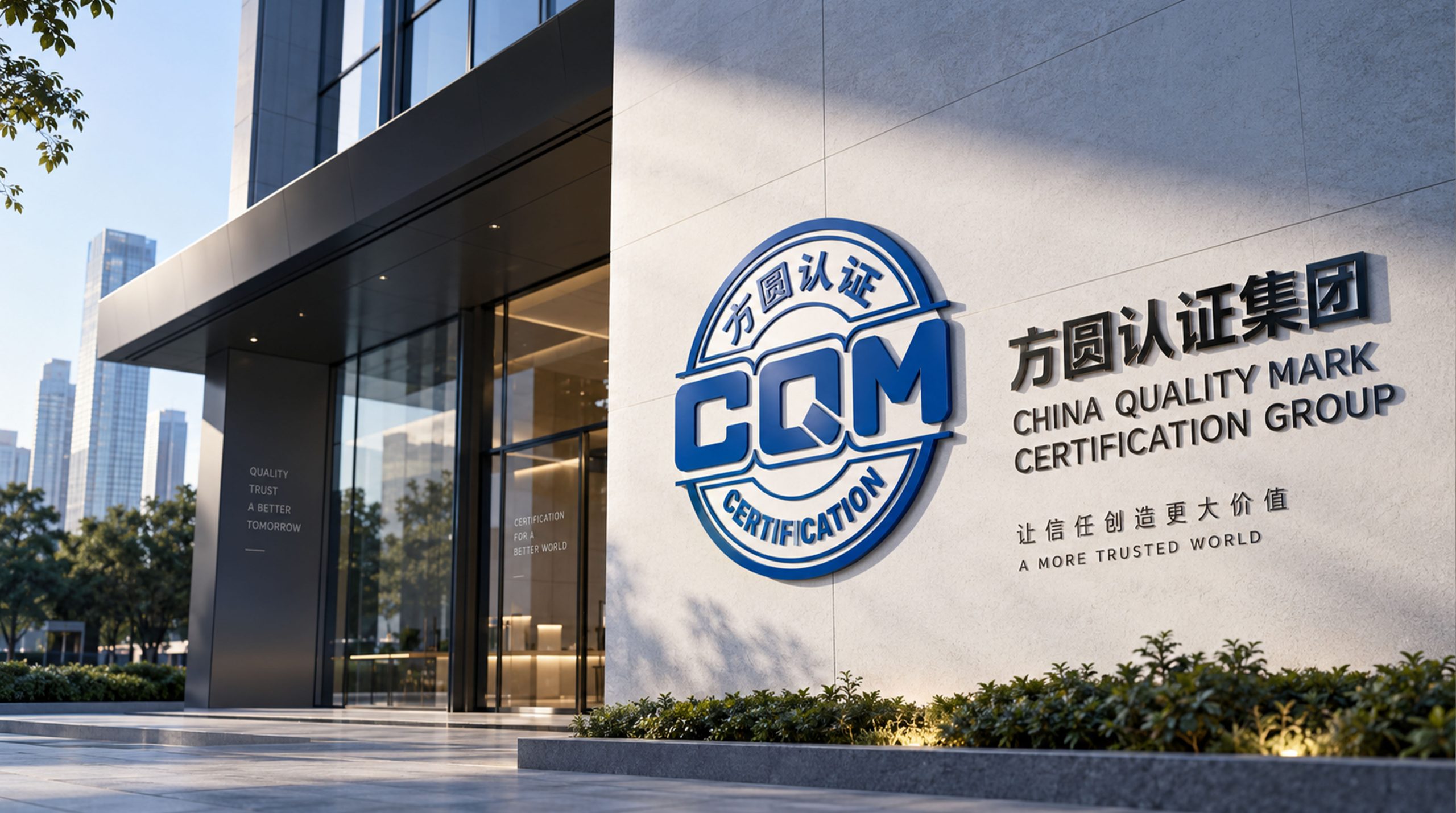
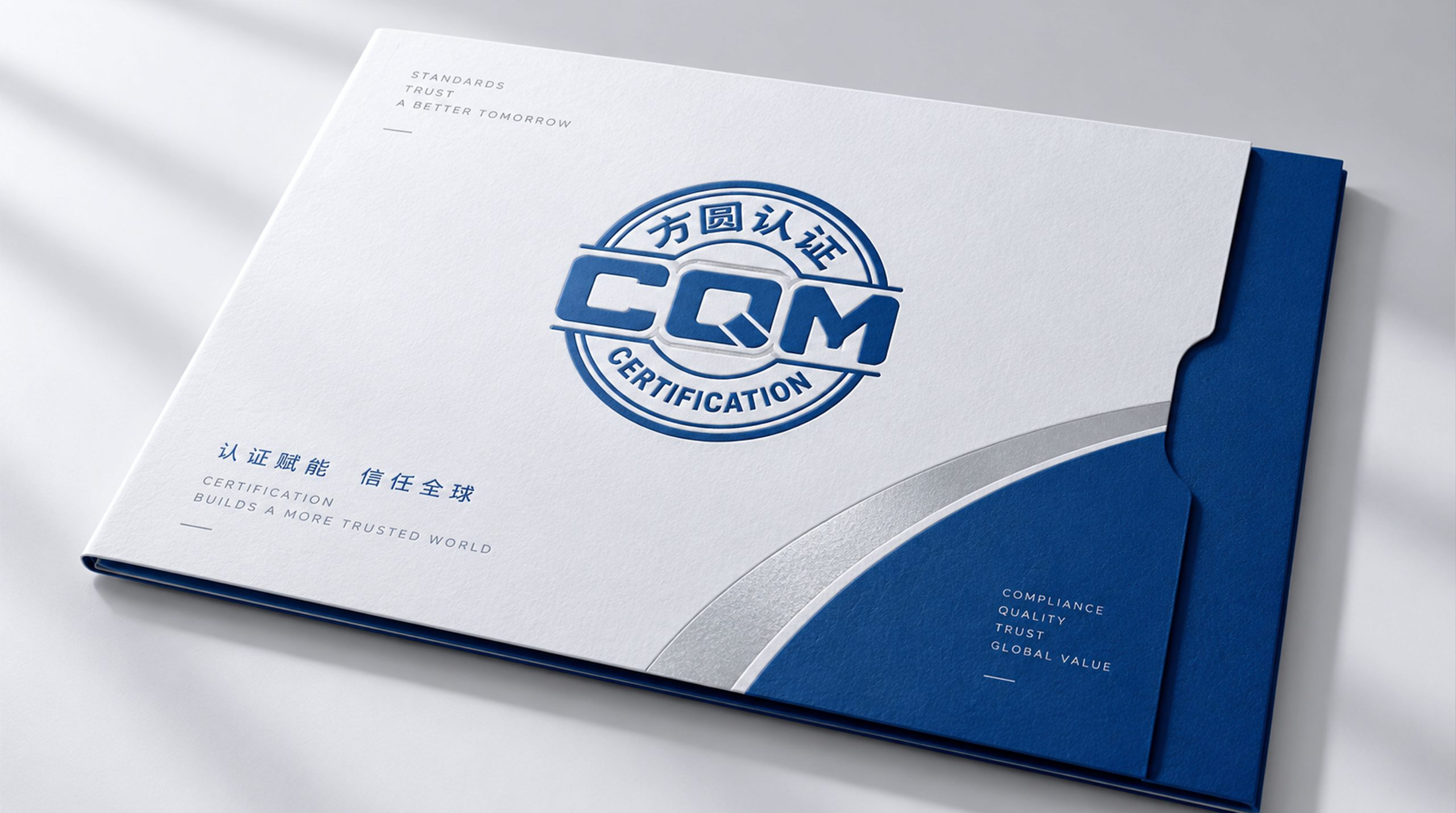
The logo can be widely used in the nameplates of the organization's headquarters and branches, and audit site signs; certification certificates, audit reports, and management system manual covers; official websites, online certification application platforms, and digital communication materials; certification and accreditation industry conferences, quality management forums, and international standardization organizations to communicate images. The most frequent application scenario is certification mark labeling - the Fangyuan certification mark is printed on the product packaging and business premises of certified companies, becoming a credible visual credential for consumers to identify quality. In the dynamic vision, the outer circle expands and shapes with a precise trajectory, the four straight lines on the inner side are drawn in sequence, and the check mark falls decisively in the center of the square, symbolizing the complete process of a certification audit from initiation to passing.
brand meaning
The logo contains three core images: Integrity - the inner side conveys the professional ethics of "unbendable standards and uncompromising fairness"; Comprehensive - the outer circle conveys the service quality of comprehensive certification services and win-win cooperation; Trust Delivered - the check mark and badge composition conveys the core value of Fangyuan certification to build a bridge of trust between enterprises and consumers. The overall design conveys the brand vision of "Founded, Trustworthy, Yuantong and Zhiyuan".
Improper Usage (Protection Specification)
Do not change the perfect circle ratio of the outer circle or the square accuracy of the inner square; do not modify the spacing relationship between the square and the circle; do not change the hue of the main blue color of the square circle; do not add gradients, shadows or decorative effects that are inconsistent with the certified style; do not separate the outer circle, inner square and check mark for separate use; keep the white space ≥ 25% of the graphic diameter; the minimum display width shall not be less than 15mm.
design results
After the release of the logo, Fangyuan Certification's brand unity and authoritative recognition in the national certification and accreditation industry have significantly improved. "Fangyuanheyi", with its classic visual language that integrates the wisdom of Chinese philosophy and international certification standards, has become the core identification symbol of the brand system. It is widely used in certification services, industry exchanges and corporate labeling, showing the brand vision of "Founder, Trustworthiness, Yutong and Zhiyuan".