











The Chinese Peacock Garden is a cultural tourist attraction with peacock-themed eco-tourism and rare bird viewing as its core. It integrates peacock breeding and protection, ecological science education, leisure and vacation experience, and cultural and creative product development. It is committed to presenting the beauty of peacocks and the unique charm of Chinese ecological culture to tourists.
The brand name "Chinese Peacock Garden" directly points out the core features of the scenic spot - "China" carries national cultural confidence and national characteristics, "Peacock" clarifies the core species and theme IP, and "Garden" takes the meaning of garden and garden, conveying the elegant garden space and ecological habitat. Qingmei Future was commissioned to lead the brand identity design.
The design goal of the brand logo is to convey the brand image of "Colorful Peacock, Ecological Garden" through the beauty of peacock, ecological artistic conception and the visual language of Chinese culture.
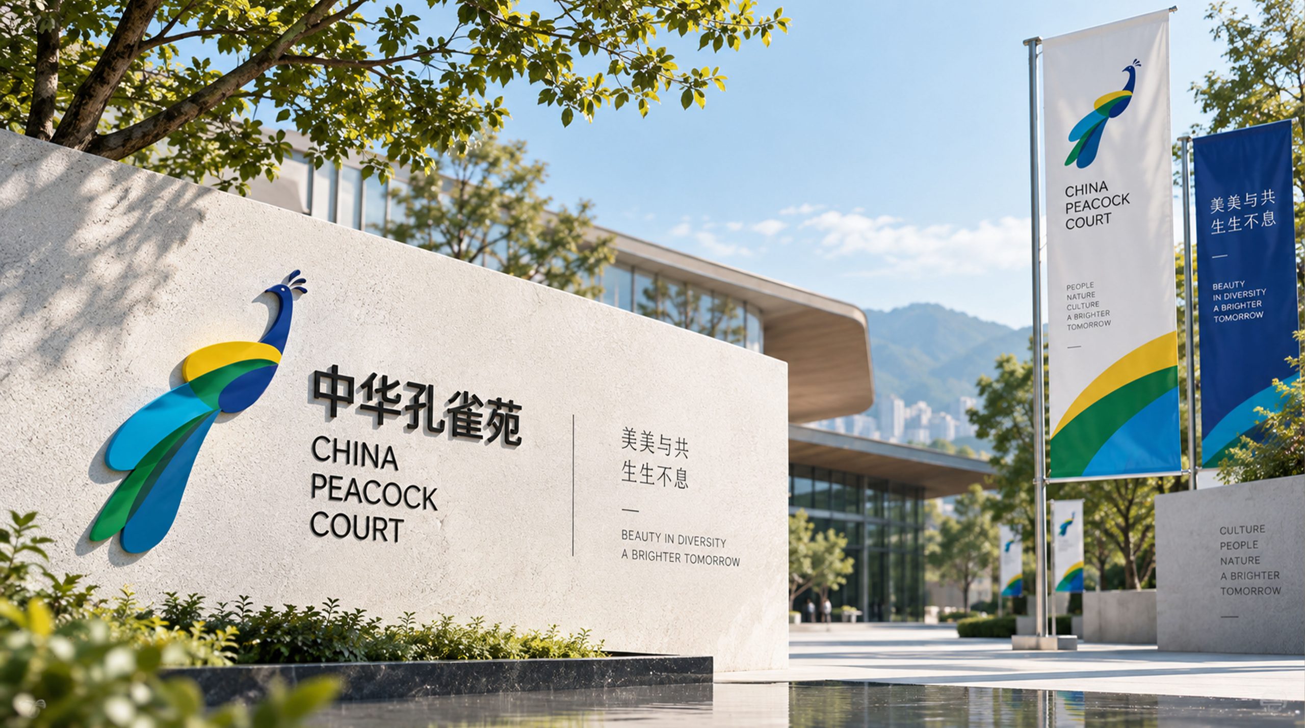
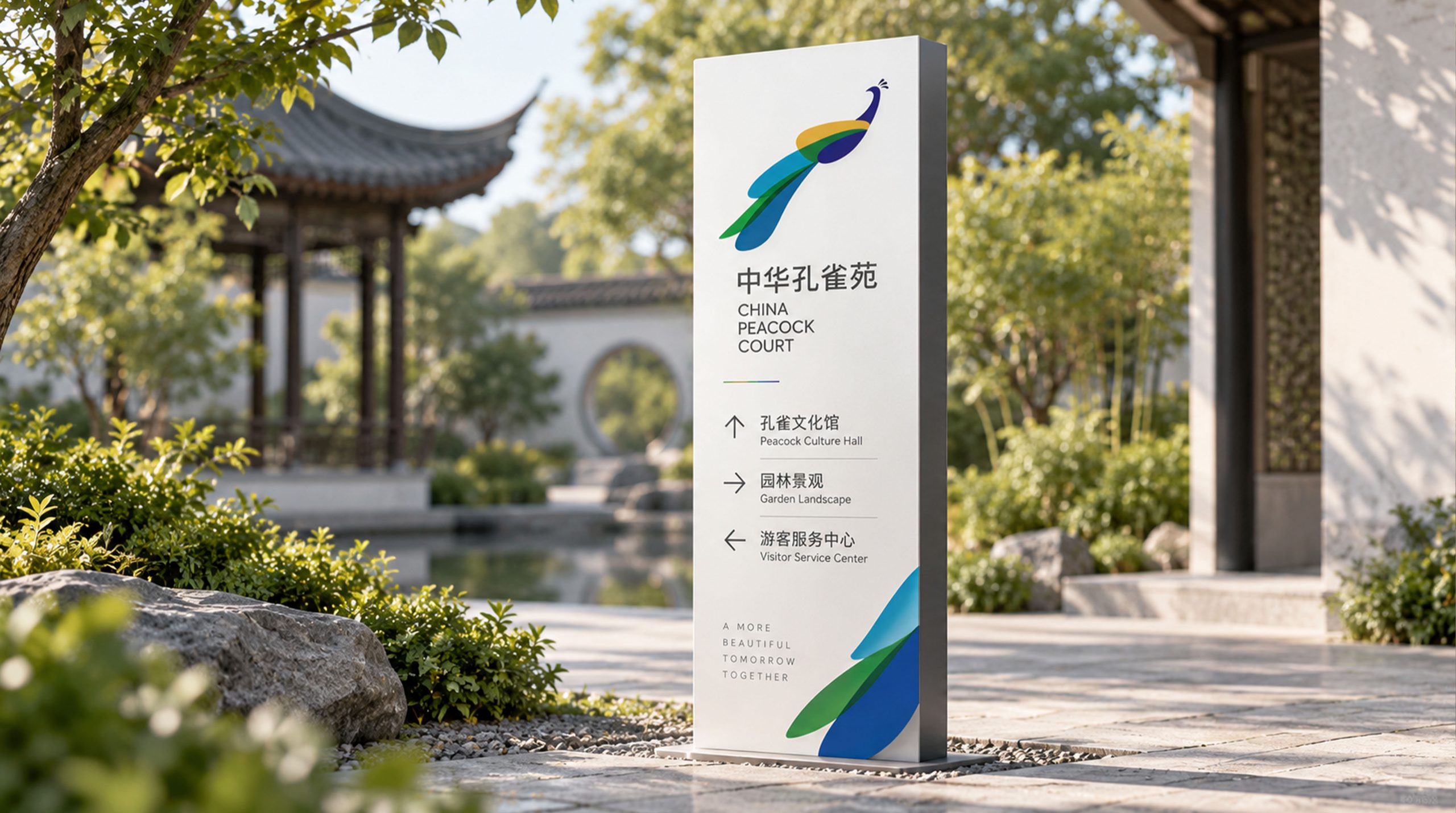
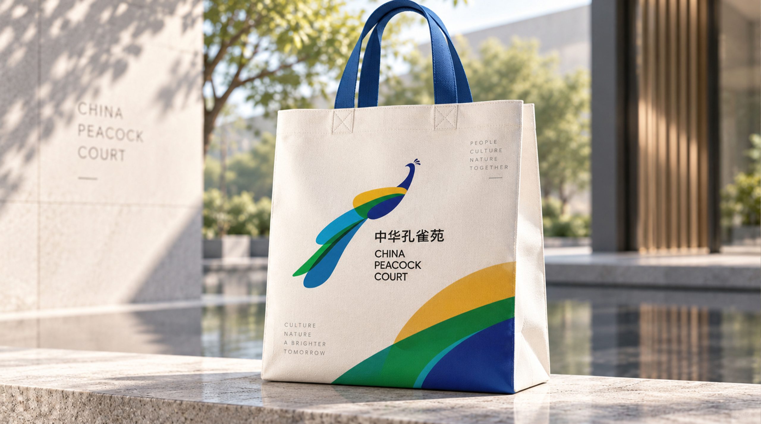
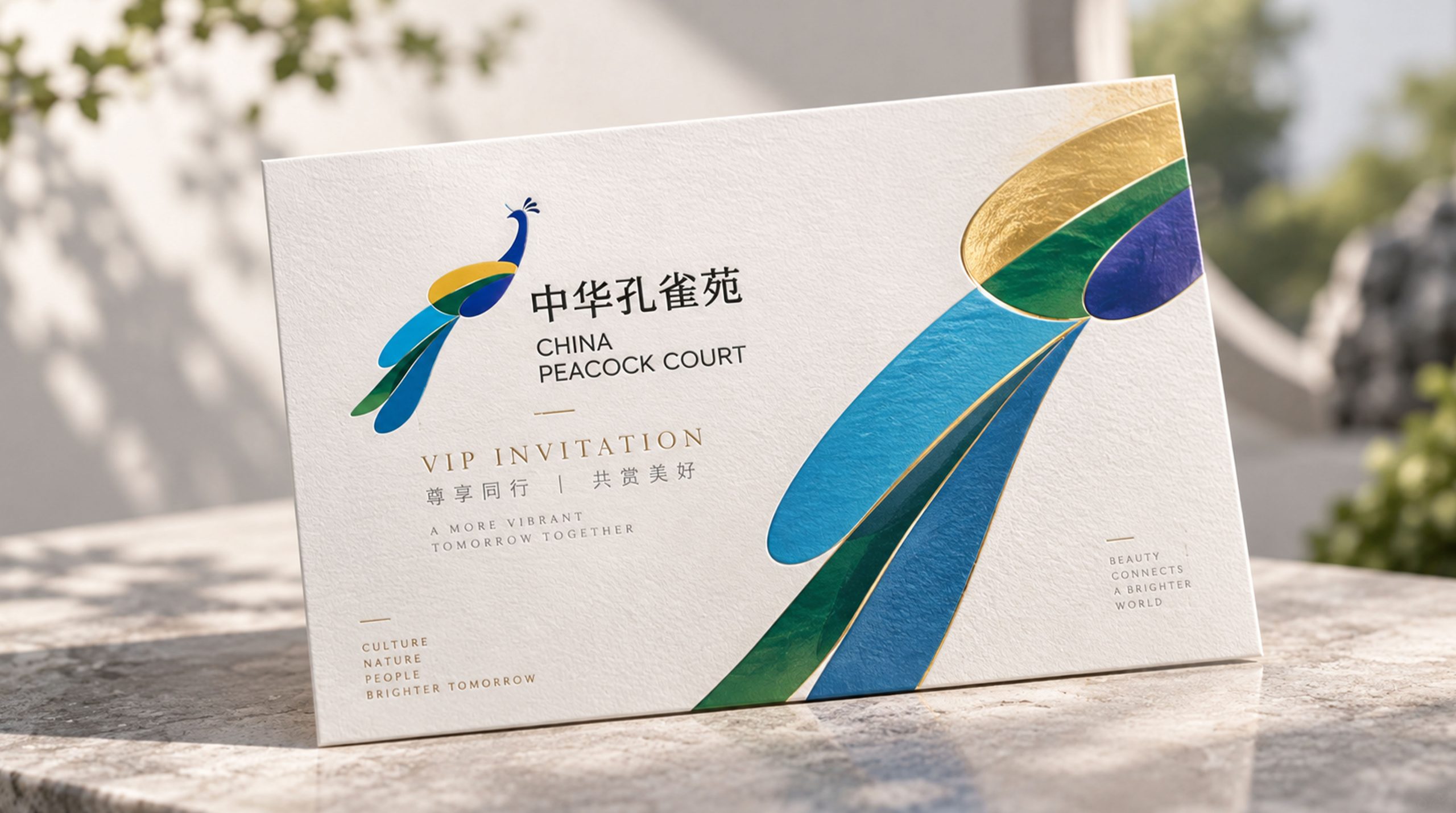
design concept
The logo takes "Splendid Plumage" as the core concept, condensing the gorgeous moment of the peacock spreading its wings into the core visual symbol of the brand. The peacock's tail is one of the most spectacular visual spectacles in nature - a hundred feathers spread out, with colorful eyes. It has been regarded by Chinese culture as a symbol of good luck, beauty and nobility since ancient times. With the opening of the screen as the core of the logo, the core theme and aesthetic height of the scenic spot are conveyed to the viewer in the first place.
graphic language
The main body of the graphic is a highly artistically refined peacock with its tail spread out from the front. The peacock's head is summarized by a simple round shape and a cluster of slender crown feathers. The crown feathers are presented in three to five upward stretching thin lines, standing elegantly like a crown, conveying the noble status of the peacock as the "King of Birds". The lower part of the head is connected to the body by a slender neckline, which is as straight as a willow and as elegant as a string.
The tail screen is the visual center of the graphics, with a fan-shaped radiating structure that spreads gorgeously to both sides and above. The tail feathers are composed of several arcs radiating outward from the center. The arcs gradually unfold from the inside to the outside, like a folding fan slowly opening. The end of each arc of tail feathers ends with an oval "eye" - the most recognizable characteristic element of peacock feathers. The eye is presented in a simple shape of concentric ellipses, like bright eyes staring at the viewer. The overall outline of the tail screen is fan-shaped with a wide top and narrow bottom, which is symmetrically unfolded, gorgeous but not complicated. The overall composition uses a radiating structure of "the head stands in the middle and the screen extends to the outside" to construct the "Hua Yu Open Screen".
Font composition
The Chinese "Chinese Peacock Garden" adopts the elegant modern Song style, with thin horizontal lines, thick vertical lines, and clear strokes, conveying the elegant style of Chinese cultural scenic spots. "China" carries the country's cultural confidence, "Peacock" highlights the core theme, and "Garden" conveys the elegance of the garden. The English "CHINA PEACOCK GARDEN" is arranged in a classic serif font to ensure the brand's recognition in international tourism promotion.
color system
The main color peacock blue #006D6F represents the most iconic color of peacock feathers - emerald blue between blue and green, just like the bright luster of the peacock's neck feathers refracted in the sun. Auxiliary feather eye gold #C5A55A is used for the feather eye graphic and brand noble elements, just like the golden halo in the eye of a peacock's tail feathers. Auxiliary emerald green #2E8B57 is used for ecological-related elements to convey the natural environment and ecological protection concept of the scenic spot. Pure white #FFFFFF as standard base color. The overall color is peacock blue as the core, supplemented by golden green, reflecting the brand temperament of "colorful, ecological and elegant".
Application extension
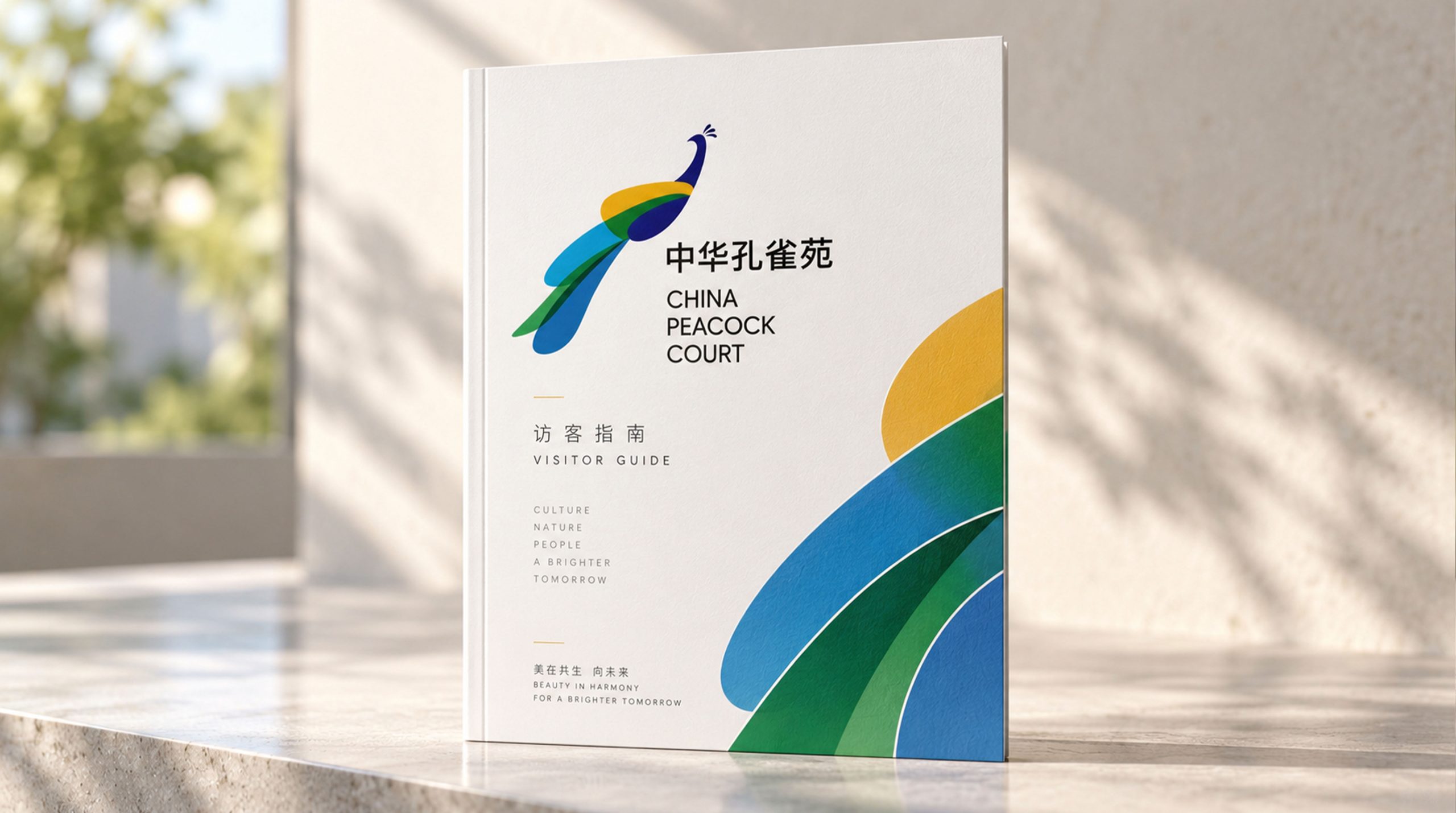
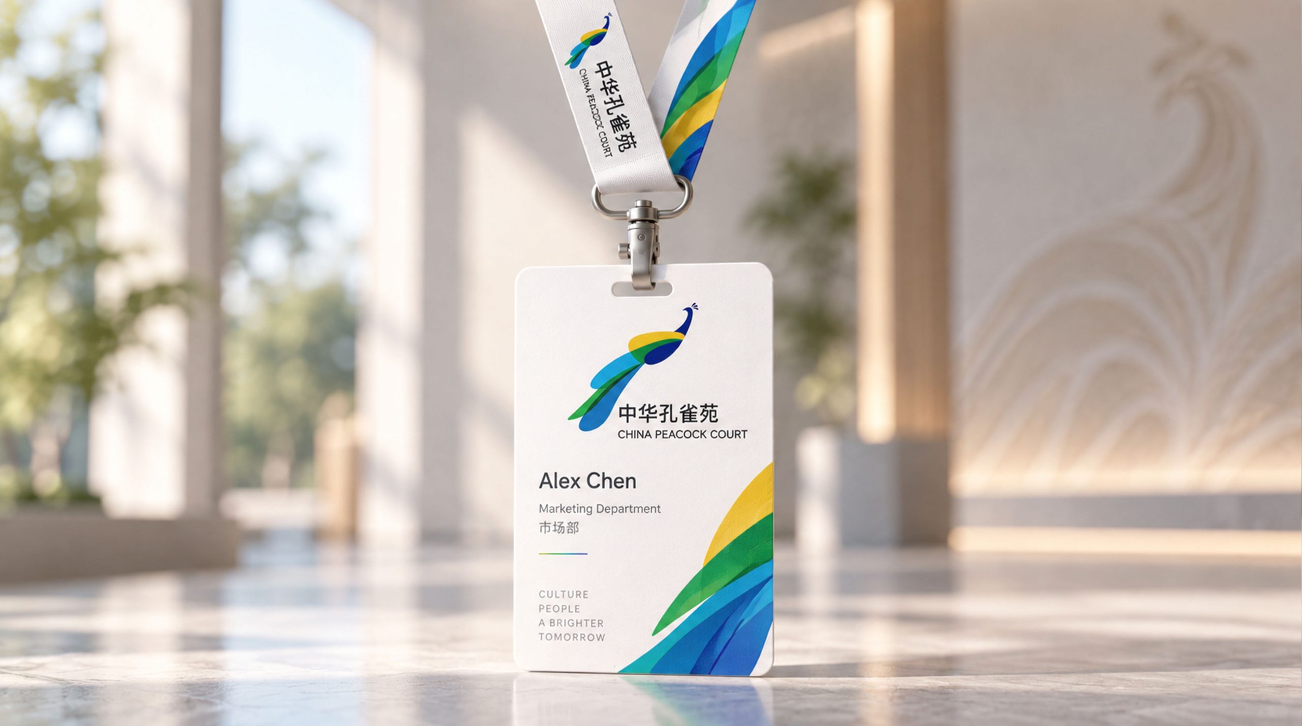
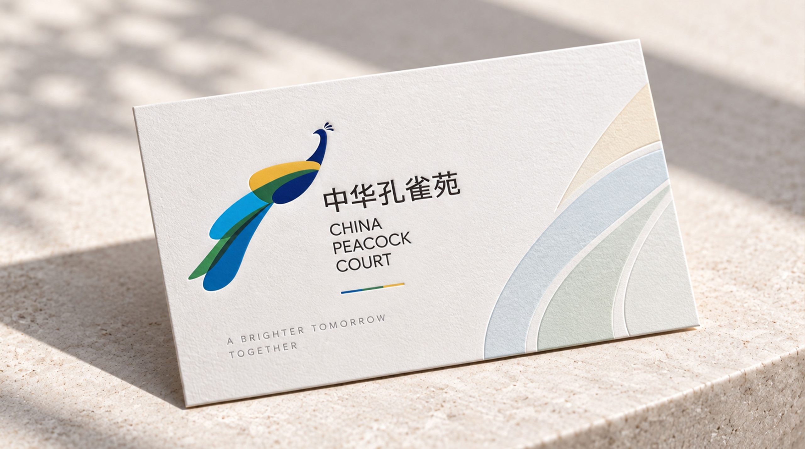
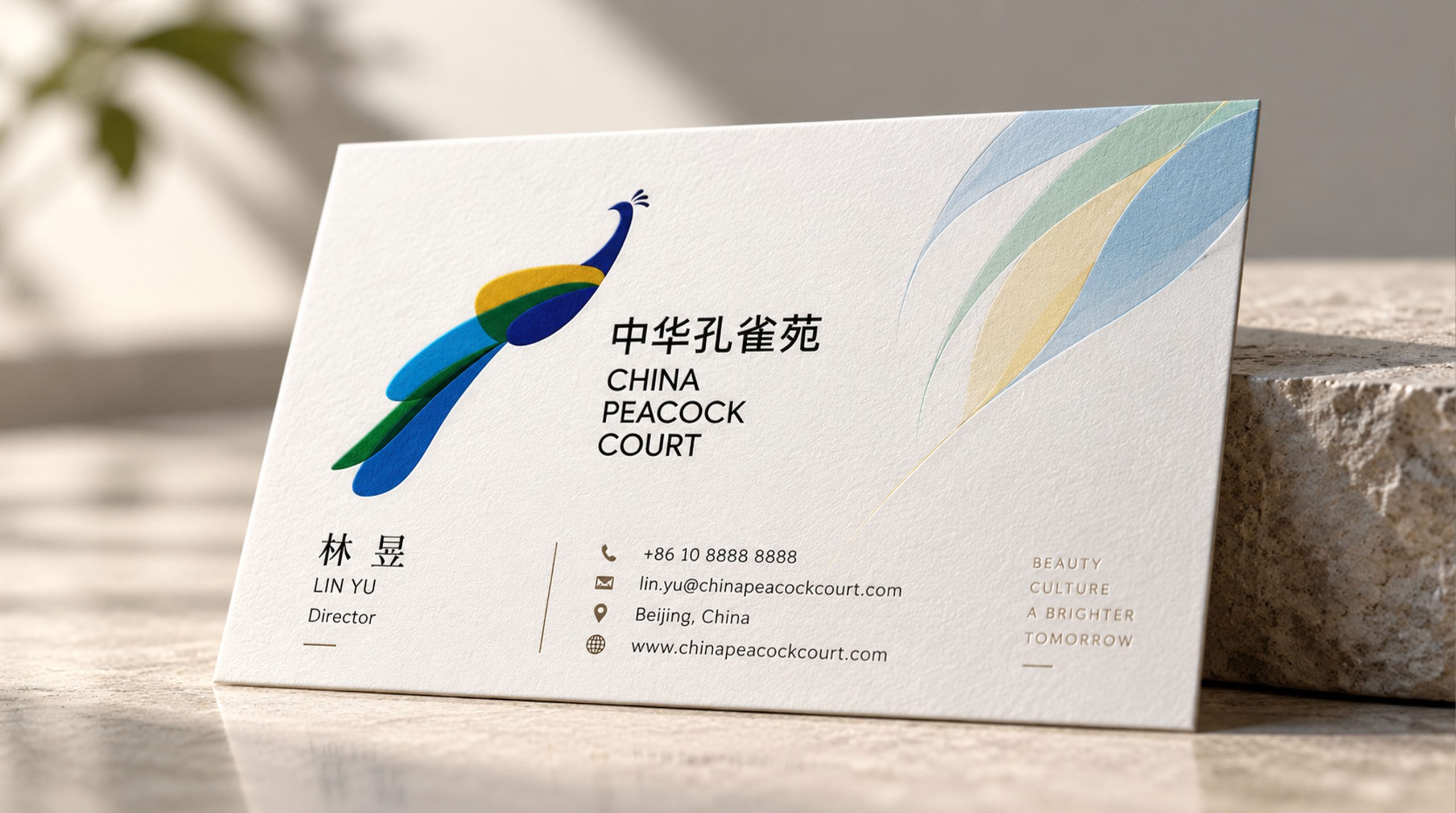
The logo can be widely used in scenic area gates, park guidance systems and viewing area signs; tickets, guide manuals, science display boards and souvenir packaging; official websites, social media and tourism platform store images; cultural tourism promotion meetings, eco-tourism forums and scenic area alliance cooperation images. At the main entrance of the scenic spot, a peacock spread its tail pattern is presented in the center of the gate with metal relief or colorful inlay technology. Visitors are attracted by the gorgeous spread of its tail at the first moment of entering the park. In the dynamic vision, the arc of the tail feathers unfolds from the center outwards, and the eyes light up one by one, completing a spectacular "virtual screen opening".
brand meaning
The logo contains three core images: Splendid Beauty - the open tail feathers convey the beauty of the peacock and the core visual appeal of the scenic spot; Chinese Heritage - the Song-style word mark and peacock blue convey the profound heritage of the peacock as a symbol of auspiciousness and nobility in Chinese culture; Ecological Garden - the auxiliary emerald green and garden-like brand naming convey the management concept of ecological protection and natural harmony of the scenic spot. The overall design conveys the brand vision of "Colorful Peacock, Ecological Garden".
Improper Usage (Protection Specification)
Do not change the fan-shaped symmetry structure or the number of eyes of the tail screen; do not change the hue of the main color of peacock blue; do not add gradients, shadows or decorative effects inconsistent with the ecological style; do not separate the peacock head and tail screen for separate use; keep white space ≥ 25% of the height of the graphic; the minimum display width shall not be less than 25mm.
design results
After the logo was released, the brand recognition of China Peacock Garden in the fields of eco-tourism and rare bird themed scenic spots has been significantly improved. With its visual language that combines the beauty of peacocks and the elegance of China, "Huayu Kaiping" has become the core identification symbol of the brand system, showing the brand vision of "Colorful Peacock, Ecological Elegant Garden".