










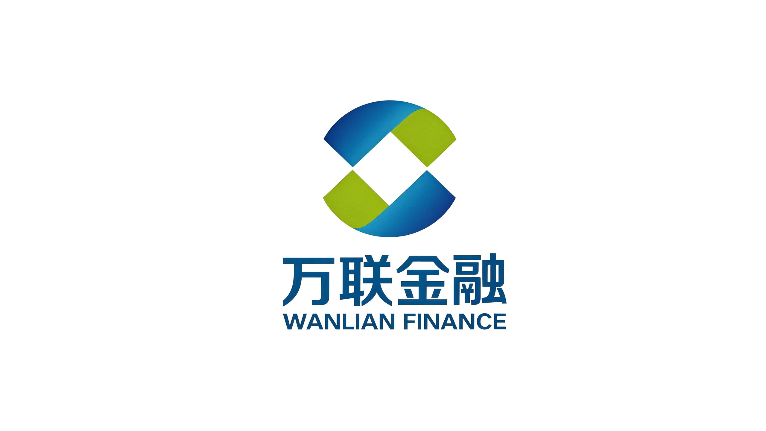
Wanlian Financial is a comprehensive financial services company with supply chain finance and industrial Internet finance as its core. It is committed to connecting upstream and downstream enterprises in the industrial chain through technological means, and providing them with one-stop financial solutions such as financing, payment, risk control and asset management.
The brand name "Wanlian" accurately conveys the brand's core capabilities - "Wan" means thousands and thousands, symbolizing the broad pattern of services covering thousands of enterprises; "Lian" means connection and connectivity, symbolizing the value of the platform that connects all links in the industrial chain and opens up the flow of capital and information. Qingmei Future was commissioned to lead the brand identity design.
The design goal of the brand logo is to convey the brand image of "thousands of interconnected networks and financial empowerment" through the visual language of financial expertise, technological connection and industrial empowerment.
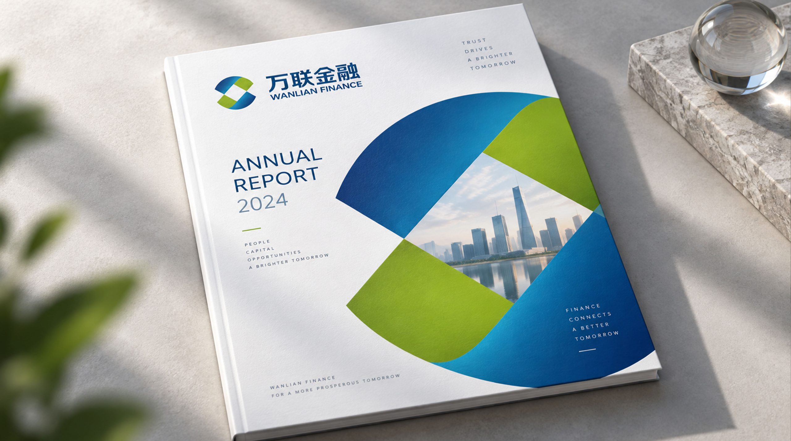
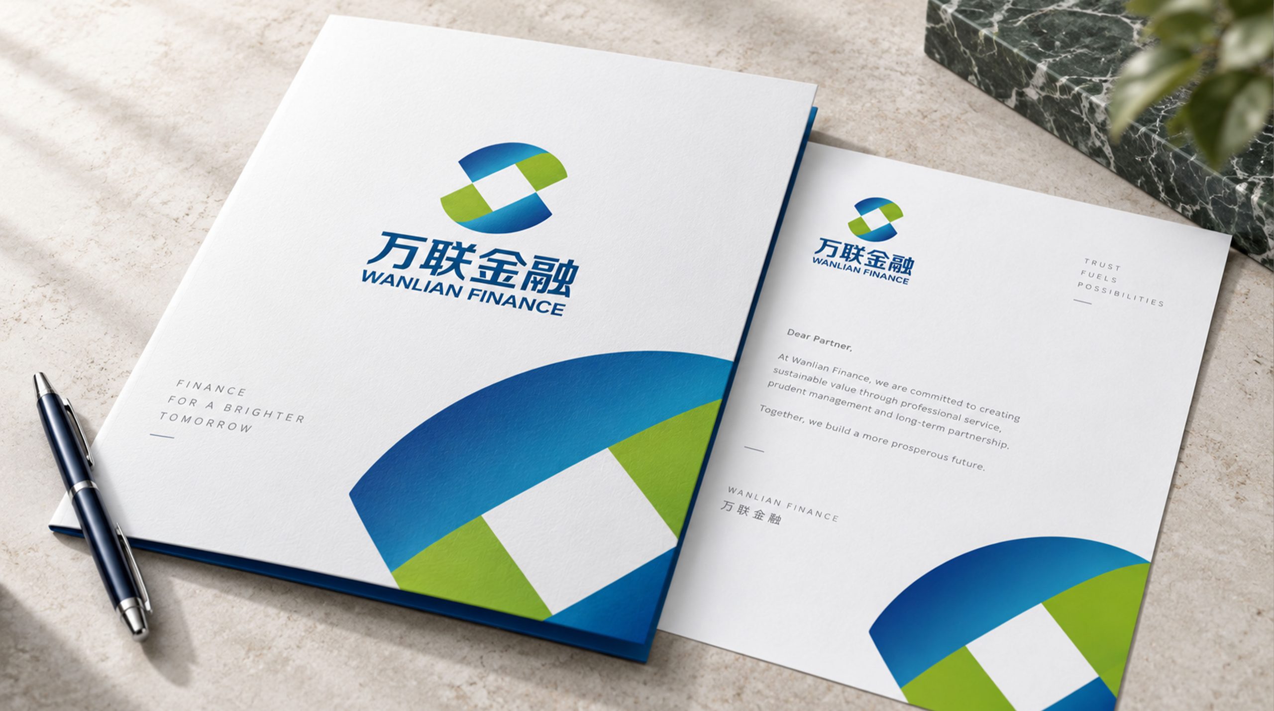
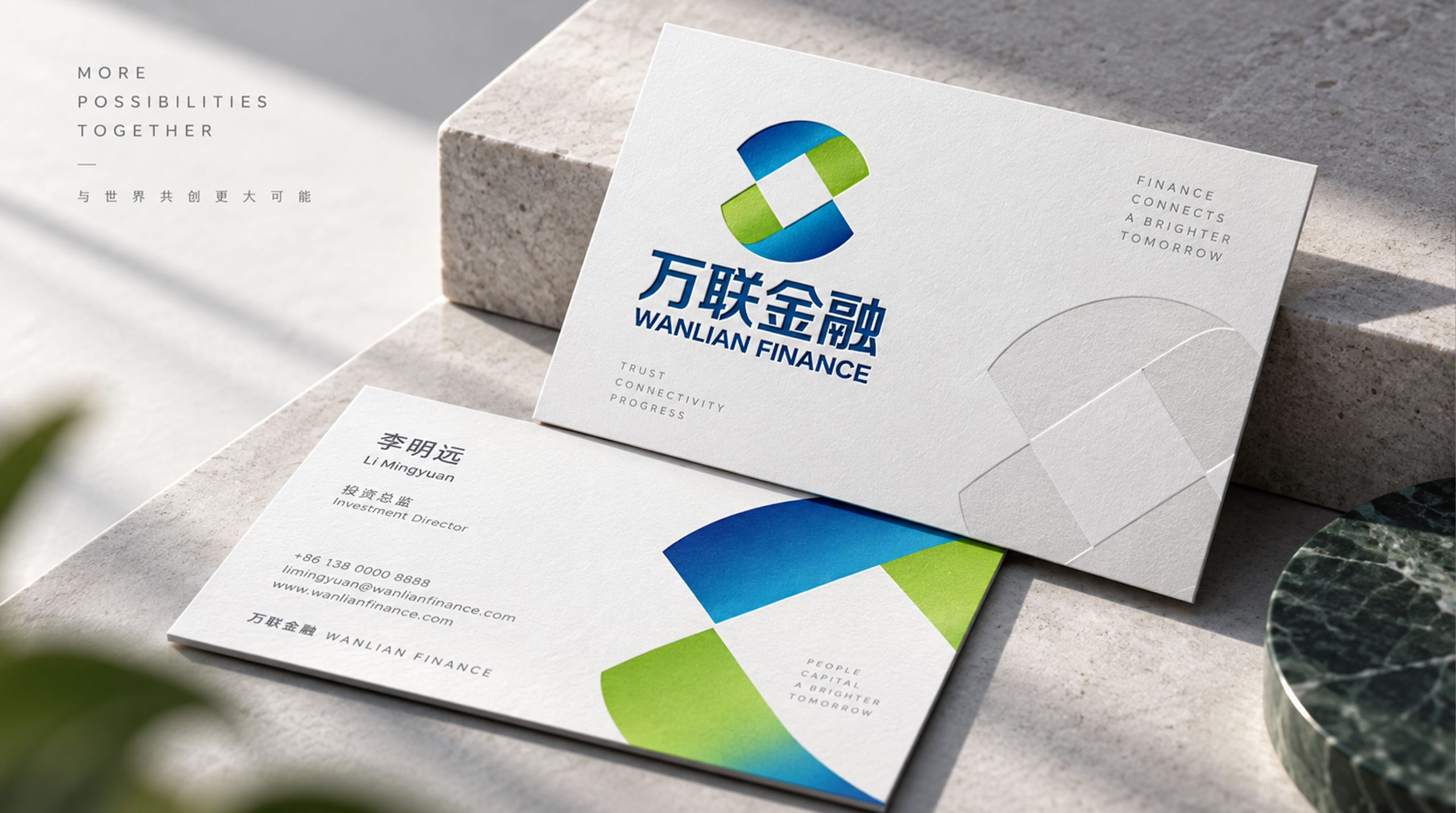
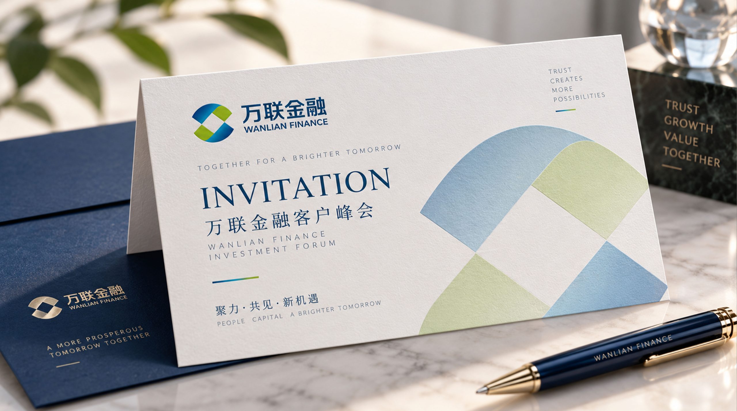
design concept
The logo takes "Infinite Link" as the core concept, condensing the interconnection of multiple rings into a brand symbol. Chain link is the most intuitive visual expression of the word "Lian" - interlocking and unbreakable, just like supply chain finance closely connecting upstream and downstream enterprises into a symbiotic and win-win whole. The infinite loop of the ring also implies the continuous flow of funds in the industrial chain.
graphic language
The main body of the graphic is composed of three intertwined elliptical rings. The three rings respectively represent the three core elements of supply chain finance - capital flow, logistics and information flow. The three rings intersect at different angles and interlock with each other to form a three-dimensional chain structure. The central area where the three rings intersect forms a shared space, which is like the core hub where the three streams converge - Wanlian Financial is the builder and operator of this hub.
The lines of the elliptical ring are presented with uniform thickness, and the corners are smooth and rounded, conveying the smooth flow of funds and the efficient operation of the platform. The interpenetrating relationship of the three rings has been carefully designed to present a three-dimensional sense through the layers of front and rear occlusion, allowing the plane graphics to gain spatial depth and convey the multi-dimensional and multi-level service architecture of the financial technology platform. The overall graphic outline is approximately spherical, conveying the broad coverage and global vision carried by the word "Wan".
Font composition
The Chinese "Wanlian Financial" uses a stable modern boldface, with thick and even strokes and a correct structure. "Wanlian" conveys the brand's connectivity and sense of scale, while "Finance" clarifies the industry attributes. The English "WANLIAN FINANCE" is arranged in standard uppercase sans-serif fonts with regular and professional fonts to ensure that the brand is clearly identifiable in the financial industry and business scenarios.
color system
The main color Wanlian Blue #0D47A1 represents financial authority, technological rationality and professional trust. Deep Blue delivers the industry consensus of "safety, compliance, and trustworthiness" in the financial technology field. Auxiliary chain gold #C9A84C is used for financial value elements and high-end customer materials in the brand system. Gold is associated with the original meaning of "finance" and conveys wealth appreciation and value protection. The combination of blue and gold conveys "the rigor of technology + the value of finance". Assistive Technology Gray #607D8B is used for assistive information and data visualization elements. Pure white #FFFFFF as standard base color. The overall color is blue and gold as the dual core, reflecting the brand temperament of "professional finance and technology empowerment".
Application extension
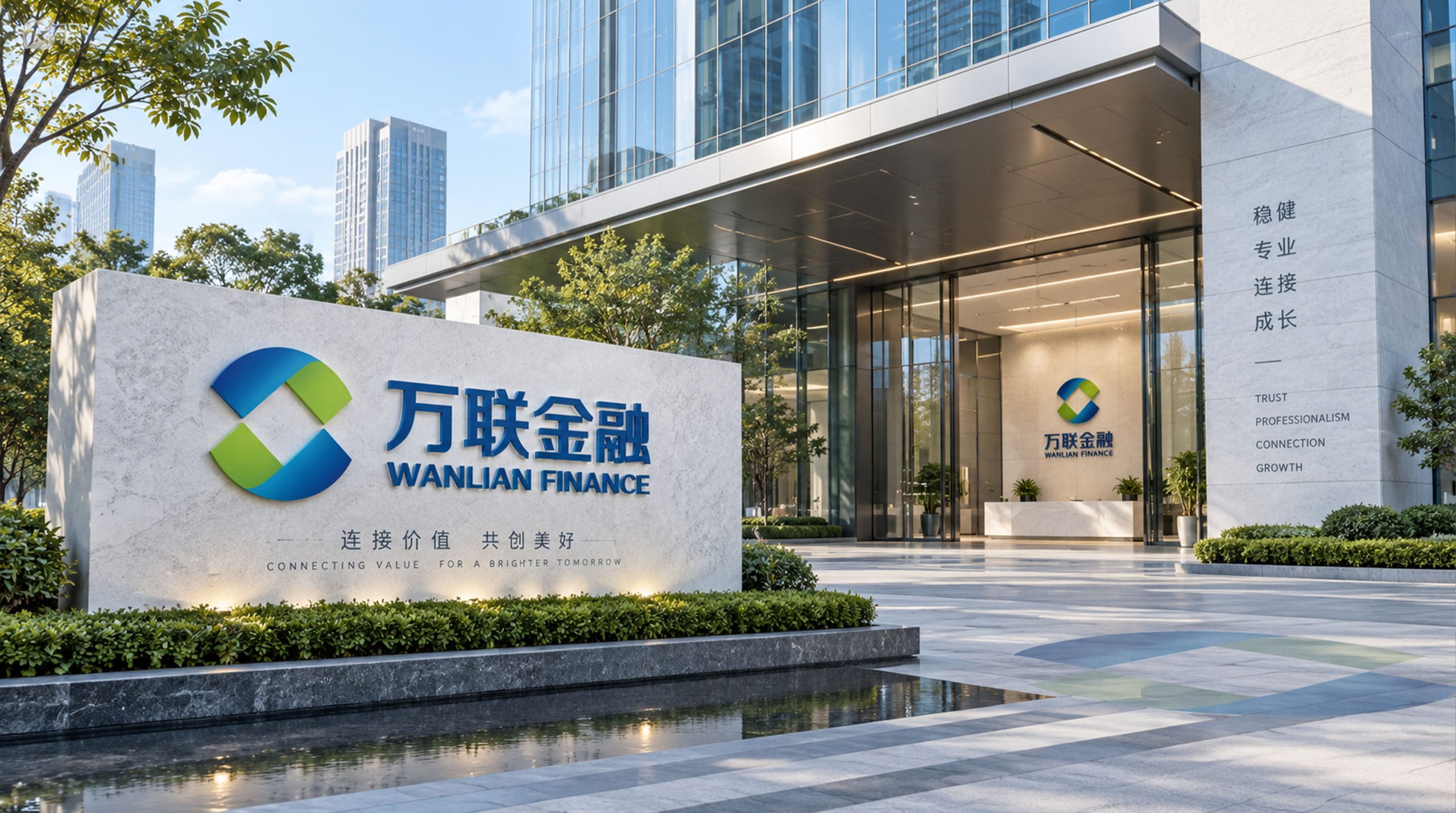
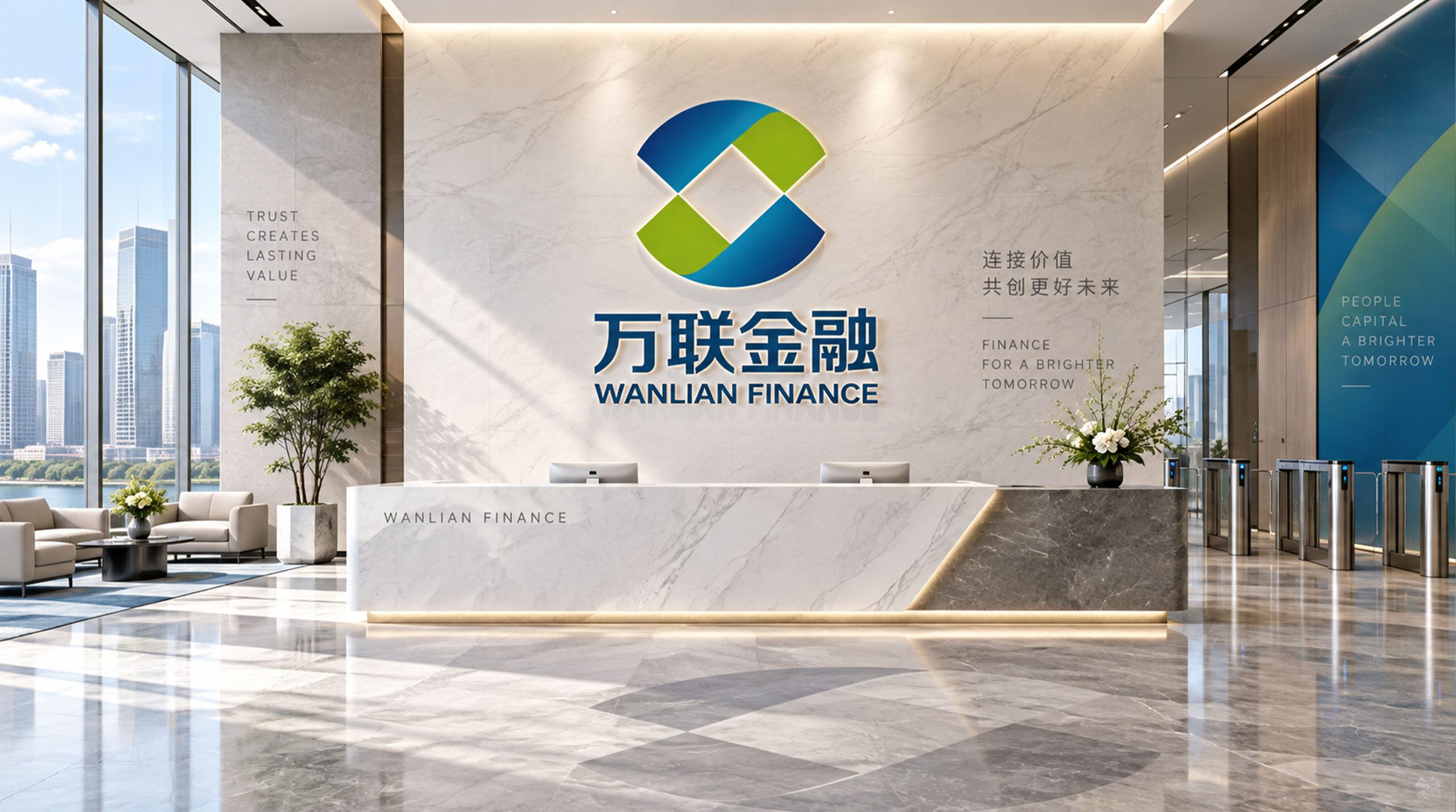
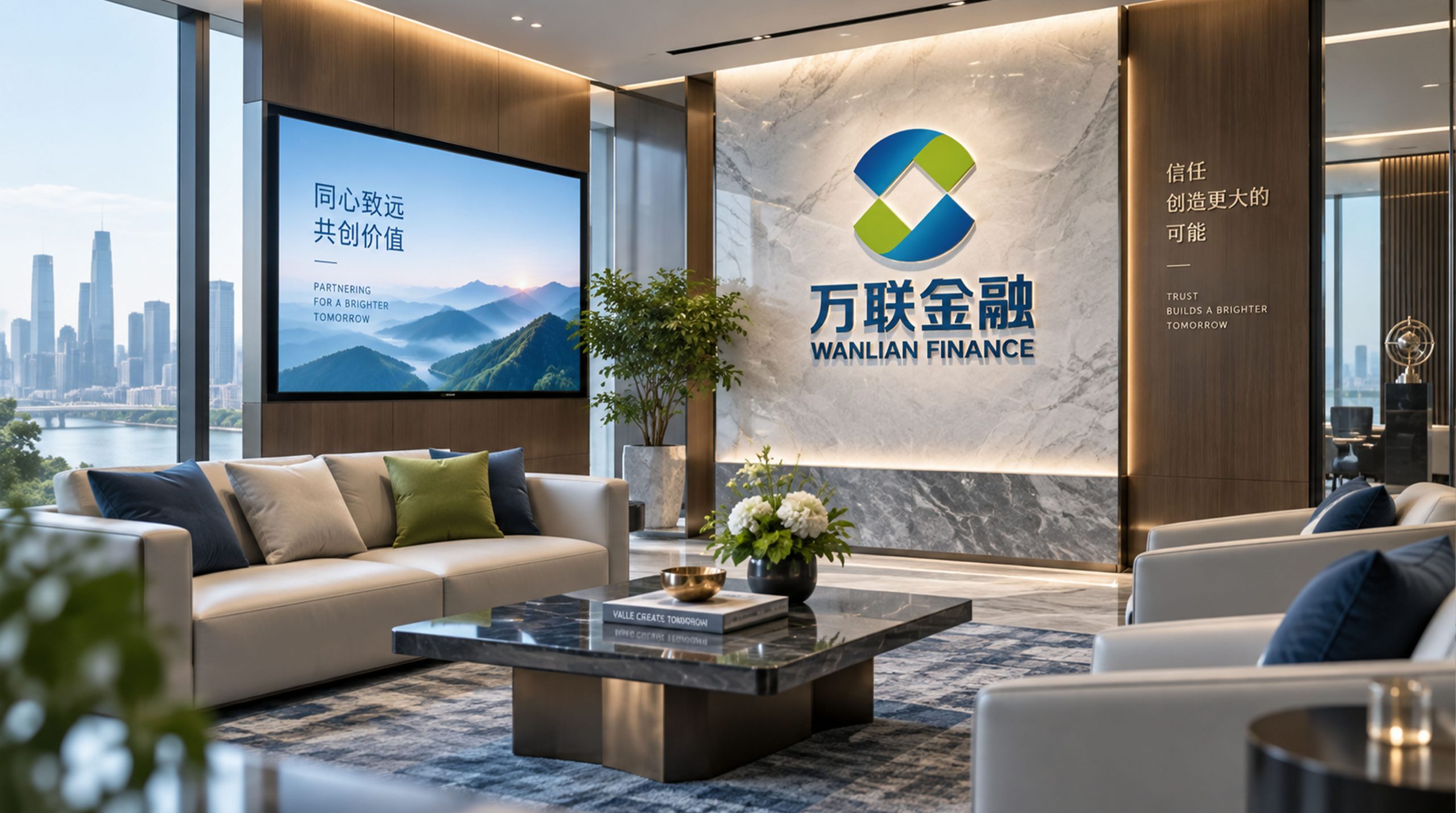
The logo can be widely used in corporate headquarters and branch logos; business cooperation plans, financing product brochures and risk control report covers; official websites, financial service platforms and mobile APP interfaces; supply chain finance summits, industrial Internet forums and industry cooperation event images. In the dynamic visual, three elliptical rings rotate in sequence, interlocking and interlocking in the central area, and the flow of funds circulates along the circular track, symbolizing the efficient turnover of industrial funds driven by Wanlian Financial through its technology platform.
brand meaning
The logo contains three core images: Universal Connection - the three interlocking rings convey the platform scale and network effect that connects thousands of enterprises in the industrial chain; Financial Empowerment - the solid structure of the chain links and the blue and gold tones convey the safe and reliable service quality of supply chain finance; Ecosystem Flow - the endless loop of the ring conveys the platform value of the continuous and efficient flow of funds, logistics and information in the industrial ecology. The overall design conveys the brand vision of "Interconnection of Ten Thousand Chains and Financial Empowerment".
Improper Usage (Protection Specification)
Do not change the interweaving angle or interlocking relationship of the three rings; do not reduce or increase the number of rings; do not change the hue of the main color of Wanlian Blue; do not add gradients, shadows or decorative effects that are inconsistent with the financial style; do not separate the three rings for separate use; keep the white space ≥ 25% of the graphic height; the minimum display width shall not be less than 25mm.
design results
After the release of the logo, Vanlian Financial's brand recognition in the fields of supply chain finance and industrial Internet finance has been significantly improved. With its visual language of conveying interconnection and financial empowerment, the "Ring of Ten Thousand Links" has become the core identification symbol of the brand system, demonstrating the brand vision of "Thousands of Links Connected and Financial Empowerment".