










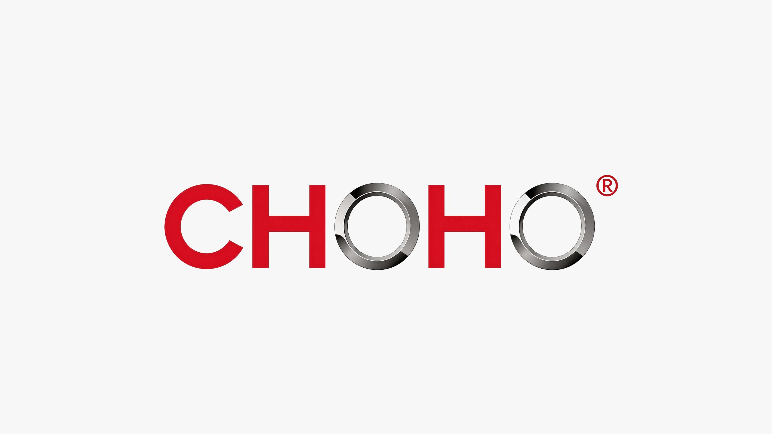
CHOHO is an industrial technology company with precision transmission parts manufacturing as its core. It focuses on chain transmission systems, precision parts and intelligent manufacturing solutions, serving the fields of automobiles, motorcycles, engineering machinery and industrial automation. It is committed to driving the efficient operation of global industrial equipment with its precision manufacturing capabilities.
The brand name "CHOHO" is derived from the transliteration of the Chinese word "changhe" - "chang" means eternity and continuity, symbolizing the durable quality of the product and the long-term development of the company; "river" means rushing and power, symbolizing the continuous output of power by the transmission system like a river. Qingmei Future was commissioned to lead the brand identity design.
The design goal of the brand logo is to convey the brand image of "precision drive, long-lasting reliability" through the visual language of precision industrial feeling, power transmission and global quality.
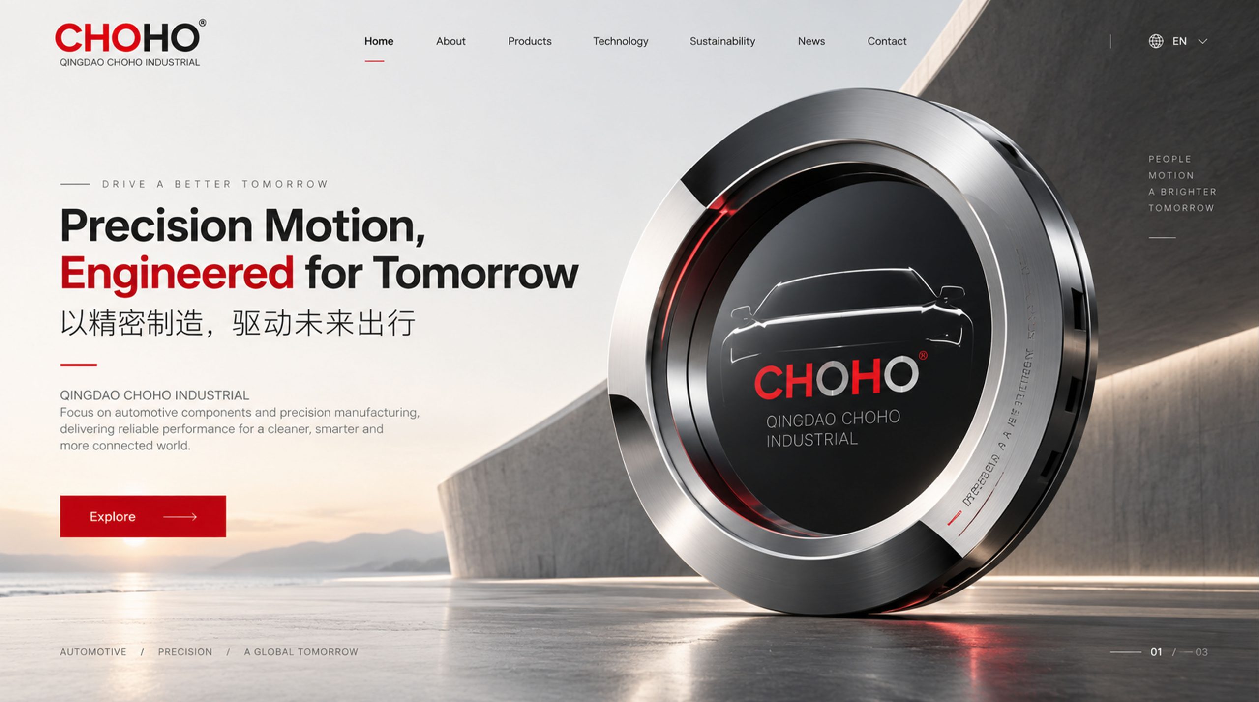
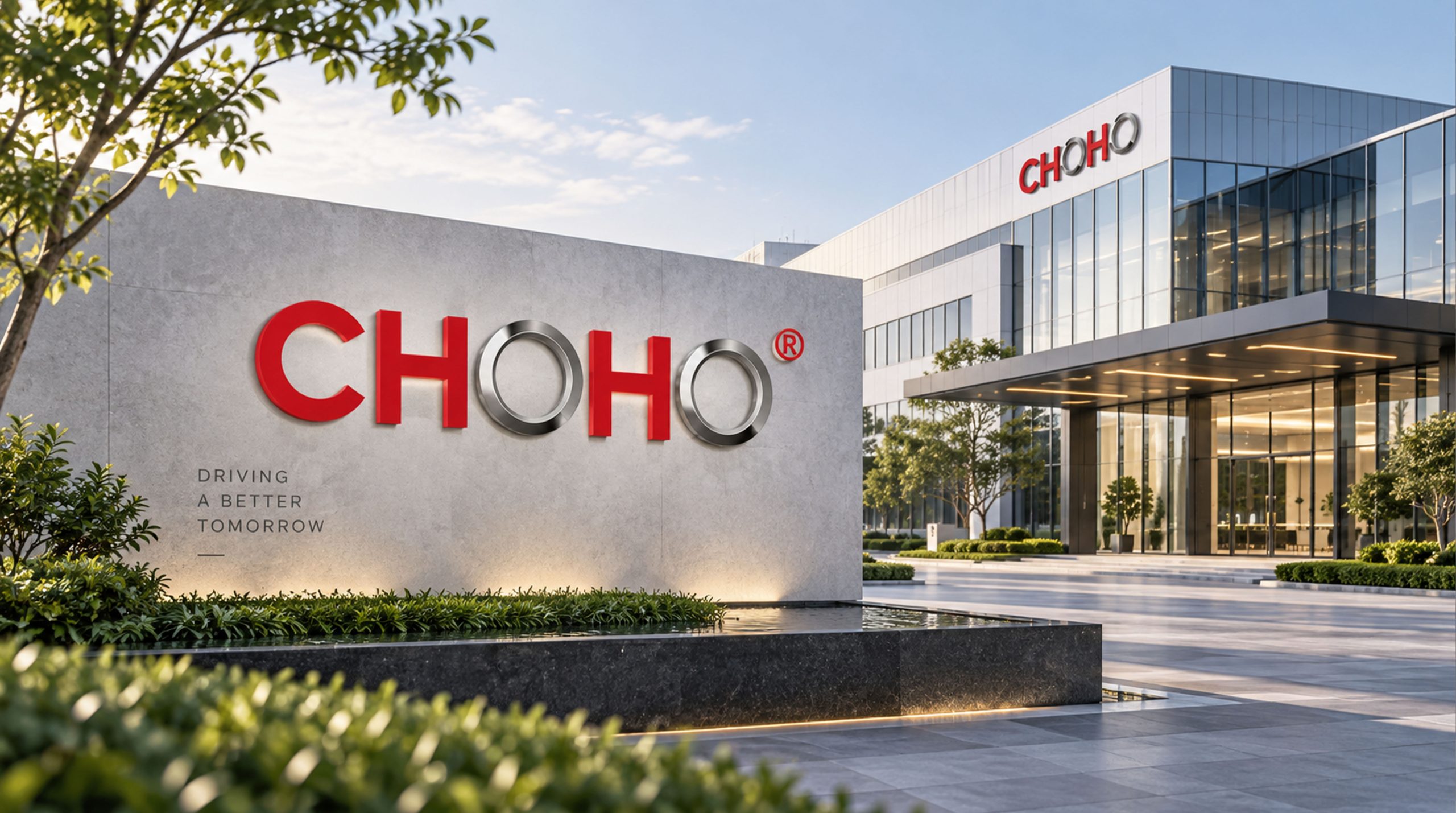
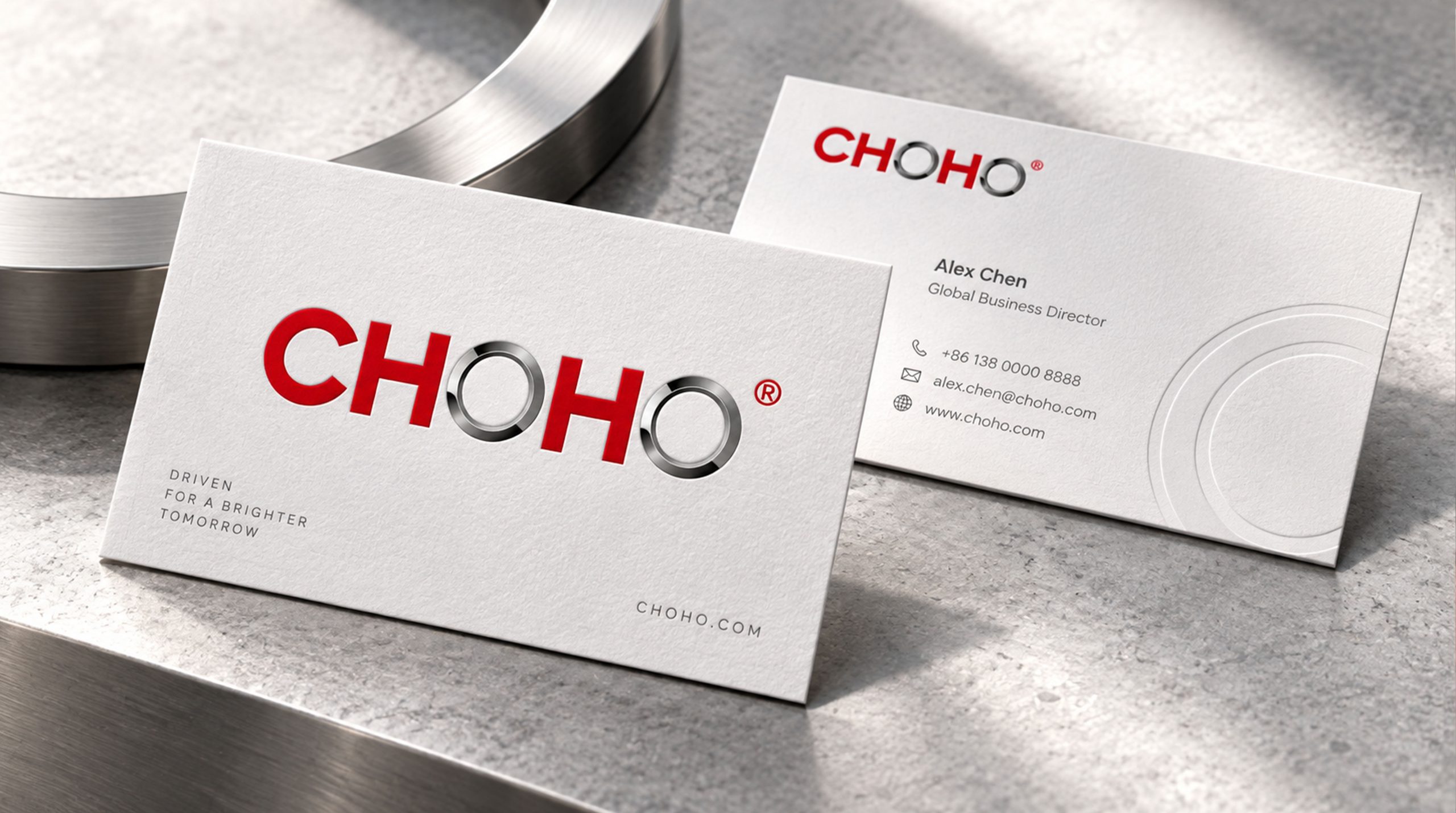
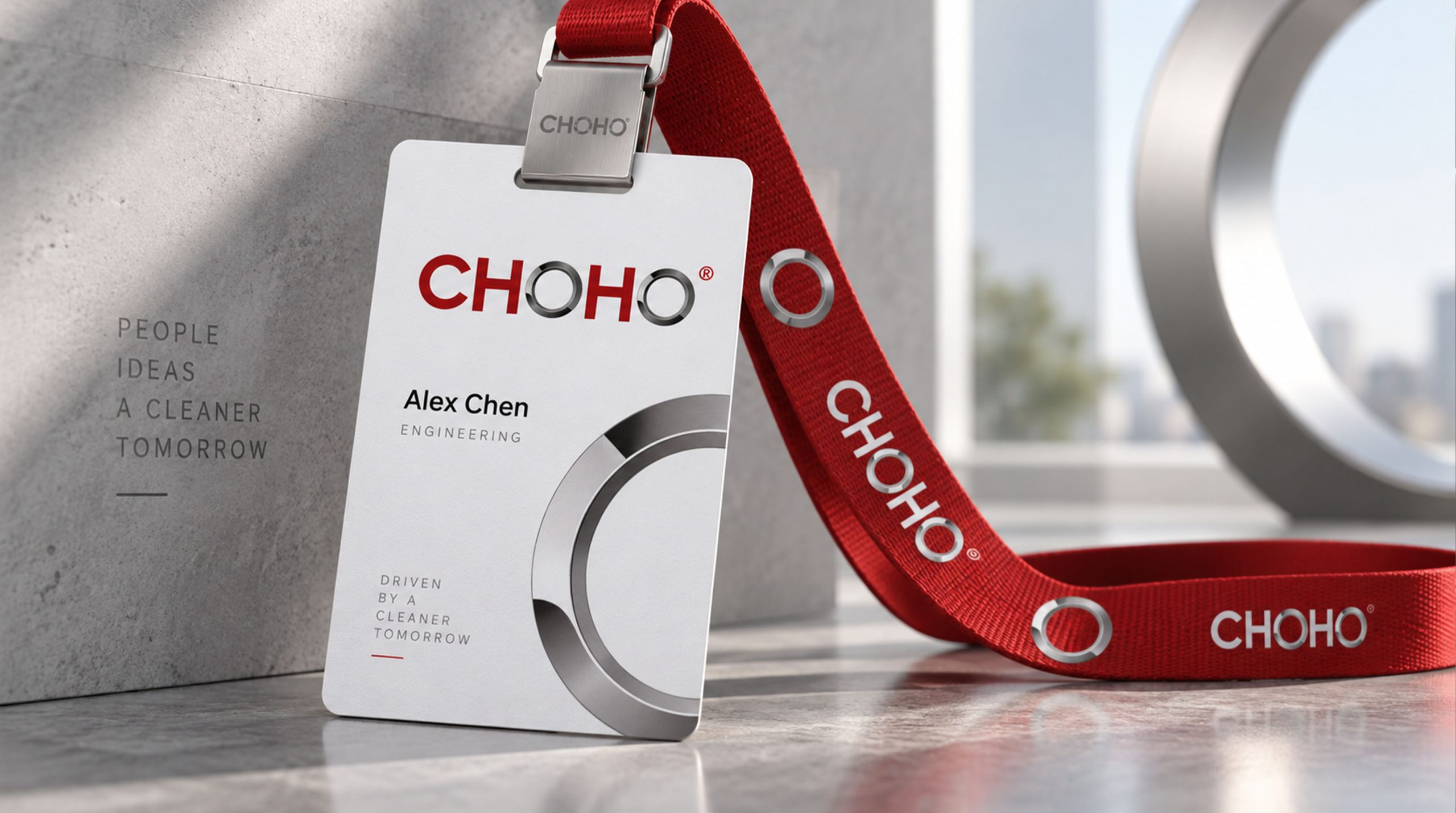
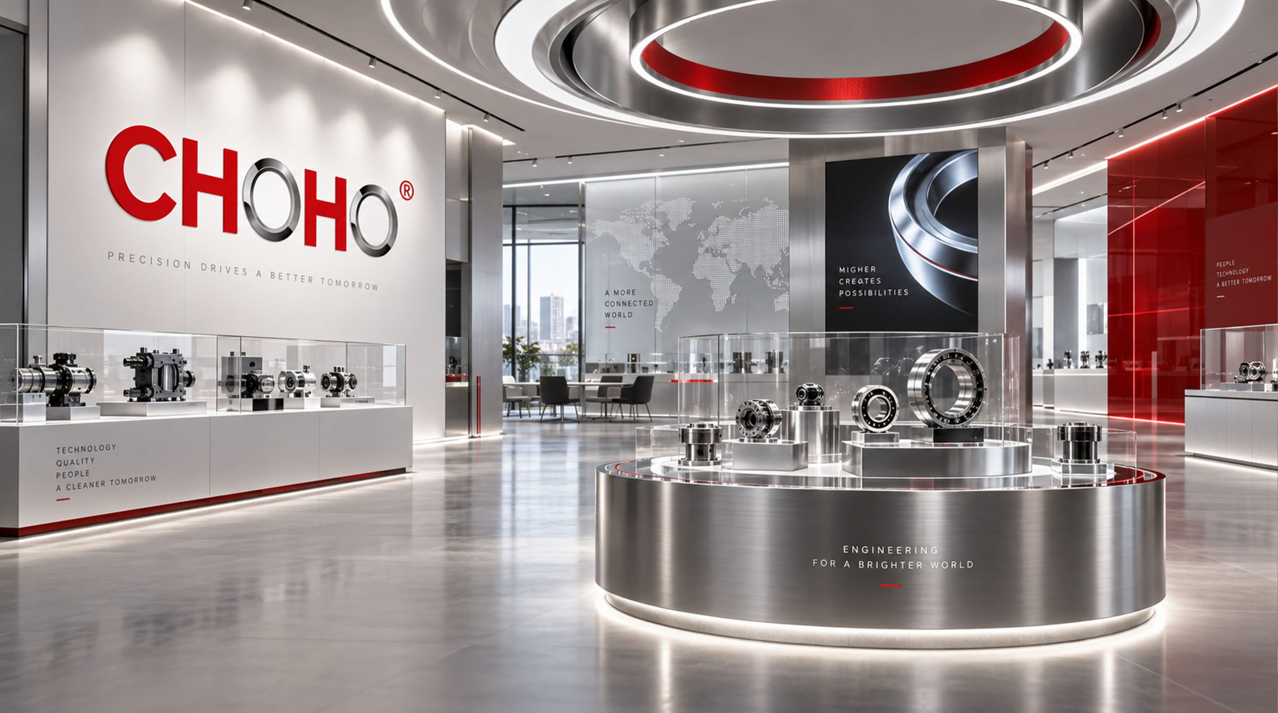
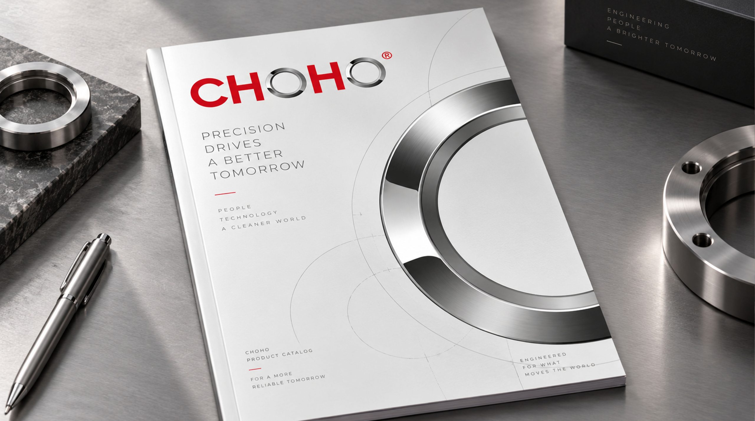
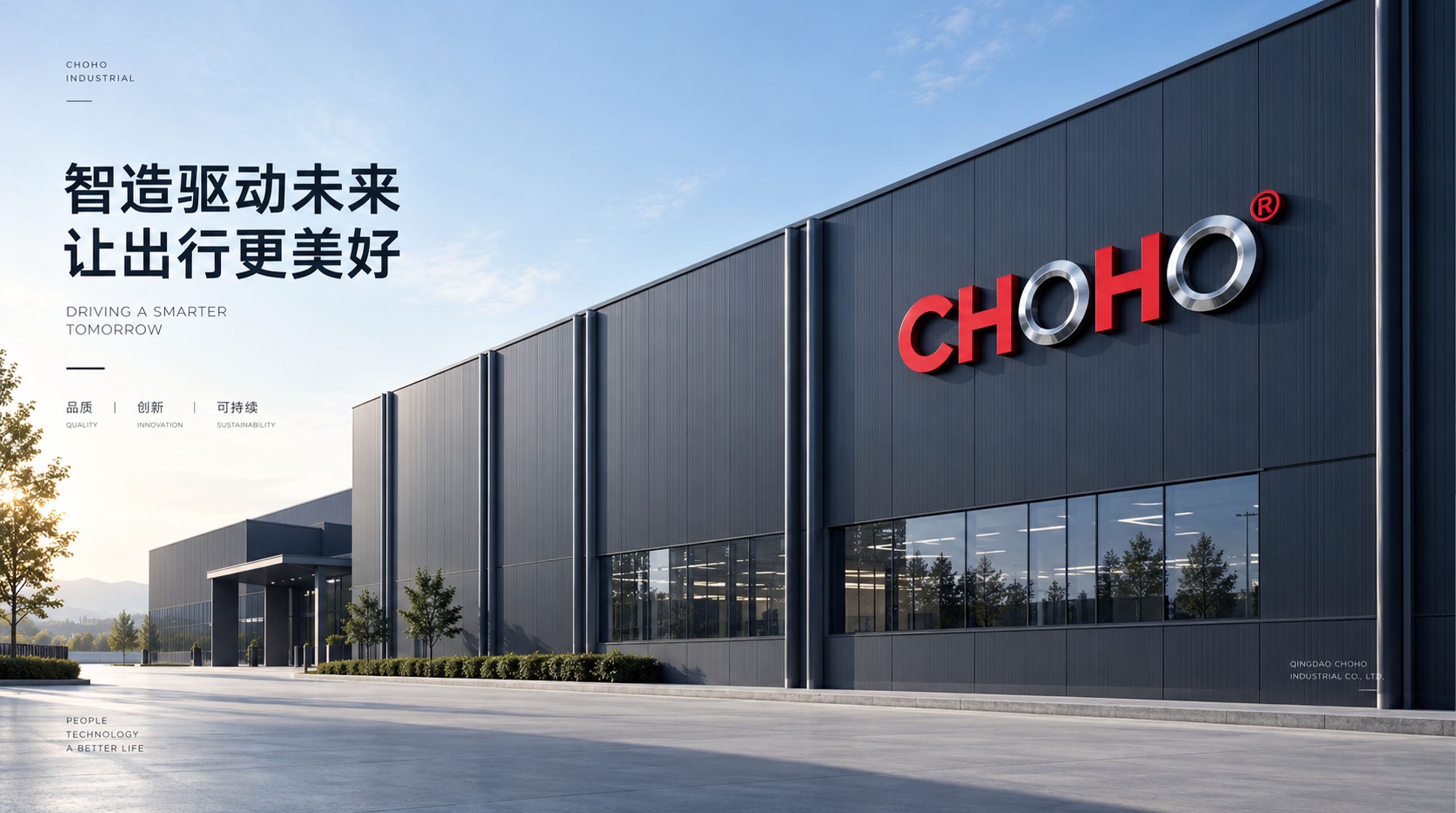
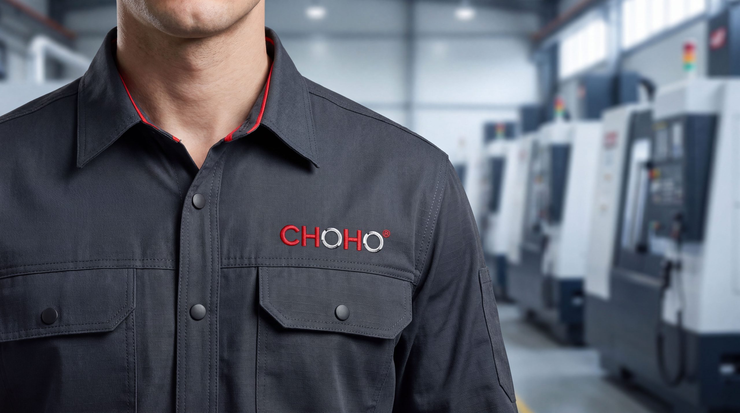
design concept
The logo takes "Power Chain" as the core concept, integrating the chain's precision bite structure with the image of continuous flowing power. The chain is the direct visual expression of CHOHO's core product - the precise cooperation of each link drives the efficient operation of the mechanical system. With the chain as the core of the logo, it immediately establishes the industry association of the brand with "precision transmission".
graphic language
The main body of the figure is a partial close-up of a set of precision chains composed of two or three interlocking links. The basic shape of the chain link is a rounded rectangle, and the two ends of each link are connected with circular hinge holes. The round holes are like pins in the chain - precise, strong, and capable of carrying torque. Adjacent chain links are closely interlocked in a cross-interpenetrating manner, and the front and rear blocking relationship presents a three-dimensional sense of space, conveying the precision manufacturing quality of industrial products.
The arrangement of the chain links is at a dynamic angle tilted to the upper right, just like the moment when a set of chains is running at high speed - not a static display, but a sense of power when power transmission is in progress. The engagement gaps between the chain links are extremely narrow and uniform, conveying the ultimate requirements for tolerance control in precision manufacturing - every micron of precision is related to the efficiency and lifespan of the transmission system.
The overall outline of the chain group is in the shape of a horizontally extending belt, with the left and right ends extending outward in an open manner without being closed, implying that the chain extends in infinite directions - CHOHO's transmission products drive the continuous operation of thousands of mechanical equipment around the world. The overall composition constructs a "power chain link" with the industrial aesthetics of "precision bite and endless power".
Font composition
The English "CHOHO" uses a customized industrial sans-serif font, with thick and powerful strokes, and micro-arc processing on the corners to maintain a sense of precision. The five letters are arranged in equal width like five precision parts installed in sequence, conveying the manufacturing company's consistency requirements for every detail. The two "O"s are presented in a perfect circle, just like the end faces of the pins in the chain, continuing the product semantics of the chain at the font level. The Chinese "Changhe" (if necessary) is presented with the aid of solid modern boldface.
color system
The main color CHOHO blue #003D73 represents industrial technology, precision, reliability and global quality. Dark blue is the most trustworthy brand color in the global industrial manufacturing field, conveying the industry image of precision manufacturing companies as "rigorous, durable and worthy of trust". Auxiliary steel silver #8C939A is used for product display and technical documentation in the brand system. It is like the metallic luster of precision steel parts after processing, conveying the material texture and manufacturing precision of industrial products. Auxiliary power orange #E8600A is used for the power elements in the brand system and the visuals of marketing activities. It is like the heat energy generated by high-speed mechanical friction, injecting the sense of industrial power energy into the calm blue gray. Pure white #FFFFFF as standard base color. The overall color uses blue and silver as the dual core and orange as the finishing touch, reflecting the brand temperament of "precision industry, reliable power".
Application extension
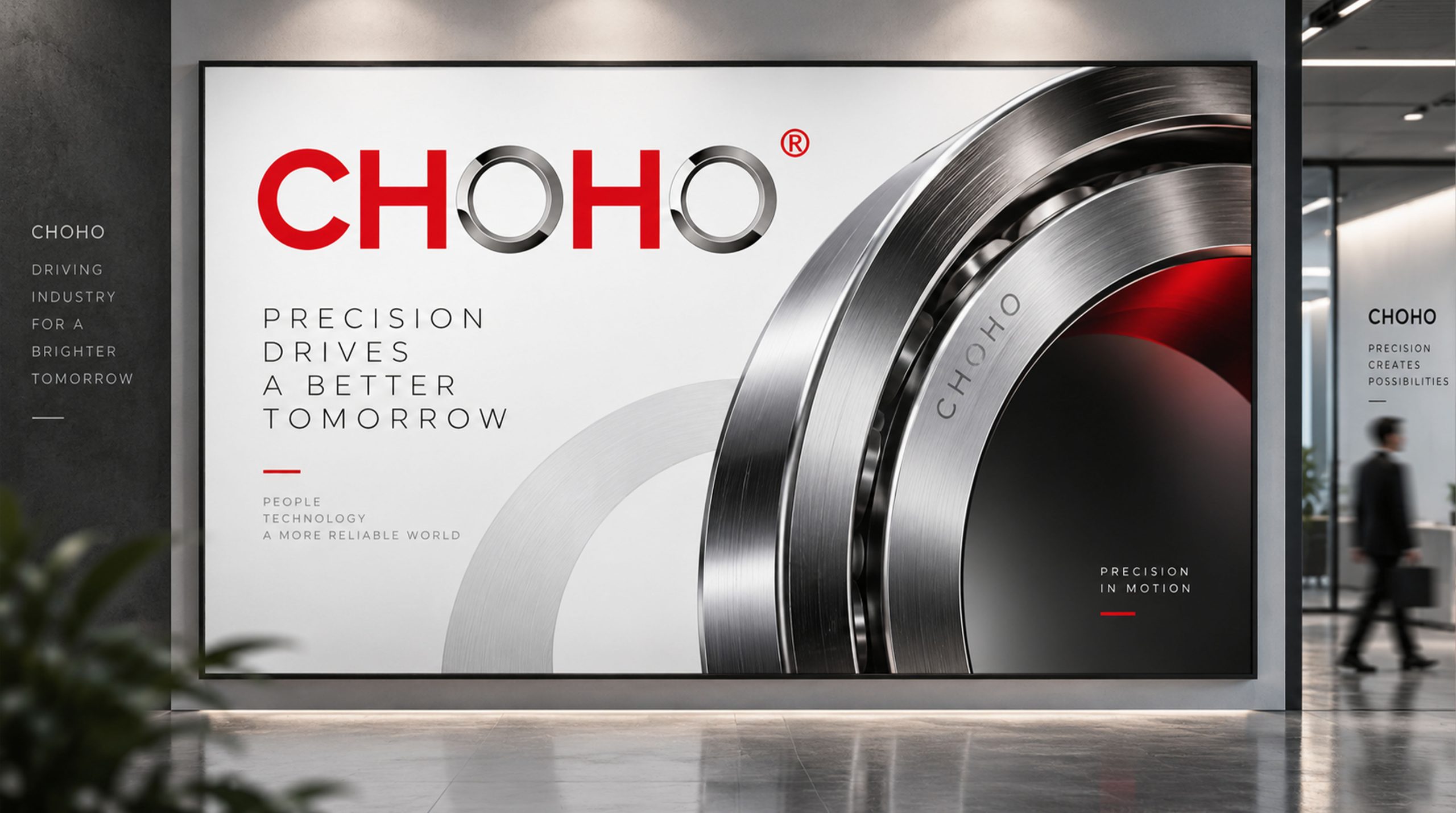
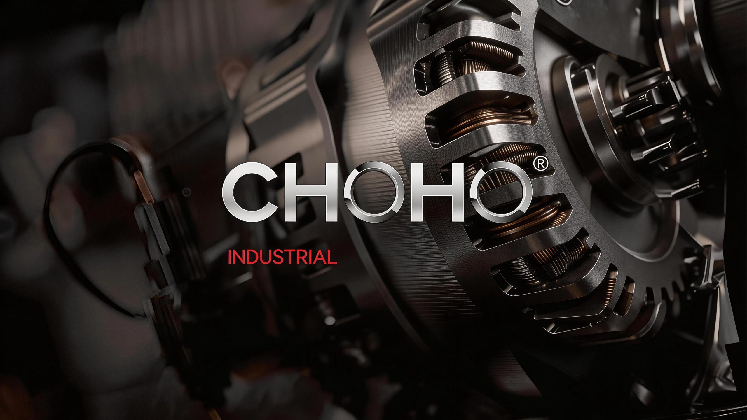
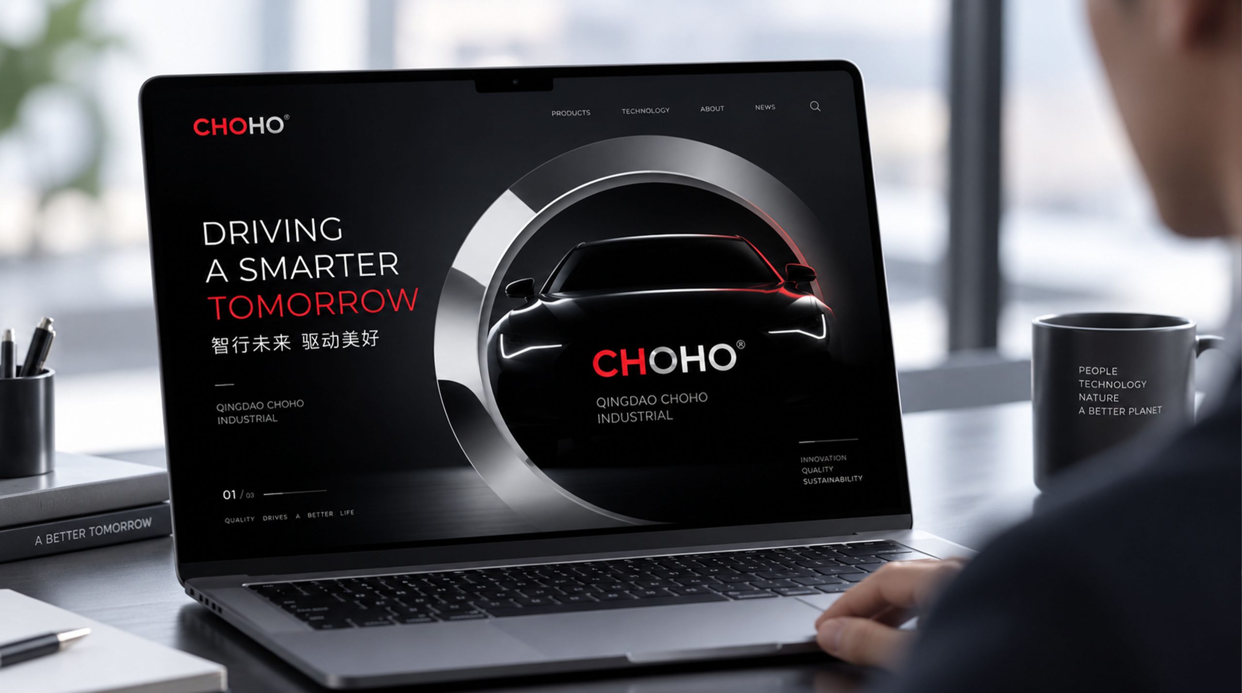
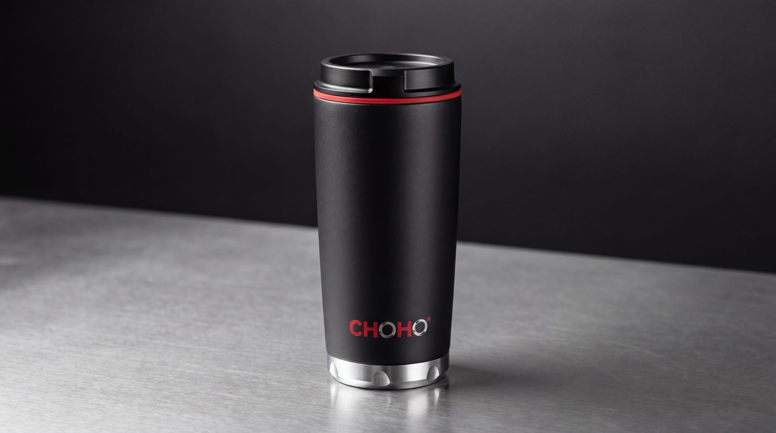
Logo can be widely used in corporate headquarters and production base logos, factory guidance systems and workshop nameplates; product packaging, parts labels and technical instructions; official website, B2B digital platform and industry e-commerce store image; international industrial expo, auto parts exhibition and smart manufacturing forum image; corporate brochure, customer cooperation plan and global dealer materials. On the product packaging, the CHOHO blue logo is presented on the surface of the metallic packaging box using an embossing process. The chain link graphics and the precision products in the box form an intuitive connection that "the logo is the product". In the dynamic vision, the chain links are rotated into position in sequence, engaged and locked with precision, and the chain is driven forward at high speed, symbolizing CHOHO's precision manufacturing that drives the efficient operation of global industries.
brand meaning
The logo contains three core images: Precision Engineering - the precise engagement of the chain links transmits the ultimate pursuit of manufacturing tolerances and the reliable guarantee of product quality; Power Transmission - the running posture of the chain transmits the core product function of the transmission system to continuously output power; Enduring Reliability - the chain's solid structure and dark blue tone convey the durable quality commitment of industrial products. The overall design conveys the brand vision of "precision drive, long-term reliability".
Improper Usage (Protection Specification)
Do not change the engagement method of the chain links or the circular structure of the hinge holes; do not change the inclination angle or dynamic trend of the chain group; do not change the hue of the main color of CHOHO blue; do not add gradients, strokes or soft decorations that are inconsistent with the industrial style; do not split the chain links and use them alone; keep the white space ≥ 25% of the graphic height; the minimum display width shall not be less than 25mm.
design results
After the release of the logo, CHOHO's brand recognition and global market influence in the fields of precision transmission components and industrial manufacturing have significantly increased. "Power Link", with its visual language that conveys precision industrial aesthetics and reliable power, has become the core identification symbol of the brand system, showing the brand vision of "precision drive, long-lasting reliability".