










Kefeng Group is a comprehensive enterprise group with industrial investment and diversified industrial operations as its core. Its business covers manufacturing, technological innovation, trade services and capital operations. It is committed to continuously climbing the industry peak with the entrepreneurial spirit of overcoming difficulties.
The brand name "Ke Feng" is full of enterprising power - "Ke" means to conquer and overcome difficulties, symbolizing the enterprise's fighting spirit to face challenges and overcome difficulties; "Feng" means peak and peak, symbolizing the continuous pursuit of industry leadership and excellent quality. Only by overcoming difficulties can one reach the peak. To reach the peak, one must first overcome difficulties. Qingmei Future was commissioned to lead the brand identity design.
The design goal of the brand logo is to convey the brand image of "overcoming difficulties and climbing mountains and aiming for the top" through the visual language of climbing strength, peak pursuit and stable pattern.
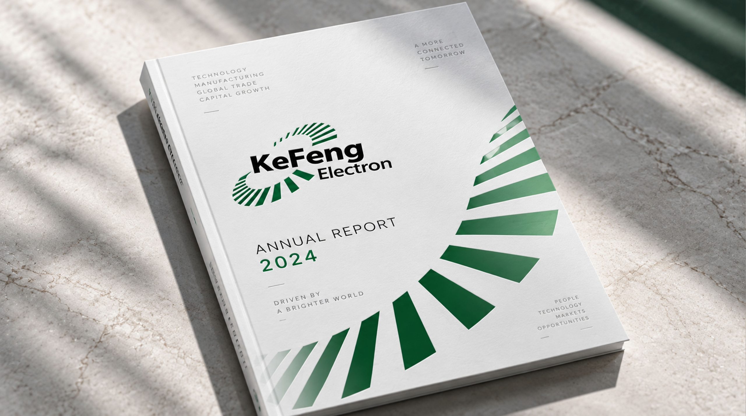
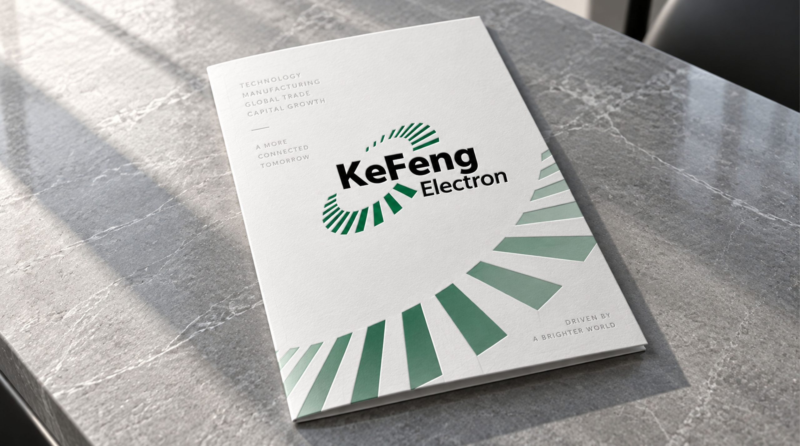
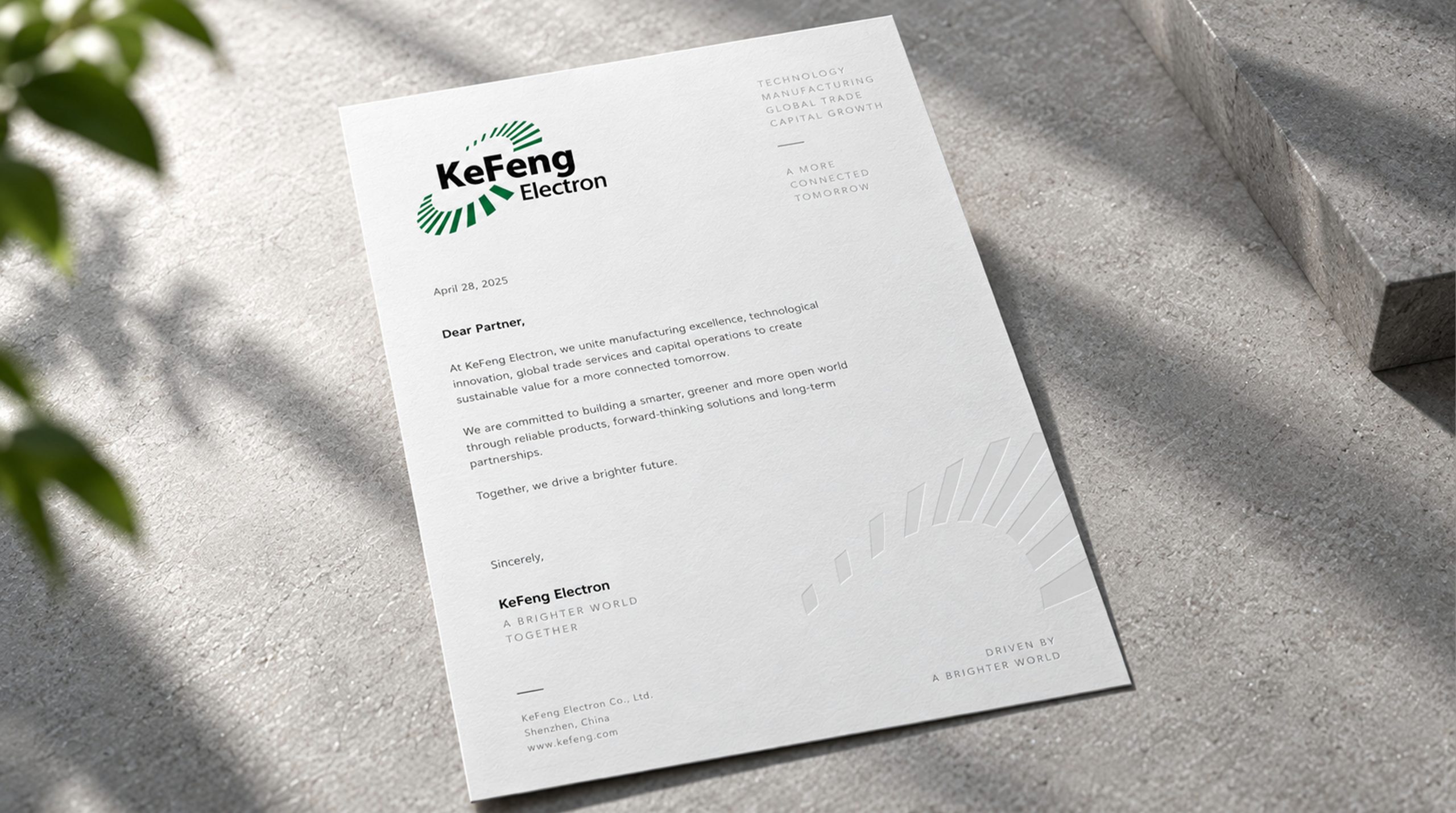
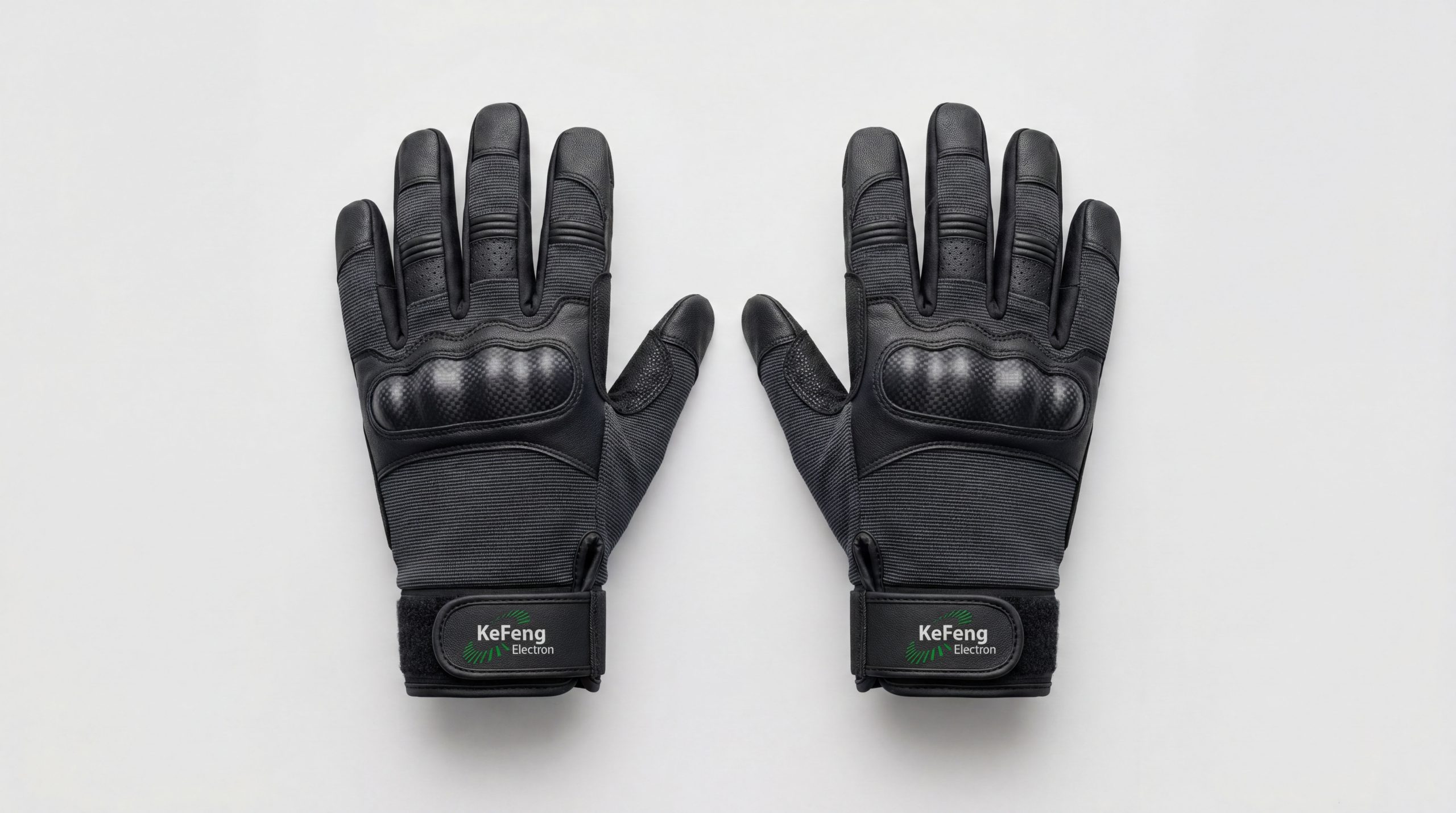
design concept
The logo takes "Path to the Summit" as its core concept, integrating the majestic outline of the mountain with the upward momentum of climbing. The mountain peak is the most intuitive visual expression of the word "peak", and the upward climbing posture is the embodiment of the spirit of the word "gram" - every step of climbing is an attack, and every attack is one step closer to the peak.
graphic language
The main body of the graphic takes a geometrically refined mountain peak as the visual core. The peak is presented as a sharp triangle, with the peak pointing straight to the sky, and the two hypotenuses extending from the top to both sides in powerful straight lines, like the strong silhouette of a snow-capped mountain. The sharp angle of the peak conveys the brand's strategic edge of "forge ahead and aim directly at the goal".
The main side of the mountain is divided into two sides, light and dark, by a diagonally upward cutting line - the light-receiving side is presented in brighter tones, and the backlit side is presented in darker tones, just like the natural light and shadow when one side is bright and the other side is deep when the morning light shines on the mountain. The contrast between light and dark gives the flat graphics a three-dimensional sense of volume and sculptural power, and at the same time conveys the brand's magnanimity of "seeing both light and not being afraid of shadows" on the road to development.
The base of the mountain peak is supported by a thick bottom edge. The triangular structure with a wide bottom and a tapered top is the most stable mechanical form in nature, conveying the group's business chassis of "solid foundation and steady center of gravity". An upward-climbing diagonal or stepped fold line can extend from the left or right side of the mountain's outline, just like a mountaineering road leading to the peak - although the road is steep, it goes up step by step, conveying the brand spirit of "overcoming difficult peaks". The overall composition constructs the "Road to the Peak" with an upward structure of "the peak stands on the ground and the road leads to the top".
Font composition
The Chinese "Kefeng Group" uses strong modern boldface, with strong and powerful strokes and a square and compact structure. The word "ke" is as decisive as a knife and an axe, the word "feng" stands majestically at the bottom of the word "shan", and the word "group" ends calmly. The English "KEFENG GROUP" is arranged in standard uppercase sans-serif font, with a stable and powerful font to ensure professional recognition of the brand in business cooperation and international markets.
color system
The main color, Kefeng Blue #1A3A5C, represents calmness, perseverance, professionalism and reliability. Dark blue is like the deep outline of a mountain before dawn - calm, determined and ready to go, conveying the group's calmness and determination when facing challenges. The auxiliary peak gold #C49A2A is used as the peak element and honor logo in the brand system. It is like the golden light illuminating the peak in the morning sun, conveying the glory of successful summit and the pursuit of outstanding value. The combination of blue and gold conveys "calm climbing + peak glory". Auxiliary Rock Gray #6B7280 is used for auxiliary information and system base elements. Pure white #FFFFFF as standard base color. The overall color uses blue and gold as the dual core, reflecting the brand temperament of "persistent climbing, reaching the top".
Application extension
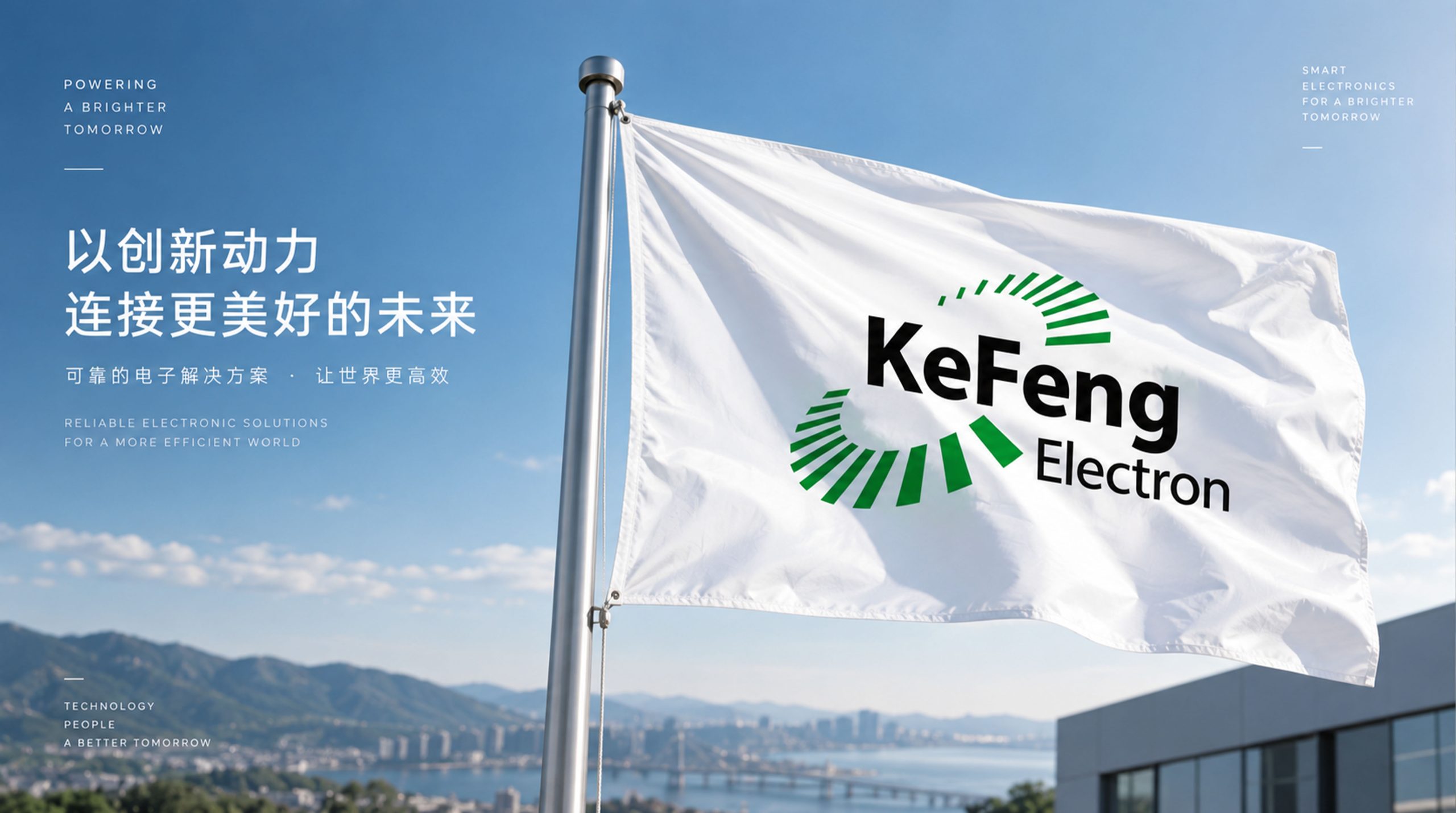
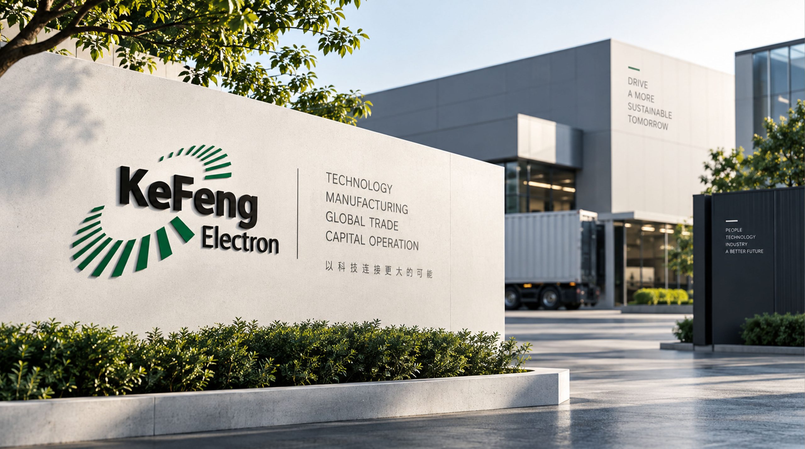
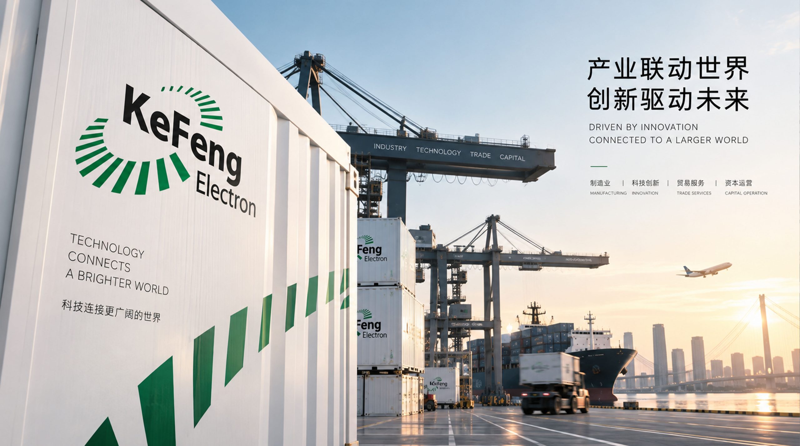
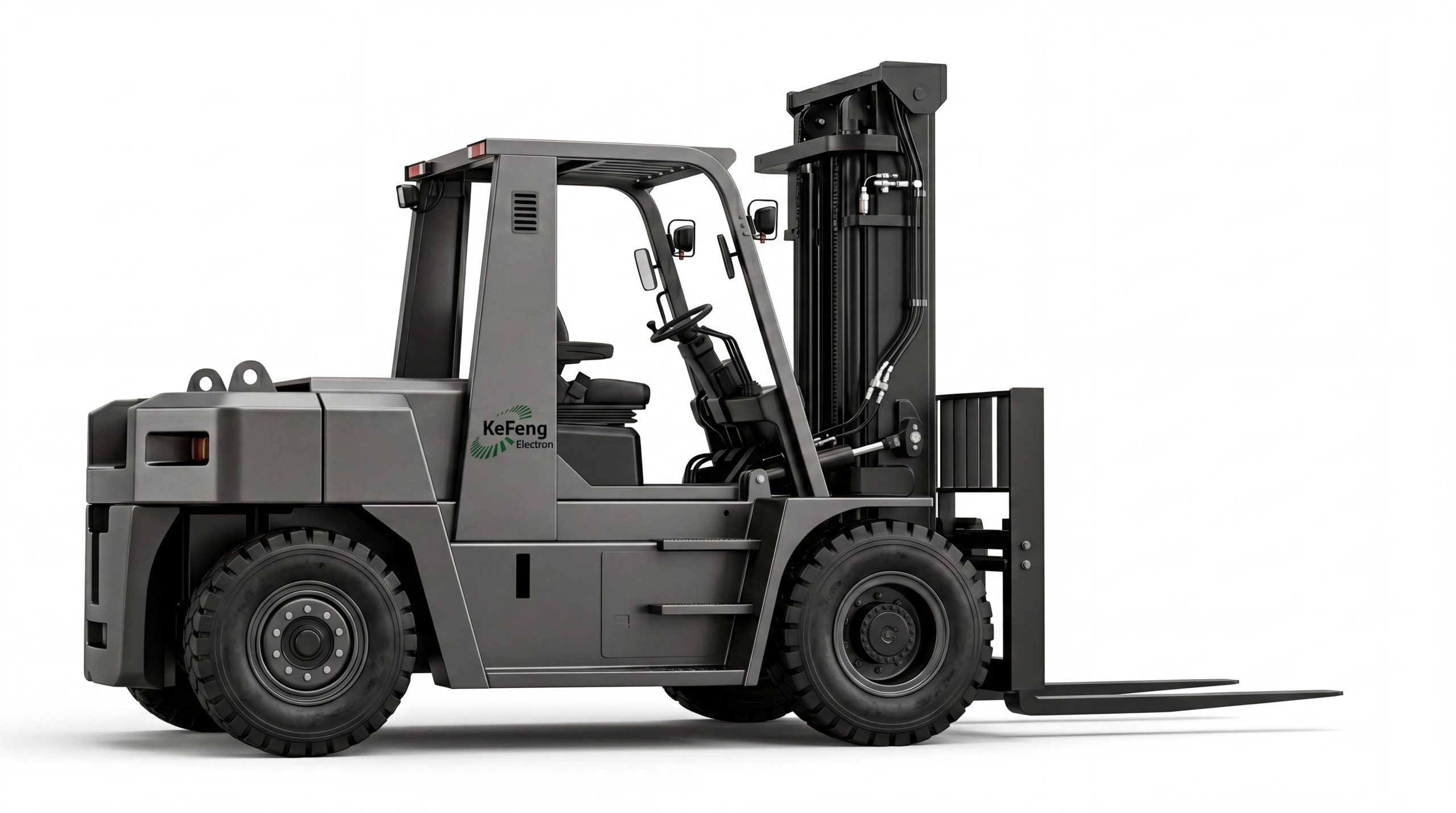
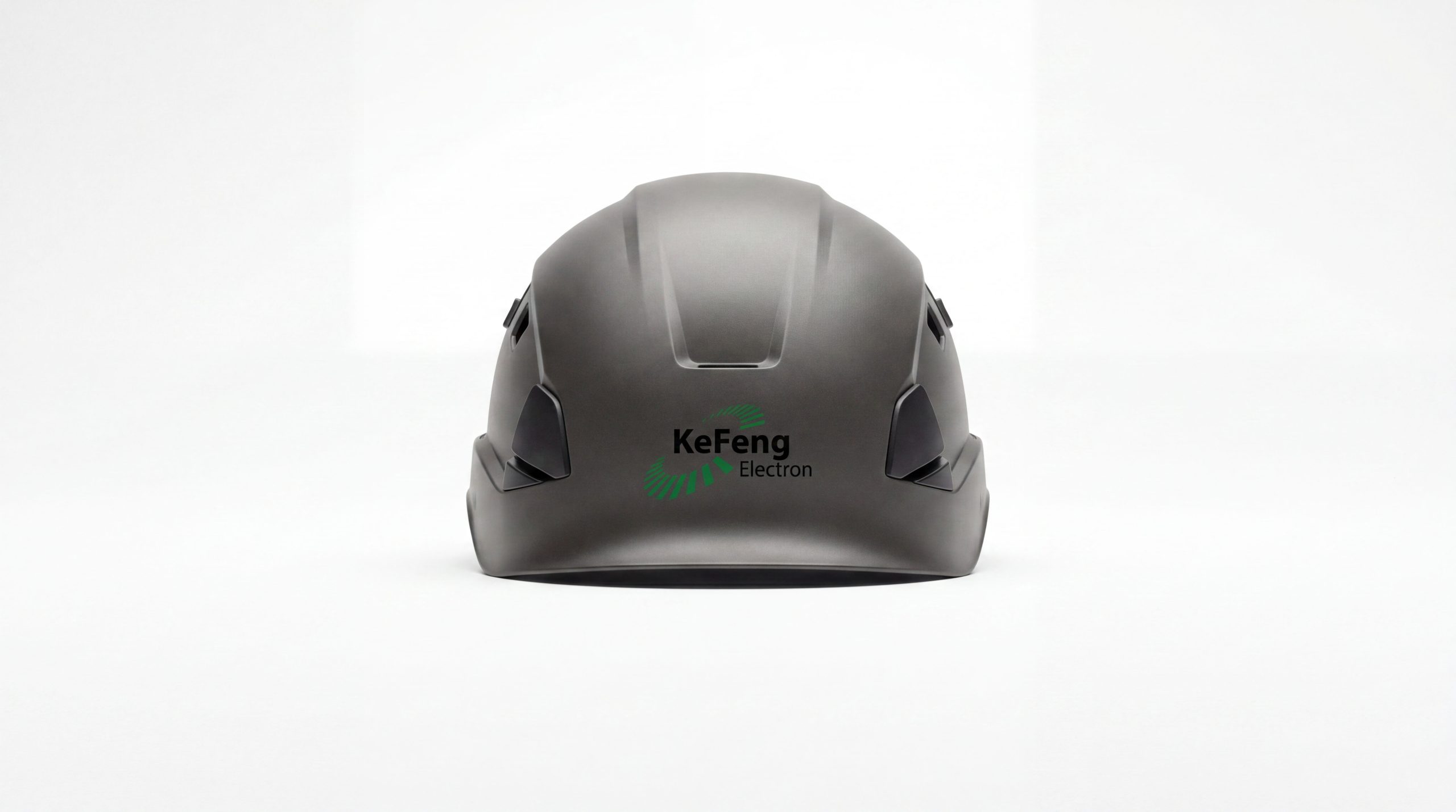
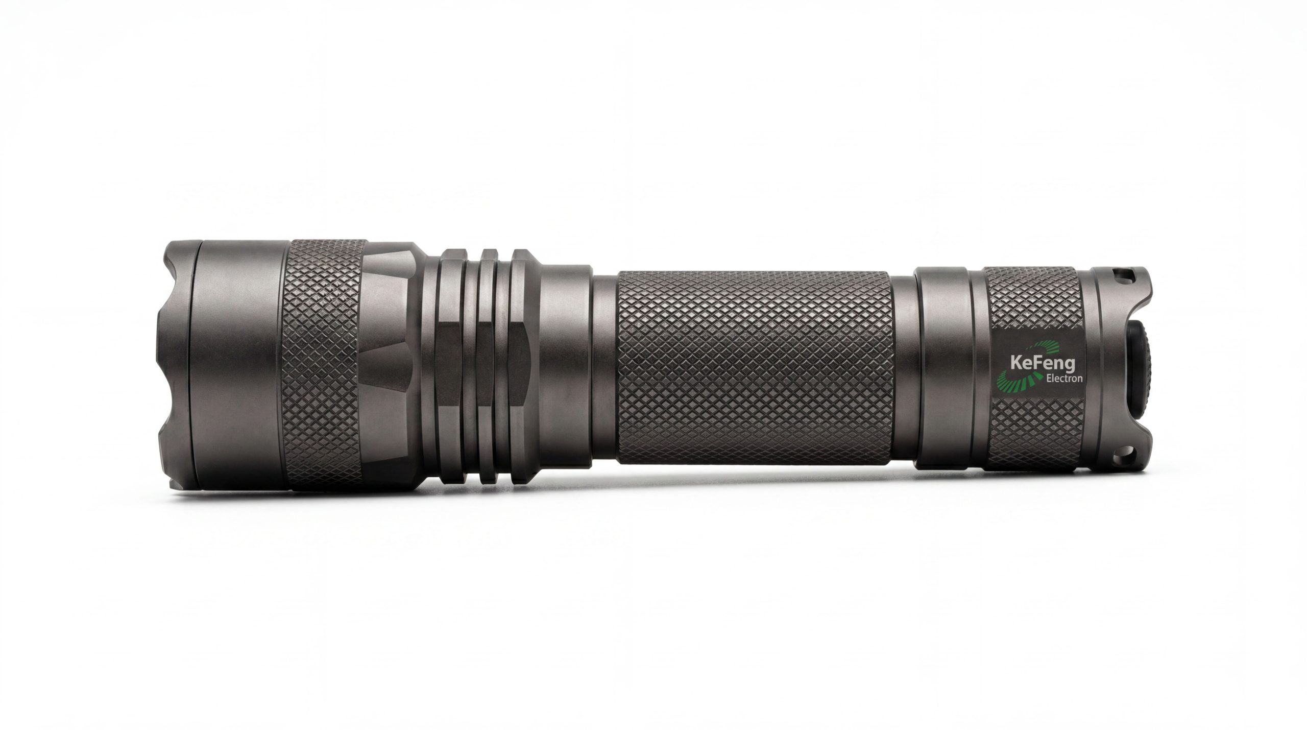
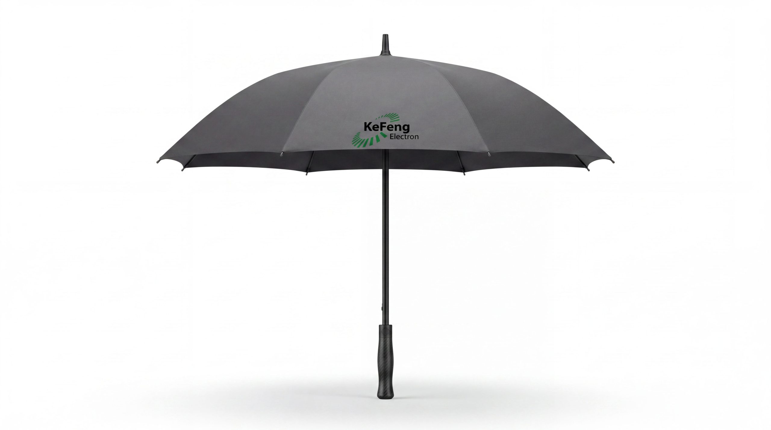
The logo can be widely used in group headquarters and various industrial sector logos; corporate brochures, investment plans and business cooperation documents; official websites, digital platforms and social media images; industry summits, industry forums and brand event images. In the lobby of the group headquarters, the mountain logo is presented on the image wall with metal relief technology. The dark blue mountain and the golden light of the peak convey the perseverance and glory of the climbers against the light. In the dynamic visual, the mountain peak rises from the bottom of the picture, and the light and dark light and shadow appear sequentially along the cutting line. The climbing road gradually lights up from the foot of the mountain to the top, symbolizing that Kefeng Group is moving toward the peak step by step.
brand meaning
The logo contains three core images: Overcome Challenges - the sharp peaks and climbing roads convey the brand's fighting spirit to face challenges and overcome difficulties; Summit Ambition - the towering height of the mountain conveys the unremitting pursuit of industry leadership and excellent quality; Solid Foundation - the generous mountain base conveys the group's development chassis with a solid foundation and steady operations. The overall design conveys the brand vision of "overcoming difficulties and reaching the peak".
Improper Usage (Protection Specification)
Do not change the triangular proportion or peak angle of the mountain; do not delete light and dark cutting lines or change the direction of light and shadow; do not change the hue of the main color of Kefeng Blue; do not add gradients, strokes or soft decorations that are inconsistent with the group's style; do not split the mountain and the climbing road for separate use; keep white space ≥ 25% of the graphic height; the minimum display width must not be less than 25mm.
design results
After the release of the logo, Kefeng Group's brand recognition and market influence in the field of diversified industrial operations have been significantly improved. "Road to the Peak" has become the core identification symbol of the brand system with its visual language that conveys the strength and pursuit of the peak, showing the brand vision of "overcoming difficulties and climbing the peak, aiming for the peak".