










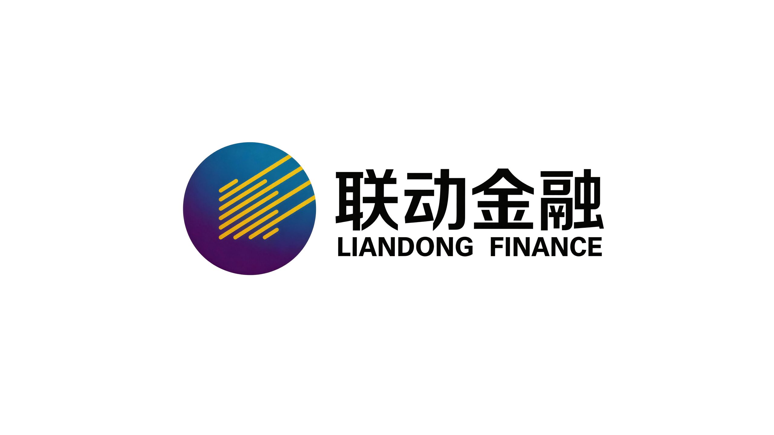
Linkage Finance is an innovative financial enterprise with financial technology and comprehensive financial services as its core. It is committed to linking multiple financial resources such as banks, insurance, and securities through technological means to provide efficient, intelligent, and one-stop financial solutions for corporate and individual users.
The brand name "Lianfeng" accurately conveys the core value of the brand - "Lian" means union and connection, symbolizing the integration and gathering of multiple financial resources; "Dong" means drive and linkage, symbolizing the efficient flow and collaborative operation of funds and information. Linkage is connection, movement is efficiency, and linkage is to allow financial resources to operate efficiently in connection. Qingmei Future was commissioned to lead the brand identity design.
The design goal of the brand logo is to convey the brand image of "diversified linkage and smart finance" through the visual language of technological connection, collaborative drive and professional trust.
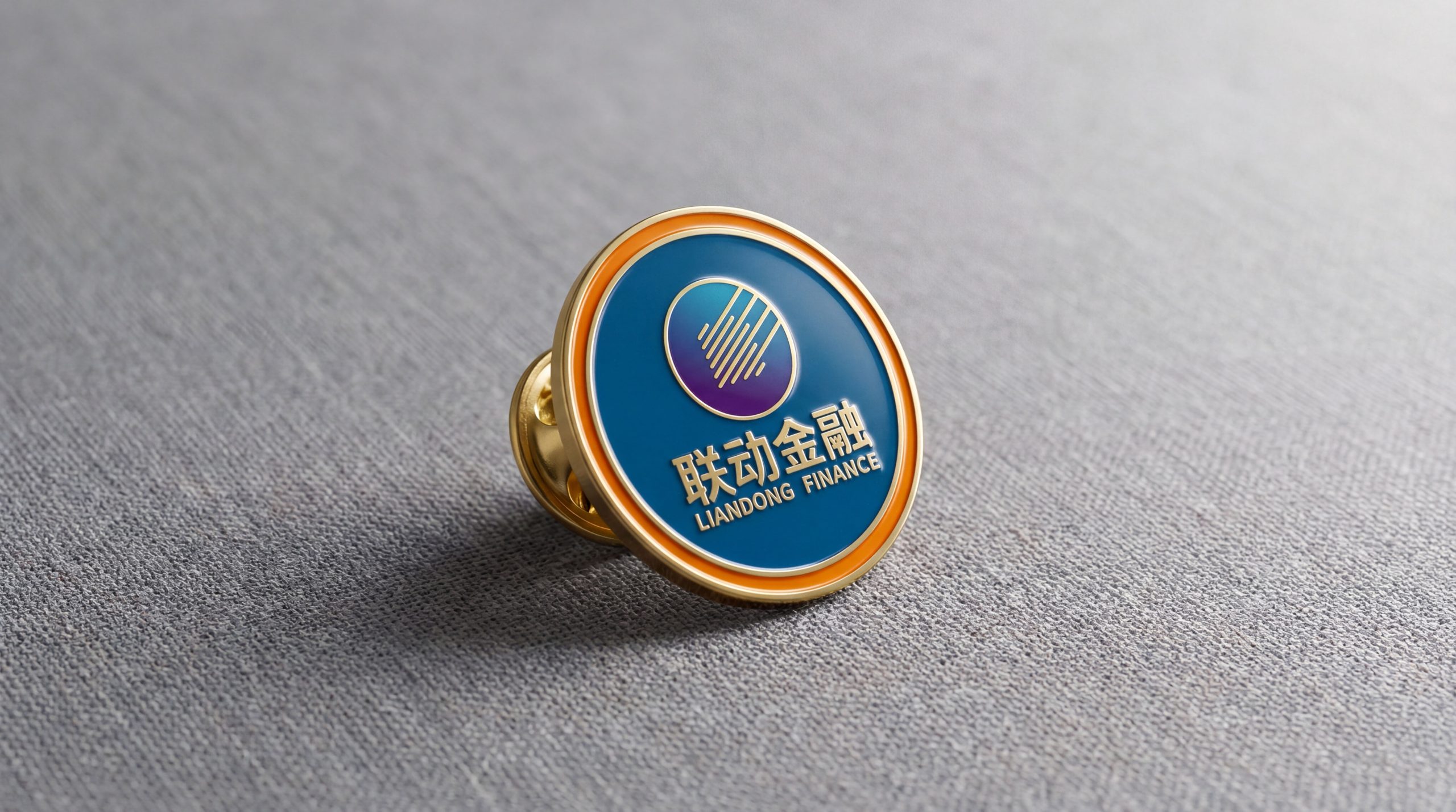
design concept
The logo takes "Gears in Motion" as the core concept, condensing two mutually interlocking and rotating gears into a brand symbol. Gears are the most intuitive mechanical metaphor for "linkage" - the rotation of one gear drives the other gear to rotate synchronously, power is transmitted through bite, and efficiency is multiplied through synergy. The two gears are the financial resources of the two parties, and the engagement is the linkage.
graphic language
The main body of the figure is composed of two gears of different sizes meshing with each other. The large gear represents the core resources of the financial system—banks, insurance, securities and other institutional forces; the small gear represents the diverse needs of clients—actual scenarios such as financing, wealth management, and risk control. The large and small gears are connected with precise teeth, conveying precise docking and efficient collaboration between supply and demand parties.
The teeth of the gear are presented as evenly spaced square protrusions. Each tooth is like a standardized financial product module - standardized, precise and reliable. The gaps between the teeth are uniform, conveying the strict requirements of financial technology platforms for process standardization and risk control consistency. The bite of the two gears is closely connected in a perfectly interlaced manner with no gaps or deviations, conveying the service commitment of Linkage Finance of "seamless connection and zero-friction collaboration".
The center of the large gear is marked with a dot, which is like an axis - the entire linkage system rotates stably around this core. The small gear is slightly tilted to the upper right, forming a dynamic diagonal arrangement with the large gear, conveying the vitality and forward momentum of the system in operation. The overall composition conveys the brand's platform value with a linkage structure of "two-wheel engagement and collaborative drive".
Font composition
The Chinese "Linked Finance" uses a modern sans-serif font with even and neat strokes and a compact and powerful structure. "Linkage" conveys the synergy ability of the brand, and "finance" clarifies the industry attributes. The English "LIANDONG FINANCE" is arranged in standard uppercase sans serif font, with regular and professional fonts.
color system
The main color linkage blue #0A5EB0 represents financial technology, trust and professionalism. Blue delivers the industry consensus of "security, compliance, and intelligence" in the field of financial technology. Auxiliary drive orange #E8750A is used for dynamic elements and user interaction nodes in the brand system. It is like the energy light generated by friction when gears are running, injecting "dynamic" vitality into the rational blue. The combination of blue and orange conveys "robust connection + efficient drive". Assistive Technology Gray #6B7B8D is used for assistive information and data visualization. Pure white #FFFFFF as standard base color. The overall color uses blue and orange as the dual core, reflecting the brand temperament of "technology-driven and financial linkage".
Application extension
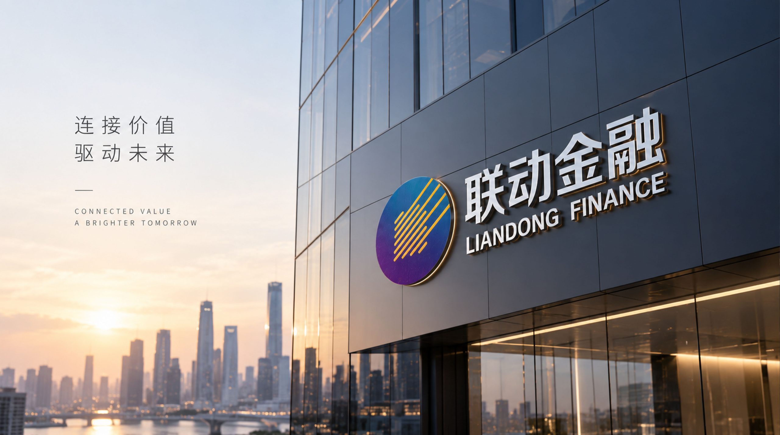
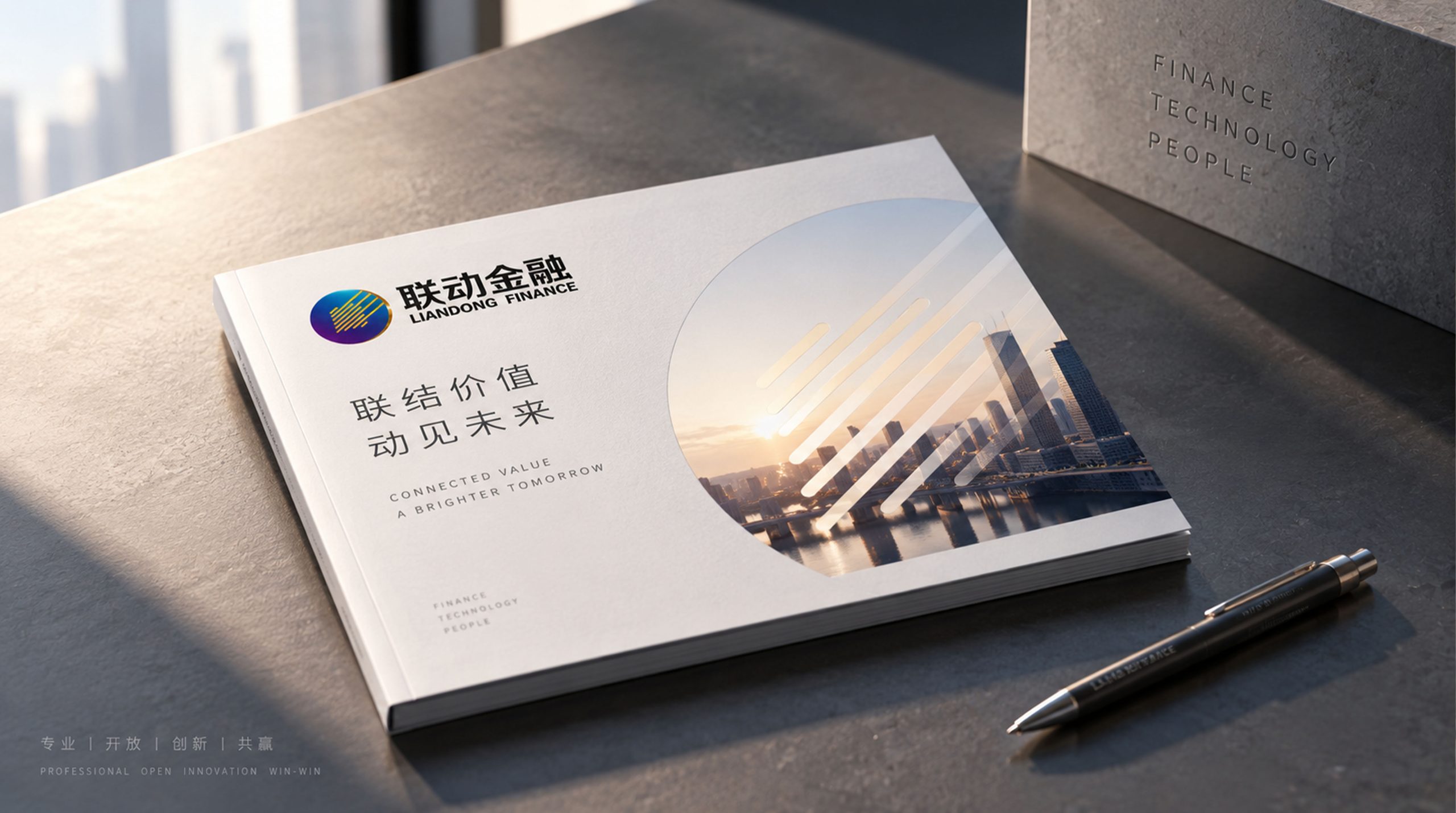
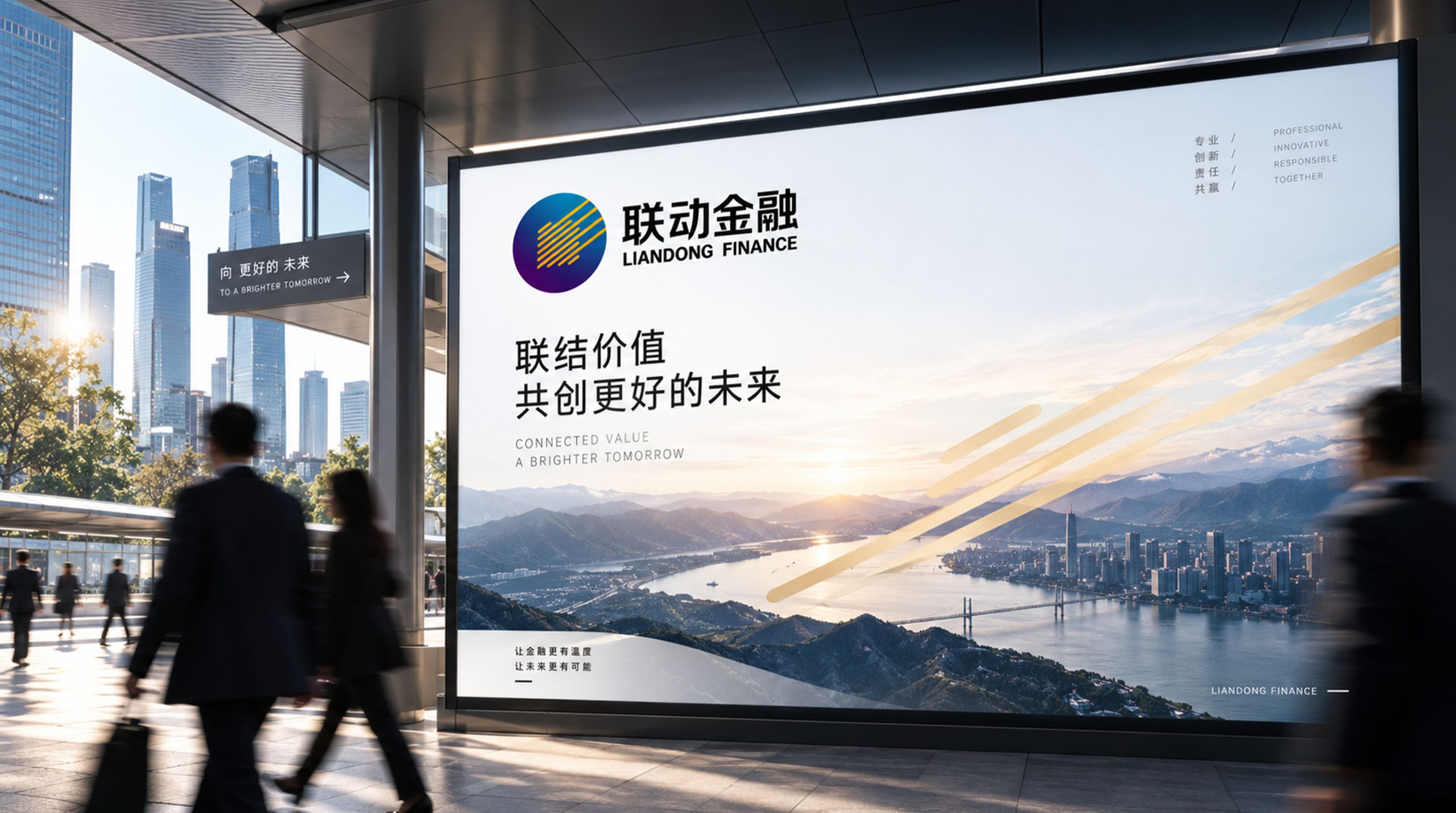
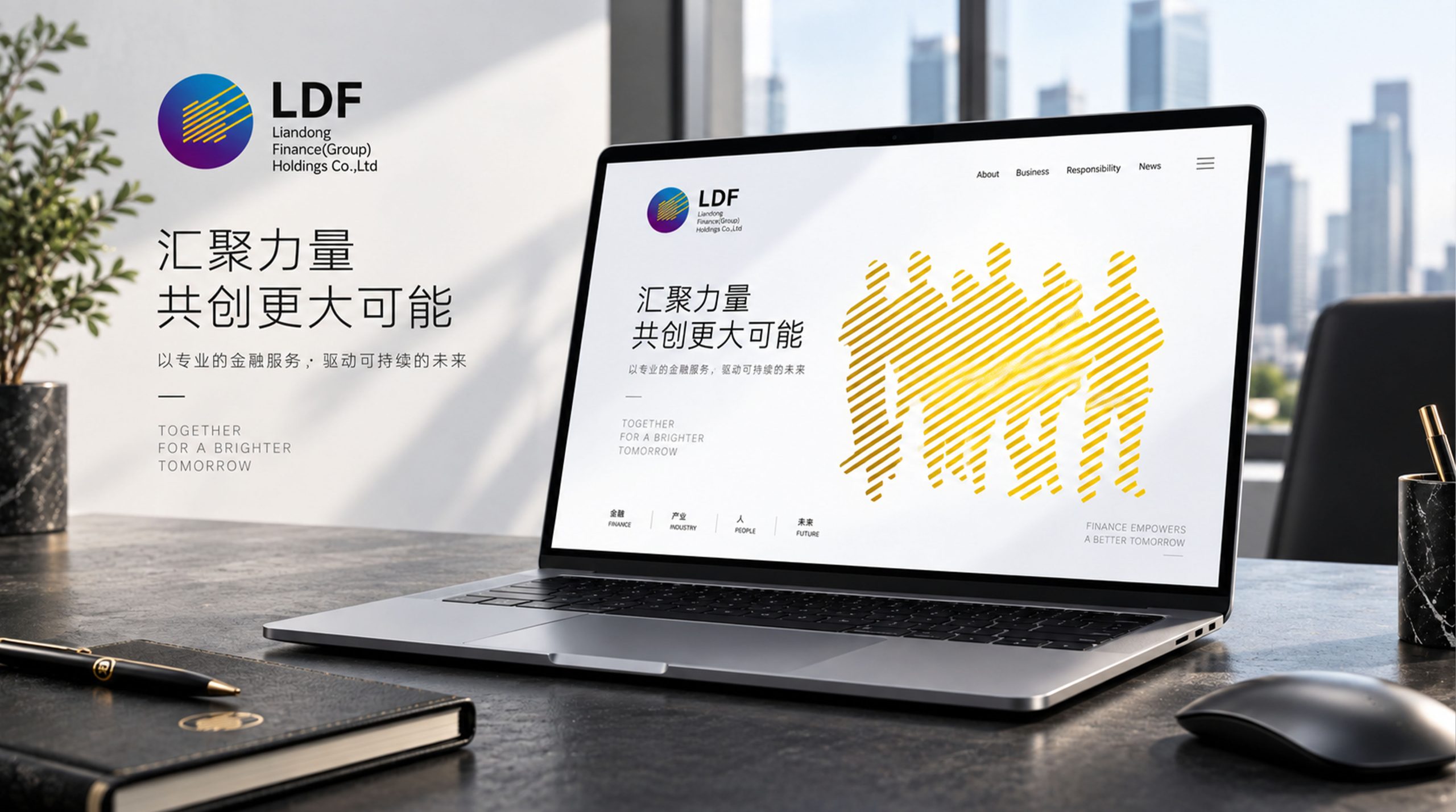
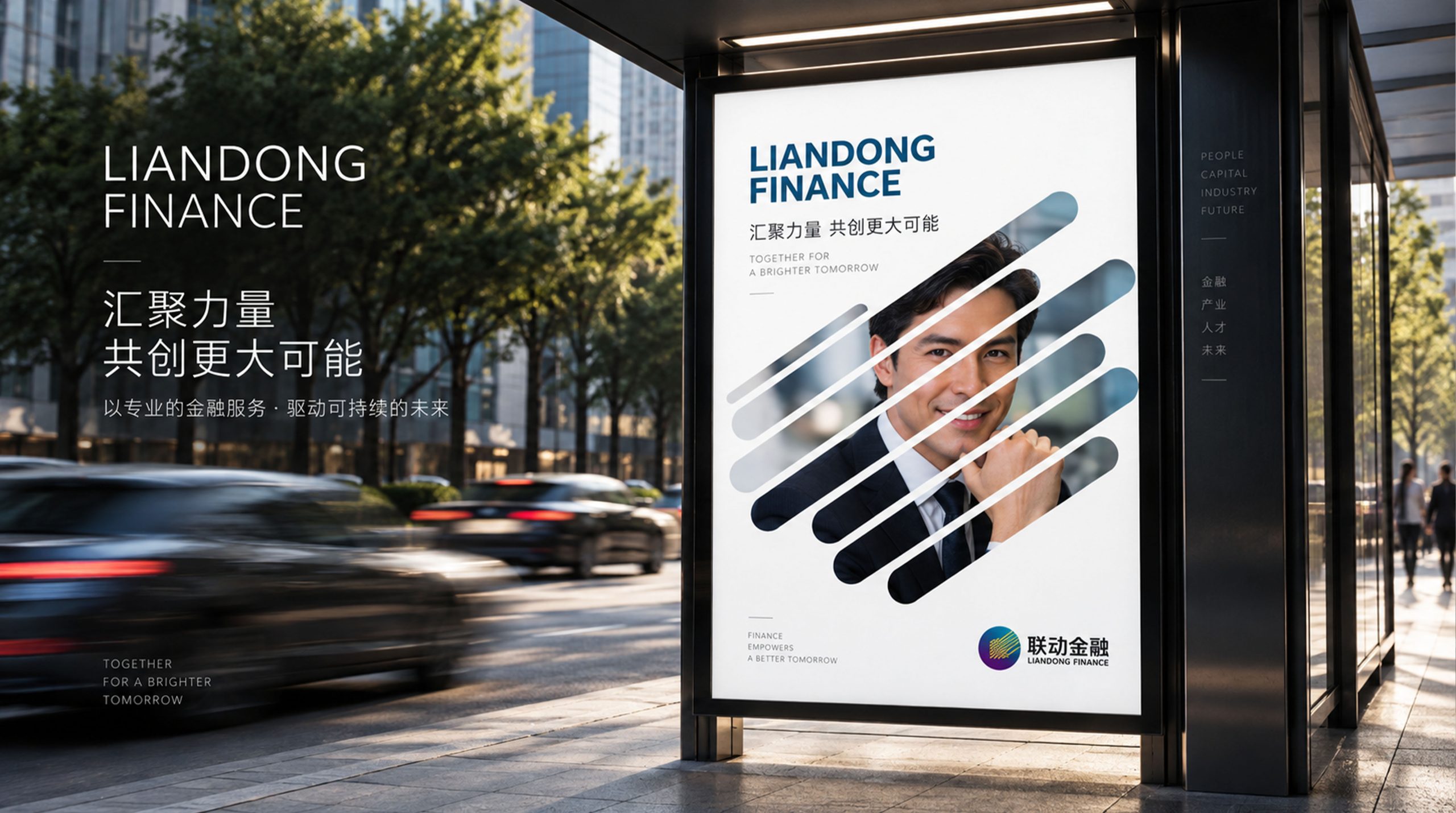
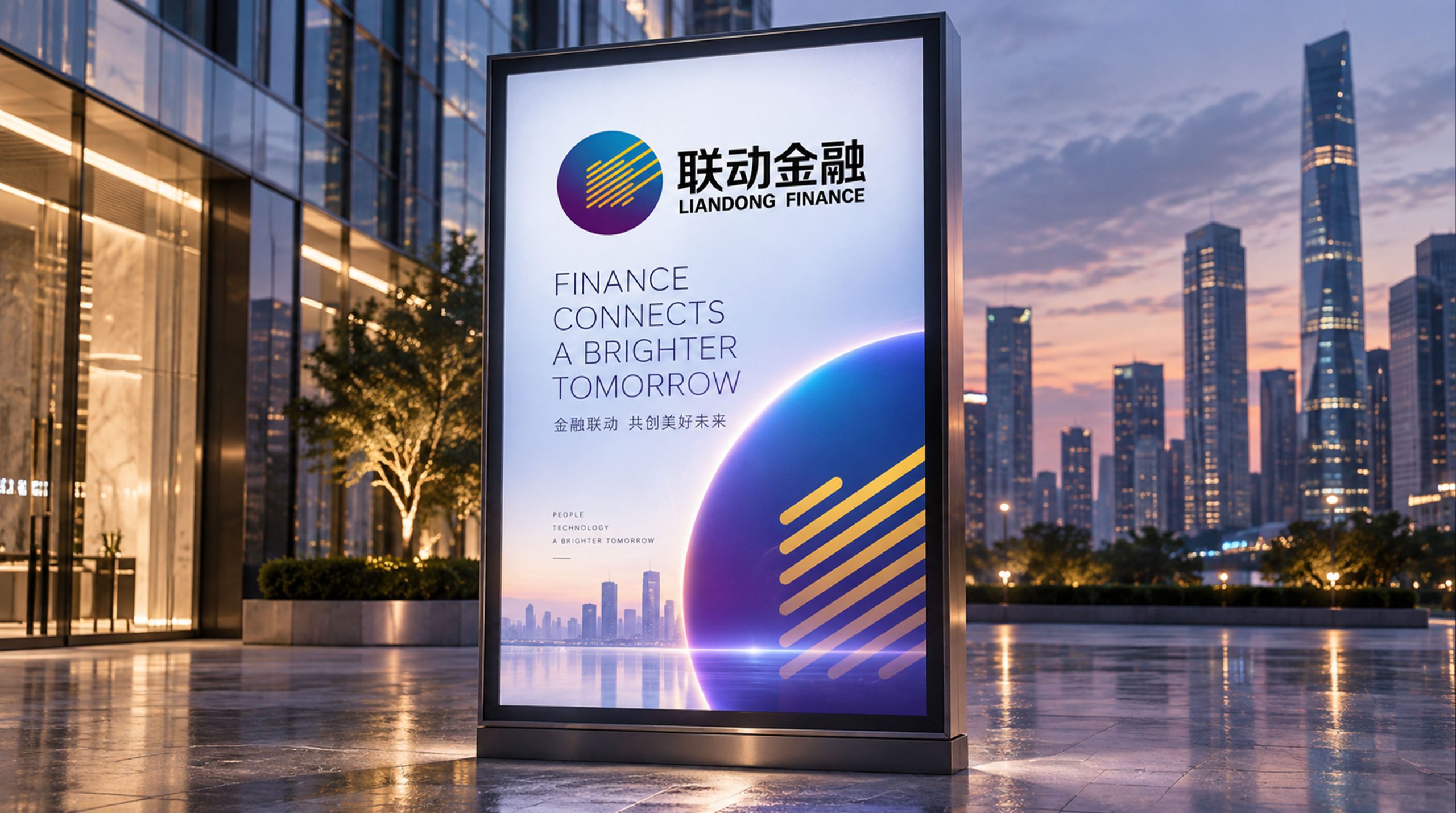
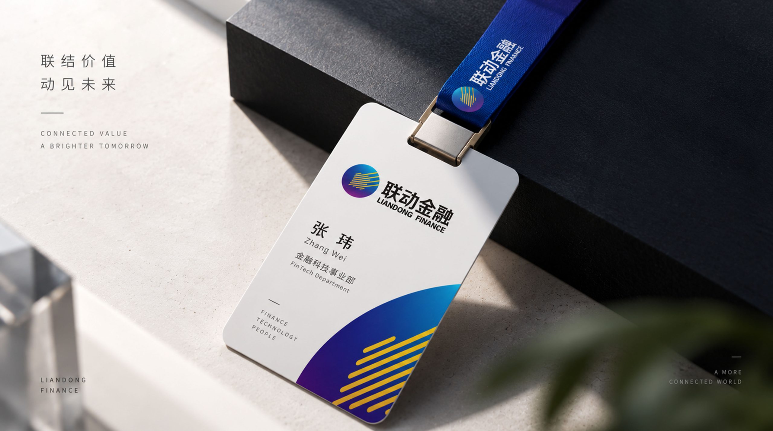
The logo can be widely used in corporate headquarters and branch logos; business cooperation plans, financial product manuals and risk control reports; official websites, financial service APPs and digital platform interfaces; financial technology summits, industry forums and partner event images. In the dynamic visual, two gears rotate from both sides of the screen and are precisely engaged in the center. A blue-orange light bursts out at the moment when the teeth intersect. Then the two wheels rotate together and the power is transmitted along the teeth in sequence, symbolizing that Linked Finance uses a technological platform to drive the efficient collaboration of multiple financial resources.
brand meaning
The logo contains three core images: Multi-Connection - the engagement of double gears conveys the platform's ability to integrate multiple financial resources; Synergy in Motion - the operation of gears conveys the service value of efficient flow of funds and information in collaboration; Precision & Trust - the precise engagement of teeth conveys the standardized and standardized professional quality of the financial technology platform. The overall design conveys the brand vision of "diversified linkage and smart finance".
Improper Usage (Protection Specification)
Do not change the size ratio or bite relationship of the two gears; do not increase or decrease the number of gears or modify the uniform spacing of the teeth; do not change the hue of the main color of the linkage blue; do not add gradients, shadows or decorative effects that are inconsistent with the financial style; do not separate the double gears for separate use; keep the white space ≥ 25% of the graphic height; the minimum display width shall not be less than 25mm.
design results
After the release of the logo, the brand recognition of Linkage Finance in the field of financial technology and comprehensive financial services has been significantly improved. "Gear linkage" has become the core identification symbol of the brand system with its visual language of conveying collaborative drive and precision and reliability, demonstrating the brand vision of "diversified linkage and smart finance".