










Pengyuan is a comprehensive enterprise with industrial investment and industrial operations as its core, and is committed to driving the sustainable development of diversified businesses with lofty ambitions and deep roots.
The brand name "Pengyuan" has a lofty artistic conception - "Peng" means Dapeng, which comes from "Zhuangzi·Xiaoyaoyou" "Peng migrates to Nanmingye, the water hits three thousand miles, and the force soars up to ninety thousand miles", symbolizing the grand ambition of aiming high and spreading thousands of miles; "Yuan" means source and origin, symbolizing the fundamental strength and continuous flow of value for the development of the enterprise. Peng is the ambition, source is the foundation, only with the source can we fly far. Qingmei Future was commissioned to lead the brand identity design.
The design goal of the brand logo is to convey the brand image of "a journey of thousands of miles, a journey of great origin" through the visual language of a journey of thousands of miles, a long history and a stable pattern.

design concept
The logo takes "Rising from the Source" as its core concept, integrating the majestic appearance of the roc flying high with the flowing lines of the water source. Dapeng rises from the water - "source" is the place of departure, and "peng" is the height to which it flies. The complete transformation of the brand name from literal meaning to graphic is completed in one flight.
graphic language
The main body of the graphic takes the silhouette of a roc with its wings spread as the visual core. The wings stretch upward in two powerful arcs to both sides. The wingspan angle is wide and magnificent, conveying the majestic momentum of "swinging upward ninety thousand miles". The arc of the wings gradually tapers from thick at the base to the tip, just like the powerful brush strokes in calligraphy - the strokes are steady and powerful at the beginning and sharp at the end.
Dapeng's body is summarized in a concise streamlined shape, with its head slightly raised toward the upper right, conveying an aggressive and goal-oriented forward attitude. Several soft arcs of water sway under the body to both sides, just like the ripples caused by a roc's wings hitting the water when it takes off - Zhuangzi's image of "water hitting three thousand miles" is transformed into a visual graphic language here. The water pattern arc is the visual expression of "source" - water is the source and the source is the root. The Dapeng draws strength from the water source and soars into the sky.
The arcs of the wings and the arcs of the water lines echo up and down on both sides of the figure - the wings spread upward and the water swings downward, forming a dynamic balance between rising and falling, conveying the company's development philosophy of "aiming high but not forgetting the roots". The overall graphic outline is wide and spread horizontally, just like the majestic figure of a roc with a wingspan of thousands of miles. The composition is based on the upper and lower structure of "wings rising from above and sources emerging from below" and "the peng originates from the source".
Font composition
The Chinese "Pengyuan" adopts a modern font with both a sense of strength and calligraphy charm, and the strokes are stretched and powerful. The structure of the character "Peng" is as broad as the shape of spreading wings, and the three-point water of the character "Yuan" is smooth and flexible, echoing the water pattern. The English "PENGYUAN" is arranged in standard uppercase sans-serif font, with a stable and powerful font.
color system
The main color Pengyuan Blue #0B3D6B represents the sky, depth and lofty aspirations. The dark blue is like a roc soaring thousands of miles high in the sky - vast, far-reaching and limitless, conveying the brand's strategic pattern of "aiming for the sky". Auxiliary source green #1A8A7D is used for the "source" related elements in the brand system, just like the emerald green color of clear spring water, conveying the vitality and vitality of the foundation. The combination of blue and green forms the natural colors of "sky and water" - flying in the blue sky and flowing in the clear water. Auxiliary Peng Wing Gold #B8943E is used for honor and high-end elements in the brand system, just like the golden luster of the roc's wings shining in the sun. Pure white #FFFFFF as standard base color. The overall color uses blue and green as the dual core and gold as the finishing touch, reflecting the brand temperament of "lofty and profound, and rich in foundation".
Application extension
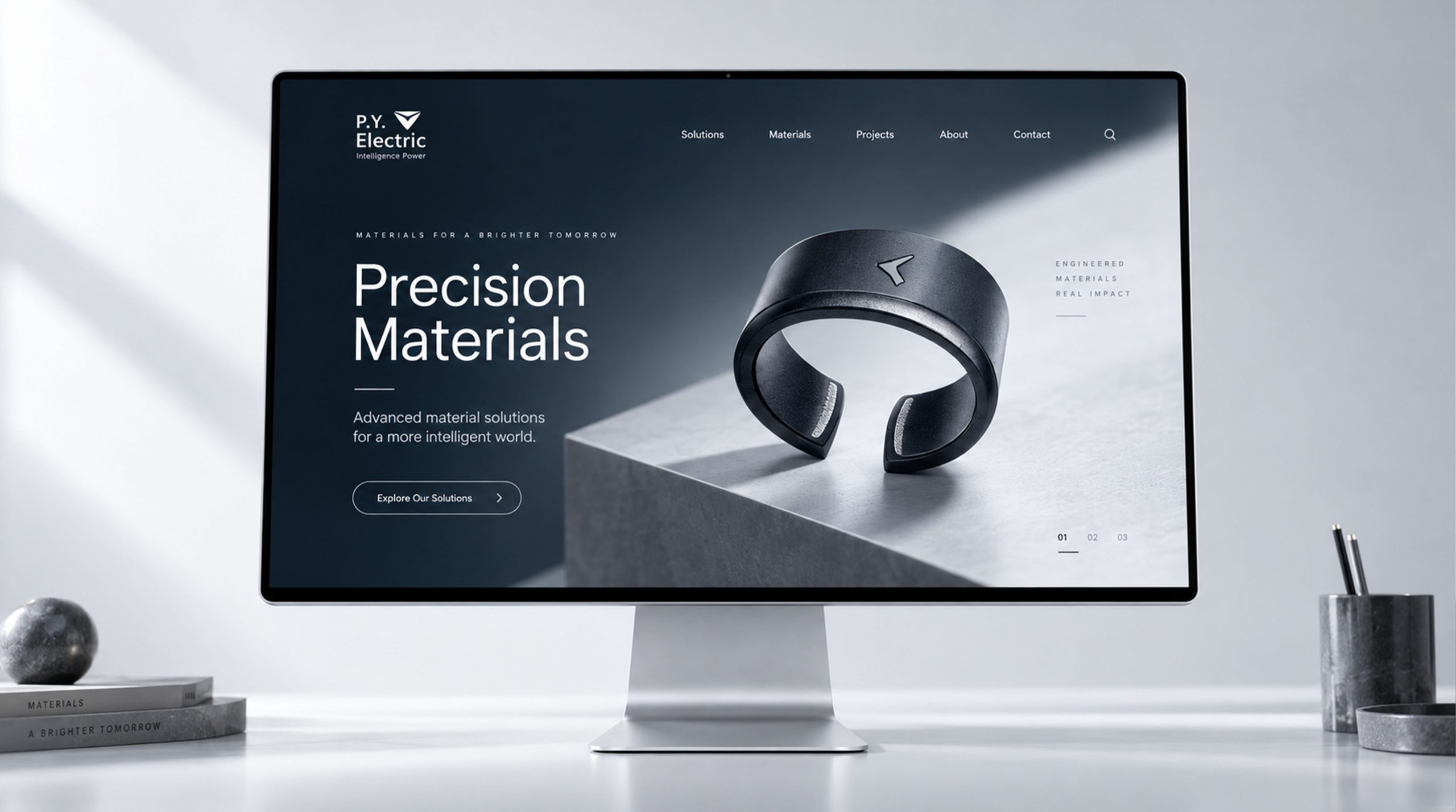
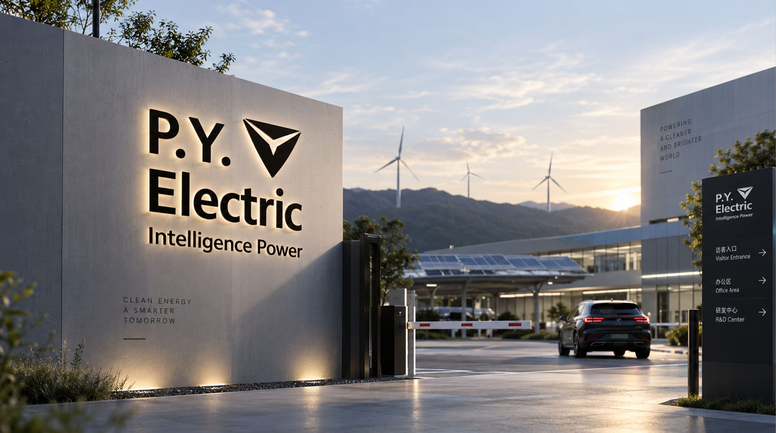
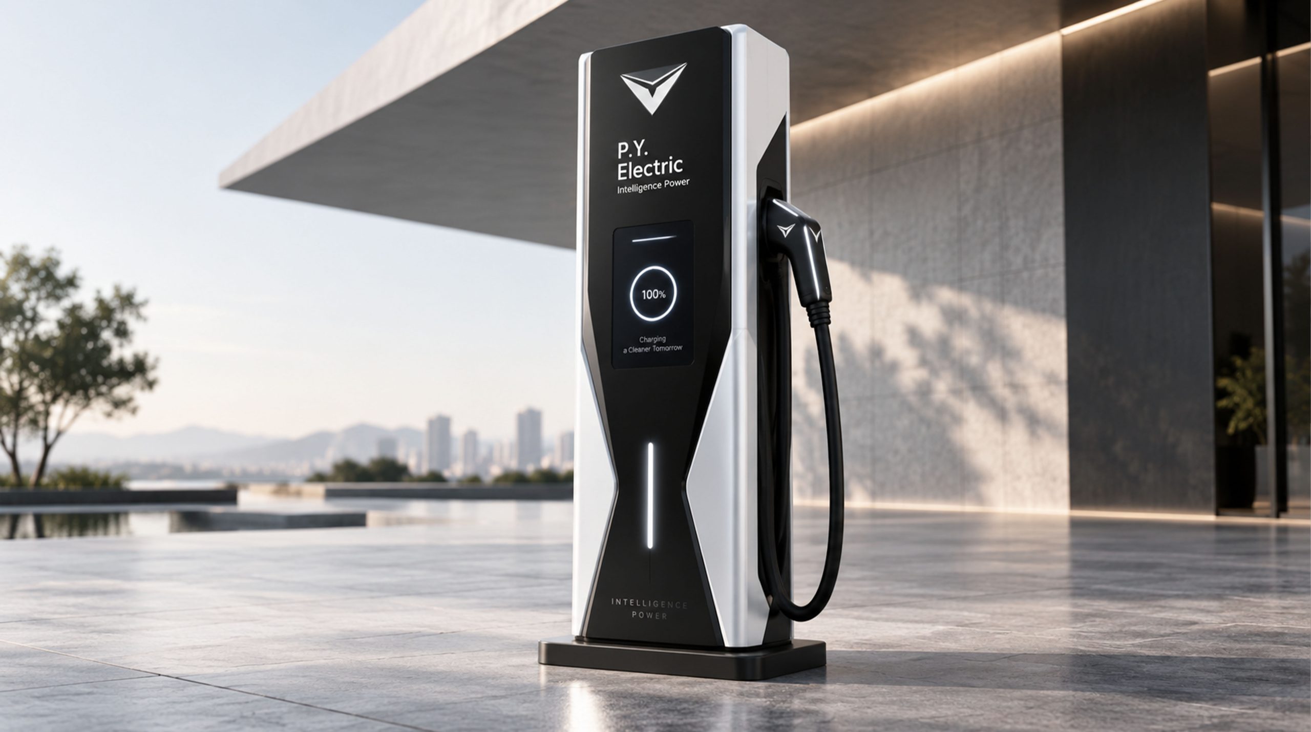
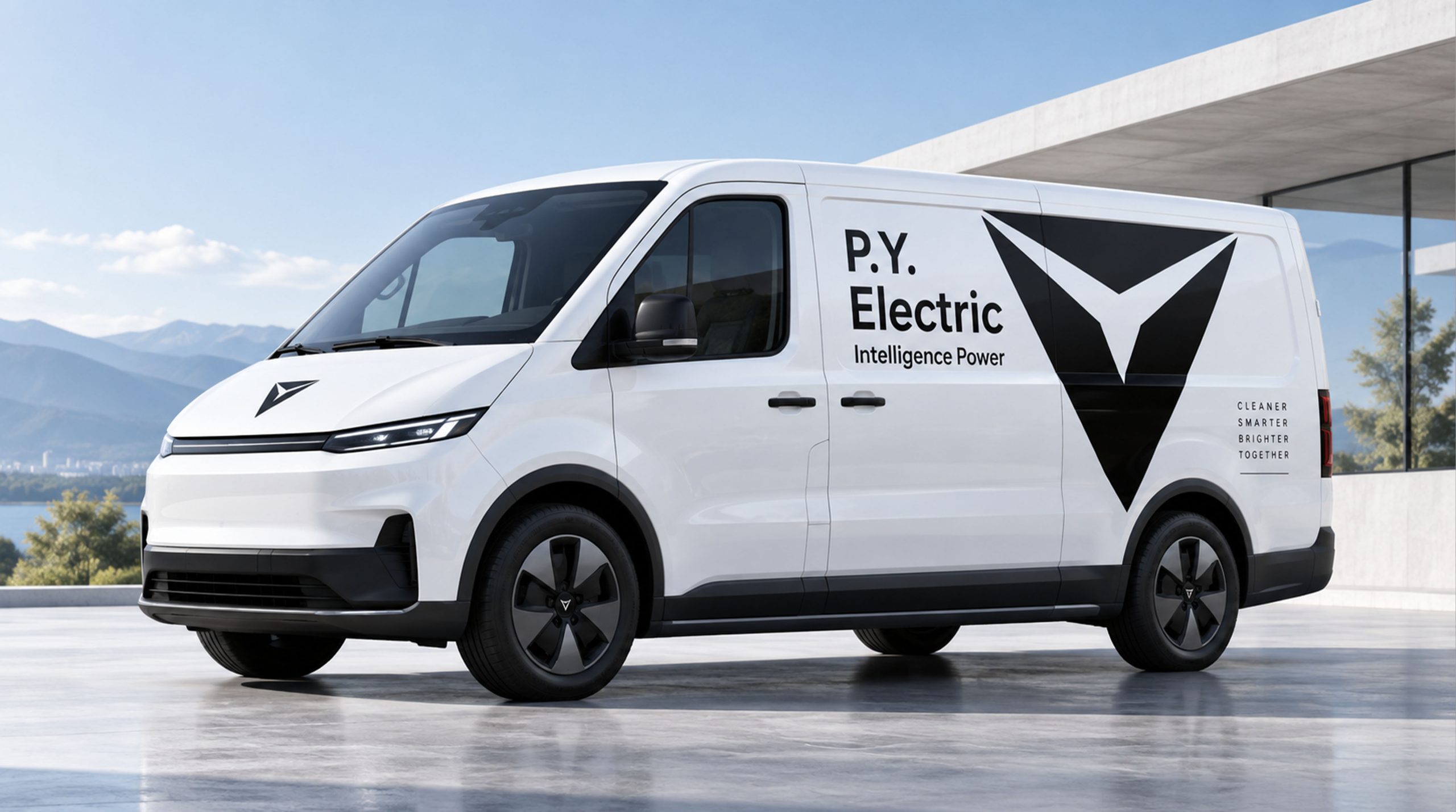
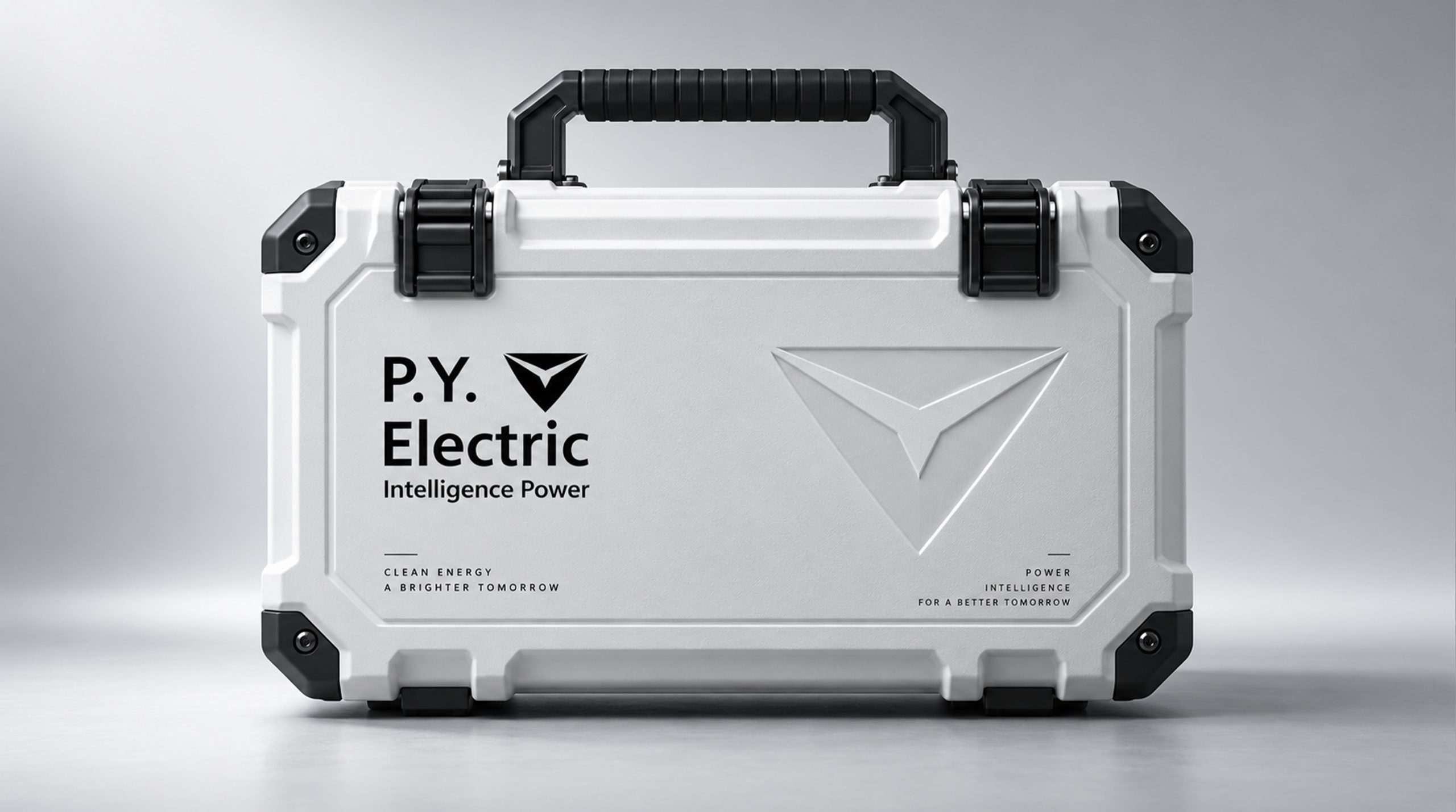
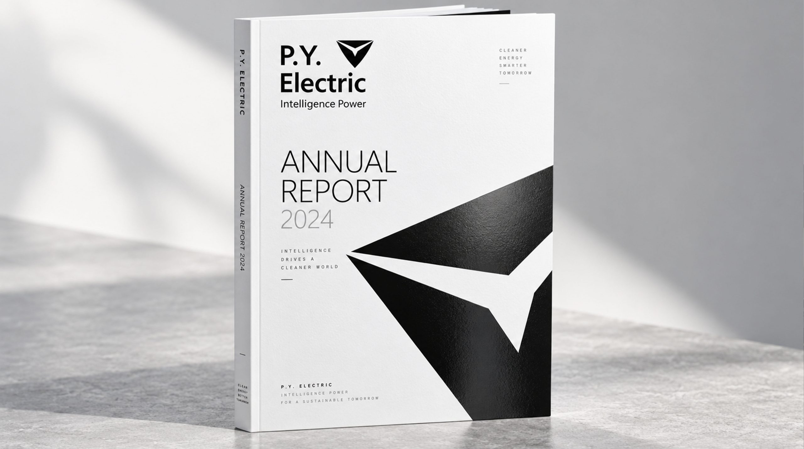
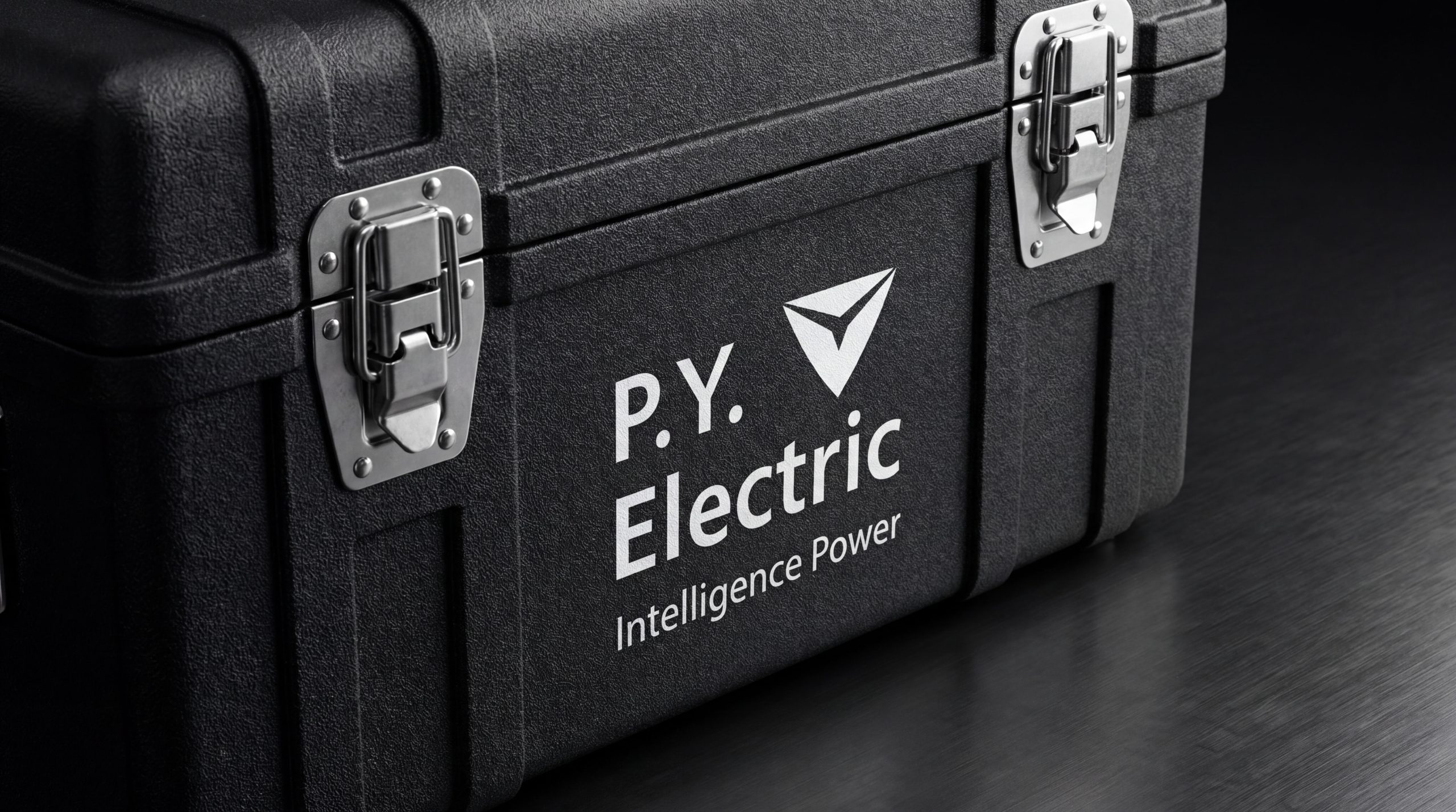
The logo can be widely used in corporate headquarters and various business segment logos; corporate brochures, investment plans and business cooperation documents; official websites, digital platforms and social media images; industry summits, industry forums and brand event images. In the lobby of the corporate headquarters, the logo of Dapeng spreading its wings is presented in metal relief on the image wall. The arc of the wings stretches from both sides of the wall, creating a magnificent momentum. In the dynamic visual, water patterns surge and spread from the bottom of the screen, and a large roc rises from the water with its wings spread powerfully across the sky, symbolizing that Pengyuan starts from a deep foundation and strives to soar toward a higher goal.
brand meaning
The logo contains three core images: Soaring Ambition - the spread of the roc's wings conveys the corporate ambition of high aspirations and pursuit of excellence; Deep Roots - the water arc conveys the development heritage with deep roots and continuous value; Dynamic Balance - the up and down echo of the wings and water conveys the steady development philosophy of "flying high without forgetting the roots, traveling far without leaving the roots". The overall design conveys the brand vision of "a long journey and a long journey".
Improper Usage (Protection Specification)
Do not change the wingspan angle or flight direction of the roc; do not delete the arc of the water pattern or change its response to the wings; do not change the hue of the main color of Pengyuan Blue; do not add gradients, strokes or decorative effects that are inconsistent with the brand style; do not separate the roc and the water pattern for separate use; keep the white space ≥ 25% of the width of the graphic; the minimum display width shall not be less than 30mm.
design results
After the release of the logo, Pengyuan's brand recognition and market pattern awareness in the fields of industrial investment and industrial operations have been significantly improved. "Peng originates from the source", with its visual language that combines lofty aspirations and deep roots, has become the core identification symbol of the brand system, showing the brand vision of "a journey of thousands of miles, a journey from afar".