










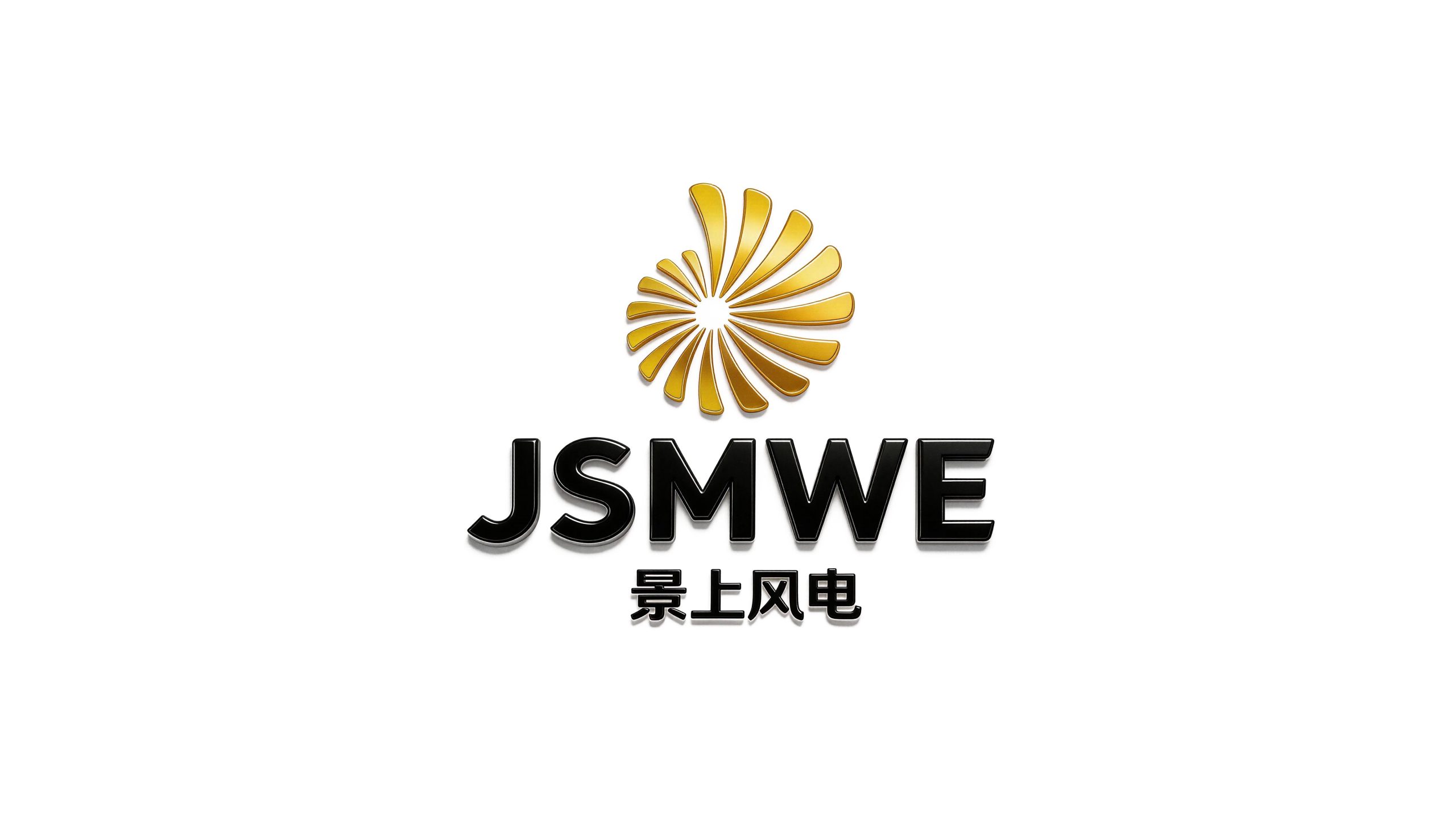
Jingshang Wind Power is a clean energy enterprise with wind power development and operation as its core. It focuses on wind farm site selection planning, wind turbine installation, wind farm operation and maintenance, and green power trading. It is committed to using wind energy resources to promote the green transformation of the energy structure.
The brand name "Jingshang" has a broad meaning - "Jing" means scenery and scenery, symbolizing the industrial picture of wind farms standing on the magnificent natural landscape; "Shang" means upward and above, conveying not only the physical form of wind turbines towering over the mountain tops and wilderness, but also the upward development momentum of the enterprise. The wind blows on the scenery, and electricity surges out. Qingmei Future was commissioned to lead the brand identity design.
The design goal of the brand logo is to convey the brand image of "riding the wind and reaching far with green energy" through the visual language of wind power, green ecology and technological power.
design concept
The logo takes "Spinning Blades" as the core concept and condenses the iconic three-blade rotating posture of the wind turbine into a brand symbol. The three rotating wind turbine blades are the most recognizable visual element in the global wind power industry - you can tell at a glance that "this is wind power". With the rotating blades as the core of the logo, the association between the brand and the wind power industry has been established in the shortest time.
graphic language
The main body of the graphic consists of three fan blades rotating and arranged around a central point. The three blades are distributed at an equal angle of 120 degrees. Each blade is presented in a slender arc shape, gradually narrowing from the width at the root to the tip, just like the aerodynamic cross-section of a real fan blade. The arc of the blades has a subtle twisting angle, conveying the dynamic feeling of the blades rotating at high speed - not a static arrangement, but the wind is blowing, the leaves are turning, and electricity is being generated.
The centers of the three blades are connected by a circular hub, which is like the core nacelle of the wind turbine - where the power of the three blades is gathered and converted into a steady stream of clean electricity. The center of the wheel hub is the visual anchor of the entire figure, allowing the three high-speed rotating blades to maintain a stable order.
The rotation direction of the blades is unified clockwise, delivering positive forward energy output. The negative space between the three blades forms three uniform fan-shaped areas, just like wind blowing into the impeller from three directions - wind power does not choose the direction of the wind, and all winds are energy, conveying the technical capabilities of wind farms to maximize the use of natural resources. The overall graphic outline is in a perfect circular rotation. The circle symbolizes the complete coverage of the blade sweep area and the endless cycle of energy conversion.
Font composition
The Chinese "Jingshang Wind Power" uses a simple modern sans-serif font, with neat and powerful strokes and a stable structure. "Jingshang" conveys the natural pattern of the brand, and "wind power" clarifies the core business. The English "JINGSHANG WIND POWER" is arranged in standard uppercase sans-serif fonts with regular and professional fonts to ensure the brand's recognition in international wind power cooperation and green power transactions.
color system
The main color, wind energy green #1D8348, represents clean energy, ecological harmony and sustainable development. Green is the core color of the global new energy industry, directly conveying the industrial value of "green power, zero carbon emissions". Auxiliary sky blue #2980B9 is used for the technological elements in the brand system and the scene vision of the wind farm, just like the vast blue sky above where the wind turbines stand. The combination of green and blue forms a natural energy picture of "green earth + blue sky". Auxiliary blade white #F0F0F0 is used for the background of the brand system and fan equipment display, just like the pure white color of the fan blade body. Pure white #FFFFFF as standard base color. The overall color is green and blue, reflecting the brand temperament of "green energy, technology driven".
Application extension
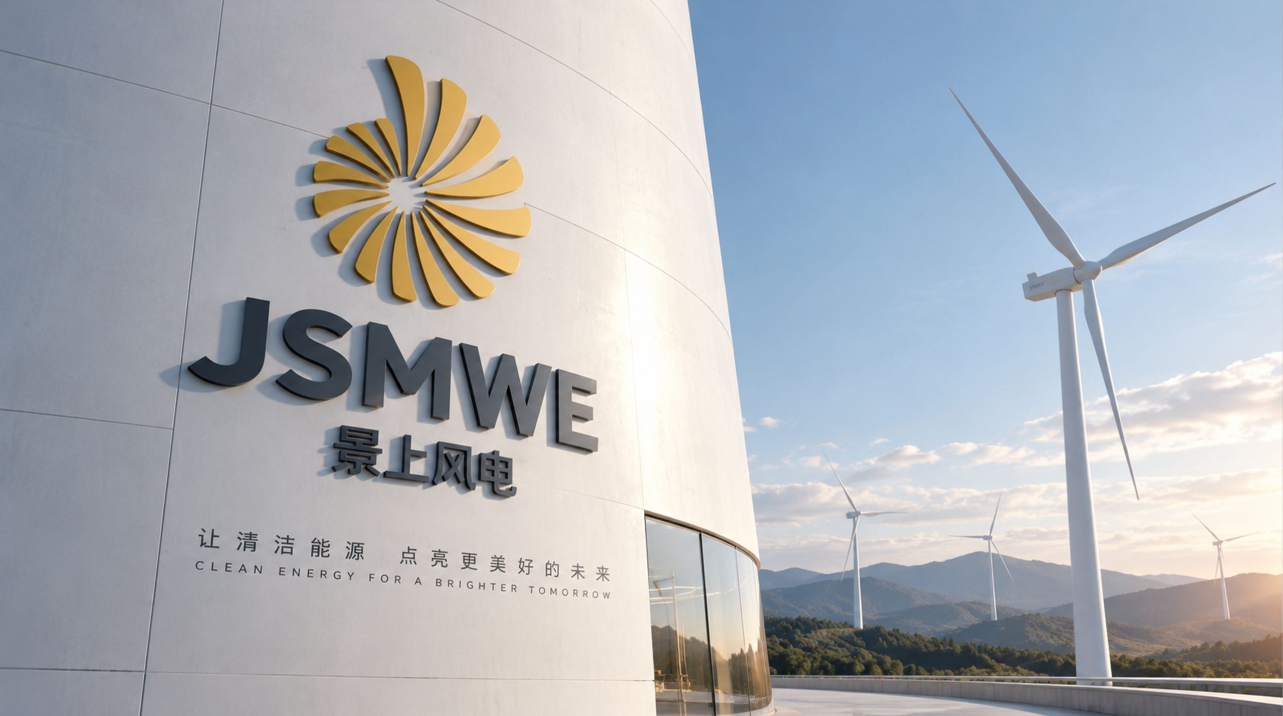
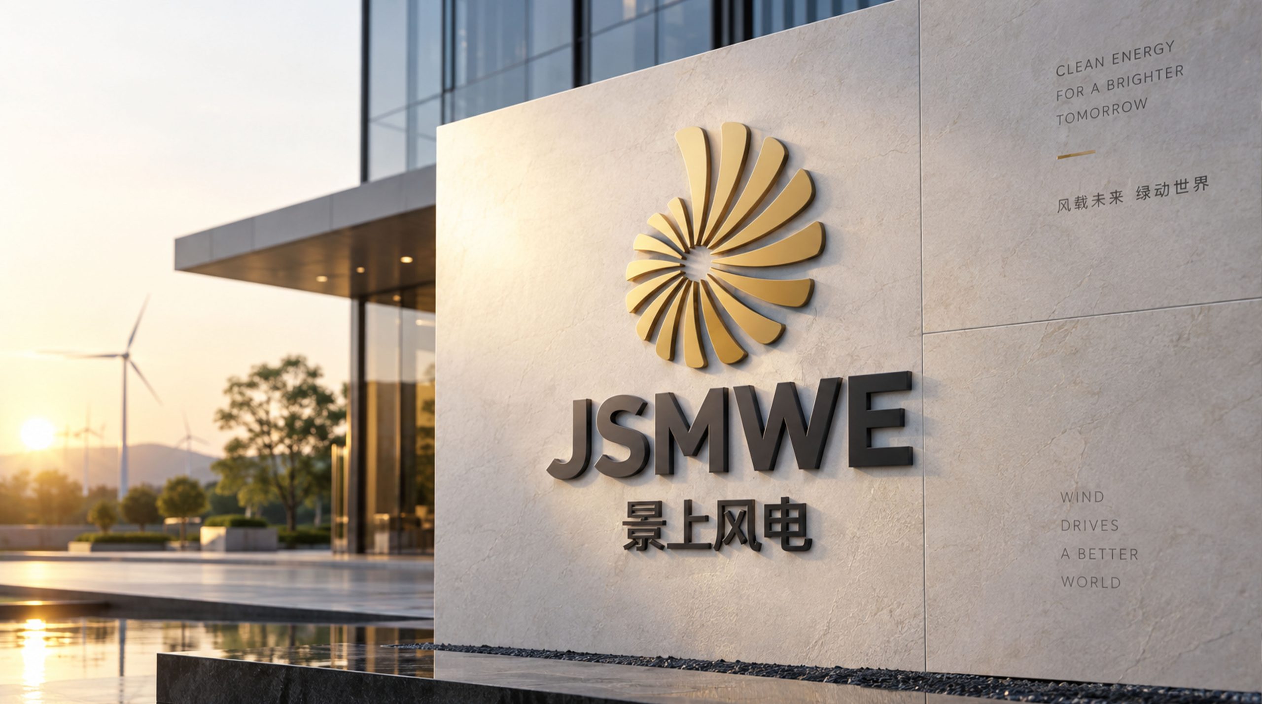
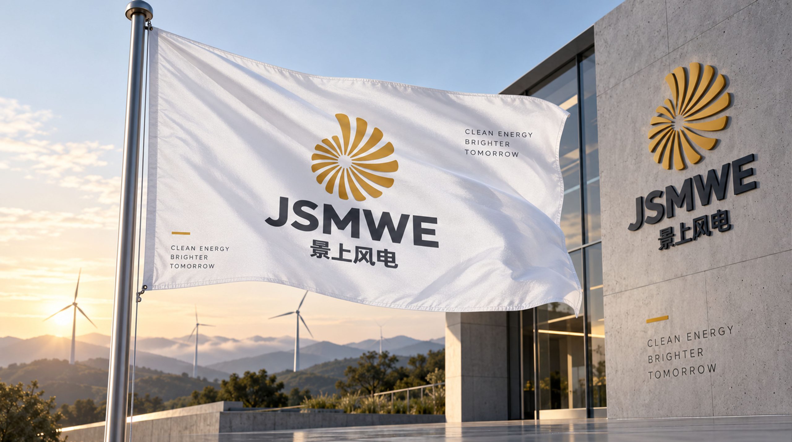
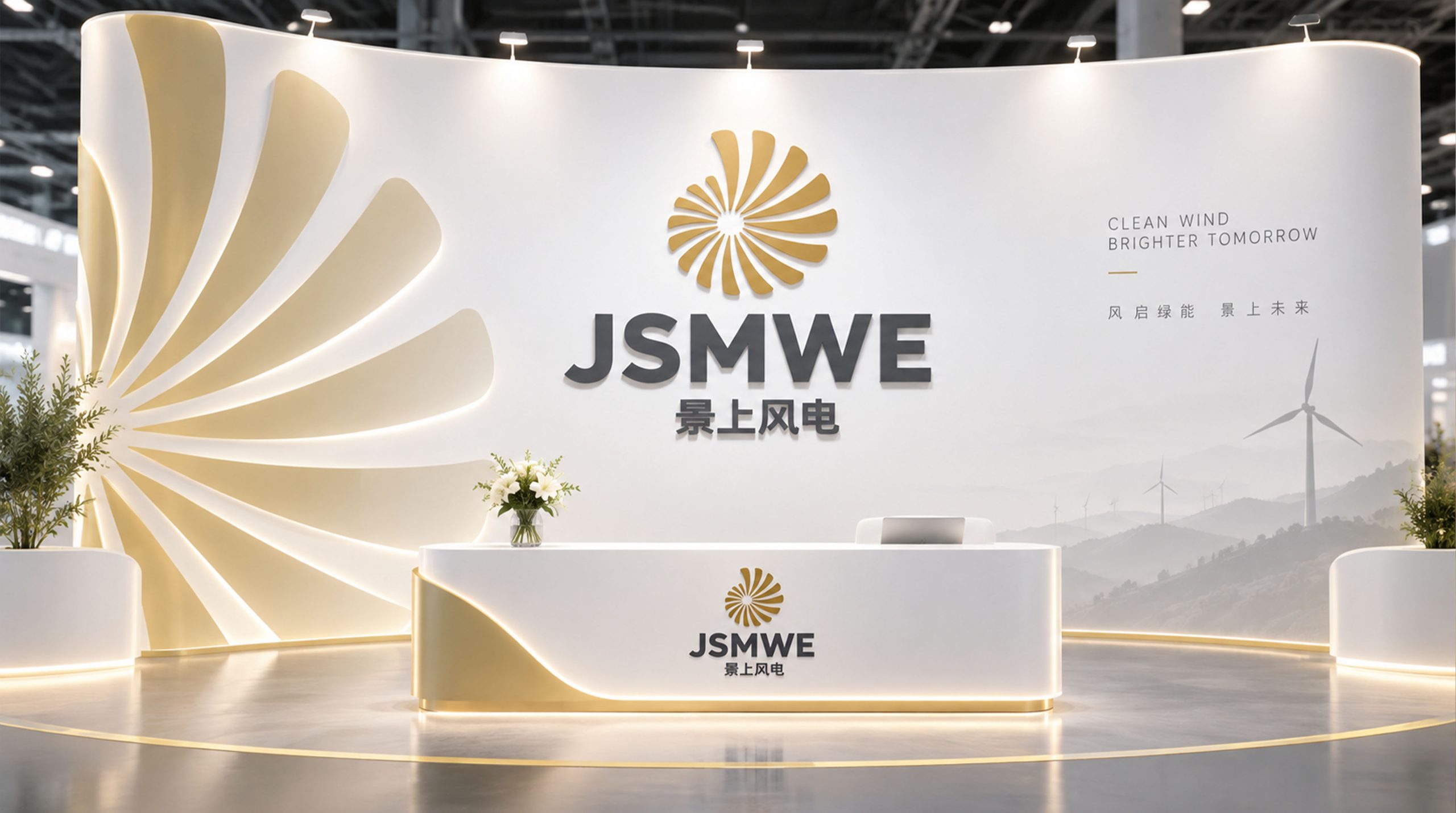
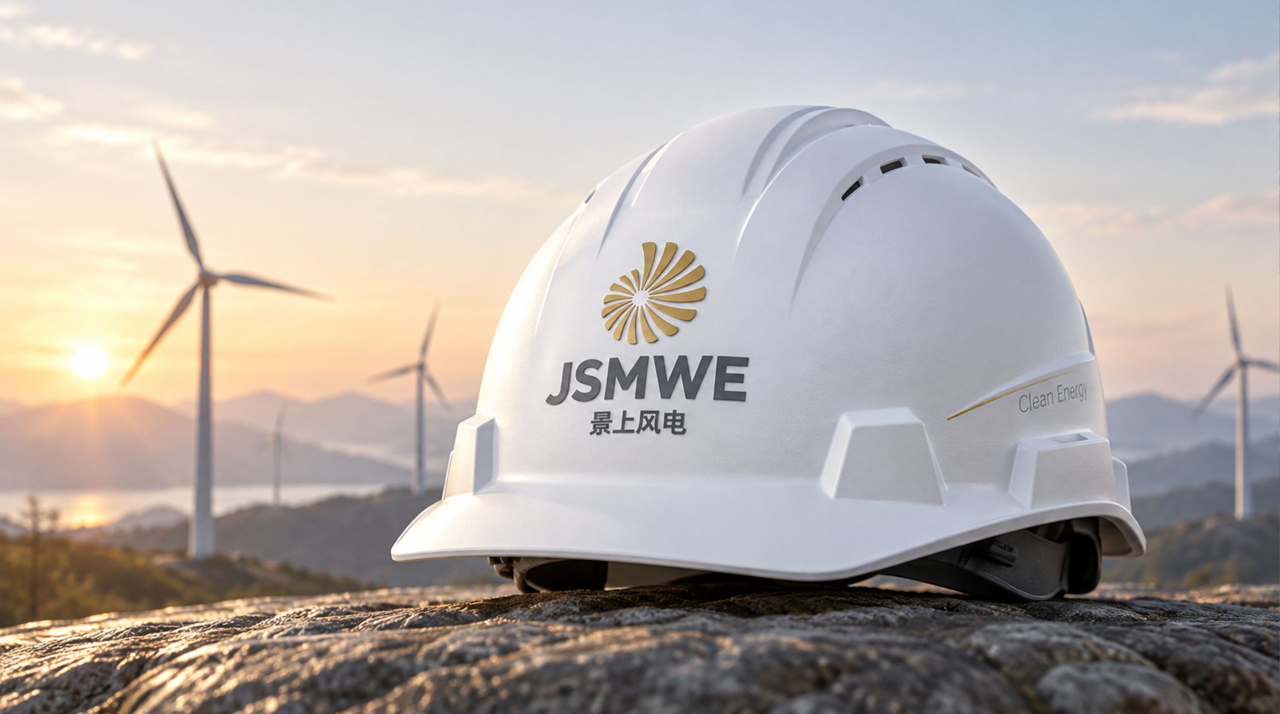
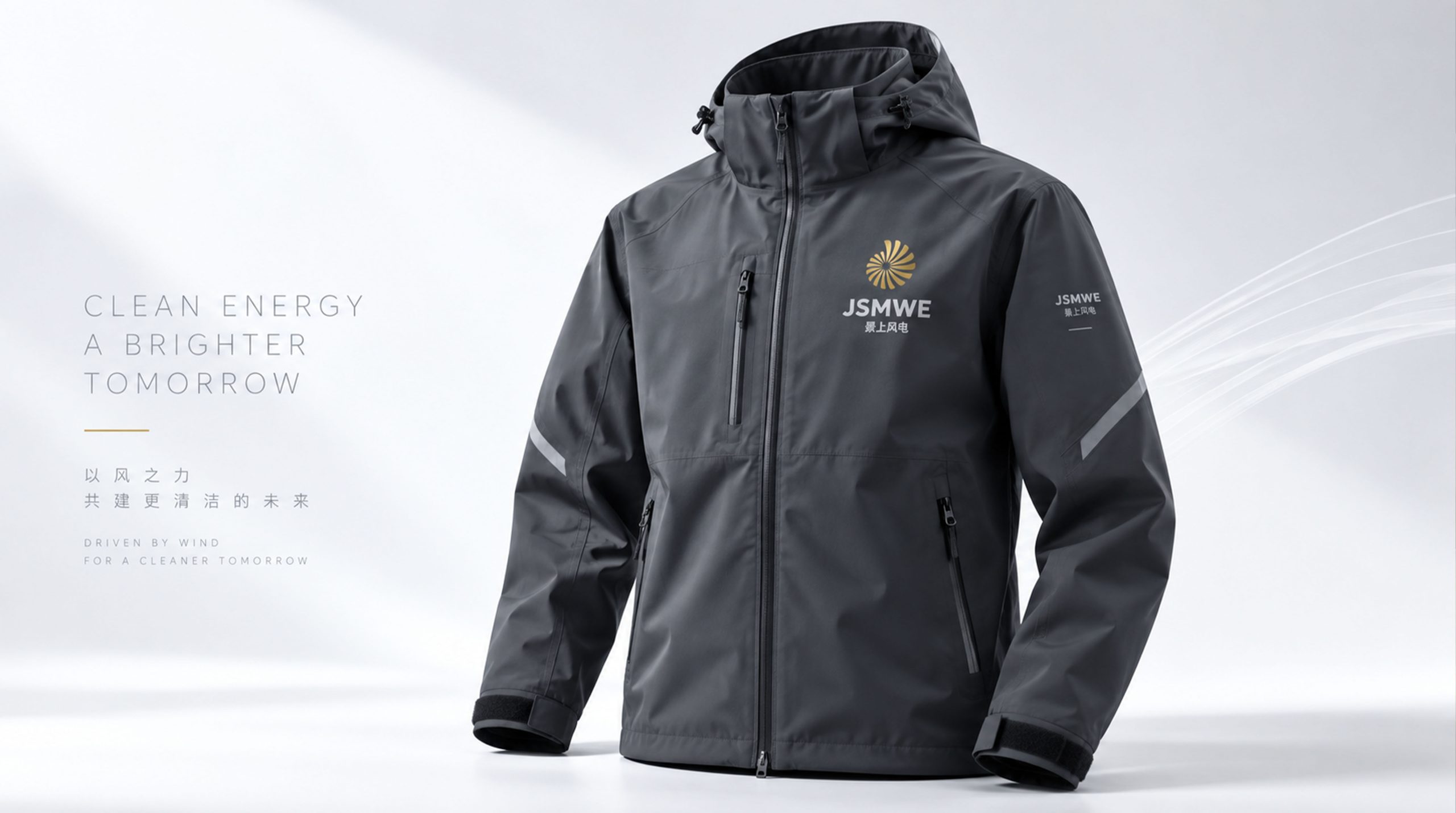
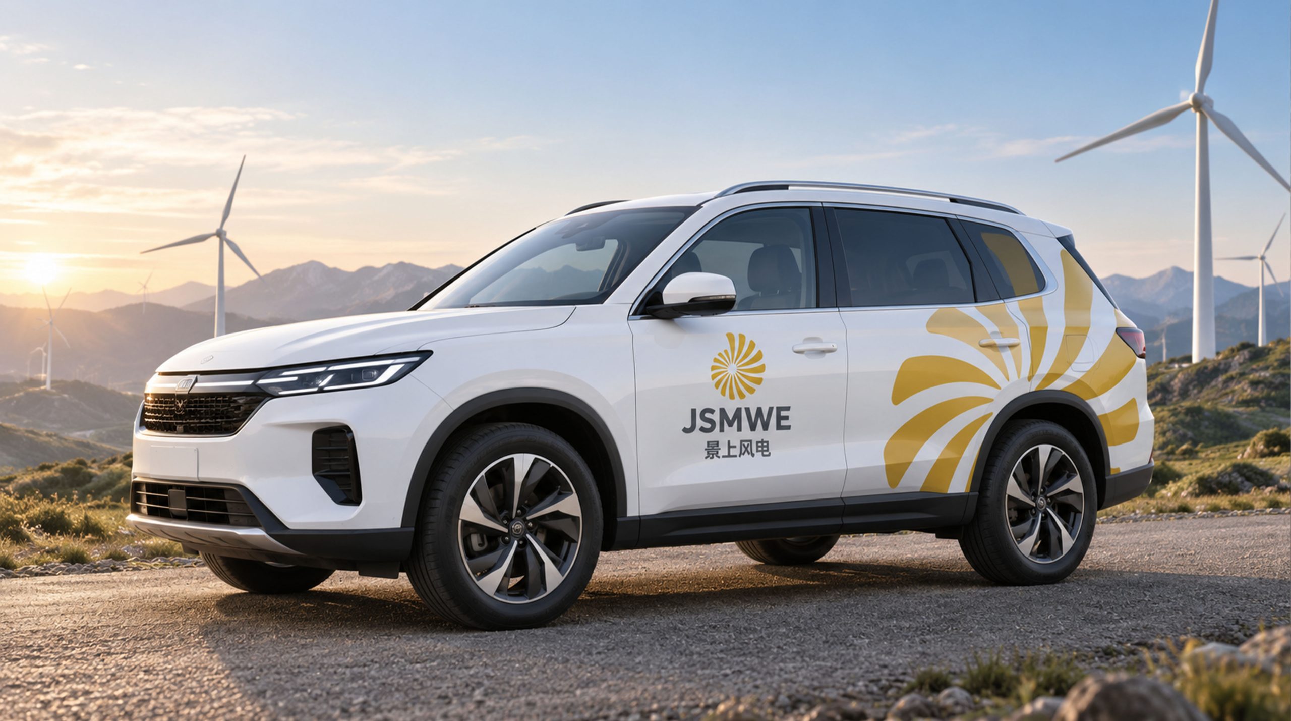
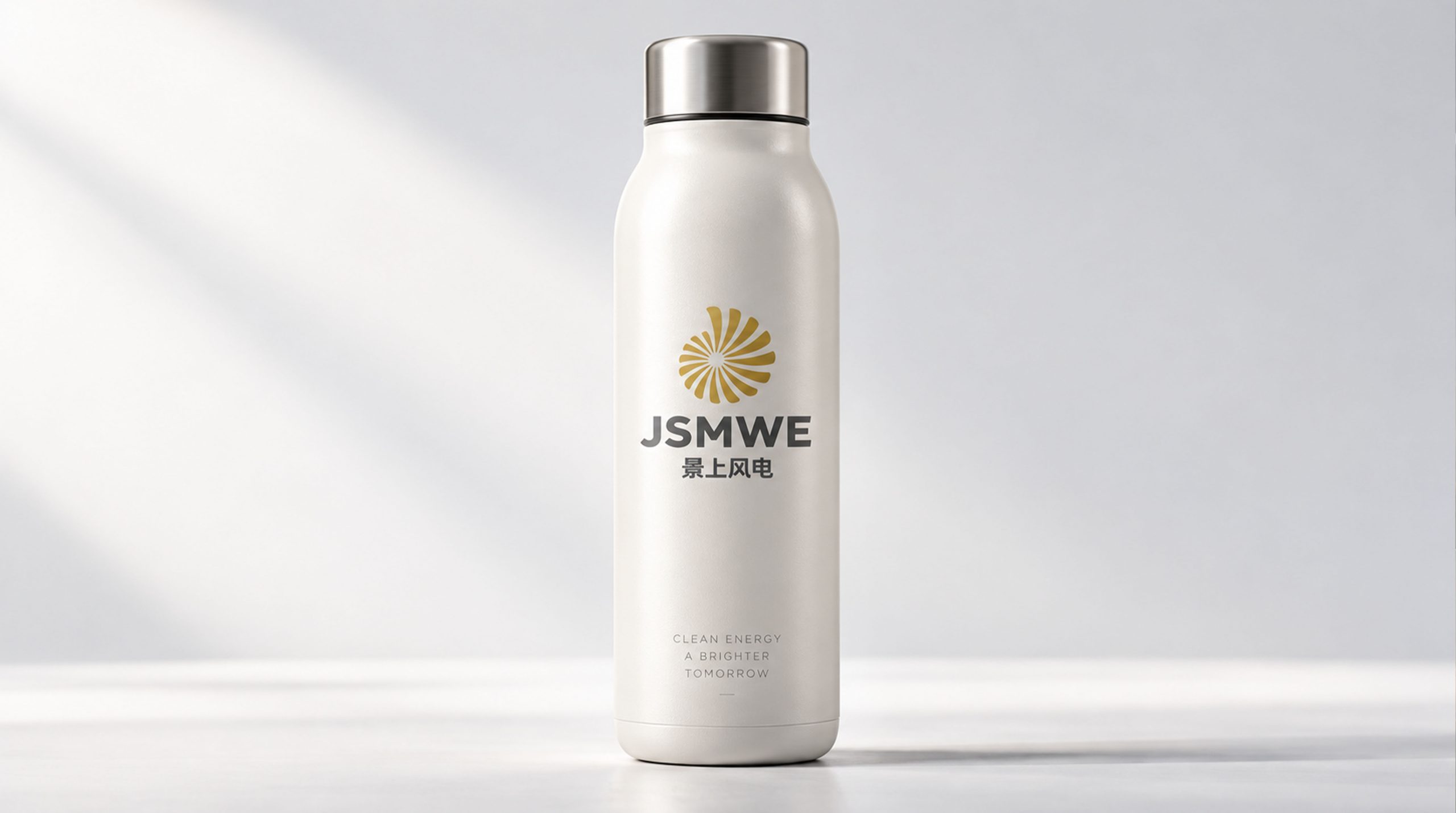
The logo can be widely used in corporate headquarters and wind farm site logos, wind turbine tower branding; technical white papers, project investment plans and operation and maintenance report covers; official websites, energy management platforms and social media images; clean energy summits, wind power industry forums and government cooperation project images. At the wind farm site, the rotating blade logo is installed on the base of the wind turbine tower with a metal nameplate. The brand symbol echoes up and down with the real rotating wind turbine blades above the head, integrating reality and reality. In the dynamic visual, the three blades are slowly blown by a gust of wind from a static state, and then rotate faster and faster, and finally form a complete impeller rotating at high speed, symbolizing that Jingshang Wind Power converts natural wind into surging green electricity.
brand meaning
The logo contains three core images: Wind Power - the rotating blades convey the core technology of wind power generation and the continuous clean energy output; Green Mission - the main color of wind green conveys the industrial mission of using wind power to promote the green transformation of the energy structure; Rising Momentum - the rotating dynamics of the blades and the word "Shang" in the brand name convey the positive momentum of the company's continuous upward development. The overall design conveys the brand vision of "riding the wind and going green with energy".
Improper Usage (Protection Specification)
Do not change the bisection angle or rotation direction of the three blades; do not modify the arc proportion of the blades or the gradient relationship from thick to thin; do not change the hue of the main color of wind energy green; do not add strokes, shadows or decorative effects that are inconsistent with the energy style; do not separate the blades and hubs for separate use; keep the white space ≥ 25% of the graphic diameter; the minimum display width must not be less than 25mm.
design results
After the release of the logo, Jingshang Wind Power's brand recognition and industry influence in the fields of wind power generation and clean energy have been significantly improved. "Wind Rises and Leaves Spin", with its visual language conveying wind energy power and green mission, has become the core identification symbol of the brand system, showing the brand vision of "riding the wind and reaching far with green energy".