










Wine Dynasty is China's first Sino-foreign joint venture wine company. It was founded in Tianjin by a Sino-French joint venture. It has always represented the quality benchmark of China's high-end wines for decades. Its products cover a full range of wines such as dry red, dry white, sparkling wine and brandy. It is committed to the deep integration of French brewing techniques and Chinese terroir resources to present Chinese wines of international standards to consumers.
The brand name "Dynasty" has an extraordinary bearing - "Dynasty" means emperor's foundation and prosperous times, symbolizing the brand's pioneering historical position in China's wine industry and its kingly bearing of high-end quality. "Dynasty" in English literally translates to dynasty, and has established a distinct image of China's high-end wineries in the international wine market. Qingmei Future was commissioned to lead the brand identity design.
The design goal of the brand logo is to reflect the industry attributes of its wine industry, while highlighting the characteristics of its high-end wines, and conveying the brand image of "dynasty magnanimity, classic brewing".
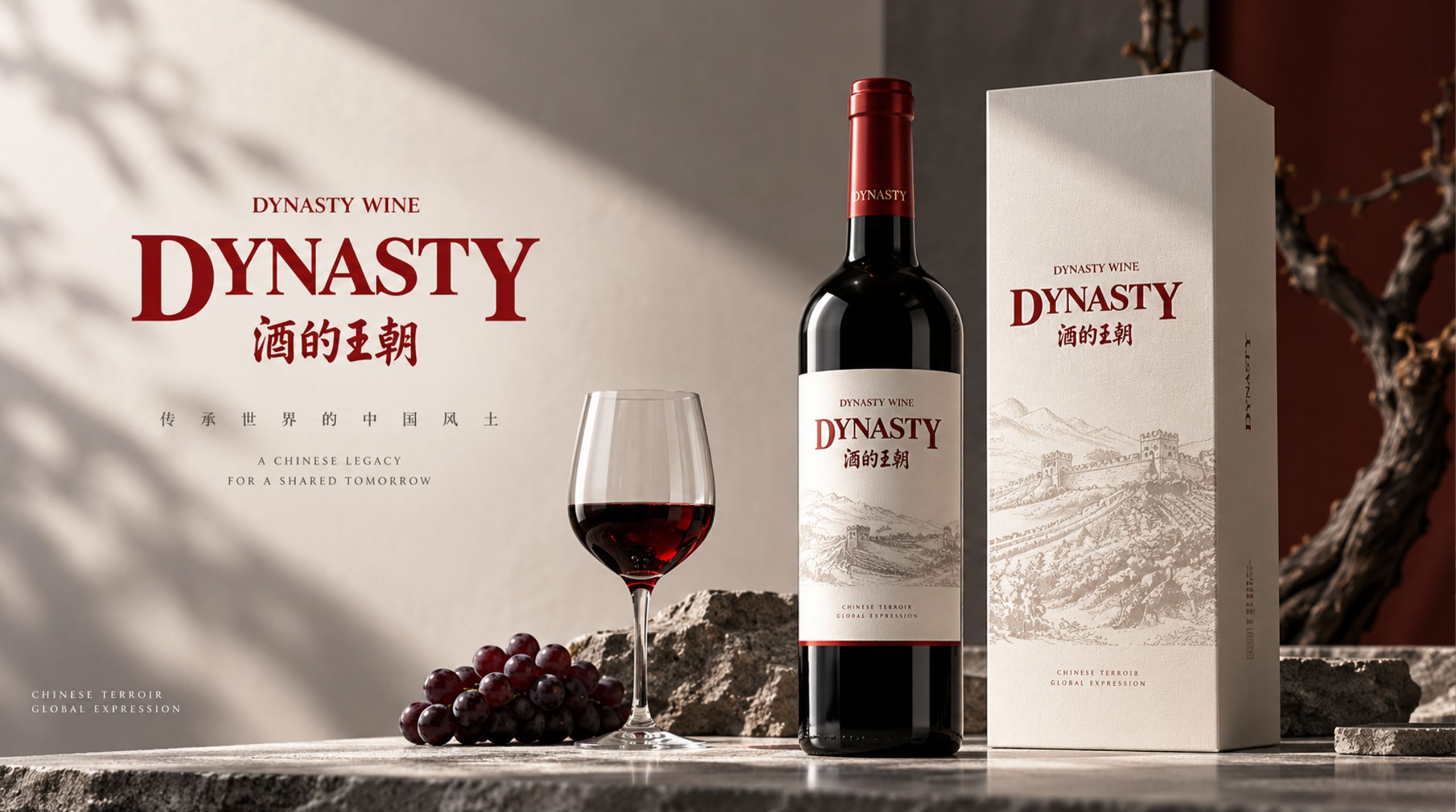
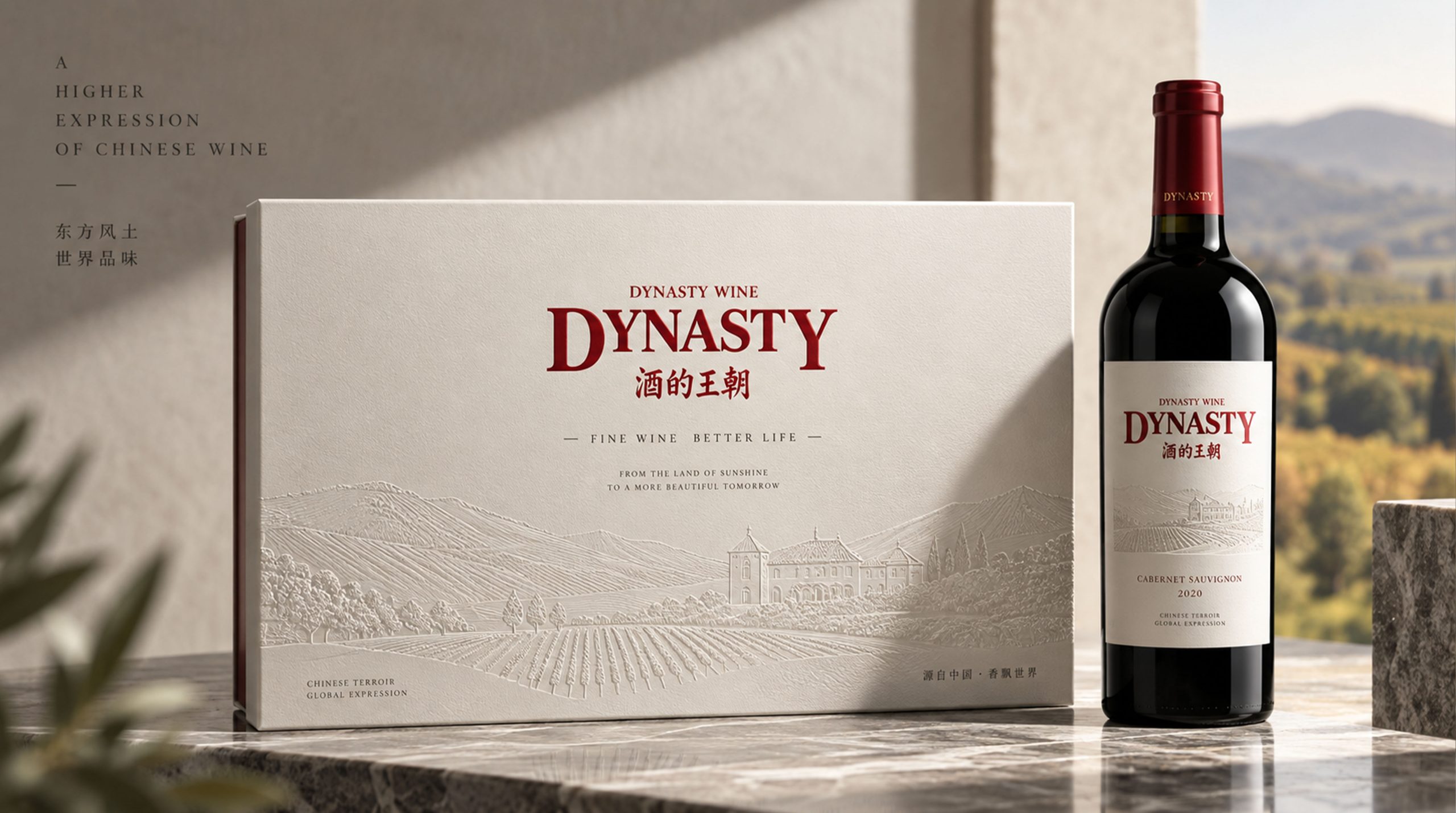
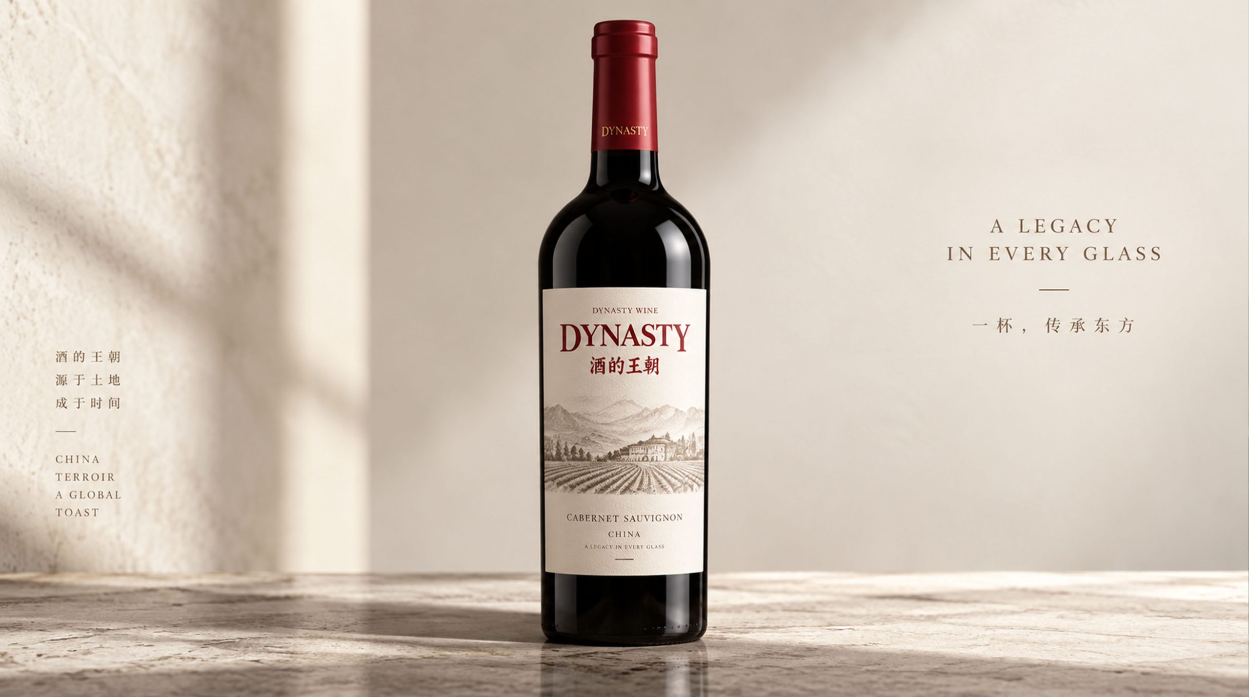
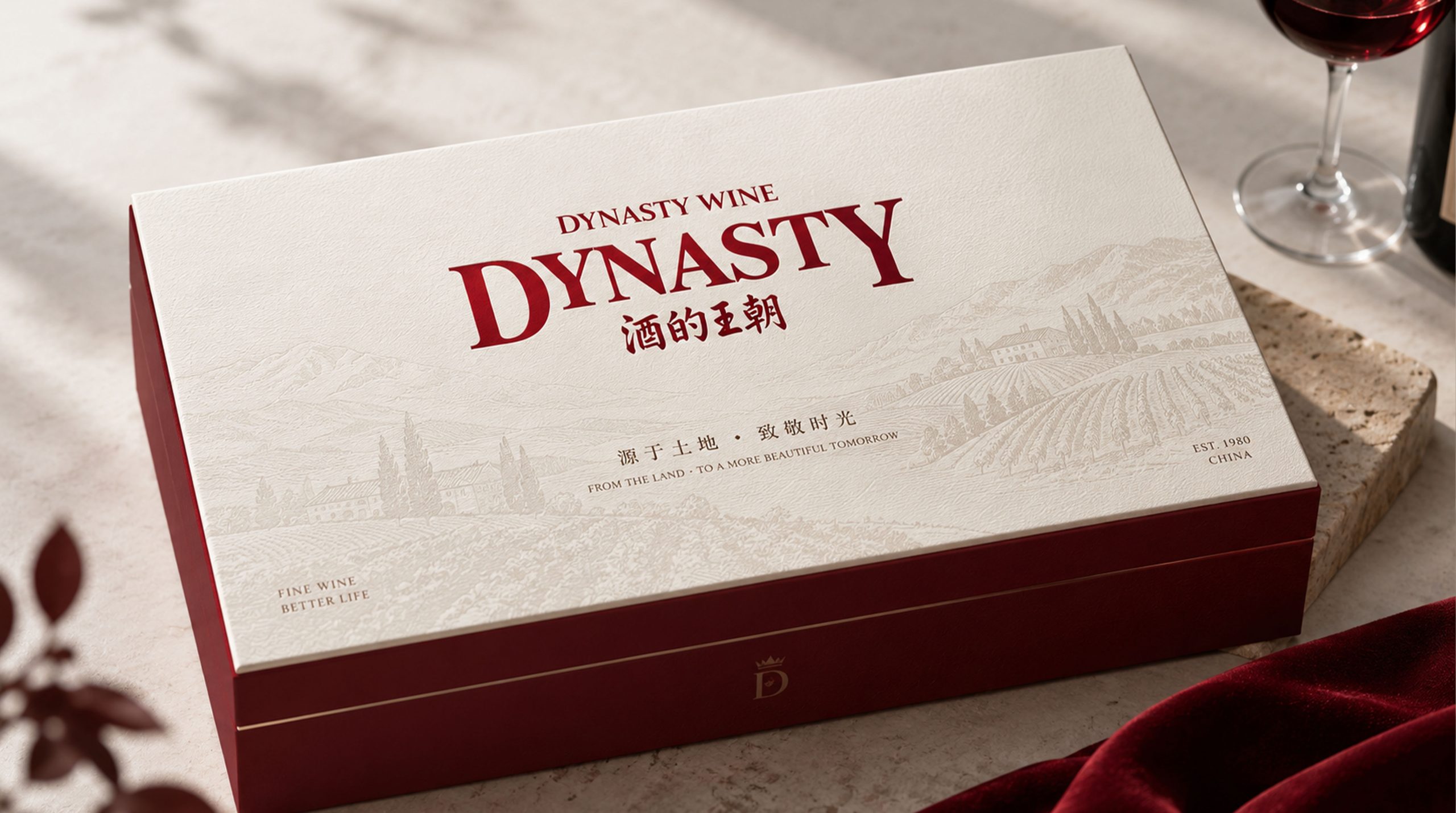
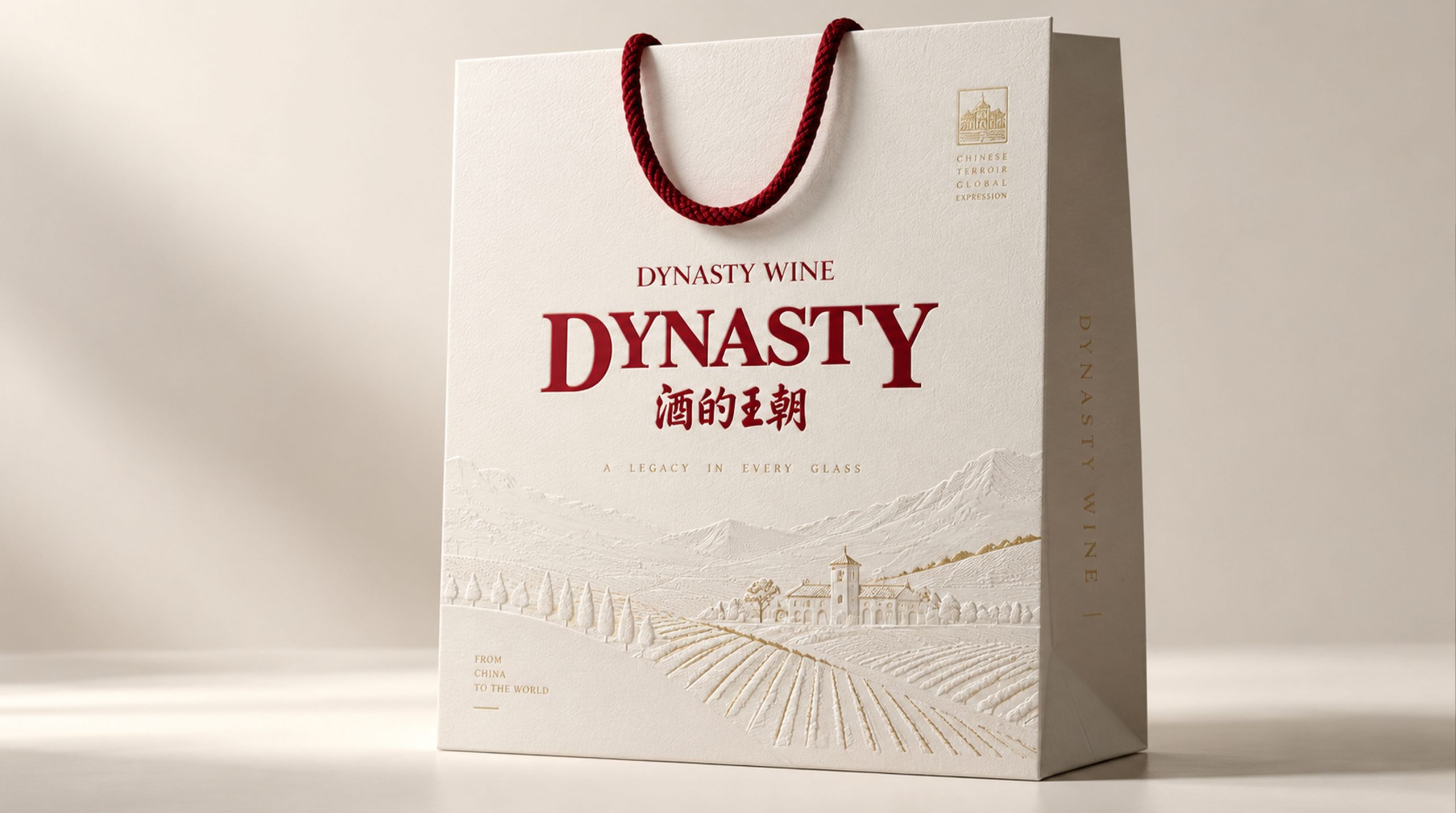
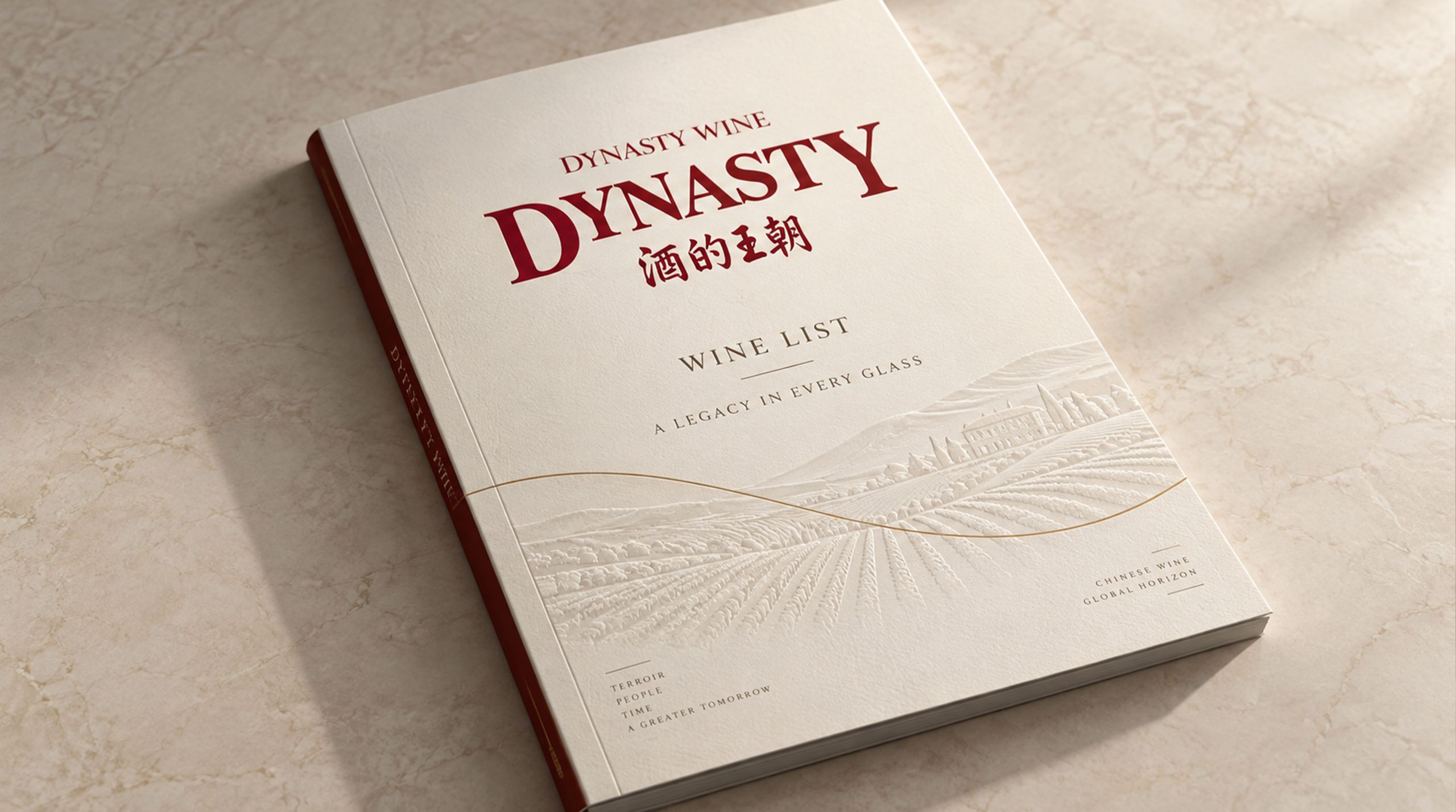
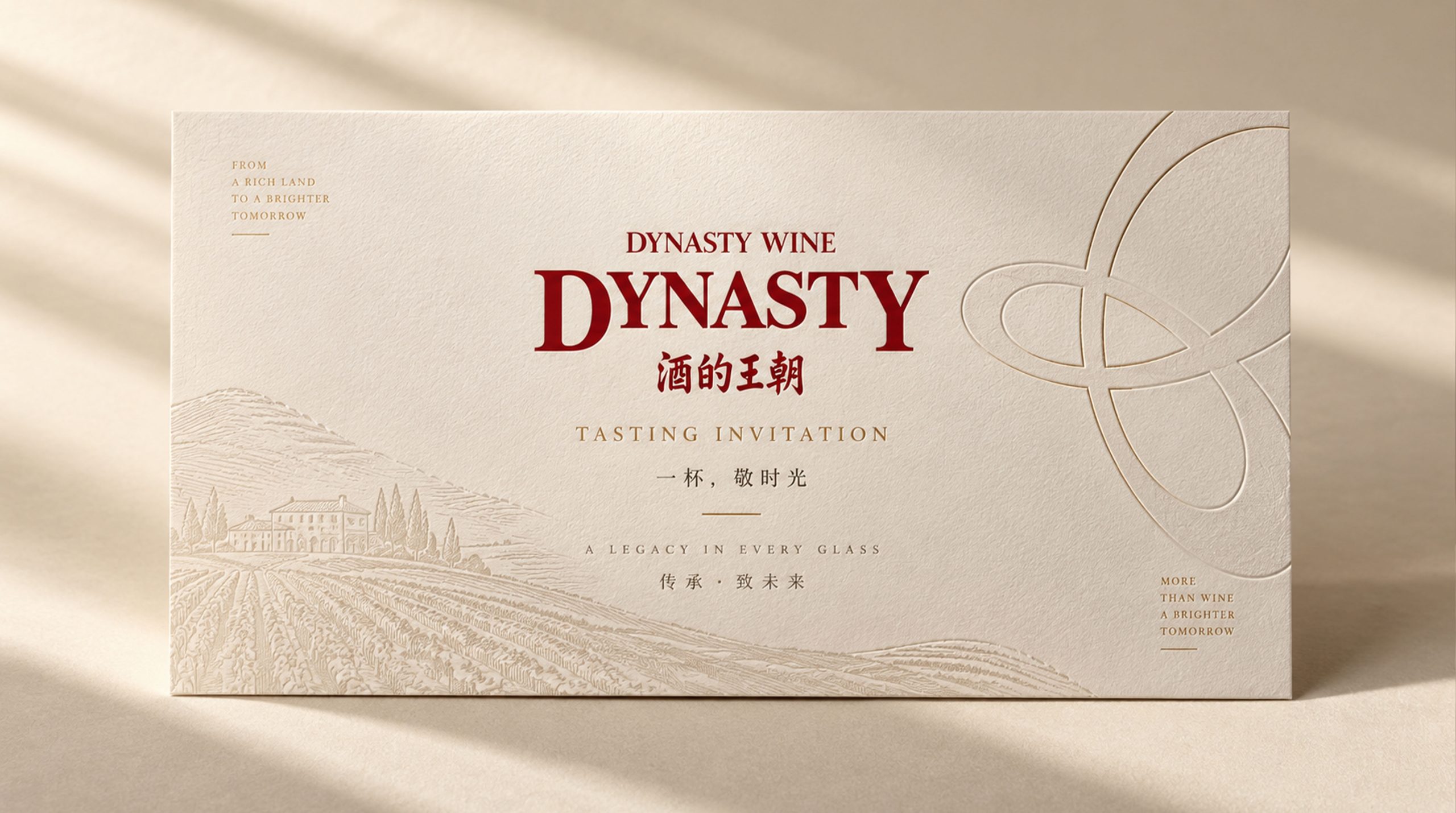
design results
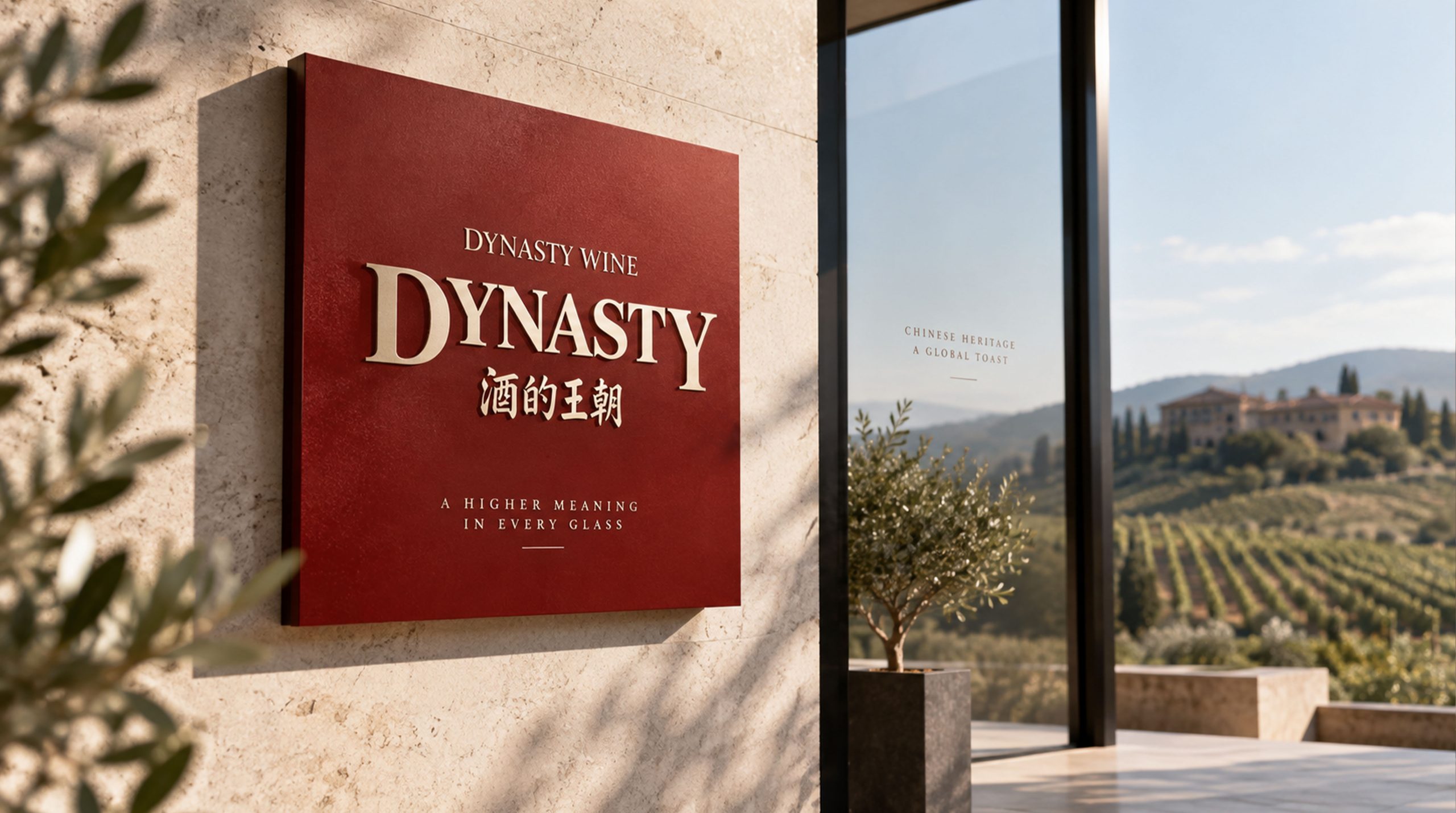
This plan uses the English "Dynasty" as the main logo, reflecting the international nature of Dynasty as a Sino-foreign joint venture. Using burgundy as the background color of the logo highlights the attributes of the wine industry, and uses golden fonts to highlight the high-end wine quality - burgundy is the true color of the fine wine in the glass, and gold is the crown of noble quality. The classic combination of burgundy and gold is the most common visual language for high-end wine brands around the world.
graphic language
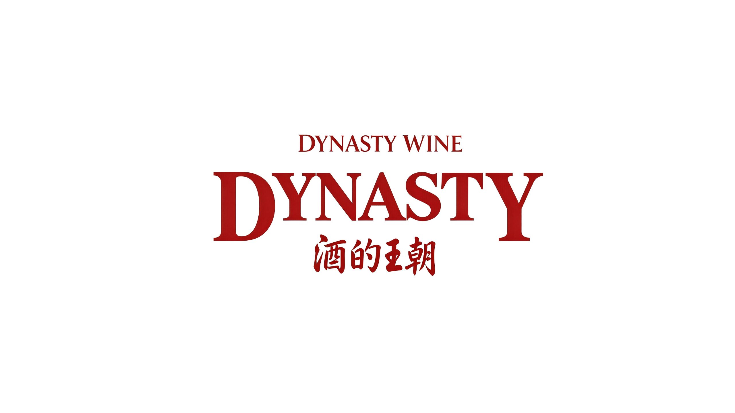
The logo is based on the artistic wordmark of "Dynasty" in English as the absolute core, and there is no independent graphic symbol - the wordmark is the logo, and the logo is the wordmark. Using the pure power of font design to convey the entire temperament of the brand is the most classic logo strategy for high-end wine brands - famous Bordeaux wineries, Burgundy wineries, and Napa Valley boutique wineries all use text logos as the first identification element of the brand. The seven letters of "Dynasty" are carefully drawn in a custom serif font. The shape of the serifs is based on the solemn bones of the classical Roman stele fonts. Each vertical stroke is narrowed in a wedge shape that is thin at the top and thick at the bottom, just like the sculptural sense of the stone inscriptions that remain tall and straight after thousands of years of weathering - conveying the brand's aging value of "having stood the test of time and getting better with time." The horizontal serifs are slightly stretched out in a delicate triangle shape, just like the elegant everted curvature of the rim of a wine glass.
The initial letter "D" is presented in a slightly larger font size, serving as the visual guide for the entire set of wordmarks. The arc of "D" is full and rounded, just like the cross-sectional outline of an oak barrel - oak barrel is the core container for wine aging. The arc of "D" inadvertently completes the metaphorical connection from letters to wine vessels. The descending stroke of "y" extends downward in an elegant curve and then recovers in a rounded arc, just like the smooth arc drawn by the wine from the mouth of the bottle when the sommelier pours wine - precise, elegant and just right.
The spacing between letters has been carefully considered one by one, and is loose and rhythmic, just like the leisurely intervals between each course of wine at a high-end wine tasting - not hasty, not impatient, and left with aftertaste. The baseline level of the overall word mark is stable, conveying the quality consistency of the brand "for decades". Above the word mark, a very thin horizontal gold line can run across the entire width, just like the classic dividing line on a wine label, adding a sense of ceremony and wine label texture to the word mark.
Font composition
The English "Dynasty" is the core logo of the brand, and every detail of the customized serif font is tailor-made for the wine industry and high-end quality. The Chinese character "Dynasty" is presented in matching classic Song font, with thin horizontal lines and thick vertical strokes, and a sharp edge like a blade. The character "Wang" has three horizontal and one vertical strokes like the three steps of a crown, and the moon next to the character "Chao" is like a bright moon reflecting on a wine glass. The Chinese logo is usually placed below the English logo, with a smaller font size used as an auxiliary identification - English dominates to convey the international identity, and Chinese assists in anchoring the Chinese market perception.
color system
The main color burgundy #722F37 is the soul color of the entire logo. The burgundy color is directly taken from the classic color of high-quality dry red wine in the glass - deep, rich, with a jewel-like luster, just like the charming dark red of a glass of aged Cabernet Sauvignon sparkling in the candlelight. Burgundy is the most industry-recognizable color in the global wine industry. When consumers see burgundy, they immediately think of wine. Choosing this color as the background color of the logo completes the industry identification of the brand at the first moment of vision.
The font color of the logo is gold #C5A14E. The gold color is like the gold-plated year label on the bottle of aged wine - noble, rare and worth collecting. Gold presents a strong and harmonious contrast on the burgundy background - the unity of warm tones prevents the two from conflicting, while the difference in brightness allows the word mark to emerge clearly on the background. The combination of burgundy and gold is the most classic color combination in the global high-end wine and luxury goods industry - the wine labels of famous Bordeaux chateaux, gift boxes of vintage champagne, and packaging of top brandy all use burgundy and gold as the noble visual code.
Auxiliary ivory white #FAF5EE is used for the light background and printing base color in the brand system, just like the warm texture of aged wine label paper after it turns yellow. Auxiliary Oak Brown #5D3A1A is used as a material-related element in the brand system, like the deep color of French oak barrels. The overall color uses burgundy and gold as the absolute dual core, reflecting the brand temperament of "high-end brewing, noble classics".
Application extension
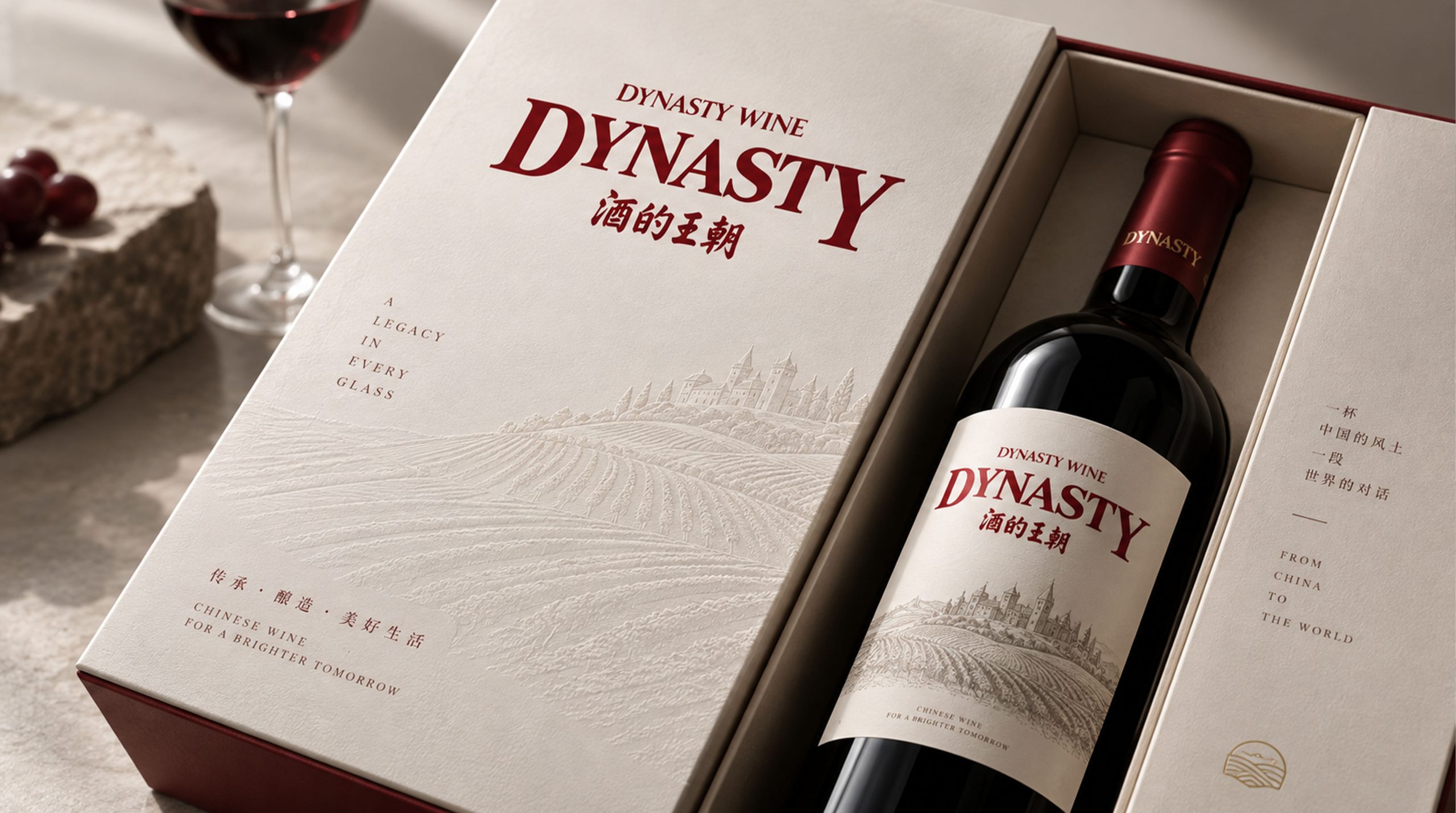
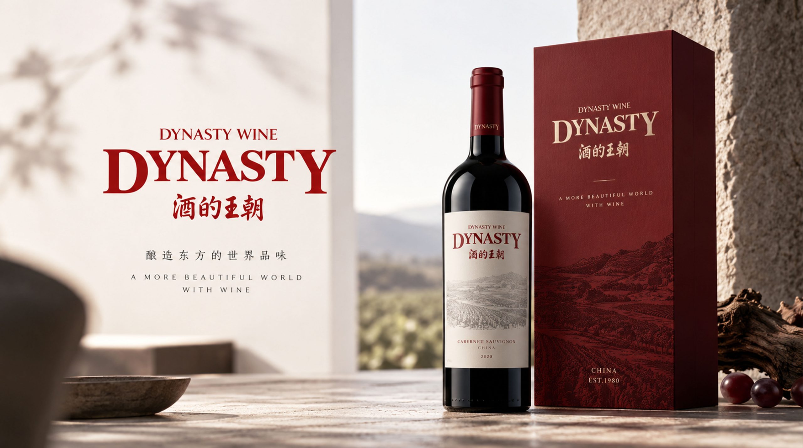
The logo can be widely used in a full range of wine bottle labels, bottle caps, cork hot stamping and outer packaging gift boxes; winery visit center, tasting room and exhibition hall logos; official website, e-commerce platform flagship store and social media image; international wine exhibitions, wine tastings and high-end business banquet cooperation images. In the wine label design of the flagship dry red product, the burgundy background covers the main body of the label, and the golden "Dynasty" word mark is presented in the center with hot stamping technology. A thin golden line runs across the top of the word mark, and the production area, year and variety are marked in small gold letters below the word mark. The entire wine label is like a miniature brand medal, conveying in the most stable manner on the wine rack that "this is a bottle of Chinese high-end wine worthy of serious treatment." At the high-end tasting dinner, the golden "Dynasty" on the burgundy table card glowed warmly under the candlelight, just like the light of gems reflected by the wine in the glass - the brand symbol and product experience were perfectly integrated on the same table.
brand meaning
The logo contains three core images: Wine Identity - the burgundy background declares the brand's industry affiliation with the most authentic color of wine, completing the recognition of "this is a wine brand" at the first moment of vision; Premium Quality - the gold font uses the noble color common to global luxury goods to highlight the high-end positioning and aging value of Dynasty Wine; International Gene Heritage) - the dominant position of the English logo conveys Dynasty's international pedigree and global quality standards as China's first Sino-foreign joint venture wine company. The overall design conveys the brand vision of "dynasty style and classic brewing".
Improper Usage (Protection Specification)
Do not change the stroke structure or letter spacing of the "Dynasty" custom serif font; do not replace the burgundy background color with other colors or replace the gold font with colors other than white; do not change the hue and brightness of gold #C5A14E or wine red #722F37; do not add strokes, embossing or digital special effects inconsistent with the high-end wine style to the word mark; do not reverse the primary and secondary relationship between the English logo and the Chinese logo; keep the space ≥ 30% of the wordmark height; the minimum display width shall not be less than 35mm.
design results
After the release of the logo, Dynasty's brand recognition and quality awareness in China's high-end wine market continued to consolidate. The visual language with a burgundy background and golden wordmark as the core accurately conveys the industry attributes and high-end quality characteristics of wine, and has become the core identification symbol of the brand system. It is widely used in product packaging, terminal displays and international wine exhibitions, showing the brand vision of "dynasty style, classic wine".